Read our official report here!
Inspiration
Coming into HackGT 8, we agreed as a team that we wanted to target either a social good or sustainability project. Especially with this opportunity to work alongside amazing people, in addition to the support offered by the HackGT team, this was an excellent time to work on a project that could potentially improve people’s lives.
What it does
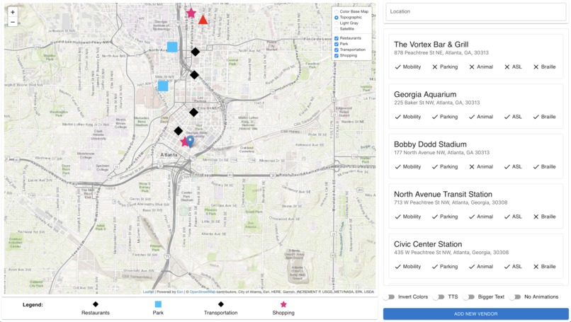
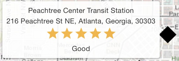
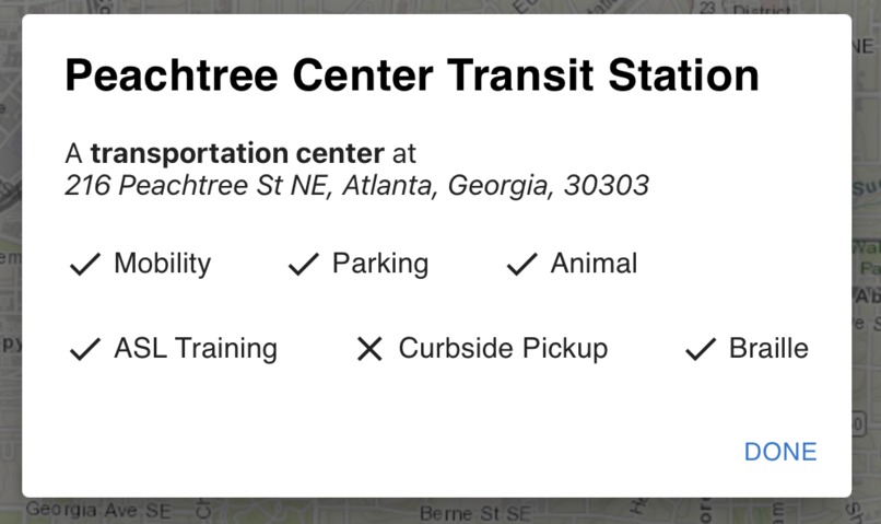
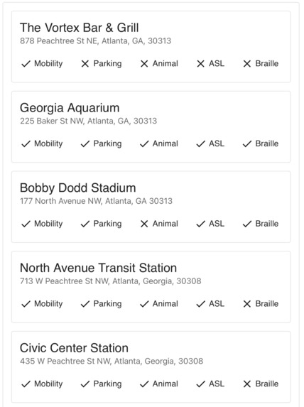
For Individuals with Disabilities The main map features multiple layers for a variety of viewing experiences, In addition to color-coded and uniquely shaped icons which represent important landmarks in their location such as transportation hubs, shopping centers, and public parks. Hovering over these landmarks reveal the name of the location, address information, as well as an easy to understand 5-star rating system based on the accessibility of the location. Clicking on a landmark reveals additional accommodations provided by the location, which is similarly reflected in the right hand side of the webpage. This simple-to-read interface provides the key information for those with disabilities to choose to visit locations that are most accommodating to their conditions. As discussed earlier, designing the user flow for those with disabilities consisted of adhering to accessibility guidelines and providing a simple and clean interface for our users to interact with, which was reflected in our final product. From the beginning and throughout the web application, this theme continues throughout our application, with intuitiveness and simplicity driving our design choices.
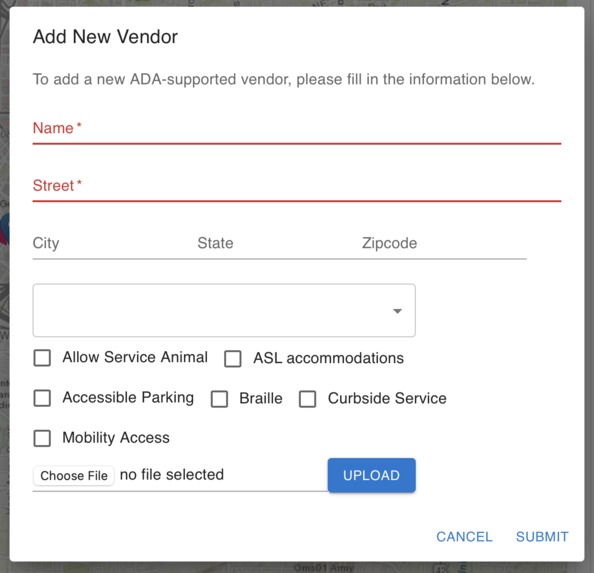
Vendors (local businesses, public services, etc…) For vendors, we hope to provide a platform that not only features their advocacy for inclusivity but also promotes awareness of potential disability accommodations to better serve their local community. Businesses and vendors can provide information about their venue and specify their accommodations through a form on the web app. The form takes in name, address, and their available disability accommodations. Additionally, they can provide images of potentially helpful information about their venue. When designing user flow for vendors, our priorities were grounded in functionality and efficiency. As an app, we recognize that vendors must believe it worthwhile to interact with our service, and therefore, an easy and straightforward flow, often taking under a minute, was essential to opening the door to possible adaptation by companies.
Technical Aspects
Since our website mainly serves users with disabilities, we decided to focus on polishing the frontend interface and functionalities to make our website more accessible to users.
Front End As stated above, we strived to keep our front end as sleek and clean as possible. While we employed some animation techniques, most of our front end consists of elegantly crafted panels and components. One of our major achievements on the front end of our application is the fully functional map, built to scale alongside our application, allowing for vendors from all over the globe to be represented.
Back End We wanted to keep our backend simple, maintaining our storage through a Google Firestore database, and representing each vendor as an object that could be queried by the client. The most difficult problems we solved while developing the back end of our application were relaying information, managing Javascript promises, and representing vendors as JSON objects.
Challenges we ran into
Conceptually it was hard for us to pinpoint the exact needs of people with disabilities at first, but after extensive research on the difficulties that they face in their everyday life, we constructed a list of services that they might need and expanded our design based on that. Additionally, it was challenging to learn new concepts at the same time as applying it to our hackathon project. This resulted in a realization and questioning of the feasibility of some of our planned features, which unfortunately did not make it into the final submission. It was in our best interest to choose the most important features that needed to be implemented in the final solution.
Accomplishments that we're proud of
Our final product was very nice to look at and minimal bugs remain in our final submission. The overall experience from beginning to end was seamless and accomplished our goals for the two user groups. Specifically, the map was a resounding success. Multiple ways of interactions with map and vendor objects were made possible, thus making it very easy for an end-user to learn and navigate through the web app.
What we learned
One of the most important things we learned was the extensitivity and variety of disabilities, as well as an equally staggering but assuring variety of accommodations. Finally, we gained a lot of technical skills from working on this project. This included better experience with external APIs and understanding web development workflows. Furthermore, we gained a lot of experience with collaboration - a skill that is hard to learn in a classroom setting.
What's next?
If Accessibility.me continues to make progress, the next goals would be to implement the planned features that never fully made it into the final product. This would include furthering the web app’s accessibility features, such as implementing the larger text and inverting colors toggles. However, as a whole, we strongly believe that this project will help guide us to new future projects and further our drive to continue to contribute to projects focused on social good.


Log in or sign up for Devpost to join the conversation.