Inspiration
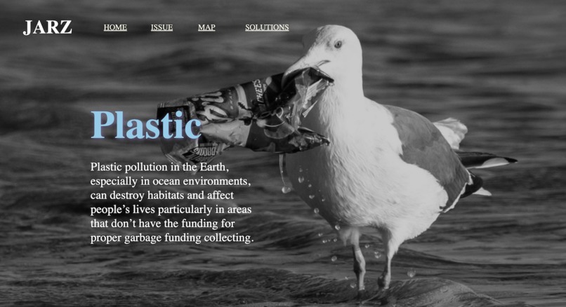
Everyday in our daily lives, we come into contact or use plastic, it’s almost unavoidable. But our actions are taking a significant toll on our surrounding environment, and animals are getting affected by us. Only we can make the Earth better by making more sustainable choices.
What it does
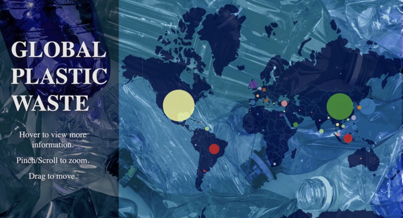
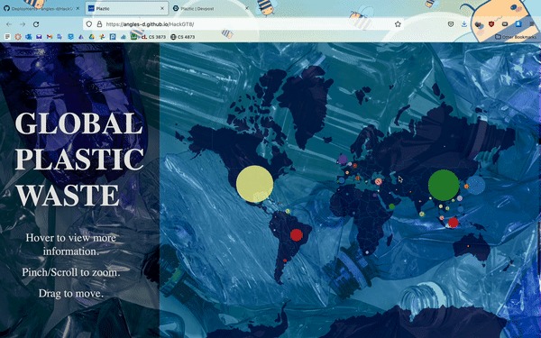
Our project is an informational and interactive website that shows the amount of plastic waste generated daily by each country. We wanted to convey the true scope of the problem and emphasize the asymmetric waste generation between countries. Using hover, zoom, and pan features, the viewer can explore the map and get a true sense of this problem's scope. We recommend you take a look at the United States and China and compare them to the rest of the world.
How we built it
We found a data set from science.org and used that data in our visualization. We first started with the map since we knew that would be the hardest part to implement. After we got the map working, we built the website around it to be interactive for the user.
Challenges we ran into
Making the interactive map with the tooltips. Australia didn't want to fit on the map.
Accomplishments that I'm proud of
We actually finished the project!
What we learned
We learned d3.js.
Log in or sign up for Devpost to join the conversation.