Inspiration
TTC delays are a common frustration for commuters, often leading to unpredictable travel times and missed connections. We wanted to analyze these delays to uncover patterns, identify problem areas, and provide actionable insights for both commuters and TTC administrators to improve transit reliability.
What it does
Our analysis examines TTC delay data, comparing different transit modes (subway, streetcar, and buses) to determine where and why delays occur. Key findings include:
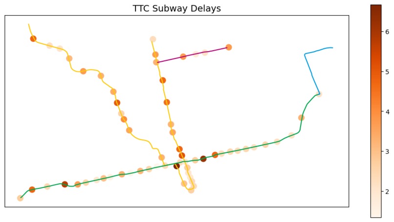
Streetcars and buses experience fewer delays but have longer wait times when they do. Subway delays are more frequent but typically short. Hotspots: Delays are concentrated around Museum and Spadina stations. Line 2 has more delay time, while Line 1 sees more delays on the Finch branch than Vaughan. We offer recommendations for commuters (better planning strategies) and TTC administrators (improving service reliability and handling common incidents).
How we built it
Data Collection: Retrieved TTC delay data and geospatial subway data. Data Cleaning & Processing: Standardized station names, handled missing values, and mapped delay occurrences. Visualization: Used Python (Pandas, Geopandas, Matplotlib, Seaborn, Folium) to create heatmaps, line plots, and geographic visualizations to highlight delay patterns.
Challenges we ran into
Geospatial Data Issues: Some subway shapefiles had missing components, requiring fixes. Station Name Mismatches: Delay data used different station naming conventions, leading to a manual mapping process. Balancing Insights & Visualization: Making sure data was both insightful and visually intuitive was a challenge.
Accomplishments that we're proud of
Successfully merged multiple datasets to create a comprehensive TTC delay analysis. Built a clear and interactive visualization that helps users understand the data at a glance. Identified key hotspots and transit inefficiencies that can help commuters plan ahead and TTC administrators optimize routes.
What we learned
The importance of data cleaning when dealing with different datasets. How to work with geospatial data and mapping libraries for transit analysis. The value of presenting data in an engaging, accessible way to help commuters and decision-makers take action.
What's next for TTC Delay Analysis
Real-time analysis: Implementing live delay tracking for more dynamic insights. Machine learning prediction: Predicting future delays based on historical patterns and external factors (e.g., weather, events). Interactive Web Dashboard: Creating an easy-to-use dashboard where users can check delay trends for their routes.
Built With
- beautiful-soup
- folium
- geopandas
- matplotlib
- pandas
- python
- seaborn

Log in or sign up for Devpost to join the conversation.