Inspiration
Similar maps have been made for reddit communities, twitter hashtags, and facebook friend networks and we thought it would be interesting to see what the map for youtube would look like.
What it does
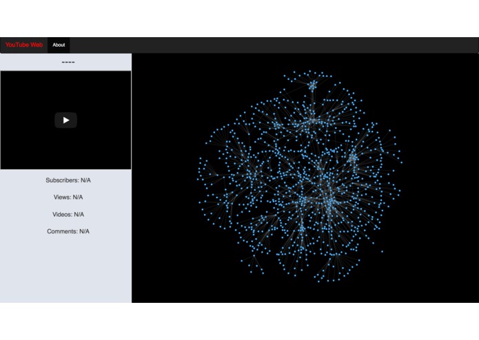
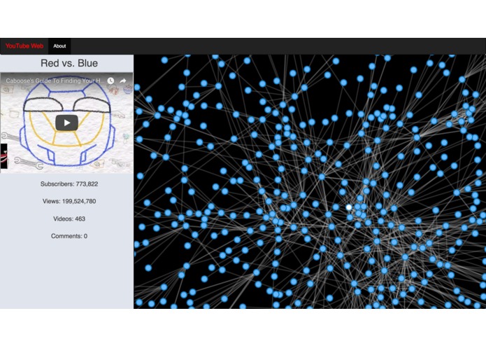
It visualizes the relationships between youtube channels based on which channels are "featured" or "recommended" on the page of a particular channel.
How I built it
The data was collected by running a Java program that collects data from the Youtube website using a library called Jsoup. The website is hosted by a python server and runs JavaScript and HTML. The data is visualized using the alchemy.js library, which is built in d3.js. The website also makes calls to the Youtube API to get view counts and most recent videos.
Challenges I ran into
The YouTube API does not have information about related channels, only featured channels. (featured channels are channels selected by the channel owner, while related channels are based on YouTube's algorithm). Since many channels only feature a few channels or do not feature any channels at all, this is much less than interesting than if it would have both featured and recommended. We solved it by using a Java library called Jsoup, which gets the HTML for a web page given an URL, and parsing the HTML code to find the related channels listed on the YouTube website.
Accomplishments that I'm proud of
We're proud of being able to embed multiple different platforms into one application, and of being able to collect data not available through the youtube API.
What I learned
We learned how to use the youtube API, how to systematically collect data from a webpage, and how to make complex graph visualization using javascript.
What's next for Youtube Graph
Currently the app starts with the most popular channel (PewDiePie) and builds out a set distance from there via a breath first search. It only scans a few hundred channels. Scaling the app to visualize a much larger section of the site would be more useful.


Log in or sign up for Devpost to join the conversation.