Progress Bar
Sometimes, one number matters most. A fundraising target, a project milestone, a skill mastery. The Master Addons Progressbar Element makes that single metric a visual centerpiece. Choose from multiple engaging styles – classic Line, radial Circle, or unique Fan and Bubble designs. Set your goal value, then customize every part. It’s the perfect elementor progress bar element to focus attention, visualize completion, and motivate action around one key objective.
Multiple Visual Style Presets
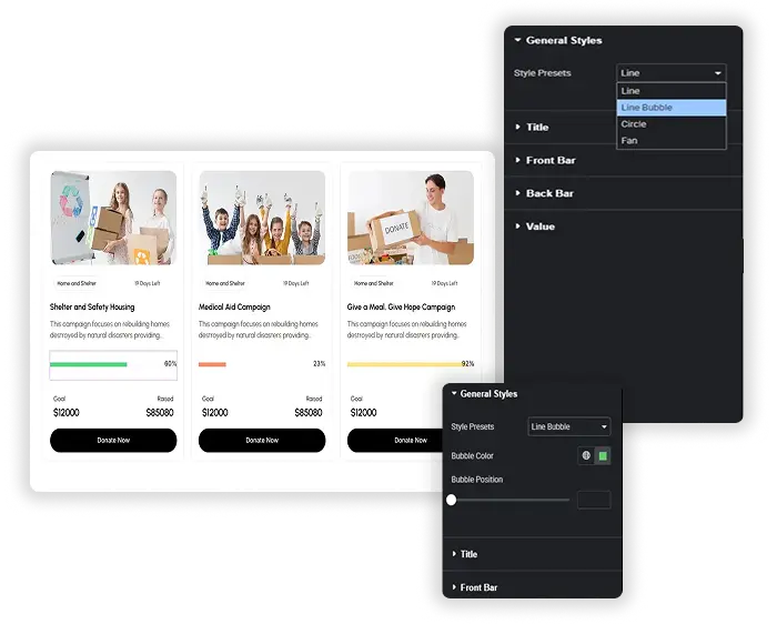
A single number can be shown in many ways. Select the visual style that fits your page’s personality. Choose the simple, clean Line bar for horizontal layouts. Opt for the Circle for a compact, radial gauge. Make it playful with the Fan shape or add a dynamic Bubble that moves with the progress on the line style. Each preset offers a distinct way to visualize advancement, ensuring your progress bar is always an integral part of the design, not an afterthought.
- Four Distinct Styles: Choose from Line, Circle, Fan, and Line Bubble presets.
- Radial vs. Linear: Use Circle and Fan for compact, radial progress indicators in tight spaces.
- Animated Bubble: The Line Bubble style adds a moving endpoint that highlights the current value.
Content & Value customization
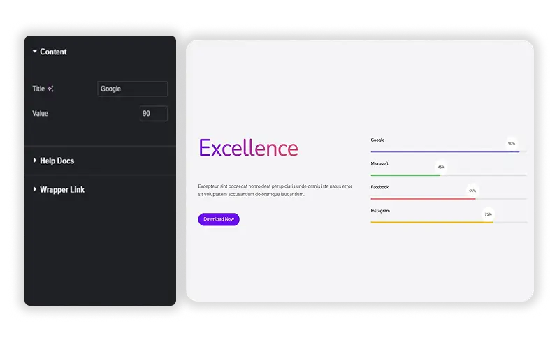
Setting up your progress bar is straightforward. In the Content tab, give it a meaningful Title like “Project Funding” or “Customer Satisfaction.” Then, set the Value – the all-important percentage that defines how full the bar or circle should be. This simple two-step process is all you need to get a functional, dynamic progress indicator live on your page.
- Simple Input: Just two fields: Title and Value (Percentage).
- Live Preview: See the title and percentage value update in the editor as you type.
- Dynamic Display: The bar, circle, or fan fill automatically adjusts to the exact percentage you enter.
Progress Bar Styling
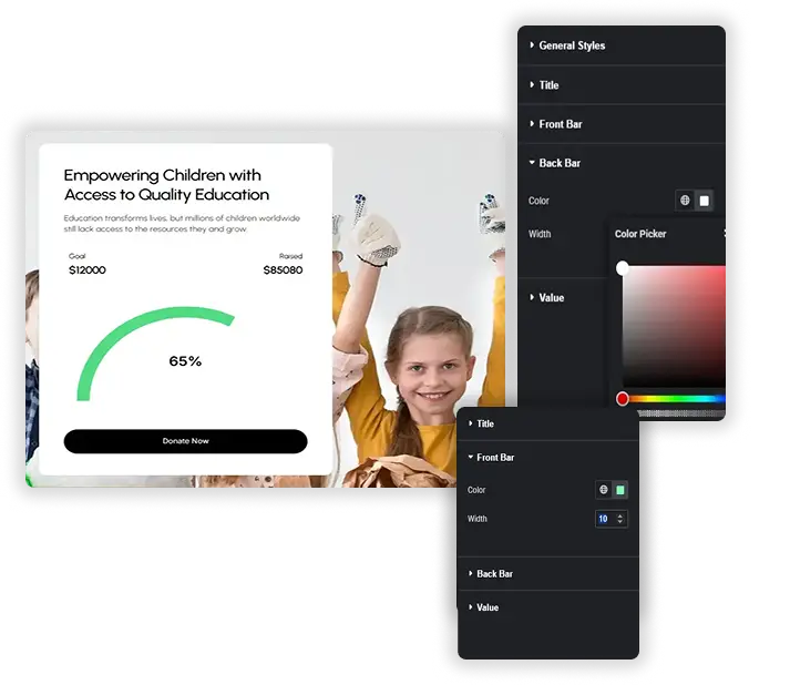
Style the Back Bar (the empty track or background) and the Front Bar (the colored fill) independently. For the Front Bar, choose its Color and control its Width (or thickness). For the Back Bar, set its own color and style. This separation allows you to make the advancing progress stand out clearly against the background, ensuring maximum readability and visual impact.
- Dual-Bar Styling: Style the Front Bar (progress) and Back Bar (track) with completely different colors.
- Thickness Control: Adjust the Width of the progress fill, especially useful for Line and Circle styles.
- Clear Visual Hierarchy: Use contrasting colors to make the completed portion instantly obvious.
Label & Value Design
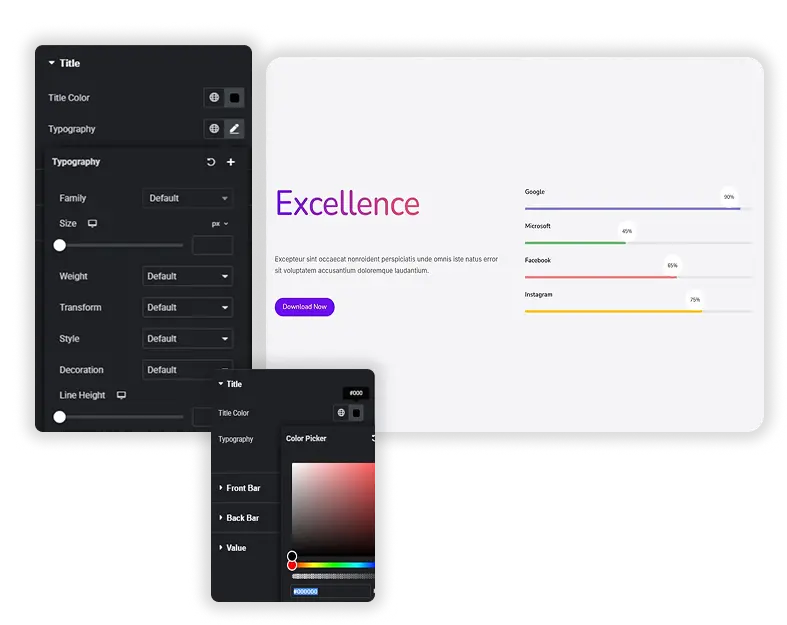
Use the Title and Value styling sections to design your text. Set the Title Color and choose its Typography – font, size, and weight. The Value (the percentage number) can be styled for emphasis, often making it larger or bolder than the title. This integrated approach guarantees that all elements of your progress bar feel like a unified, custom-designed component.
- Text-Specific Styling: Separate controls for styling the Title label and the Value percentage.
- Typography Control: Use the Typography panel for precise font control over the title text.
- Emphasis on the Number: Often style the Value to be more prominent, drawing the eye to the key metric.

Frequently Asked Questions For Progress Bar
What's the main difference between this and the "Progressbars" (group) element?
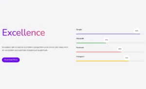
This element is for one single, standout progress indicator. It offers unique shape presets (Circle, Fan, Bubble) and is designed to be a focal point. The Progressbars element is for creating lists or groups of multiple bars (like a skills list), all in a similar linear style.
Does the bar/circle animate when the page loads?
Yes, typically. To engage visitors, the progress fill (Front Bar) should animate from 0% to your set value when the element comes into view on the page, creating a smooth, dynamic effect.
Can I use the Circle style to show a score out of 100?
Absolutely. The Circle (and Fan) style is perfect for this. Set your Value to the score (e.g., 85 for 85%). The element will fill the radial arc accordingly, creating a clear gauge or rating visualization.
Is the "Bubble" in Line Bubble style customizable?
Yes. There is a Bubble Color and Bubble Position setting. You can change the bubble’s color and adjust where it sits along the track relative to the fill’s end point.
Trending Elementor Widgets & Extensions
Build sophisticated websites in less time.
Popup Trigger
Off-Canvas Content

Caldera Forms
