Inspiration
News applications do not truly give us a worldwide perspective. News Mood solves this issue by getting the sentiments of news articles and visualizing them onto a map of the world.
What it does
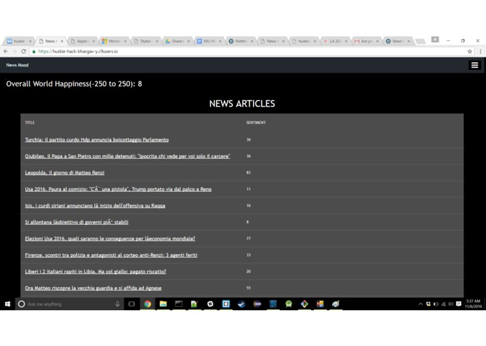
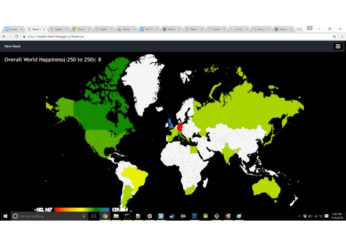
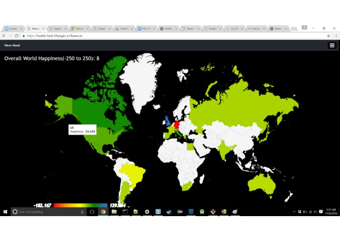
Pulls articles from around the world and does sentimental analysis to determine whether articles are happy or sad. Users are able to press on country to view a list of the articles and the specific sentiments. Negative sentiments are shown shades of red whereas positive values are shown as shades of green and blue. Neutral sentiments are shown as yellow.
How we built it
Pulled news from Bing News API and used npm package 'sentiment' to do sentimental analysis. We then visualized the data with the google charting API.
Challenges we ran into
Handling tons of Bing requests. Connecting back end and front end.
Accomplishments that we're proud of
Pulling news from around the world and charting it.
What we learned
We learnt about data visualization and handling many API requests.
What's next for News Mood
In depth statistical analysis and new data visualization charts. Properly integrate Amazon Alexa.


Log in or sign up for Devpost to join the conversation.