How to Make Your Tabs Responsive
Ensure your tabs look and work perfectly on all devices with Easy Tabs Block’s responsive controls. Easily adjust how tab buttons and content appear on desktop, tablet, and mobile—no coding needed.
We are going to show how-
1. Accessing Responsive Controls
In the Gutenberg editor, select your Tabs block to begin customizing it. In the block sidebar, open the Responsive panel, where you’ll find three toggles that let you control how the tabs behave on mobile and tablet devices. This helps ensure a smooth and user-friendly experience across all screen sizes.
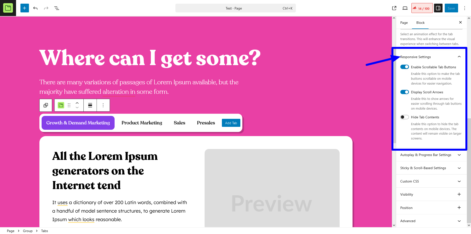
2. Enable Scrollable Tabs
It allows horizontal scrolling of tab buttons when they exceed the container width (especially useful on narrow screens).
- When to use: If you have many tabs or long tab labels that don’t fit in one row.
- How to apply:
- Toggle Enable Scrollable Tabs to On.
- Preview on mobile/tablet; swipe left or right on the tab buttons to scroll.
3. Display Scroll Arrows
It shows “‹” and “›” arrows at each end of the tab list to navigate through scrollable tabs.
- When to use: For better discoverability of hidden tabs on touch and non-touch devices.
- How to apply:
- Ensure Enable Scrollable Tabs is already on.
- Toggle Display Scroll Arrows to On.
- Use the arrows or swipe to move between tabs.
4. Hide Tab Content on Mobile
It collapses all tab panels on mobile by default, showing only the active tab’s header. Users tap to reveal the content.
- When to use: To conserve screen space and improve page load UX on small devices.
- How to apply:
- Toggle Hide Tab Content on Mobile to On.
- On mobile view, only the selected tab label appears; tap it to expand the content.
Best Practices
For a better mobile experience, combine scrollable tabs with navigation arrows to support both touch and keyboard users. Keep tab labels short to reduce the need for excessive scrolling. Always test your layout on real devices to ensure smooth touch and click interactions. Use nested tabs sparingly on mobile to prevent overly complex layouts that may confuse users.
With these responsive tab settings, you can craft mobile-friendly, no-code tabbed layouts that adapt perfectly from desktop to smartphone—right inside Gutenberg.