 June 8th, 2020
  Prerana Kasar
 Bootstrap 4 Button Groups
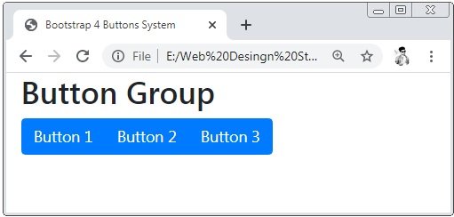
Bootstrap 4 provides series of the buttons together in a single line knows as button group. The class .btn-group is used to create the button groups.
Example 1 – Bootstrap 4 Buttons Groups Example
<!DOCTYPE html>
<html>
<head>
    <title>Bootstrap 4 Buttons System</title>
    <!-- link the bootstrap online or through CDN -->
    <link rel="stylesheet" href="https://maxcdn.bootstrapcdn.com/bootstrap/4.5.0/css/bootstrap.min.css">
 	<script src="https://ajax.googleapis.com/ajax/libs/jquery/3.5.1/jquery.min.js"></script>
  	<script src="https://cdnjs.cloudflare.com/ajax/libs/popper.js/1.16.0/umd/popper.min.js"></script>
  	<script src="https://maxcdn.bootstrapcdn.com/bootstrap/4.5.0/js/bootstrap.min.js"></script>
</head>
<body>
    <div class="container-fluid">
       	<h2>Button Group</h2>
        <div class="btn-group">
            <button type="button" class="btn btn-primary">Button 1</button>
            <button type="button" class="btn btn-primary">Button 2</button>
            <button type="button" class="btn btn-primary">Button 3</button>
        </div>
    </div>
</body>
</html>
On the above code, we apply button tags to create buttons and these buttons are wrapped by the .btn-group container.
Bootstrap 4 Buttons Group Sizes
Bootstrap 4 provides the classes to set the sizes of the button groups. There are 3 sizes of the button groups these are large, medium and small.
;Example 2 – Bootstrap 4 Buttons Groups Sizes Example
<!DOCTYPE html>
<html>
<head>
    <title>Bootstrap 4 Buttons Group</title>
    <!-- link the bootstrap online or through CDN -->
    <link rel="stylesheet" href="https://maxcdn.bootstrapcdn.com/bootstrap/4.5.0/css/bootstrap.min.css">
 	<script src="https://ajax.googleapis.com/ajax/libs/jquery/3.5.1/jquery.min.js"></script>
  	<script src="https://cdnjs.cloudflare.com/ajax/libs/popper.js/1.16.0/umd/popper.min.js"></script>
  	<script src="https://maxcdn.bootstrapcdn.com/bootstrap/4.5.0/js/bootstrap.min.js"></script>
</head>
<body>
    <div class="container-fluid">
       	<h2>Large Button Group</h2>
        <div class="btn-group btn-group-lg">
            <button type="button" class="btn btn-primary">Button 1</button>
            <button type="button" class="btn btn-primary">Button 2</button>
            <button type="button" class="btn btn-primary">Button 3</button>
        </div>
        <h2>Medium Button Group</h2>
        <div class="btn-group">
            <button type="button" class="btn btn-primary">Button 1</button>
            <button type="button" class="btn btn-primary">Button 2</button>
            <button type="button" class="btn btn-primary">Button 3</button>
        </div>
        <h2>Small Button Group</h2>
        <div class="btn-group btn-group-sm">
            <button type="button" class="btn btn-primary">Button 1</button>
            <button type="button" class="btn btn-primary">Button 2</button>
            <button type="button" class="btn btn-primary">Button 3</button>
        </div>
    </div>
</body>
</html>
On the above code, we apply the class .btn-group-lg for large button group and btn-group-sm for the small size of the button group. And the default size of the button group is medium.

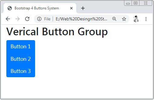
Bootstrap 4 Vertical Button Groups
Bootstrap 4 provides the class btn-group-vertical is used to create the vertical button group.
;Example 3 – Bootstrap 4 Vertical Button Groups Example
<!DOCTYPE html>
<html>
<head>
    <title>Bootstrap 4 Buttons System</title>
    <!-- link the bootstrap online or through CDN -->
    <link rel="stylesheet" href="https://maxcdn.bootstrapcdn.com/bootstrap/4.5.0/css/bootstrap.min.css">
 	<script src="https://ajax.googleapis.com/ajax/libs/jquery/3.5.1/jquery.min.js"></script>
  	<script src="https://cdnjs.cloudflare.com/ajax/libs/popper.js/1.16.0/umd/popper.min.js"></script>
  	<script src="https://maxcdn.bootstrapcdn.com/bootstrap/4.5.0/js/bootstrap.min.js"></script>
</head>
<body>
    <div class="container-fluid">
       	<h2>Verical Button Group</h2>
        <div class="btn-group-vertical">
            <button type="button" class="btn btn-primary">Button 1</button>
            <button type="button" class="btn btn-primary">Button 2</button>
            <button type="button" class="btn btn-primary">Button 3</button>
        </div>
    </div>
</body>
</html>
On the above code, we apply the class .btn-group-vertical to the button group container to create the vertical button group.
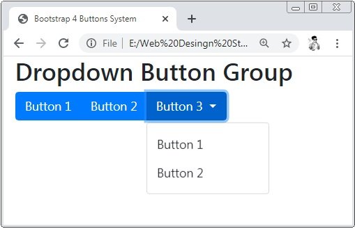
Bootstrap 4 Dropdown Menus
Bootstrap 4 provides class .dropdown-menu to create the dropdown and also apply attribute data-toggle=”dropdown” to the button tag.
Example 4 – Bootstrap 4 Dropdown Menus Example
<!DOCTYPE html>
<html>
<head>
    <title>Bootstrap 4 Buttons System</title>
    <!-- link the bootstrap online or through CDN -->
    <link rel="stylesheet" href="https://maxcdn.bootstrapcdn.com/bootstrap/4.5.0/css/bootstrap.min.css">
 	<script src="https://ajax.googleapis.com/ajax/libs/jquery/3.5.1/jquery.min.js"></script>
  	<script src="https://cdnjs.cloudflare.com/ajax/libs/popper.js/1.16.0/umd/popper.min.js"></script>
  	<script src="https://maxcdn.bootstrapcdn.com/bootstrap/4.5.0/js/bootstrap.min.js"></script>
</head>
<body>
    <div class="container-fluid">
       	<h2>Dropdown Button Group</h2>
        <div class="btn-group">
            <button type="button" class="btn btn-primary">Button 1</button>
            <button type="button" class="btn btn-primary">Button 2</button>
            <div class="btn-group">
                <button type="button" class="btn btn-primary dropdown-toggle" data-toggle="dropdown">Button 3
                    <span class="caret"></span>
                </button>
                 <ul class="dropdown-menu" role="menu">
                    <li><button type="button" class="btn">Button 1</button></li>
                    <li><button type="button" class="btn">Button 2</button></li>
                </ul>
            </div>
        </div>
    </div>
</body>
</html>
On the above code, we apply the class .droupdown-menu tag the list tag to dropdown button groups.
Bootstrap 4 Split Button Dropdowns
To divide the droupdown into two buttons the class dropdown-toggle-split is used
Example 5 – Bootstrap 4 Split Button Dropdowns Example
<!DOCTYPE html>
<html>
<head>
    <title>Bootstrap 4 Buttons System</title>
    <!-- link the bootstrap online or through CDN -->
    <link rel="stylesheet" href="https://maxcdn.bootstrapcdn.com/bootstrap/4.5.0/css/bootstrap.min.css">
 	<script src="https://ajax.googleapis.com/ajax/libs/jquery/3.5.1/jquery.min.js"></script>
  	<script src="https://cdnjs.cloudflare.com/ajax/libs/popper.js/1.16.0/umd/popper.min.js"></script>
  	<script src="https://maxcdn.bootstrapcdn.com/bootstrap/4.5.0/js/bootstrap.min.js"></script>
</head>
<body>
    <div class="container-fluid">
       	<h2>Split Dropdown Button Group</h2>
        <div class="btn-group">
            <button type="button" class="btn btn-primary">Button 1</button>
            <button type="button" class="btn btn-primary">Button 2</button>
            <div class="btn-group">
                <button type="button" class="btn btn-primary dropdown-toggle dropdown-toggle-split" data-toggle="dropdown">
		            <span class="caret"></span>
                </button>
                 <ul class="dropdown-menu" role="menu">
                    <li><button type="button" class="btn">Button 1</button></li>
                    <li><button type="button" class="btn">Button 2</button></li>
                </ul>
            </div>
        </div>
    </div>
</body>
</html>
On the above code, we apply the class .droupdown-toggle-split class is used to split the buttons into 2 parts.

 Posted in
  Tags:
Tags: 


