Create and Customize Tkinter Checkbox (Checkbutton)
In this tutorial, you’ll learn how to create and customize checkboxes (Checkbutton) in Tkinter.
We begin by generating checkboxes automatically from a list of options and store selected ones.
Then, we’ll integrate checkboxes in a Listbox-like format. We’ll also learn how to right-align the text of your checkboxes.
Finally, we cover how to change the font size of checkbox labels and how to change the checkbox size.
- 1 Create Checkboxes from a List (Using Loop)
- 2 Store Multiple Selection Values
- 3 Delete Checkbox
- 4 Checkboxes in Listbox
- 5 Create Scrollable List of Checkbuttons
- 6 Grid of Checkboxes
- 7 Align Checkbox Text To Right Side
- 8 Change Checkbox Font Size
- 9 Change Checkbox Size
- 10 Change Checkbox Border Color
- 11 Checkboxes Inside Combobox
Create Checkboxes from a List (Using Loop)
You can loop through a Python list and create a checkbox (Checkbutton) for each item.
You can also store the state of each checkbox in a separate variable.
import tkinter as tk
root = tk.Tk()
root.title("Service Selection")
options = ["Plan A", "Plan B", "Feature X", "Feature Y", "Add-on Z"]
checkboxes = {}
for option in options:
    var = tk.BooleanVar()
    chk = tk.Checkbutton(root, text=option, variable=var)
    chk.pack(anchor=tk.W)
    checkboxes[option] = {'var': var, 'chk': chk}
root.mainloop()
Output:
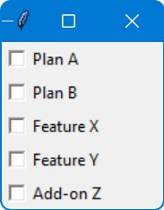
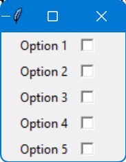
In this code, a list named options contains various service options like “Plan A”, “Plan B”, etc.
For each option in the list, a checkbox is created.
The state of each checkbox is stored in a BooleanVar (var), and the association between the option and its variable is maintained in the checkboxes dictionary.
Store Multiple Selection Values
To store the values of the selected checkboxes, you need to iterate through the checkboxes dictionary and check which checkboxes are selected.
This can be done by checking the state of each BooleanVar associated with the checkboxes.
You can then append the corresponding option to a list if its checkbox is selected.
import tkinter as tk
def get_selected_options():
    selected_options = []
    for option, data in checkboxes.items():
        if data['var'].get():
            selected_options.append(option)
    return selected_options
root = tk.Tk()
root.title("Service Selection")
options = ["Plan A", "Plan B", "Feature X", "Feature Y", "Add-on Z"]
checkboxes = {}
for option in options:
    var = tk.BooleanVar()
    chk = tk.Checkbutton(root, text=option, variable=var)
    chk.pack(anchor=tk.W)
    checkboxes[option] = {'var': var, 'chk': chk}
finalize_button = tk.Button(root, text="Finalize Selection", command=lambda: print(get_selected_options()))
finalize_button.pack()
root.mainloop()
When the button (finalize_button) is clicked, it calls the get_selected_options function and prints the stored selected options.
Delete Checkbox
Let’s say you want to delete the checkbox for “Feature X” from the above example.
You can do this by calling the destroy method on the corresponding Checkbutton widget and removing its entry from the checkboxes dictionary.
def delete_checkbox(option):
    if option in checkboxes:
        checkboxes[option]['chk'].destroy()
        del checkboxes[option]
delete_button = tk.Button(root, text="Delete 'Feature X'", command=lambda: delete_checkbox("Feature X"))
delete_button.pack()
Checkboxes in Listbox
The Standard Listbox widget does not support embedding other widgets like checkboxes directly.
However, you can do a similar effect by using a Canvas widget along with Frame widgets for each item.
This allows you to place checkboxes in a scrollable list.
import tkinter as tk
root = tk.Tk()
root.title("Checkbox Listbox")
canvas = tk.Canvas(root)
scrollbar = tk.Scrollbar(root, orient="vertical", command=canvas.yview)
scrollable_frame = tk.Frame(canvas)
scrollable_frame.bind(
    "<Configure>",
    lambda e: canvas.configure(
        scrollregion=canvas.bbox("all")
    )
)
canvas.create_window((0, 0), window=scrollable_frame, anchor="nw")
canvas.configure(yscrollcommand=scrollbar.set)
options = ["Option " + str(i) for i in range(1, 21)]
checkboxes = {}
for option in options:
    var = tk.BooleanVar()
    chk = tk.Checkbutton(scrollable_frame, text=option, variable=var)
    chk.pack(anchor=tk.W)
    checkboxes[option] = var
canvas.pack(side="left", fill="both", expand=True)
scrollbar.pack(side="right", fill="y")
root.mainloop()
Output:
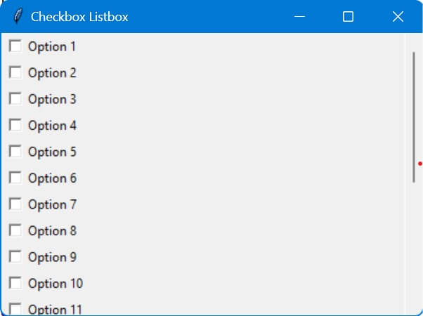
Here, the Canvas widget is used to provide a scrollable area.
The Frame (canvas_frame) is embedded inside the Canvas. This frame acts as a container for the checkboxes.
Then, Checkboxes are added to the canvas_frame, not directly to the Canvas.
The scrollbar is configured to scroll the canvas view.
The scrollregion of the canvas is updated based on the size of the canvas_frame.
The above list is not scrollable by the mouse wheel.
You can use the ScrolledText widget to display text and embed Checkbuttons into it.
import tkinter as tk
from tkinter.scrolledtext import ScrolledText
root = tk.Tk()
text = ScrolledText(root, width=20, height=10)
text.pack()
for i in range(30):
    cb = tk.Checkbutton(text, text=f"Option {i}", bg='white', anchor='w')
    text.window_create('end', window=cb)
    text.insert('end', '\n')
root.mainloop()
Output:
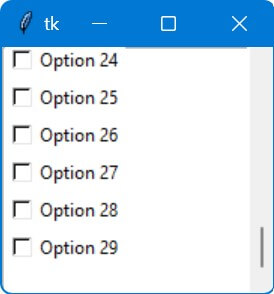
The loop iterates 30 times, each time it creates a Checkbutton. These Checkbuttons are embedded into the ScrolledText widget using the window_create method.
The window_create method attaches the Checkbutton to the text content, and 'end' specifies that each new Checkbutton is added at the end of the current content.
Grid of Checkboxes
You can use a nested loop to create a grid of Tkinter checkboxes. The outer loop represents rows, and the inner loop represents columns.
For each position in the grid, create a checkbox and place it in the appropriate row and column.
import tkinter as tk
root = tk.Tk()
root.title("5x5 Checkbox Grid")
for i in range(5):
    for j in range(5):
        checkbox = tk.Checkbutton(root, text=f"{i},{j}")
        checkbox.grid(row=i, column=j, sticky="w")
root.mainloop()
Output:
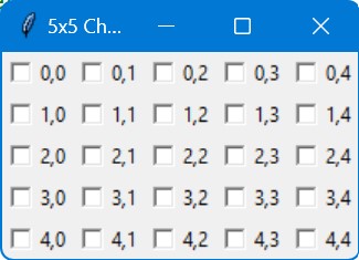
The grid uses a sticky parameter in the grid() method to align the checkboxes to the west (left side) of the grid cells.
Align Checkbox Text To Right Side
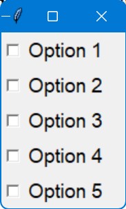
You can align the text of a checkbox to the right side by configuring the Checkbutton widget’s pack property by setting the side parameter to “right”.
import tkinter as tk
root = tk.Tk()
root.title("Right Aligned Checkbox Text")
options = ["Option " + str(i) for i in range(1, 6)]
checkbox_frame = tk.Frame(root)
checkbox_frame.pack()
checkboxes = {}
for option in options:
    var = tk.BooleanVar()
    chk_frame = tk.Frame(checkbox_frame)
    chk_frame.pack(fill='x', expand=True)
    chk = tk.Checkbutton(chk_frame, variable=var)
    chk.pack(side='right', padx=5)
    lbl = tk.Label(chk_frame, text=option, anchor='e')
    lbl.pack(side='right', fill='x', expand=True)
    checkboxes[option] = var
root.mainloop()
Output:
Change Checkbox Font Size
You can change the font size of a checkbox in Tkinter by configuring the font property of the Checkbutton widget.
The font property accepts a tuple where you can specify the font family, size, and style (like bold, italic, etc.).
import tkinter as tk
from tkinter import font
root = tk.Tk()
root.title("Checkbox with Custom Font Size")
options = ["Option " + str(i) for i in range(1, 6)]
checkbox_font = font.Font(family="Helvetica", size=14)
checkboxes = {}
for option in options:
    var = tk.BooleanVar()
    chk = tk.Checkbutton(root, text=option, variable=var, font=checkbox_font)
    chk.pack(anchor=tk.W)
    checkboxes[option] = var
root.mainloop()
Output:
The Font class is used to define the font properties. In this case, we set the family to “Helvetica” and size to 14. You can adjust these values as needed.
The custom font (checkbox_font) is applied to each Checkbutton via the font parameter.
Change Checkbox Size
Changing the font size doesn’t change te the actual checkbox square (the box part of the Checkbutton widget)
To change the checkbox size, you can create a custom checkbox using images for the checked and unchecked states.
This way, you can control the exact size and appearance of the checkbox.
import tkinter as tk
def toggle():
    global checked
    checked = not checked
    image = checked_image if checked else unchecked_image
    chk_button.config(image=image)
root = tk.Tk()
root.title("Custom Checkbox Size")
checked = False
checked_image = tk.PhotoImage(file='checked.png')
unchecked_image = tk.PhotoImage(file='unchecked.png')
chk_button = tk.Button(root, image=unchecked_image, command=toggle, bd=0)
chk_button.pack()
root.mainloop()
Output:
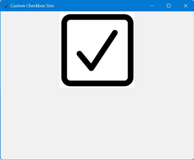
The toggle function changes the image displayed by the button.
Change Checkbox Border Color
To change the checkbox border color, you can create a custom checkbox using a Frame as a border, and place a Checkbutton inside it.
Then you can change the background color of the Frame to mimic a border color.
import tkinter as tk
root = tk.Tk()
root.title("Custom Checkbutton Border")
border_color_frame = tk.Frame(root, background="red", bd=1)
border_color_frame.pack(pady=10)
chk_var = tk.BooleanVar()
chk_button = tk.Checkbutton(border_color_frame, text="Check Me", variable=chk_var)
chk_button.pack(padx=1, pady=1)
root.mainloop()
Output:
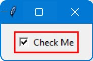
In this code, a Frame with a red background (background="red") acts as the border around the Checkbutton.
Adjusting the bd (borderwidth) of the Frame and padx, pady of the Checkbutton will change the apparent thickness of this ‘border’.
Checkboxes Inside Combobox
You can create a custom dropdown menu using a Toplevel window containing Checkbuttons.
This custom dropdown can mimic the behavior of a Combobox with Checkbuttons.
import tkinter as tk
from tkinter import ttk
class CheckbuttonCombobox:
    def __init__(self, master, options):
        self.master = master
        self.options = options
        self.selected_values = []
        self.create_dropdown()
    def create_dropdown(self):
        self.btn = ttk.Button(self.master, text="Select Options", command=self.show_dropdown)
        self.btn.pack()
        self.top_level = tk.Toplevel(self.master)
        self.top_level.withdraw()
        for option in self.options:
            mvar = tk.BooleanVar()
            chk = tk.Checkbutton(self.top_level, text=option, variable=mvar, command=lambda opt=option, var=mvar: self.on_select(opt, var))
            chk.pack(anchor='w')
            self.selected_values.append((option, mvar))
        self.top_level.overrideredirect(True)
        self.top_level.geometry(f"+{self.btn.winfo_rootx()}+{self.btn.winfo_rooty() + self.btn.winfo_height()}")
    def show_dropdown(self):
        if self.top_level.state() == 'normal':
            self.top_level.withdraw()
        else:
            x = self.btn.winfo_rootx()
            y = self.btn.winfo_rooty() + self.btn.winfo_height()
            self.top_level.geometry(f"+{x}+{y}")
            self.top_level.deiconify()
    def on_select(self, option, var):
        print(f"{option} is {'selected' if var.get() else 'deselected'}")

root = tk.Tk()
root.title("Combobox with Checkbuttons")
options = ["Option 1", "Option 2", "Option 3"]
dropdown = CheckbuttonCombobox(root, options)
root.mainloop()
Output:
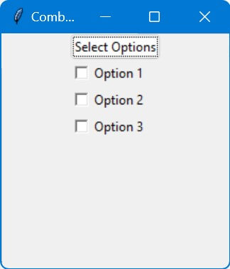
This code provides a dropdown-like widget containing Checkbuttons, similar to a multi-select Combobox.
It’s a custom solution if you need to select multiple options from a dropdown menu.
Mokhtar is the founder of LikeGeeks.com. He is a seasoned technologist and accomplished author, with expertise in Linux system administration and Python development. Since 2010, Mokhtar has built an impressive career, transitioning from system administration to Python development in 2015. His work spans large corporations to freelance clients around the globe. Alongside his technical work, Mokhtar has authored some insightful books in his field. Known for his innovative solutions, meticulous attention to detail, and high-quality work, Mokhtar continually seeks new challenges within the dynamic field of technology.