Creative Button
A button is the gateway to your most important actions – sign-ups, sales, downloads. Yet, most buttons only change color on hover. That’s a missed opportunity. Master Addons Creative Buttons Element brings a gallery of artistic hover effects to your fingertips. Choose from 20+ named presets like “Winona,” “Tamaya,” or “Wayra,” each with its own unique animation and style. Add icons, dynamic text that swaps on hover, and style every detail of both normal and hover states. Transform your generic “Submit” into an interactive experience that surprises, delights, and encourages clicks.
Style Presets & Effects
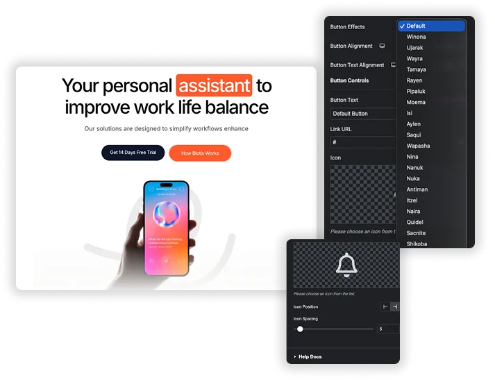
Why guess at effects? Choose from a library of professionally crafted Style Presets with distinct names like Ujarak, Moema, Saqui, and Nina. Each preset applies a complete animation system – not just a color shift, but layered movements, reveals, and transforms. Whether it’s a subtle background slide (Winona), a sophisticated double-layer effect (Tamaya), or an elegant text swap (Pipaluk), you get a unique, polished interaction in one click.
- 20+ Curated Presets: Select from uniquely named effects like Raven, Aylen, Shikoba, and Itzel for instant sophistication.
- Complex Animations: Each preset includes multi-part animations (backgrounds, text, pseudo-elements) that work harmoniously.
- No Code Required: Achieve advanced CSS hover effects without any coding knowledge.
Dynamic Content with Alternative Text & Icons
Engage users with a button that communicates in two stages. Set the initial Button Text (“Read More”) and an Alternative Button Text (“Let’s Go!”). On hover, the button seamlessly transitions to reveal the second message, adding a layer of delight and clarity. Enhance this further by adding an Icon, positioned Before or After the text, with adjustable Icon Spacing. This dynamic content layer makes the button itself feel alive and responsive to the user’s intent.
- Two-Stage Messaging: Use Alternative Button Text to change the call-to-action message during the hover effect.
- Icon Integration: Choose any icon and place it on either side of the button text for visual guidance.
- Flexible Link: Set the Link URL to any page, post, or file, making the button fully functional.



Frequently Asked Questions For Creative Button
How do I choose the right preset from so many options?
Think about the button’s purpose and your site’s energy. For a calm, professional site, try Winona or Wayra. For a bold, creative site, explore Saqui or Shikoba. For a playful vibe, Nina or Pipaluk might be perfect. The best way is to preview a few on your actual button text – the effect can feel different depending on the words used.
Can I use these buttons for a form submit button?
Yes, but with a note. These buttons are primarily designed as link buttons (they go to a URL). For a form submit button (like in Contact Form 7 or WPForms), you would usually need to use that specific form plugin’s button or a different type of widget. However, you can use our dedicated different form elements to design the form and their button.
Do the effects work on mobile devices?
The hover effects are designed for mouse interaction. On mobile, the effect will typically trigger on the first tap (which acts as a hover) + redirect to the button link. This provides some visual feedback before navigating.
Can I change the speed of the hover animation?
The animation speed is usually built into the selected Style Preset. For advanced control over the transition duration (speed), you would typically need to add custom CSS targeting the button’s class, as the provided interface focuses on colors, sizes, and styles rather than timing.
What's the best use for the "Alternative Button Text"?
Use it to create a clearer call-to-action or to provide feedback. For example:
- “Buy Now” → “Get It!”
- “Download” → “Loading…”
- “Learn More” → “Let’s Go!”
This small change can make the interaction feel much more conversational and dynamic.
Trending Elementor Widgets & Extensions
Build sophisticated websites in less time.
Popup Trigger
Off-Canvas Content

Caldera Forms
