Timeline
History, progress, and roadmaps are all about sequence – but listing events in bullet points loses the narrative. Master Addons Timeline Element brings sequence to life. Choose to build a Custom Timeline with handcrafted milestones, or generate a Post Timeline automatically from your blog. Display it as a classic Vertical Timeline or a modern Horizontal carousel. Style every component: the central line, date markers, content cards, and navigation. Perfect for company histories, project roadmaps, biographical journeys, or showcasing your blog archive in a visually compelling way. Don’t just tell people what happened – show them the journey.
Custom or Dynamic Posts Timeline
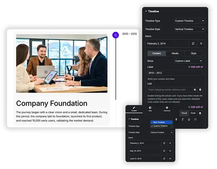
Start by choosing your timeline’s source. For full creative control, select Custom Timeline. Manually Add Items, each with its own Date, Title, rich Content (text, media), and an optional Link. For a dynamic, auto-updating timeline, choose Post Timeline. It automatically creates milestones from your blog posts, using the publish date as the timeline point. Filter posts by Category, Tag, or Author, and control the Order and number displayed. This flexibility lets you create anything from a personal history page to a dynamic “Our Story” blog feed.
- Custom Timeline: Create a Custom Timeline with complete control over every date, title, description, and image.
- Automatic Generation: Use Post Timeline to transform your blog archive into a visual chronological story.
- Smart Post Filtering: For Post Timelines, include or exclude posts by category, tag, author, or specific post IDs.
- Rich Content Cards: Add formatted text, images, and links to each timeline item, whether manual or from a post.
Vertical & Horizontal Layouts with Carousel
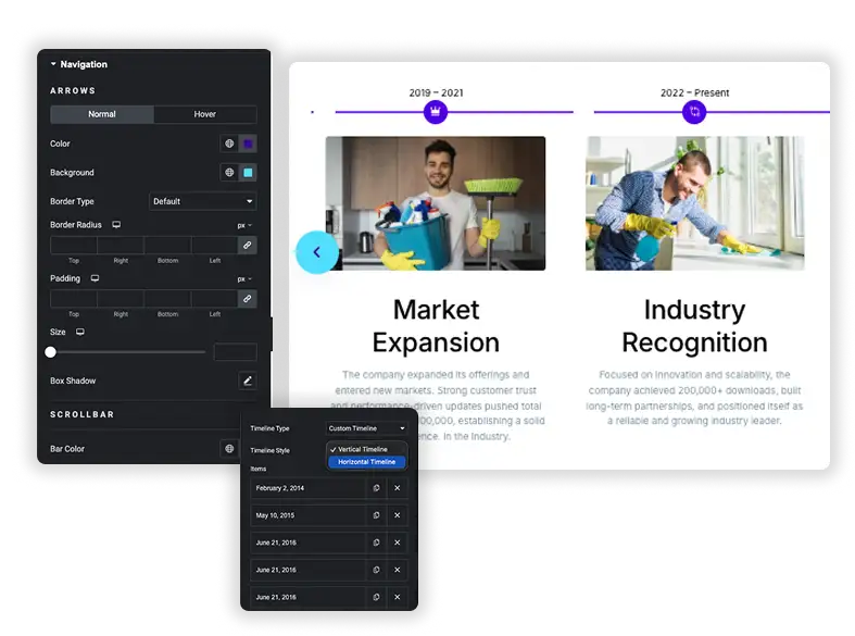
Present your timeline in the orientation that suits your page. The classic Vertical Timeline stacks items neatly in a column, perfect for sidebars or long-form story pages. For a more engaging, interactive display, use the Horizontal Timeline (Carousel). This turns your timeline into a slick, scrollable carousel with configurable navigation arrows. Control the Horizontal and Vertical Spacing between items, and adjust the Alignment of content within each card. This ensures your timeline is not just informative, but also a dynamic part of the page layout.
- Orientation Choice: Pick a traditional Vertical layout or a modern Horizontal carousel style.
- Interactive Carousel: For horizontal timelines, enable smooth scrolling, navigation arrows, and control scroll behavior.
- Precise Layout Control: Adjust Item Gap, Spacing, and Alignment (Left, Center) for pixel-perfect positioning.
- Space-Saving: The horizontal carousel is ideal for hero sections or areas with limited vertical space.
Complete Central Line & Point Styling
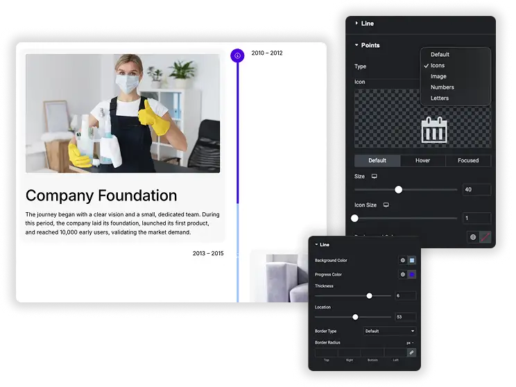
The central line and points are the iconic visual anchors. Style the Line itself – its color, thickness, and style. Then, design the Points (or icons) that mark each event on the line. Choose the Type (simple dots or custom Icons). Style them for Default, Hover, and Focused states, changing their Size, Background Color, and Points Color. You can even add a Text Shadow for depth. This turns the timeline’s skeleton from a simple divider into a designed graphic element.
- Central Line Design: Customize the color and style of the timeline’s connecting line.
- Interactive Points: Style the markers with three states (Normal, Hover, Focused) for clear interaction feedback.
- Icon or Dot Choice: Use simple dots or select any icon from the library as your timeline markers.
- Visual Hierarchy: Make the active or hovered point larger or a different color to draw attention.
Card & Date Styling with Animations
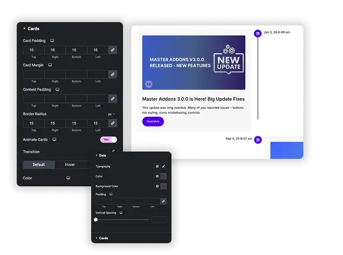
Make each event’s card a mini masterpiece. Style the Cards container: set Background Color, Border Radius, Padding, Margin, and a Box Shadow for depth. Enable Animate Cards for smooth entrance effects. Separately, design the Date labels with their own Typography, Color, and Spacing. Style these elements for Default, Hover, and the important Focused state (when a card is active/centered). This ensures each milestone is visually distinct and pleasurable to interact with.
- Card Container Design: Style the background, borders, shadows, and spacing of each timeline item card.
- Date Label Styling: Give date text its own color, font, and shadow, separate from the card content.
- Triple-State Control: Define unique styles for when a card is normal, hovered over, or in focused view.
- Smooth Animations: Add subtle entrance animations to cards as they come into view.
Frequently Asked Questions For Timeline
Should I use the Post Timeline or Custom Timeline?
Use Post Timeline if you want an automated, always-updated timeline based on your blog posts (great for “Company Updates” or “News History”).
Use Custom Timeline if you need full control over dates, content, and images for a fixed story (perfect for “Our History,” “Biography,” or “Project Roadmap”).
How does the "Focused" state work?
The Focused state is particularly useful in Horizontal (Carousel) timelines. It applies a special style to the card that is currently centered or active in the view, helping it stand out visually. You can make it larger, change its background, or add a shadow to indicate it’s the primary item in view.
Is the timeline responsive on mobile?
Yes. Vertical timelines will stack naturally. Horizontal timeline carousels will become touch-scrollable on mobile, and navigation arrows will adjust or can be hidden. Card layouts, text, and images will resize appropriately for small screens.
Can I link an entire timeline card to a page?
Yes. In the Custom Timeline item settings, you can add a Link. Enable the option to link the whole card. For Post Timelines, you can enable Links at card level, making each card clickable to its single post. Be careful not to have other links inside the card if you enable this.
Trending Elementor Widgets & Extensions
Build sophisticated websites in less time.
Popup Trigger
Off-Canvas Content

Caldera Forms
