Tooltip
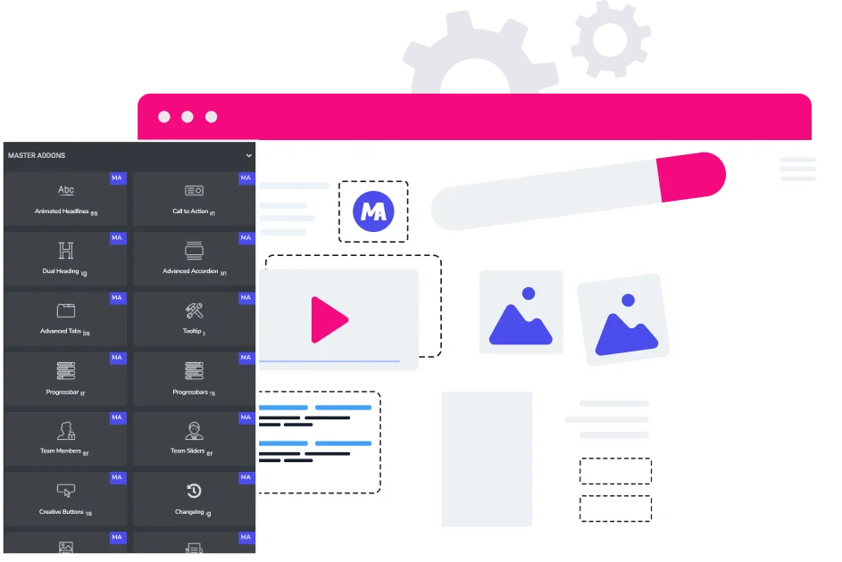
Master Addons for Elementor brings you a powerful and intuitive Tooltip widget, designed to enhance user experience and engagement on your website. This element lets you easily add helpful, stylish text hints that appear when visitors hover over or click on any content. With a full suite of customization options, you can control exactly how and where your tooltips show up, match them perfectly to your site’s branding, and make your interface more informative and interactive without any coding.
Flexible Content & Placement Control
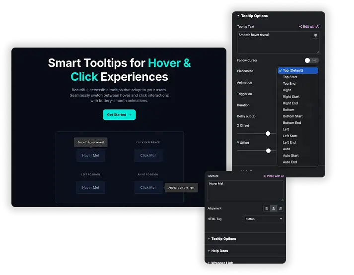
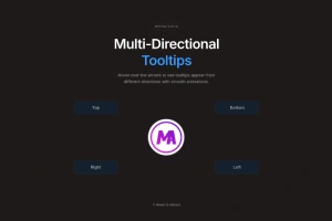
Easily manage what your tooltip says and where it appears on the screen. You can set the text content, choose from multiple placement positions (like top, bottom, left, or right), and fine-tune its position with pixel-perfect offset controls. This ensures your hints are always relevant and never get in the way.
- Display helpful explanations or definitions right where users need them.
- Position tooltips precisely to avoid overlapping with other elements.
- Guide visitors through features or forms with contextual hints.
Rich Styling & Visual Customization
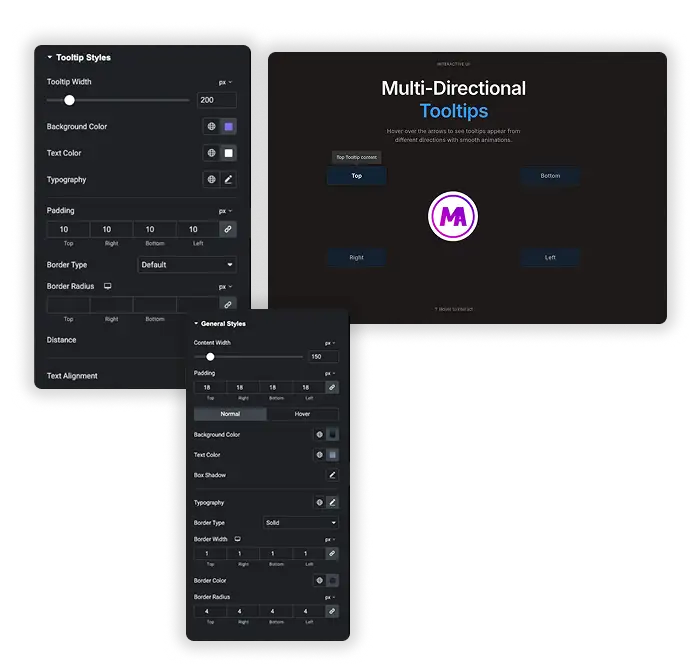
Fully design both the normal and hover state of your tooltip to match your website’s design. Customize background colors, text colors, typography, padding, border radius, and add box shadows for a polished look that feels integrated and professional.
- Create tooltips that seamlessly blend with your brand’s color scheme.
- Use borders and shadows to make tooltips stand out or appear subtle.
- Design different visual states for normal and hover interactions.

Interactive Behavior & Animation
Define how users interact with your tooltips by setting the trigger action and adding smooth animations. You can make tooltips appear on hover or click, control their display duration, and add a delay before they disappear for a smoother, less jarring user experience.
- Use hover for quick hints or click for more persistent information.
- Add subtle entrance animations to attract gentle attention.
- Prevent annoyance by setting a short delay before the tooltip fades out.


Frequently Asked Questions For Tooltip
What can I use the Tooltip widget for on my website?
It’s perfect for adding non-essential but helpful context. Common uses include explaining form field requirements, defining industry terms, offering button clarifications, or providing short instructions without cluttering your main design.
Can I make the tooltips look different when a user hovers over them?
Yes. In the Style tab, you will find separate design controls for “Normal” and “Hover” states. This allows you to change colors, shadows, or other properties when the user interacts with the tooltip trigger.
How do I control where the tooltip box appears relative to my text or button?
The Placement option gives you a wide range of preset positions (e.g., Top Start, Right End). For even finer control, you can use the X Offset and Y Offset settings to nudge the tooltip’s final position by a specific number of pixels.
Is it possible to make the tooltip appear when someone clicks, instead of just hovering?
Absolutely. In the Content settings under “Trigger on,” you can choose between “Hover” and “Click” to set the interaction that makes the tooltip visible.
Does this tooltip widget slow down my website?
The widget is built following best practices for performance. It loads only the necessary code and styles, ensuring a minimal impact on your site’s speed when used appropriately.
Will the tooltips work on mobile devices?
Yes. Tooltips are designed to be responsive. Interactions like “click” are well-suited for touchscreens, ensuring your hints remain accessible and functional for all visitors.
Trending Elementor Widgets & Extensions
Build sophisticated websites in less time.
Popup Trigger
Off-Canvas Content

Caldera Forms
