Create Your Own Elementor Widgets. No Code Required.
Meet Widget Builder by Master Addons – a powerful bridge between your custom code and the Elementor editor. Turn unique designs, AI-generated interfaces, or interactive CodePen snippets into fully functional, reusable Elementor widgets.
The Widget Builder Advantage
Create Truly Unique Widgets
Build widgets to your project's exact needs - something pre-made libraries can't offer.
Bring AI & CodePen Designs to Life
Directly integrate custom UIs from AI tools or live prototypes from CodePen into your site as editable Elementor widgets.
Full Creative Control
You own the entire stack: structure (HTML), style (CSS), and interactivity (JS), plus the ability to add external libraries.
Reuse & Save Time
Build a widget once, save it to your library, and reuse it across any project with consistent, editable settings.
Built for Power Users
If you know Elementor, you can use Widget Builder. The familiar tab-based interface makes widget creation visual and intuitive.
Custom Widgets Across Any Site
Build a widget once and easily export/import it to use on completely different WordPress websites, saving immense time

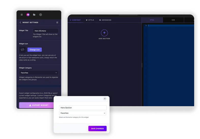
Create & Name Your Widget
Begin by establishing the identity of your new component. Give it a clear title and organize it within a category for seamless access every time you use Elementor.
- Assign a unique and descriptive title to your widget.
- Categorize it for easy future access in the editor panel.
- Set up the basic foundation for your reusable element.
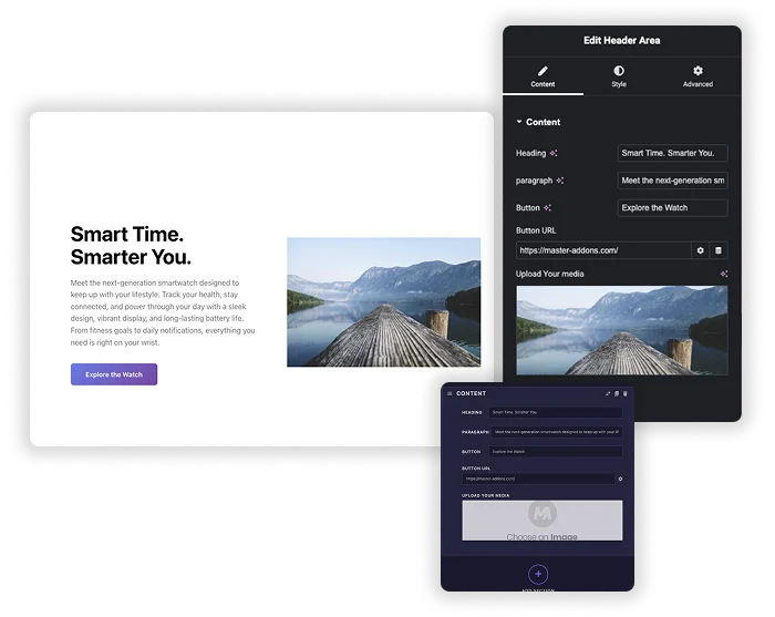
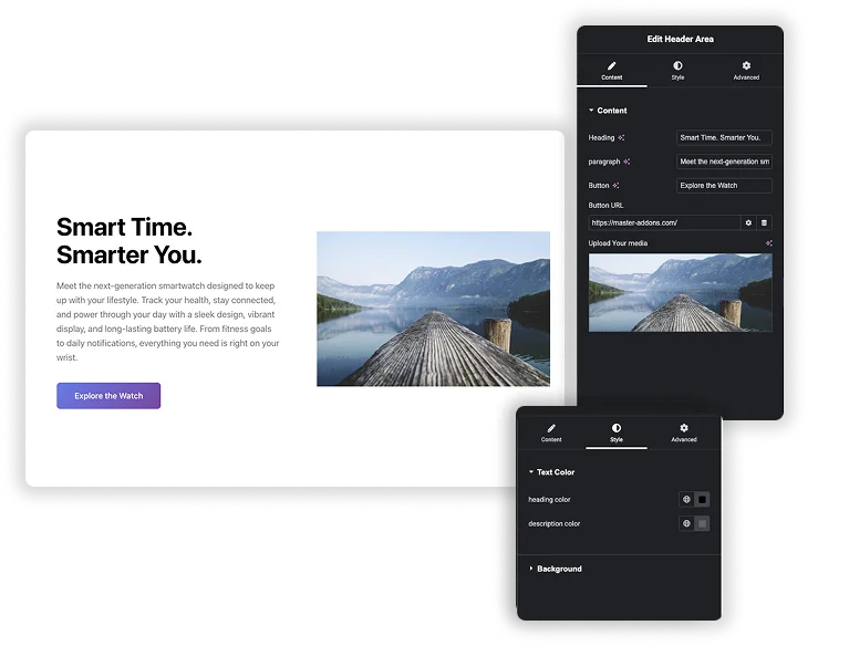
Design the Editor Experience
Construct the interface your users will interact with. By adding controls like toggles and color pickers, you visually build the widget’s settings panel without writing any code.
- Add controls (text, color, select) from the left panel.
- Each control becomes an editable option in Elementor.
- Visually design the entire user-facing settings panel.
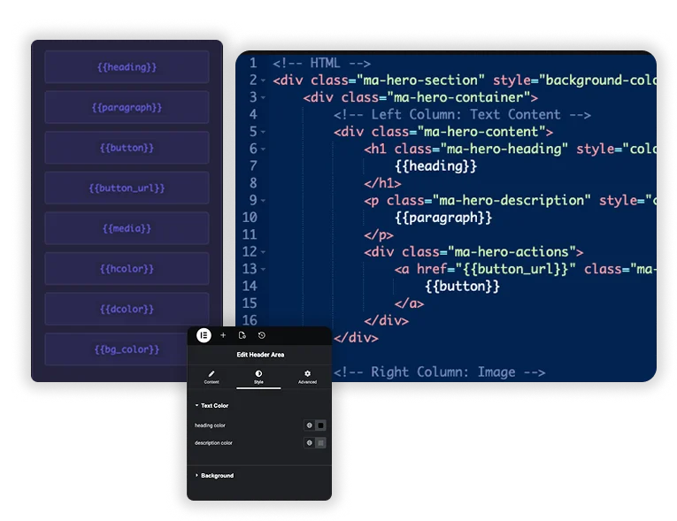
Map Controls to Your Code
This is where your widget becomes dynamic. The builder generates smart shortcodes for each control, which you place in your templates to create live links between settings and output.
- Use auto-generated shortcodes like {{color}}.
- Paste them into your HTML, CSS, or JS code.
- Create a direct link between editor inputs and front-end display.
Save & Use Anywhere
Once saved, your custom widget is ready for action. It appears in the Elementor editor, ready to be dragged into any page and customized with the live settings you built.
- Save to instantly add it to your Elementor panel.
- Drag and drop the widget onto any page.
- Adjust live settings and see the design render instantly.
What Can You Actually Build?
From AI to Website
Generate a complex pricing card or testimonial slider with an AI design tool, copy the code, and plug it into Widget Builder. It’s now a manageable Elementor widget with editable text and colors.
CodePen to Production
Found a stunning animated button or a unique gallery on CodePen? Don't just embed it - transform it into a native widget where you can control all parameters.
Build Your Own UI Kit
Create a suite of custom buttons, headers, or info cards with your brand's unique interaction patterns and reuse them across all client sites.
Available Options
Text
Add basic text input.
Input numeric values only.
For longer text entries.
Rich visual text editor.
Input code snippets directly.
Store hidden background data.
Toggle an option on/off.
Open advanced settings popover.
Choose from dropdown options.
Pick any color visually.
Select a font family.
Control all text styling.
Pick a date/time.
Input or select links.
Upload or select media.
Select multiple images together.
Choose from icon library.
Adjust values with slider.
Set padding, margin, etc.
Apply shadow effects visually.
Set element background properties.
Select from image options.
Create repeating content groups.
Organize content into tabs.
Add Color options in your widget.
