Python Using ggplot – Visualizing Data With plotnine
Master programming with our job-ready courses: Enroll Now
Welcome, readers! Are you looking for a powerful tool to create visually appealing data visualizations in Python? Look no further! In this blog post, we will explore the world of ggplot and discover how to leverage the plotnine library to visualize data in Python. Whether you are a data scientist, analyst, or visualization enthusiast, plotnine provides an intuitive and elegant way to create stunning plots. Let’s dive in and uncover the magic of ggplot in Python!
Understanding plotnine: A Definition
At its core, plotnine is a Python library that brings the expressive and flexible capabilities of R’s ggplot2 package to the Python ecosystem. It follows the grammar of graphics philosophy, which emphasizes the combination of simple building blocks to construct complex visualizations. Here’s what you need to know about plotnine:
- Plotnine provides a high-level interface for creating a wide range of visualizations, including scatter plots, bar plots, line plots, histograms, and more.
- It follows the “tidy” data principle, working best with structured and organized data.
- Plotnine offers a flexible syntax that allows you to easily customize every aspect of your plots, including aesthetics, themes, scales, and labels.
- The library seamlessly integrates with popular data manipulation libraries in Python, such as Pandas, making it a valuable tool for exploratory data analysis.
- Plotnine incorporates the grammar of the graphics approach, allowing you to express complex visualizations in a concise and intuitive manner.
Getting Started with plotnine
Now that we understand the basics of plotnine, let’s get started with creating visualizations using this powerful library. Follow the steps below to embark on your journey with ggplot in Python:
Step 1: Install plotnine
To begin, make sure you have plotnine installed in your Python environment. Launch your terminal or command prompt and run the subsequent command:
pip install plotnine
Step 2: Import the necessary modules
Next, import the required modules from the plotnine library. This includes the essential components for building plots:
from plotnine import ggplot, aes, geom_point
Step 3: Load and prepare your data
Before creating visualizations, load and prepare your data. Ensure that your data is structured properly for plotting purposes.
Step 4: Create your first plot
With plotnine, creating a plot is a breeze. Specify the data, aesthetics, and geometry of the visualization to construct your plot. As an illustration, let’s consider the creation of a scatter plot:
plot = ggplot(data, aes(x='x', y='y')) + geom_point()
Step 5: Customize your plot
To enhance your plot, you can customize various aspects such as themes, labels, titles, and scales. Add additional layers and fine-tune the plot to match your requirements.
Step 6: Render and display your plot
Once your plot is ready, render and display it. Depending on your Python environment, you can use functions like print(plot) or plot.show() to visualize your plot.
Here’s an example of how to use ggplot in Python:
import pandas as pd
from ggplot import *

# Create a sample dataframe
data = pd.DataFrame({
    'x': [1, 2, 3, 4, 5],
    'y': [2, 4, 6, 8, 10]
})

# Create a ggplot object and specify the data
p = ggplot(data, aes(x='x', y='y'))

# Add a scatter plot layer
p += geom_point()

# Add a line plot layer
p += geom_line()

# Add labels and title
p += labs(title='Scatterplot with Line')
p += xlab('X-axis')
p += ylab('Y-axis')

# Display the plot
print(p)
Output:
Explanation:
1. First, we import the necessary libraries, including pandas, for data manipulation and ggplot for creating the plot.
2. Next, we create a sample dataframe called data with two columns, ‘x’ and ‘y’.
3. We create a ggplot object p and specify the data using the ggplot() function, passing in the dataframe data and mapping the ‘x’ column to the x-axis and the ‘y’ column to the y-axis using the aes() function.
4. We add a scatter plot layer using the geom_point() function, which adds individual points to the plot.
5. We add a line plot layer using the geom_line() function, which connects the points with a line.
6. We add labels and a title to the plot using the labs() function, specifying the title, x-axis label, and y-axis label.
7. Finally, we print the plot using the print() function.
This is a basic example to demonstrate the usage of ggplot in Python. You can explore the official ggplot documentation or the realpython.com article for more advanced features and customization options.
Creating a Basic Scatter Plot:
A scatter plot is a useful visualization to explore the relationship between two variables. In plotnine, you can create a scatter plot by specifying the aesthetics (aes) for the x-axis and y-axis variables. Here’s an example:
from plotnine import *

# Create a sample dataframe
data = pd.DataFrame({
    'x': [1, 2, 3, 4, 5],
    'y': [2, 4, 6, 8, 10]
})

# Create a scatter plot
p = ggplot(data, aes(x='x', y='y')) + geom_point()

# Display the plot
print(p)
Output:
Customizing Plot Aesthetics:
plotnine provides various options to customize the aesthetics of your plot. For example, you can change the color, shape, and size of the points in a scatter plot. Here’s an example:
p = ggplot(data, aes(x='x', y='y')) + geom_point(color='blue', shape=3, size=5)
Output:
Creating a Line Plot:
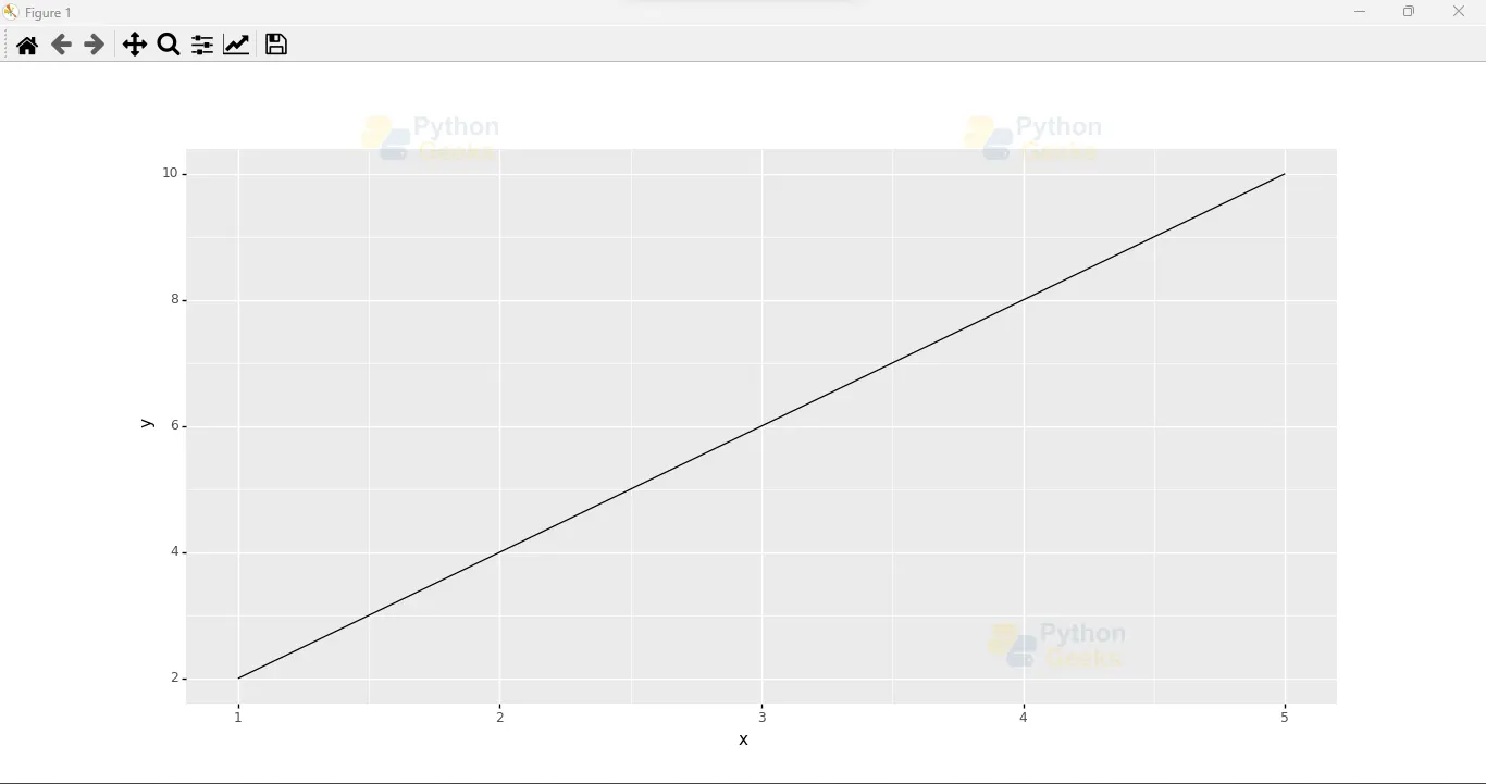
Line plots are useful for visualizing trends or patterns in data. You can create a line plot using the geom_line() function in plotnine. Here’s an example:
p = ggplot(data, aes(x='x', y='y')) + geom_line()
Output:
Customizing Axis Labels and Limits:
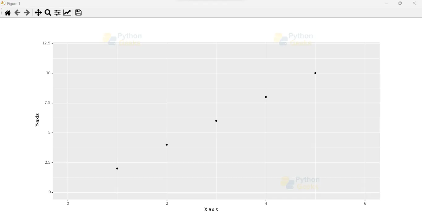
You can customize the axis labels and limits to provide more context to your plot. Here’s an example:
p = ggplot(data, aes(x='x', y='y')) + geom_point() + xlab('X-axis') + ylab('Y-axis') + xlim(0, 6) + ylim(0, 12)
Output:
Creating a Bar Plot:
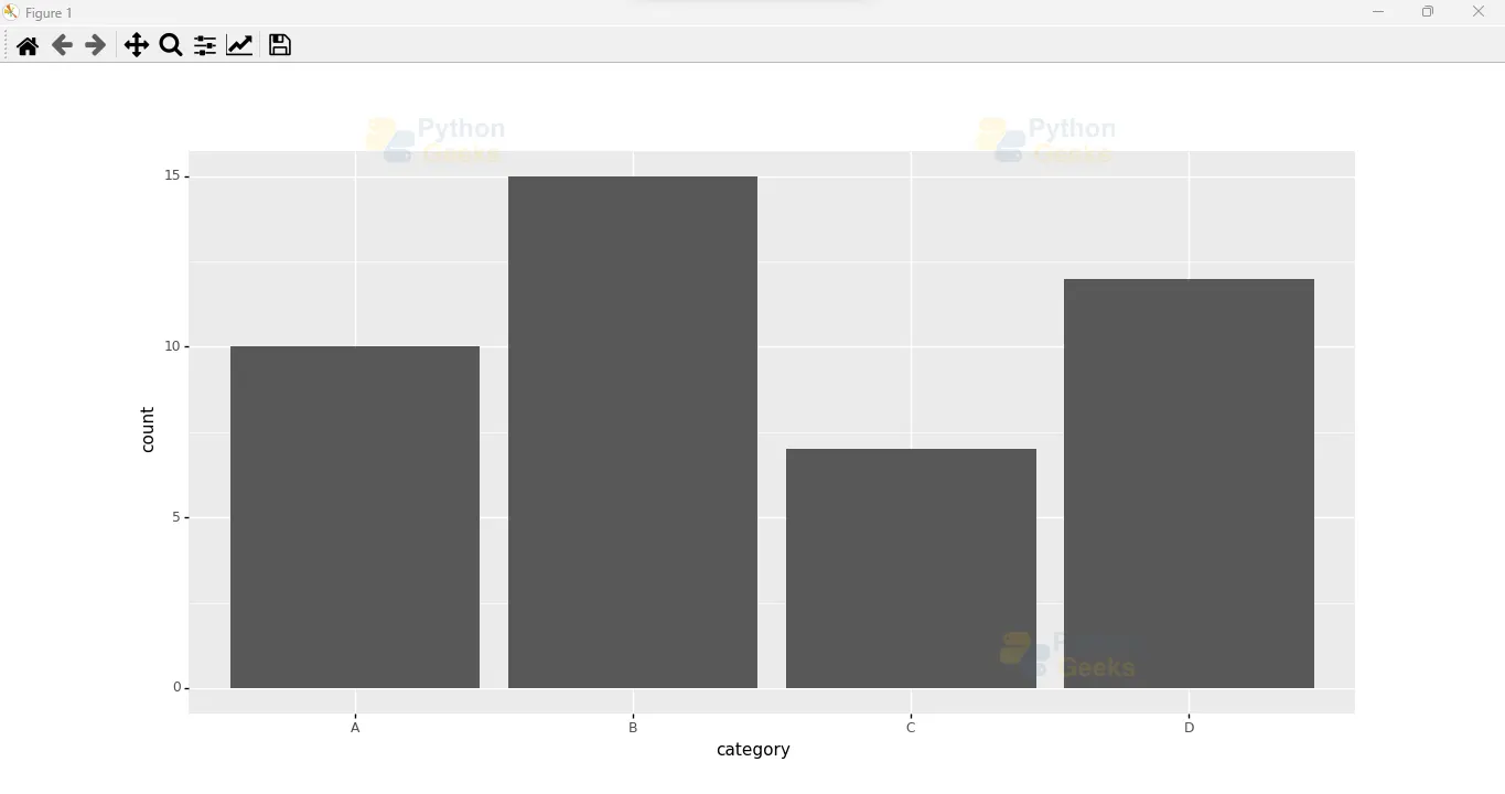
Bar plots are commonly used to compare categorical data. You can create a bar plot using the geom_bar() function in plotnine. Here’s an example:
# Create a sample dataframe
data = pd.DataFrame({
    'category': ['A', 'B', 'C', 'D'],
    'count': [10, 15, 7, 12]
})

# Create a bar plot
p = ggplot(data, aes(x='category', y='count')) + geom_bar(stat='identity')
Output:
Conclusion
In this blog post, we explored the power of plotnine, a Python library that brings the rich visualization capabilities of R’s ggplot2 to the Python ecosystem. We defined plotnine and highlighted its key features, including the grammar of graphics philosophy, flexible syntax, and seamless integration with data manipulation libraries. We also provided a step-by-step guide to help you get started with plotnine and create your first visualization. With plotnine, you can unleash your creativity and transform your data into compelling visual stories. So, why wait? Start using ggplot in Python with plotnine and unlock a world of possibilities!
Remember, effective data visualization is not only about conveying information but also about engaging and captivating your audience. Let your data come to life with plotnine and create visualizations that make an impact.


