


Get Started #
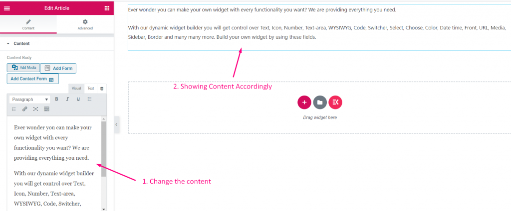
Create and Custom your own Elementor Widget within minutes. No need any deep coding knowledge! Just follow the steps and you will be able to create your own widget with custom control field.
Watch the video:
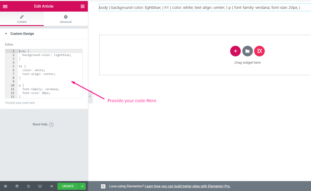
Create a Widget #
Watch the video guide:
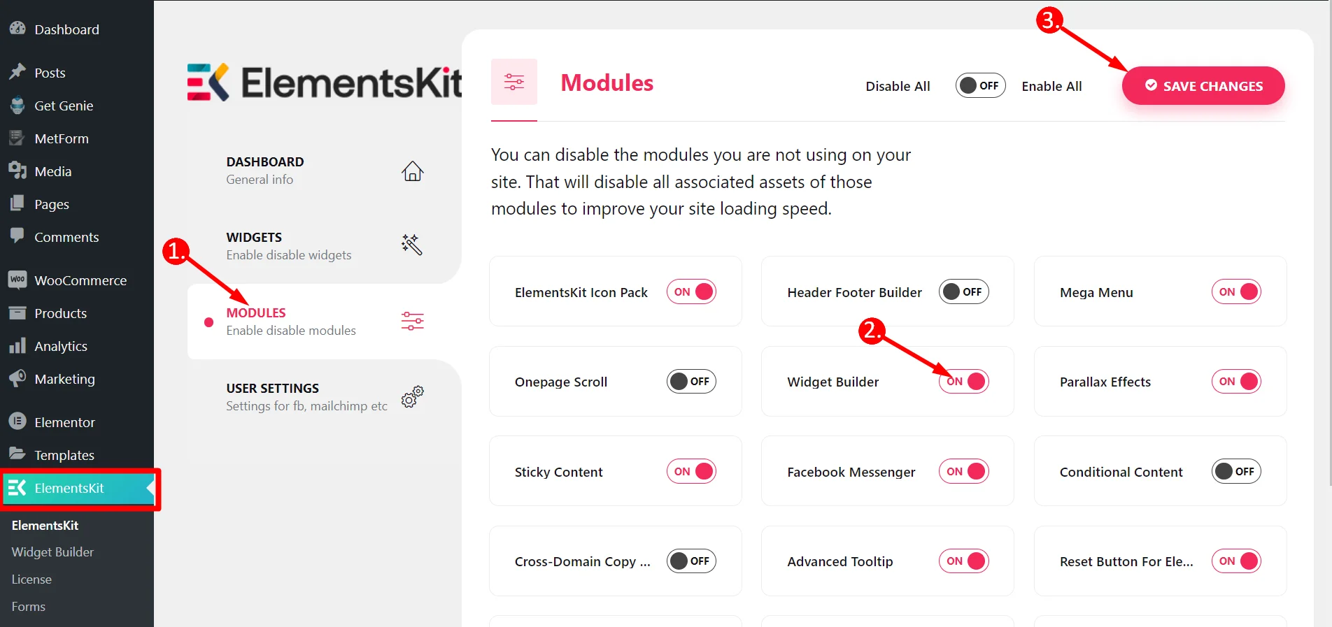
Step=>1: Go to Elementskit
- Click Modules
- Turn on the toggle Widget Builder
- Save Changes
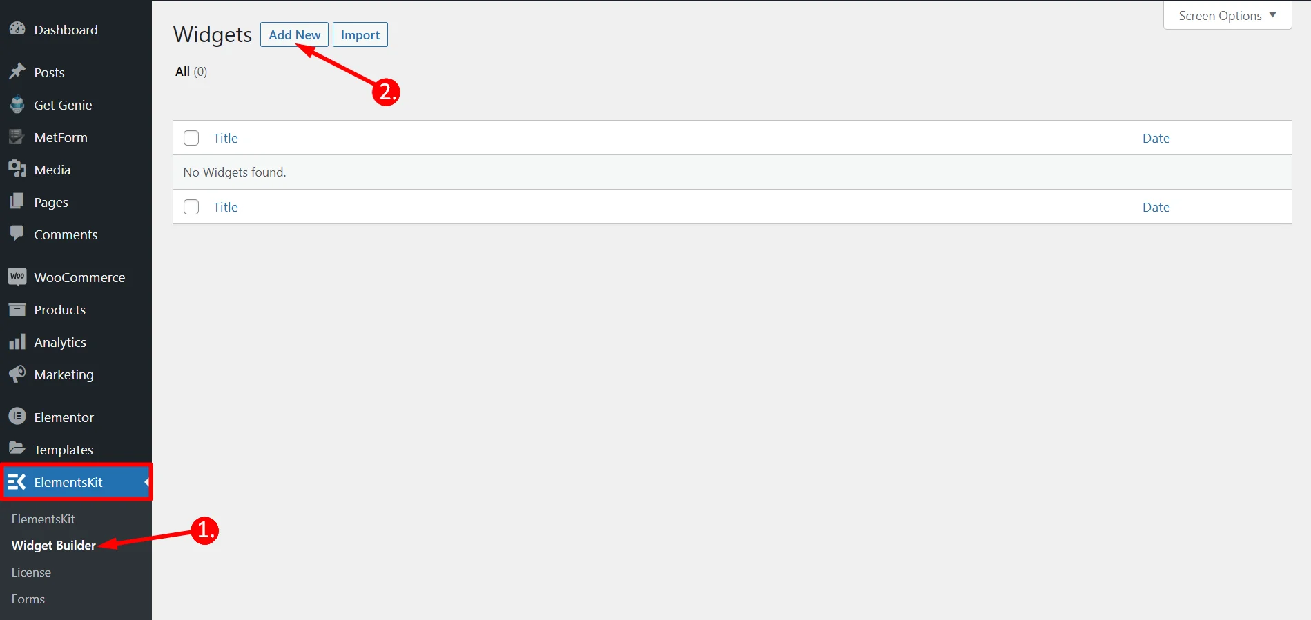
Step=>2
- Click on Widget Builder
- Add new
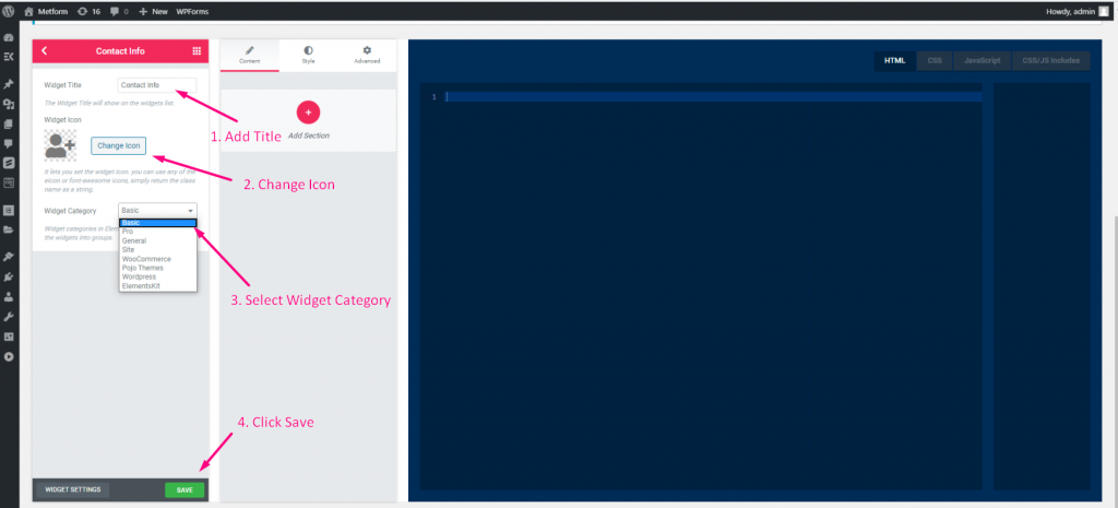
Step=>3
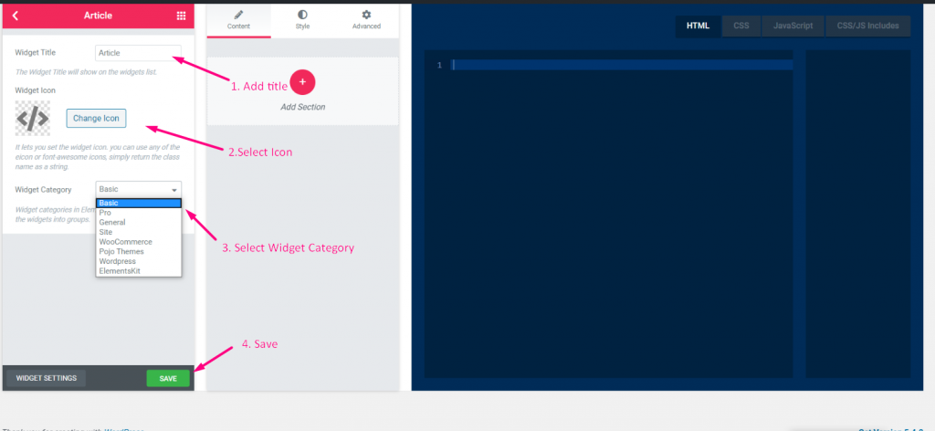
- Add widget Title
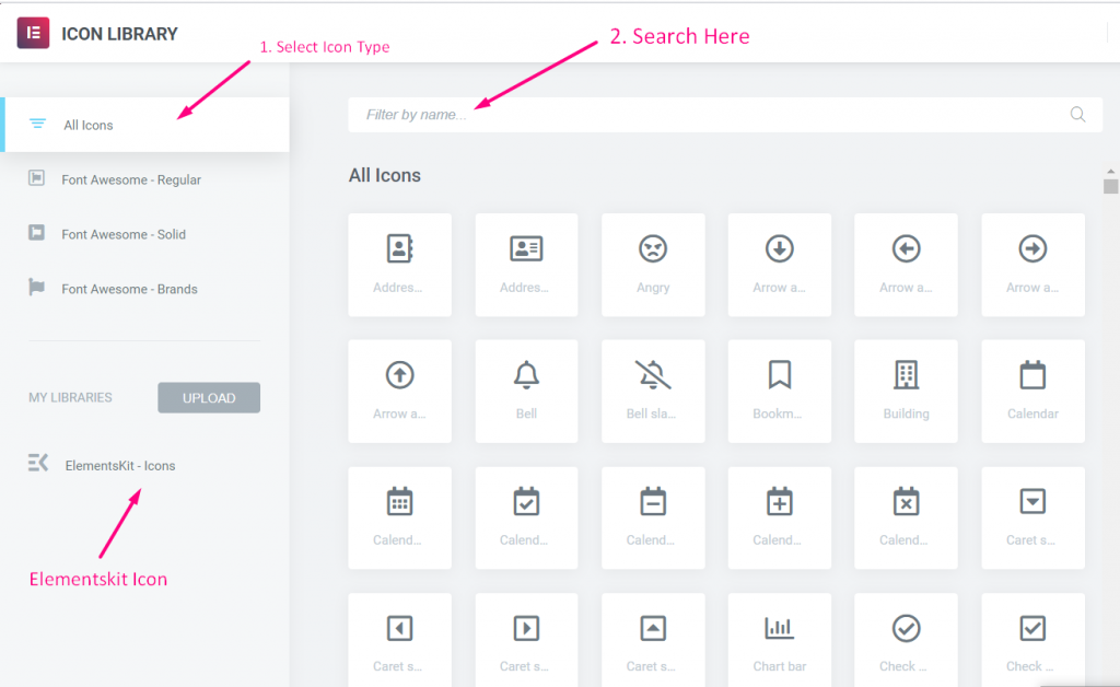
- Click on change Icon to add new Icon–> Select your Icon type–> Search for Icon
- Select Widget Category
- Click on Save
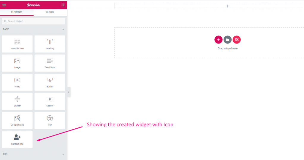
Step=>4
- Now go to Elementor–> You can see the Widget is created on the selected category section
Text #
Watch the video guide:
Step=>1: Create a Widget
- Add widget Title
- Click on change Icon to add new Icon–> Select your Icon type–> Search for Icon
- Select Widget Category
- Click on Save
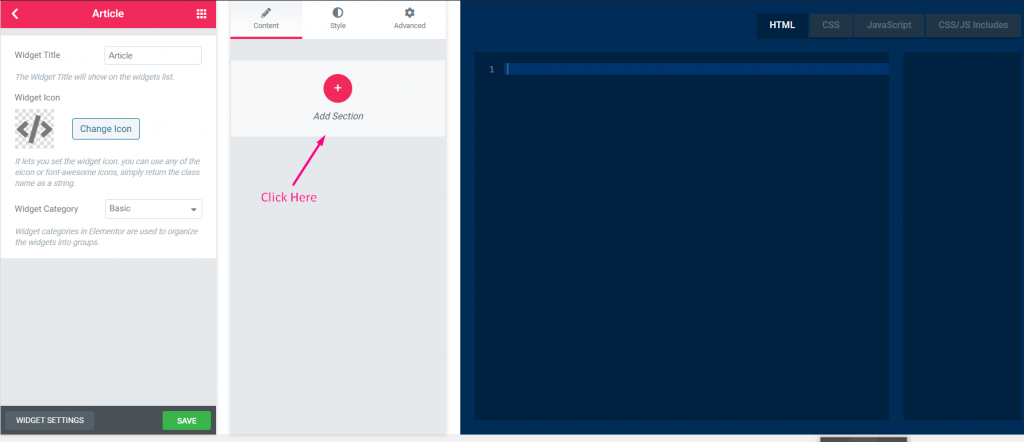
Step=>2: Add Text Control
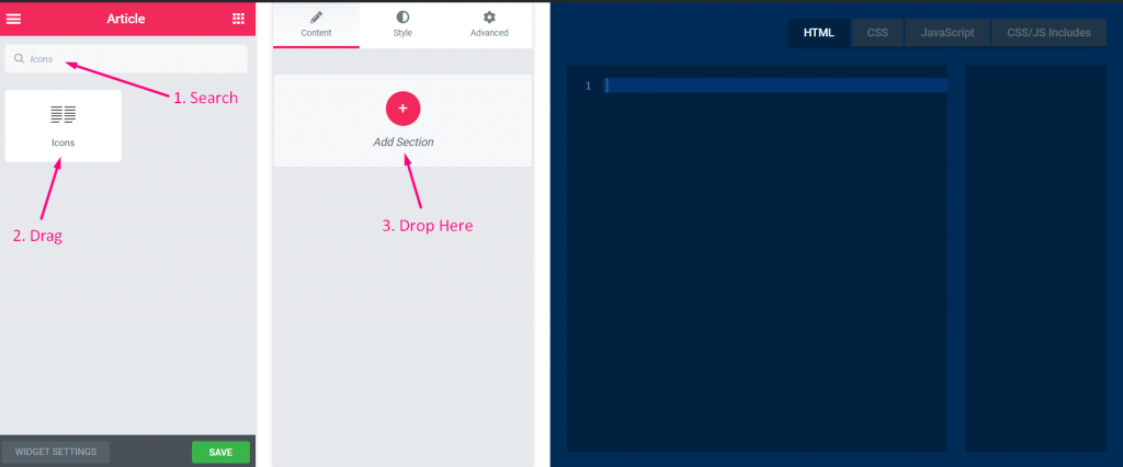
- Now click on Add section to add Text control to the widget
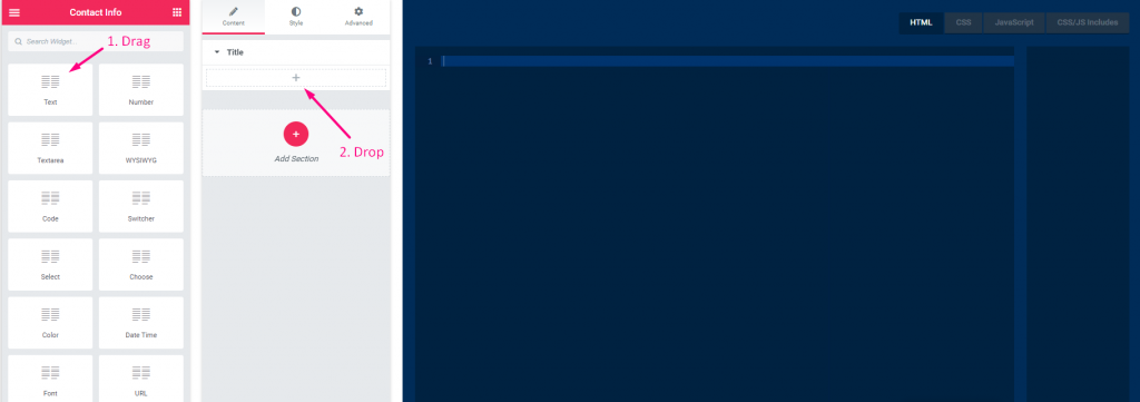
Step=>3
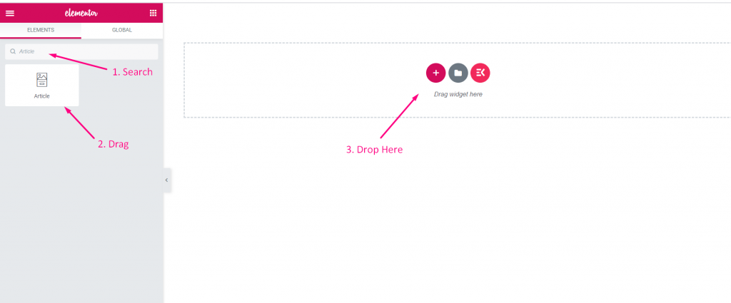
- Search for Text control
- Drag –> Drop
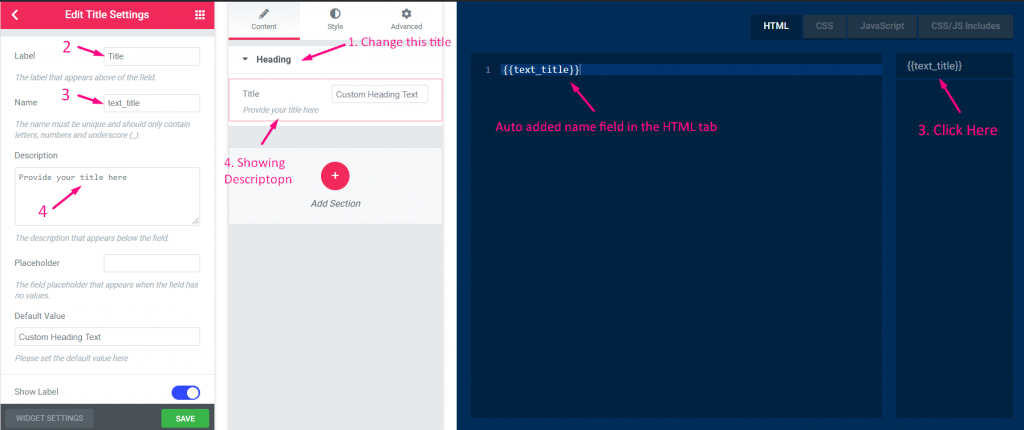
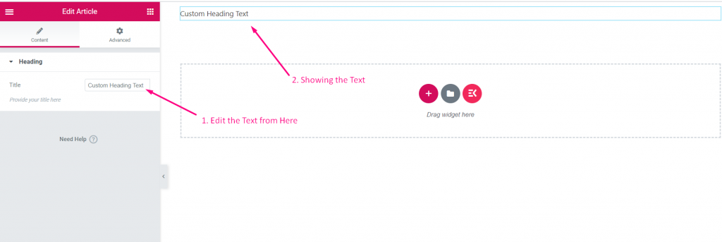
Step=>4
- Change the title
- Change the label
- Change the name field — Click on the name field–> the name will auto add in the HTML tab. Note** The name must be unique and should only contain letters, numbers and underscore (_)
- Add any description–> Showing the provided description
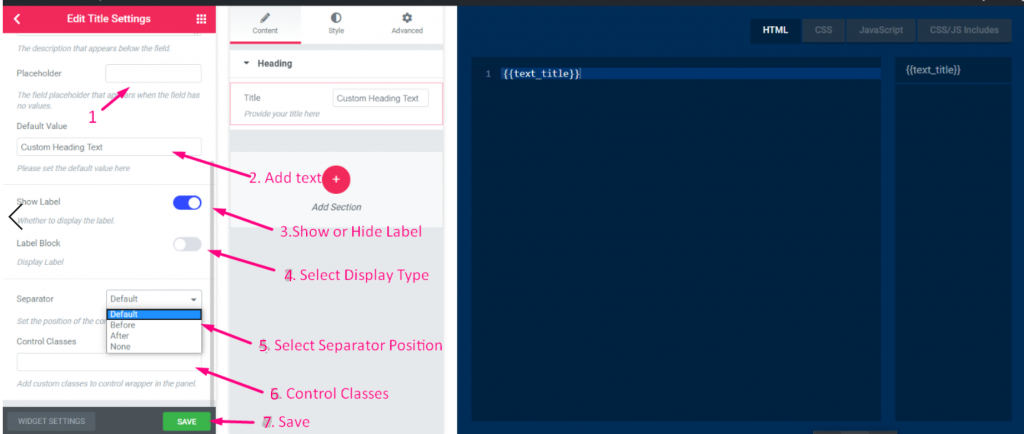
Step=>5
- Add any placeholder that will show as a help text for the user
- Add default text
- Show or hide label
- Select display type–> Show or hide block style
- Select Separator Position–> Default, Before, After or none
- Add custom classes to control wrapper in the panel
- Save
Step=>6: Now go to Elementor–> Search for your created widget –> Drag the widget–> Drop
- You can now add or edit your text field from here
Number #
Step=>1: Create a Widget
- Add widget Title
- Click on change Icon to add new Icon–> Select your Icon type–> Search for Icon
- Select Widget Category
- Click on Save
Step=>2: Add number Control
- Now click on Add section to add Number control to the widget
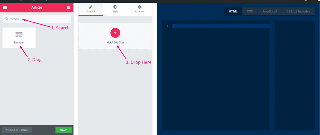
Step=>3
- Search for Number control
- Drag
- Drop
Step=>4
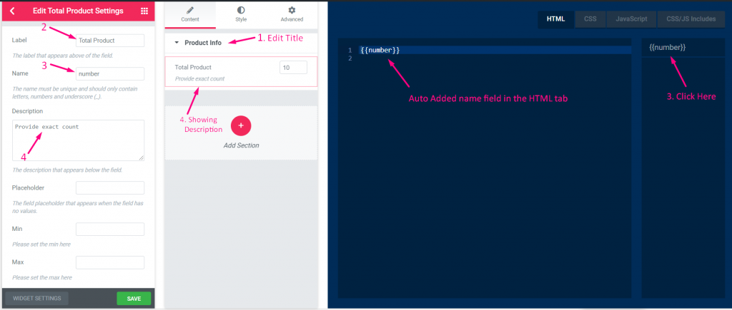
- Change the title
- Change the label
- Change the name field — Click on the name field–> the name will auto add in the HTML tab. Note** The name must be unique and should only contain letters, numbers and underscore (_)
- Add any description–> Showing the provided description
Step=>5
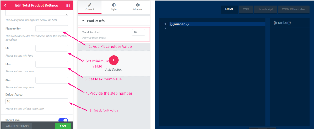
- Add any placeholder that will show as a help text for the user
- Set the minimum value
- Set the maximum value
- Provide the step (Number of the incremental value)
- Set the default value
Step=>6
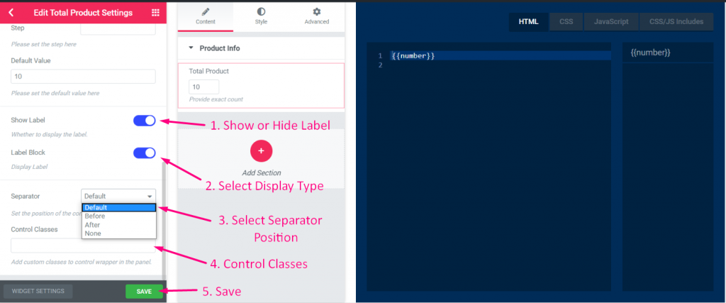
- Show or Hide label
- Select display type–> Show or hide block style
- Select Separator Position–> Default, Before, After or none
- Add custom classes to control wrapper in the panel
- Save
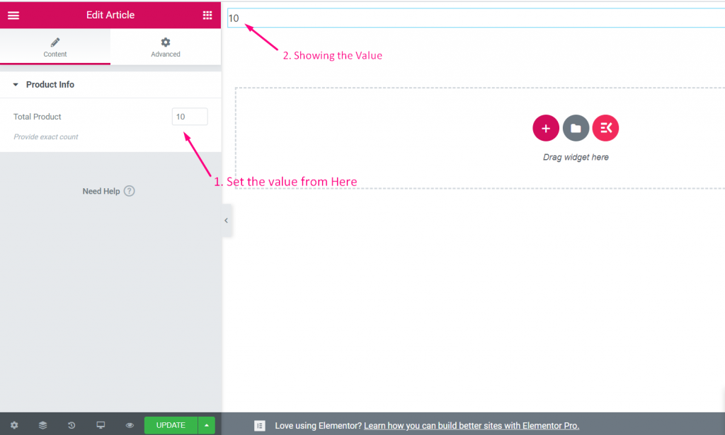
Step=>7: Now go to Elementor–> Search for your created widget –> Drag the widget–> Drop
- You can now add or edit your number field from here
Text-area #
Watch the video guide:
Step=>1: Create a Widget
- Add widget Title
- Click on change Icon to add new Icon–> Select your Icon type–> Search for Icon
- Select Widget Category
- Click on Save
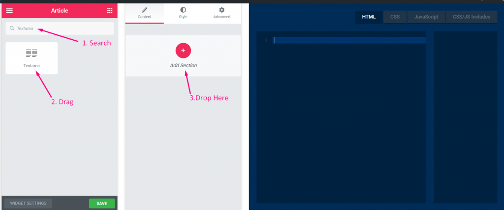
Step=>2: Add Text-area Control
- Now click on Add section to add Text-area control to the widget
Step=>3
- Search for Text-area control
- Drag
- Drop
Step=>4
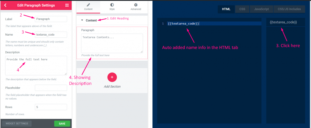
- Change the title
- Change the label
- Change the name field — Click on the name field–> the name will auto add in the HTML tab. Note** The name must be unique and should only contain letters, numbers and underscore (_)
- Add any description–> Showing the provided description
Step=>5
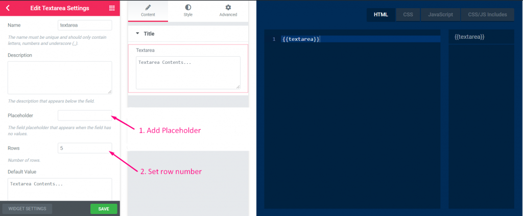
- Add any placeholder that will show as a help text for the user
- Add number of rows
Step=>6
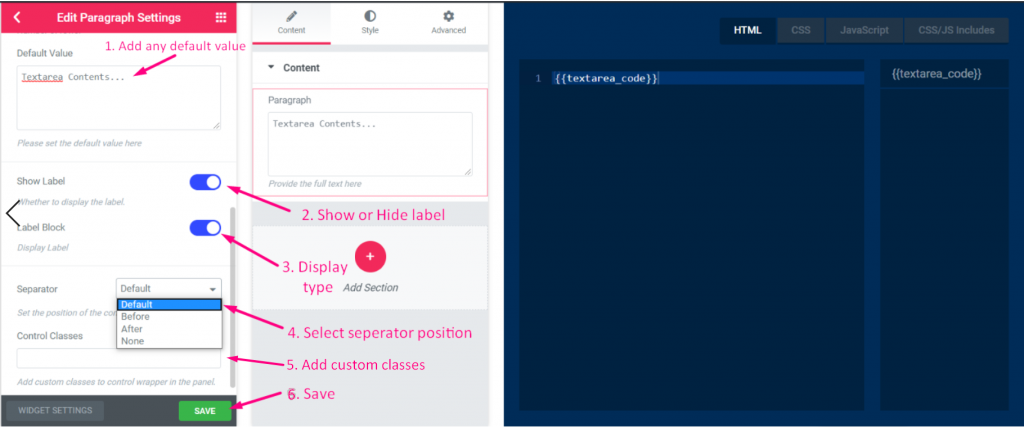
- Add any default value
- Show or hide label
- Select display type–> Show or hide block style
- Select Separator Position–> Default, Before, After or none
- Add custom classes to control wrapper in the panel
- Save
Step=>7: Now go to Elementor–> Search for your created widget –> Drag the widget–> Drop
- You can now add or edit your text-area content from here
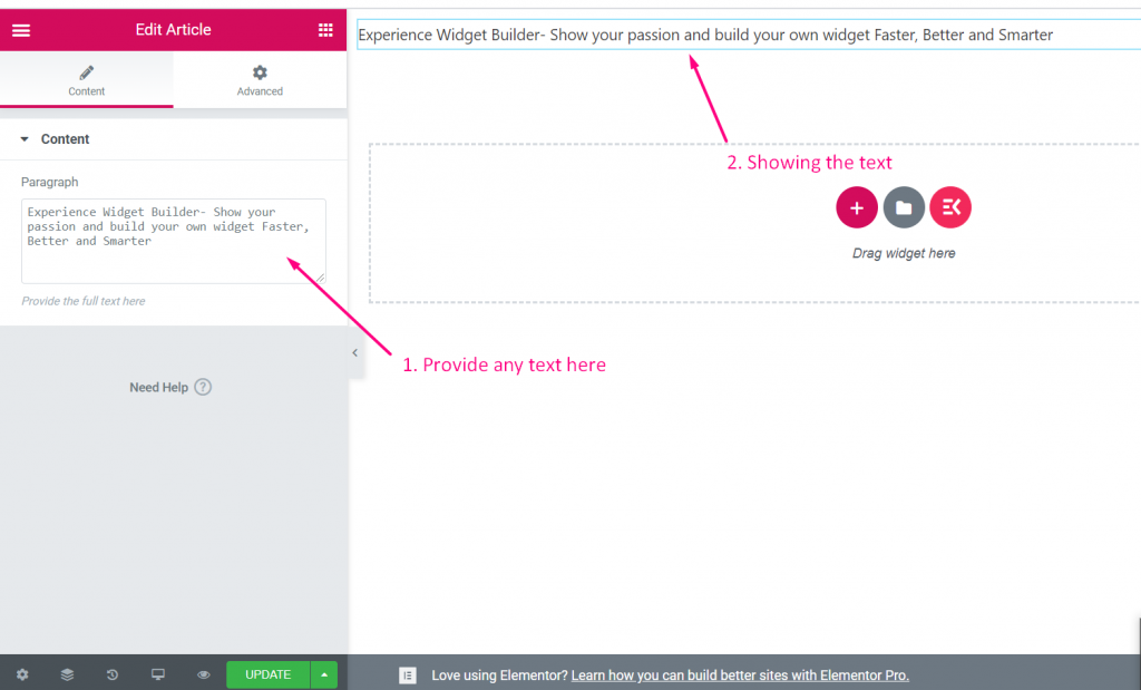
WYSIWYG #
Watch the video guide:
Step=>1: Create a Widget
- Add widget Title
- Click on change Icon to add new Icon–> Select your Icon type–> Search for Icon
- Select Widget Category
- Click on Save
Step=>2: Add WYSIWYG Control
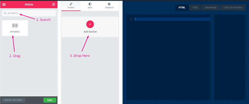
- Now click on Add section to add WYSIWYG control to the widget
Step=>3
- Search for WYSIWYG control
- Drag
- Drop
Step=>4
- Change the title
- Change the label
- Change the name field — Click on the name field–> the name will auto add in the HTML tab. Note** The name must be unique and should only contain letters, numbers and underscore (_)
- Add any description–> Showing the provided description
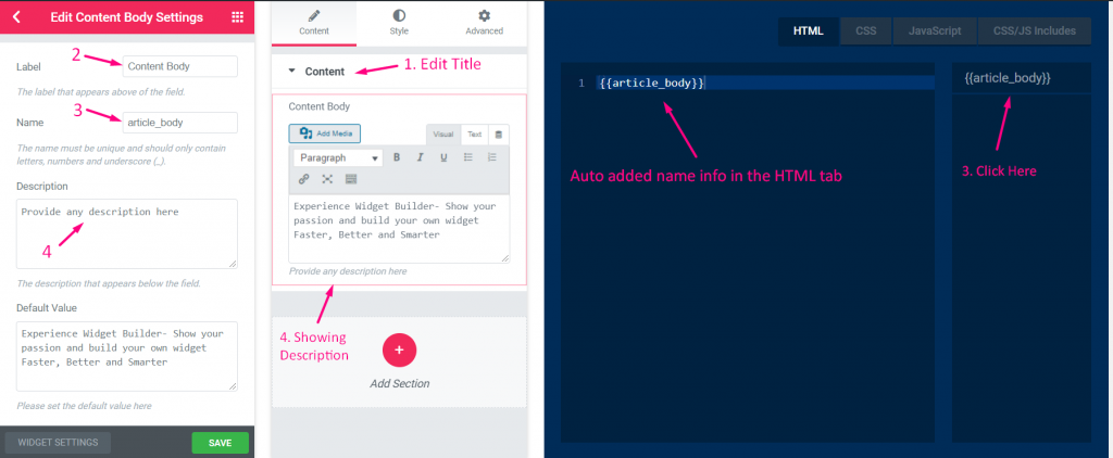
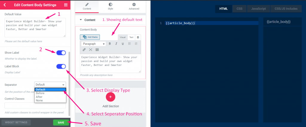
Step=>5
- Add default text
- Show or hide label
- Select display type–> Show or hide block style
- Select Separator Position–> Default, Before, After or none
- Add custom classes to control wrapper in the panel
- Save
Step=>6: Now go to Elementor–> Search for your created widget –> Drag the widget–> Drop
- You can now add or edit your content from here
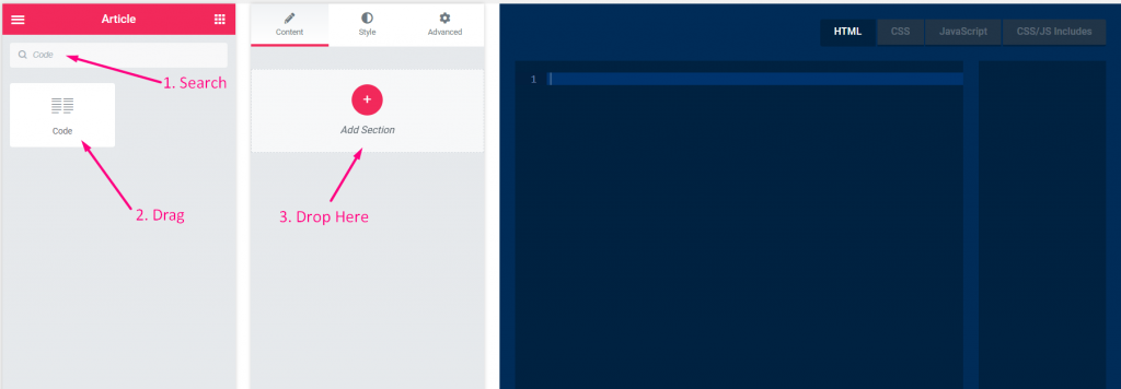
Code #
Step=>1: Create a Widget
- Add widget Title
- Click on change Icon to add new Icon–> Select your Icon type–> Search for Icon
- Select Widget Category
- Click on Save
Step=>2: Add Code Control
- Now click on Add section to add Code control to the widget
Step=>3
- Search for Code control
- Drag
- Drop
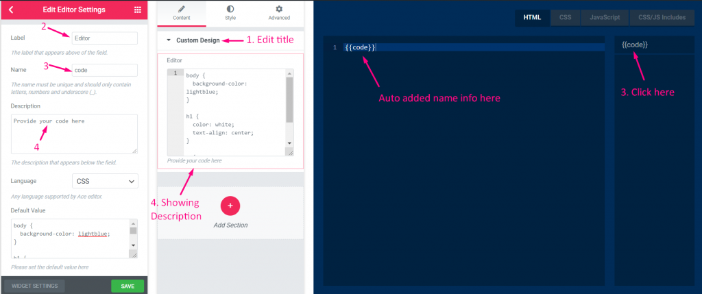
Step=>4
- Change the title
- Change the label
- Change the name field — Click on the name field–> the name will auto add in the HTML tab. Note** The name must be unique and should only contain letters, numbers and underscore (_)
- Add any description–> Showing the provided description
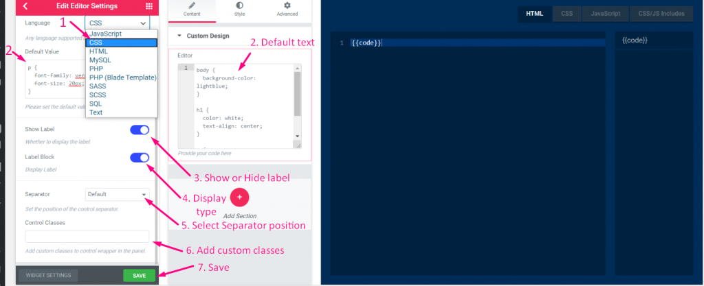
Step=>5
- Select your Language type–> JavaScript, CSS, HTML, MYSQL, PHP, PHP(Blade Template), SAAS, SCSS, SQL and Text
- Add default value
- Show or hide label
- Select display type–> Show or hide block style
- Select Separator Position–> Default, Before, After or none
- Add custom classes to control wrapper in the panel
- Save
Step=>6: Now go to Elementor–> Search for your created widget –> Drag the widget–> Drop
- You can now add or edit your code field from here
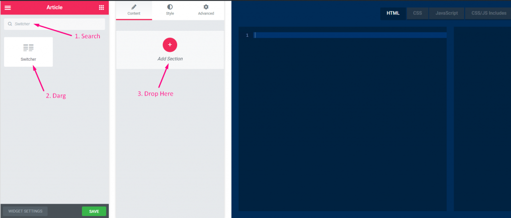
Switcher #
Watch the video guide:
Step=>1: Create a Widget
- Add widget Title
- Click on change Icon to add new Icon–> Select your Icon type–> Search for Icon
- Select Widget Category
- Click on Save
Step=>2: Add Switcher Control
- Now click on Add section to add Switcher control to the widget
Step=>3
- Search for Switcher control
- Drag
- Drop
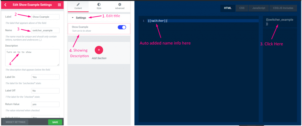
Step=>4
- Change the title
- Change the label
- Change the name field — Click on the name field–> the name will auto add in the HTML tab. Note** The name must be unique and should only contain letters, numbers and underscore (_)
- Add any description–> Showing the provided description
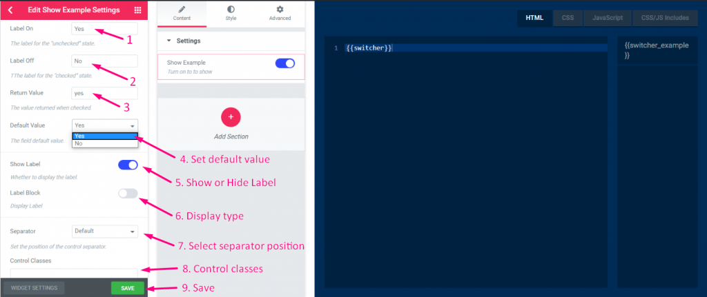
Step=>5
- Label on: Yes==> The label for the “unchecked” state that means when the switch is ON the switcher label will show YES text.
- Label off: No==> The label for the “checked” state that means when the switch is OFF the switcher label will show NO text
- Add Return Value==> The value returned YES or NO when the switcher checked
- Select any default value: Yes or No
- Show or hide label
- Select display type–> Show or hide block style
- Select Separator Position–> Default, Before, After or none
- Add custom classes to control wrapper in the panel
- Save
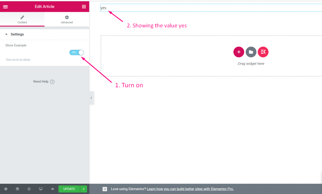
Step=>6: Now go to Elementor–> Search for your created widget –> Drag the widget–> Drop
- Now turn ON the switcher-> showing the default value Yes
Select #
Watch the video guide:
Step=>1: Create a Widget
- Add widget Title
- Click on change Icon to add new Icon–> Select your Icon type–> Search for Icon
- Select Widget Category
- Click on Save
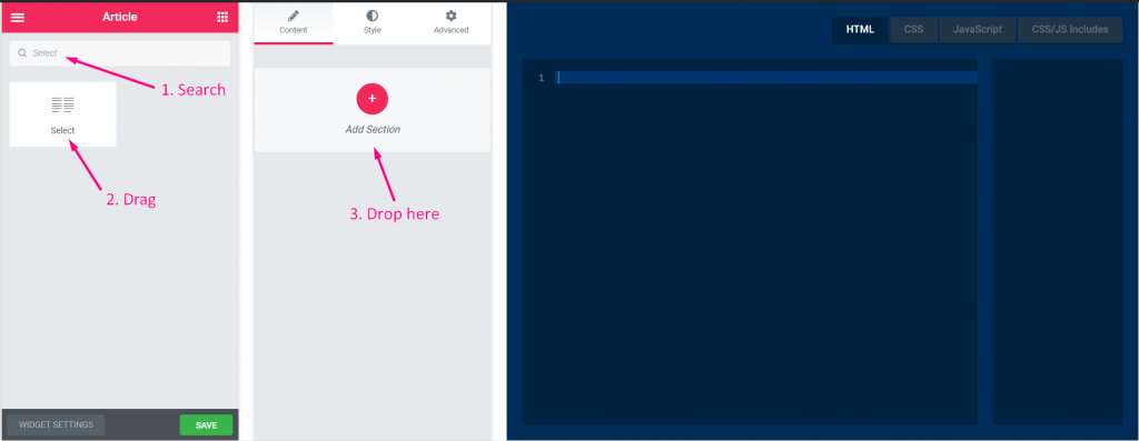
Step=>2: Add Select Control
- Now click on Add section to add Select control to the widget
Step=>3
- Search for Select control
- Drag
- Drop
Step=>4
- Change the title
- Change the label
- Change the name field — Click on the name field–> the name will auto add in the HTML tab. Note** The name must be unique and should only contain letters, numbers and underscore (_)
- Add any description–> Showing the provided description
Step=>5
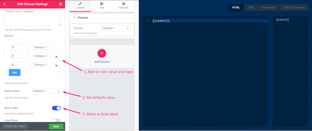
- Add or edit value and select your options for that value
- Add default text
- Show or hide label
Step=>6
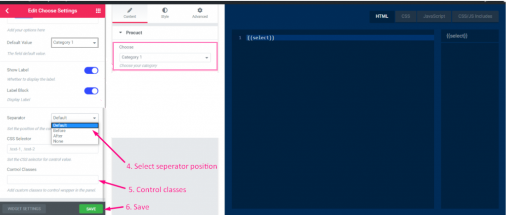
- Select Separator Position–> Default, Before, After or none
- Add custom classes to control wrapper in the panel
- Save
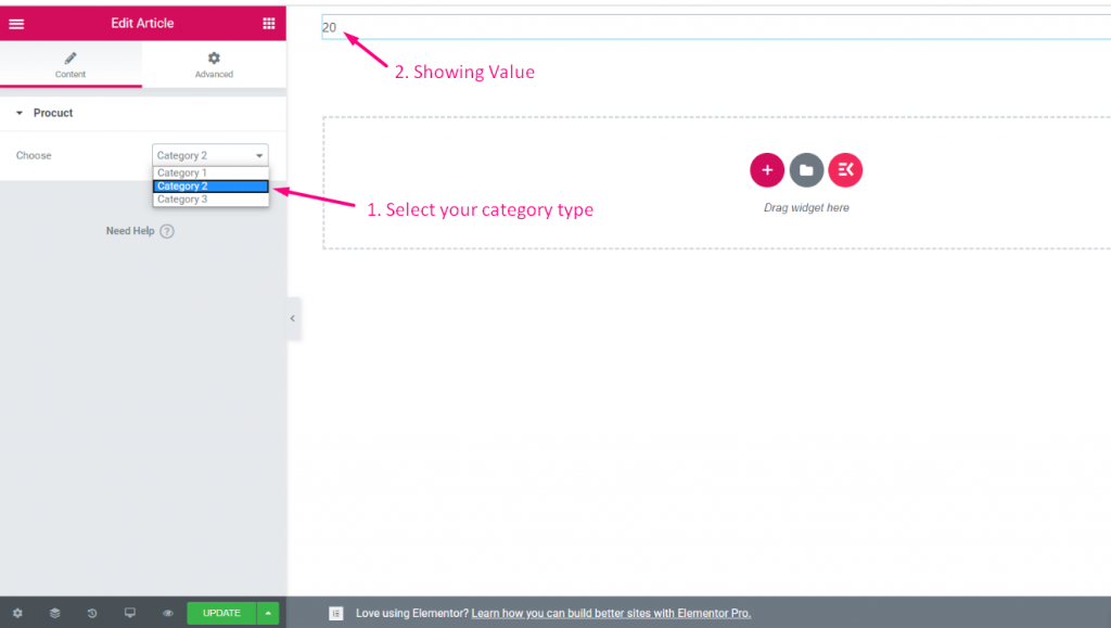
Step=>7: Now go to Elementor–> Search for your created widget –> Drag the widget–> Drop
- You can now select your category and the value will show accordingly
Choose #
Watch the video guide:
Step=>1: Create a Widget
- Add widget Title
- Click on change Icon to add new Icon–> Select your Icon type–> Search for Icon
- Select Widget Category
- Click on Save
Step=>2: Add Choose Control
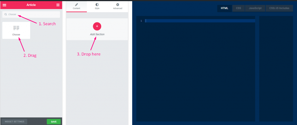
- Now click on Add section to add Choose control to the widget
Step=>3
- Search for Choose control
- Drag
- Drop
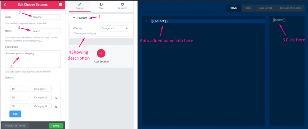
Step=>4
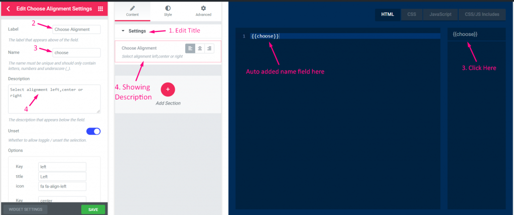
- Change the title
- Change the label
- Change the name field — Click on the name field–> the name will auto add in the HTML tab. Note** The name must be unique and should only contain letters, numbers and underscore (_)
- Add any description–> Showing the provided description
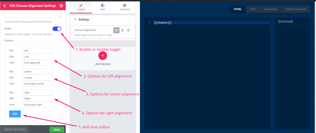
Step=>5
- Whether to allow toggle / disable to unset the selection.
- Provide options for Left Alignment. For ex: Key: left, Title: Left, icon: fa fa-align-left
- Provide options for Center Alignment. For ex: Key: center, Title: Center, icon: fa fa-align-center
- Provide options for Right Alignment. For ex: Key: right, Title: Right, icon: fa fa-align-right
- Click on Add to add new option
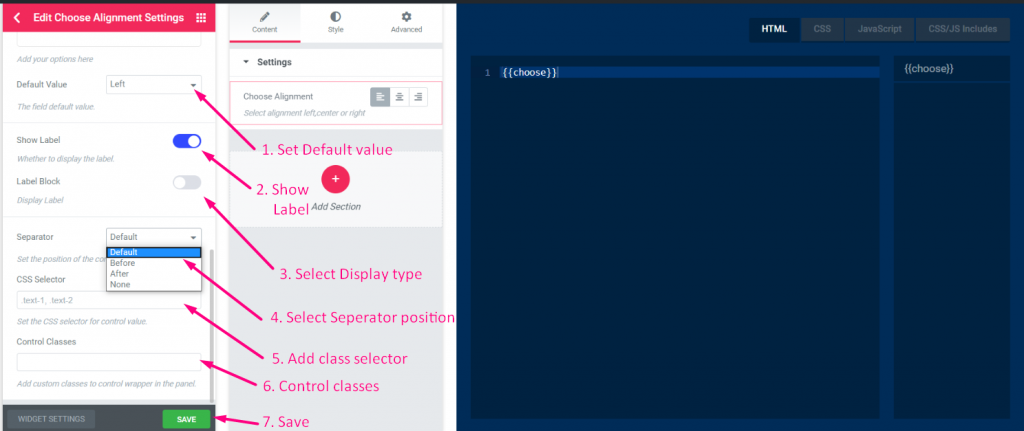
Step=>6
- Set default value
- Show or hide label
- Select display type–> Show or hide block style
- Select Separator Position–> Default, Before, After or none
- Add custom classes to control wrapper in the panel
- Save
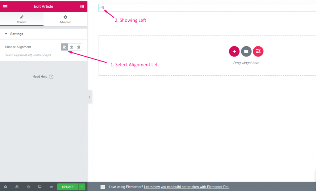
Step=>7: Now go to Elementor–> Search for your created widget –> Drag the widget–> Drop
- You can now select your alignment left, Center or Right
Color #
Watch the video guide:
Step=>1: Create a Widget
- Add widget Title
- Click on change Icon to add new Icon–> Select your Icon type–> Search for Icon
- Select Widget Category
- Click on Save
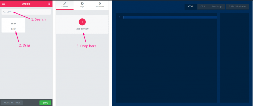
Step=>2: Add Color Control
- Now click on Add section to add Color control to the widget
Step=>3
- Search for Color control
- Drag
- Drop
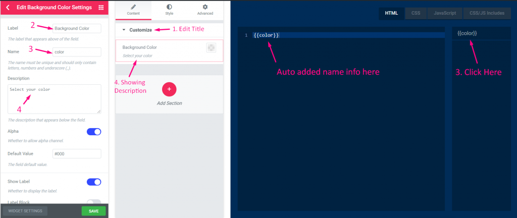
Step=>4
- Change the title
- Change the label
- Change the name field — Click on the name field–> the name will auto add in the HTML tab. Note** The name must be unique and should only contain letters, numbers and underscore (_)
- Add any description–> Showing the provided description
Step=>5
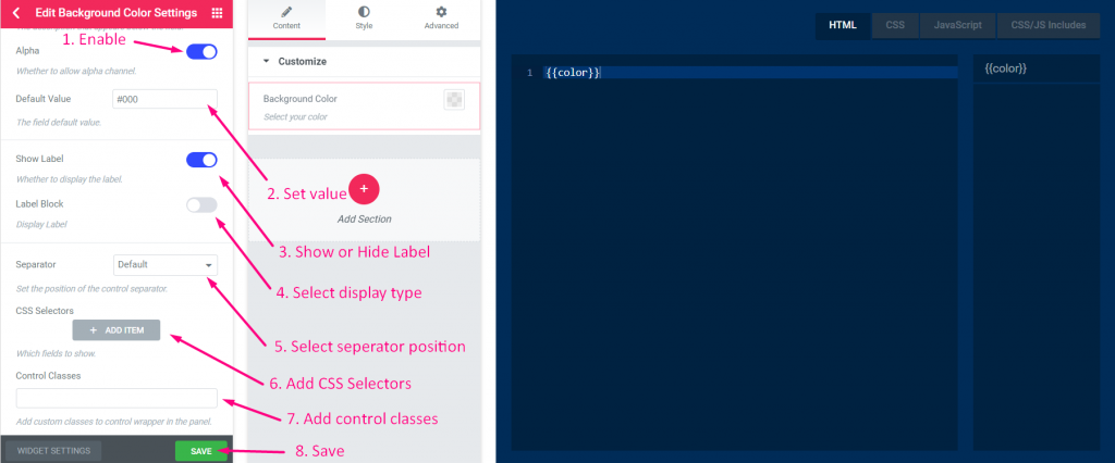
- Enable to add Alpha value (Color values)
- Add default value
- Show or hide label
- Select display type–> Show or hide block style
- Select Separator Position–> Default, Before, After or none
- Add CSS Selectors (Set the CSS selector for control value)
- Add custom classes (control wrapper in the panel)
- Save
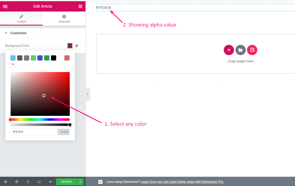
Step=>6: Now go to Elementor–> Search for your created widget –> Drag the widget–> Drop
- Select any color from the color palate
Date Time #
Watch the video guide:
Step=>1: Create a Widget
- Add widget Title
- Click on change Icon to add new Icon–> Select your Icon type–> Search for Icon
- Select Widget Category
- Click on Save
Step=>2: Add Date Time Control
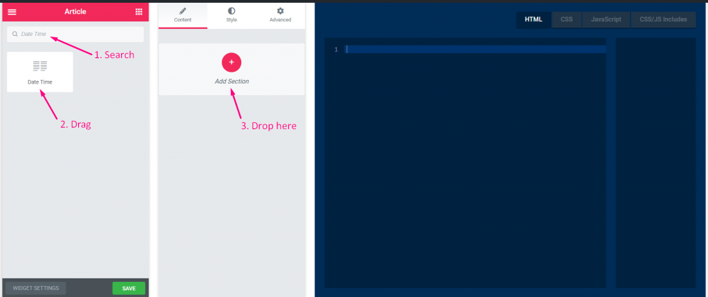
- Now click on Add section to add Date Time control to the widget
Step=>3
- Search for Date Time control
- Drag
- Drop
Step=>4
- Change the title
- Change the label
- Change the name field — Click on the name field–> the name will auto add in the HTML tab. Note** The name must be unique and should only contain letters, numbers and underscore (_)
- Add any description–> Showing the provided description
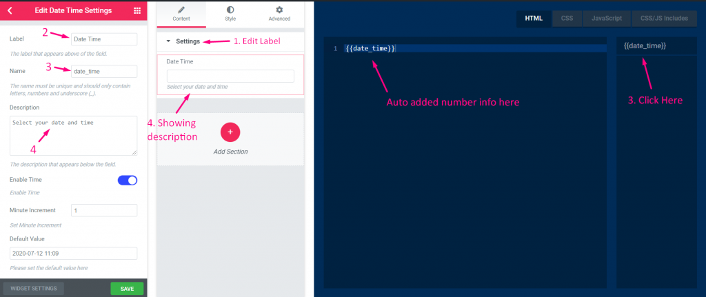
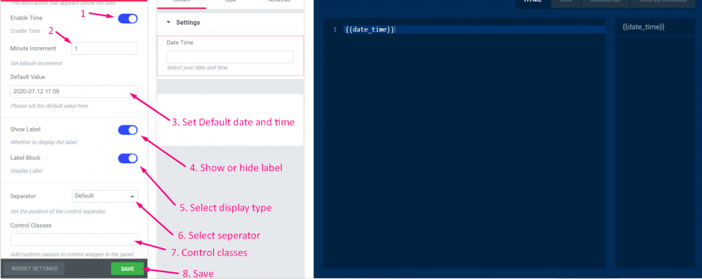
Step=>5
- Enable to show or time and disable to hide
- Set minute increment
- Add default date and time
- Show or hide label
- Select display type–> Show or hide block style
- Select Separator Position–> Default, Before, After or none
- Add custom classes to control wrapper in the panel
- Save
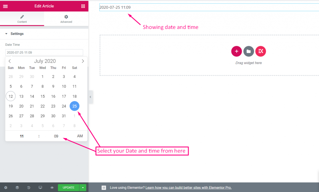
Step=>6: Now go to Elementor–> Search for your created widget –> Drag the widget–> Drop
- You can now select your date and time from here
Font #
Step=>1: Create a Widget
- Add widget Title
- Click on change Icon to add new Icon–> Select your Icon type–> Search for Icon
- Select Widget Category
- Click on Save
Step=>2: Add Font Control
- Now click on Add section to add Font control to the widget
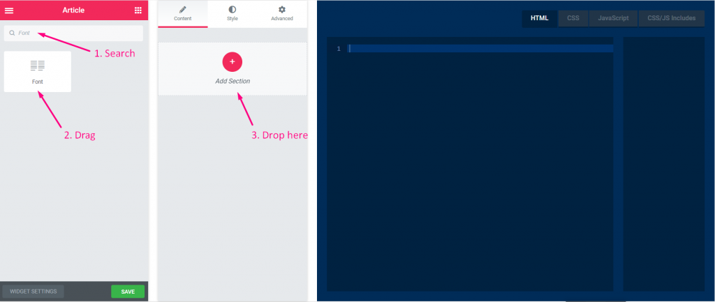
Step=>3
- Search for Font control
- Drag
- Drop
Step=>4
- Change the title
- Change the label
- Change the name field — Click on the name field–> the name will auto add in the HTML tab. Note** The name must be unique and should only contain letters, numbers and underscore (_)
- Add any description–> Showing the provided description
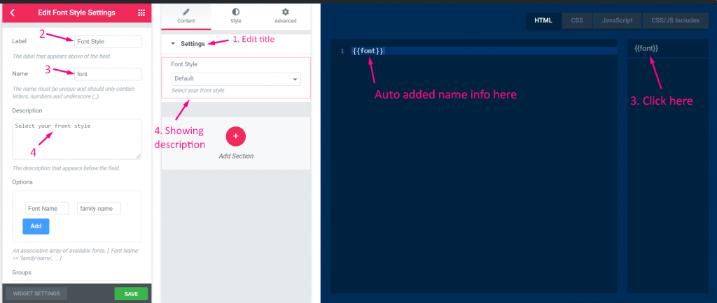
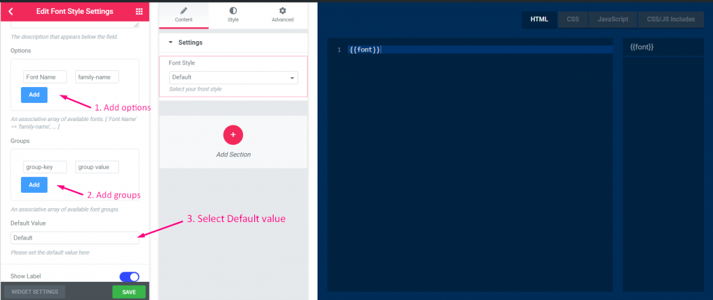
Step=>5
- Add or edit options
- Add or edit groups
- Add default value
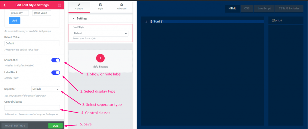
Step=>6
- Show or hide label
- Select display type–> Show or hide block style
- Select Separator Position–> Default, Before, After or none
- Add custom classes to control wrapper in the panel
- Save
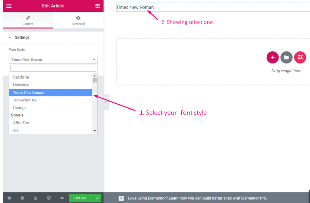
Step=>7: Now go to Elementor–> Search for your created widget –> Drag the widget–> Drop
- You can now select your font field from here
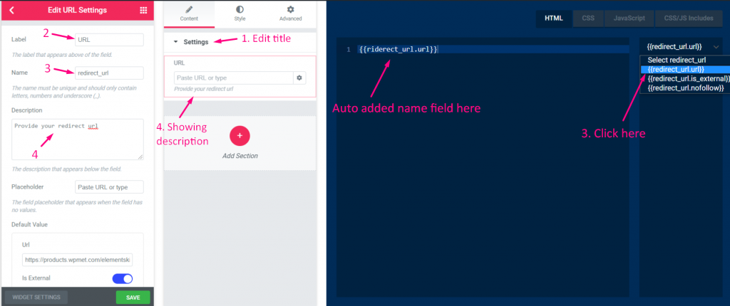
URL #
Step=>1: Create a Widget
- Add widget Title
- Click on change Icon to add new Icon–> Select your Icon type–> Search for Icon
- Select Widget Category
- Click on Save
Step=>2: Add URL Control
- Now click on Add section to add URL control to the widget
Step=>3
- Search for URL control
- Drag
- Drop

Step=>4
- Change the title
- Change the label
- Change the name field — Click on the name field–> the name will auto add in the HTML tab. Note** The name must be unique and should only contain letters, numbers and underscore (_)
- Add any description–> Showing the provided description
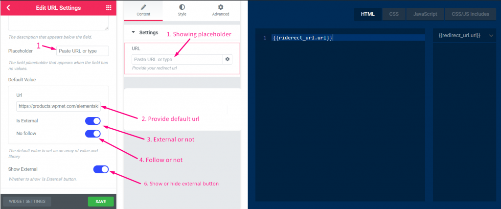
Step=>5
- Add any placeholder that will show as a help text for the user (The field of placeholder appears when the field has no values)
- Add any default URL
- Enable external or not (Open link in new tab)
- Enable follow or not
- Show or hide external button
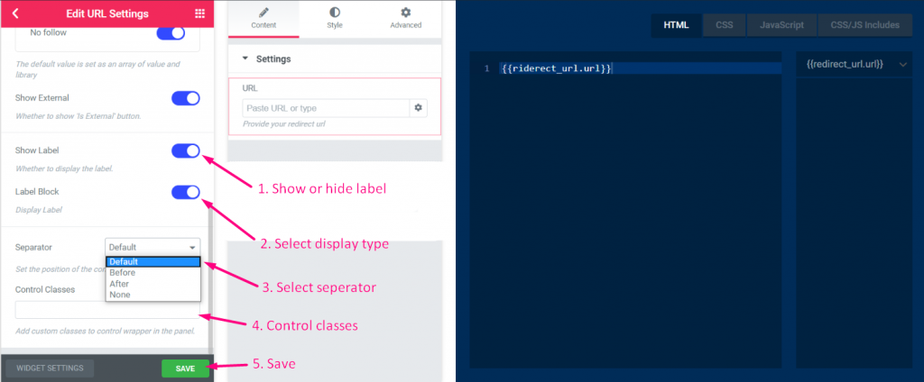
Step=>6
- Show or hide label
- Select display type–> Show or hide block style
- Select Separator Position–> Default, Before, After or none
- Add custom classes to control wrapper in the panel
- Save
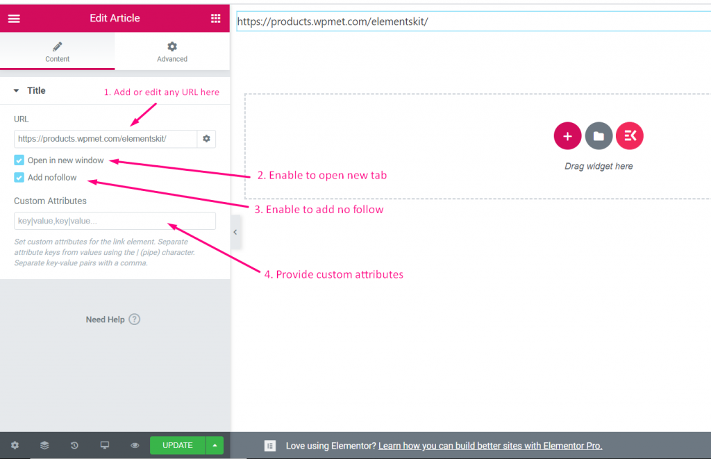
Step=>7: Now go to Elementor–> Search for your created widget –> Drag the widget–> Drop
- You can now add or edit your URL from here
- Check or unchecked open link in new tab
- Check or unchecked to add no follow
- Provide custom attributes
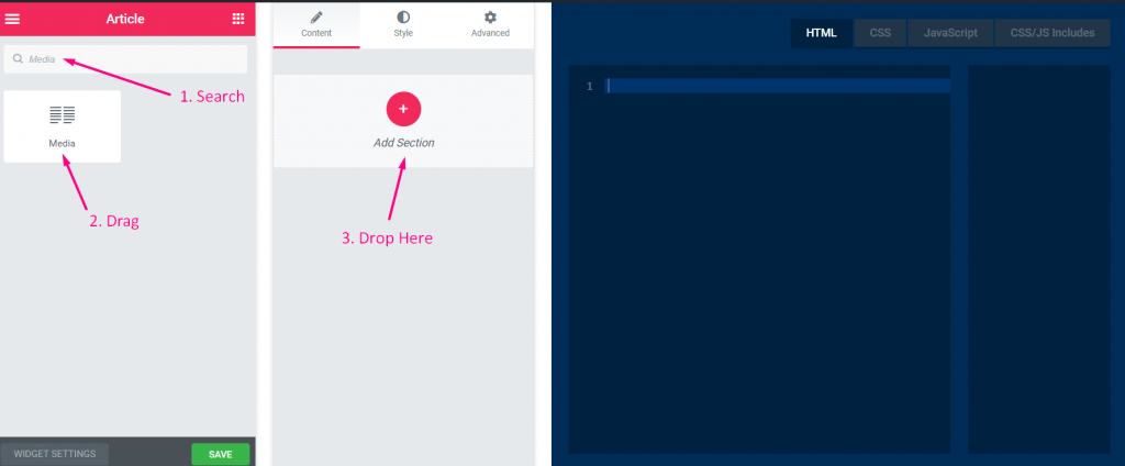
Media #
Watch the video guide:
Step=>1: Create a Widget
- Add widget Title
- Click on change Icon to add new Icon–> Select your Icon type–> Search for Icon
- Select Widget Category
- Click on Save
Step=>2: Add Media Control
- Now click on Add section to add Media control to the widget
Step=>3
- Search for Media control
- Drag
- Drop
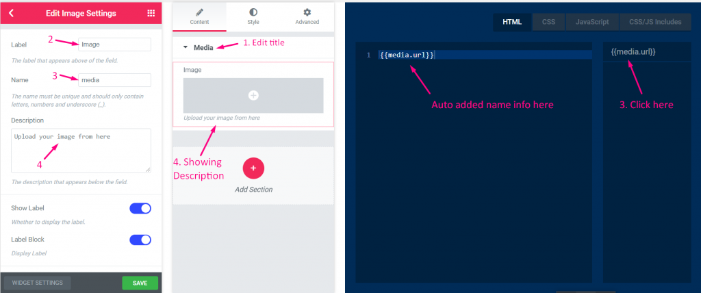
Step=>4
- Change the title
- Change the label
- Change the name field — Click on the name field–> the name will auto add in the HTML tab. Note** The name must be unique and should only contain letters, numbers and underscore (_)
- Add any description–> Showing the provided description
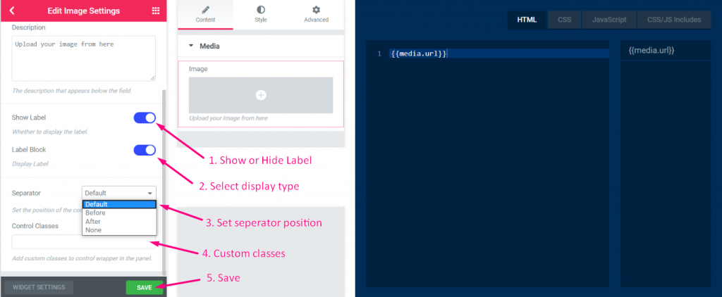
Step=>5
- Show or hide label
- Select display type–> Show or hide block style
- Select Separator Position–> Default, Before, After or none
- Add custom classes to control wrapper in the panel
- Save
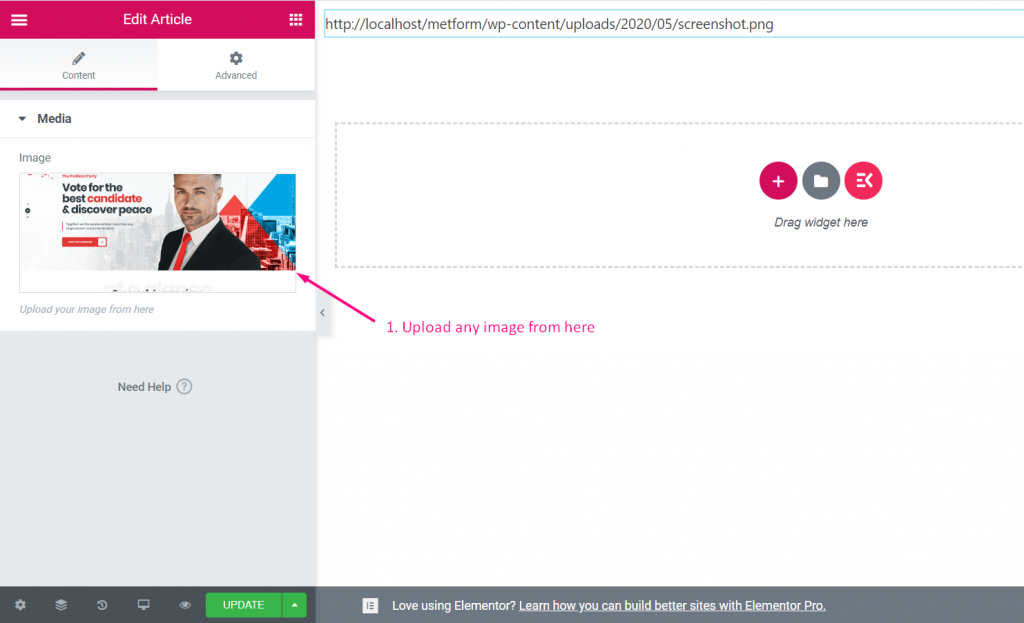
Step=>6: Now go to Elementor–> Search for your created widget –> Drag the widget–> Drop
- You can now upload your image from here
Icon #
Watch the video guide:
Step=>1: Create a Widget
- Add widget Title
- Click on change Icon to add new Icon–> Select your Icon type–> Search for Icon
- Select Widget Category
- Click on Save
Step=>2: Add Icon Control
- Now click on Add section to add Icon control to the widget
Step=>3
- Search for Icon control
- Drag
- Drop
Step=>4
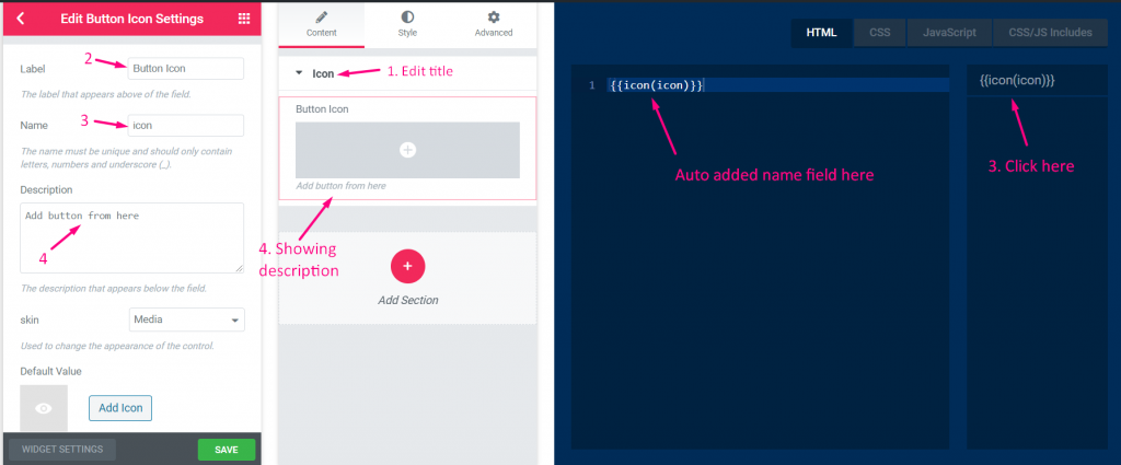
- Change the title
- Change the label
- Change the name field — Click on the name field–> the name will auto add in the HTML tab. Note** The name must be unique and should only contain letters, numbers and underscore (_)
- Add any description–> Showing the provided description
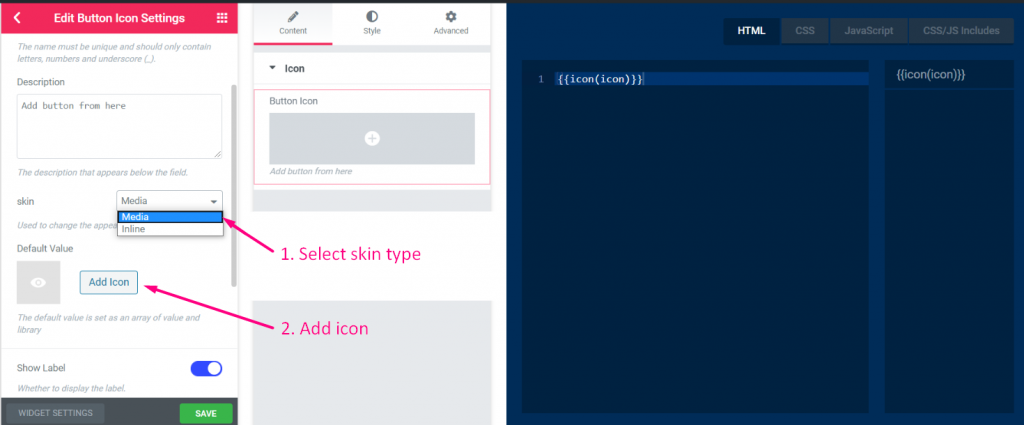
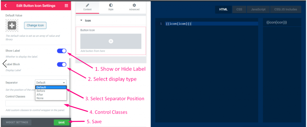
Step=>5
- Select skin type
- Add icon
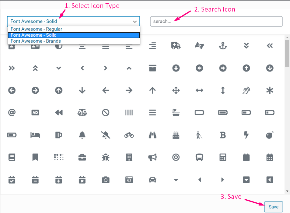
Step=>6
- Select your Icon type
- Search for Icon
Step=>7
- Show or hide label
- Select display type–> Show or hide block style
- Select Separator Position–> Default, Before, After or none
- Add custom classes to control wrapper in the panel
- Save
Step=>8: Now go to Elementor–> Search for your created widget –> Drag the widget–> Drop
- You can now add or change your Icon field from here
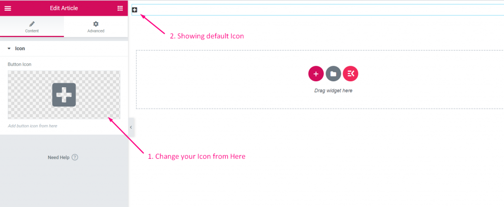
- Select your Icon type
- Search for Icon
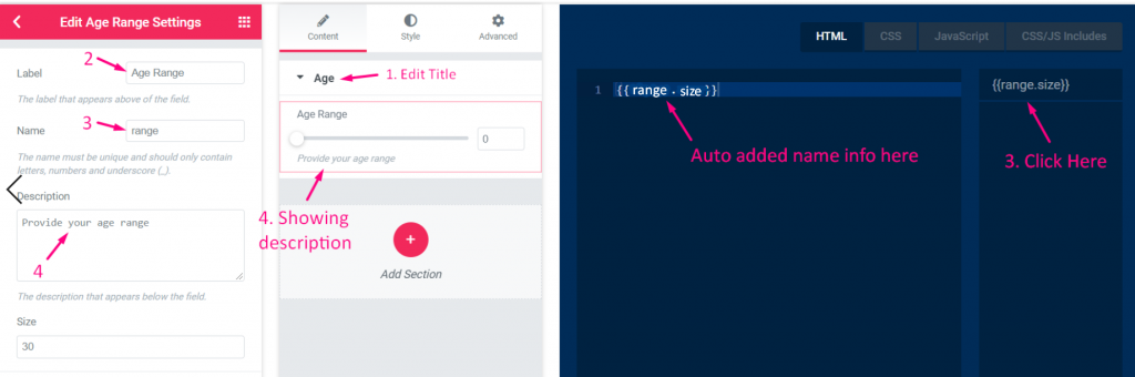
Slider #
Step=>1: Create a Widget
- Add widget Title
- Click on change Icon to add new Icon–> Select your Icon type–> Search for Icon
- Select Widget Category
- Click on Save
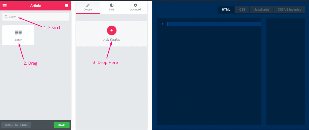
Step=>2: Add Slider Control
- Now click on Add section to add Slider control to the widget
Step=>3
- Search for Slider control
- Drag
- Drop
Step=>4
- Change the title
- Change the label
- Change the name field — Click on the name field–> the name will auto add in the HTML tab. Note** The name must be unique and should only contain letters, numbers and underscore (_)
- Add any description–> Showing the provided description
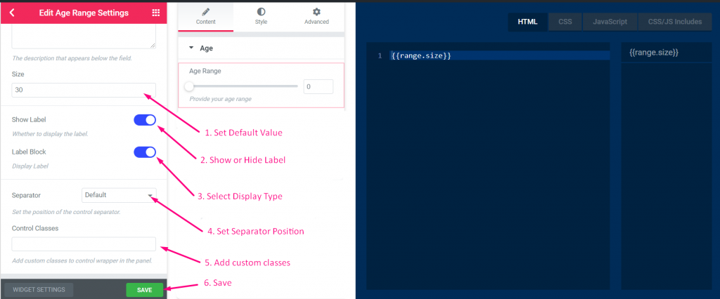
Step=>5
- Set default value
- Show or hide label
- Select display type–> Show or hide block style
- Select Separator Position–> Default, Before, After or none
- Add custom classes to control wrapper in the panel
- Save
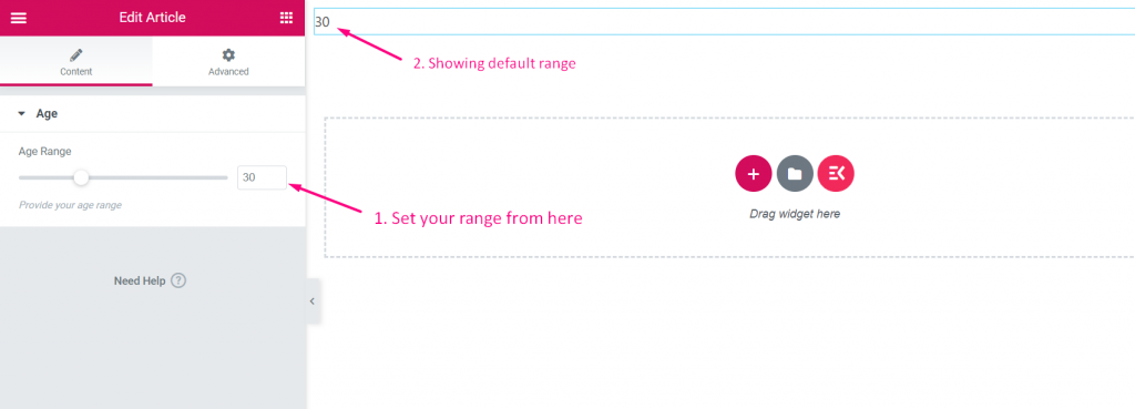
Step=>6: Now go to Elementor–> Search for your created widget –> Drag the widget–> Drop
- You can now select your age range from here
Border #
Step=>1: Create a Widget
- Add widget Title
- Click on change Icon to add new Icon–> Select your Icon type–> Search for Icon
- Select Widget Category
- Click on Save
Step=>2: Add Border Control
- Now click on Add section to add Border control to the widget
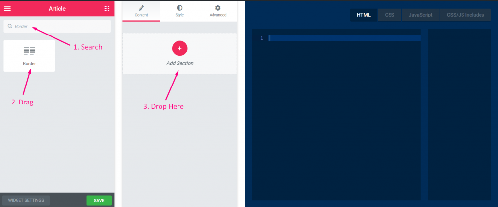
Step=>3
- Search for Border control
- Drag
- Drop
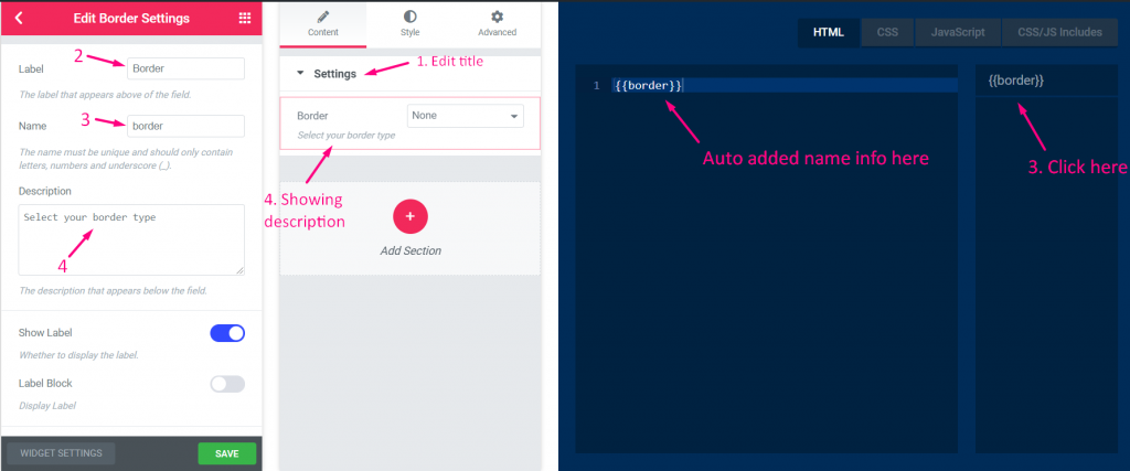
Step=>4
- Change the title
- Change the label
- Change the name field — Click on the name field–> the name will auto add in the HTML tab. Note** The name must be unique and should only contain letters, numbers and underscore (_)
- Add any description–> Showing the provided description
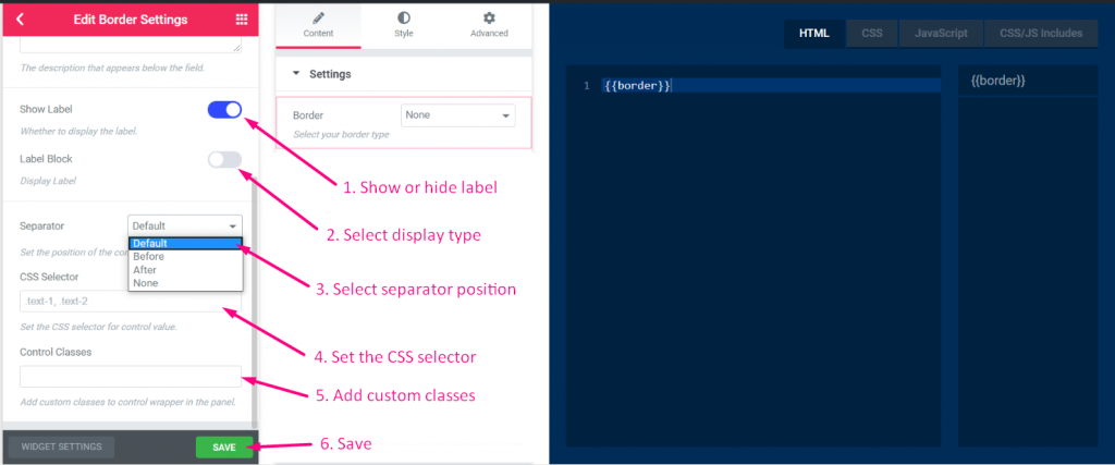
Step=>5
- Show or hide label
- Select display type–> Show or hide block style
- Select Separator Position–> Default, Before, After or none
- Add CSS selector
- Add custom classes to control wrapper in the panel
- Save
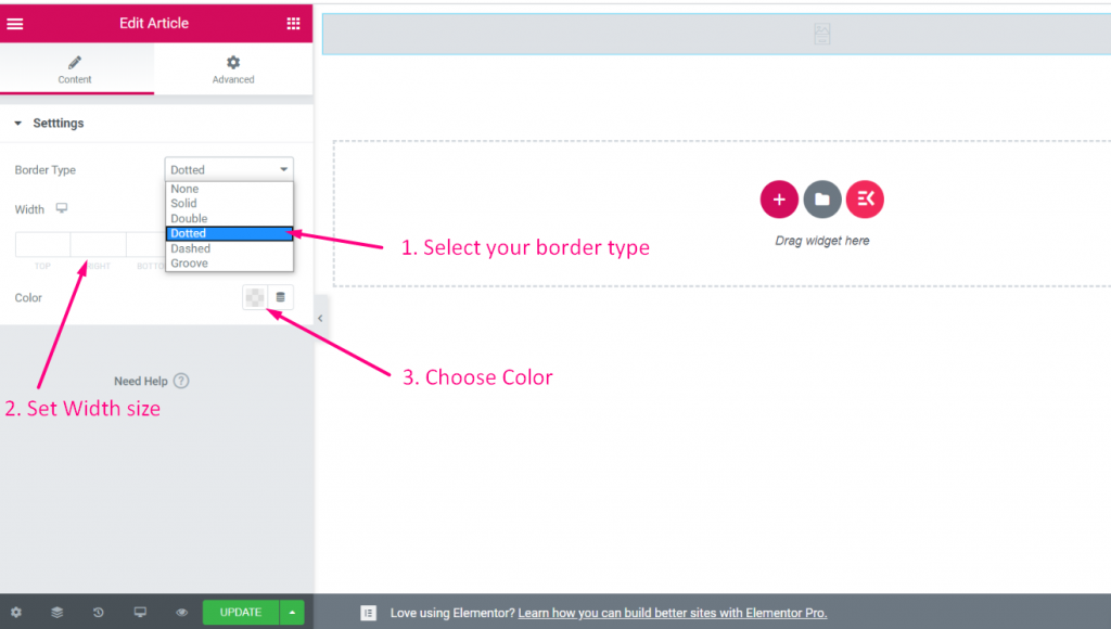
Step=>6: Now go to Elementor–> Search for your created widget –> Drag the widget–> Drop
- You can now select your border type, set width size, select color from here


