Description:
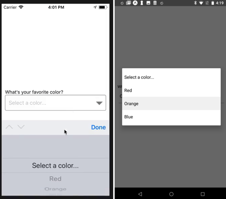
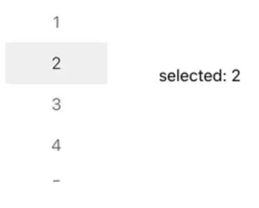
react-native-drum-picker is a Fabric React Native component that creates an iOS-style wheel picker with native Kotlin and Swift implementations.
It includes controlled selection, date columns, custom rows, circular values, imperative refs, and virtualized large lists on Android and iOS.
Features
- Native iOS-style wheel snapping on Android and iOS.
- Optional center selection indicator and haptic feedback.
- Controlled index, value callbacks, and imperative scrolling.
- Generic item arrays with custom React row renderers.
- Date columns through
DateDrumPicker. - Circular scrolling for bounded repeating values.
- Virtualized windows for large picker lists.
- Picker groups for synchronized columns.
How To Use It
Install and rebuild the native app
# Add the Fabric wheel picker.
npm install react-native-drum-picker
# Install iOS pods, then rebuild the native app.
npx pod-install
npx react-native run-ios
# Run the Android rebuild when the Android target is ready.
npx react-native run-android
Expo apps need expo prebuild and a development build:
# Install the native package in an Expo project.
npx expo install react-native-drum-picker
npx expo prebuild
# Compile the generated native project.
npx expo run:ios
# npx expo run:android
Render a basic wheel
Pass an array through items, set the selected row, and read the native event from onChange:
import { useState } from "react";
import { Text, View } from "react-native";
import { DrumPicker } from "react-native-drum-picker";
const DAYS = ["Mon 8 Jun", "Tue 9 Jun", "Wed 10 Jun", "Thu 11 Jun"];
export function DeliveryDayField() {
  const [selectedIndex, setSelectedIndex] = useState(1);
  return (
    <View>
      <DrumPicker
        items={DAYS}
        selectedIndex={selectedIndex}
        itemHeight={44}
        visibleItemCount={5}
        onChange={(event) => {
          // Use the settled row for form state or persistence.
          setSelectedIndex(event.nativeEvent.index);
          console.log("Selected day:", event.nativeEvent.value);
        }}
        style={{ width: 150, height: 220 }}
      />
      <Text>{DAYS[selectedIndex]}</Text>
    </View>
  );
}
Handle live wheel movement
onChange fires after the wheel snaps to idle and the centered index changes. onValueChanging fires during the scroll and can run many times per second:
import { useState } from "react";
import { Text } from "react-native";
import { DrumPicker } from "react-native-drum-picker";
export function LiveTemperaturePicker() {
  const [preview, setPreview] = useState("21");
  return (
    <>
      <Text>Preview: {preview}°C</Text>
      <DrumPicker
        items={["18", "19", "20", "21", "22", "23", "24"]}
        selectedIndex={3}
        onValueChanging={({ nativeEvent }) => {
          // Keep this handler light because it runs during the drag.
          setPreview(nativeEvent.value);
        }}
        onChange={({ nativeEvent }) => {
          // Use the settled event for the committed value.
          setPreview(nativeEvent.value);
        }}
        style={{ width: 110, height: 220 }}
      />
    </>
  );
}
Render a constrained date picker
DateDrumPicker builds day, month, and year columns, adjusts day ranges for the selected month, and accepts inclusive minDate and maxDate constraints:
import { useState } from "react";
import { DateDrumPicker, type DateDrumPickerValue } from "react-native-drum-picker";
export function BookingDateField() {
  const [date, setDate] = useState<DateDrumPickerValue>({
    day: 12,
    month: 6,
    year: 2026,
  });
  return (
    <DateDrumPicker
      mode="day-month-year"
      value={date}
      onChange={setDate}
      monthFormat="long"
      locale="en-US"
      minDate={{ day: 1, month: 6, year: 2026 }}
      maxDate={{ day: 30, month: 9, year: 2026 }}
      itemHeight={44}
      visibleItemCount={5}
    />
  );
}
Scroll through a ref
Use DrumPickerRef for resets, jumps, and value lookup:
import { useRef } from "react";
import { Button } from "react-native";
import { DrumPicker, type DrumPickerRef } from "react-native-drum-picker";
const MONTHS = ["Jan", "Feb", "Mar", "Apr", "May", "Jun"];
export function MonthPickerActions() {
  const pickerRef = useRef<DrumPickerRef>(null);
  return (
    <>
      <DrumPicker
        ref={pickerRef}
        items={MONTHS}
        style={{ width: 112, height: 220 }}
      />
      <Button
        title="Jump to June"
        onPress={() => pickerRef.current?.scrollToValue("Jun")}
      />
      <Button
        title="Reset"
        onPress={() => pickerRef.current?.scrollToIndex(0, { animated: true })}
      />
    </>
  );
}
Render custom rows and large lists
Use renderItem for labels with flags, icons, or selected-row styling. Wrap the component with withVirtualized when the source array is large:
import { Text } from "react-native";
import { DrumPicker, withVirtualized } from "react-native-drum-picker";
const VirtualizedCityPicker = withVirtualized(DrumPicker);
const CITIES = Array.from({ length: 1500 }, (_, index) => `City ${index + 1}`);
export function CityField() {
  return (
    <VirtualizedCityPicker
      items={CITIES}
      selectedIndex={12}
      windowSize={20}
      renderItem={({ item, isSelected }) => (
        <Text style={{ color: isSelected ? "#111827" : "#9CA3AF" }}>
          {item}
        </Text>
      )}
      onChange={({ nativeEvent }) => console.log(nativeEvent.value)}
      style={{ width: 180, height: 220 }}
    />
  );
}
Available Component Props
DrumPicker
| Prop | Type | Default | Description |
|---|---|---|---|
items | T[] | required | Generic picker values. Strings and objects are supported. |
selectedIndex | number | 0 | Selected row index. |
circular | boolean | false | Wraps the last item to the first and the first item to the last. |
itemHeight | number | 44 | Row height in density-independent pixels. |
visibleItemCount | number | 5 | Number of visible rows. An odd value keeps the center symmetric. |
textColor | string | #8E8E93 | Unselected text color. |
selectedTextColor | string | #1C1C1E | Selected text color. |
textSize | number | 20 | Unselected text size. |
selectedTextSize | number | 22 | Selected text size. |
showSelectionIndicator | boolean | true | Shows the center selection lines. |
selectionIndicatorColor | string | #D1D1D6 | Selection line color. |
selectionIndicatorHeight | number | 1 | Selection line thickness. |
backgroundColor | string | transparent | Root view background. |
containerBackgroundColor | string | transparent | Native RecyclerView background. |
itemBackgroundColor | string | transparent | Row background. |
hapticFeedback | boolean | false | Adds light haptic feedback when the wheel snaps. |
disabled | boolean | false | Blocks user drags and taps while programmatic scrolling remains active. |
enableScrollByTapOnItem | boolean | false | Scrolls a visible row to the center when the user taps it. |
onChange | (event: NativeSyntheticEvent<DrumPickerChangeEvent>) => void | undefined | Fires with nativeEvent.index and nativeEvent.value after the wheel settles. |
onValueChanging | (event: NativeSyntheticEvent<DrumPickerChangeEvent>) => void | undefined | Fires on every scroll tick during a drag. |
pickerGroup | PickerGroupHandle | undefined | Connects the picker to a group from usePickerGroup. |
pickerName | string | undefined | Unique name used inside a picker group. |
renderItem | (info: DrumPickerRenderItemInfo<T>) => ReactNode | undefined | Renders a custom row. |
style | StyleProp<ViewStyle> | undefined | Sets picker dimensions and layout. |
testID | string | undefined | Test identifier for the native view. |
DateDrumPicker
| Prop | Type | Default | Description |
|---|---|---|---|
mode | DateDrumPickerMode | day-month-year | Column order and selection fields. |
value | DateDrumPickerValue | undefined | Controlled { day, month, year } value. |
onChange | (value: DateDrumPickerValue) => void | undefined | Fires with the current date value. |
onValueChanging | (column: DateDrumPickerColumnKey, event: NativeSyntheticEvent<DrumPickerChangeEvent>) => void | undefined | Fires while a day, month, or year column scrolls. |
minYear | number | current year minus 100 | First year in the legacy year range. |
maxYear | number | current year plus 50 | Last year in the legacy year range. |
minDate | DateConstraint | undefined | Inclusive minimum date. Partial fields are supported. |
maxDate | DateConstraint | undefined | Inclusive maximum date. Partial fields are supported. |
monthFormat | "short" | "long" | "number" | short | Month label format. |
locale | string | en | Intl locale for month labels. |
itemHeight | number | 44 | Row height passed to each column. |
visibleItemCount | number | 5 | Visible rows passed to each column. |
textColor | string | undefined | Unselected text color for each column. |
selectedTextColor | string | undefined | Selected text color for each column. |
textSize | number | undefined | Unselected text size for each column. |
selectedTextSize | number | undefined | Selected text size for each column. |
showSelectionIndicator | boolean | undefined | Shows the center lines in each column. |
selectionIndicatorColor | string | undefined | Center line color for each column. |
selectionIndicatorHeight | number | undefined | Center line thickness for each column. |
backgroundColor | string | transparent | Background passed to each column. |
itemBackgroundColor | string | transparent | Row background passed to each column. |
containerBackgroundColor | string | transparent | Native container background for each column. |
hapticFeedback | boolean | false | Haptic feedback setting for each column. |
disabled | boolean | false | Blocks user interaction on every column. |
enableScrollByTapOnItem | boolean | false | Centers a visible row after a tap. |
style | StyleProp<ViewStyle> | undefined | Style for the row containing the columns. |
columnStyle | StyleProp<ViewStyle> | undefined | Shared style for every column. |
columnStyles | Partial<Record<"day" | "month" | "year", StyleProp<ViewStyle>>> | undefined | Per-column styles. |
columnTestIDs | Partial<Record<"day" | "month" | "year", string>> | undefined | Per-column test IDs. |
Date modes
| Mode | Columns from left to right |
|---|---|
day | day |
month | month |
year | year |
day-month | day, month |
month-year | month, year |
day-month-year | day, month, year |
month-day-year | month, day, year |
year-month-day | year, month, day |
withVirtualized props
| Prop | Type | Default | Description |
|---|---|---|---|
windowSize | number | 20 | Rows rendered above and below the selected window. |
windowRecenterDebounceMs | number | 100 | Delay before the native slice recenters at a window edge. |
Custom row data
renderItem receives this object:
| Field | Type | Description |
|---|---|---|
item | T | Raw value from items. |
label | string | Display label resolved by the package. |
index | number | Index in the source array. |
isSelected | boolean | Indicates the centered row. |
Events, Refs, and Hooks
Ref methods
// Scroll to a valid item index. The default is animated scrolling.
pickerRef.current?.scrollToIndex(3, { animated: true });
// Scroll to the first item that matches the value string.
pickerRef.current?.scrollToValue("Apr");
// Read the current native selection.
const index = pickerRef.current?.getCurrentIndex();
const value = pickerRef.current?.getCurrentValue();
Picker groups
Use usePickerGroup when separate wheels need shared change events:
import { View } from "react-native";
import {
  DrumPicker,
  usePickerGroup,
  usePickerGroupChangedEffect,
  usePickerGroupChangingEffect,
} from "react-native-drum-picker";
export function TimeColumns() {
  const group = usePickerGroup();
  usePickerGroupChangedEffect(group, ({ pickerName, value }) => {
    // Update the final time value after a column settles.
    console.log(`${pickerName}: ${value}`);
  });
  usePickerGroupChangingEffect(group, ({ pickerName, value }) => {
    // Keep previews light during the wheel movement.
    console.log(`Preview ${pickerName}: ${value}`);
  });
  return (
    <View style={{ flexDirection: "row" }}>
      <DrumPicker
        pickerGroup={group}
        pickerName="hour"
        items={["08", "09", "10", "11"]}
        onChange={() => {}}
      />
      <DrumPicker
        pickerGroup={group}
        pickerName="minute"
        items={["00", "15", "30", "45"]}
        onChange={() => {}}
      />
    </View>
  );
}