Checkbox button
press the button to check
This tailwind example is contributed by Anonymous, on 17-Feb-2024. Component is made with Tailwind v3.4. It is responsive. It supports dark mode.

Related Examples
-
 13.4k
13.4k -
 Radio Buttons
Users can click anywhere on the input field to select the radio option
17.1k -

-
 Accordion block
FAQ accordion component, featuring expandable sections with smooth transitions and a clean, modern design
2.8k -
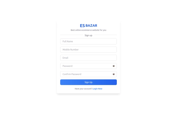 Responsive Sign-Up Form with TailwindCSS
Create a visually appealing and fully responsive sign-up form using TailwindCSS. This form includes input fields for full name, mobile number, email, password, and confirm password, along with a gradient sign-up button. Designed with simplicity and flexibility, it is perfect for modern web applications and easy to integrate into any project.
1.8k -
 Input field with logo
Logo on the left side of the input field
11.6k -
-
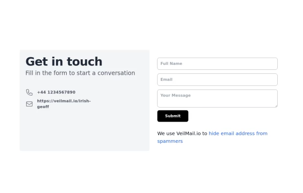 beautiful tailwind contact form
beautiful tailwind contact form
6.5k -
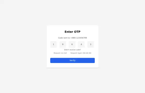 Simple OTP box Form
A Simple OTP form with full responsiveness && dark mode supported
4.1k -
 tailwind contact form
tailwind contact form
-
-
 Search input asasasas
sasasasasas
1.8k








Browse by topic
Explore components by Tags
Jump straight to the UI pattern you need.
Can't find it?
Didn't find the component you were looking for?
Search across 3,000+ community-built components and grab the code in seconds.
