Image carousel
Uses Flowbite
This tailwind example is contributed by Fagundo67, on 18-Feb-2023. Component is made with Tailwind v3.4. It is responsive. It supports dark mode.

Related Examples
-
 Carousel with Tailwind CSS and Alpine.js
Simple card Carousel
33.4k -
 Tailwind image slider
slider with navigation buttons and info about image
21.5k -
 8.1k
8.1k -
 3 columns blog section
de columnis, columni, 3 columns
12.8k -
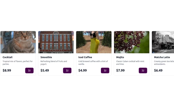 Carousel Card Slider Swiper on Alpine.JS
with support drag and drop mouse actions
14.2k -
 3D Animated Image Gallery
3D Animated Image Gallery
9.9k -
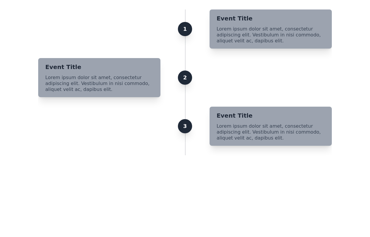 17.8k
17.8k -
 Hero Slider with Alpine.js
This responsive hero slider features full-screen image backgrounds with elegant text overlays and smooth transitions.
2.8k -
 Product Carousel with Tailwind CSS, Swiper & Alpine.js
A modern, responsive product carousel built with Tailwind CSS, Swiper, and Alpine.js. The component features smooth sliding animations, autoplay, and custom navigation controls. Each product card uses a flexible Tailwind layout and includes dynamically generated demo images, making it easy to drop into any landing page, marketing site, or product showcase. Ideal for showcasing products in a clean, lightweight, and highly customizable way.
636 -
 2.3k
2.3k -

-
 ArtoGallery
Explore a curated selection of contemporary and classic artwork, connecting collectors and creators in an inspiring online space.
2k







Browse by topic
Explore components by Tags
Jump straight to the UI pattern you need.
Can't find it?
Didn't find the component you were looking for?
Search across 3,000+ community-built components and grab the code in seconds.
