Simple User Icon
Perfect for dashboard corners or social media platforms. Part of the coastalui.com collection.
This tailwind example is contributed by Coastal UI, on 13-Feb-2025. Component is made with Tailwind v3.4. It is responsive. similar terms for this example are Author box, User information

Related Examples
-
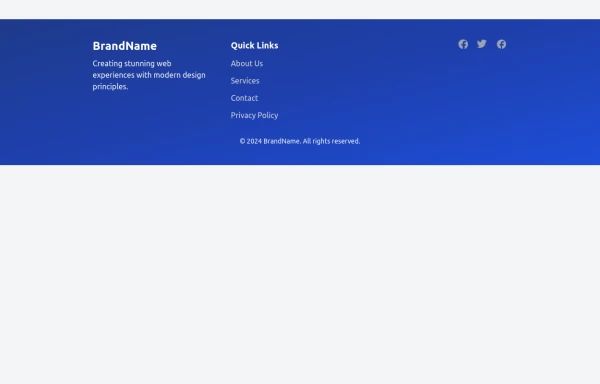 Modern Responsive Footer with Tailwind CSS
This sleek and modern responsive footer is built using HTML and Tailwind CSS. It features three sections: brand information, useful links, and social media icons. The footer includes smooth hover effects, subtle fade-in animations, and a fully responsive design that adapts seamlessly to different screen sizes. Perfect for websites looking for a professional and stylish footer section.
2.5k -
 User Profile Card
Useful for testimonials and reviews section
11.2k -
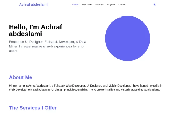 Responsive portfolio with dark mode
responsive and support dark mode .portfolio website
4.4k -

-
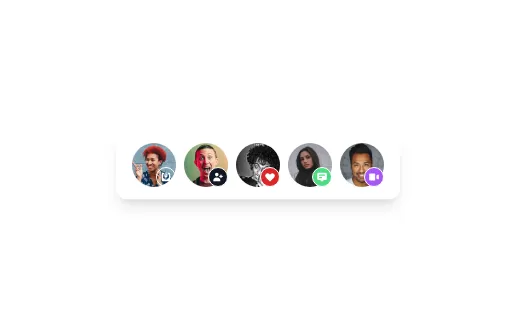 Avatar
Avatar
5.1k -
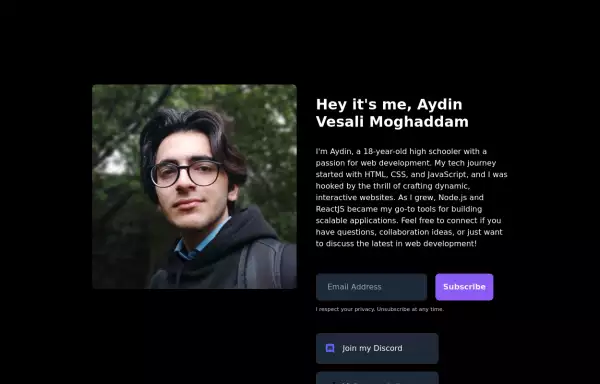 My Personal Landing page
This HTML document showcases Aydin Vesali Moghaddam's personal portfolio, highlighting his journey in web development. The page features a responsive design that adapts to various screen sizes, ensuring a seamless user experience across devices. It includes a personal introduction, a brief overview of Aydin's tech journey, and a contact form for visitors to subscribe to updates. Additionally, the page provides links to Aydin's Discord, website, and Twitter, offering multiple avenues for connecting and staying updated on his projects.
6.7k -
 Website Pricing List Card Component
Website Pricing List Card Component with Package Names: Basic Package → Starter Website Premium Package → Business Website Professional Package → E-Commerce Solution Pricing Structure: Increased prices significantly to reflect web development services one-time payment model FAQ Content.
1.7k -
 canvas fully covers
canvas fully covers
5.1k -
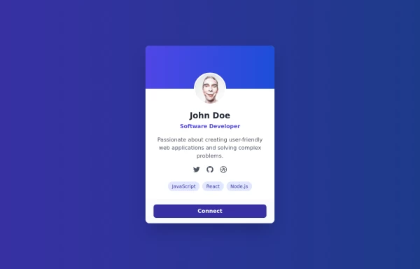 User Profile Card
This User Profile Card includes: 1. Responsive design using Tailwind CSS classes 2. Indigo-800 and Blue-900 color scheme 3. Dark mode support with appropriate color adjustments 4. Profile picture with hover effect 5. User name, job title, and a brief description 6. Social media icons with hover effects 7. Skill tags with hover animations 8. Connect button with hover effect 9. Subtle animations and transitions for better user experience 10. Automatic dark mode detection based on system preferences Key features: - The background uses a gradient from Indigo-800 to Blue-900 - The card has a white background in light mode and dark gray in dark mode - Text colors are adjusted for readability in both light and dark modes - The profile picture has a border that changes color in dark mode - Social media icons and skill tags have hover effects - The Connect button uses Indigo-800 with a Blue-900 hover state - The entire card has a shadow effect that changes on hover - Dark mode is automatically applied based on system preferences This design provides a clean, professional look for a user profile card while incorporating the requested color scheme and maintaining good usability across different devices and color modes.
2.5k -
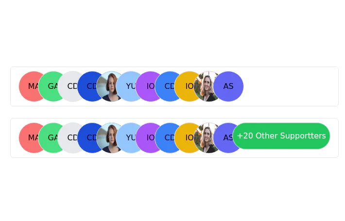 Stacked Profile
Stacked profile images
-
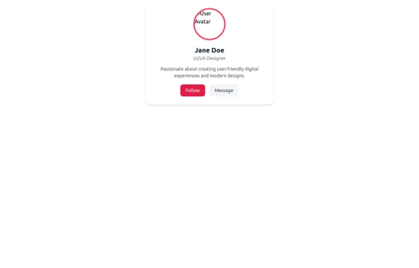 Profile Card
User profile card
556 -
 Profile Card with Transparent
Dynamic Background: Darker gradient background for better contrast Floating colored blobs for visual interest Profile Image Glow: Added a gradient glow effect behind the profile picture Smoother hover transition Typography Improvements: Larger, bolder name text Subtle hover underline animation for the name Better spacing and hierarchy
1.4k





Browse by topic
Explore components by Tags
Jump straight to the UI pattern you need.
Can't find it?
Didn't find the component you were looking for?
Search across 3,000+ community-built components and grab the code in seconds.
