Loader
A small, minimal animated loader using Tailwind CSS and Flexbox for clean, centered loading states.
This tailwind example is contributed by Rupesh, on 05-Jan-2026. Component is made with Tailwind v3.4. It is responsive. It supports dark mode. similar terms for this example are loading, loader

Related Examples
-
 Tailwind CSS Loading Spinner
simple tailwind CSS spinner with some custom CSS animation
2.1k -
 Matha ghurainna Ball
Tailwind Spinner
6.4k -
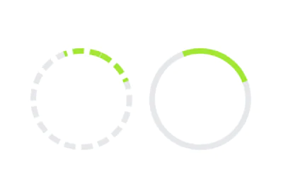 Tailwind Spinner(Loader)
simple and precise
10.2k -

-
 2.4k
2.4k -
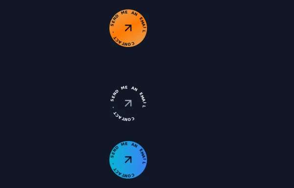 Contact Spinner
Contact button spinning
6.4k -
 Clean AI Chat UI with Tailwind CSS – ChatGPT-Style Interface
A polished and responsive AI chat interface built using modern Web Components and Tailwind CSS. This UI replicates the smooth, minimal experience of ChatGPT with a clean layout, floating input bar, animated scrollable message feed, and mock AI responses. Ideal for SaaS dashboards, AI assistants, or frontend prototypes. Designed with professional spacing, accessible colors, and reusable components. Key features: Responsive layout with mobile support Floating input bar with auto-expanding textarea Tailwind-powered message bubbles with clear sender roles Modern dark theme with subtle gradients and shadows Easily extendable to real AI APIs (e.g., OpenAI)
2.9k -
 14.4k
14.4k -

-
 2.7k
2.7k -
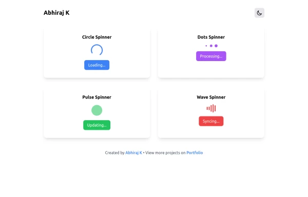 Spinner
The Spinner is a simple and visually appealing component that indicates ongoing processes like loading or data fetching. It's a great way to improve user engagement and reduce frustration during wait times. Different styles and animations (circular, dots, pulsating). Customizable size, color, and speed. Easy to integrate with loading states in any app. Lightweight and responsive.
2.4k








Browse by topic
Explore components by Tags
Jump straight to the UI pattern you need.
Can't find it?
Didn't find the component you were looking for?
Search across 3,000+ community-built components and grab the code in seconds.
