Toggle Content
Got too much content cramming your page? Organize it with sleek, interactive toggles. But this isn’t just a basic expand/collapse widget. Master Addons’ Toggle Content element lets you put entire Elementor saved templates inside each toggle. Build detailed FAQs, compare product features, or create tabbed testimonials – all within a clean, space-saving interface. Design every part of the toggler, from the sliding indicator to the labels with icons, and animate the switch with smooth, professional transitions. It’s the smart way to hide complexity and guide your visitors through your content, step by step.
Beyond Text - Embed Full Templates
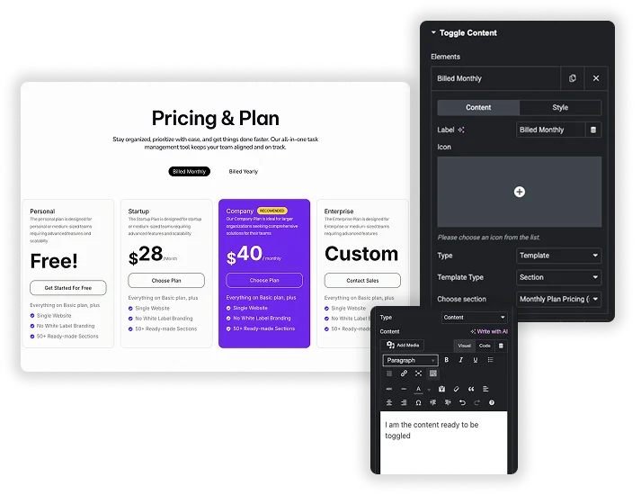
Why limit your toggles to simple text? Each toggle item can be a powerful Content Type: choose plain Text Editor or, more powerfully, a Template. Select any saved Elementor template – like a testimonial section, a pricing table, or a feature list – and nest it inside the toggle. This lets you create incredibly rich, tabbed interfaces where clicking a label swaps out entire sections of content, not just a paragraph.
- Unlimited Content Freedom: Place testimonials, contact forms, image galleries, or product specs in separate toggles.
- Reuse Your Best Work: Insert your pre-designed Elementor sections or pages to maintain consistency.
- Perfect for Comparisons: Use one toggle for “Plan A Details” and another for “Plan B Details,” each with its own full template.
Complete Visual Customization
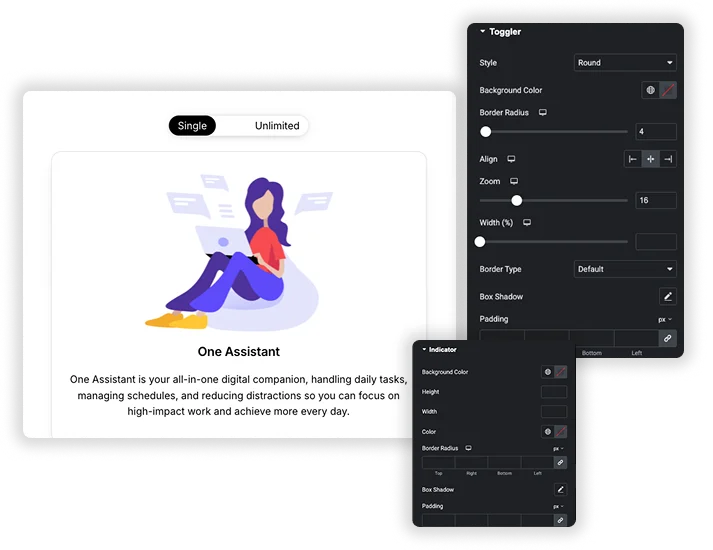
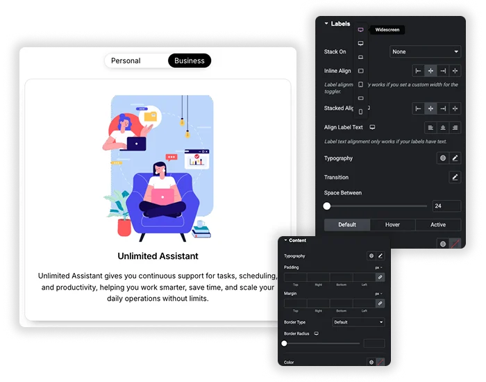
Make the toggle itself a design element. Style the main Toggler container with backgrounds, borders, and choose its Style (like rounded pill or sharp rectangle). Then, design the dynamic Indicator that slides between options – customize its color, size, and border radius. Finally, style the Labels with full typography, colors, and add icons for extra clarity. You have independent control over the Normal, Hover, and Active states for each part, creating a truly polished interactive component.
- Custom Toggle Shapes: Create pill-shaped, rectangular, or custom-rounded toggle switches.
- Animated Sliding Indicator: Style the moving selector that visually highlights the active choice.
- Label & Icon Design: Control label text, spacing, and add icons (like a checkmark or info icon) to each option.
Smooth Functionality & Responsive Control
Control how the toggle feels and functions. Set the default Active Index (which toggle is open first). Adjust the Indicator Speed for a snappy or smooth slide animation. Use the Stack On feature to control responsive behavior – making labels stack vertically on mobile if needed. Manage the Position of the toggler relative to the content and the Space Between elements to ensure a clean, functional layout on all devices.
- Controlled Animation: Set the speed of the sliding indicator for the perfect responsive feel.
- Mobile-Optimized Layouts: Use Stack On to adapt the horizontal toggle into a vertical list on mobile screens.
- Smart Defaults: Choose which content panel is visible when the page first loads.
Frequently Asked Questions For Toggle Content
How is this better than others Toggle widget?
The other toggle is for simple text Q&A. Our Toggle Content element is a layout and design system. The key advantages are: 1) The ability to insert full saved templates into each toggle, 2) A sliding visual indicator (like an iOS switch), 3) Separate styling for the toggler, indicator, and labels, and 4) More advanced responsive controls (like Stack On).
Can I use my existing Elementor templates (sections) inside a toggle?
Yes, absolutely! That’s one of its most powerful features. When adding content to a toggle item, set the Content Type to “Template”. Then, you can select any template you’ve saved in your Elementor library. It will be loaded perfectly inside that toggle panel.
What’s a great real-world use for the "Template" content type inside toggles?
Imagine a software product page. You could have three toggles: “Features,” “Pricing,” and “Testimonials.” Instead of writing text, you insert your pre-designed Features grid template into the first toggle, your Pricing table template into the second, and a Testimonials slider template into the third. You’ve just created a powerful, tabbed product overview in minutes.
How does this behave on mobile phones?
It’s fully responsive. The toggle switch and content will shrink to fit the screen. You can also use the Stack On setting to change the layout – for example, making the toggle labels stack vertically instead of sitting side-by-side on very small screens, which makes them easier to tap. The content inside (whether text or a template) will also respond based on its own responsive settings.
Can I have more than two toggle items?
Yes, you can add unlimited toggle items by clicking the “Add Item” button. This makes it perfect for detailed FAQ pages, multi-step processes, or comparing several different product plans or options side-by-side.
Trending Elementor Widgets & Extensions
Build sophisticated websites in less time.
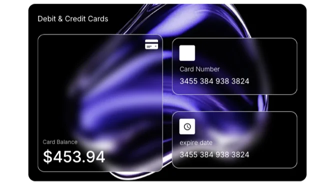
Glassmorphism
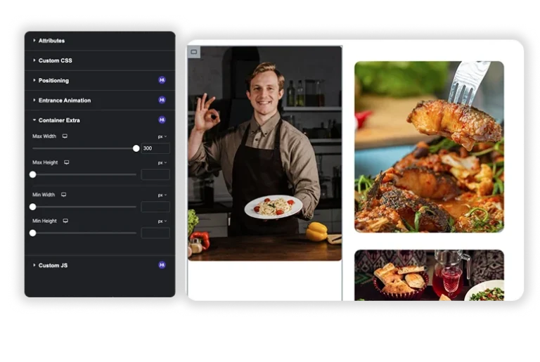
Container Extras
Patterns
Post/Page Duplicator

