CSS Flexbox
Full Stack Web Development Courses with Real-time projects Start Now!!
CSS Flexbox is a layout module in CSS that provides a flexible and efficient way to lay out, align, and distribute space among elements within a container. Flexbox allows items to align vertically or horizontally and can be used to build responsive and flexible web designs with ease. It provides greater layout control on web pages, allowing for dynamic and intricate designs that adjust to viewport size, making it a powerful tool for responsive web design.
Flexbox is especially useful, when it comes to designing cross references, which may vary in size or orientation of the device used. This makes it ideal for designing websites that require the layout to be perfect for both the PC as well as the mobile gadgets. With the help of Flexbox you can create the layouts of the site, which are adaptable and look good on any device. This means to cater for the accessibility of your site for people with disabilities as well as make sure that this site will look good no matter the way that it will be used.
Properties that can be used to style an arrow
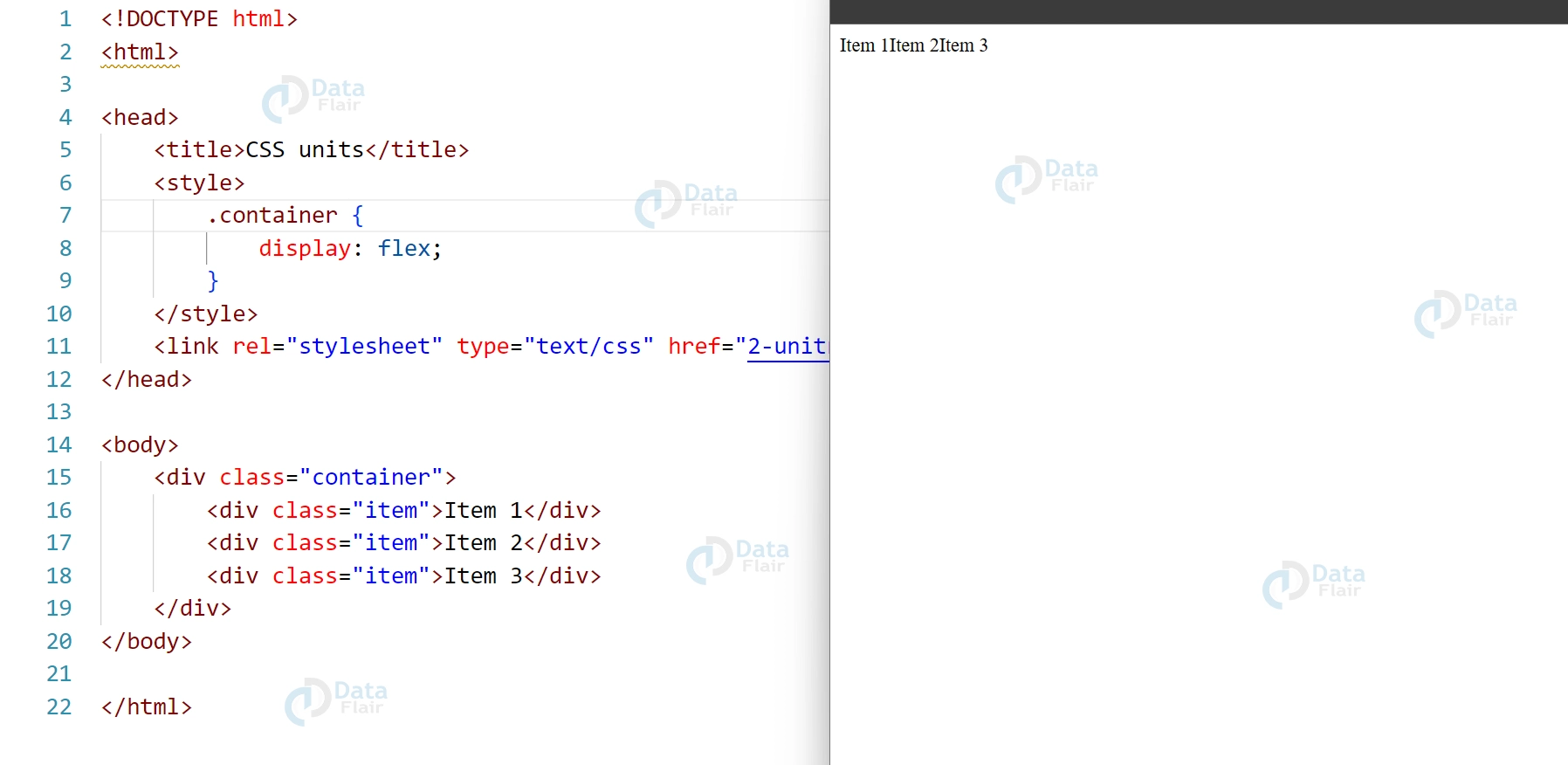
1. display: Specifies the type of flex container.
HTML:
<div class="container">
<div class="item">Item 1</div>
<div class="item">Item 2</div>
<div class="item">Item 3</div>
</div>
CSS
.container {
  display: flex;
}
Output:
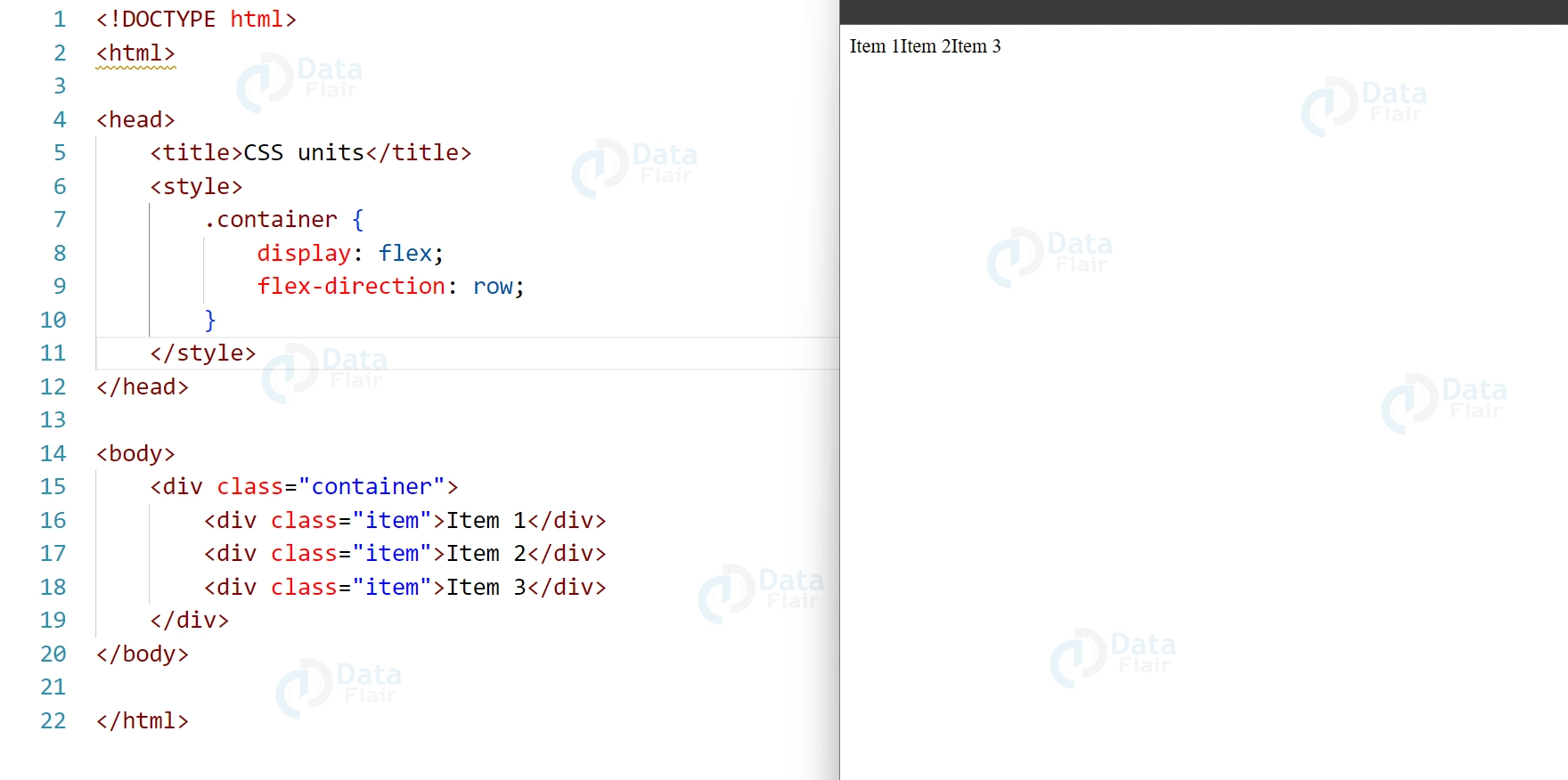
2. Flex-Direction: The orientation of flexible elements is specified via the attribute “flex-direction.”
HTML:
<div class="container">
<div class="item">Item 1</div>
<div class="item">Item 2</div>
<div class="item">Item 3</div>
</div>
CSS
.container {
  display: flex;
  flex-direction: row;
}
Output:
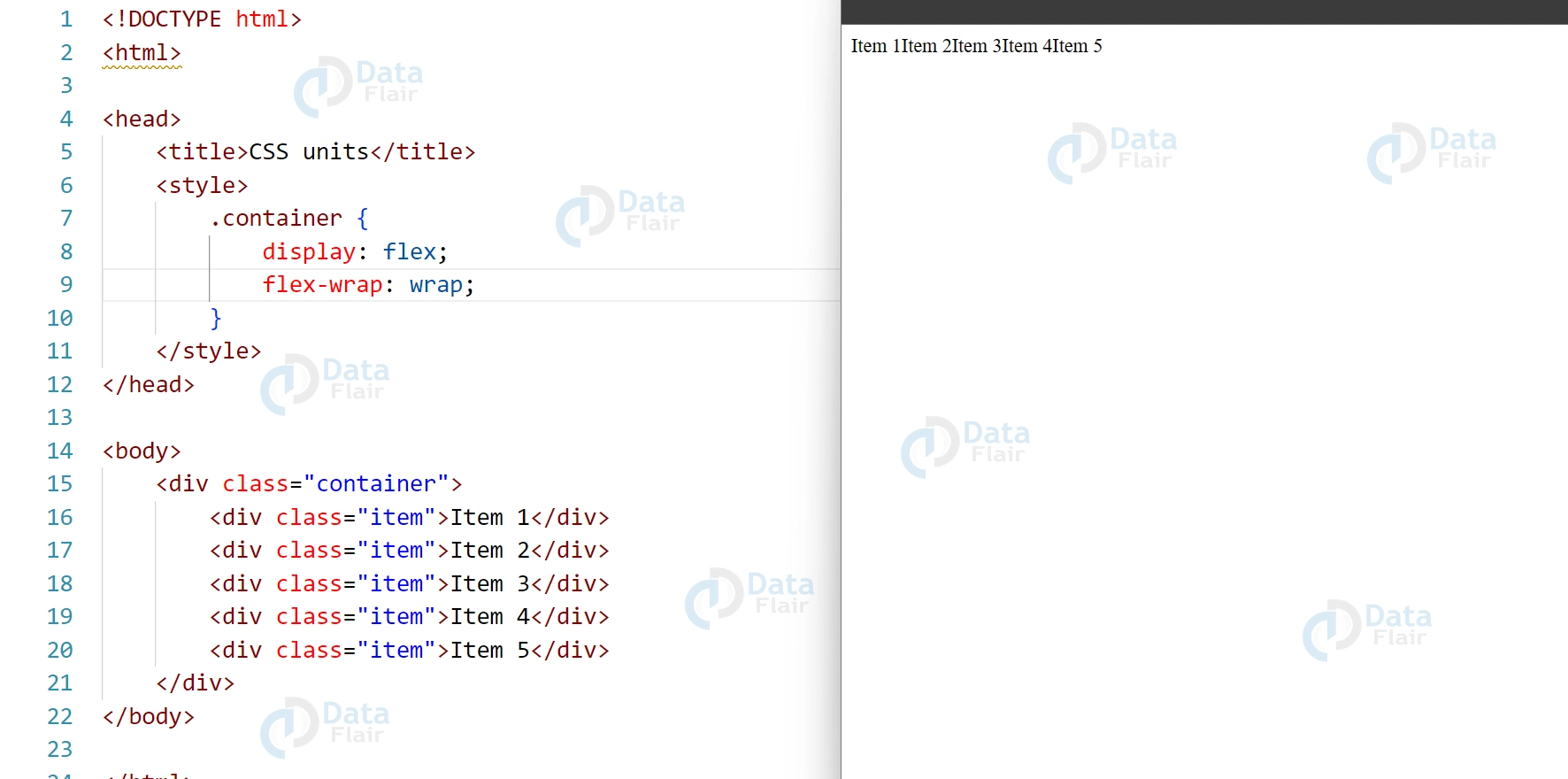
3. Flex-Wrap: Whether flexible objects should be wrapped to many lines or kept on a single line is determined by the “flex-wrap” attribute.
HTML:
<div class="container">
<div class="item">Item 1</div>
<div class="item">Item 2</div>
<div class="item">Item 3</div>
<div class="item">Item 4</div>
<div class="item">Item 5</div>
</div>
CSS:
.container {
display: flex;
flex-wrap: wrap;
}
Output:
4. justify-content: Aligns flex items along the main axis.
HTML:
<div class="container">
<div class="item">Item 1</div>
<div class="item">Item 2</div>
<div class="item">Item 3</div>
</div>
CSS:
container {
display: flex;
justify-content: center;
}
Output:
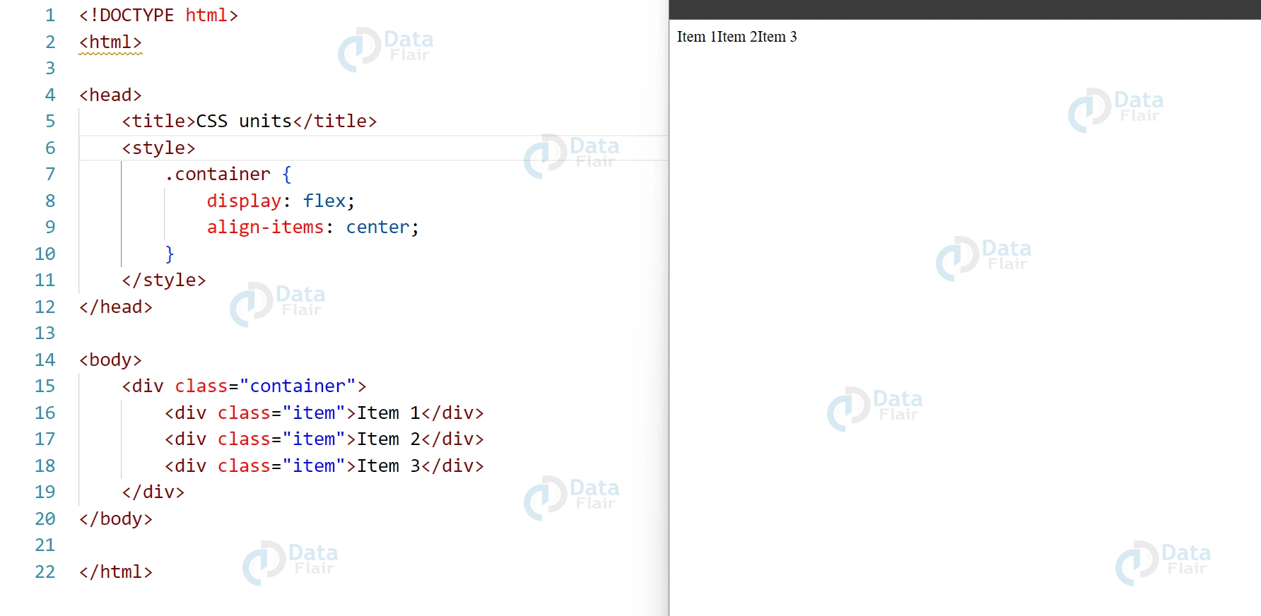
5. To align flex items on the cross-axis, use the “align-items” attribute.
HTML:
<div class="container">
<div class="item">Item 1</div>
<div class="item">Item 2</div>
<div class="item">Item 3</div>
</div>
CSS:
.container {
display: flex;
align-items: center;
}
Output:
Uses of CSS Flexbox
CSS Flexbox is a powerful layout tool that provides an efficient and flexible way to layout content in one dimension. Here are some of the common uses of CSS Flexbox:
- Creating flexible and responsive navigation menus
- Aligning items within a container horizontally or vertically
- Creating equal-height columns without using JavaScript
- Building complex grid-based layouts with ease
- Implementing flexible and scalable landing pages
- Automatically adjusting the size and position of elements based on the available screen space
- Simplifying the implementation of masonry-style layouts
- Implementing responsive and dynamic forms
- Creating dynamic and flexible card designs
- Building custom carousels and image sliders.
Example of uses of CSS Flexbox
HTML:
<header>
<nav>
<ul class="nav-list">
<li><a href="#">Home</a></li>
<li><a href="#">About</a></li>
<li><a href="#">Services</a></li>
<li><a href="#">Contact</a></li>
</ul>
</nav>
</header>
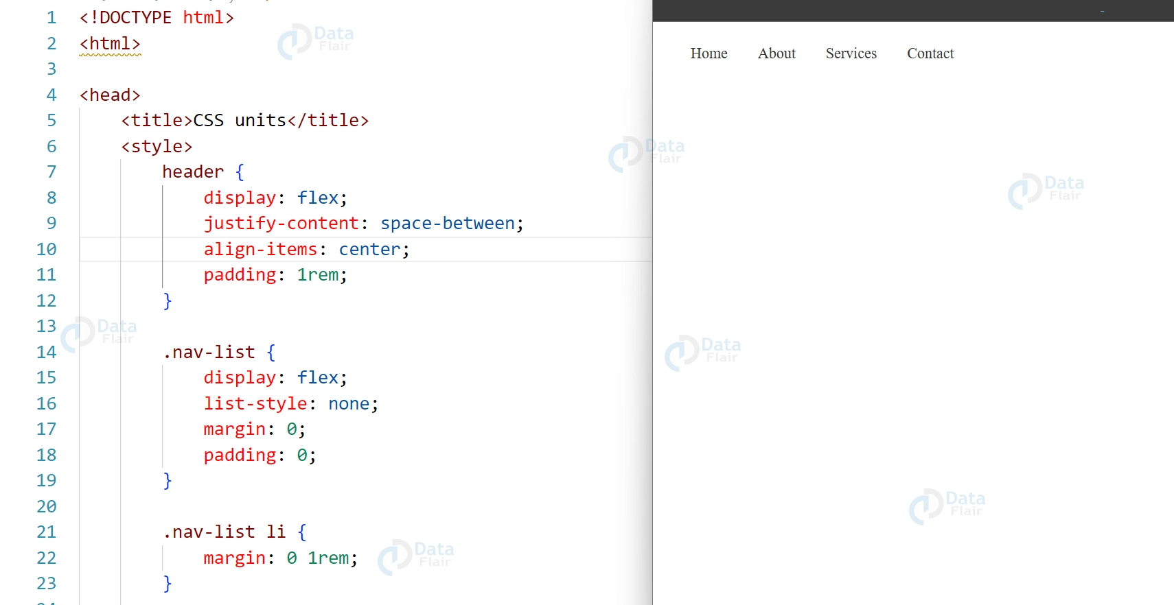
CSS:
header {
display: flex;
justify-content: space-between;
align-items: center;
padding: 1rem;
}

.nav-list {
display: flex;
list-style: none;
margin: 0;
padding: 0;
}

.nav-list li {
margin: 0 1rem;
}

.nav-list a {
text-decoration: none;
color: #333;
}
Output:
This code will create a navigation menu that is aligned to the center of the header and spaced out evenly. The navigation menu will also be responsive and will adjust to the available screen space.
HTML:
<section class="container">
<div class="item item-1">1</div>
<div class="item item-2">2</div>
<div class="item item-3">3</div>
<div class="item item-4">4</div>
<div class="item item-5">5</div>
<div class="item item-6">6</div>
</section>
CSS:
.container {
display: flex;
flex-wrap: wrap;
}

.item {
width: calc(33.33% - 20px);
margin: 10px;
background-color: lightgray;
text-align: center;
line-height: 150px;
font-size: 2em;
color: white;
}
Output:
Flexbox Elements
Flexbox Elements refer to the components that make up a CSS Flexbox layout. These include the flex container, flex items, and the main and cross axes. The flex container is the parent element that holds the flex items. Flex items are the children of the flex container and are laid out along the main axis. The main axis is the primary axis of the layout, and the cross axis is perpendicular to it.
Browser Support
All major modern browsers, including Google Chrome, Mozilla Firefox, Safari, Opera, and Microsoft Edge support CSS Flexbox. However, some older browsers may not support all the features of CSS Flexbox, so it’s important to be aware of which versions of each browser support Flexbox.
- Here’s a breakdown of browser support for CSS Flexbox:
- Google Chrome: Flexbox is supported in Chrome 29 and later versions.
- Mozilla Firefox: Flexbox is supported in Firefox 28 and later versions.
- Safari: Flexbox is supported in Safari 6.1 and later versions.
- Opera: Flexbox is supported in Opera 17 and later versions.
- Microsoft Edge: Flexbox is supported in Edge 12 and later versions.
- Internet Explorer: Flexbox is partially supported in Internet Explorer 10 and 11, but with some limitations and inconsistencies.
It’s important to note that browser support for Flexbox is constantly evolving, and new versions of browsers may introduce new features or improve existing support for Flexbox.
Conclusion
In conclusion, CSS Flexbox is a powerful layout tool that provides an efficient and flexible way to lay out content in one dimension. It’s popular for responsive and dynamic web designs because it enables easy adjustments to element size and position based on screen space. Flexbox makes it easy to align items, create equal-height columns, build complex grid-based layouts, implement masonry-style layouts, and much more. Whether you’re a beginner or an experienced web developer, CSS Flexbox is an essential tool in your front-end development toolkit.
Did you know we work 24x7 to provide you best tutorials
Please encourage us - write a review on Google
