Histograms in Matplotlib
Machine Learning courses with 100+ Real-time projects Start Now!!
Histograms are graphs that show how data is distributed. They show how often something occurs or how likely something is, helping us to see trends, high points, and outliers in continuous data. When investigating the underlying properties of enormous datasets, histograms prove to be invaluable.
Displaying continuous data’s probability distribution in Matplolib
The Matplotlib histogram displays the data set’s value distribution graphically. Data is organised into bins, and the percentage of instances in which each value appears is shown. This helps us determine if the data distribution is symmetric, skewed, or multi-modal, among other descriptive statistics.
Locating trends, high points, and anomalies in the data
We can see trends and outliers in the data with the help of histograms. Concentrations of data points, shown by peaks in the histogram, are called outliers, as are values that are far from the mean. Data distributions may be better understood with the use of histograms.
Constructing Basic Histograms in Matplotlib
Histogram Plotting
The hist function in Matplotlib allows us to generate a simple histogram. Let’s pretend we wish to visualise the information in a dataset named data. To see a sample of the histogram code, please refer to the following:
import matplotlib.pyplot as plott


list_a = [1, 7, 7, 9, 9, 9, 13, 13, 17, 19, 17, 16, 16, 16, 21]


plott.hist(list_a)
plott.xlabel('Values')
plott.ylabel('Frequency')
plott.title('Histogram DataFlair')
plott.show()
1. Setting up the histogram by specifying the data and the number of bins
The preceding code creates a histogram by sending the data to the hist function. The bins argument allows us to override the default behaviour of automated bin determination.
Histogram Appearance Modification
1. Adjusting histogram bar appearance (colour, transparency)
The histogram bars, including their colour and transparency, may be modified in a number of ways thanks to Matplotlib. The bars’ colour and transparency may be adjusted using the colour and alpha parameters, respectively. So, to illustrate:
plott.hist(list_a, color='red', alpha=0.5)
plott.title('Histogram & Custom Appearance DataFlair')
plott.show()
2. Changing the bars’ outline or fill style for aesthetic appeal.
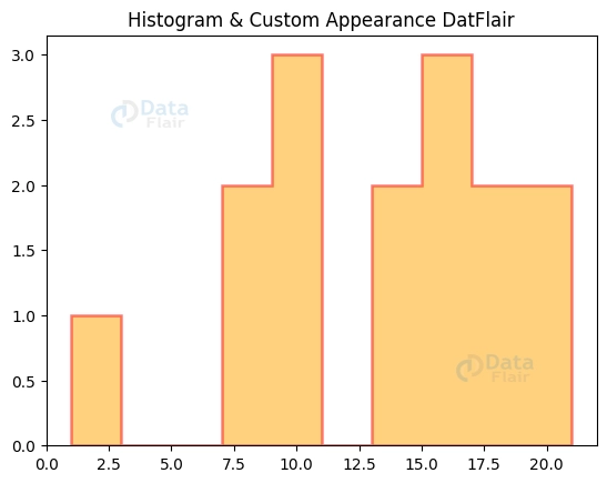
The appearance of the histogram may be improved by changing the fill or outline style of the bars. We may modify the outline using the edgecolor and linewidth parameters and the fill using the histtype option. So, to illustrate:
plott.hist(list_a, color='orange', edgecolor='red', alpha=0.5, linewidth=1.8, histtype='stepfilled')
plott.title('Histogram & Custom Appearance DatFlair')
plott.show()
Bins and Bin Width in Histograms
Deciding on a Bin Size
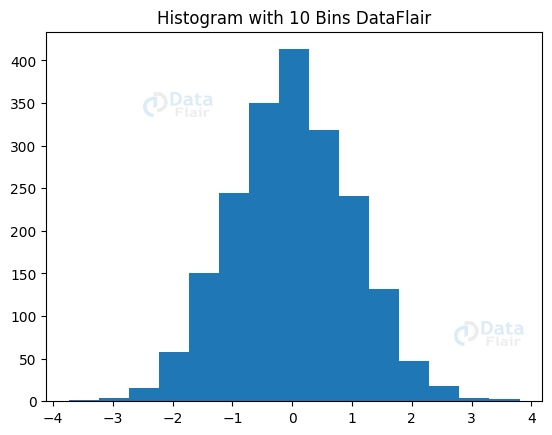
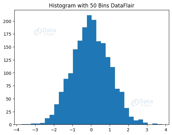
The level of detail and readability of a histogram is dependent on the size of its bins. A scatter plot with too few bins may oversimplify the distribution, whereas a scatter plot with too many bins may be confusing. The qualities of the data should be taken into consideration while deciding on the number of bins to use. The bins argument allows us to override Matplotlib’s default bin selection method and choose the number of bins ourselves. For example:
import matplotlib.pyplot as plott
import numpy as numpyy


dataset = numpyy.random.randn(2000)


plott.hist(dataset, bins=15)
plott.title("Histogram with 10 Bins DataFlair")


plott.figure()
plott.hist(dataset, bins=30)
plott.title("Histogram with 50 Bins DataFlair")


plott.show()
Managing the Depth of the Bins
When displaying a histogram, the bin width is also an important factor to consider. While a wider bin width helps smooth out the distribution and expose broader patterns, a narrower bin width gives more granular insight into the distribution. By adjusting the value of the bins parameter, we may set our own unique bin borders and hence regulate the bin width.
By adjusting the bin width and number of bins, we may make the histogram more or less useful for our purposes.
Multiple Histograms in Matplotlib
Overlaying Histograms
Sometimes, it’s helpful to look at how different variables or data sets are distributed. Matplotlib allows us to compare numerous histograms side by side in one graph. Differentiating between the datasets or variables being displayed is made easier by utilising distinct colours or patterns for each histogram.
import matplotlib.pyplot as plott
import numpy as numpyy


dataset1 = numpyy.random.normal(0, 0.8, 1500)
dataset2 = numpyy.random.normal(3, 1.5, 1500)
dataset3 = numpyy.random.normal(-3, 0.5, 1500)


figuree, axess = plott.subplots()


axess.hist([dataset1, dataset2, dataset3], bins=30, color=['green', 'purple', 'orange'], alpha=0.7, label=['A', 'B', 'C'])
axess.set_xlabel('Value')
axess.set_ylabel('Frequency')
axess.set_title('Distribution of Variables DataFlair')
axess.legend()


plott.show()
Stacking the Histograms
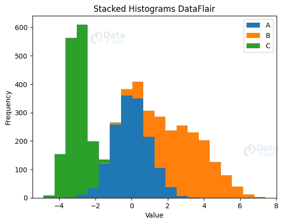
When we need to see how different parts of a dataset fit together, stacked histograms come in handy. They reveal the relative importance of each variable in explaining the pattern. The total effect and relative proportions of each variable may be shown by stacking their respective histograms.
import matplotlib.pyplot as plott
import numpy as numpyy


numpyy.random.seed(0)
dataset1 = numpyy.random.normal(0, 1, 1500)
dataset2 = numpyy.random.normal(3, 1.5, 1500)
dataset3 = numpyy.random.normal(-3, 0.5, 1500)


plott.hist([dataset1, dataset2, dataset3], bins=20, stacked=True, label=['A', 'B', 'C'])
plott.xlabel('Value')
plott.ylabel('Frequency')
plott.title('Stacked Histograms DataFlair')
plott.legend()


plott.show()
Dealing with Irregular or Unbalanced Data
Reducing Outliers
The meaning of a histogram may be drastically altered by outliers. It may be helpful to exclude or ignore extreme values in order to examine the average. This makes the primary data points more visible and easier to comprehend in the histogram, facilitating a more thorough analysis.
Using a Logarithmic Conversion
Applying a logarithmic adjustment may assist in normalising data distributions that are excessively skewed. This adjustment makes the data more balanced by shrinking the largest values and increasing the smallest ones. A histogram may be used to get insight into the converted distribution and make data analysis easier after transformation.
Conclusion
In summary, histograms are excellent methods for representing and analysing statistical distributions. Analysts and data scientists may investigate data trends, outliers, and composition with the use of Matplotlib’s rich histogram creation and customization features. It is possible to compare several datasets and variables by stacking and overlaying histograms. Using Matplotlib, you can do a lot of cool things with histograms for data analysis and visualisation.
Did we exceed your expectations?
If Yes, share your valuable feedback on Google


