Plotting in Matplotlib
Machine Learning courses with 100+ Real-time projects Start Now!!
Matplotlib is a strong tool for Python programmers to use in the domain of data analysis and visualisation. For complicated information, “a picture is worth a thousand words,” and data visualisation is an essential tool for doing just that.
Matplotlib is widely used by data scientists, analysts, and academics because of its extensive and customizable foundation for constructing informative and aesthetically pleasing charts.
This post will explore many methods of plotting using Matplotlib. Various alternatives for personalization, other plot layouts, and the use of annotations and legends to enhance the visual impact of our plots will be investigated.
By the conclusion, you’ll know how to use Matplotlib to its full potential for producing eye-catching visualisations.
Personalization of the Plot in Matplotlib
Identifying Elements with Names and Labels
The addition of titles, labels, and legends to our plots is crucial for providing context and understanding.
1. Choosing a plot title:
The title() method allows us to create a meaningful title that conveys the plot’s main idea.
Putting names on the axes of data: We can clearly identify the x and y axes with the help of the xlabel() and ylabel() utilities.
2. Legend for several parts:
A legend is useful for graphing numerous elements at once, such as multiple lines or a scatter plot. We can add a legend to the plot with meaningful labels using the legend() method.
Modifying Axis Limits and Ticks
By adjusting the axis bounds and ticks, we can zero in on certain data ranges and make the chart easier to read.
1. Changing the axis limitations to concentrate on specified ranges:
The xlim() and ylim() methods let us provide unique upper and lower bounds for the x and y axes, respectively. This comes in handy when we need to zero down on a certain subplot inside the larger story.
2. Modifying the Locations and Names of the Ticks:
Matplotlib allows users to freely customise the axis tick placements and labelling. The use of the xticks() and yticks() routines allow us to set the tick locations and labels to our liking.
Making Use of Grids
Gridlines are useful because they act as a visual guide and make a story easier to follow.
1. Setting grid lines for improved visualisation:
The grid() method, when activated, superimposes horizontal and vertical lines on the plot.
2. Modifying the look of the gridlines (colour, style):
By changing things like the colour, line style, and linewidth of the gridlines, we can make them seem exactly as we want them to in Matplotlib.
Annotations and Content
Data points may be highlighted or more information provided by adding annotations and text inside a visualisation.
1. Adding text and comments to emphasise certain points:
Annotations with arrows referring to the relevant data may be added using the annotate() method, while the text() function allows us to add text at precise locations in the plot.
Altering the font size and colour of the text: The new text may be made to mix in with the plot thanks to the many choices provided by Matplotlib for adjusting the font size, colour, and style.
Several Plots and Subplots
Matplotlib allows for the production of many plots and subplots inside a single figure, which is useful for analysing and comparing data from various sources.
Generating Side Stories
1. Separating the graph into several subplots: Using the subplot() method, the figure may be partitioned into rows and columns, making it possible to plot many charts or graphs at once.
2. Altering the arrangement and separation of subplots: Matplotlib’s flexible options for arranging and respacing subplots guarantee a visually appealing presentation.
Trading Stories and Axes
1. Utilising x or y points among subplots: By setting the sharex or sharey option while creating subplots, we may have them share the same axes. When comparing data across subplots, this function is quite helpful.
2. Making a unified legend for all subplots: The figlegend() method may be used to generate a single legend for use with many subplots. The story becomes more coherent and easier to understand as a result.
Modifying and Enhancing the Plot
Matplotlib is a robust Python library for creating plots, and it provides a wide range of choices for personalization, so you may make charts that are both beautiful and useful. Here, we will investigate a number of options for modifying and enhancing Matplotlib-generated graphs.
Modifications Made to Axis
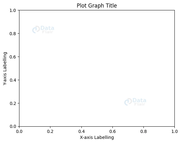
Matplotlib has a variety of functions, such as xlabel(), ylabel(), and title(), for labelling and titling axes and plots. Adding labels and titles that explain what’s going on will help the reader follow the story better.
Code Sample:
import matplotlib.pyplot as plott


plott.xlabel("X-axis Labelling")
plott.ylabel("Y-axis Labelling")
plott.title("Plot Graph Title")
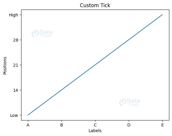
The xticks() and yticks() methods let us modify the list_a and list_b axis tick positions and labels, respectively. This gives us command over the precision and visibility of the axis data.
Code Sample:
list_a = [1, 2, 3, 4, 5]
list_b = [7, 14, 21, 28, 35]


plott.plot(list_a, list_b)
plott.xticks([1, 2, 3, 4, 5], ['A', 'B', 'C', 'D', 'E'])
plott.yticks([0, 7, 14, 21, 28, 35], ['0', 'Low', '14', '21', '28', 'High'])


plott.xlabel('Labels')
plott.ylabel('Positions')
plott.title('Custom Tick')


plott.plot(list_a, list_b)
plott.show()
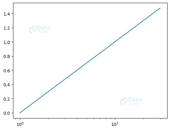
Matplotlib’s semilogx(), semilogy(), and loglog() functions allow for the application of logarithmic scaling on primary and secondary axes, respectively. In addition, the twinx() and twiny() methods make it possible to add supplementary axes to a plot, which may be helpful for comparing many variables or scales.
Code Sample:
import matplotlib.pyplot as plott
import numpy as numpyy


a = numpyy.linspace(1, 30, 300)
b = numpyy.log10(a)


plott.semilogx(a, b)
Personalization of Look and Feel
Matplotlib has several predefined colour maps and palettes that may be used to quickly and easily apply colours to plots. These colour maps provide aesthetically pleasing and semantically significant colour palettes for many forms of information.
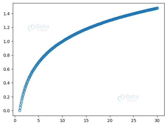
Matplotlib enables users to modify the appearance of lines, markers and fills in order to highlight certain data points. Linestyle, marker, and fillstyle are just a few of the available options for doing this.
Code Sample:
import matplotlib.pyplot as plott


plott.plot(a, b, linestyle='--', marker='o', fillstyle='none')
Matplotlib’s style sheets make it easy to add preset sets of style parameters to our plots, increasing their aesthetic attractiveness. These style sheets include a variety of predefined colour schemes and fonts that may be used to quickly and easily establish brand cohesion and elevate the visual presentation of your plots.
Code Sample:
import matplotlib.pyplot as plott


plott.style.use('grayscale')
Plot Archiving and Exporting
PNG, JPEG, PDF, and SVG are just some of the file types that Matplotlib supports for saving plots. This opens up a wide variety of potential applications for the plots, including but not limited to reports, presentations, and websites.
Code Sample:
import matplotlib.pyplot as plott


plott.savefig('figure.png')
Matplotlib allows for customization of both the image size and resolution when saving plots. This guarantees the required size and quality of the stored plots.
Code Sample:
import matplotlib.pyplot as plott


plott.figure(figsize=(10, 8), dpi=300)
Conclusion
When working with data in Python, Matplotlib is required. Its broad personalization features let users produce highly personalised and aesthetically pleasing plots, from axis labelling and styles to colour schemes and plot saving. Data visualisation may be taken to new heights with Matplotlib’s help since it offers a wealth of options and complex functionality. So, get into Matplotlib and see how far your data visualisation projects can go.
We work very hard to provide you quality material
Could you take 15 seconds and share your happy experience on Google


