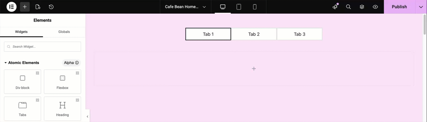
- Add the Tabs element to the canvas. For details, see Add elements to a page.
The options for the Image element appear in the left panel.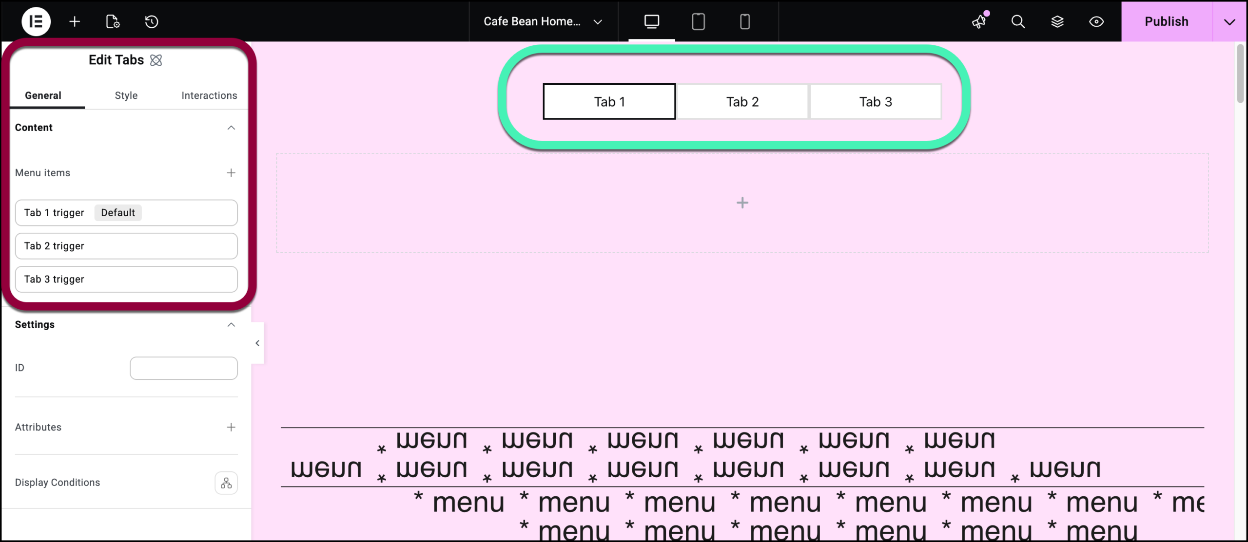
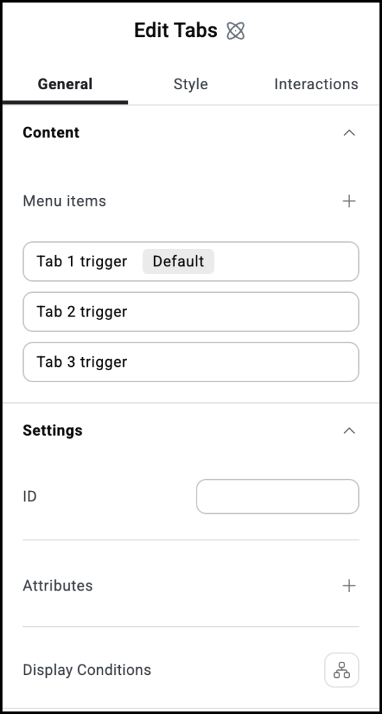
By default, the Tabs widget has three tabs. You can add or delete tabs by using the controls on the panel. For details see the Settings section below.
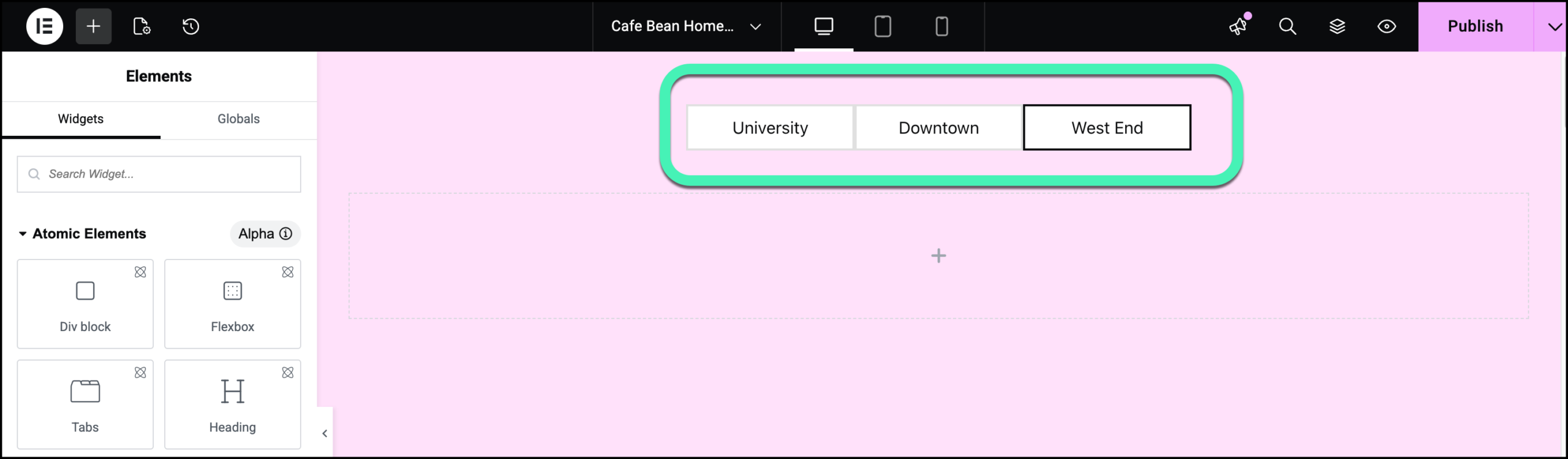
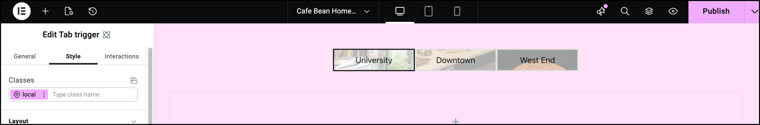
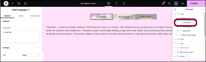
For this example, our chain has three branches – Downtown, University and West End.With the Tabs widget, each tab can have its own style and content. For this example, we’ll give each tab a unique name and background.
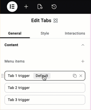
- To make our navigation easier, let’s change the names of the tab triggers. This will not affect the name that appears to visitors. Click the field labelled Tab 1 trigger.
- In the name field, change the name to University.NoteThis is also where you can use the Default toggle to set which tab will be open when visitors first view the page.
- Change the names of the other two tabs to Downtown and West End.
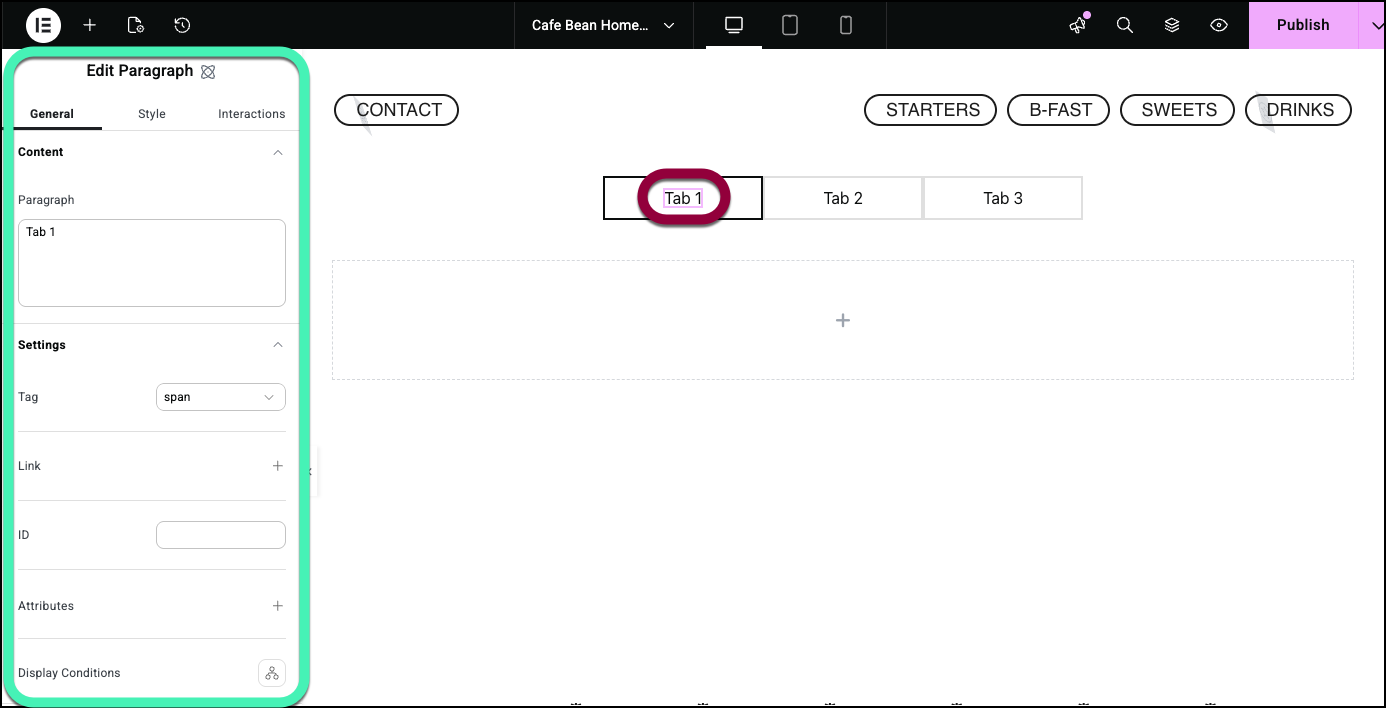
- Click the center of Tab 1. This opens a paragraph element inside the tab.
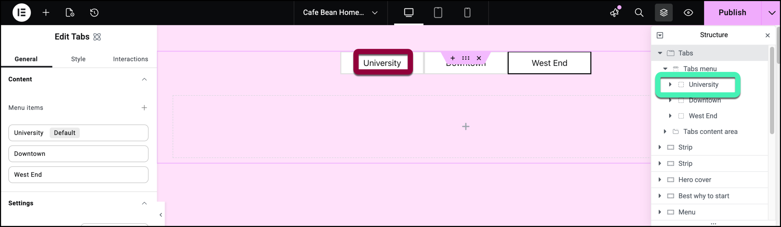
 TipIt may be easier navigating tabs by using the structure window. For details, see Use page structure to navigate your page.
 - Enter University on the Paragraph box.
- Do the same to change the name of the other tabs to Downtown and West End.
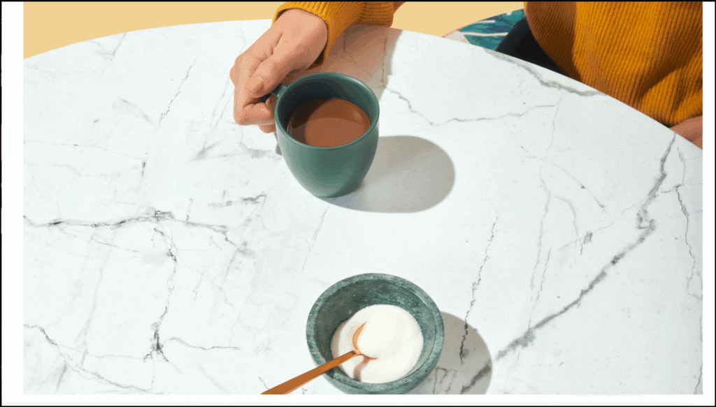
Let’s add a unique background to each tab. For this example we’ll add a different image for each tab. - Select the University tab by either hovering over the tab and clicking the icon or by clicking University in the structure window.
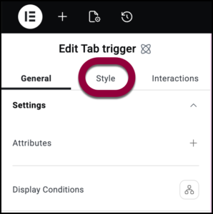
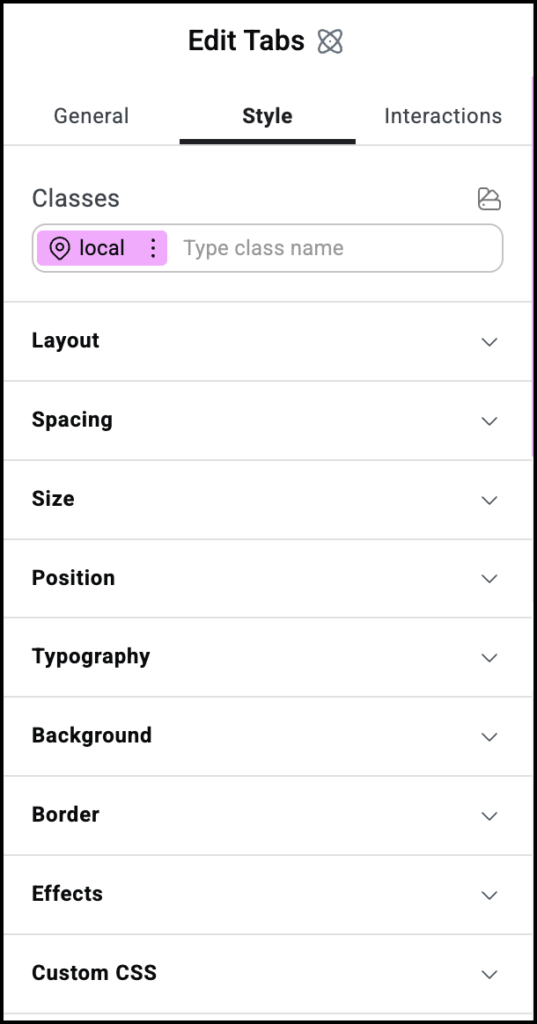
- Click the Style tab.
- Insert and image as the Background. For details, see Style tab- Background.
Now let’s add content to the tab. - Select the Tab 1 Content area by selecting it from the structure window.
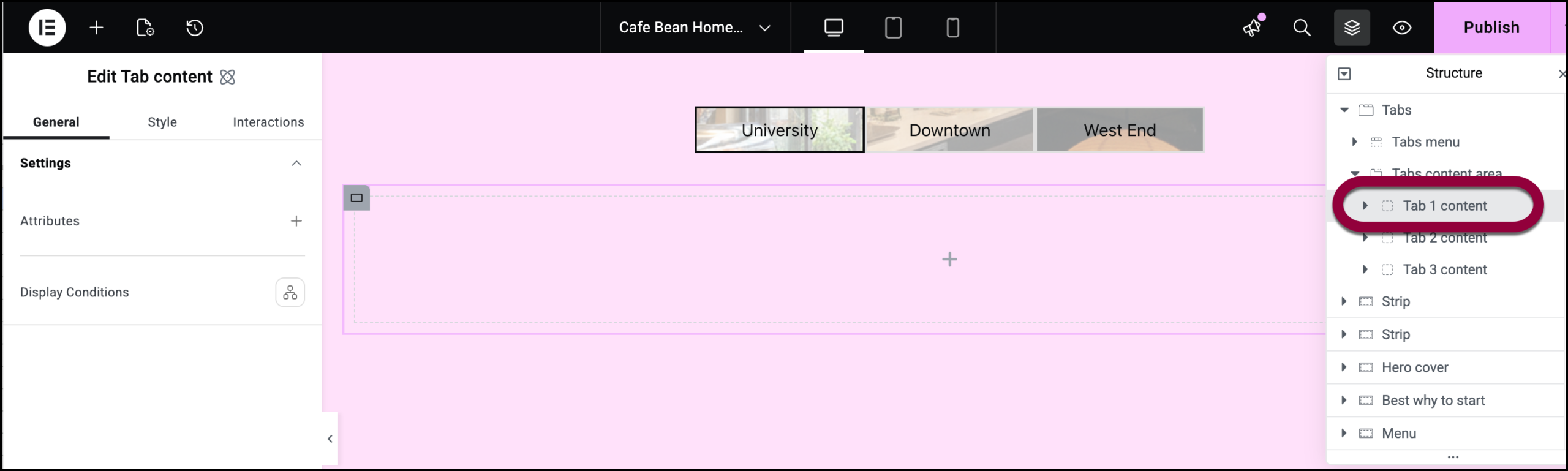
- Add a Paragraph element to the Tab 1 Content area. For details, see Add elements to a page.
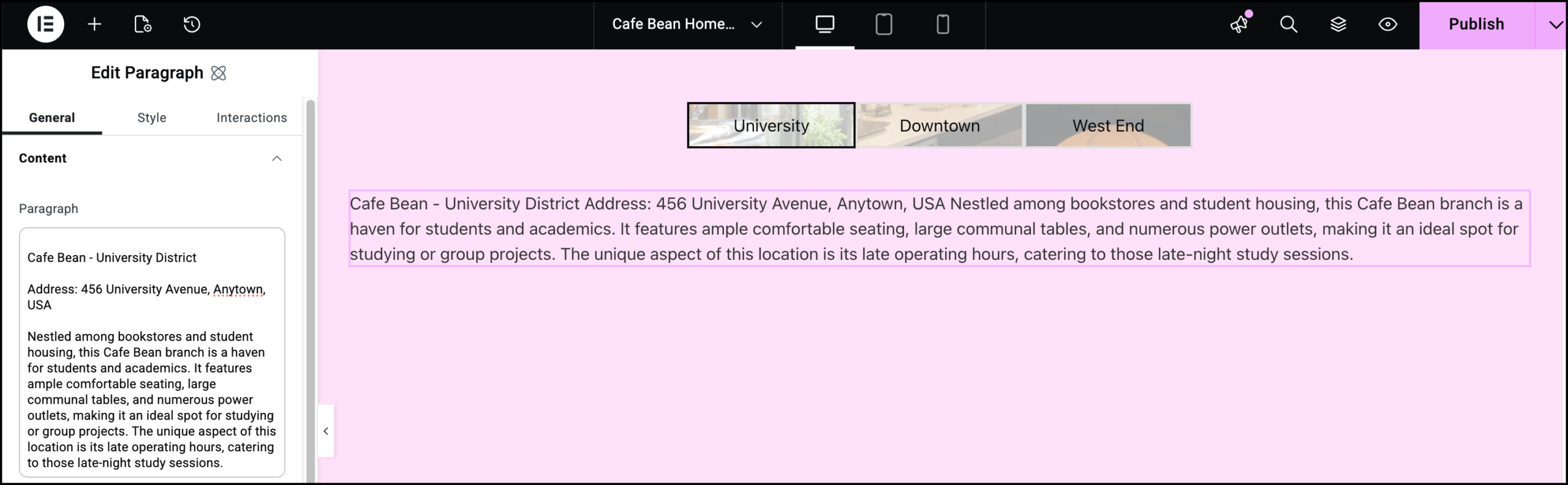
- Add the branch details to the Paragraph element. For details, see Paragraph element.
 NoteYou can also add headings, images and any other elements to this area.
 - Repeat this for the other tabs.
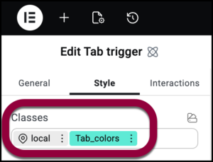
Finally, we’ll add some effects to the tabs to help with navigation and UI. - Select the University tab trigger.
- Delete the background image as it will interfere with these effects.
- Create a class called tab_colors with the following characteristics:
- Hover: red background
- Active: light blue background
- Selected: yellow background
For details, see Classes in Elementor and Element states.
- Add the class tab_colors to all the tab triggers.
 NoteNow when you roll over or select tabs they will change color. The Active color may be difficult to detect as it only applies to the moment visitors click on the tab.
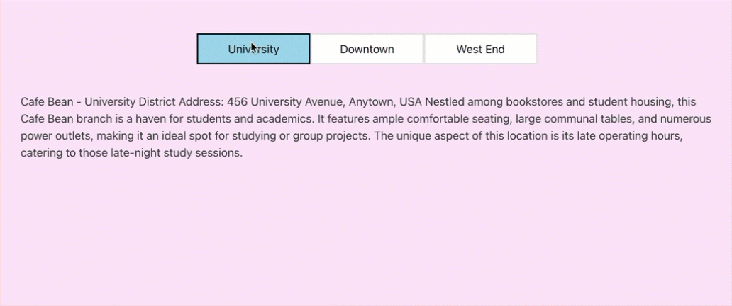
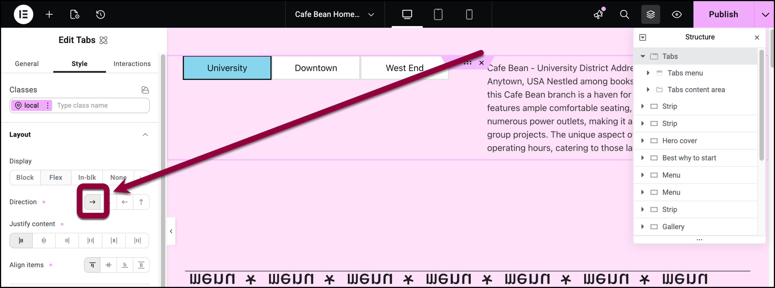
Now let’s look at how the tabs would look if they were in a vertical, accordion style layout. - Select the Tabs widget.
- Click the Style tab.
- Open the Layout section.
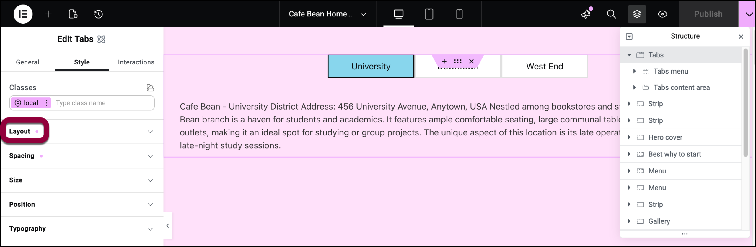
- Change the tabs to Row.
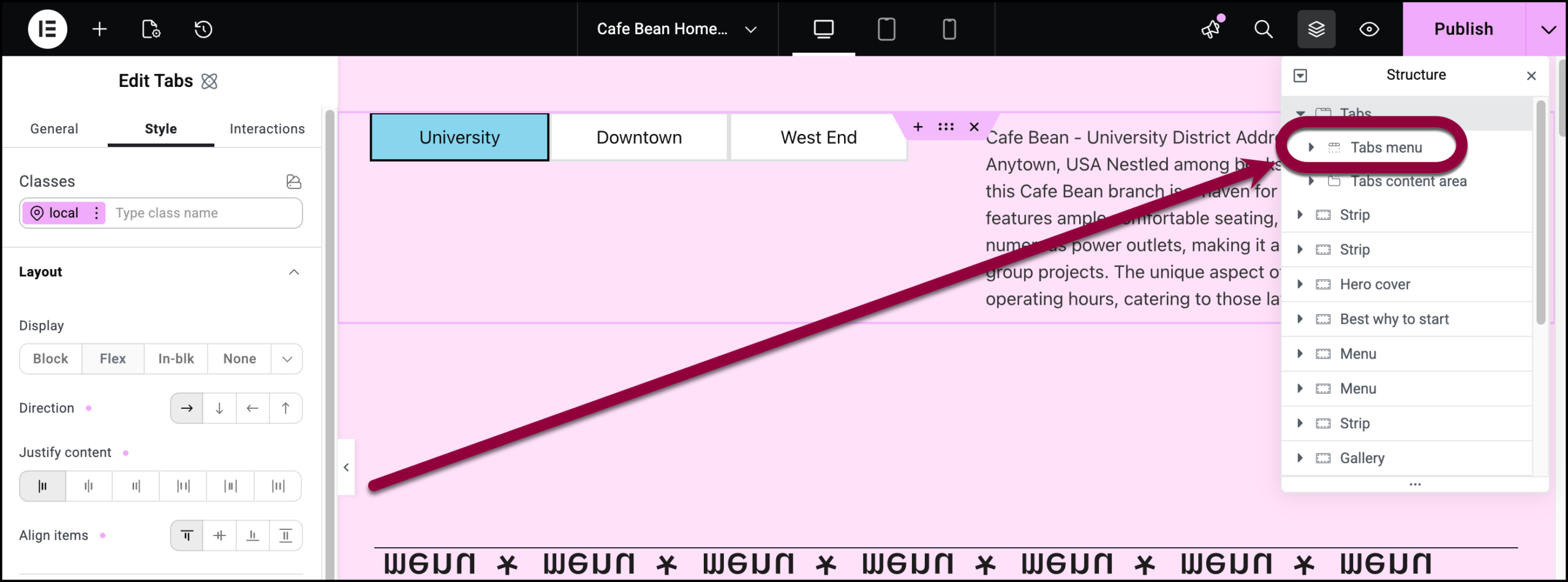
- Select Tabs menu.
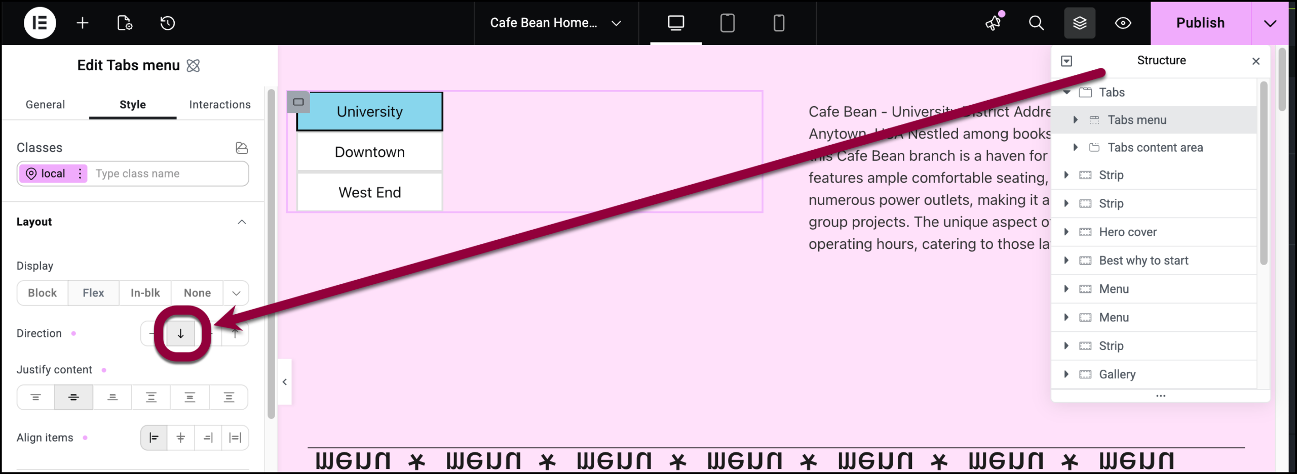
- Change Tabs Menu to column.
The tabs are complete.

