CSS Cheat Sheet - A Basic Guide to CSS
Last Updated :
15 Dec, 2025
CSS (Cascading Style Sheets) is a styling language used to control the presentation of documents written in HTML, XML, and similar markup languages. It defines how elements appear on screen or in other media, enhancing the overall look and user experience of a webpage.
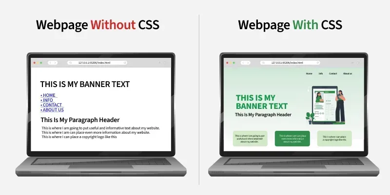
- Allows developers to style and layout web pages with colors, fonts, spacing, and positioning.
- Separates content from design, making webpages easier to maintain and more visually consistent.
CSS Basics
Cascading Style Sheet(CSS) is used to set the style in web pages that contain HTML elements, here we will see in how many ways we can add CSS for our HTML, there three different ways to do so one by one we will see those procedure.
External CSS: External CSS contains a separate CSS file with a .css extension which contains only style property with the help of tag attributes.
selector{
    property1: value1;
    property2: value2;
}
Include external CSS file: The external CSS file is linked to the HTML document using a link tag.
<link rel="stylesheet" type="text/css" href="/style.css" />
Internal CSS or Embedded: Internal CSS is embedded within the HTML file using a style HTML tag.
<style type="text/css">
div { color: #444;}
</style>
Inline CSS: The inline CSS contains CSS properties in the body section specified within HTML tags.
<tag style="property: value"> </tag>
Clearfix: It clears floats to select or control margins and padding.
.clearfix::after {
    content: "";
    clear: both;
    display: block;
}
Selectors
CSS selectors are used to find or select the HTML elements you want to style.
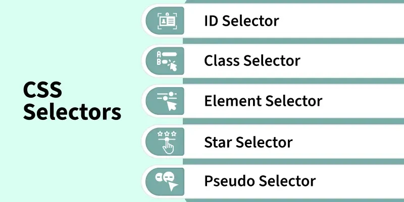
These are categorized as follows:
- Universal Selector: Applies a common style to every element on a page when Universal Selector targets all elements.
- Type Selector: Styles all elements of a specific HTML tag because Type Selector matches by element type.
- ID Selector: Targets a single unique element since ID Selector matches an element with a specific id.
- Class Selector: Styles multiple elements with shared design as Class Selector selects elements using a common class.
- Attribute Selector: Enables precise styling because Attribute Selector matches elements based on attribute presence or value.
- Combinator Selectors: Create advanced element targeting since Combinator Selectors define relationships like parent–child or sibling.
- Pseudo Selectors: Allow dynamic styling as Pseudo Selectors apply styles based on element states or conditions like hover or first-child.
HTML
<!DOCTYPE html>
<html>
<head>
<title>* Selectors</title>
<!-- CSS Selectors are in used -->
<style>
/* universal selector */
* {
background-color: hsl(325, 63%, 82%);
text-align: center;
}
/* type selector */
span {
background-color: skyblue;
}
/* id selector */
#div1 {
color: green;
text-align: center;
font-size: 20px;
font-weight: bold;
}
/* class selector */
.div2 {
color: orange;
text-align: left;
font-size: 10px;
font-weight: bold;
}
/* attribute selector */
div[style] {
text-align: center;
color: purple;
font-size: 20px;
font-weight: bold;
margin-bottom: -20px;
}
/* combinator selector */
div>p {
color: #009900;
font-size: 32px;
font-weight: bold;
margin: 0px;
text-align: center;
}
/* class selector */
.box {
background-color: yellow;
width: 300px;
height: 100px;
margin: auto;
font-size: 30px;
text-align: center;
}
/* pseudo selector */
.box:hover {
background-color: orange;
}
</style>
</head>
<body>
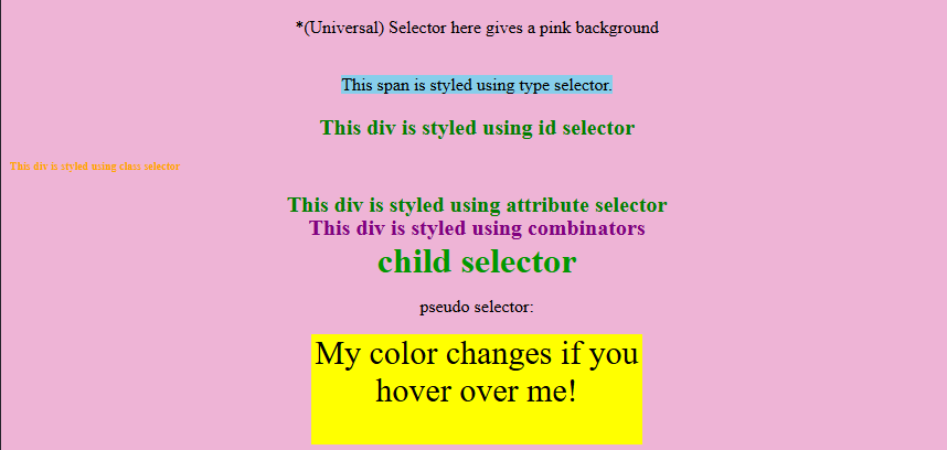
<p>
*(Universal) Selector here gives a pink background
</p>
<br>
<span>This span is styled using type selector.
<br><br>
<div id="div1">
This div is styled using id selector
</div>
<br>
<div class="div2 ">
This div is styled using class selector
</div>
<br>
<div style="color:green">
This div is styled using attribute selector
</div>
<br>
<div style="text-align:center;">
This div is styled using combinators
<p>child selector</p>
</div>
<br>
<p>pseudo selector:</p>
<div class="box">
My color changes if you hover over me!
</div>
</body>
</html>
Output:
Font Properties
CSS font properties are used to set the font's content of the HTML element as per requirement.
- font-family: Sets the typeface for text because font-family chooses custom or generic fonts for styling.
- font-style: Controls text appearance as font-style makes text normal, italic, or oblique for emphasis.
- font-variant: Changes text presentation since font-variant converts lowercase text into small-caps for a formal look.
- font-weight: Adjusts text boldness because font-weight sets thickness from normal to bold or numeric levels.
- font-size: Determines text scale as font-size sets how large or small text appears for readability.
HTML
<!DOCTYPE html>
<html>
<head>
<title>Font properties</title>
<style>
.style1 {
font-family: "Times New Roman", "sans-serif";
font-weight: bold;
font-size: 30px;
color: #090;
text-align: center;
font-style: normal;
font-variant: normal;
}
.style2 {
font-family: "sans-serif";
font-weight: 5px;
font-size: 15px;
color: blueviolet;
text-align: left;
font-style: italic;
font-variant: normal;
}
.style3 {
font-family: "arial";
font-weight: 10px;
font-size: 20px;
color: black;
text-align: right;
font-style: oblique;
font-variant: small-caps;
}
</style>
</head>
<body>
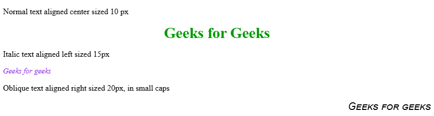
<p>Normal text aligned center sized 10 px</p>
<div class="style1">Geeks for Geeks</div>
<p>Italic text aligned left sized 15px</p>
<div class="style2">Geeks for geeks</div>
<p>Oblique text aligned right sized 20px, in small caps</p>
<div class="style3">Geeks for geeks</div>
</body>
</html>
Output:
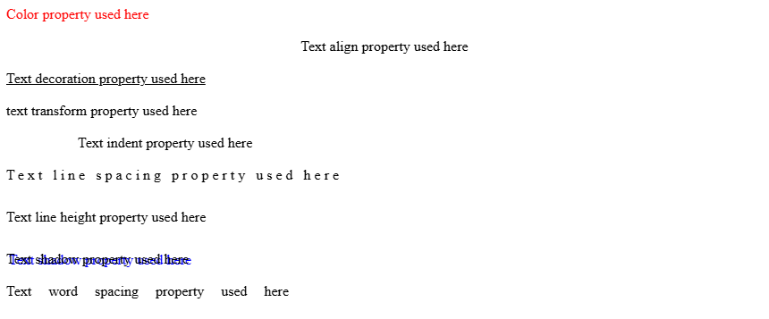
Text-properties
CSS text formatting properties are used to format and style text by setting their color, alignment, spacing, etc. as per requirement.
- text-color: Controls visual appearance of text because text-color sets the color applied to written content.
- text-alignment: Positions text horizontally as text-alignment sets left, right, center, or justified formatting.
- text-decoration: Adds or removes visual effects since text-decoration applies underlines, overlines, or line-through styling.
- text-transformation: Changes text case because text-transformation converts content to uppercase, lowercase, or capitalized form.
- text-indentation: Structures paragraphs as text-indentation shifts the first line inward for readability.
- letter-spacing: Modifies character gaps because letter-spacing controls distance between individual letters.
- line-height: Improves readability since line-height adjusts vertical spacing between lines of text.
- text-shadow: Enhances appearance as text-shadow adds shadow effects behind text.
- word-spacing: Adjusts layout because word-spacing sets spacing between words.
HTML
<!DOCTYPE html>
<html>
<head>
    <title>Text formatting properties</title>
</head>
<body>
    <div style=" color: red">
        Color property used here
    </div>
    </br>
    <div style=" text-align: center">
        Text align property used here
    </div>
    </br>
    <div style=" text-decoration: underline">
        Text decoration property used here
    </div>
    </br>
    <div style="text-transform: lowercase">
        Text transform property used here
    </div>
    </br>
    <div style="text-indent: 80px">
        Text indent property used here
    </div>
    </br>
    <div style=" letter-spacing: 4px">
        Text line spacing property used here
    </div>
    </br>
    <div style="line-height: 40px">
        Text line height property used here
    </div>
    </br>
    <div style="text-shadow: 3px 1px blue;">
        Text shadow property used here
    </div>
    </br>
    <div style="word-spacing: 15px;">
        Text word spacing property used here
    </div>
</body>
</html>
Output:
Background properties
The CSS background properties are used to design the background and define the background effects for elements.
- background-color: Sets element backdrop because background-color applies a specific color to define theme or highlight areas.
- background-image: Creates decorative visuals as background-image places one or more images behind element content.
- background-repeat: Manages image tiling since background-repeat decides if a background image repeats horizontally, vertically, both, or not at all.
- background-position: Controls image placement because background-position sets exact alignment of a background image inside an element.
- background-origin: Adjusts starting area as background-origin chooses whether an image begins at padding, border, or content region.
- background-attachment: Defines scroll behavior since background-attachment keeps a background fixed or moving with page scroll.
- background-clip: Limits visual coverage because background-clip decides how far background color or image extends within an element.
HTML
<!DOCTYPE html>
<html>
<head>
    <title>Background Properties</title>
    <style>
        .a {
            background-image:
            url( "https://media.geeksforgeeks.org/wp-content/cdn-uploads/20190417124305/250.png");
            }
        .b {
            background-image:
            url( "https://media.geeksforgeeks.org/wp-content/cdn-uploads/20190417124305/250.png");
            background-repeat: no-repeat;
        }
        .c {
            background-image:
            url( "https://media.geeksforgeeks.org/wp-content/cdn-uploads/20190417124305/250.png");
            background-repeat: no-repeat;
            background-position: center;
        }
        .d {
            background-image:
            url( "https://media.geeksforgeeks.org/wp-content/cdn-uploads/gfg_200X200.png");
            background-repeat: no-repeat;
            background-origin: initial;
        }
        .e {
            background-image:
            url( "https://media.geeksforgeeks.org/wp-content/uploads/geeks-25.png");
            background-position: center;
            background-repeat: no-repeat;
            background-attachment: fixed;
        }
    </style>
</head>
<body>
    <div style="background-color: blue">Background color property</div>
    </br>
    <div class="a" style="height: 200px; width: 100%">
    <h3> Background Image property</h3>
    </div>
    <br><br>
    <div class="b" style="height: 200px; width: 100%">
    <h3> Background repeat property: no-repeat</h3>
    </div>
    <br><br>
    <div class="c" style="height: 200px; width: 100%">
    <h3> Background position property</h3>
    </div>
    <br><br>
    <div class="d" style="height: 200px; width: 100%">
    <h3>Background origin property: The background-origin
    is a property used to set the origin of the
    image in the background.
    </h3>
    </div>
    <br><br>
    <div class="e" style="height: 400px;
                          width: 100%;
                          text-align:center;">
    <h3> Background-attachment property</h3>
    <p>The property background-attachment property in CSS is used
    to specify the kind of attachment of the background image
    It can be set to scroll or remain fixed.
    </p>
    </div>
    <br>
</body>
</html>
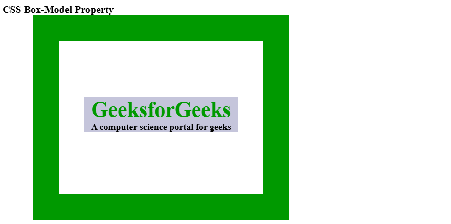
Box Properties
The CSS box model is essentially a box that wraps around every HTML element consisting of the border, padding, margin, and content.
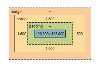
The CSS properties used to attain the box model are:
- margin: Creates outer spacing because margin defines space around an element to separate it from others.
- padding: Improves readability as padding sets inner space between content and border.
- border: Adds structure since border controls thickness, style, and color around an element.
- width: Controls horizontal size because width determines how wide an element appears in layout.
- height: Controls vertical size as height specifies how tall an element appears within layout.
HTML
<!DOCTYPE html>
<head>
    <title>CSS Box Model</title>
    <style>
    .main {
        font-size: 20px;
        font-weight: bold;
        Text-align: left;
    }

    .gfg {
        margin-left: 60px;
        border: 50px solid #009900;
        width: 300px;
        height: 200px;
        text-align: center;
        padding: 50px;
    }

    .gfg1 {
        font-size: 42px;
        font-weight: bold;
        color: #009900;
        margin-top: 60px;
        background-color: #c5c5db;
    }

    .gfg2 {
        font-size: 18px;
        font-weight: bold;
        background-color: #c5c5db;
    }
    </style>
</head>
<body>
    <div class="main">CSS Box-Model Property</div>

    <div class="gfg">
        <div class="gfg1">GeeksforGeeks</div>
        <div class="gfg2">
            A computer science portal for geeks
        </div>
    </div>
</body>
</html>
Output:
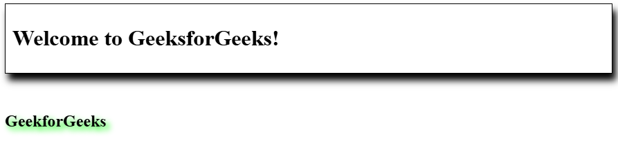
Shadow properties
These shadow properties are used to add shadow to text or boxes or frames of elements.
- text-shadow: Enhances visual style because text-shadow adds a shadow behind text for readability or decoration.
- box-shadow: Adds depth as box-shadow applies a shadow around an element’s frame for raised or inset effects.
HTML
<!DOCTYPE html>
<html>
<head>
    <title>CSS box-shadow Property</title>
    <style>
        .gfg1 {
            border: 1px solid;
            padding: 10px;
            /* box-shadow: h-offset v-offset blur */
            box-shadow: 5px 10px 10px;
        }

        /* text-shadow: h-shadow v-shadow
        blur-radius color */
        h2 {
            text-shadow: 5px 5px 8px #00FF00;
        }
    </style>
</head>
<body>
    <div class="gfg1">
    <h1>Welcome to GeeksforGeeks!</h1>
    </div>
    <br><br>
    <h2>GeekforGeeks</h2>
</body>
</html>
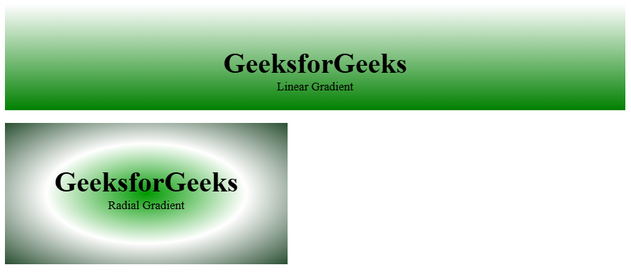
Gradient
The CSS gradient property is used to create transition between two or more specified colors
- linear Gradient: Creates smooth transitions because linear Gradient blends multiple colors along a straight line.
- radial Gradient: Forms circular effects as radial Gradient transitions colors outward from a central point.
HTML
<!DOCTYPE html>
<html>
<head>
    <title>CSS Gradients</title>
    <style>
    #main1 {
        height: 150px;
        background-color: white;
        background-image: linear-gradient(white, green);
    }
    #main2 {
        height: 200px;
        width: 400px;
        background-color: white;
        background-image: radial-gradient(#090,
                                #fff, #2a4f32);
    }
    .gfg {
        text-align: center;
        font-size: 40px;
        font-weight: bold;
        padding-top: 60px;
    }
    .geeks {
        font-size: 17px;
        text-align: center;
    }
    </style>
</head>

<body>
    <!-- Linear gradient -->
    <div id="main1">
        <div class="gfg">GeeksforGeeks</div>
        <div class="geeks">
        Linear Gradient
        </div>
    </div>
    <br>
    <!-- Radial Gradient -->
    <div id="main2">
        <div class="gfg">GeeksforGeeks</div>
        <div class="geeks">
        Radial Gradient
    </div>
</body>
</html>
Output:
Border Properties
The CSS border properties allow you to specify how the border of the box representing an element should look.
- Border Color: Applies color to edges because Border Color sets border color when a border style exists.
- Border Style: Creates visual patterns as Border Style defines solid, dotted, dashed, or decorative border types.
- Border Width: Adjusts edge thickness because Border Width controls how thick or thin a border appears
HTML
<!DOCTYPE html>
<html>
<head>
    <title> Border Properties</title>
    <style>
        #gfg1 {
            border: 2px solid blue;
            width: 60%;
        }
        #gfg2 {
            border: thick dashed green;
            width: 60%;
        }
    </style>
</head>
<body>
    <div id="gfg1">
       Demonstration of solid thick border of color blue
    </div><br><br>
    <div id="gfg2">
       Demonstration of dotted 2px width border of color green
    </div>
</body>

</html>
Classification Properties
The CSS classification properties allow you to specify how and where an element is displayed.
- Display: Controls page rendering because Display sets an element as inline, block, flex, grid, or hidden.
- Float: Manages content flow as Float lets elements shift left or right allowing text to wrap.
- Position: Defines placement because Position sets static, relative, absolute, fixed, or sticky behavior.
- Clear: Regulates layout flow as Clear blocks floating elements on chosen sides.
- Visibility: Handles element presence because Visibility decides if an element is visible, hidden, or collapsed while keeping space.
- Cursor: Customizes pointer style as Cursor changes mouse appearance to default, pointer, help, or crosshair.
HTML
<!DOCTYPE html>
<html>

<head>
    <title>Classification properties</title>
    <style>
        #geeks1 {
            height: 50px;
            width: 100px;
            background: teal;
            display: block;
        }
        #geeks2 {
            height: 50px;
            width: 100px;
            background: cyan;
            display: block;
        }

        #geeks3 {
            height: 50px;
            width: 100px;
            background: green;
            display: block;
        }
        .pos {
            position: relative;
            left: 30px;
            border: 3px solid #73AD21;
        }
        .clr {
            width: 100px;
            height: 100px;
            background-color: green;
            color: white;
            font-weight: bold;
            font-style: itallic;
            font-size: 25px;
            text-align: center;
            float: left;
            padding: 15px;
        }
        p.GFG {
            clear: left;
        }
        h1,
        h2 {
            color: green;
            text-align: center;
        }
        .wait {
            cursor: wait;
        }
    </style>
</head>

<body>
    <p>display Property: block </p>
    <div>
        <div id="geeks1">Block 1 </div>
        <div id="geeks2">Block 2</div>
        <div id="geeks3">Block 3</div>
    </div>
    <br>
    <p>Float Property:left</p>
    <div style="font-size:20px; color:#006400; float:right;">
         Content floats right
    </div>
    <br>
    <p>Position Property:relative</p>
    <div class="pos">
        This div element has position: relative;
    </div><br>
    <p>Clear property: left</p>
    <div class="clr">
        <pre>GFG</pre>
    </div>
    <p>
        GeeksforGeeks:
        A computer science portal for geeks
    </p>
    <p class="GFG">GeeksforGeeks</p>
    <br>
    <p>Visibility property: visible/ hidden</p>

    <div style="visibility: visible;">Content here is visible</div>
    <div style="visibility: hidden">Content here is hidden</div>
    <br>
    <p>Cursor property: wait</p>
    <p class="wait">
       Mouse over the words to change the mouse cursor.
    </p>
</body>
</html>
CSS Functions
CSS has a range of inbuilt functions. These are used as a value for various CSS properties. Some of the CSS functions can be nested as well. It ranges from simple color functions to mathematical, shape, color, transform, gradient, and animations functions. Some of the key functions are:
- attr(): Enables dynamic styling because attr() retrieves a selected element’s attribute value.
- calc(): Allows flexible sizing as calc() performs mathematical calculations directly in CSS.
- max(): Picks the largest option because max() returns the highest value from comma-separated numbers.
- url(): Loads external resources as url() fetches images, fonts, or files using a provided link.
- var(): Makes styling reusable because var() inserts values of custom CSS properties.
HTML
<!DOCTYPE html>
<html>

<head>
    <title>CSS functions</title>
    <style>
        a:before {
            content: attr(href) " =>";
        }
        a {
            text-decoration: none;
        }
        body {
            text-align: center;
        }
        .geeks {
            position: absolute;
            left: 50px;
            width: calc(100% - 20%);
            height: calc(100px - 20px);
            background-color: green;
            text-align: center;
        }
        .url {
            background-image: url("https://media.geeksforgeeks.org/wp-content/cdn-uploads/20190710102234/download3.png");
            text-align: center;
        }
        .gfg1 {
            background-color: var(--main-bg-color);
            padding: 10px;
        }
        :root {
            --main-bg-color: Green;
        }
    </style>
</head>

<body>

    <p>attribute function</p>
    <a href="https://www.geeksforgeeks.org">GeeksforGeeks</a><br><br>
    <p>Calc function</p>
    <div class="geeks">
        <h3>The calc() Function</h3>
    </div><br><br>

    <p>URL function</p>
    <div class="url" style="height:200px; width:100%">
        <h3>CSS url() function</h3>
    </div><br>
    <p> var function</p>
    <div class="gfg1">demonstration of var function</div><br>
</body>

</html>
The CSS Media Query is used to make the web page more responsive according to the different screens or media types. Media queries include a block of CSS only if a certain expression is true.
Syntax:
@media not | only mediatype and (expression) {
// Code content- All: Used for all types of media devices, applying styles universally.
- Print: Used when printing a document, allowing styles optimized for printed output.
- Screen: Used for digital displays such as computer screens, tablets, and smartphones.
- Speech: Used for screen readers that read content aloud, enabling accessibility-focused styling.