Python | Working with buttons in Kivy
Last Updated :
09 Oct, 2025
A Button in Kivy is a clickable widget (a Label with actions) you can style and attach callbacks to. It’s used to trigger functions when the user taps or clicks. Let's see how to add a button to a Kivy window.
This example creates a minimal Kivy app that displays a single button.
Python
from kivy.app import App
from kivy.uix.button import Button

class SimpleButtonApp(App):
    def build(self):
        b = Button(text='Push Me!')
        return b

if __name__ == '__main__':
    SimpleButtonApp().run()
Output
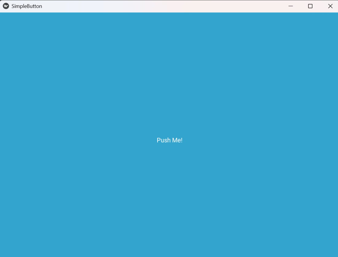 Simple Button
Explanation:
- App: base application class; build() returns the root widget.
- Button(text=...): creates a button; text sets the label shown on the button.
- return b: returned widget becomes the app root and is shown on screen.
You can style a button in Kivy by setting its size, color and position manually. This helps you match your app’s theme and improve layout control. You can also change font size or background tint to make the button stand out.
Example: This code places a custom-sized, colored button near the top-center.
Python
from kivy.app import App
from kivy.uix.widget import Widget
from kivy.uix.button import Button
from kivy.core.window import Window

class StyledButtonApp(App):
    def build(self):
        root = Widget()
        cx = Window.width / 2
        b = Button(text='Click', font_size='20sp',
                   size_hint=(None, None), size=(160, 50),
                   pos=(cx - 80, Window.height - 120),
                   background_color=(0.2, 0.6, 1, 1))
        root.add_widget(b)
        return root

if __name__ == '__main__':
    StyledButtonApp().run()
Output
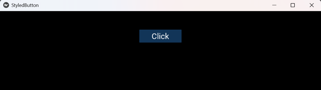 Styled Button
Explanation:
- Widget(): a blank container that lets you place children at absolute pos.
- Window.width, Window.height: give screen/ window size for positioning.
- size_hint=(None,None) + size=(w,h): disable automatic sizing and set exact button size.
- pos=(x,y): absolute position of the button inside the Widget.
- background_color=(r,g,b,a): tints the button background (works with default background image; to force a flat color you can set background_normal='').
- font_size='20sp': sets the size of the button text.
- add_widget(): places the button inside the root container.
You can attach callback functions to buttons that run when a user clicks or releases them. This lets your app respond instantly to user input like updating text, changing colors or running logic.
Example: This code updates a label and prints when the button is pressed.
Python
from kivy.app import App
from kivy.uix.widget import Widget
from kivy.uix.button import Button
from kivy.uix.label import Label
from kivy.core.window import Window

class CallbackApp(App):
    def build(self):
        root = Widget()
        cx = Window.width / 2
        lbl = Label(text='Waiting...', pos=(cx - 60, Window.height - 80), color=(0,0,0,1))
        b = Button(text='Press', size_hint=(None,None), size=(120,40), pos=(cx - 60, Window.height - 140))
        def on_press(inst):
            lbl.text = 'Pressed'
            print('Button pressed')
        b.bind(on_press=on_press)
        root.add_widget(lbl); root.add_widget(b)
        return root

if __name__ == '__main__':
    CallbackApp().run()
Output
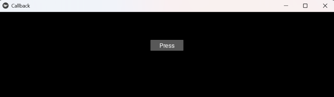 Callback
Explanation:
- Label(text=...): shows a short message on screen.
- def on_press(inst): a callback function that receives the button instance as argument.
- b.bind(on_press=on_press): registers the function to be called when the button is pressed.
- lbl.text: programmatically change widget properties inside the callback.
Note: Use on_release instead of on_press if you want the action to happen only after the user lifts the finger/mouse (commonly used for actions that should be cancellable by moving away).
Toggle-like Behavior
You can simulate toggle functionality using buttons to alternate between two states (like ON/OFF). This is useful for settings or switches where the same button changes meaning after each click.
Example: This example toggles a label between ON and OFF each time the button is released.
Python
from kivy.app import App
from kivy.uix.widget import Widget
from kivy.uix.button import Button
from kivy.uix.label import Label
from kivy.core.window import Window

class ToggleApp(App):
    def build(self):
        root = Widget()
        cx = Window.width / 2
        lbl = Label(text='OFF', pos=(cx - 30, Window.height - 80), color=(0,0,0,1))
        b = Button(text='Toggle', size_hint=(None,None), size=(120,40), pos=(cx - 60, Window.height - 140))
        state = {'on': False}
        def toggle(inst):
            state['on'] = not state['on']
            lbl.text = 'ON' if state['on'] else 'OFF'
        b.bind(on_release=toggle)
        root.add_widget(lbl); root.add_widget(b)
        return root

if __name__ == '__main__':
    ToggleApp().run()
Output
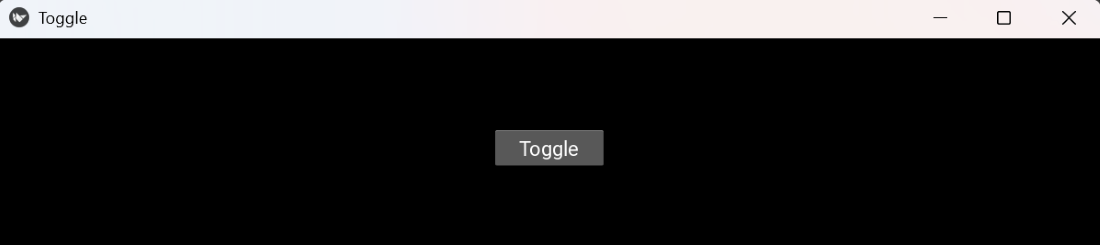 Toggle
Explanation:
- state = {'on': False}: use a mutable object (dict) to hold state inside nested function.
- toggle(inst): flips the boolean and updates lbl.text.
- b.bind(on_release=toggle): registers toggle to run when button is released.
Explore
Python Fundamentals
Python Data Structures
Advanced Python
Data Science with Python
Web Development with Python
Python Practice