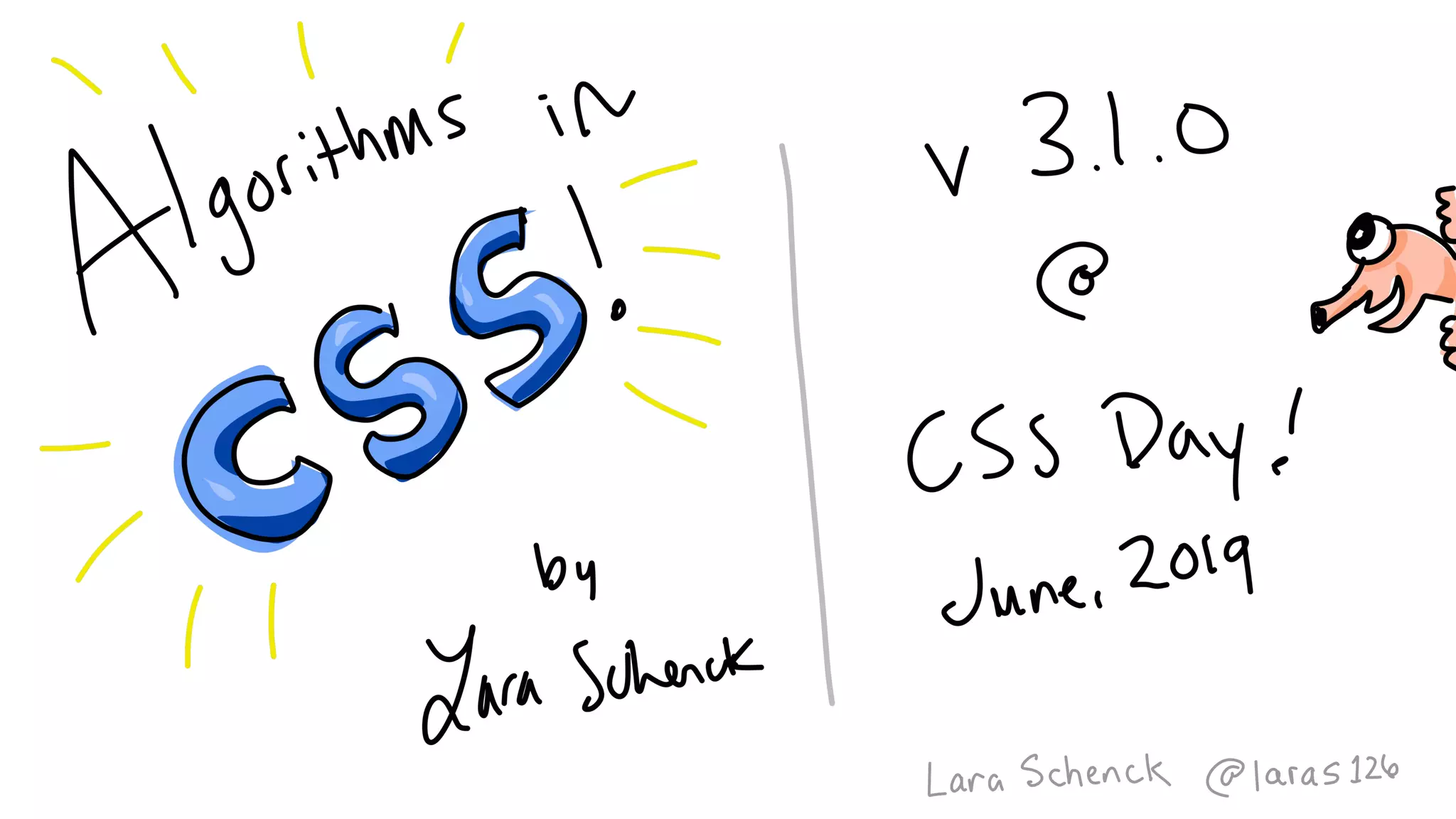
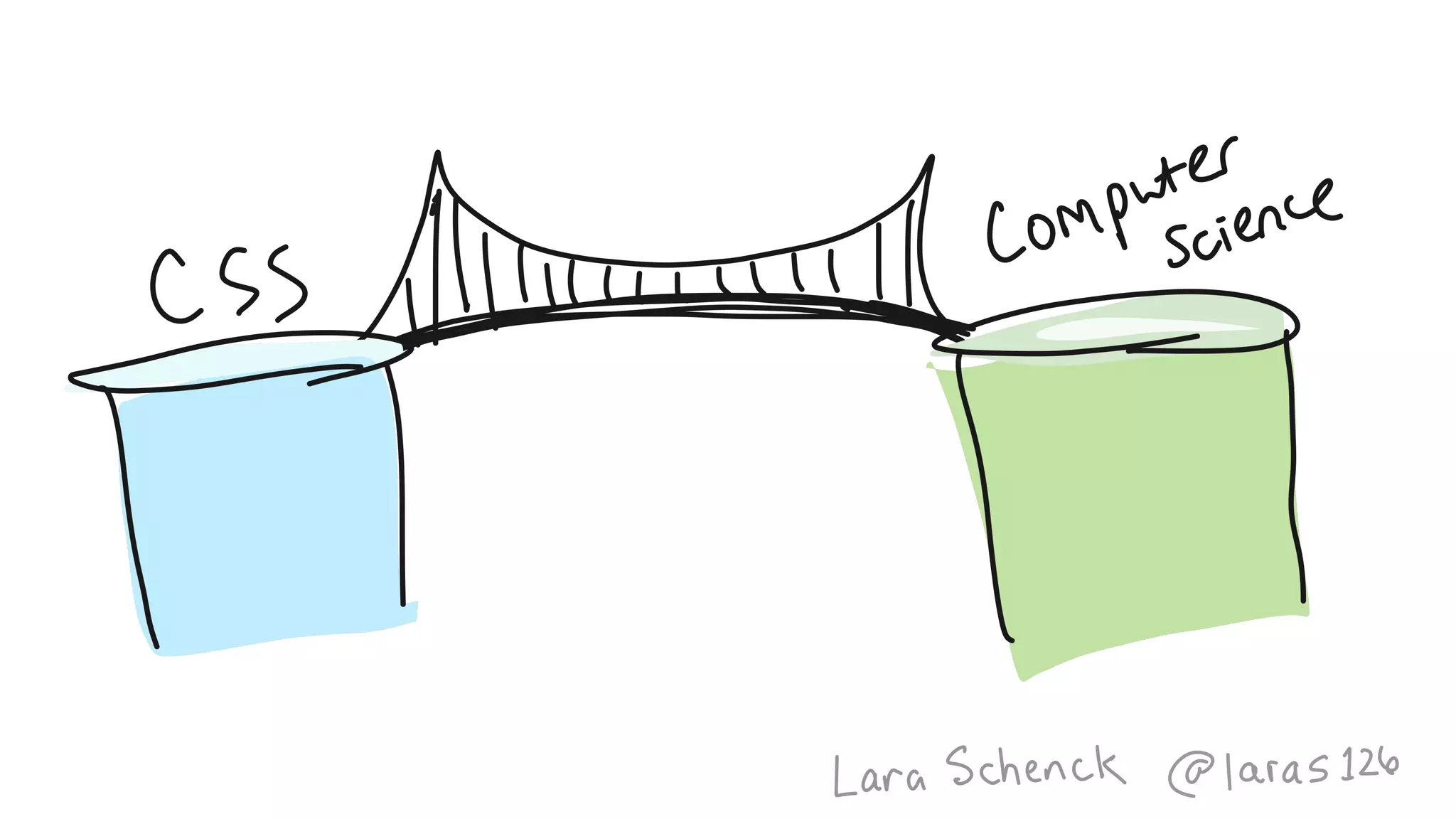
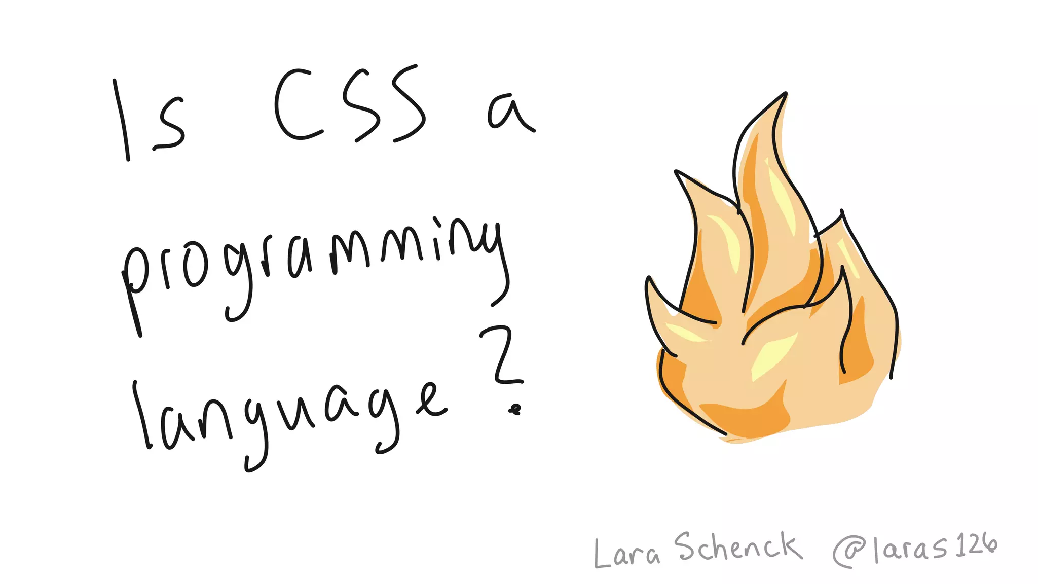
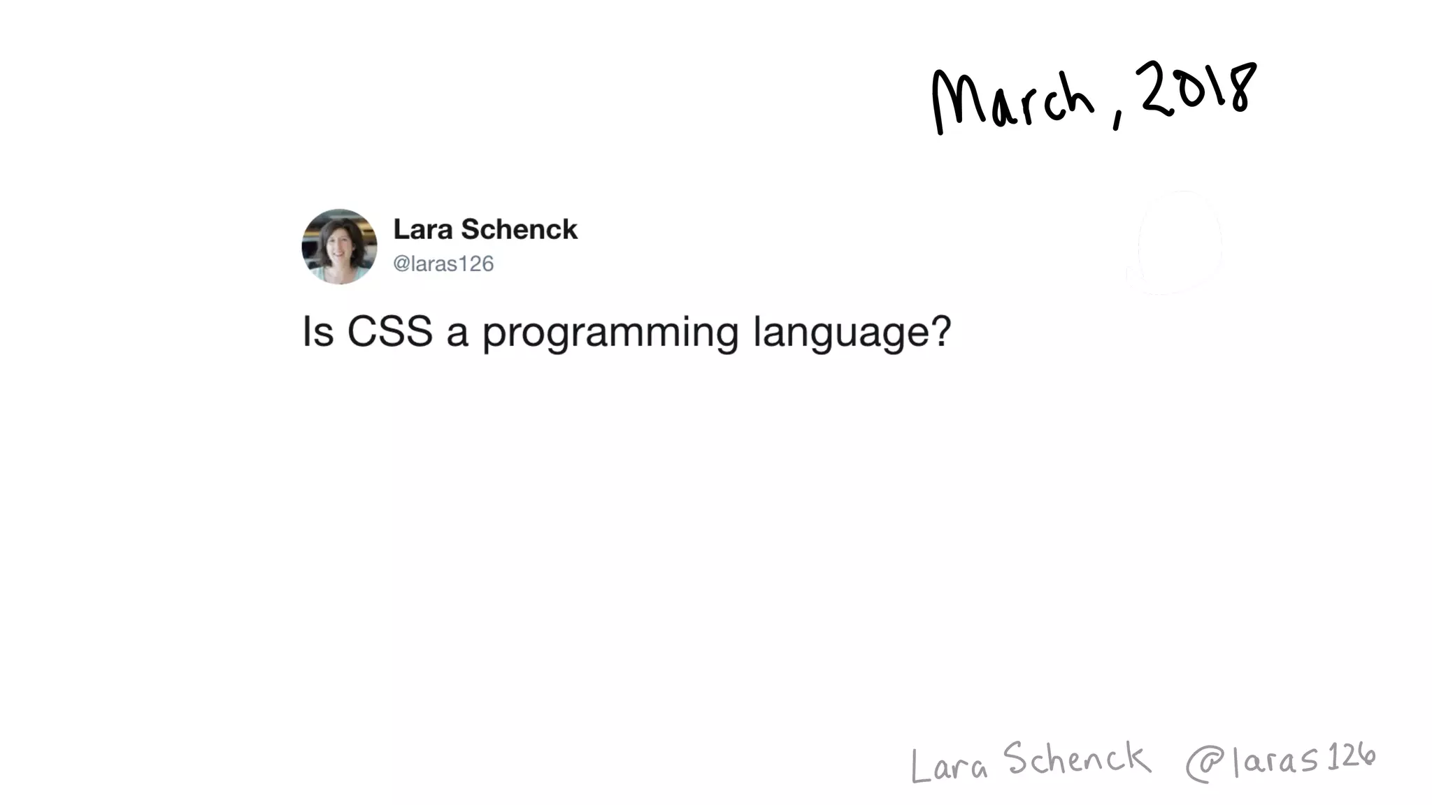
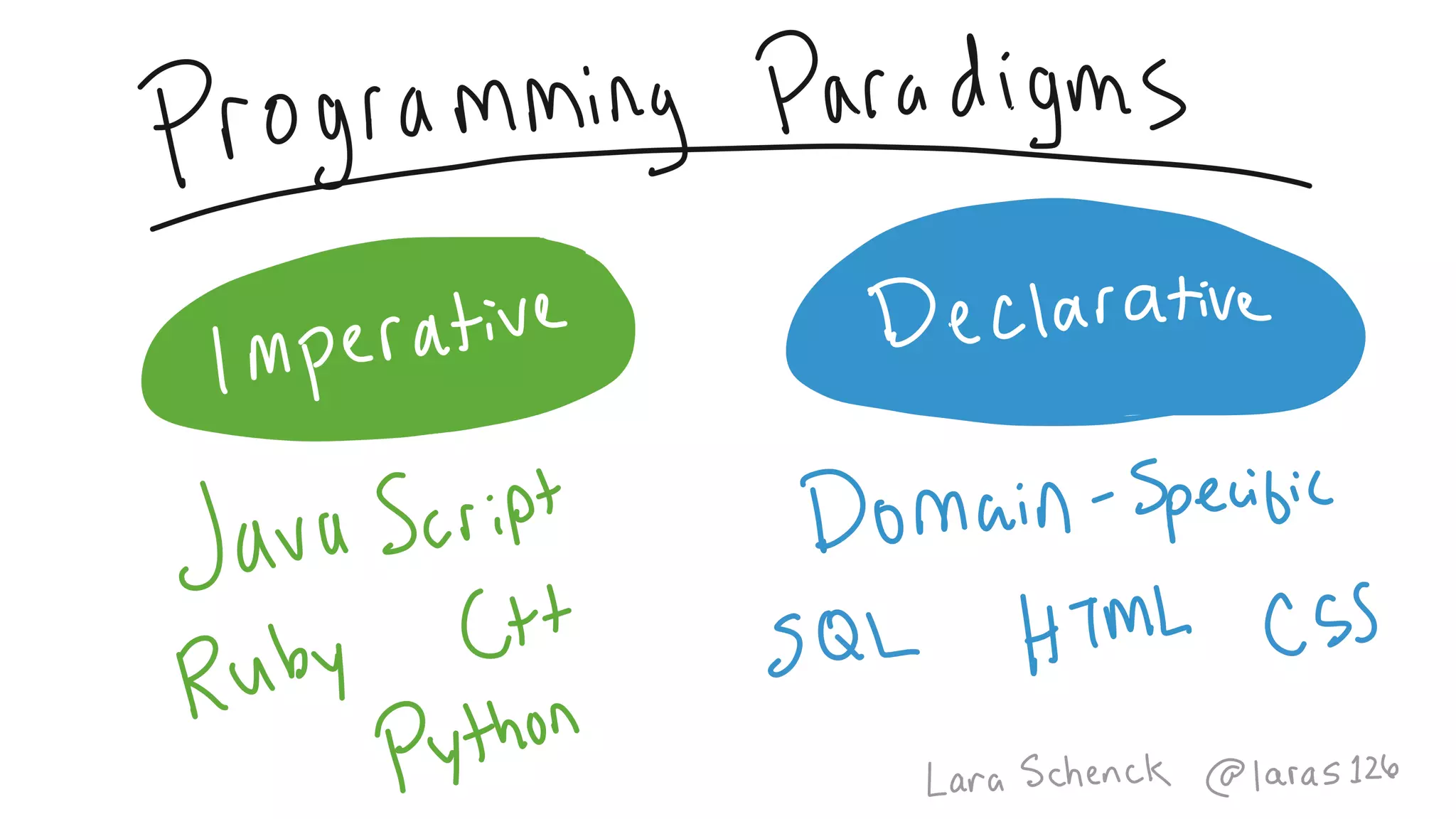
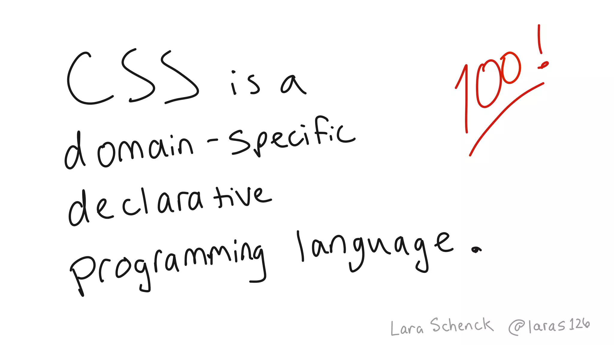
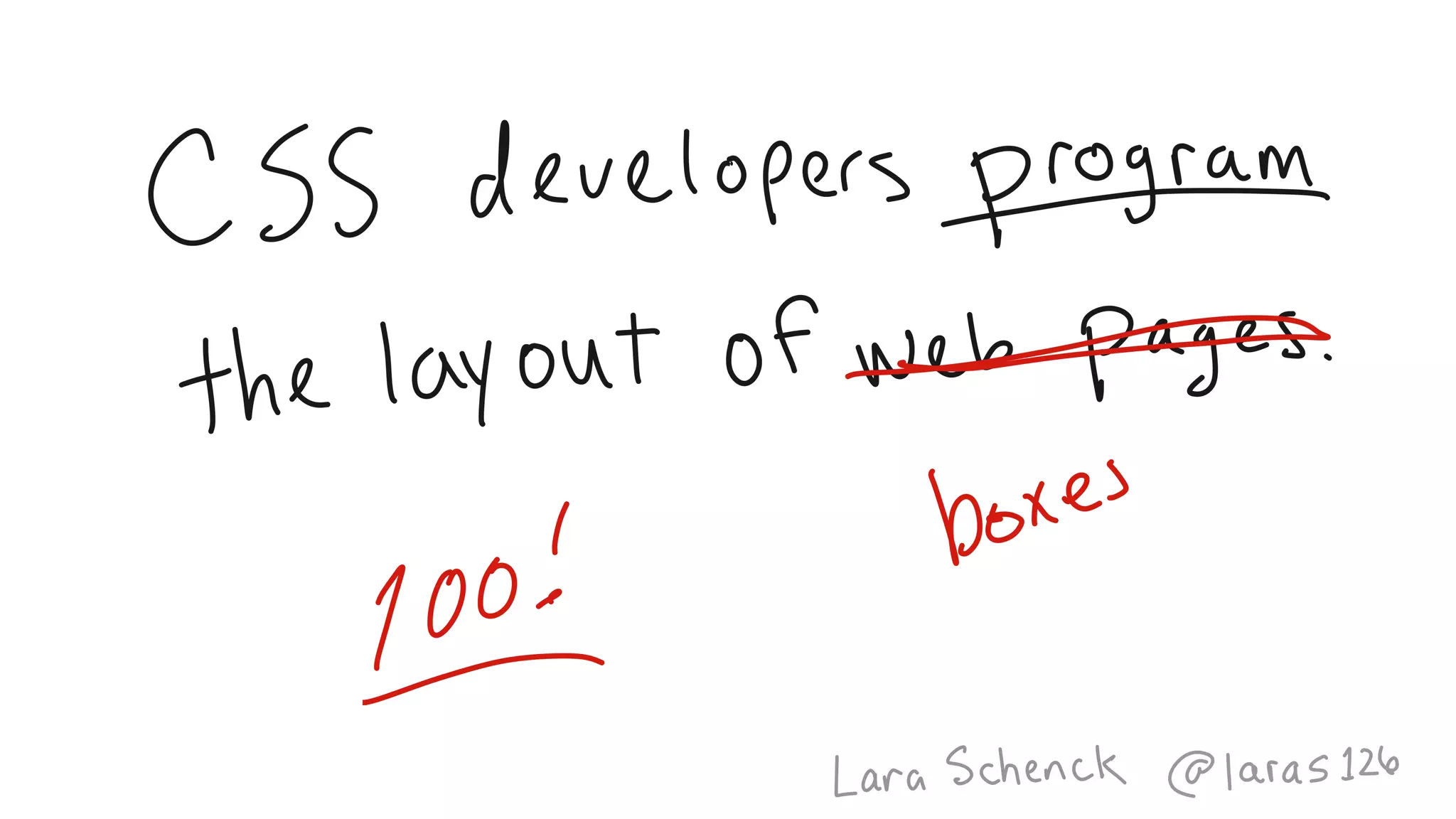
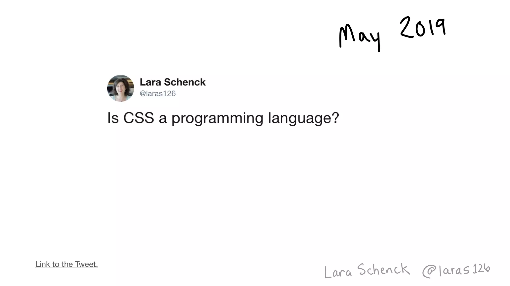
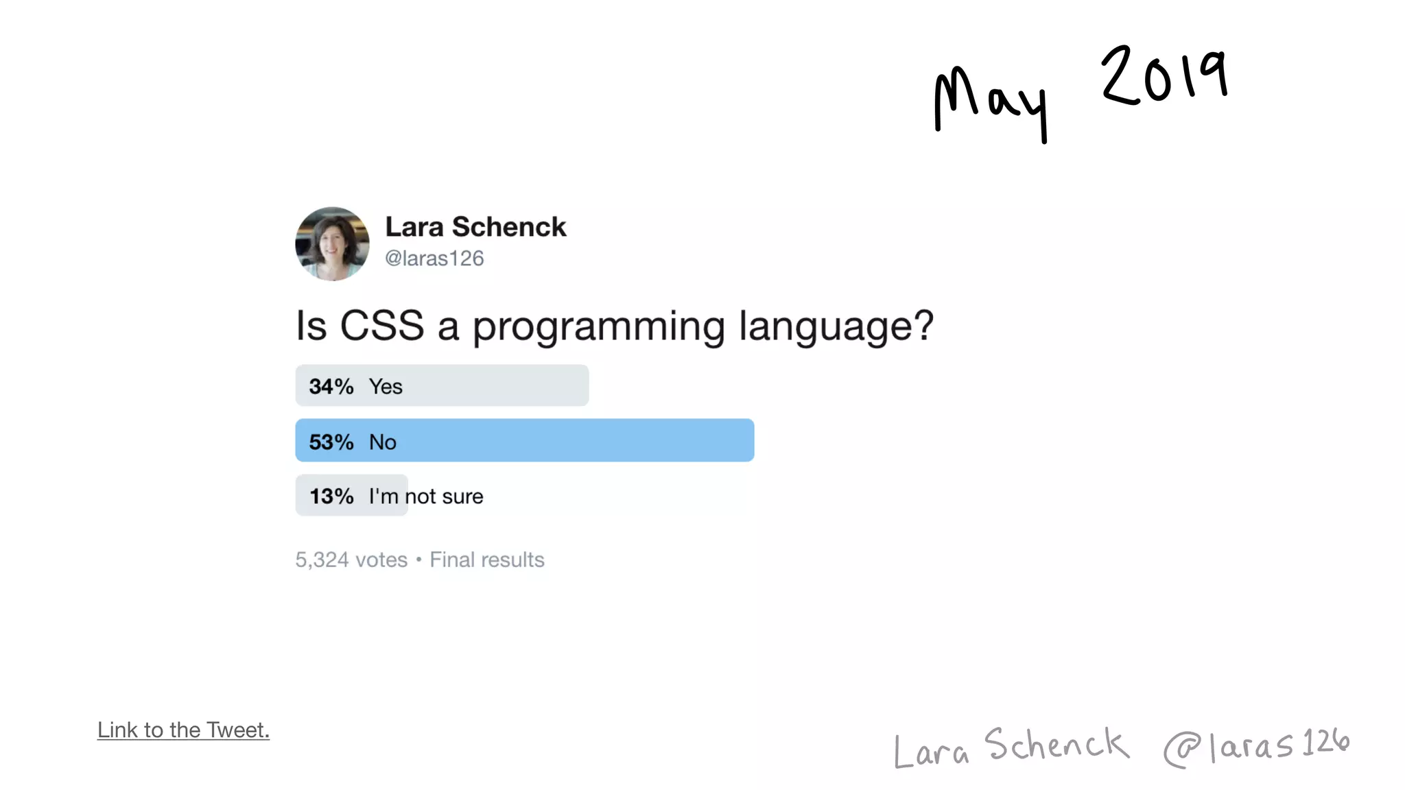
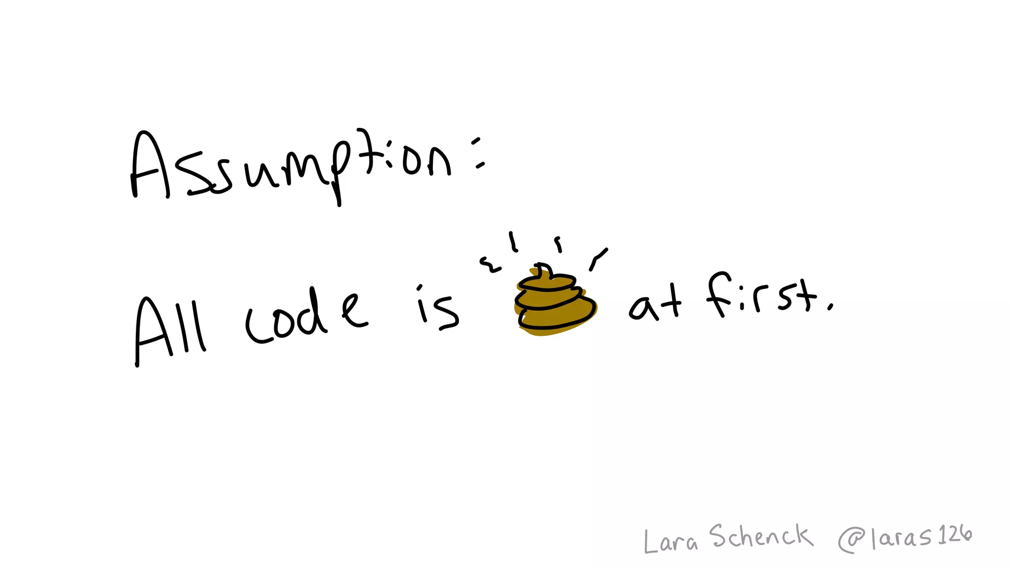
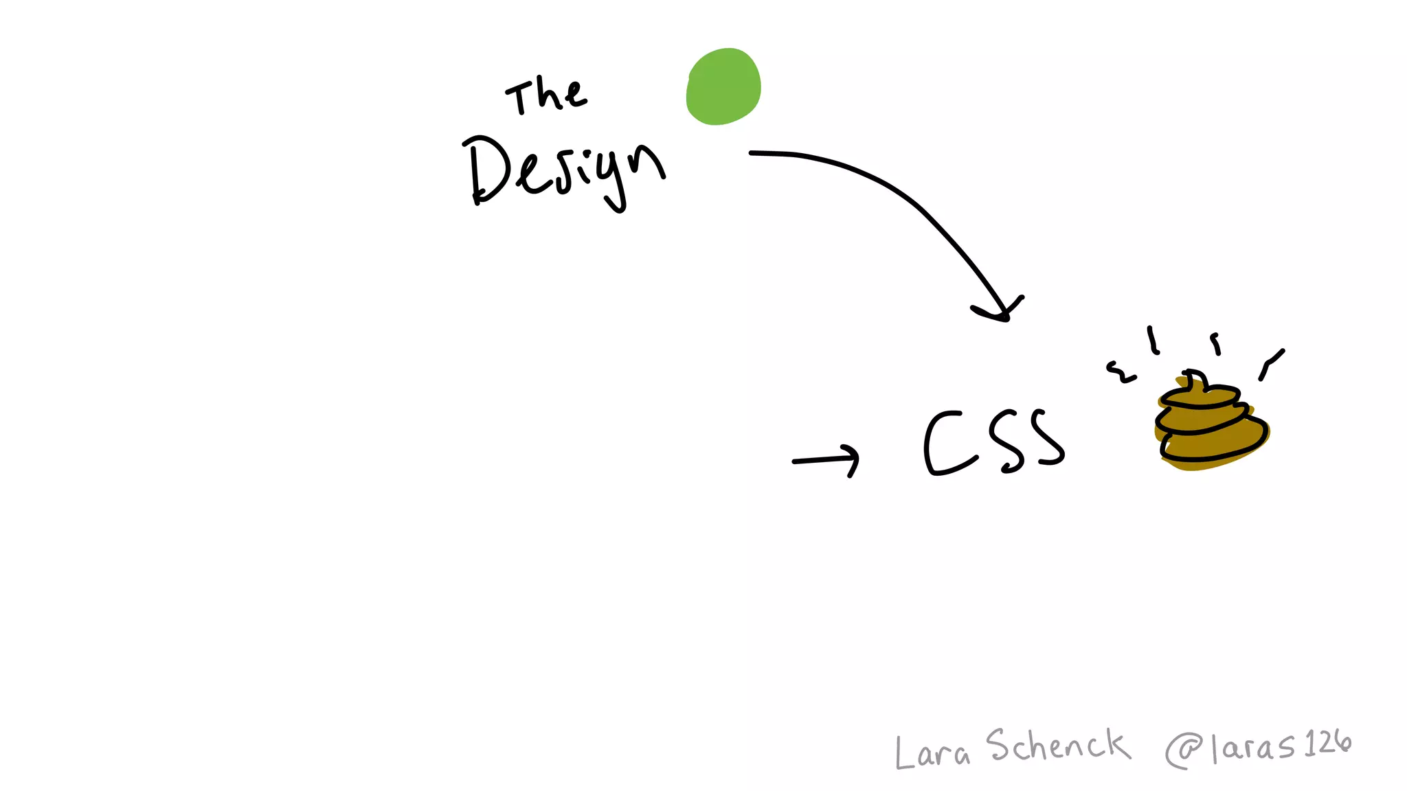
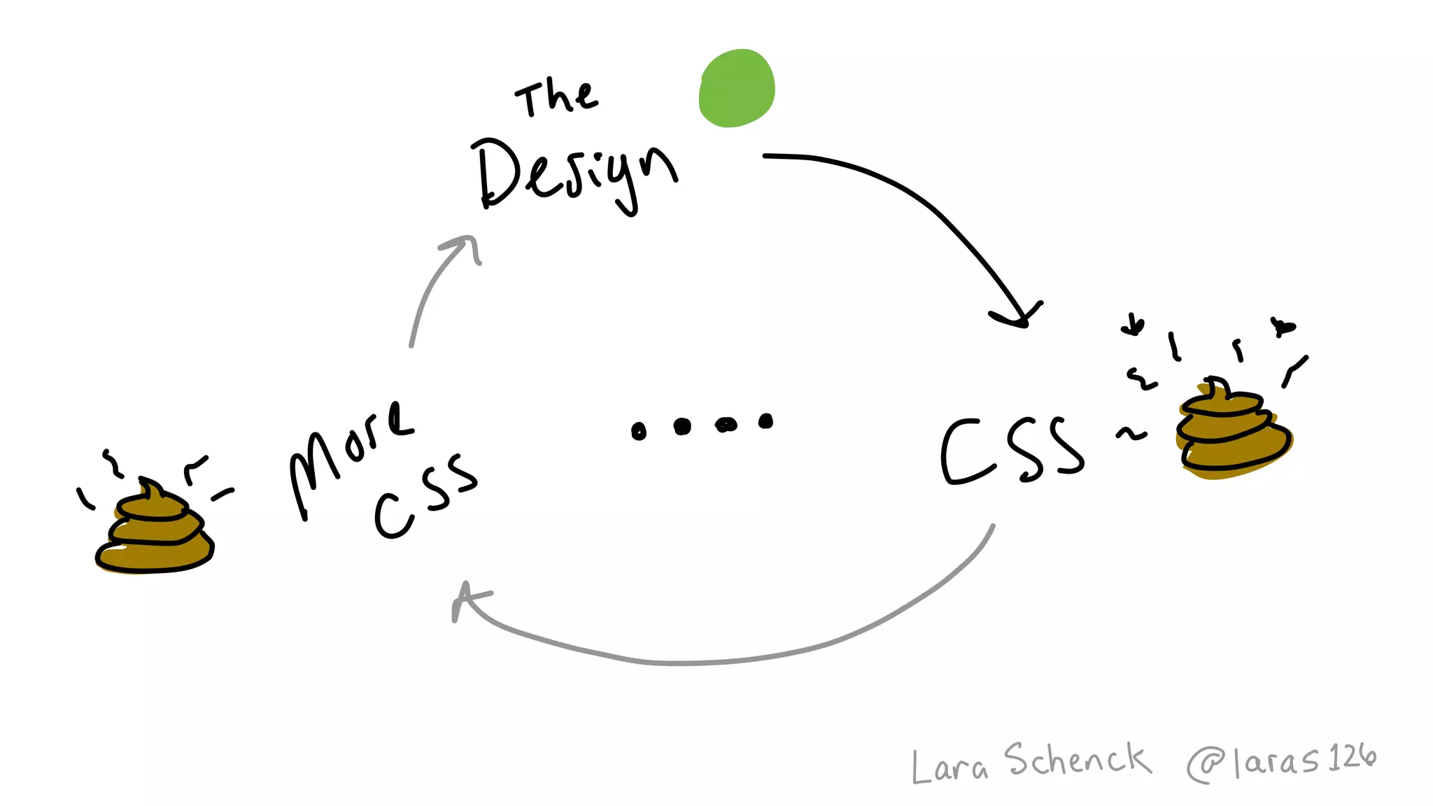
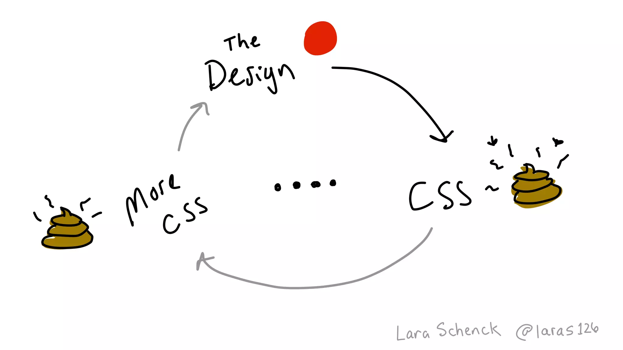
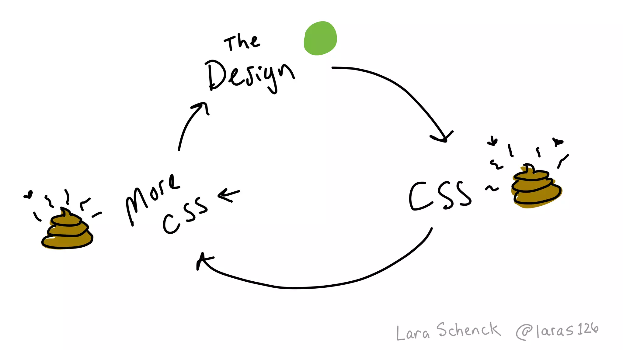
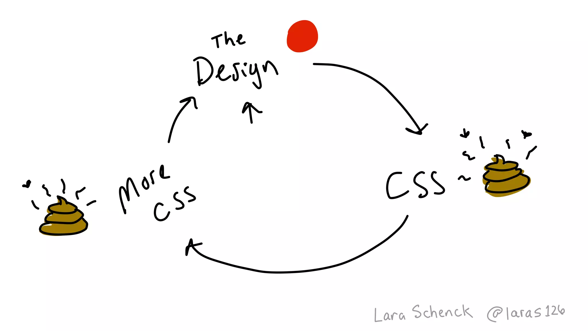
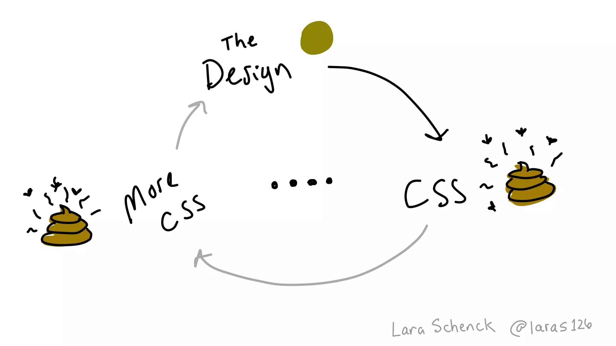
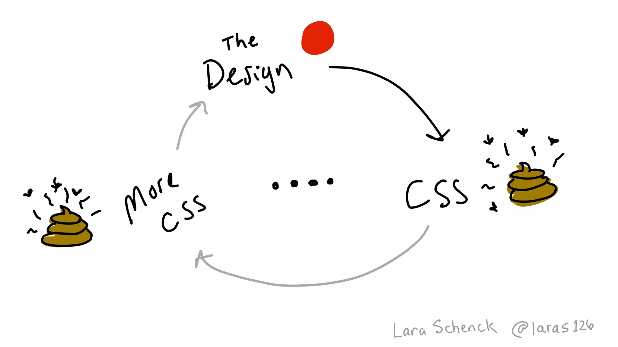
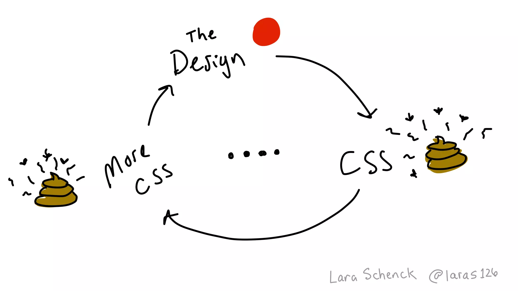
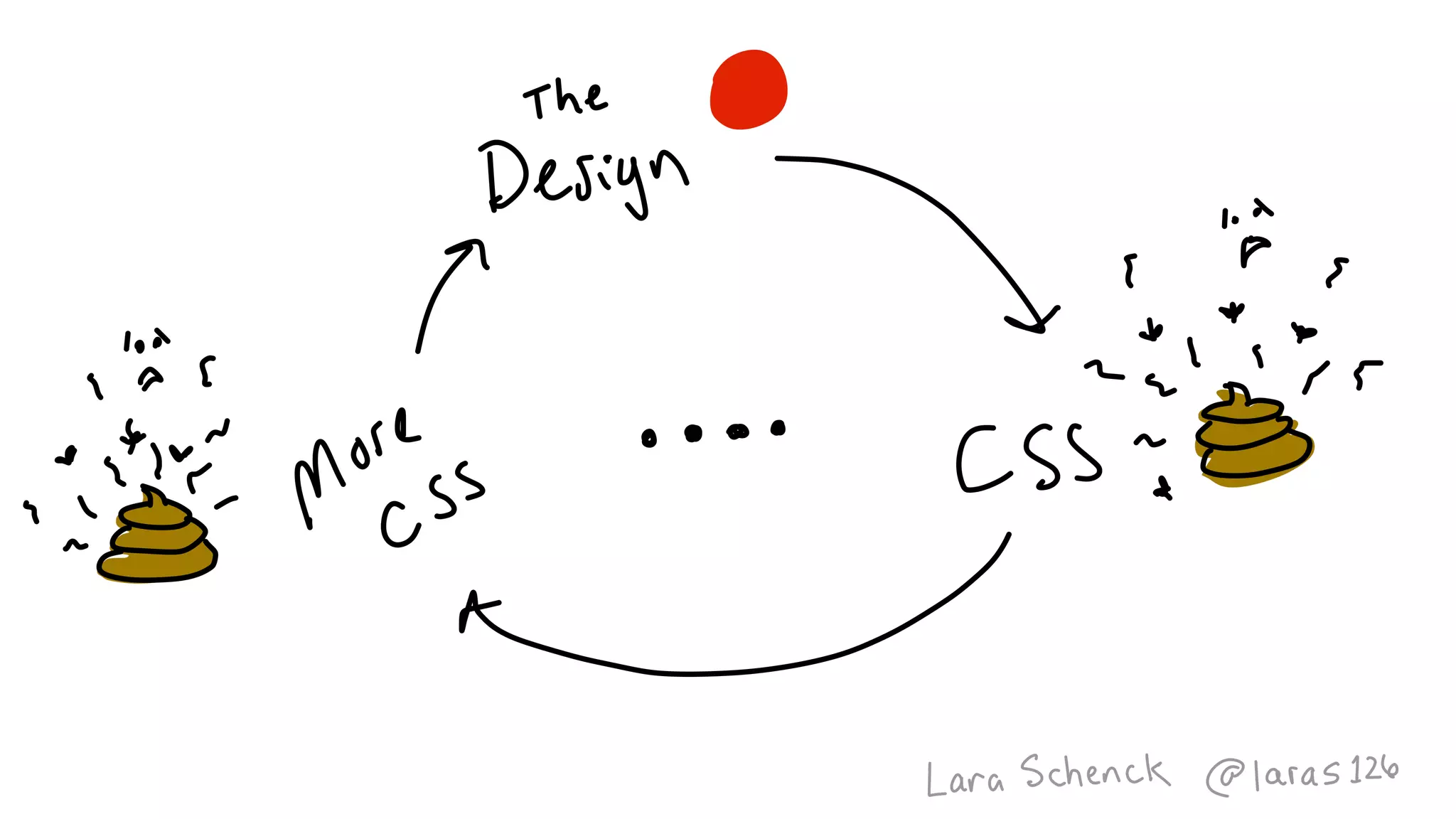
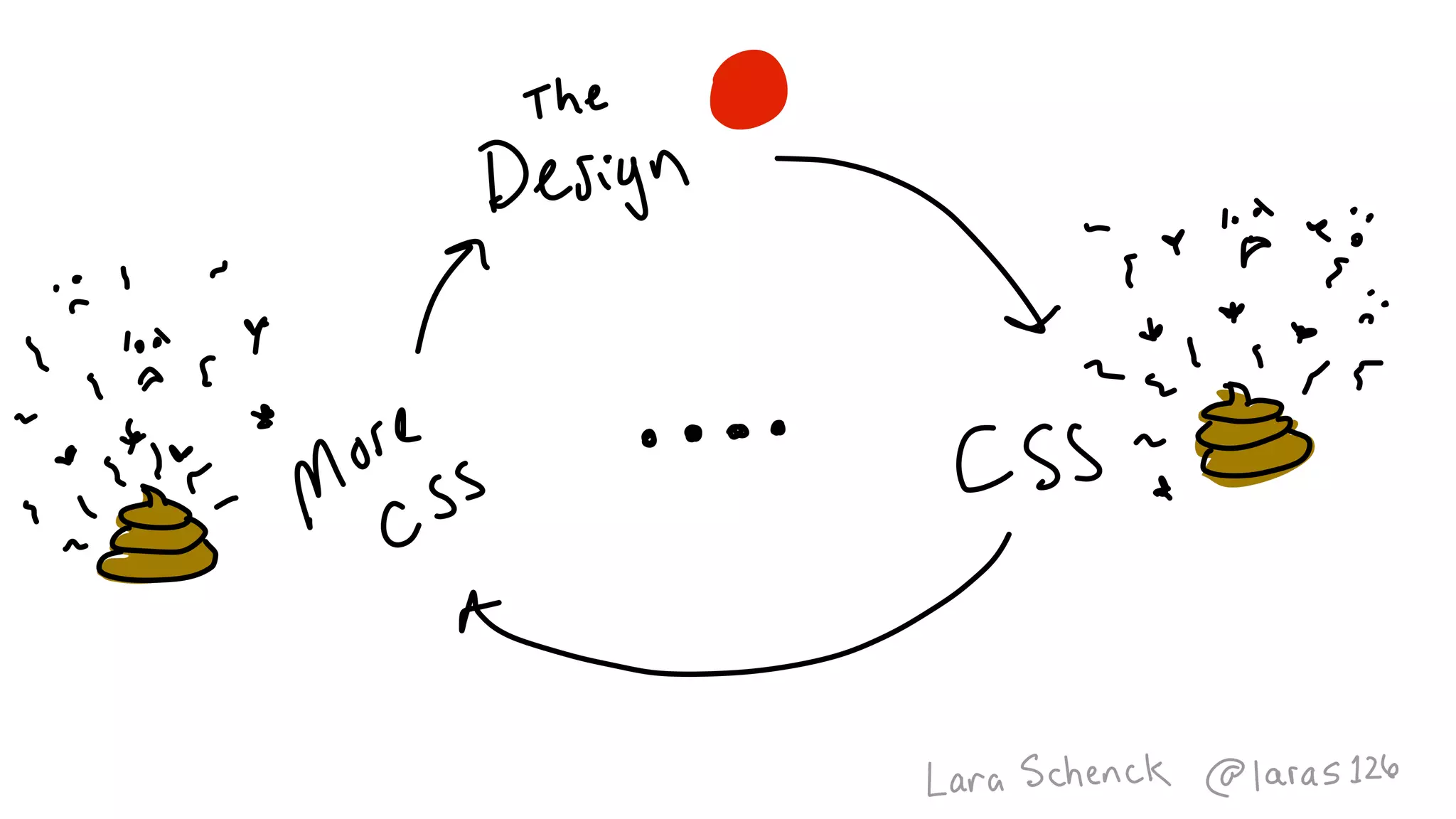
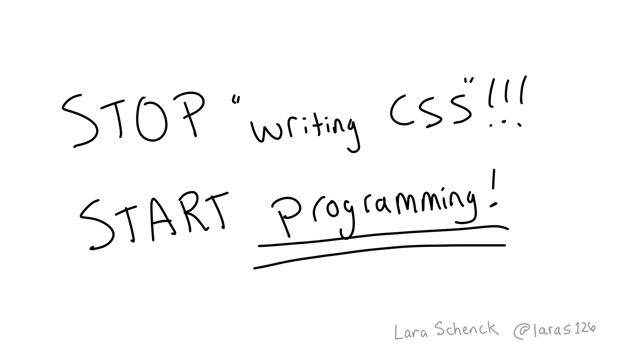
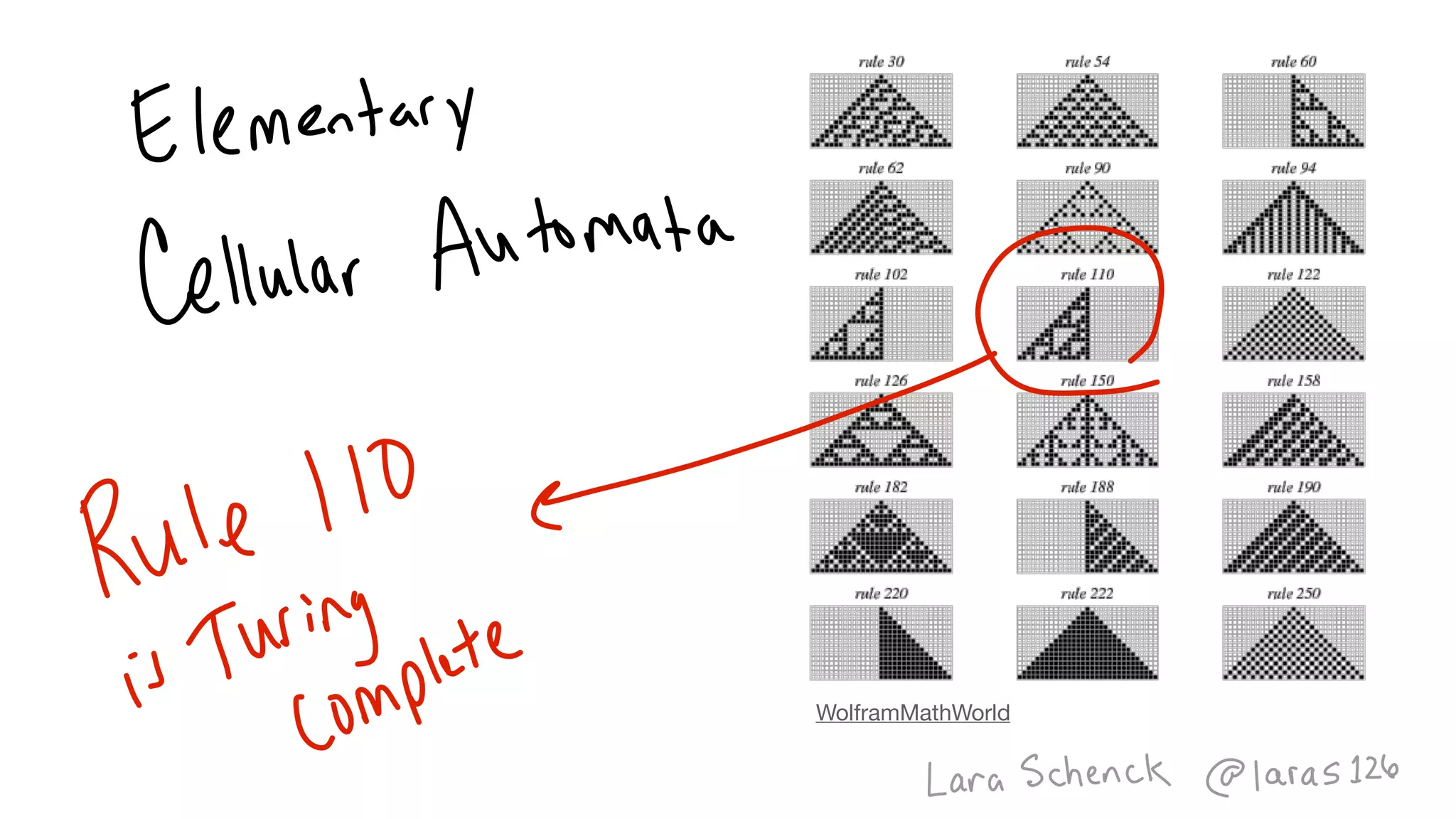
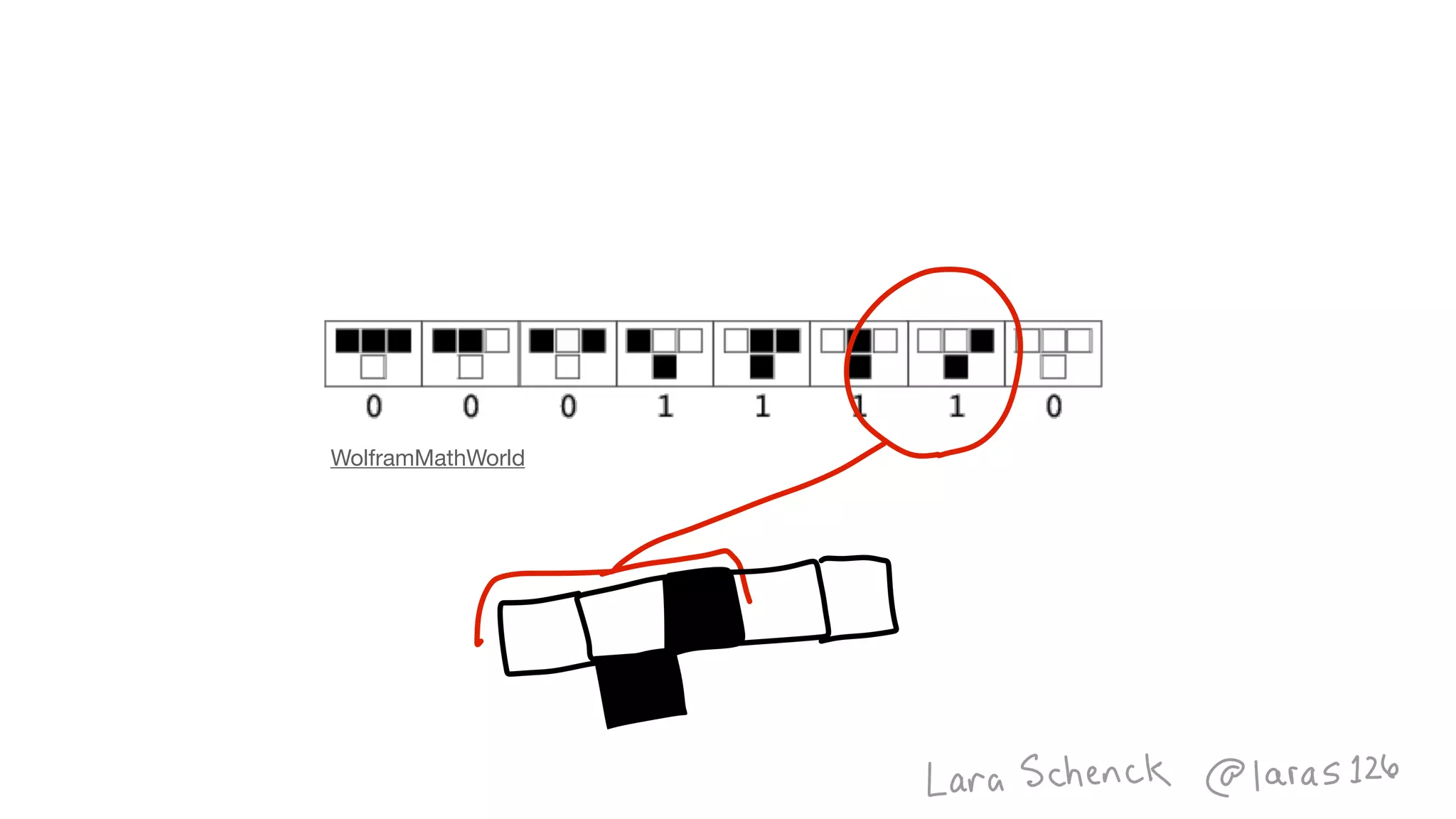
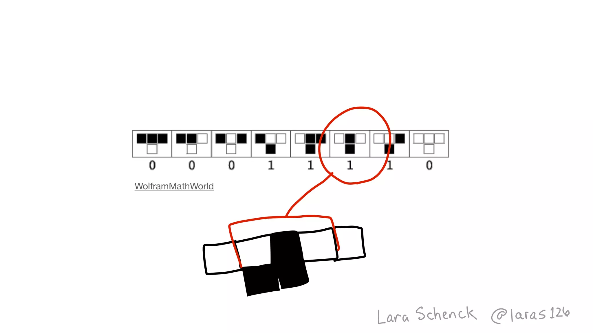
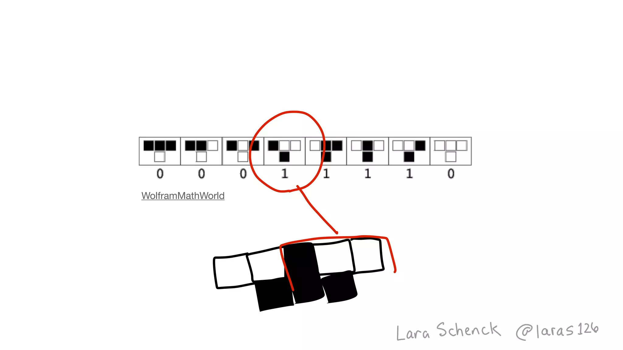
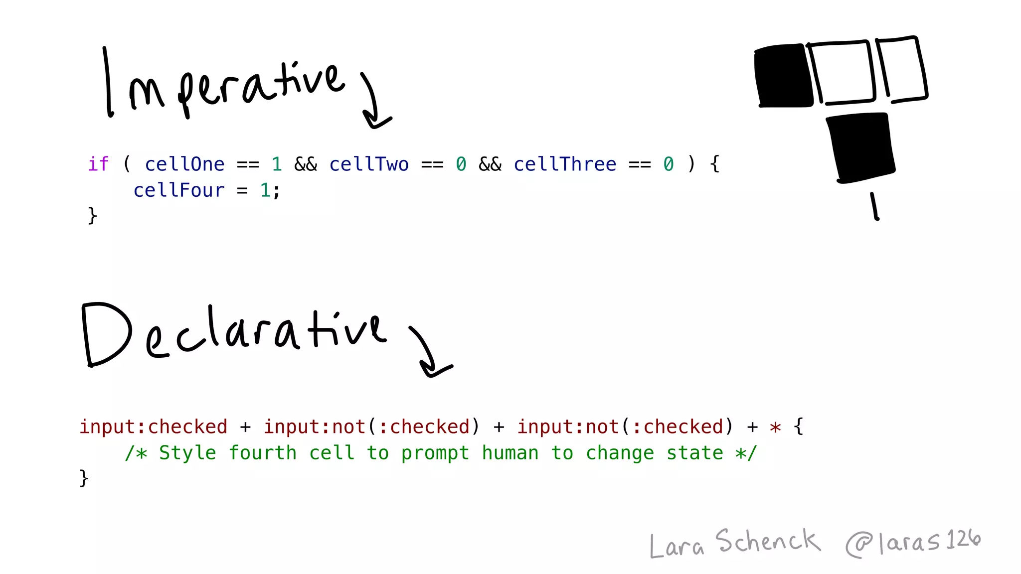
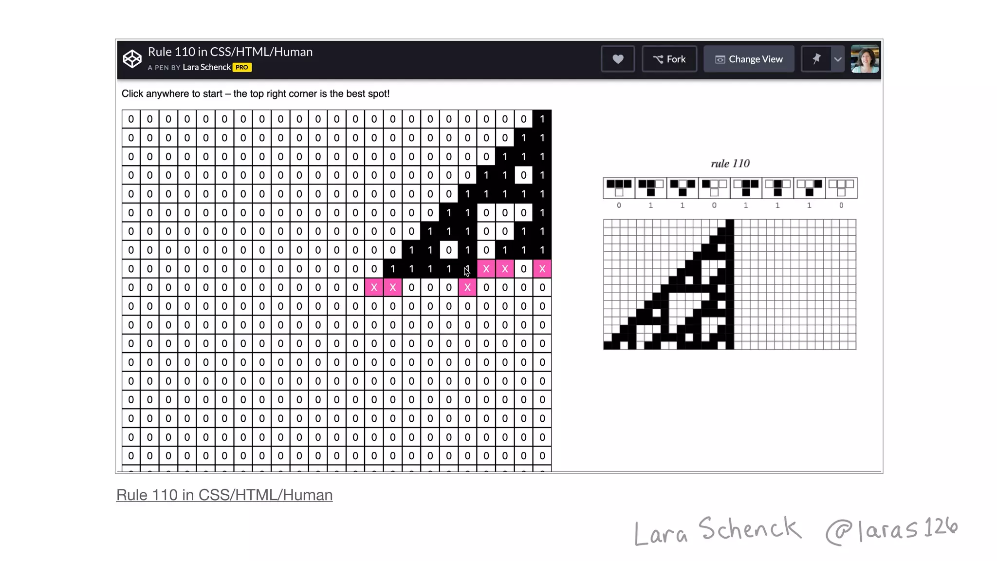
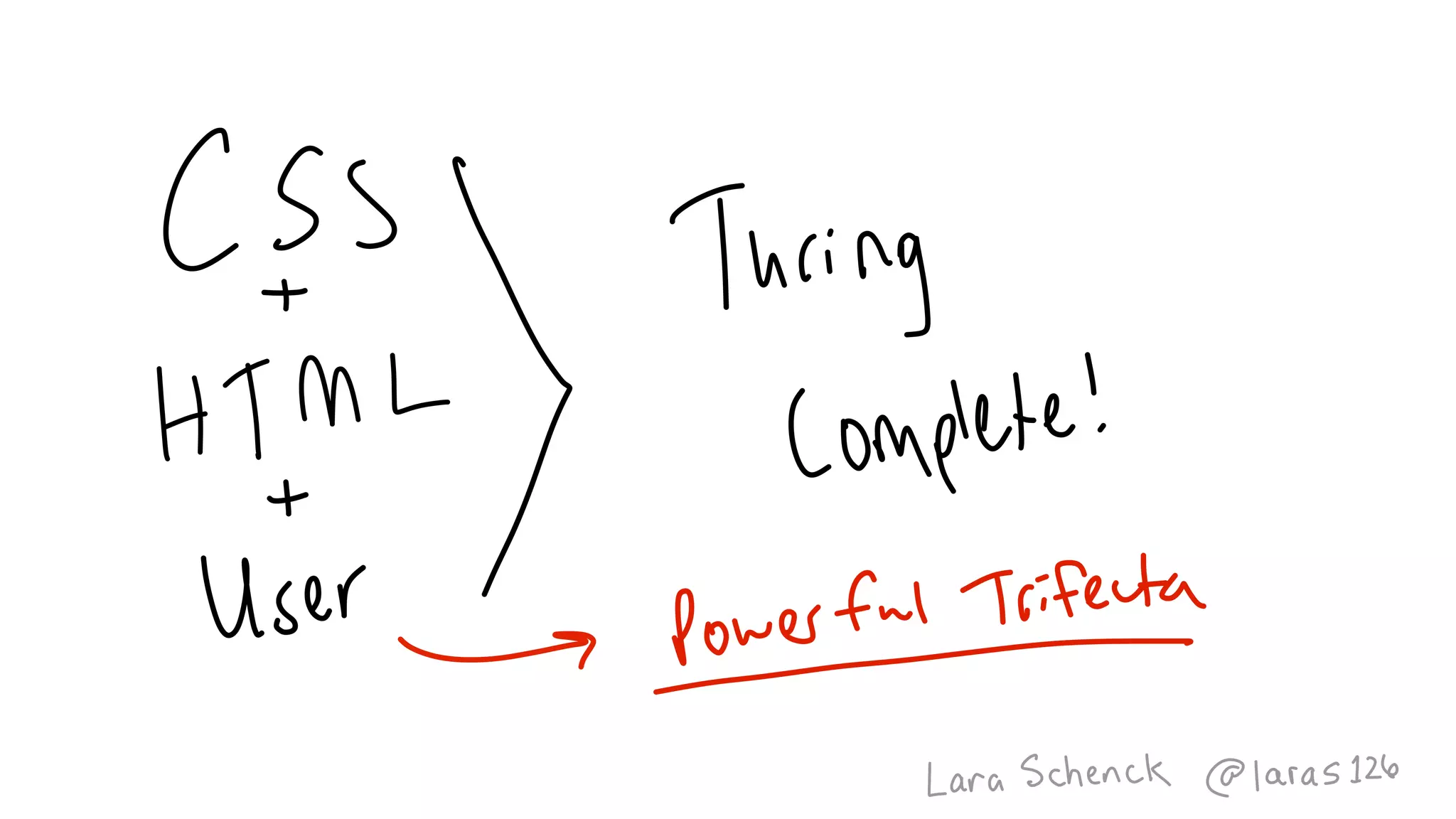
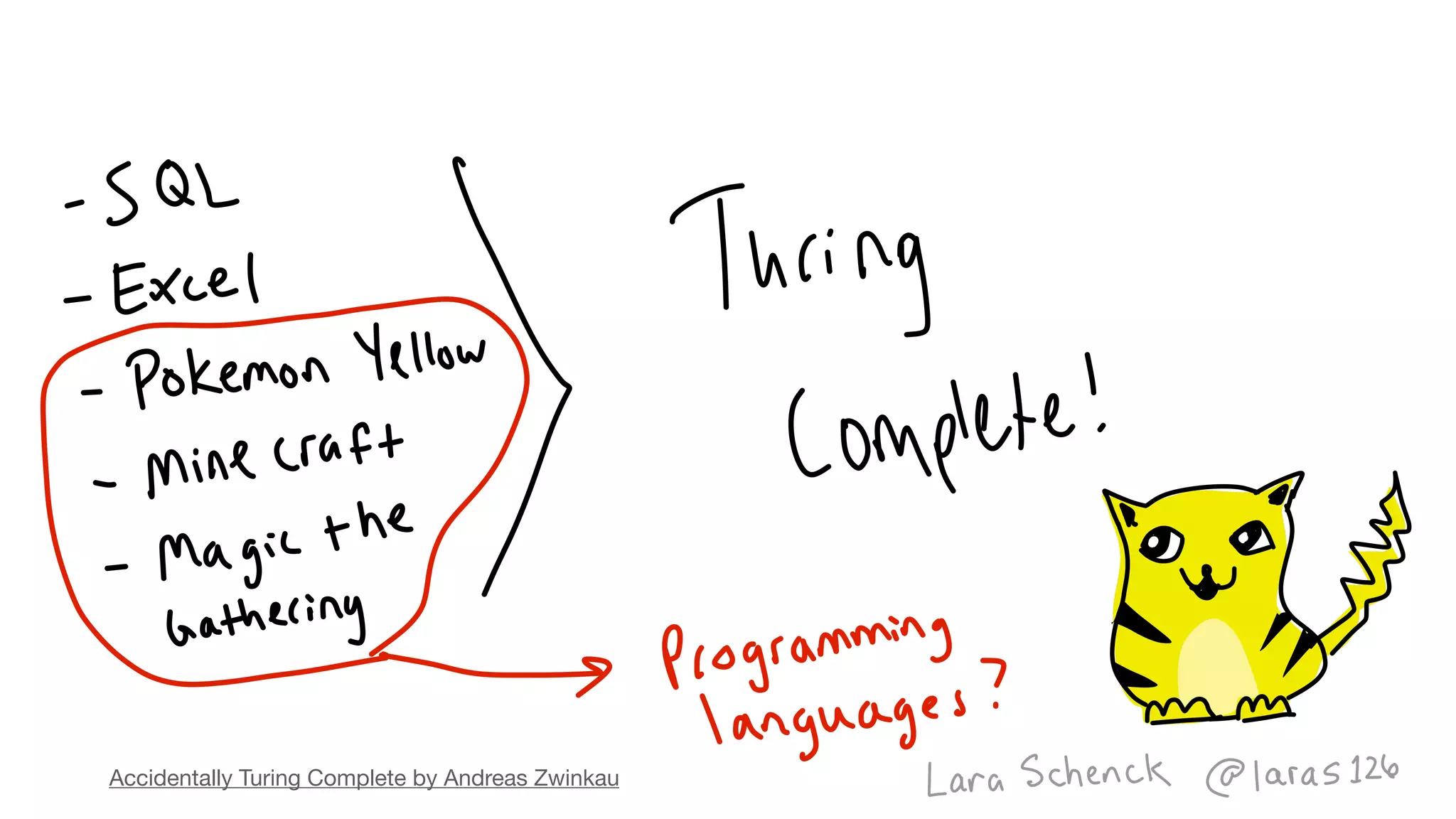
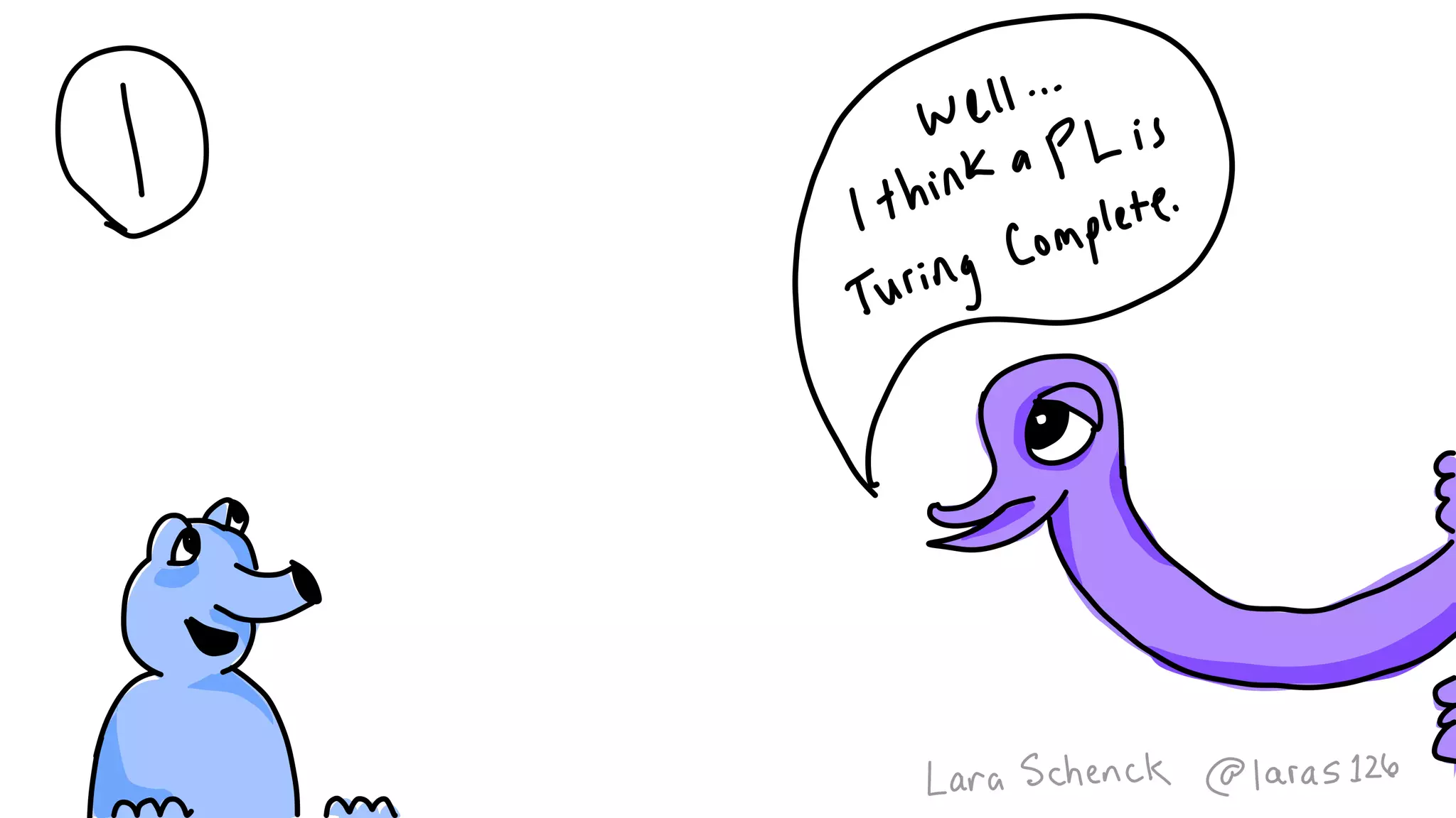
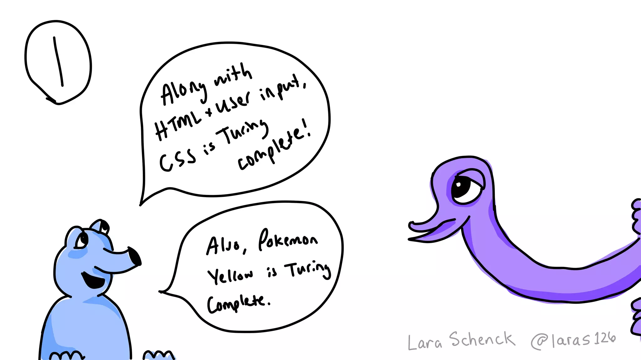
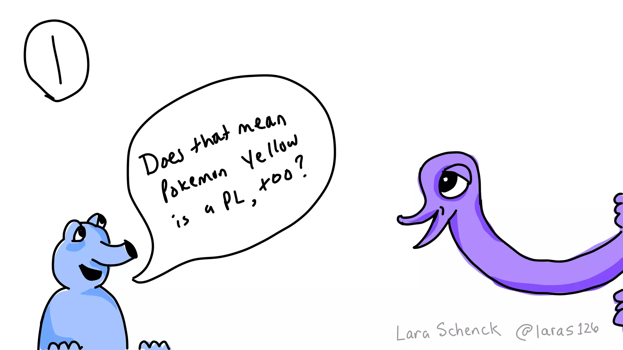
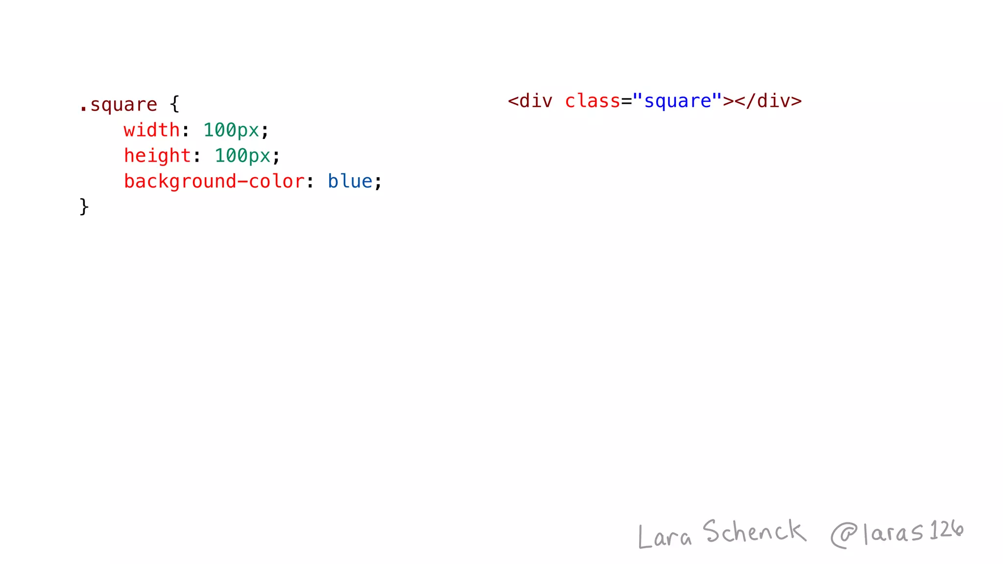
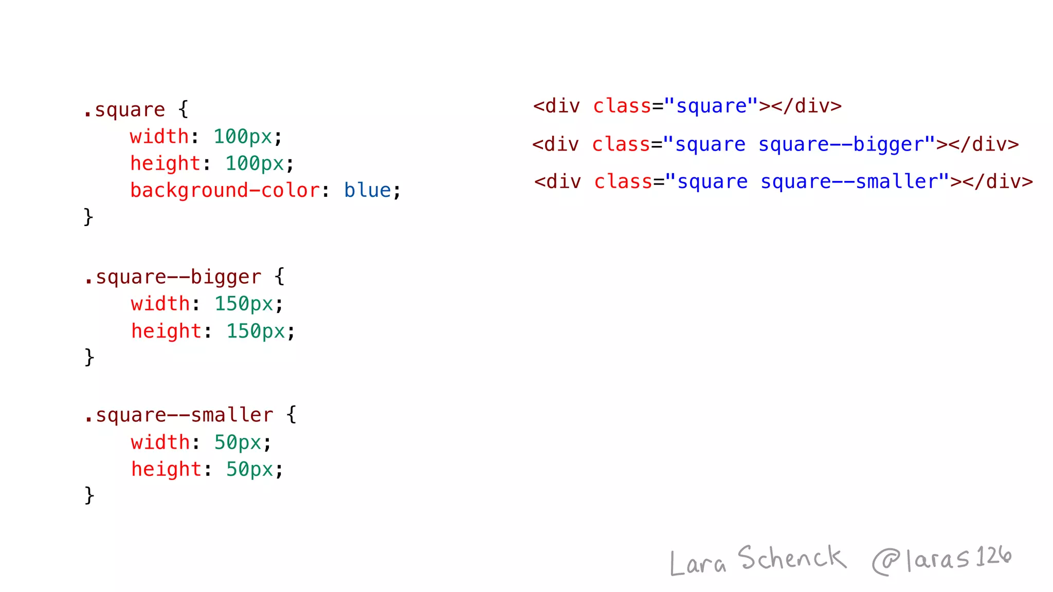
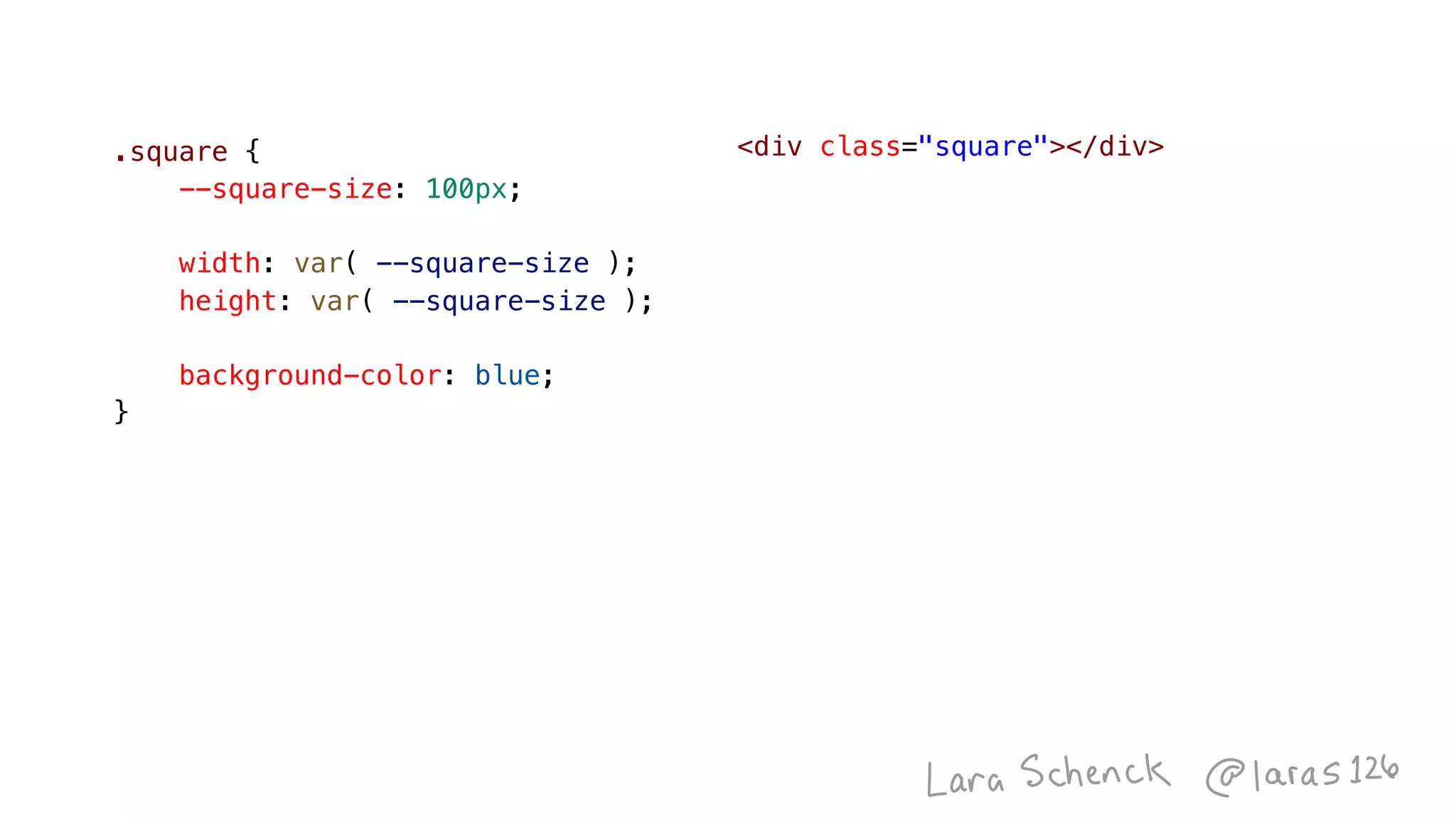
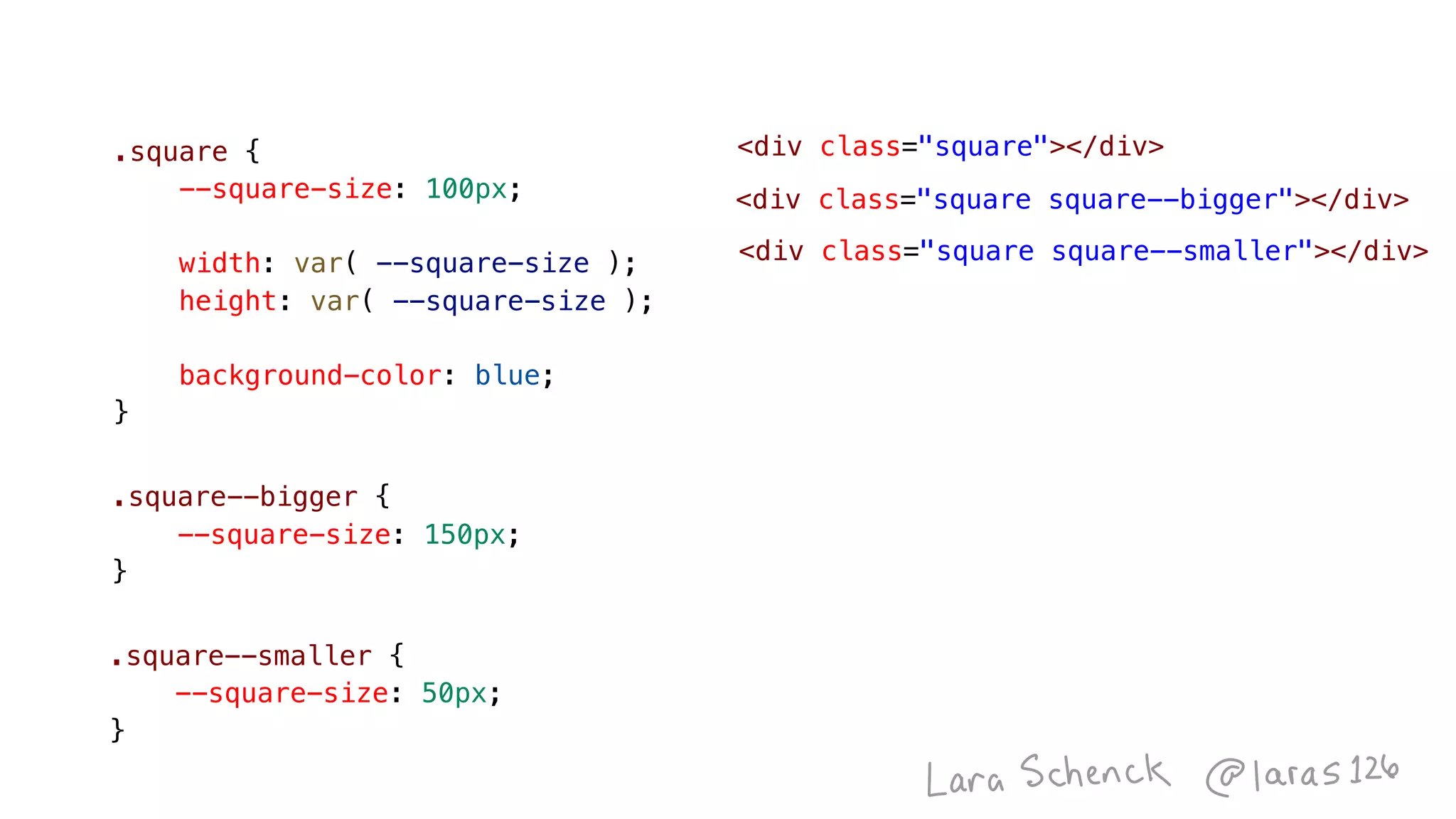
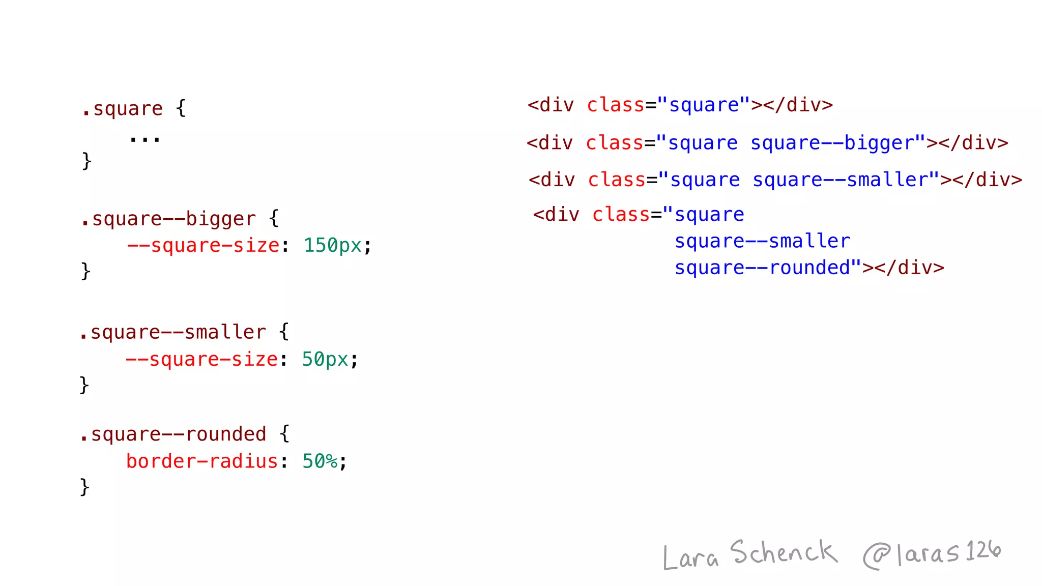
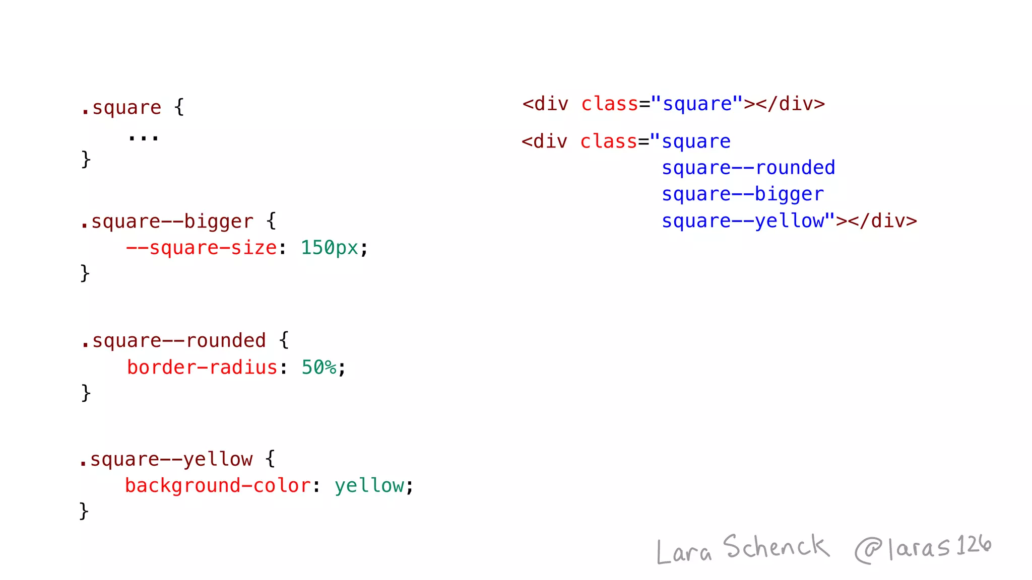
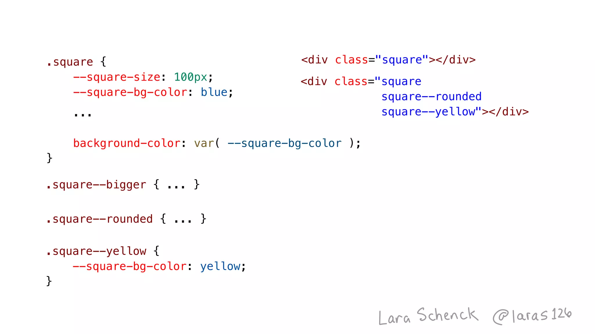
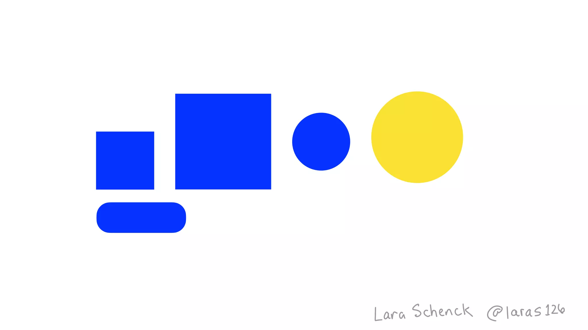
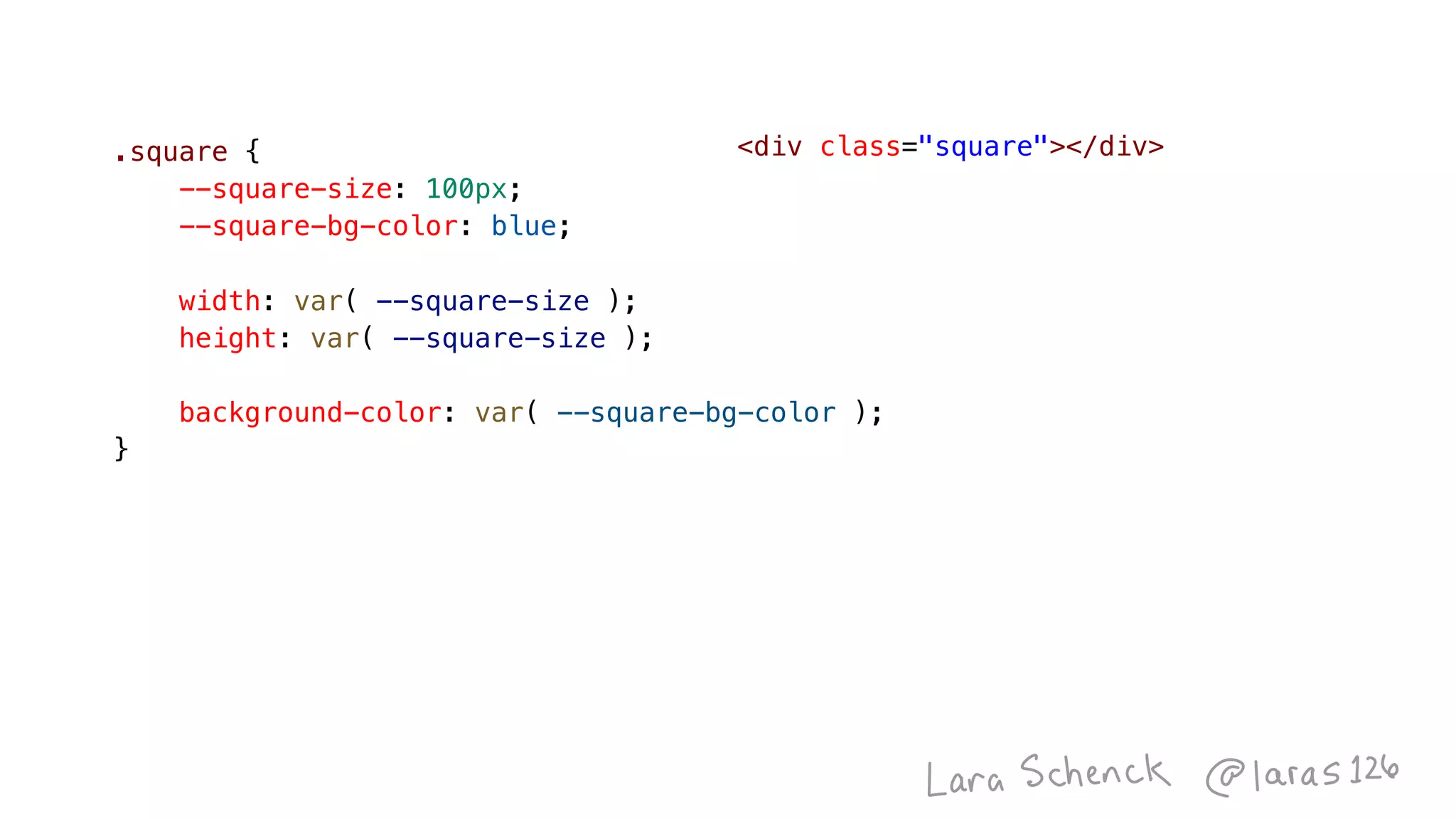
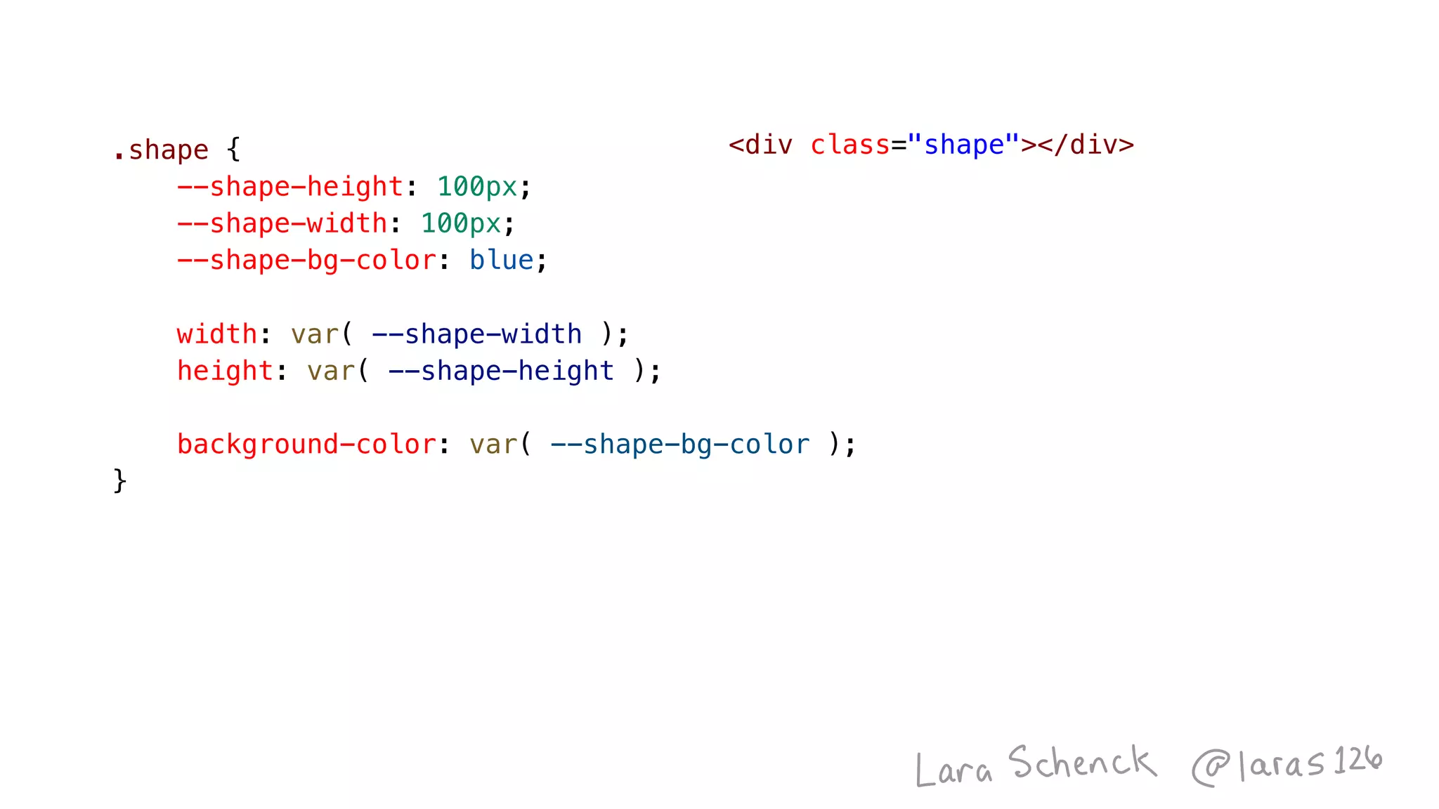
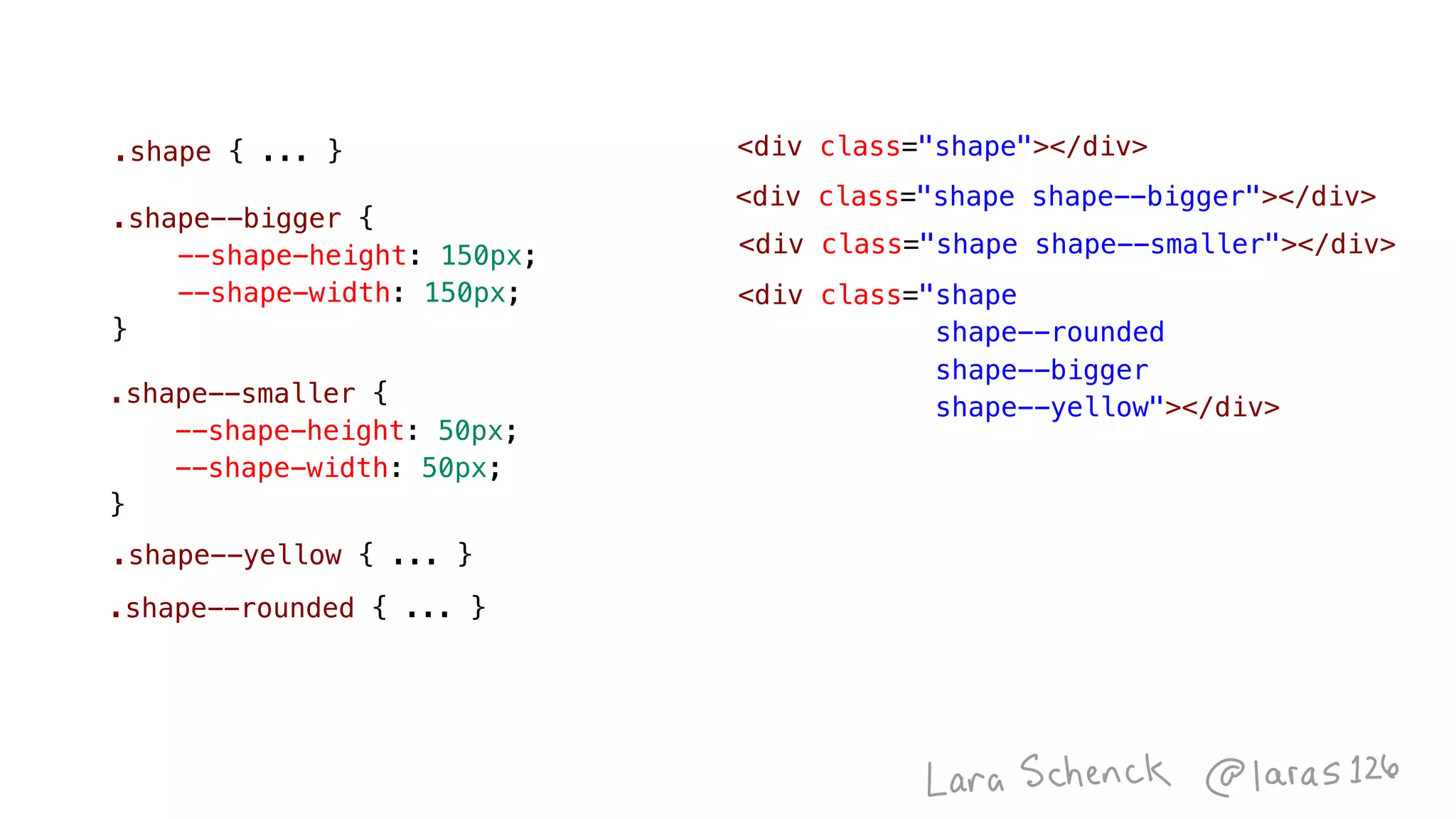
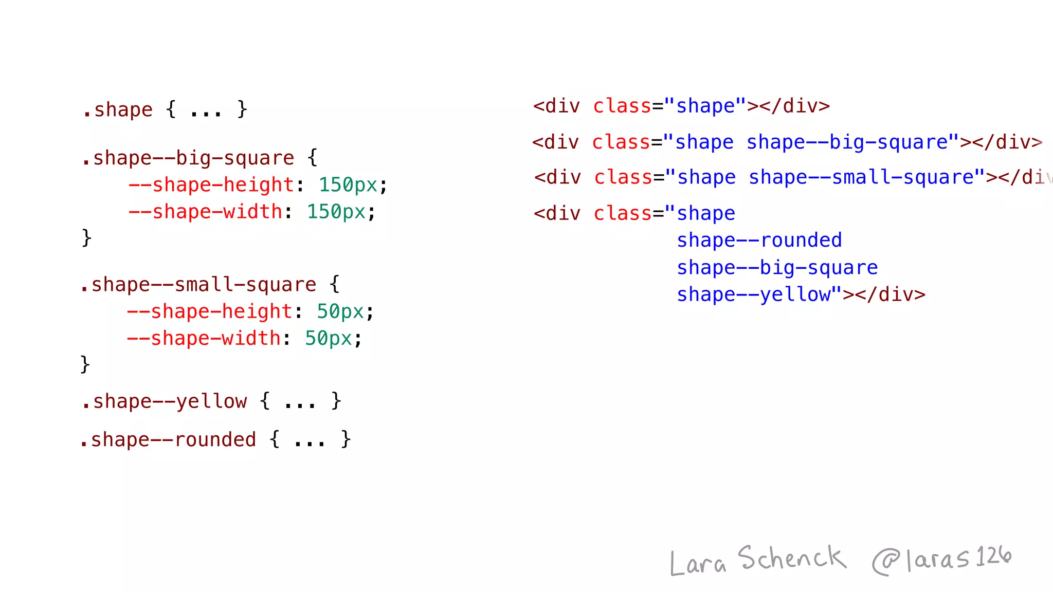
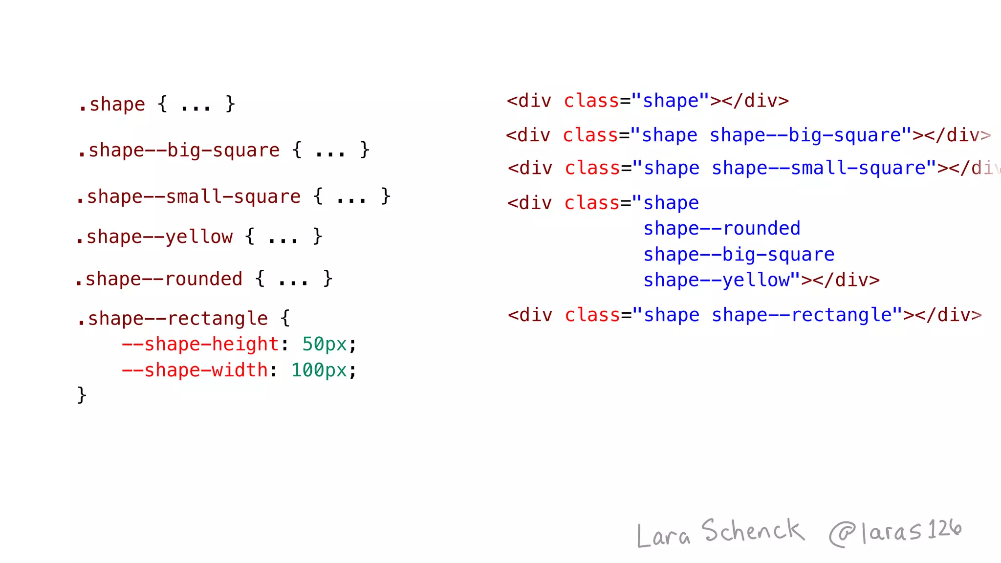
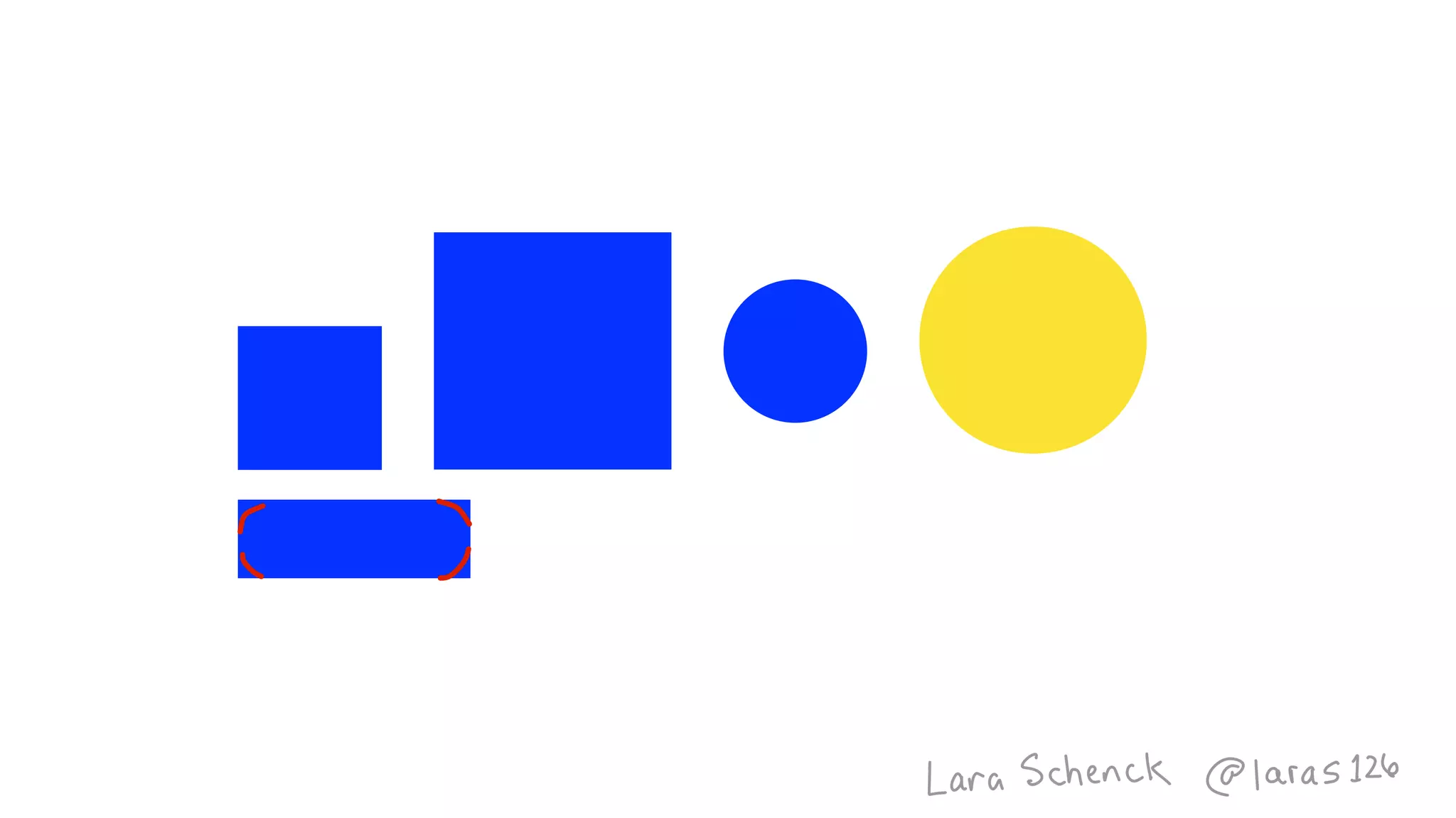
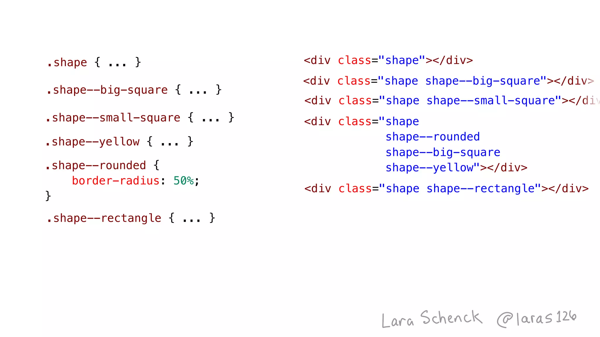
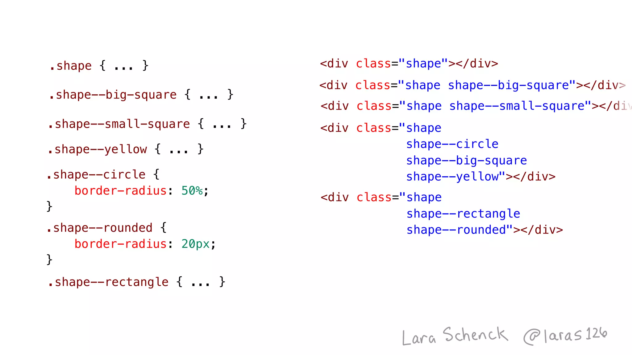
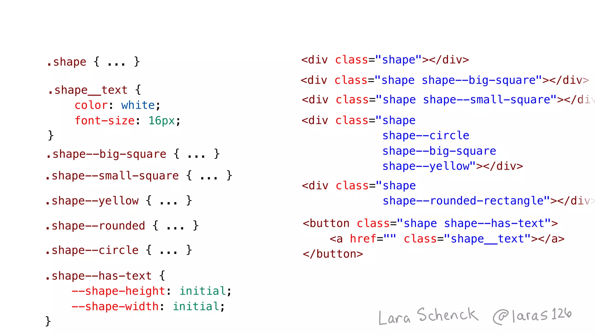
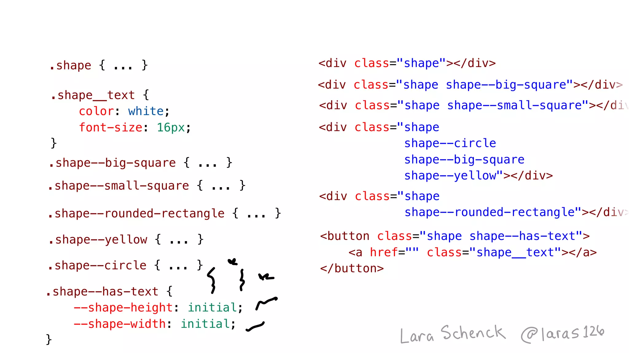
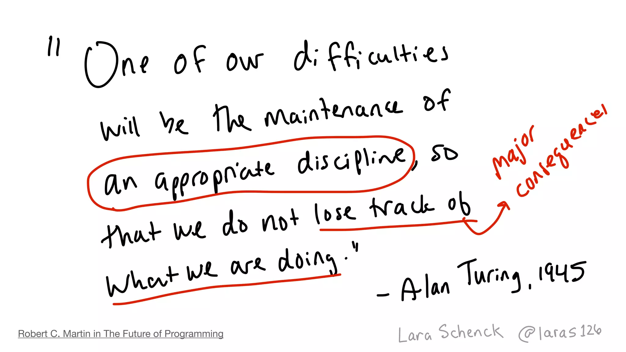
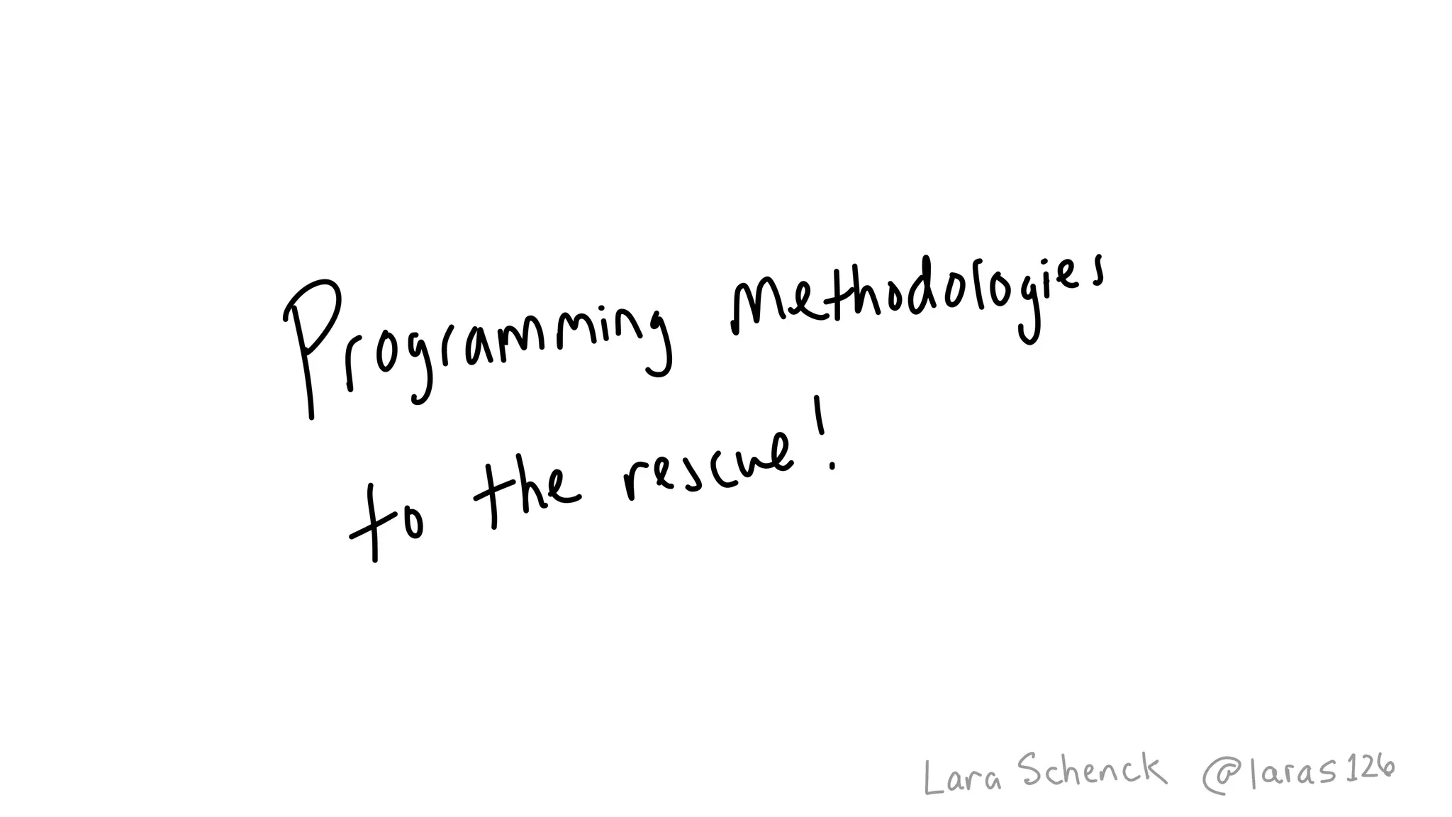
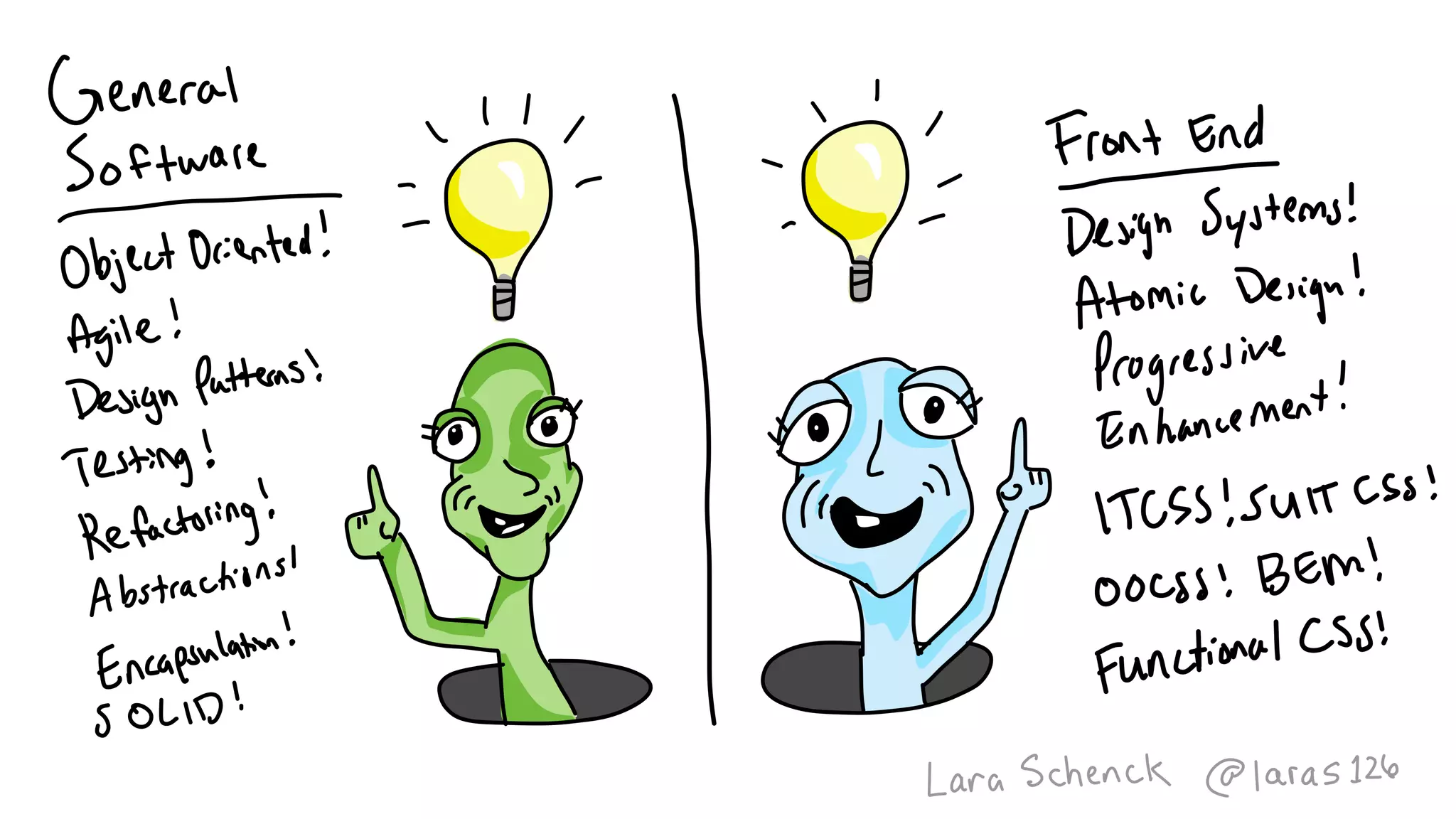
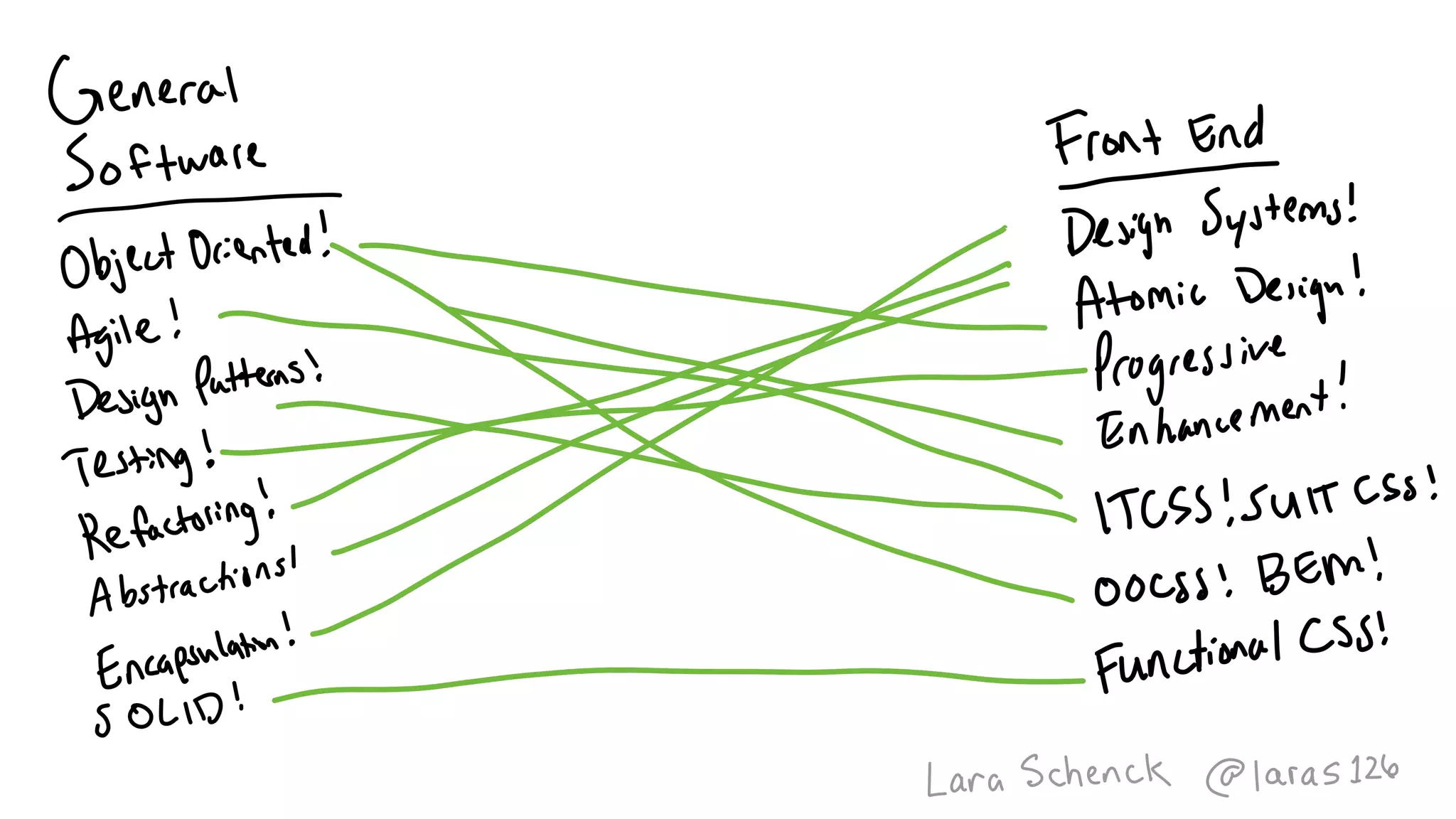
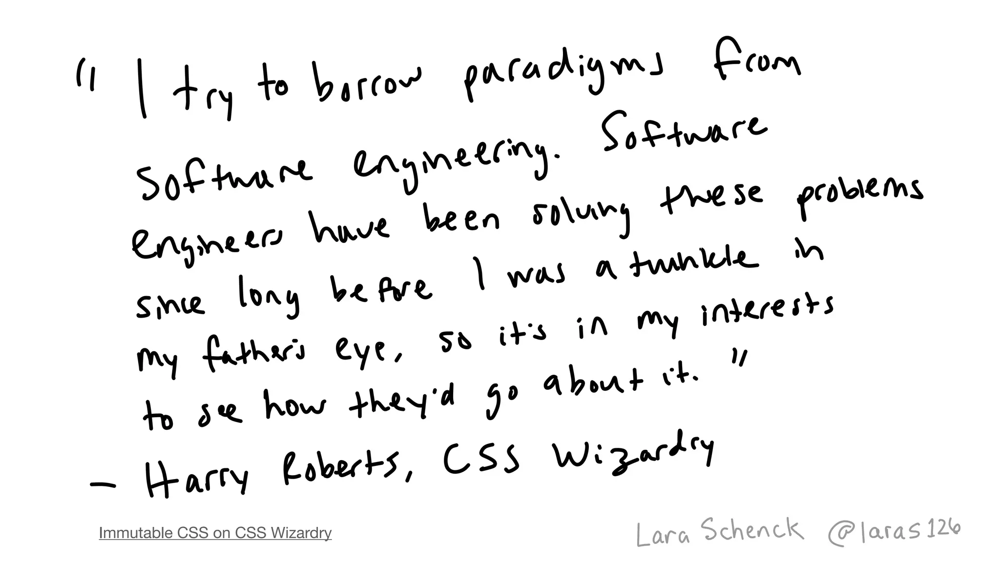
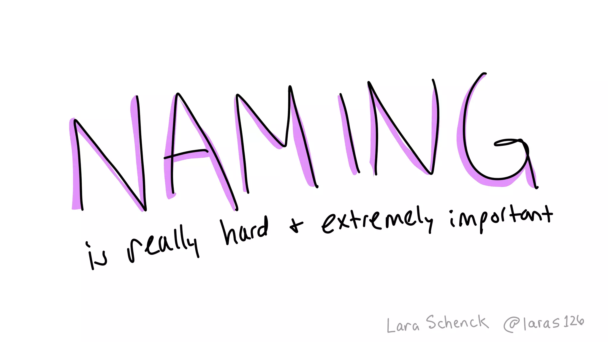
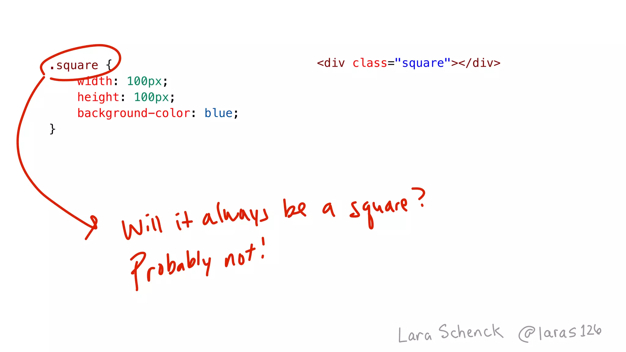
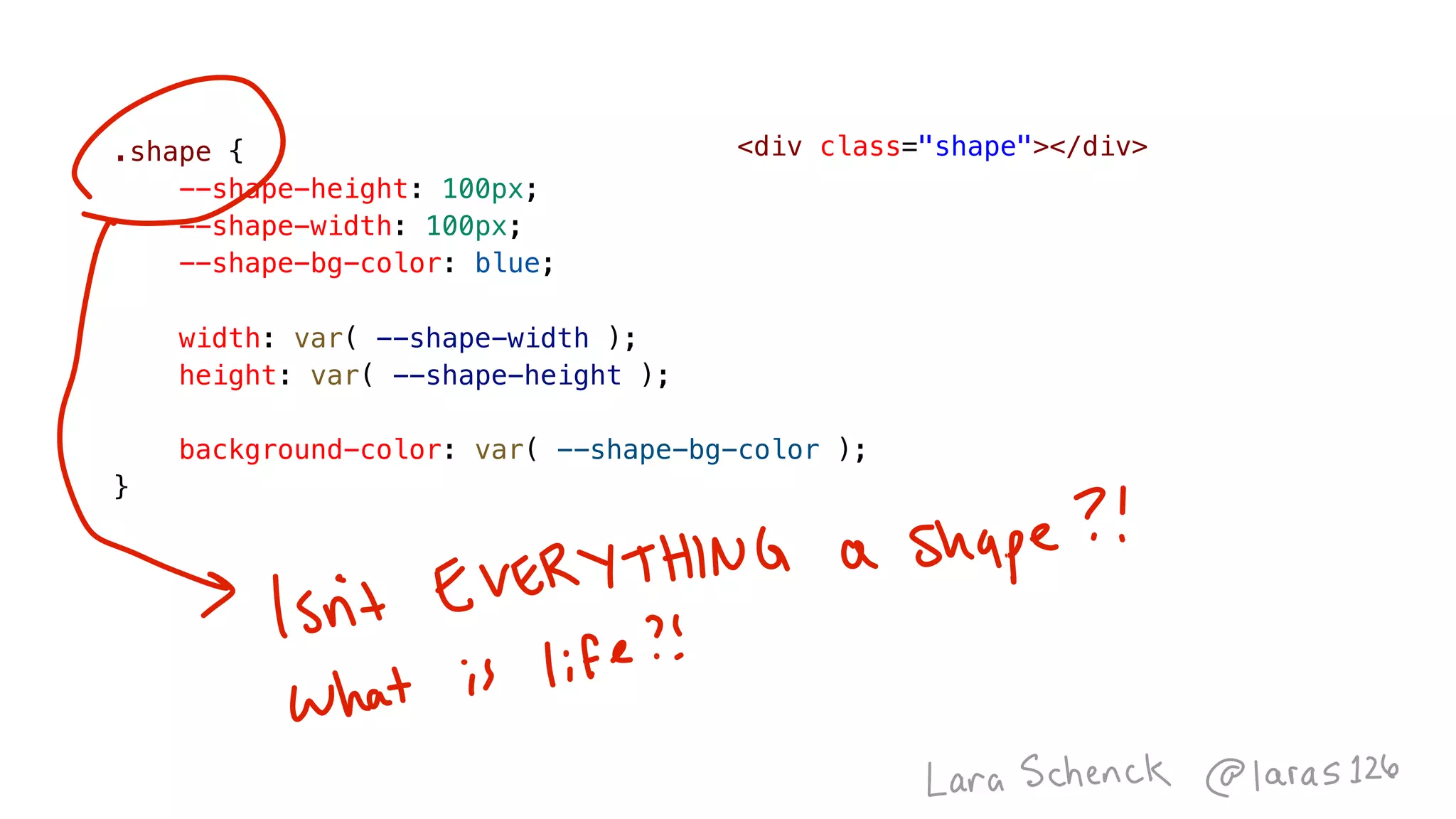
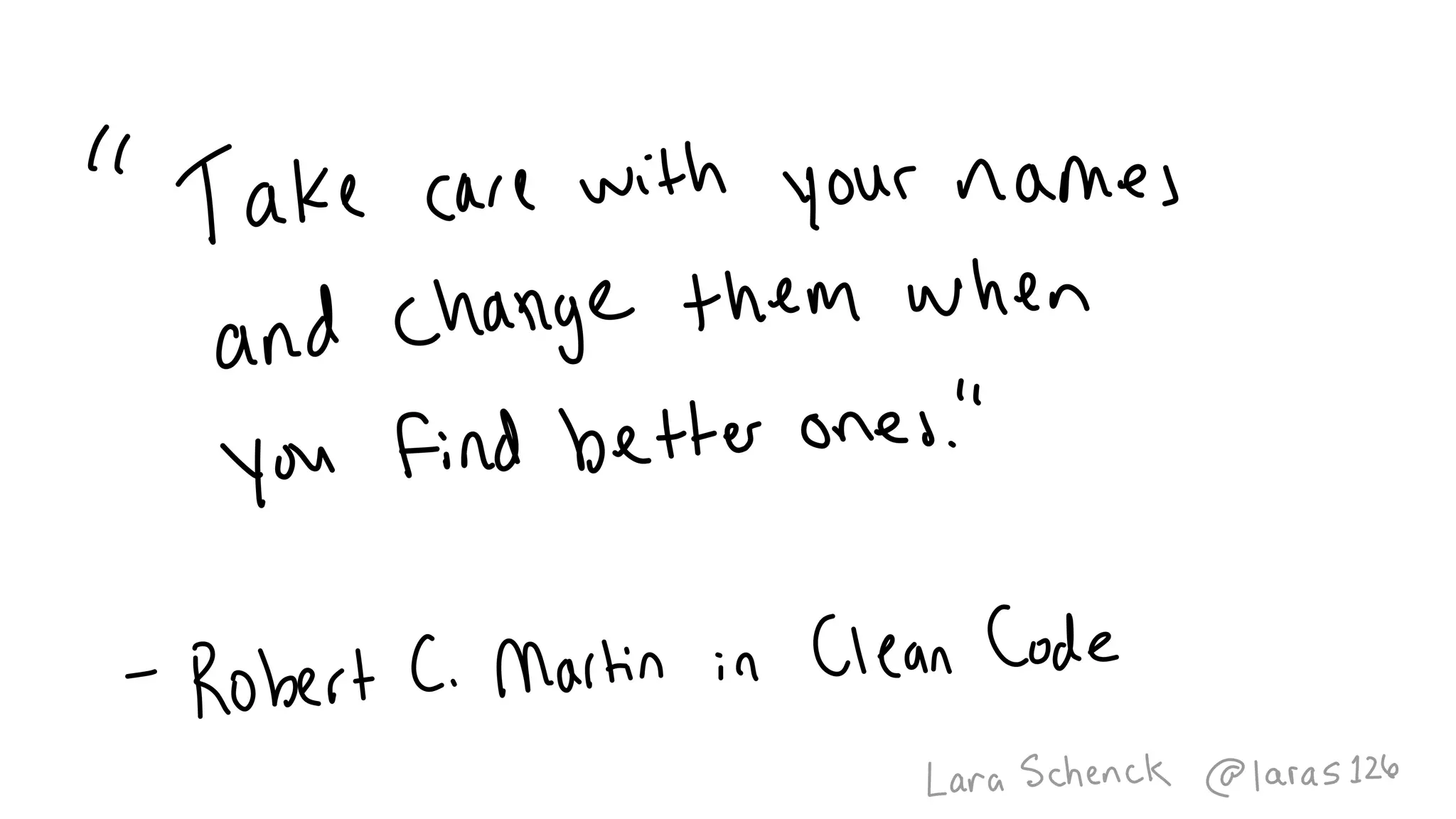
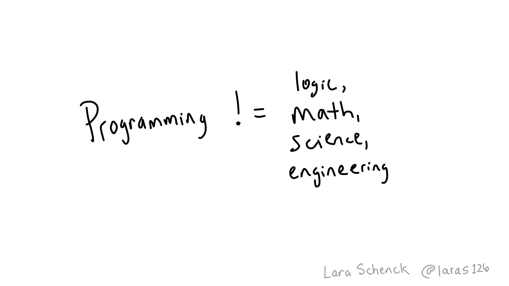
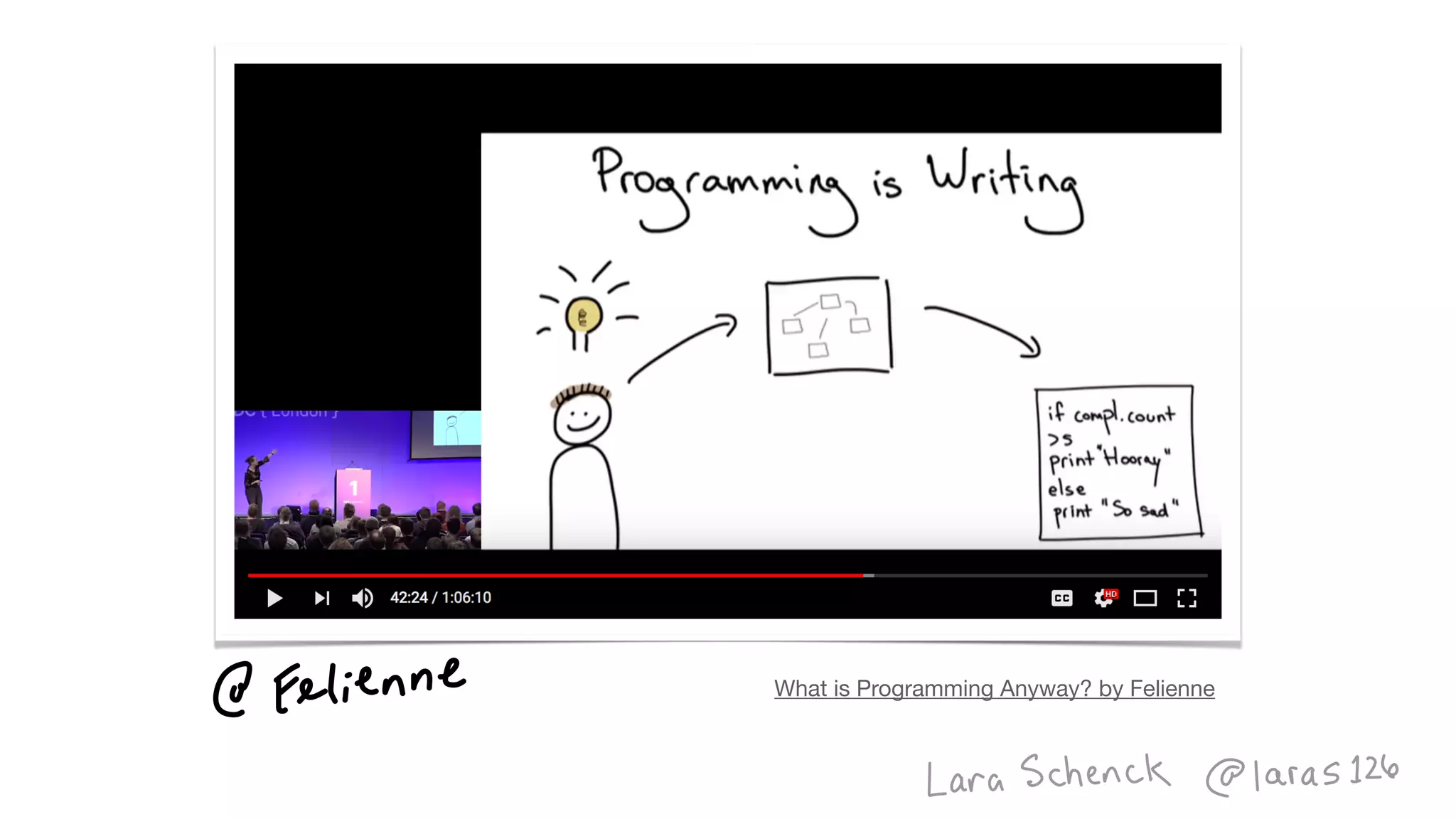
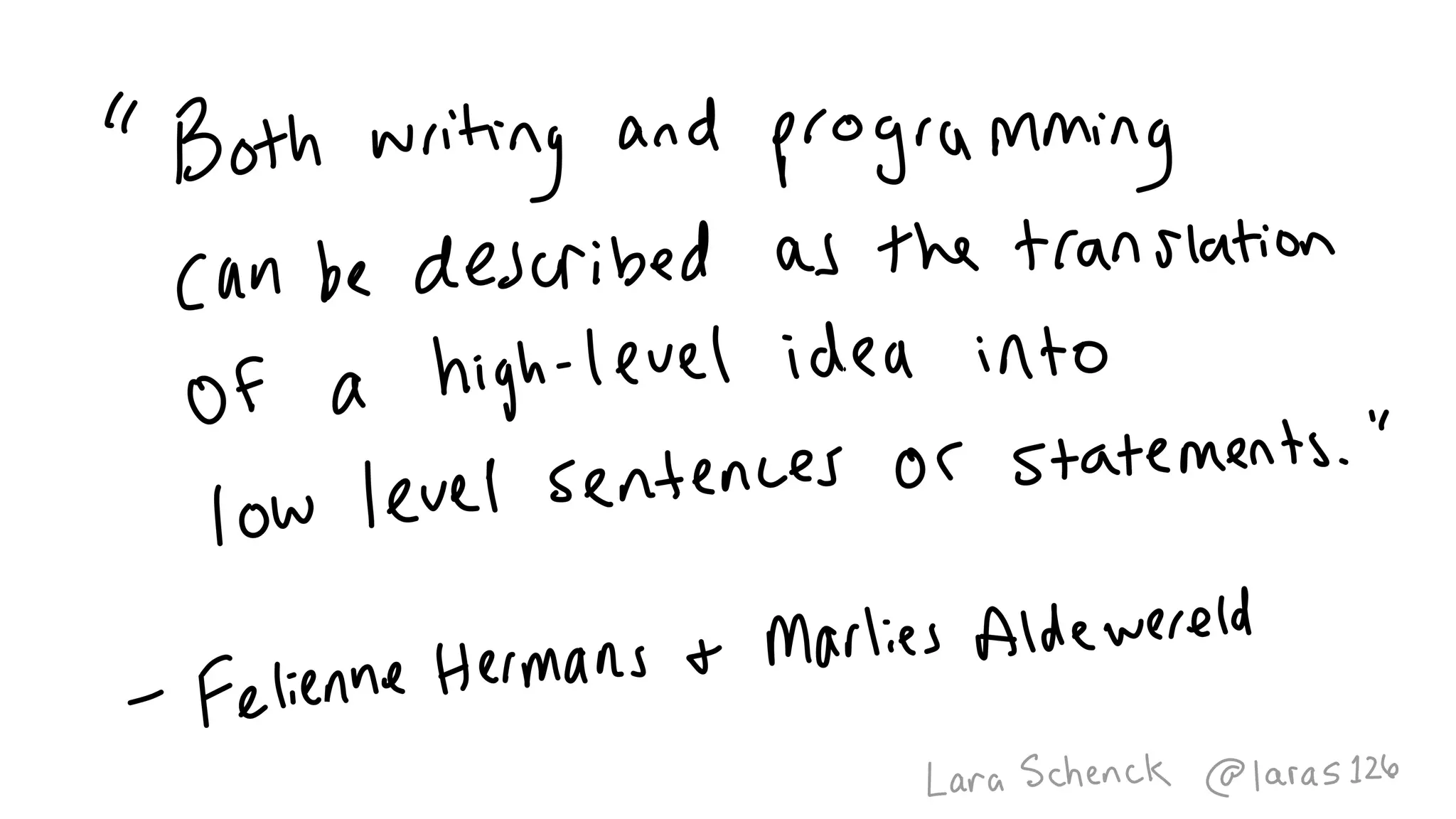
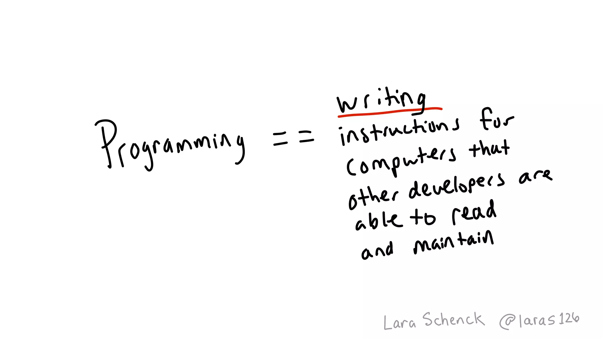
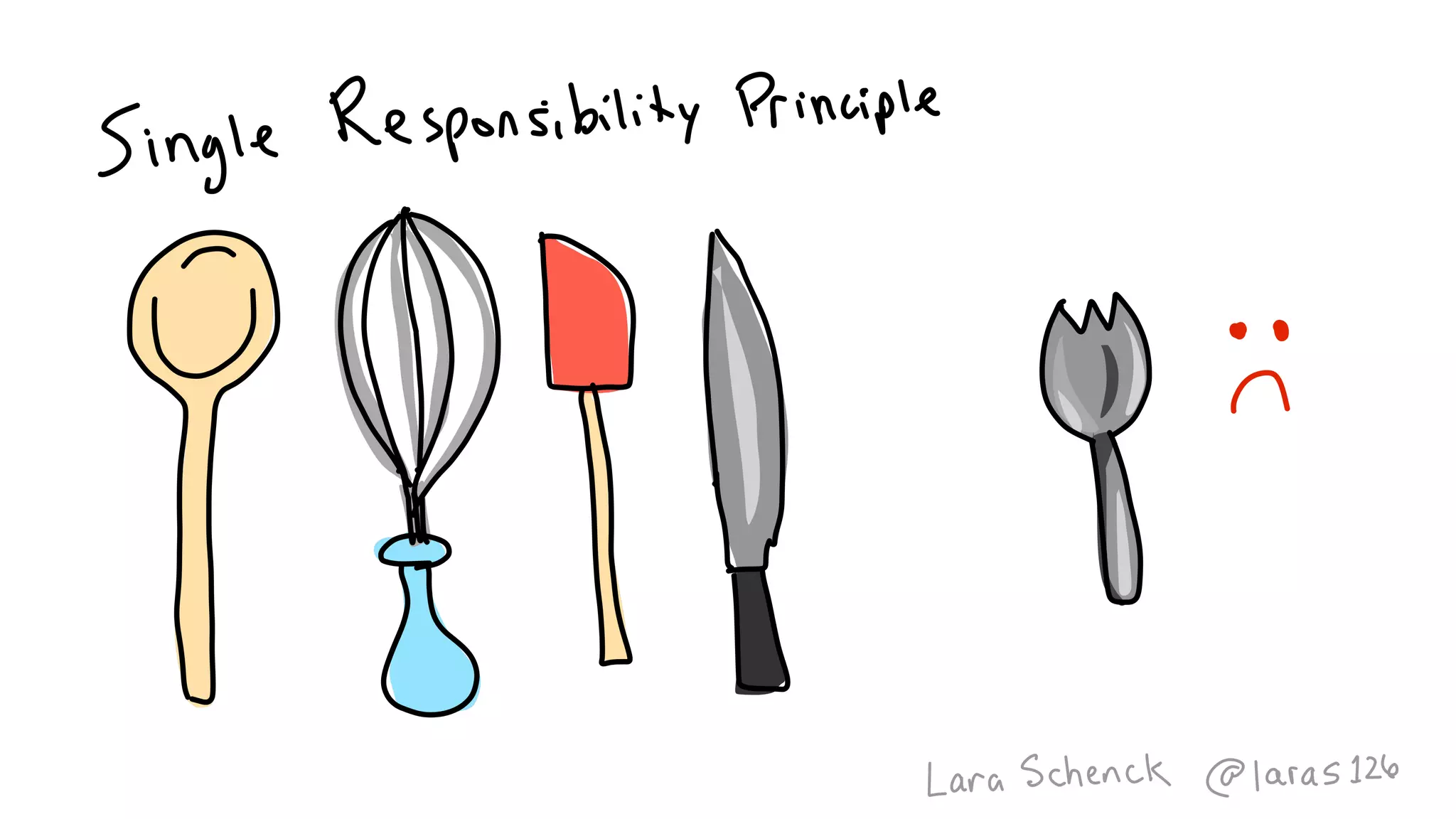
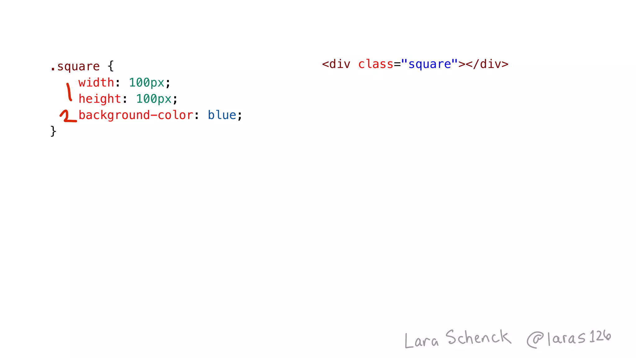
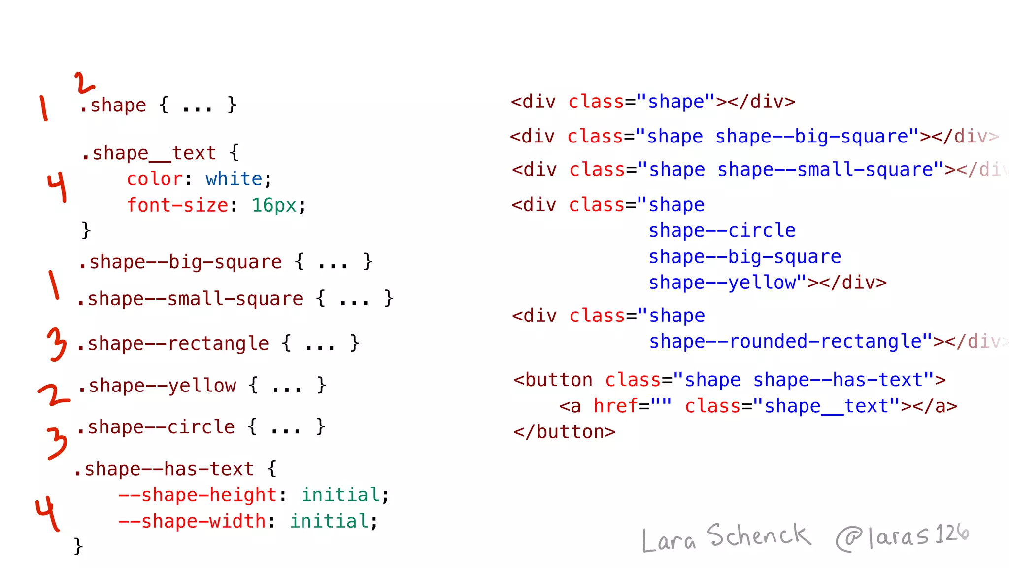
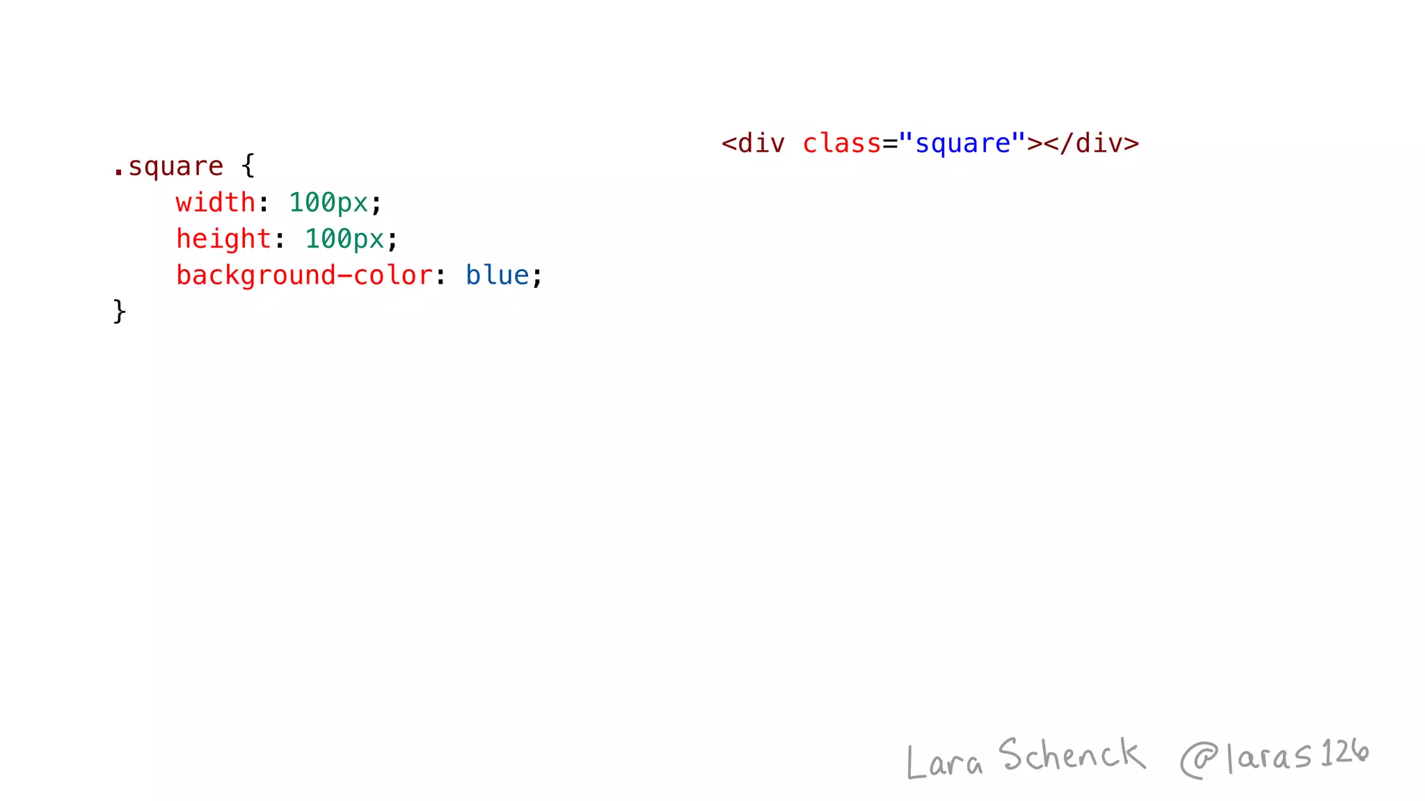
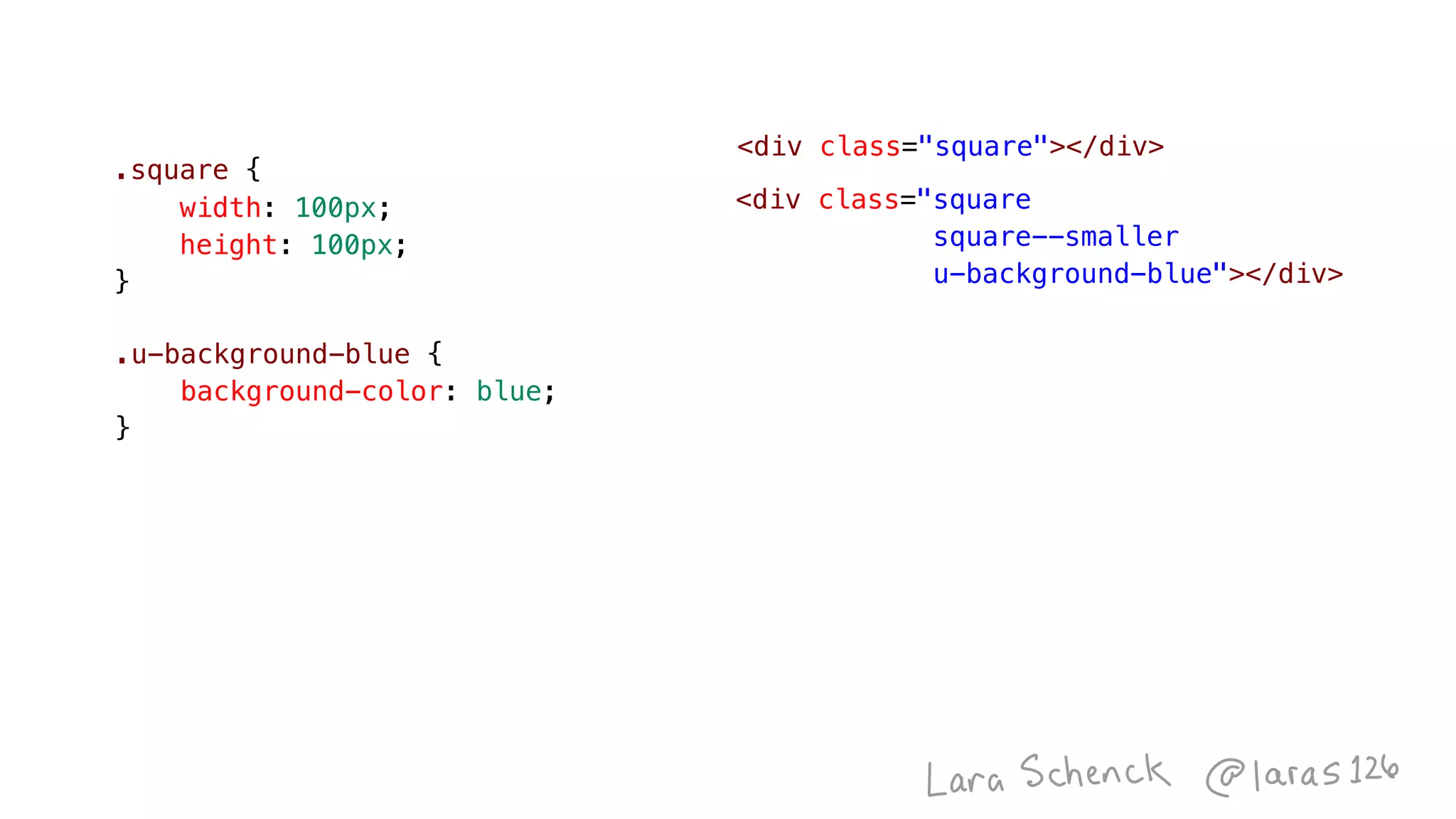
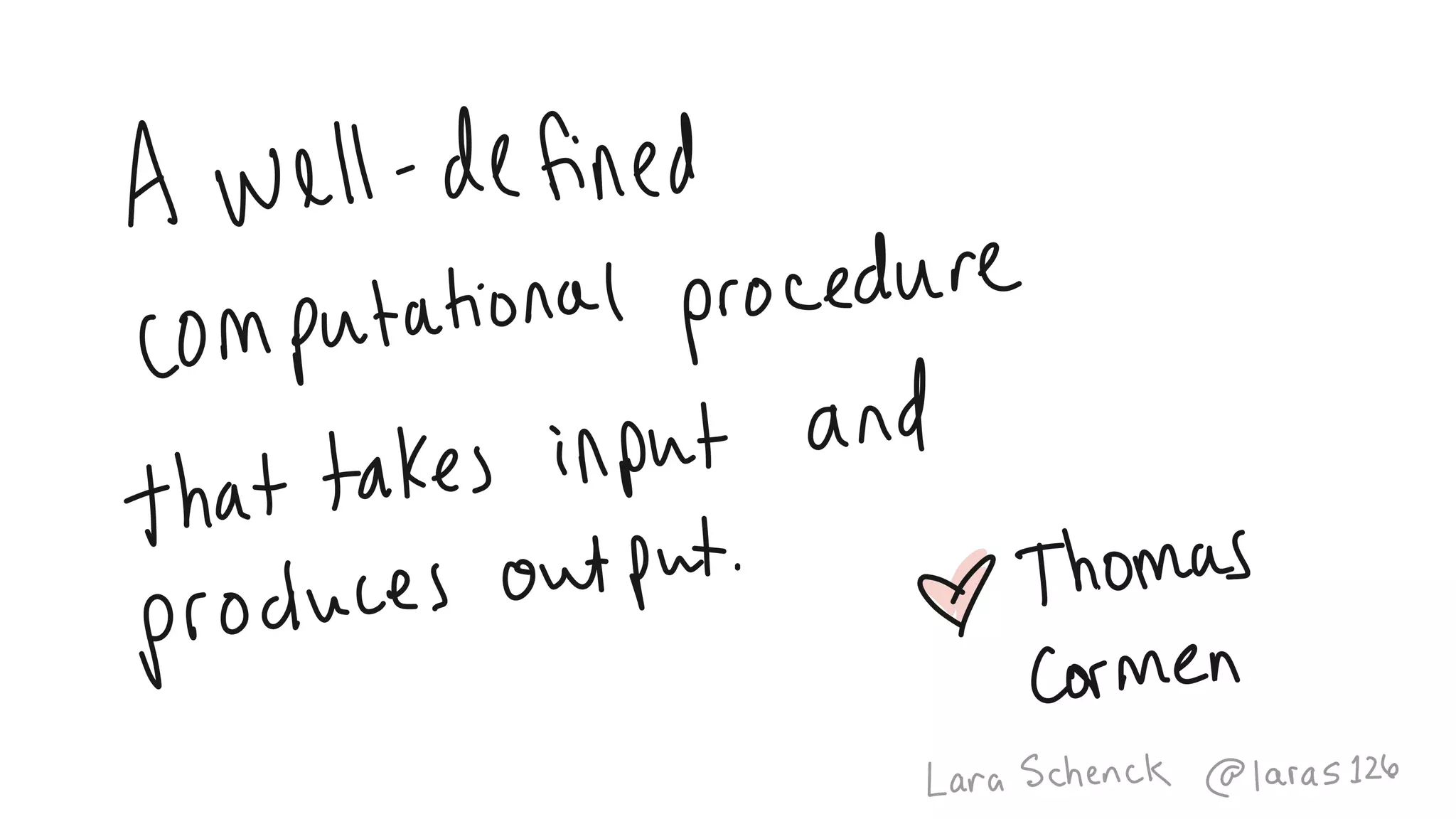
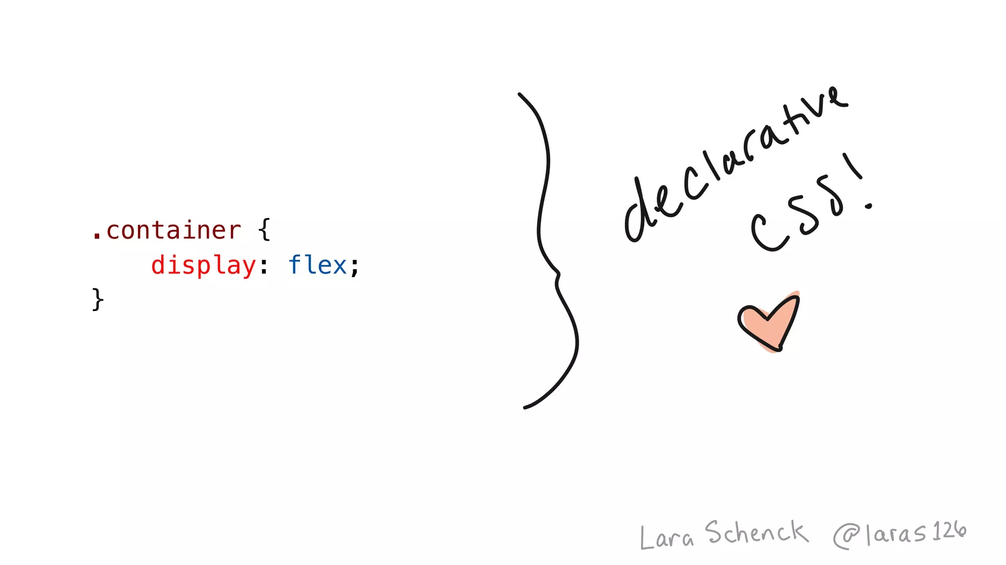
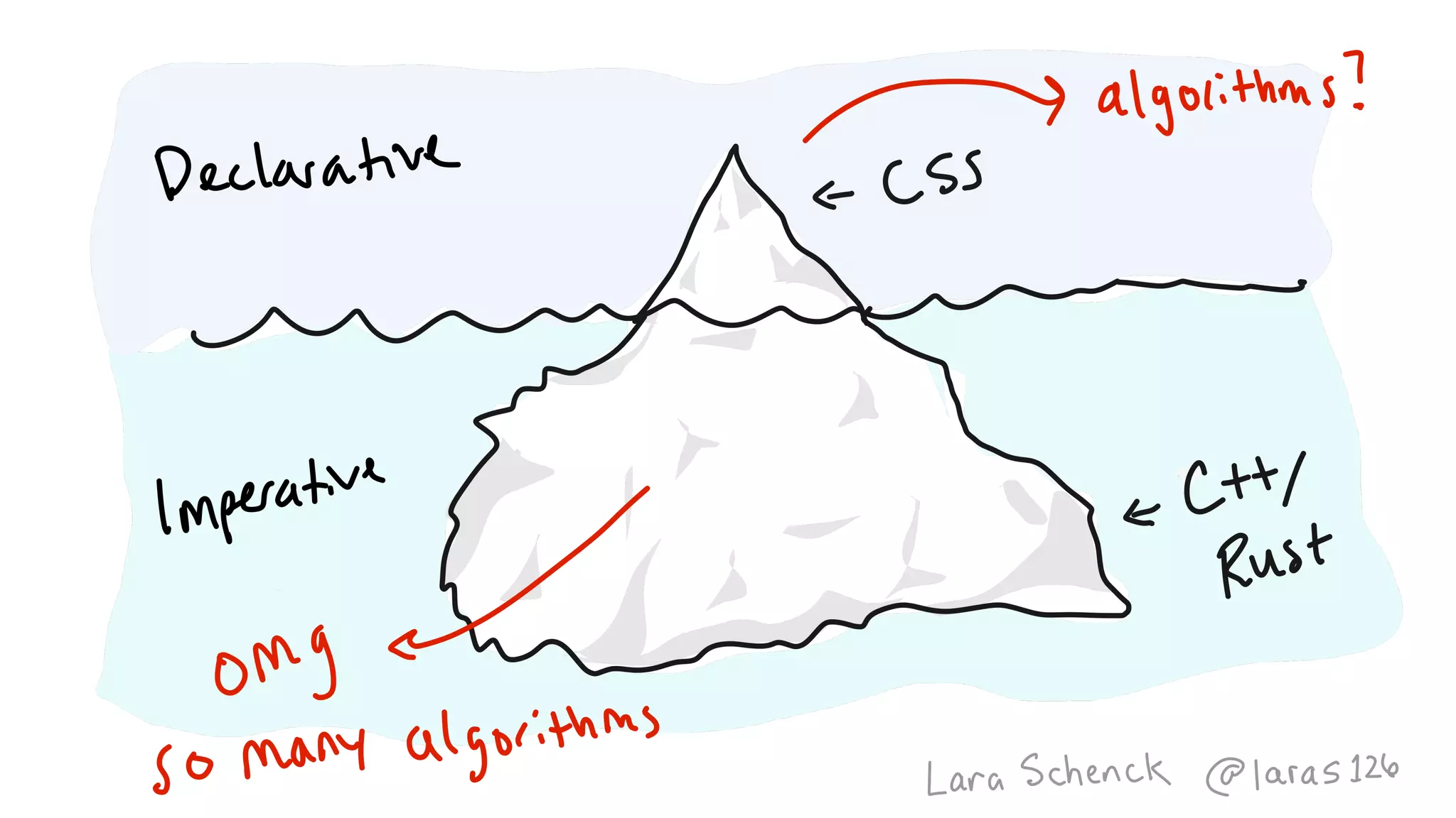
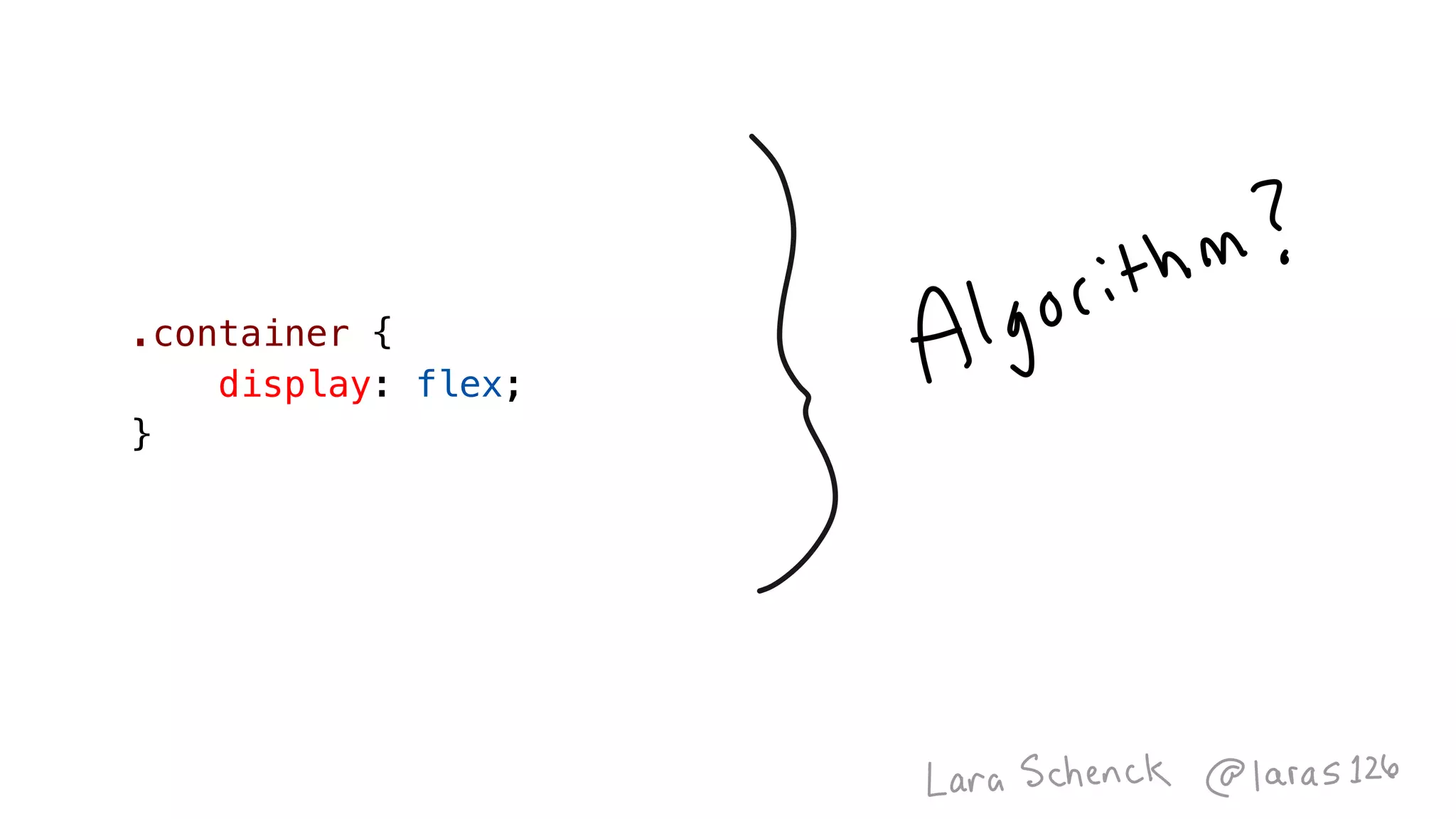
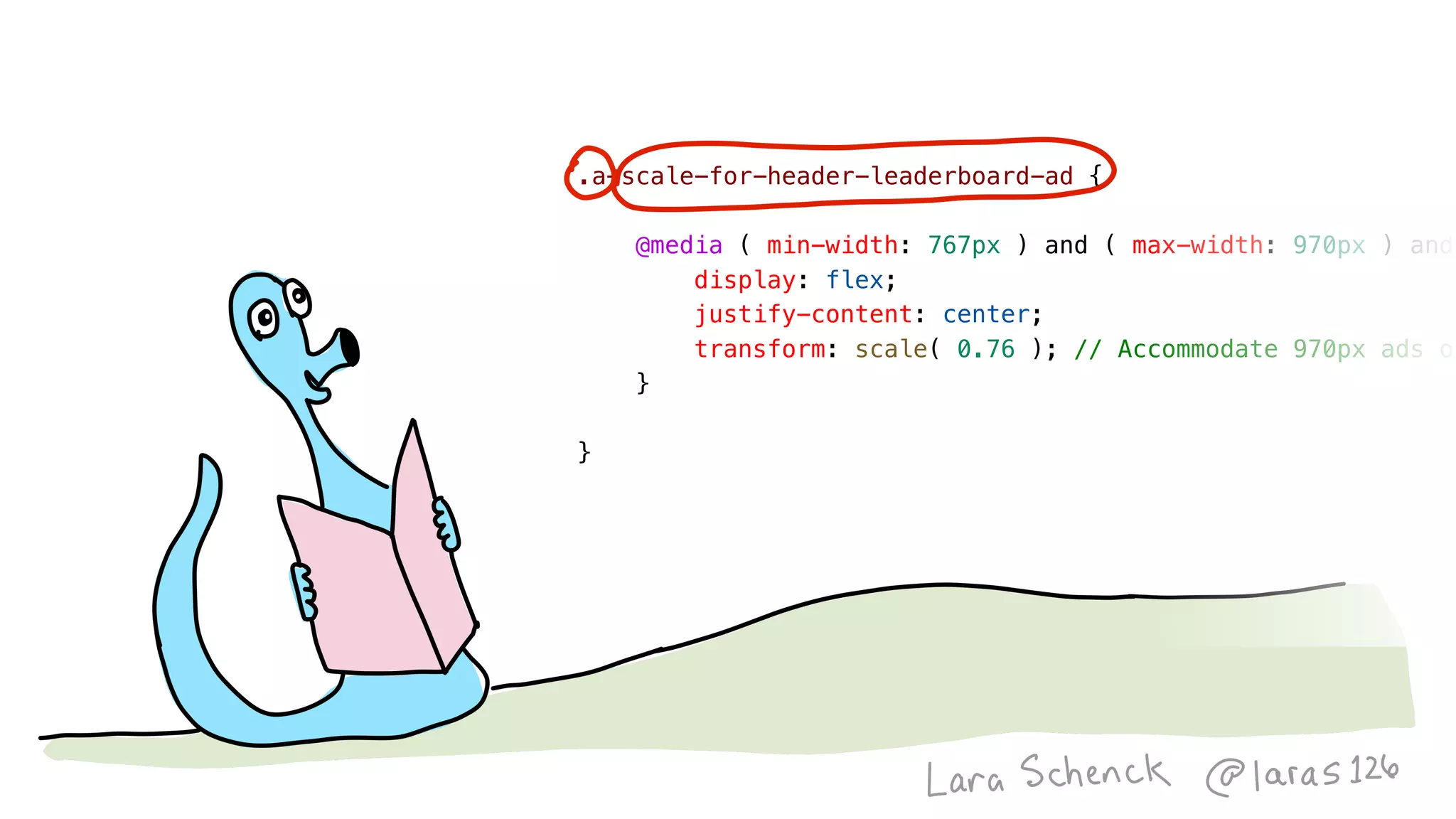
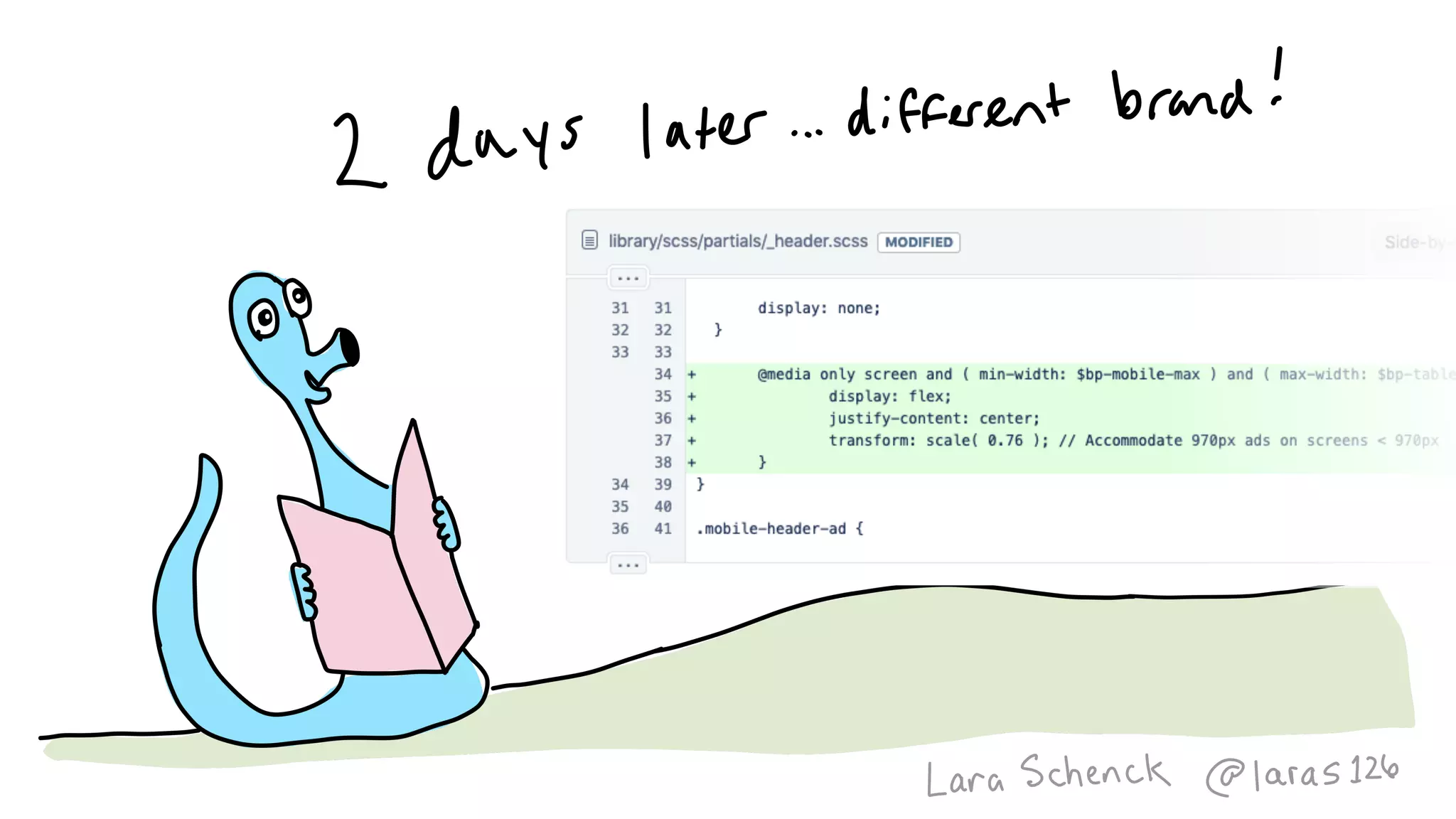
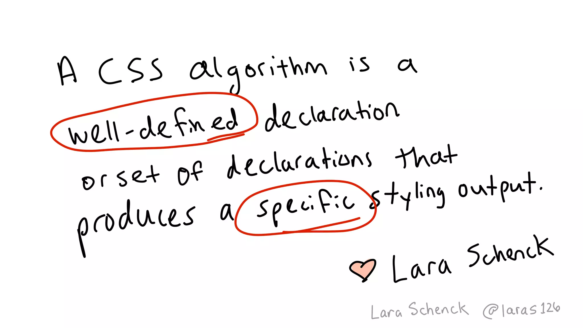
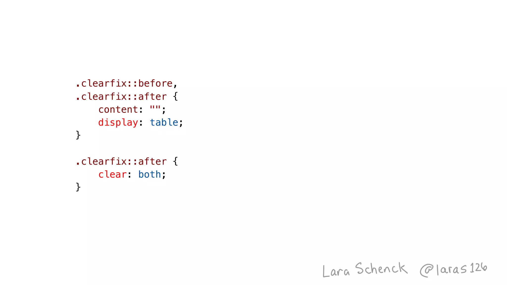
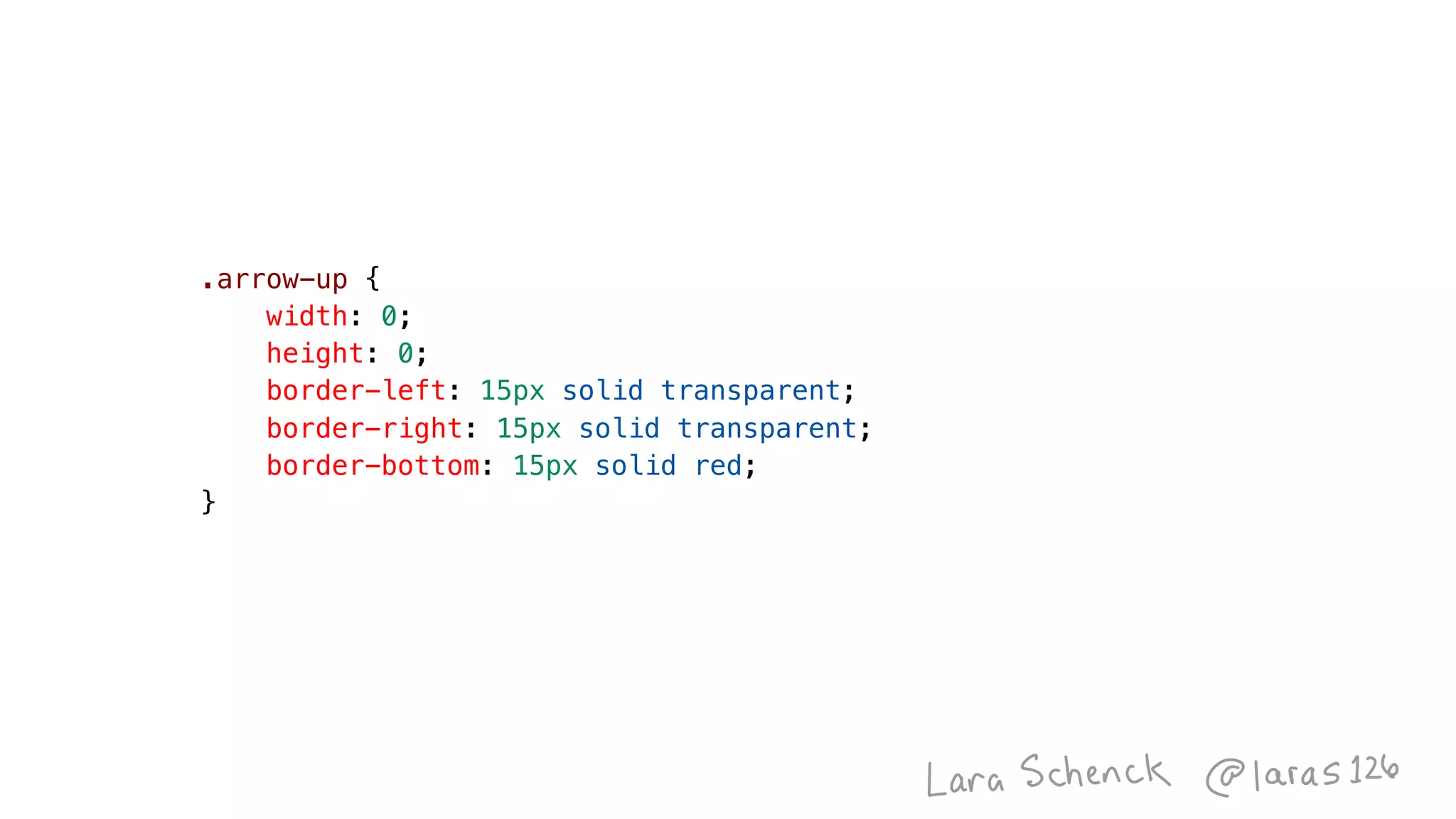
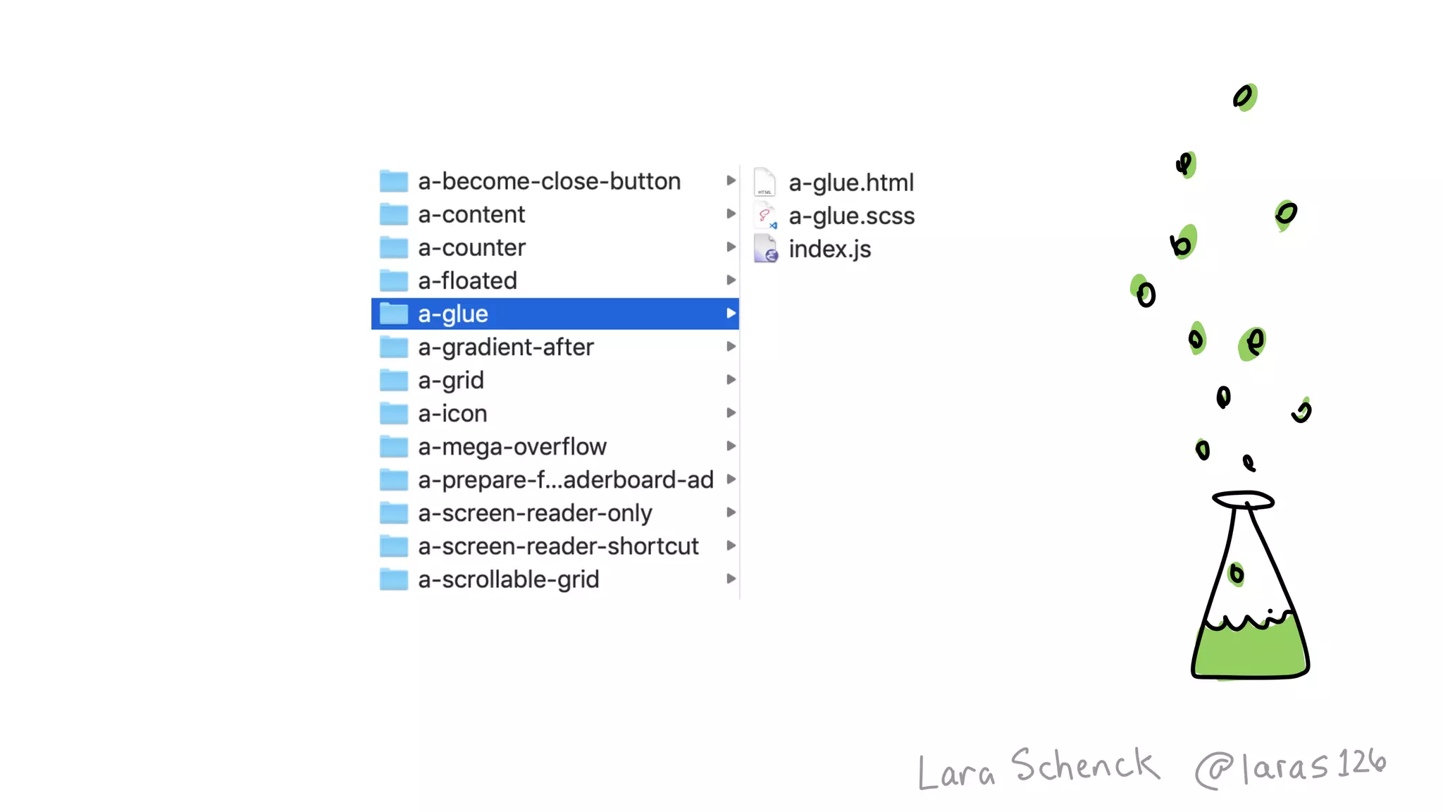
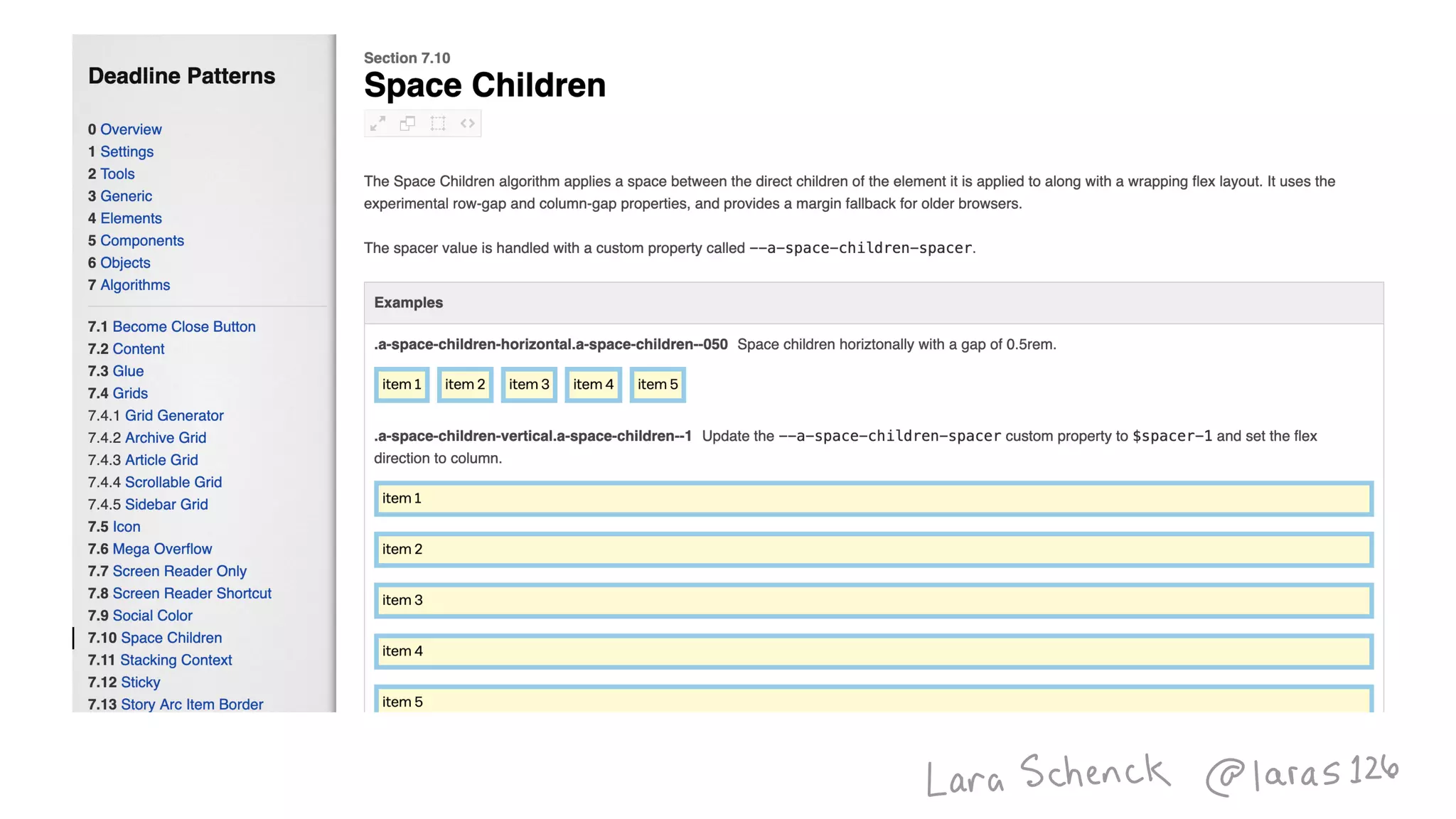
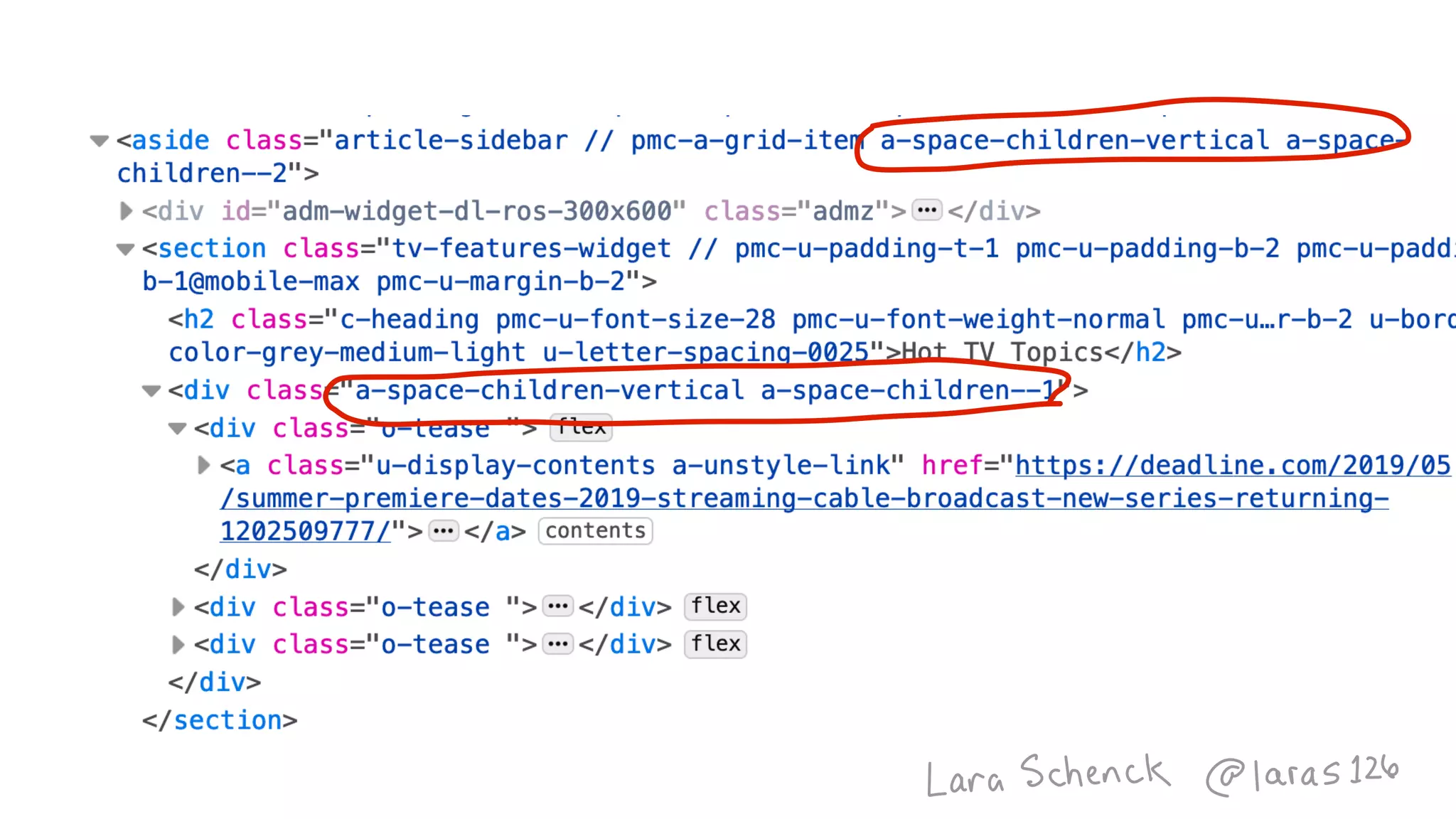
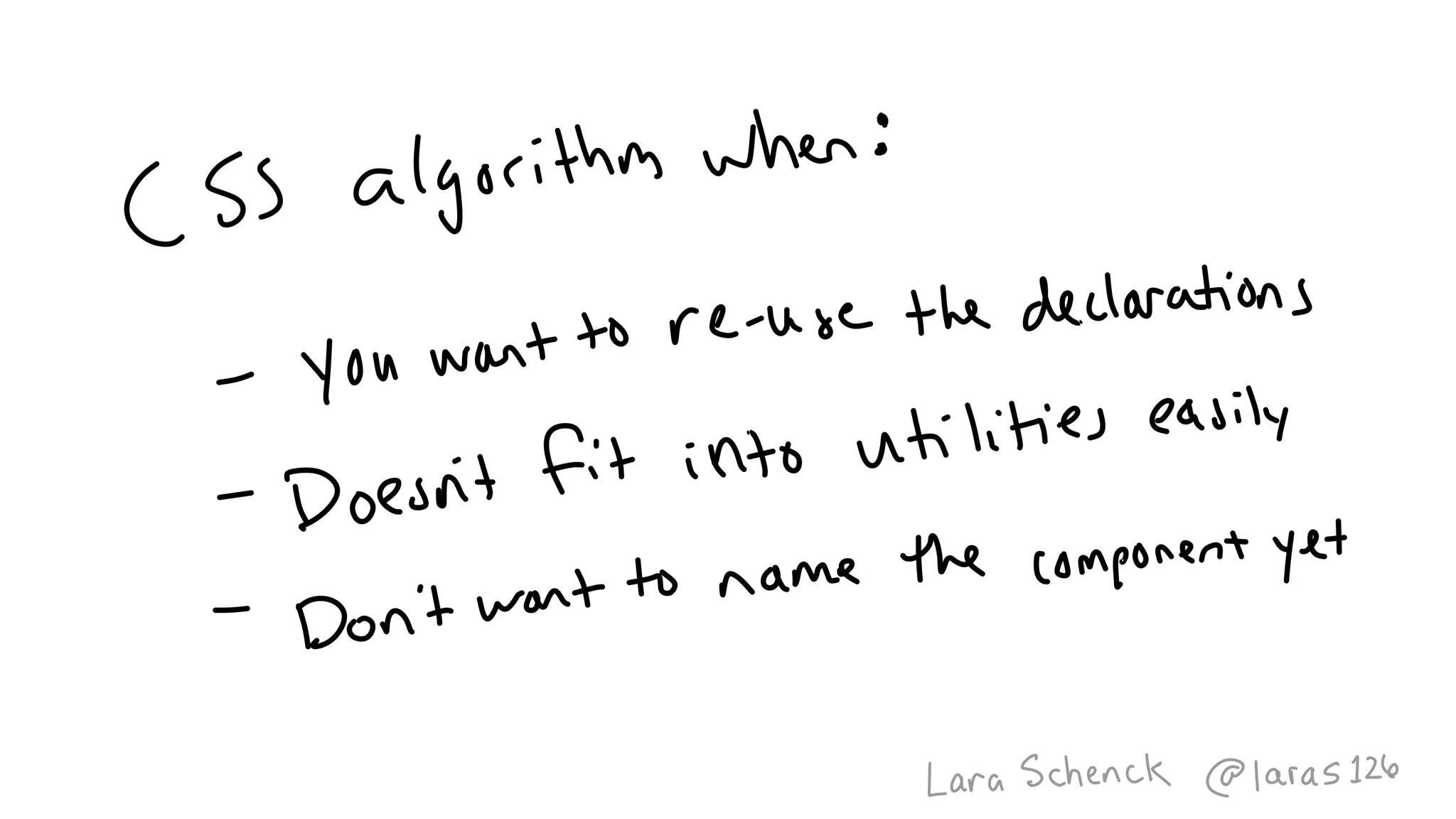
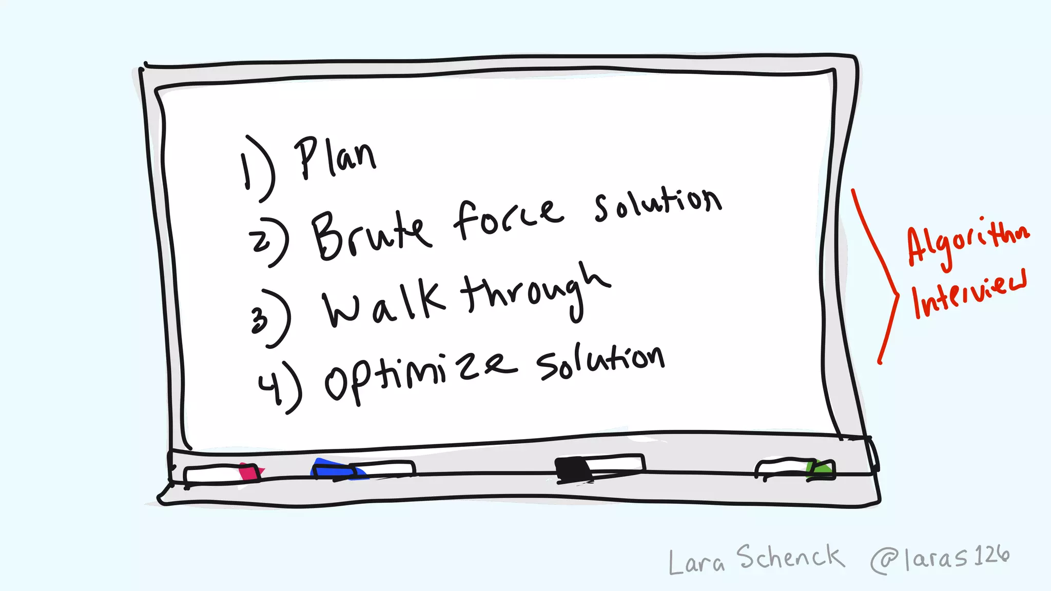
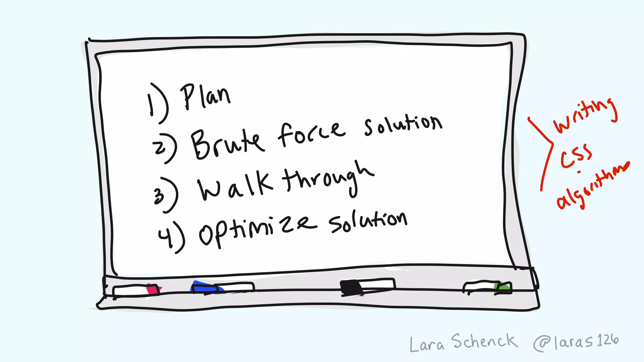
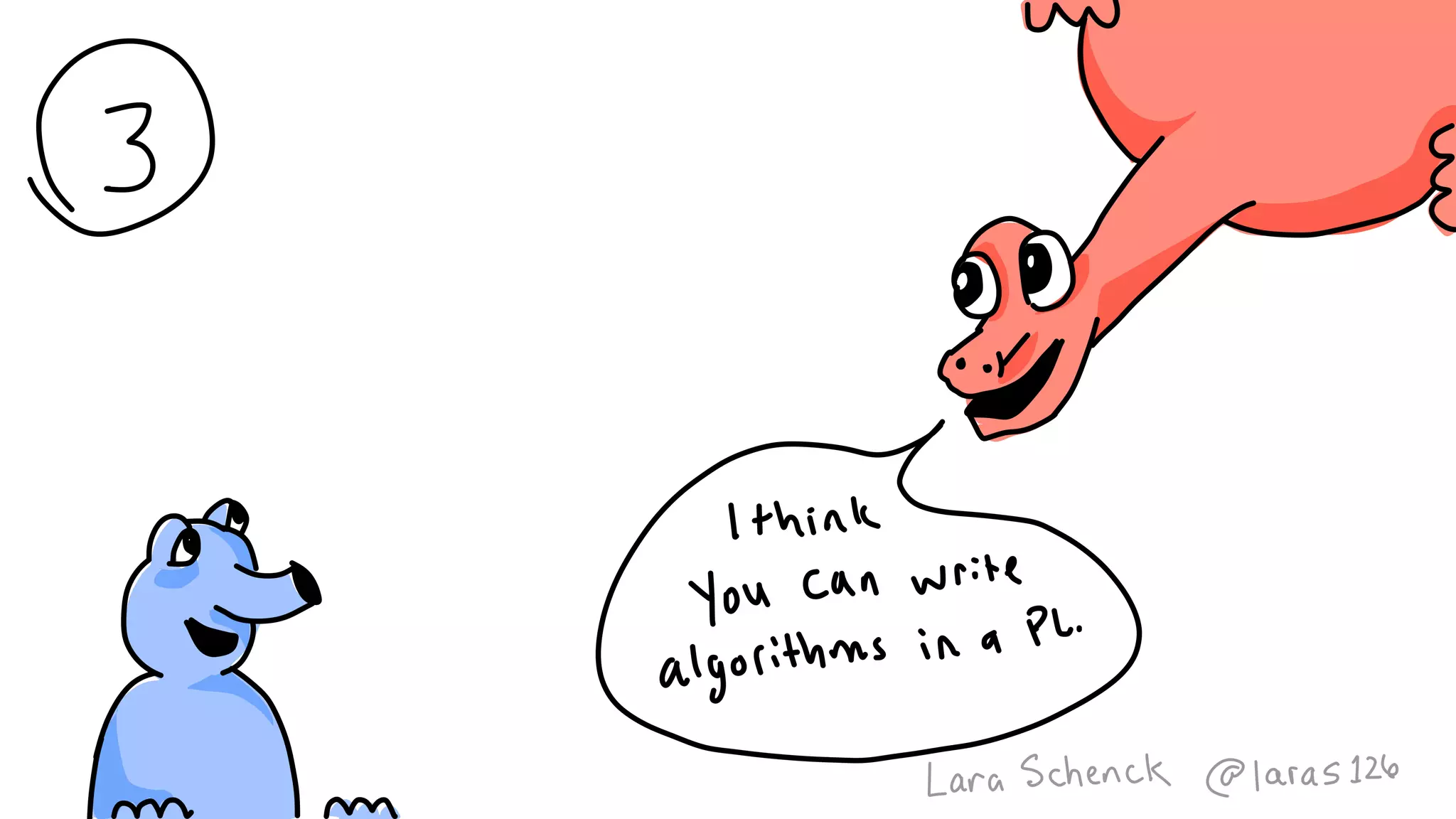
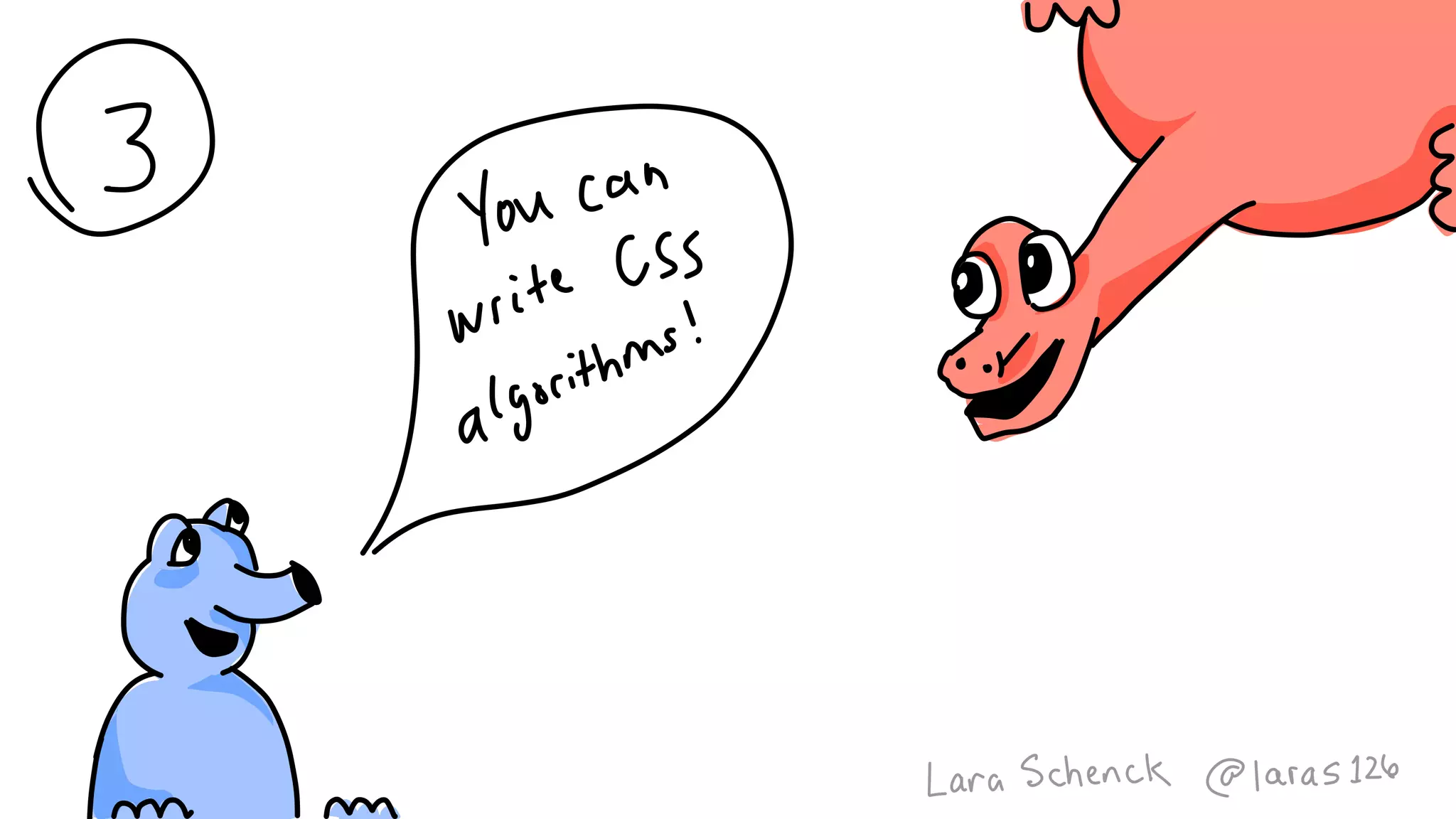
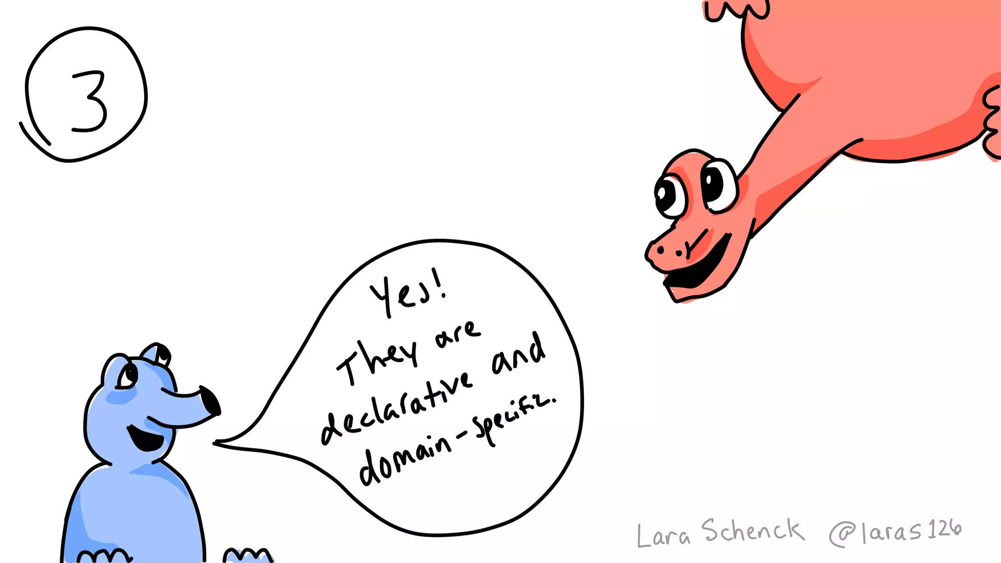
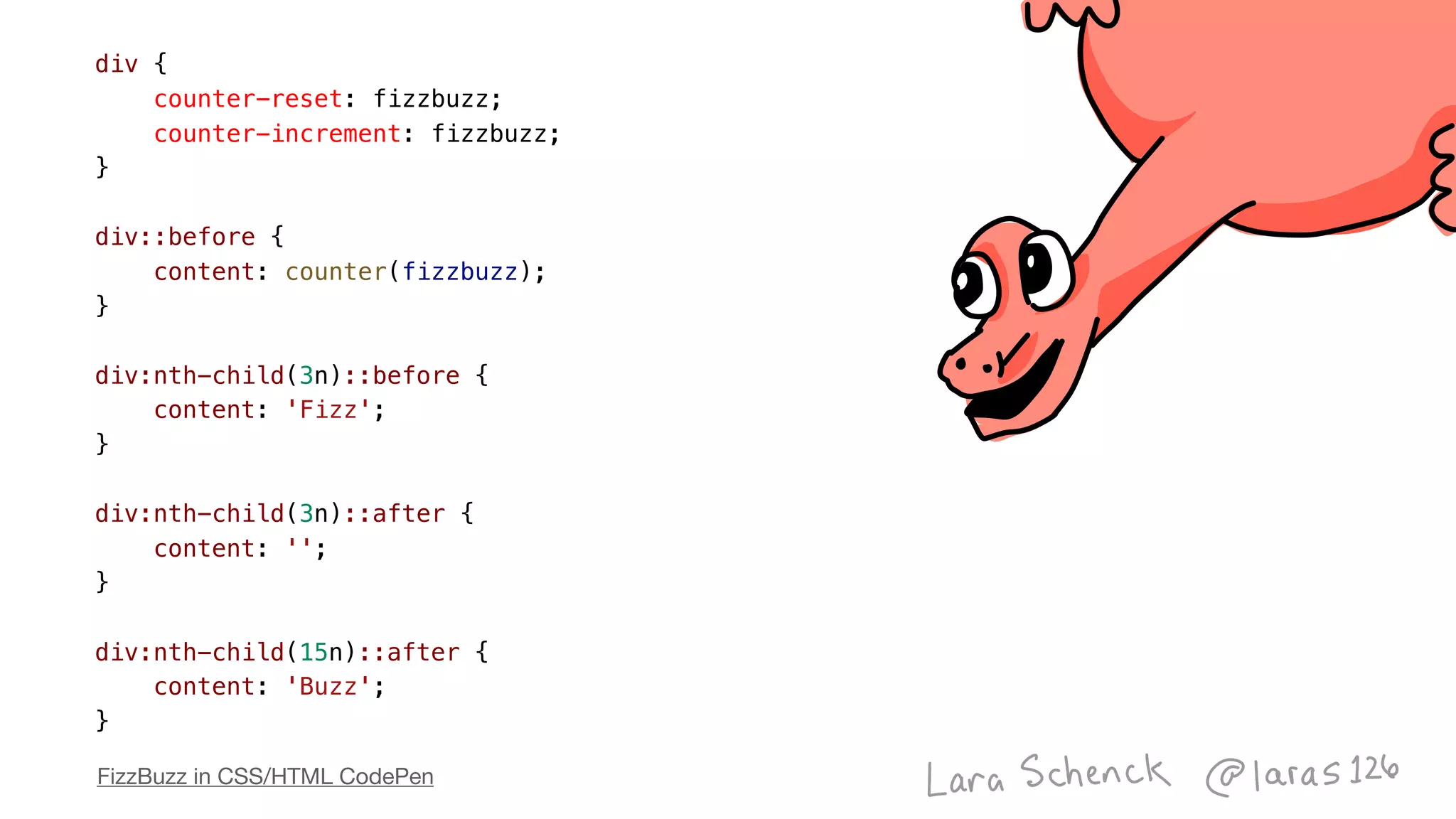
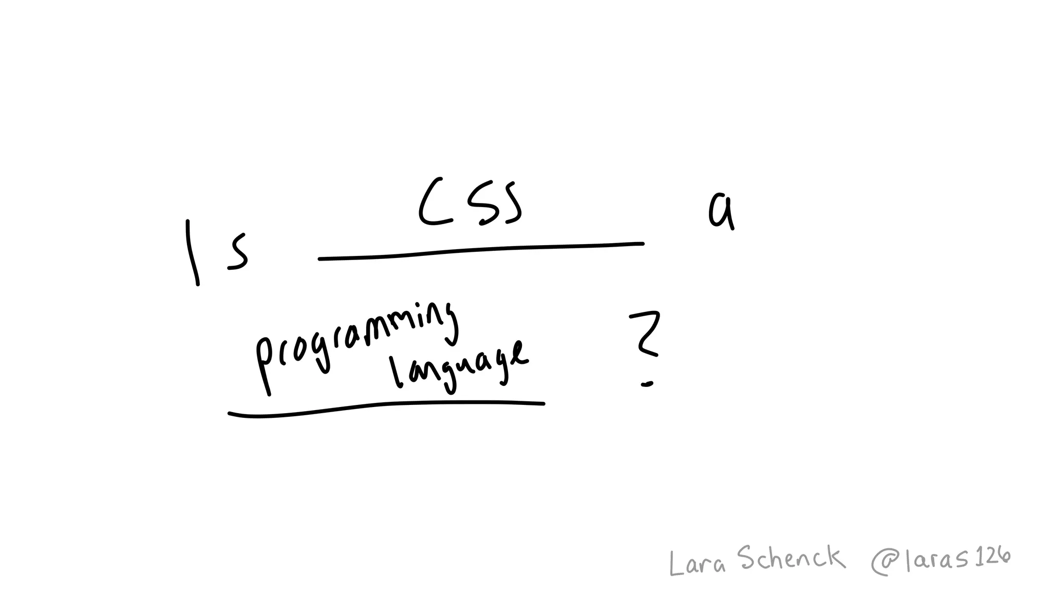
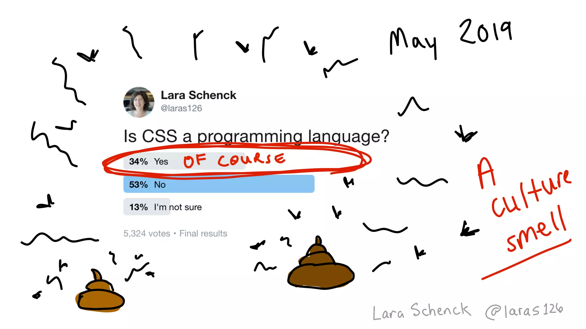
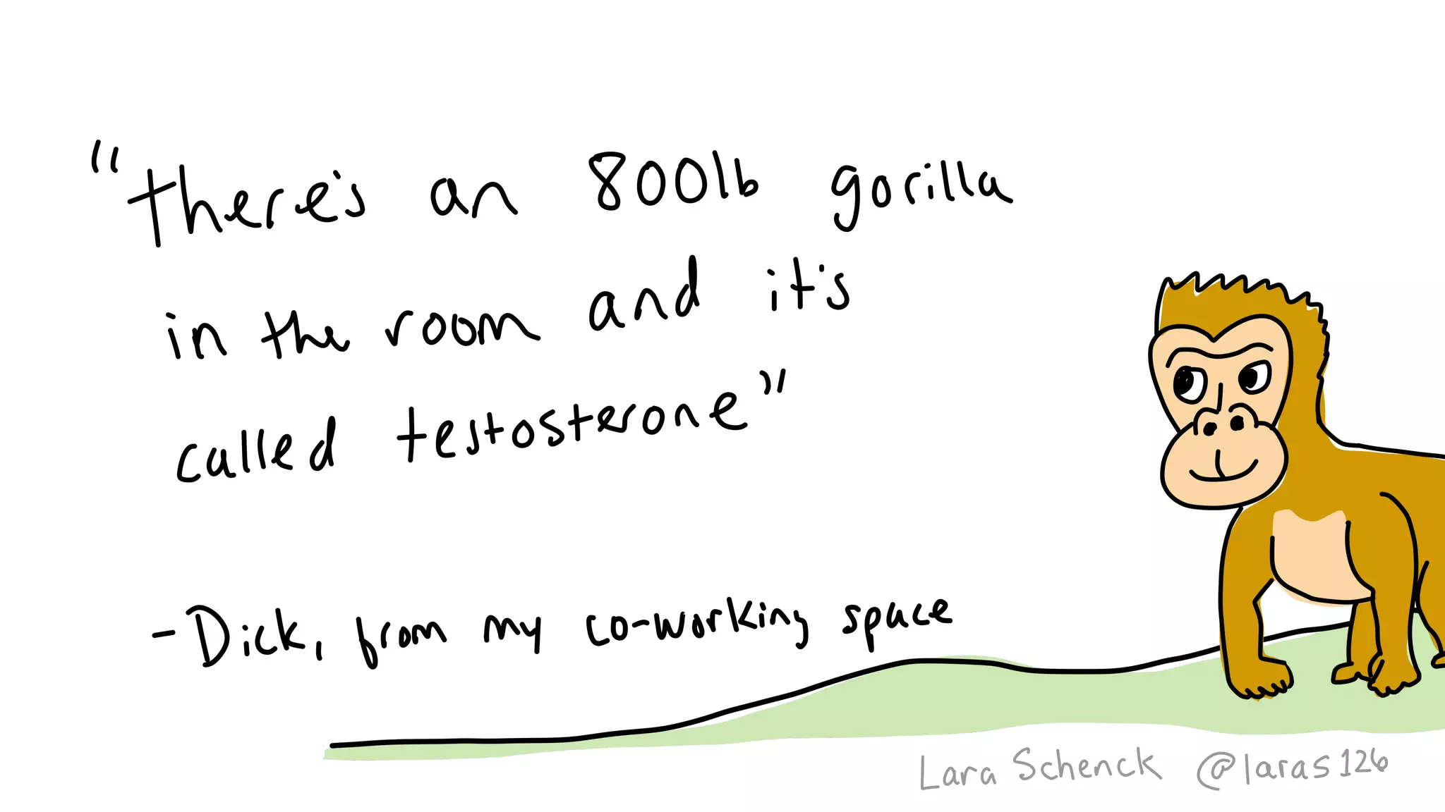
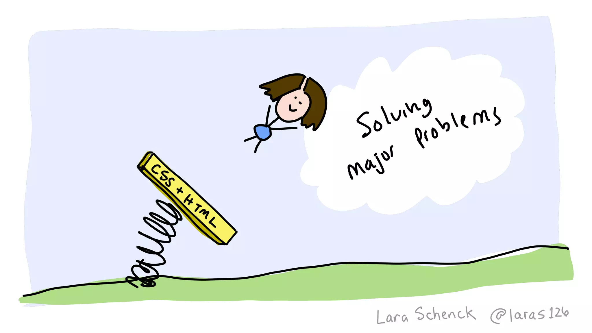
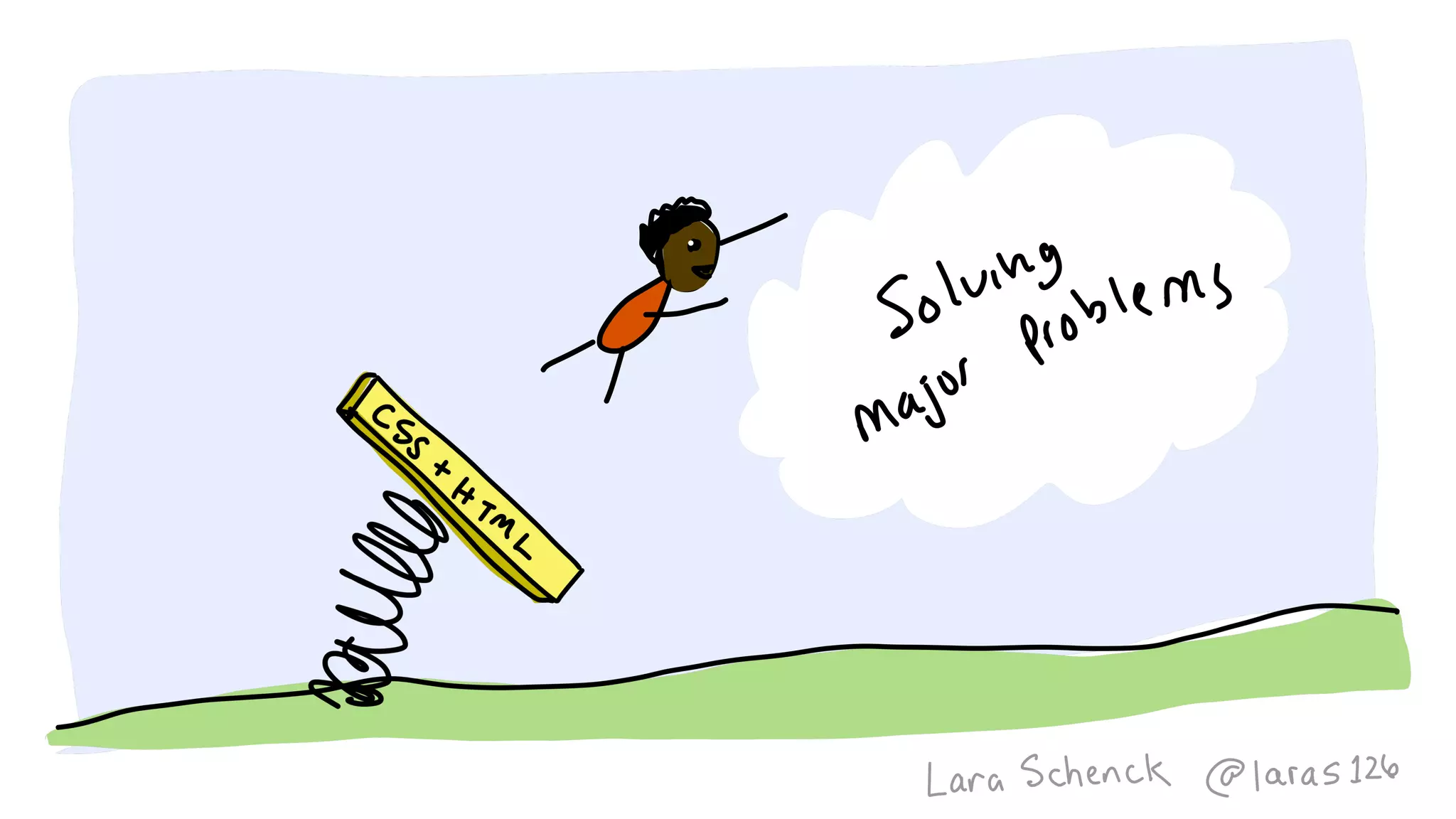
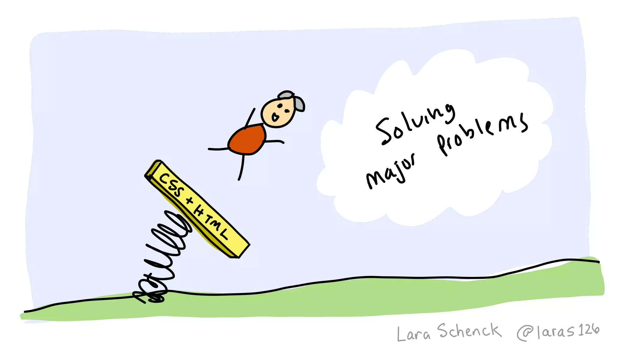
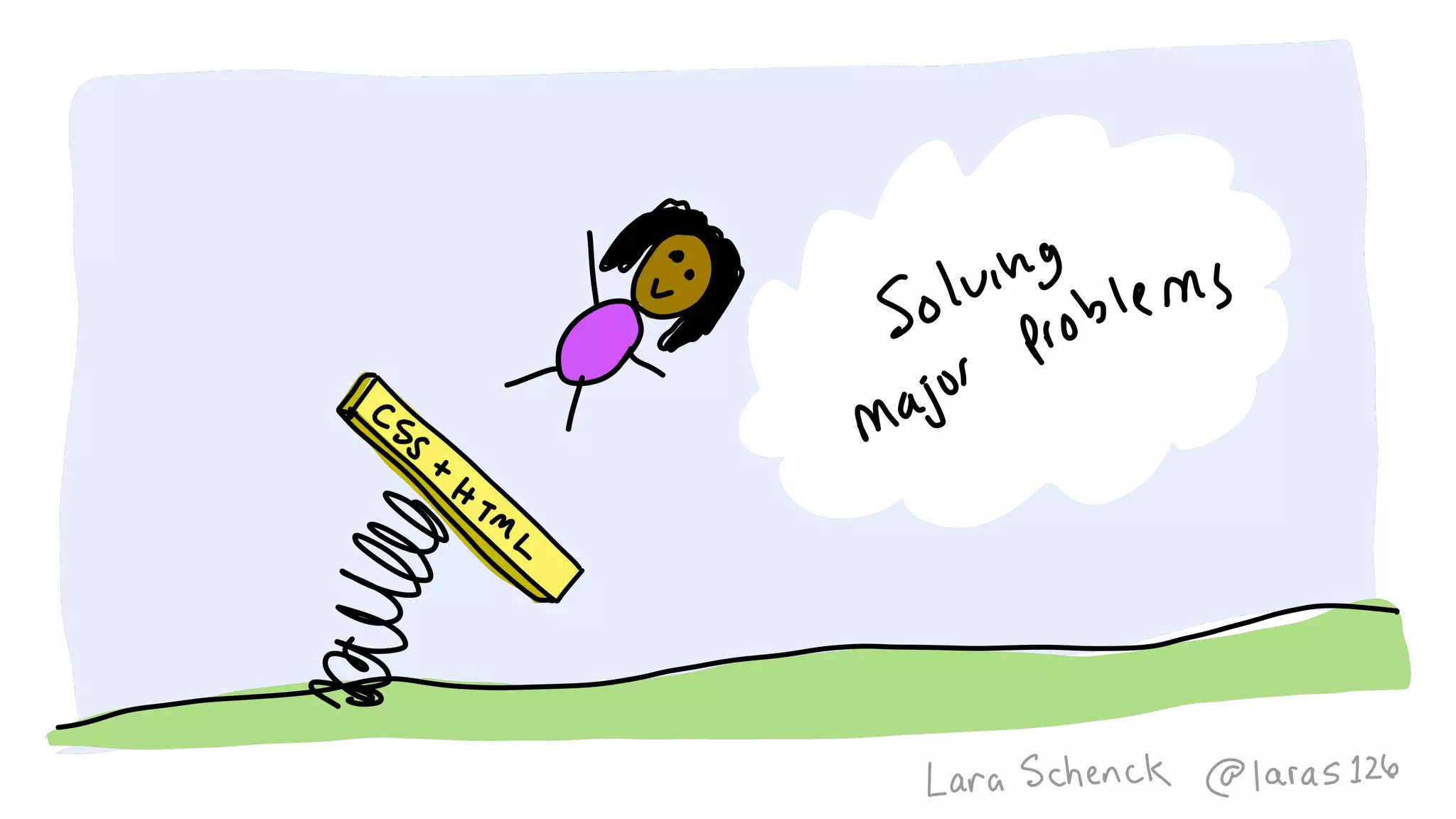
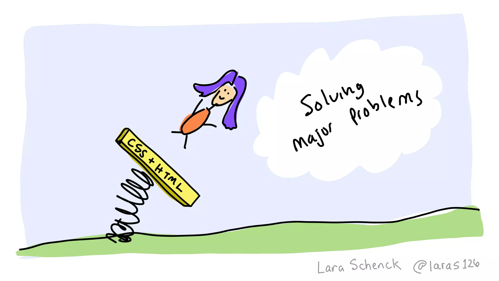
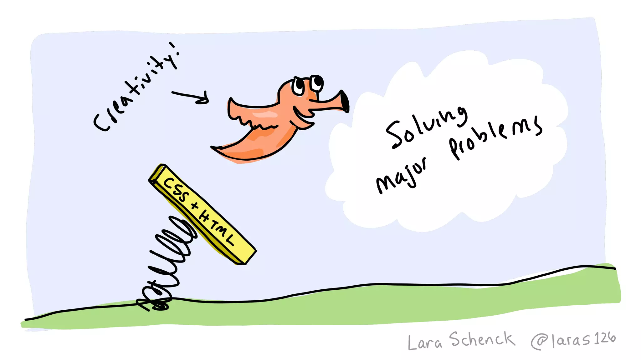
The document discusses various concepts related to programming languages, their properties, and examples of usage in CSS and HTML. It includes code snippets demonstrating the flexibility and functionality of programming through diverse shapes and styles. Additionally, it touches on broader programming theories and principles proposed by notable figures in the field.


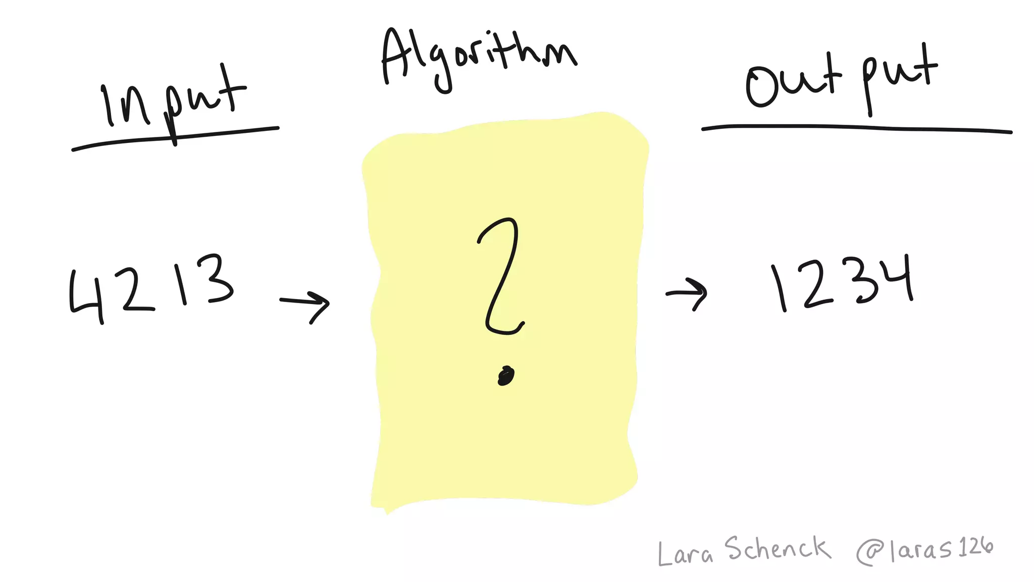
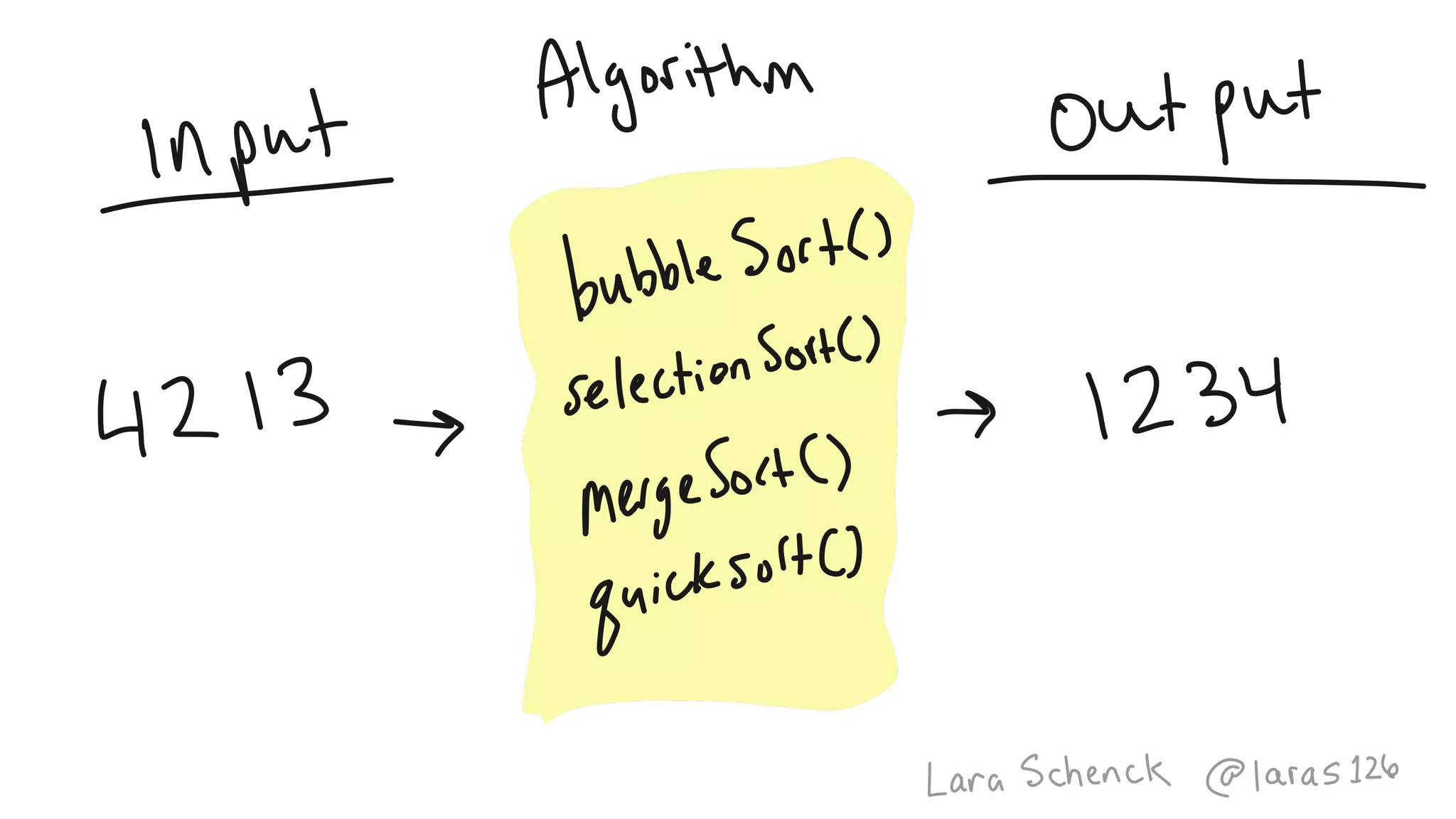
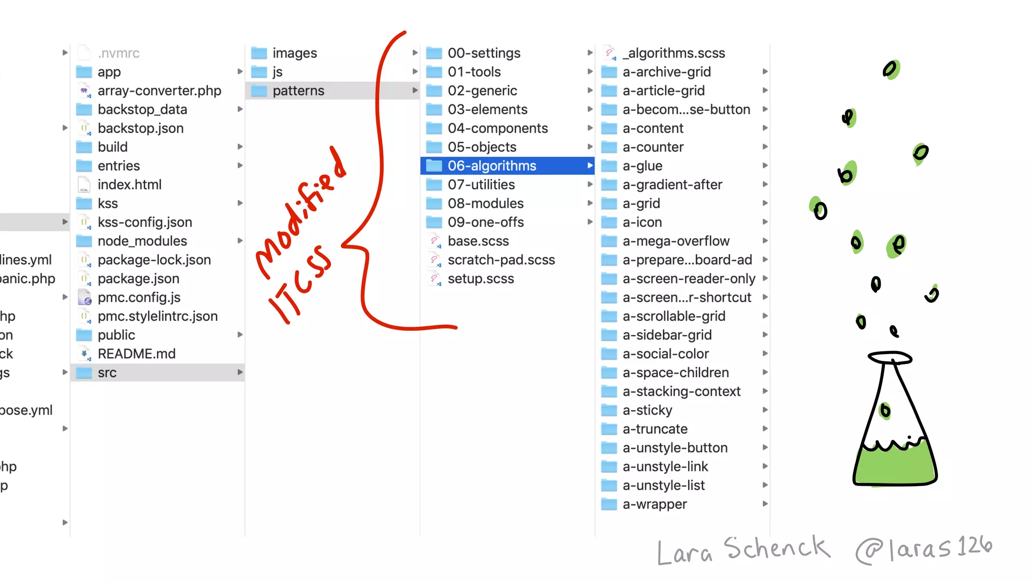
![function sort(array) {
for (let i = 0; i < array.length; i++) {
for (let ii = 0; ii < array.length; ii++) {
if (array[ii] > array[ii+1]) {
let temp = array[ii];
array[ii] = array[ii+1];
array[ii+1] = temp;
}
}
}
return array;
}
var sorted = sort([4, 2, 1, 3]);](https://image.slidesharecdn.com/algorithmsincss-v3-190617214432/75/Algorithms-in-CSS-v3-1-0-CSS-Day-2019-128-2048.jpg)


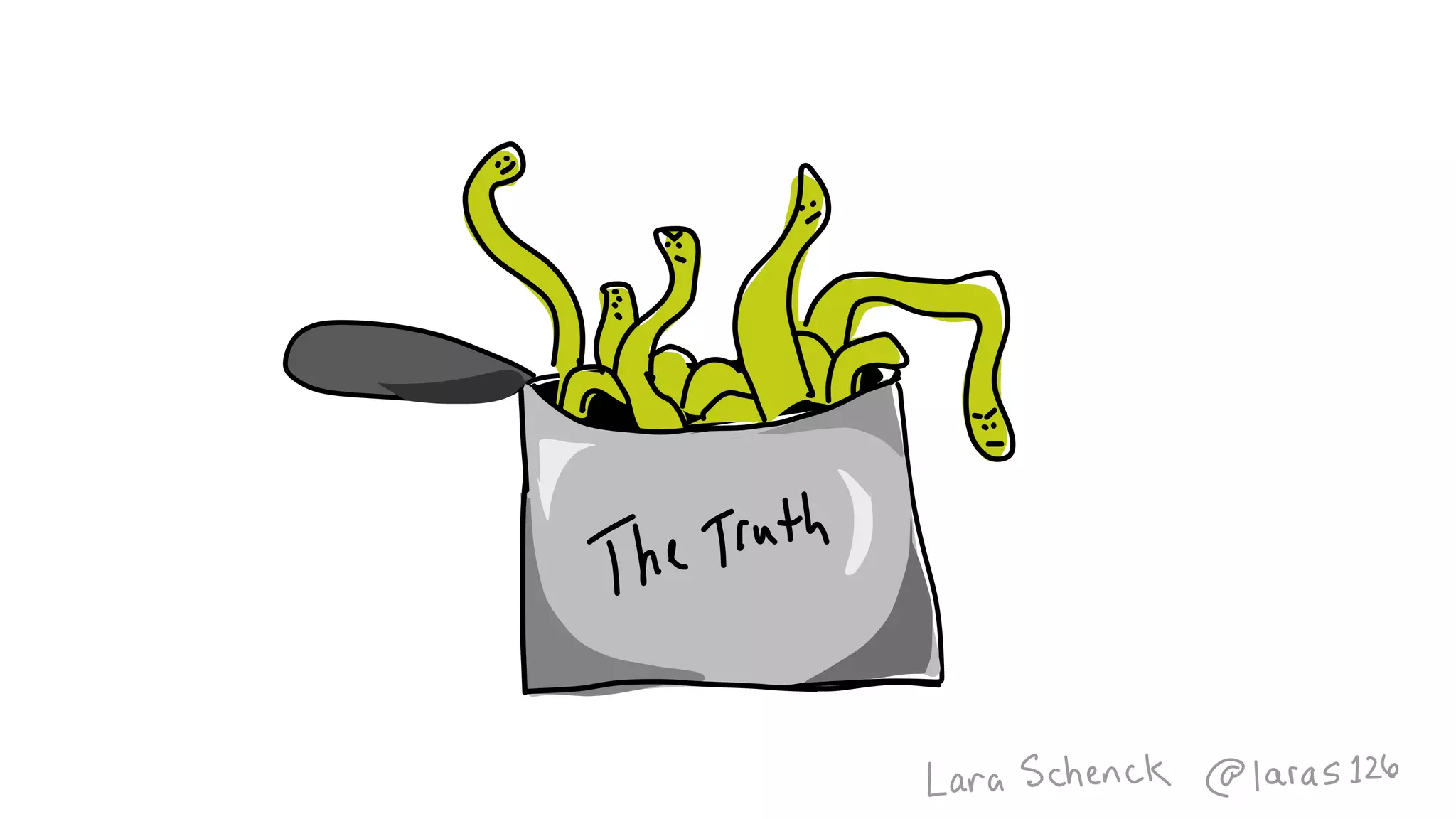


![Coded Agents – with UiPath SDK + LangGraph [Virtual Hands-on Workshop]](https://cdn.slidesharecdn.com/ss_thumbnails/codedagentsdeck-251215155422-5497c599-thumbnail.jpg?width=640&height=640&fit=bounds)


