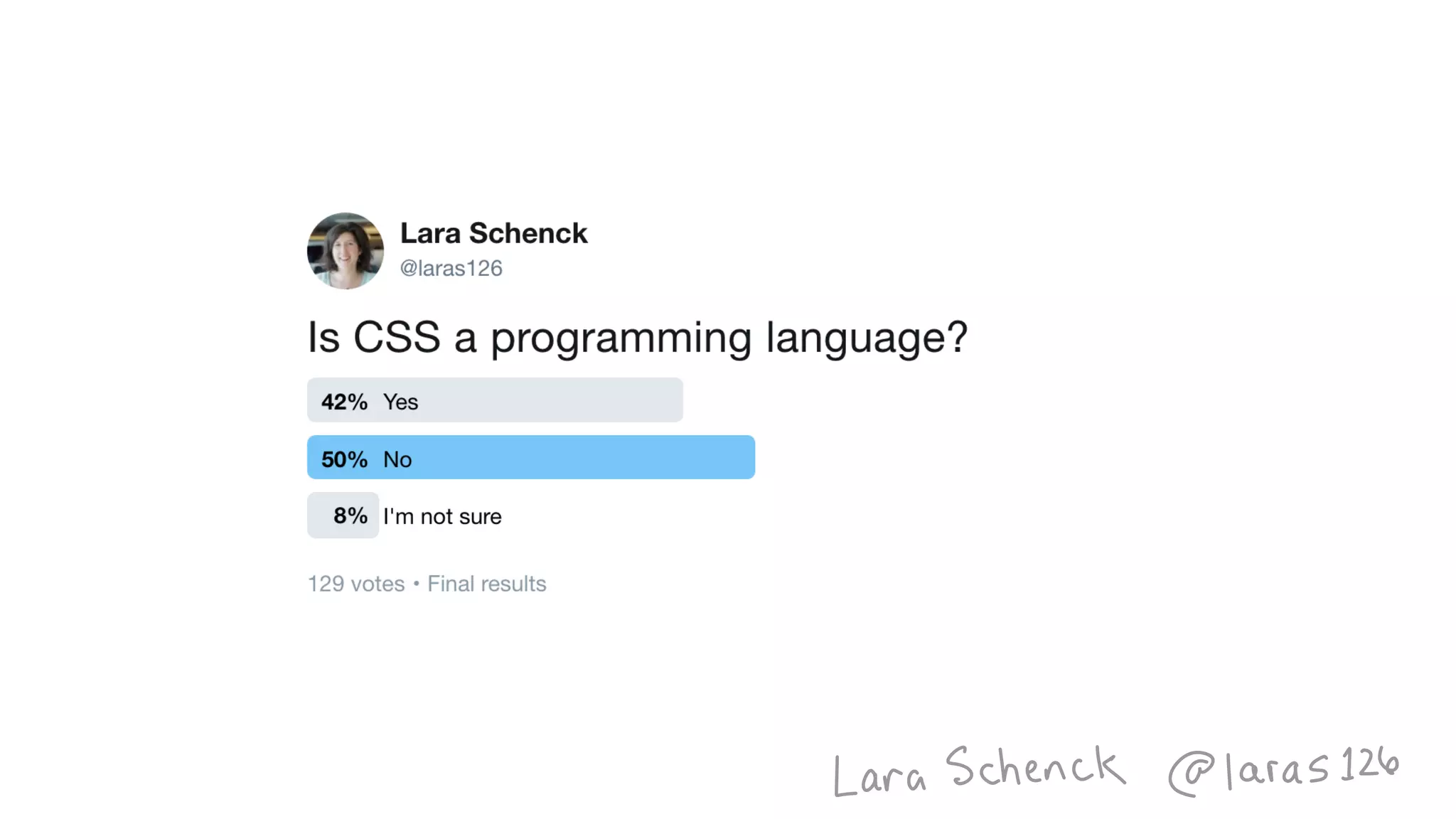
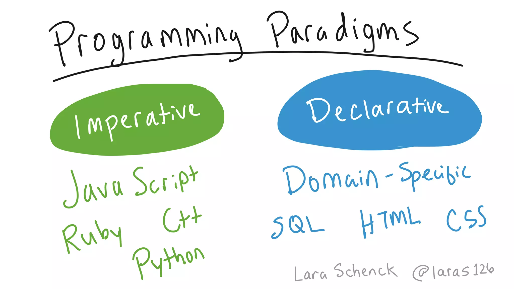
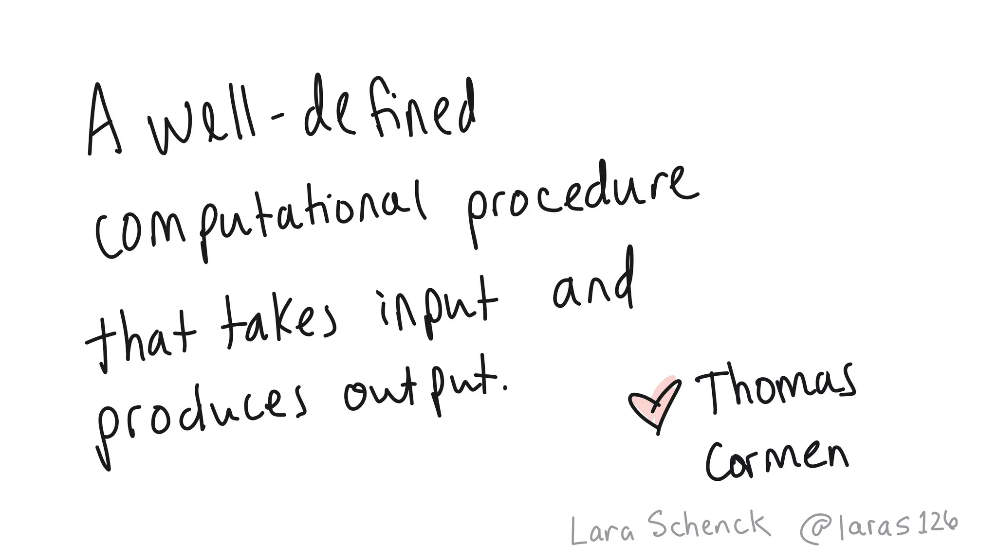
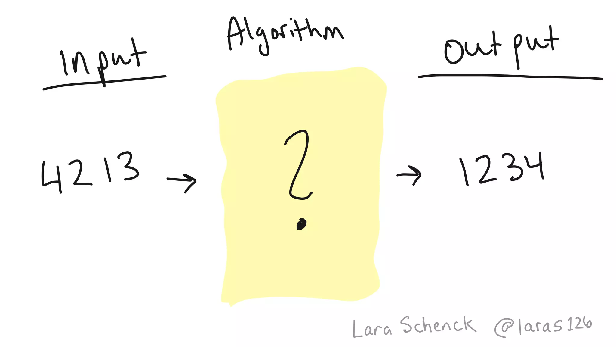
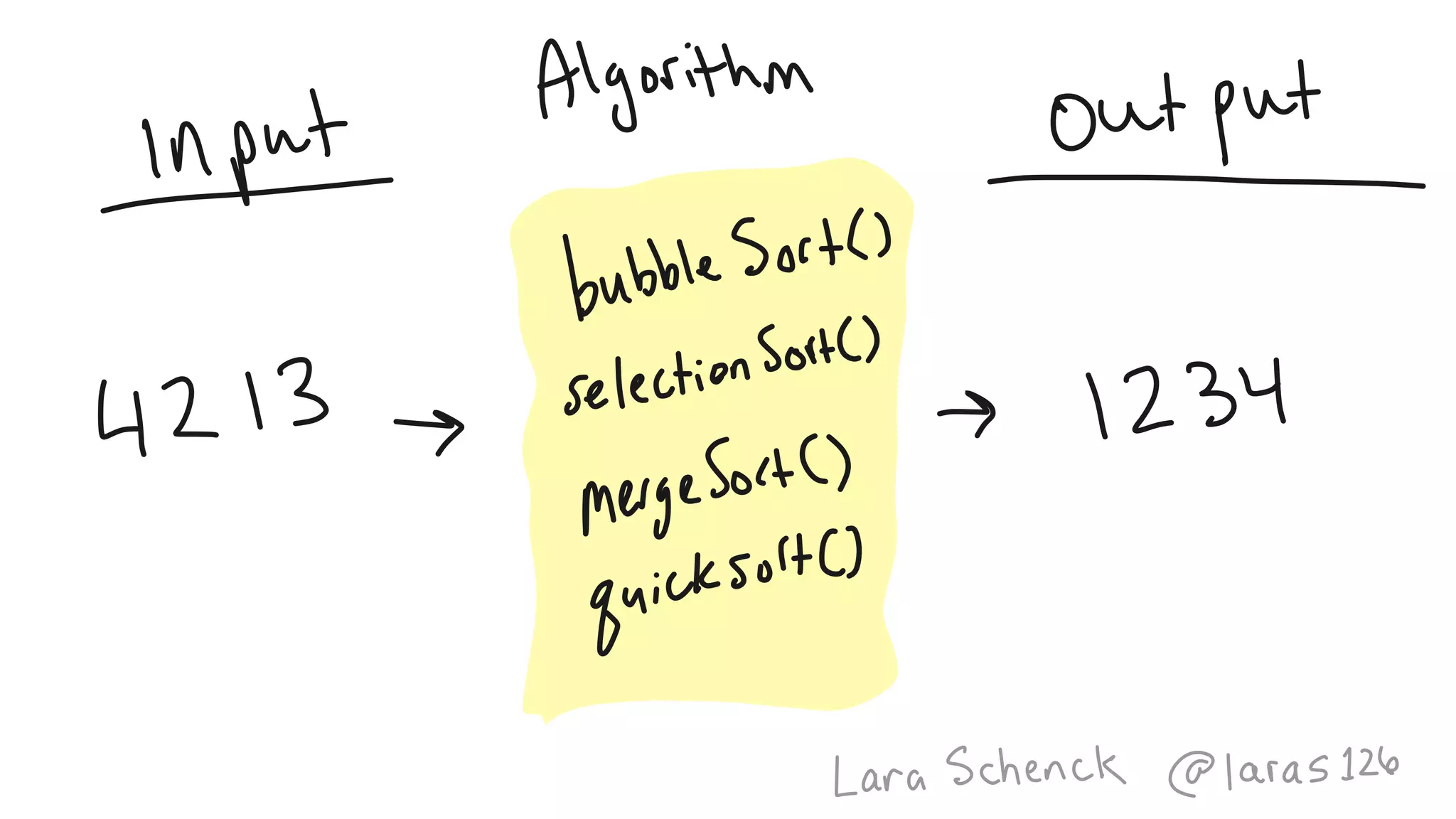
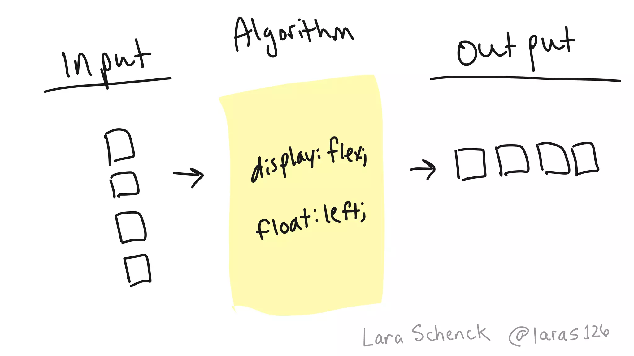
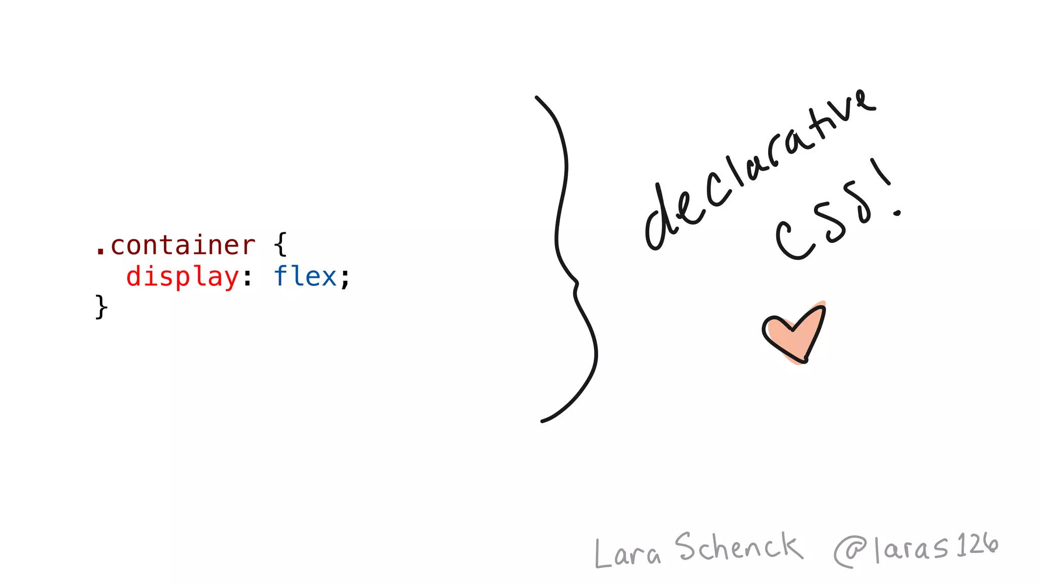
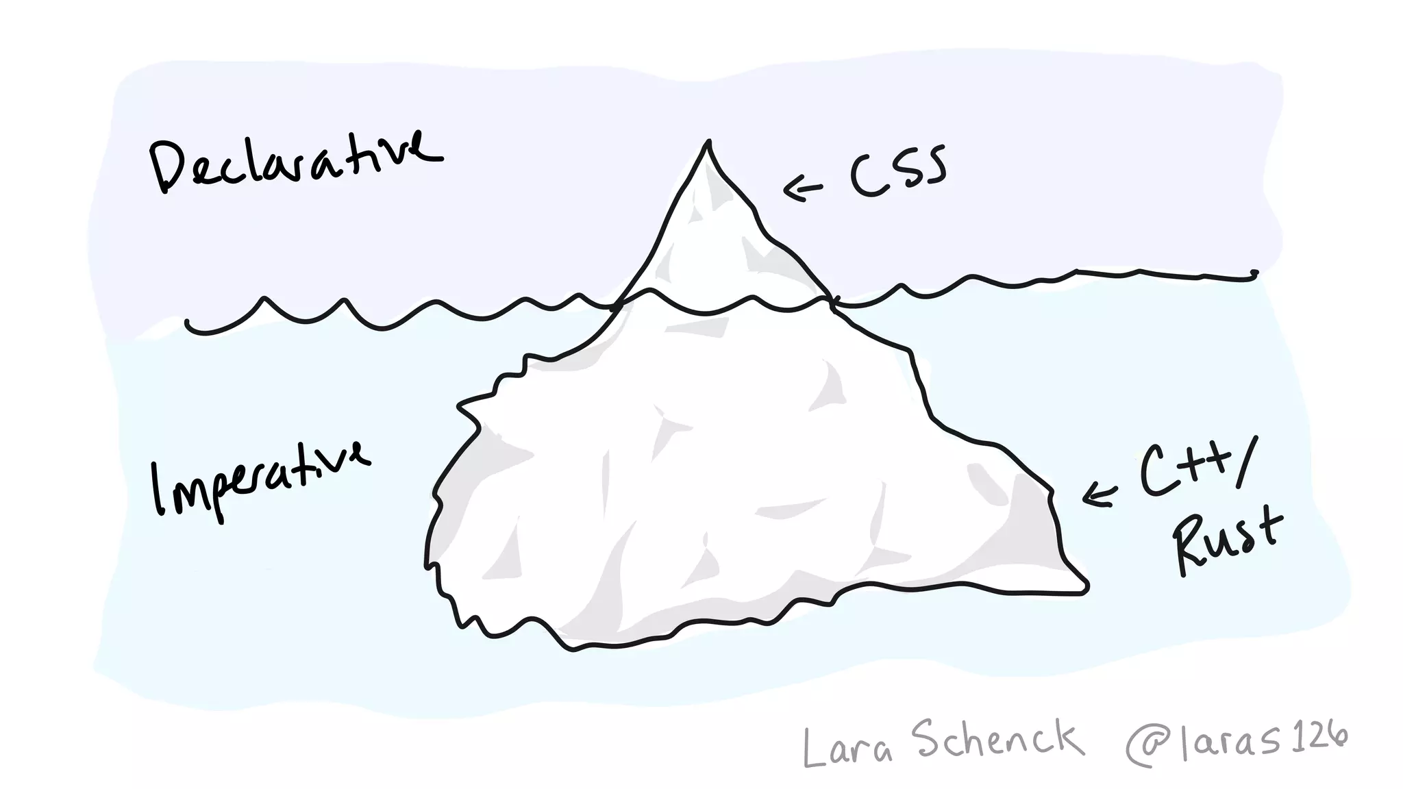
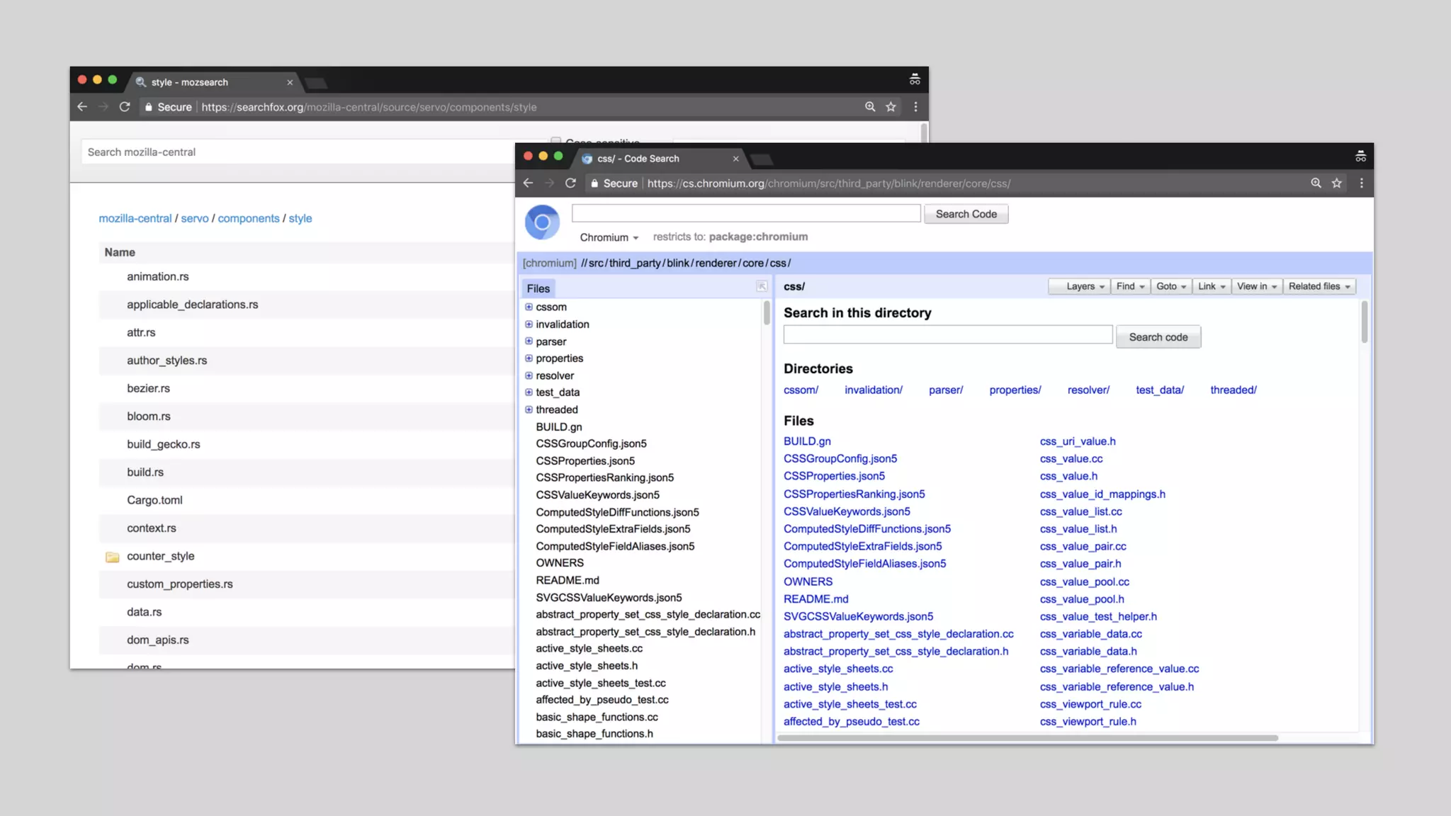
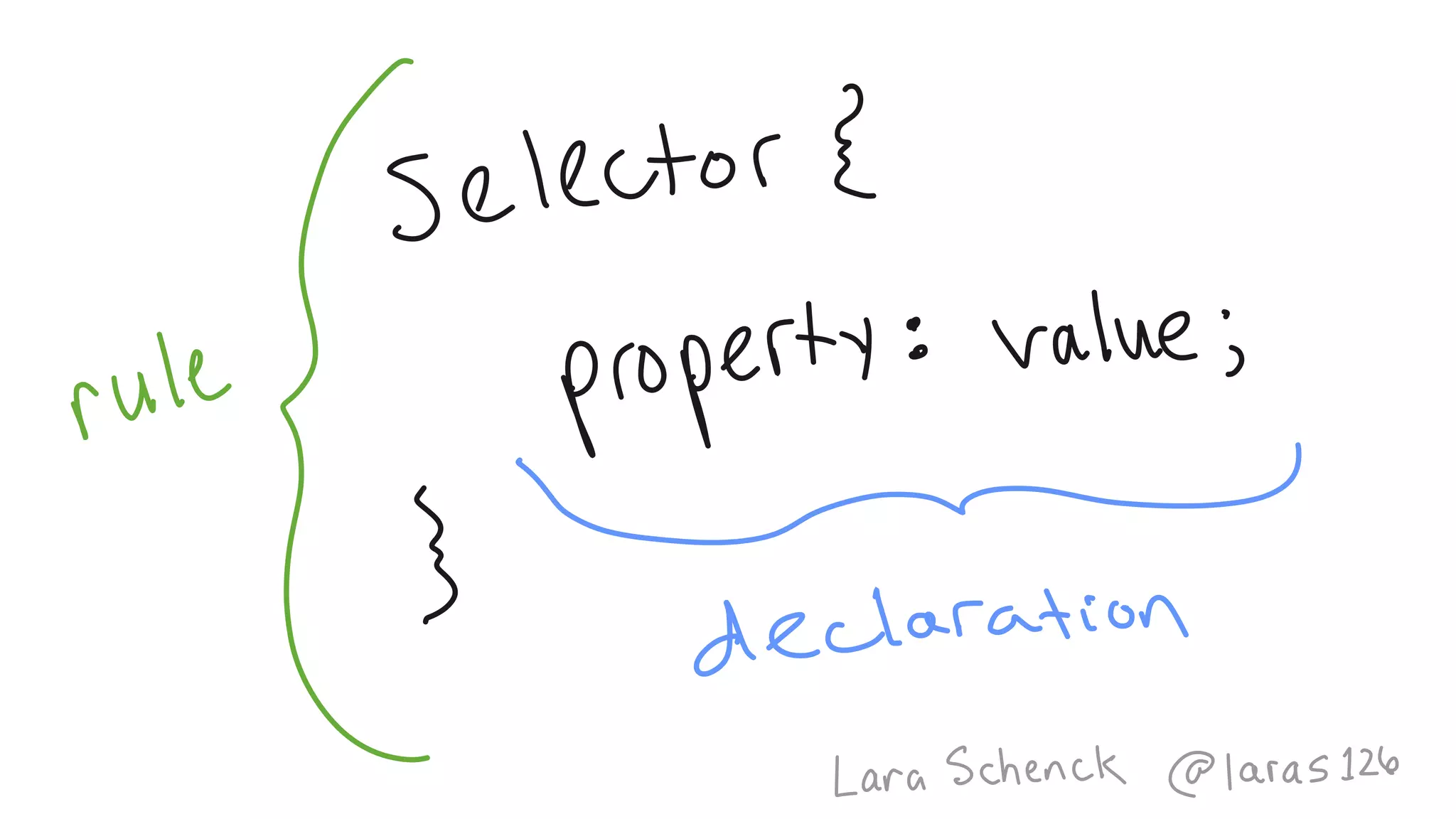
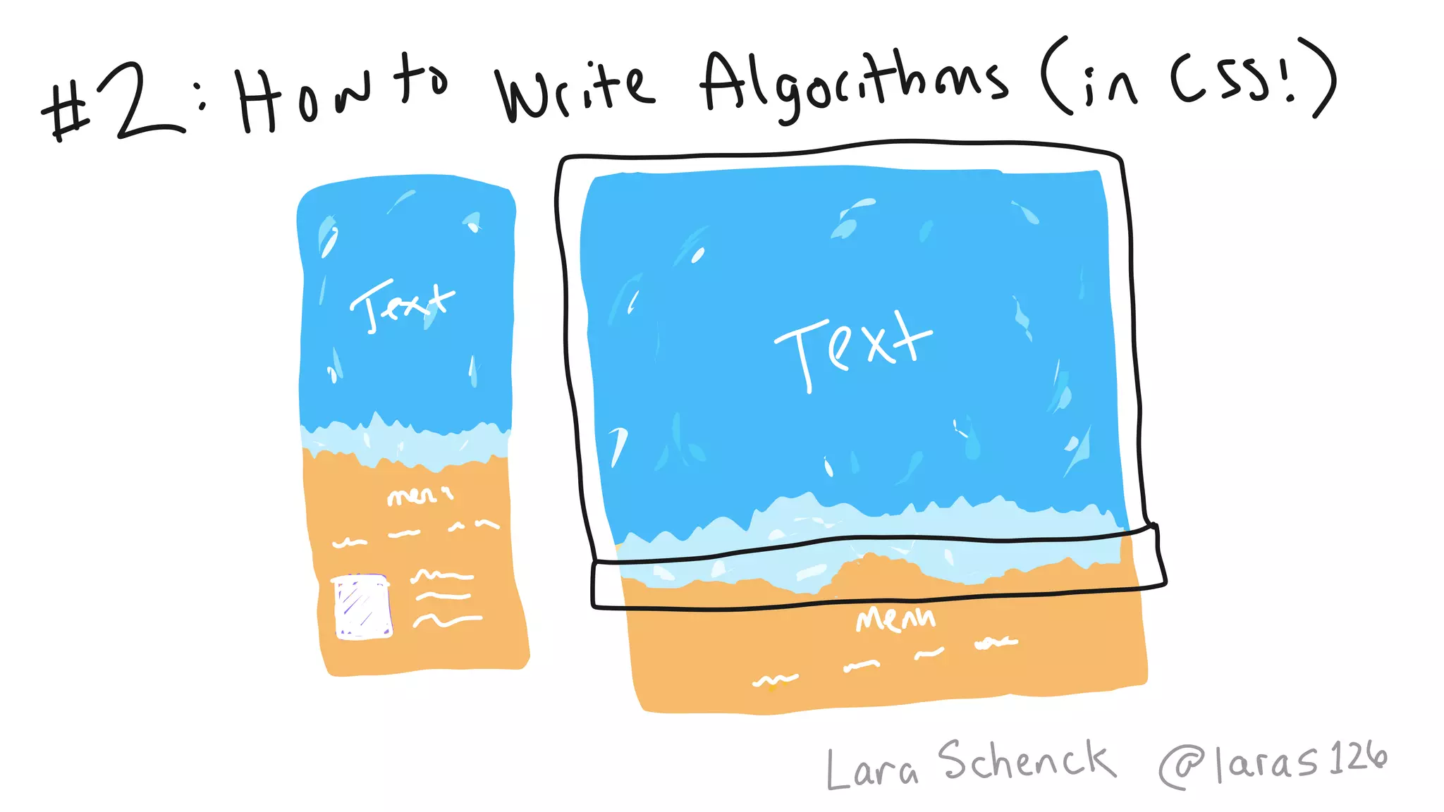
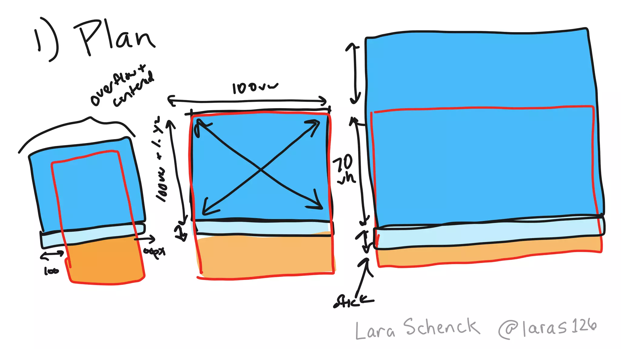
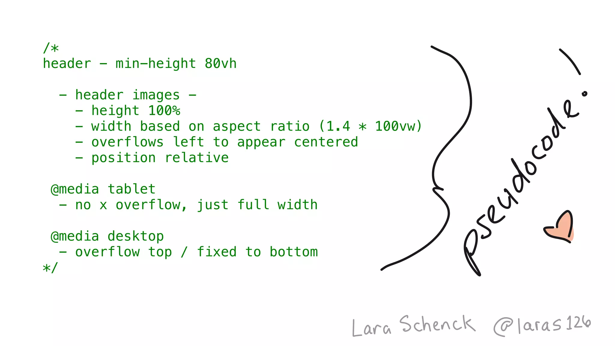
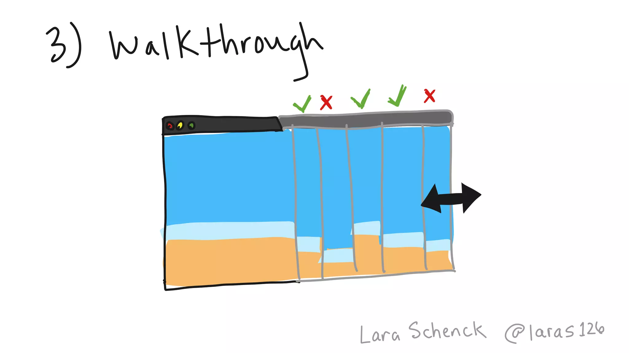
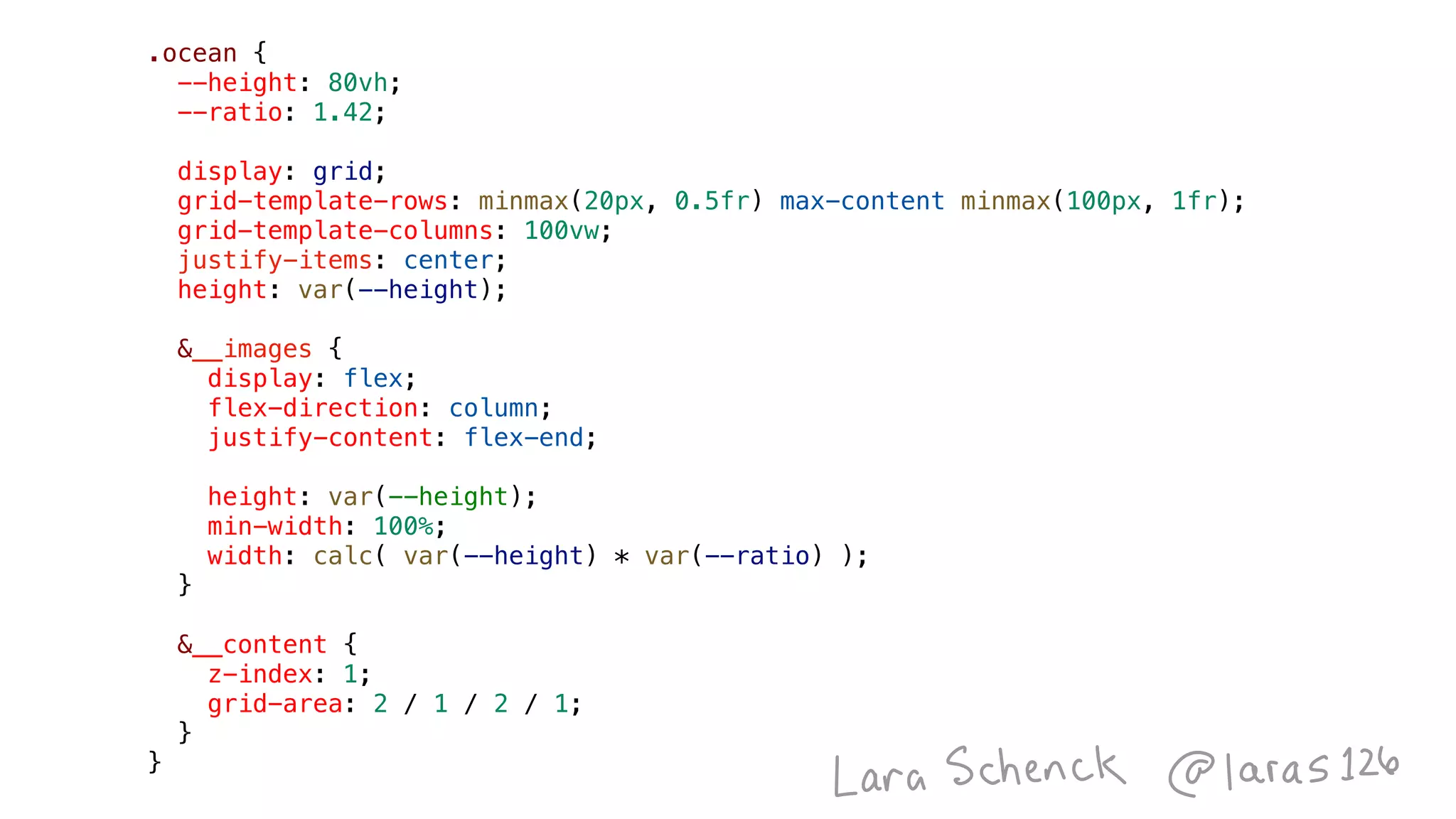
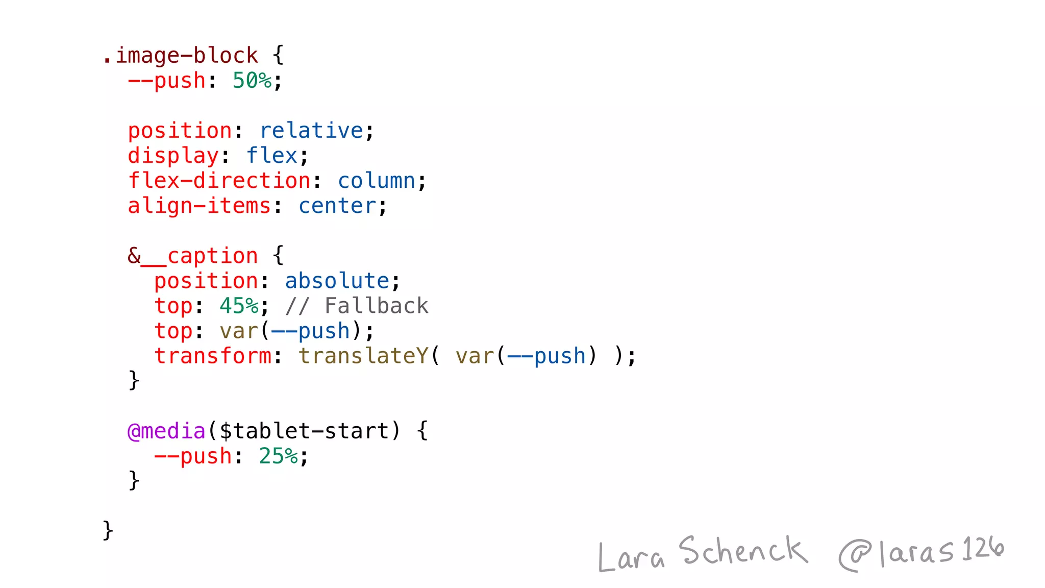
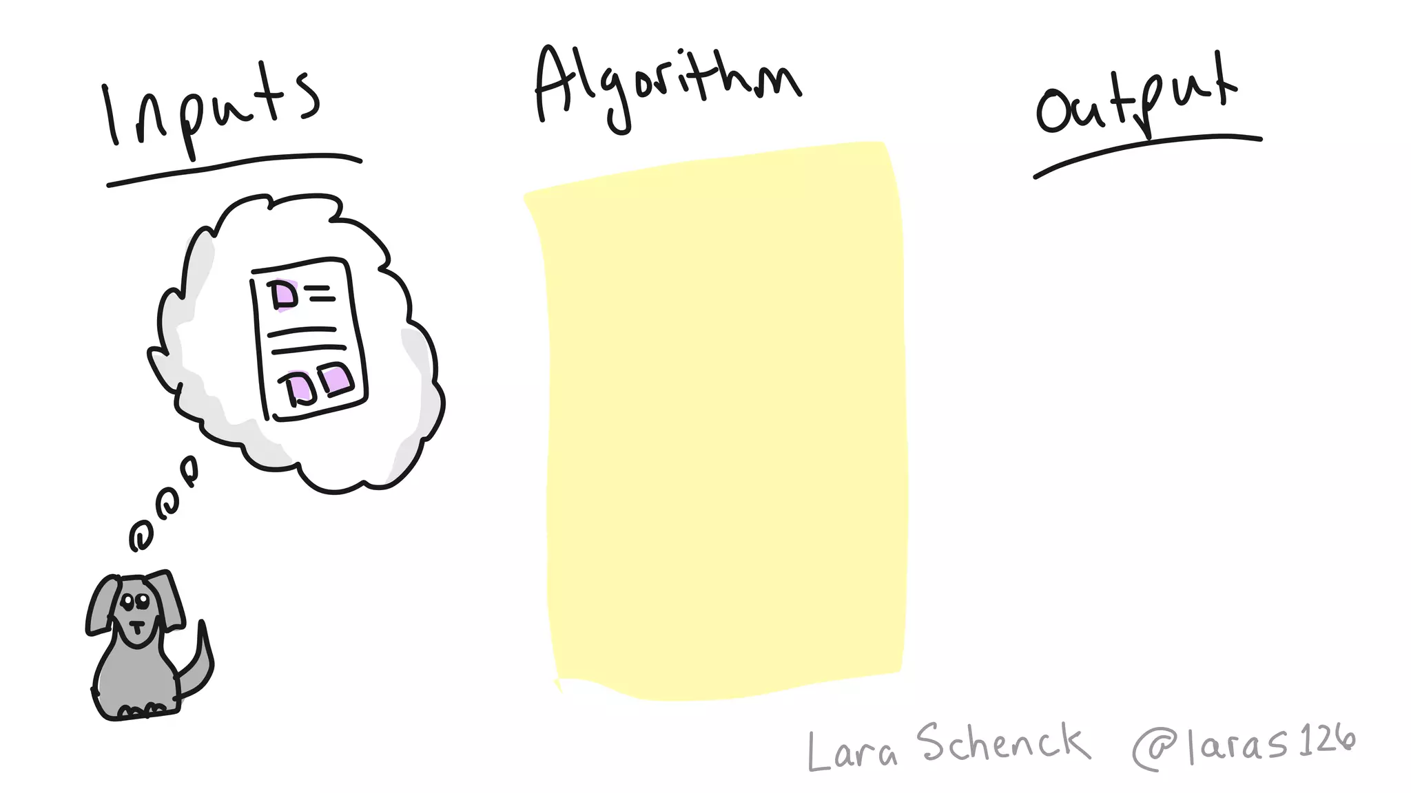
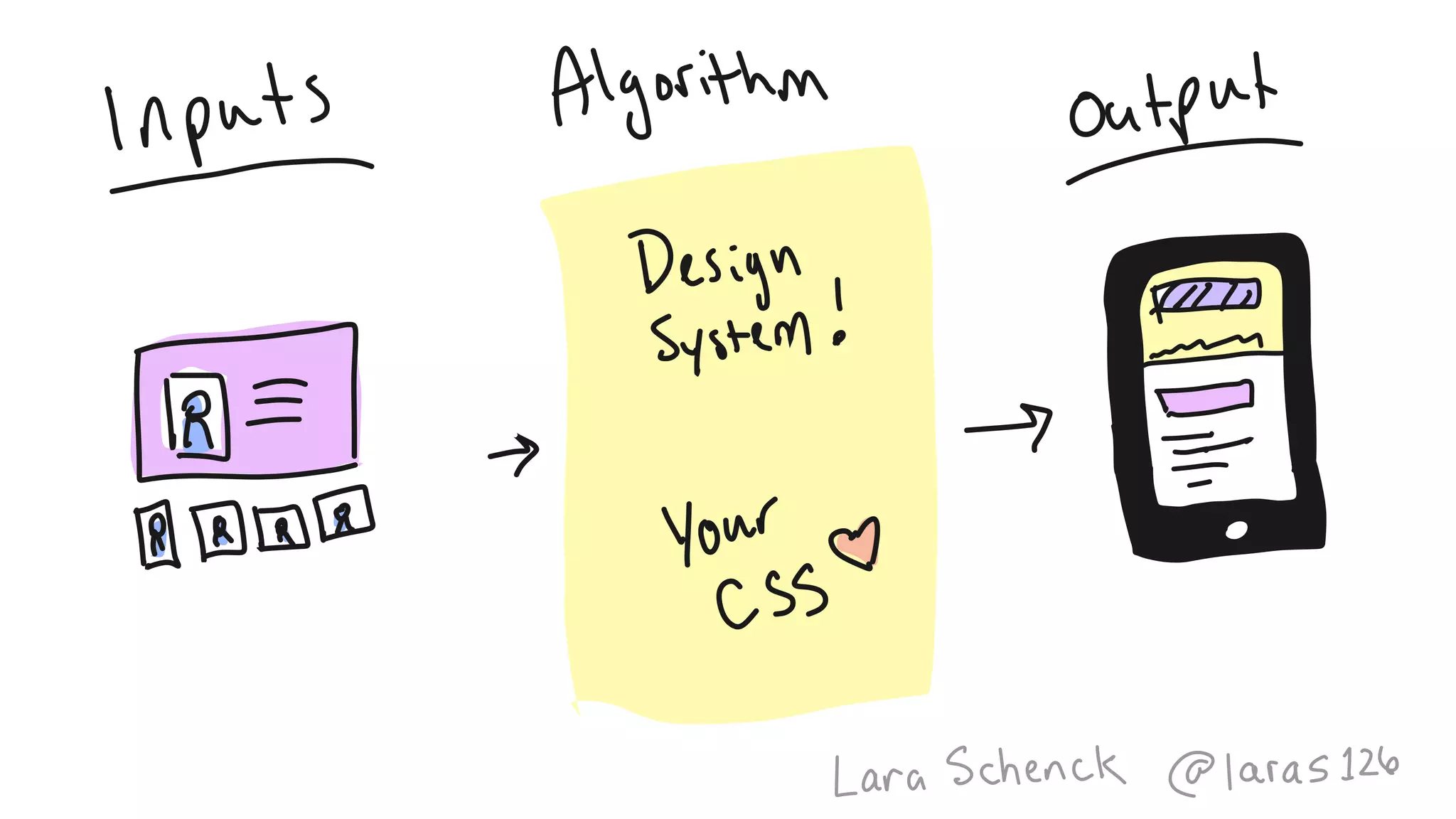
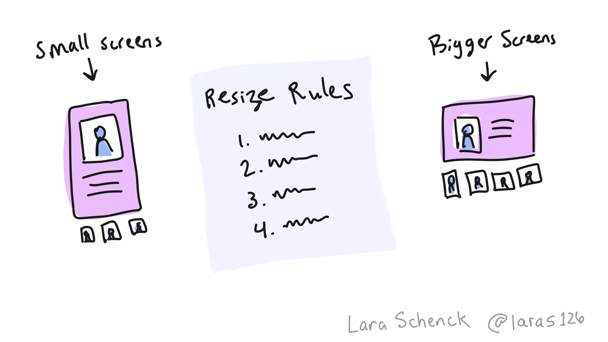
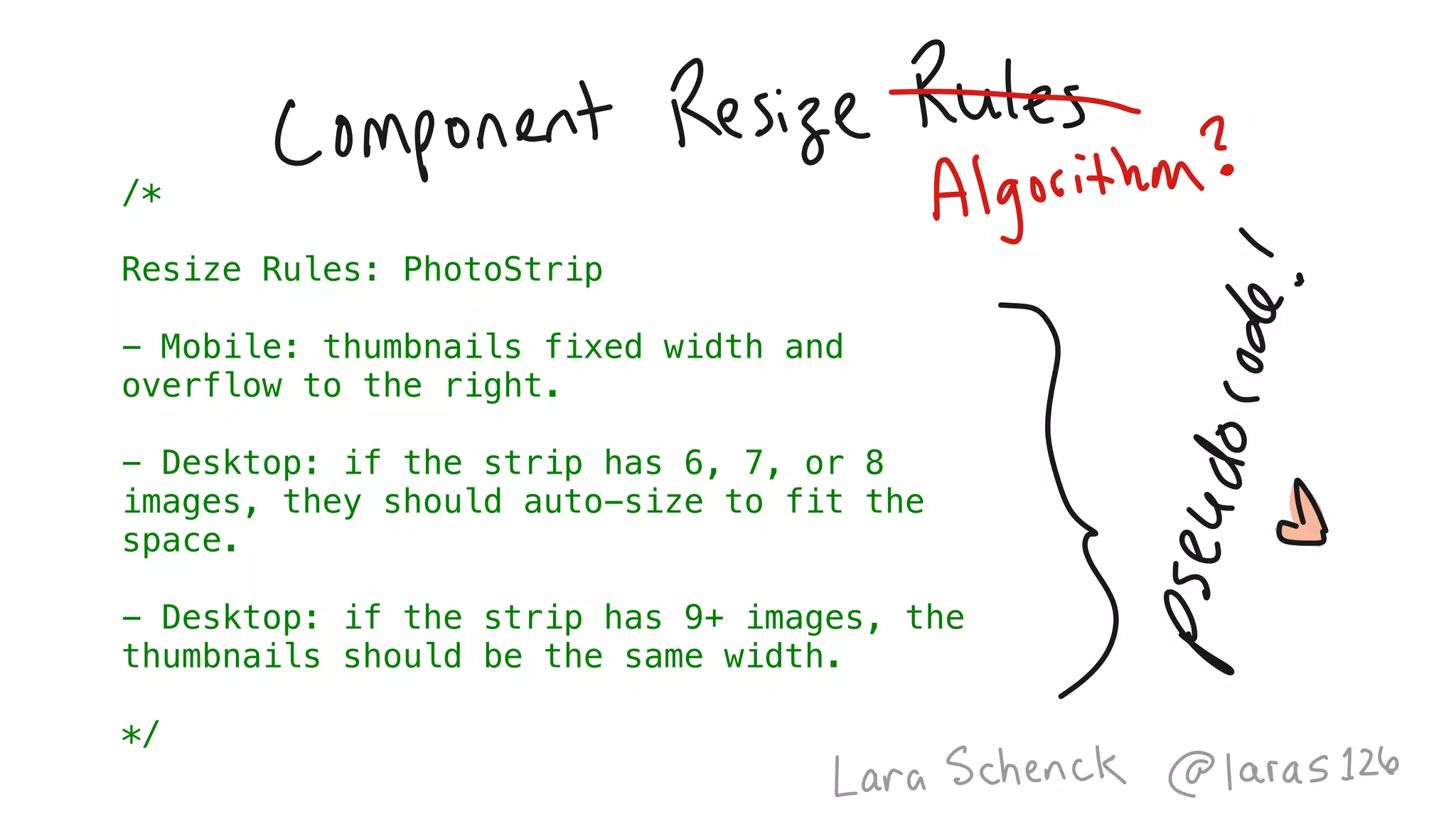
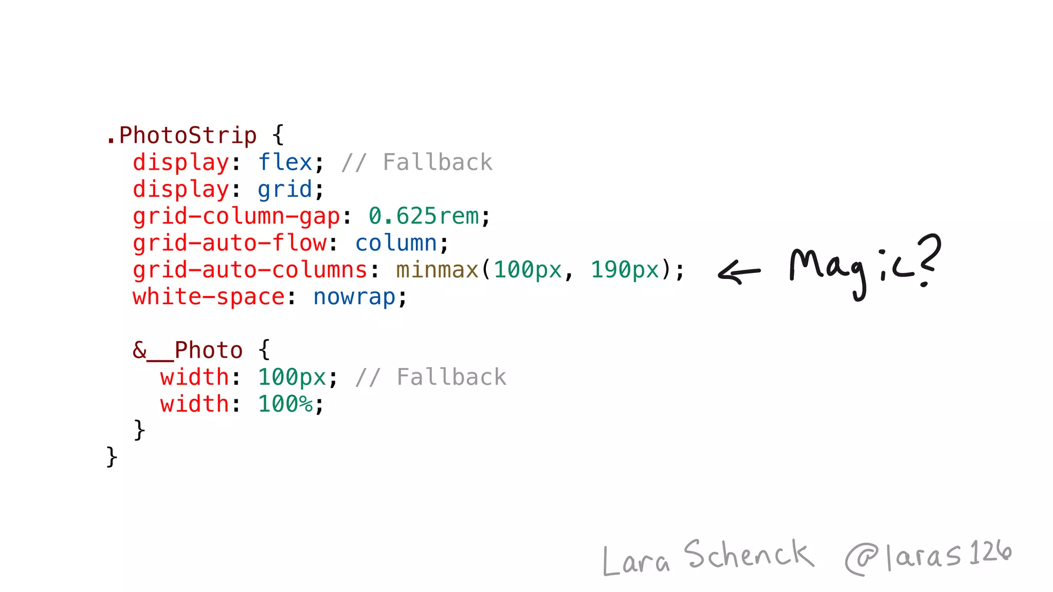
The document contains JavaScript code for a bubble sort function that sorts an array of numbers. It also includes CSS styles for layout and responsive design elements, such as a container and image blocks. The styles define display properties, grid layouts, and resizing rules for photostrips based on device types.


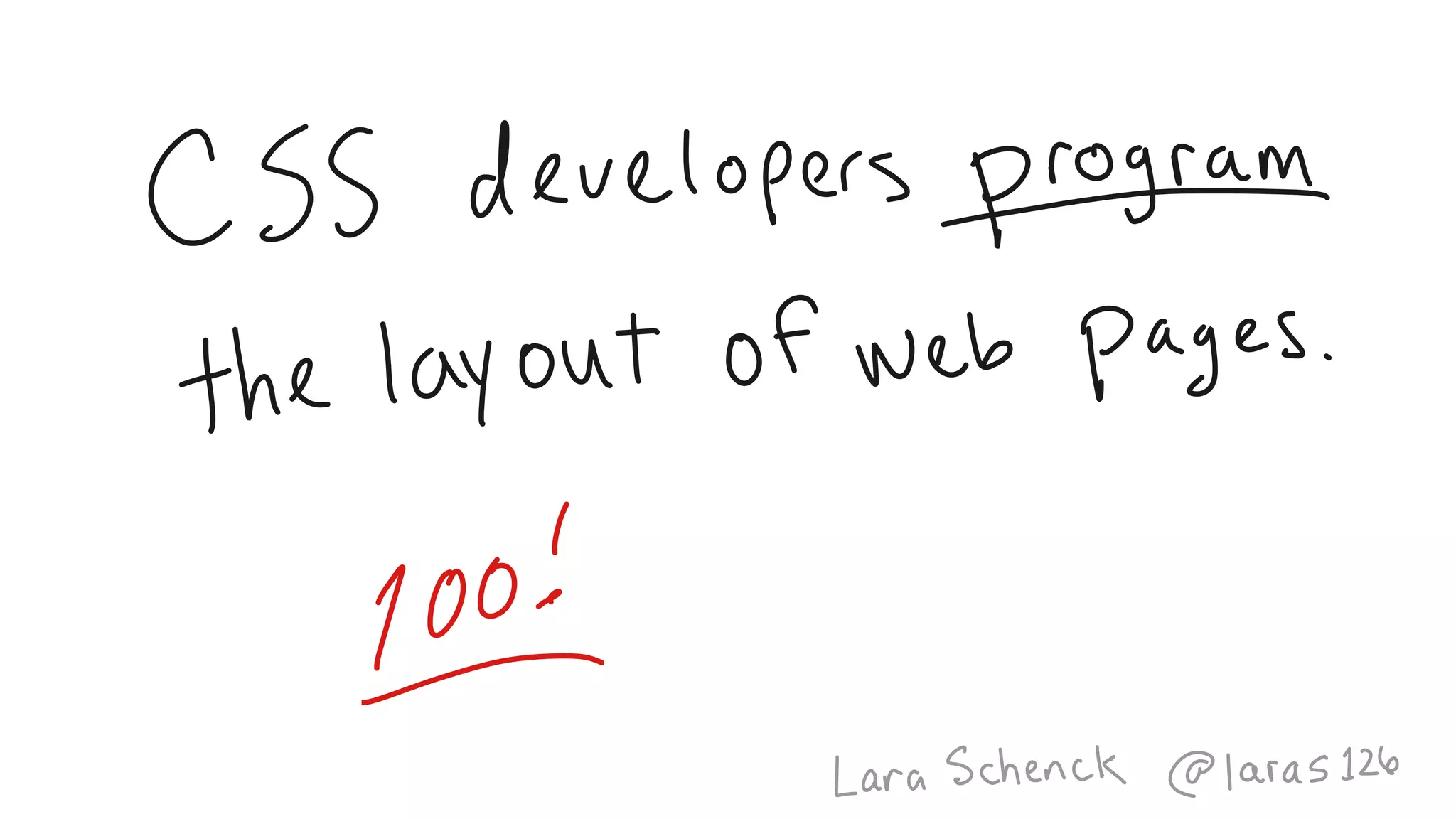

![function bubbleSort(array) {
for (let i = 0; i < array.length; i++) {
for (let ii = 0; ii < array.length; ii++) {
if (array[ii] > array[ii+1]) {
let temp = array[ii];
array[ii] = array[ii+1];
array[ii+1] = temp;
}
}
}
return array;
}
console.log( bubbleSort([4, 2, 1, 3]) );](https://image.slidesharecdn.com/algorithmsofcss-180531154018/75/The-Algorithms-of-CSS-CSSConf-EU-2018-21-2048.jpg)


