In this tutorial, we will show you how to create a Custom Directive in Angular. The Angular directives help us to extend or manipulate the DOM. We can change the appearance, behavior, or layout of a DOM element using the directives. We will build a four directive example s and show you how to
- Create a custom directive using the
@Directivedecorator. - We will create both custom attribute directive & custom Structural directive.
- How to setup selectors
- Pass value to it using the
@input. - How to respond to user inputs,
- Manipulate the DOM element (Change the Appearance) etc.
Table of Contents
Angular Directives
The Angular has three types of directives.
- Components
- Structural Directives
- Attribute Directives
Components are directives with Template (or view). We know how to build Angular Components. Structural & Attribute directives do not have an associated view.
Structural directives change the DOM layout by adding and removing DOM elements. All structural Directives are preceded by the Asterix (*) symbol.
The Attribute directives can change the appearance or behavior of an element.
Creating Custom Attribute Directive
The Angular has several built-in attribute directives. Let us create a ttClass directive, which allows us to add class to an element. Similar to the Angular ngClass directive.
Create a new file and name it as tt-class.directive.ts. import the necessary libraries that we need.
1 2 3 | import { Directive, ElementRef, Input, OnInit } from '@angular/core' |
Decorate the class with @Directive. Here we need to choose a selector (ttClass) for our directive. We name our directive as ttClassDirective.
1 2 3 4 5 6 | @Directive({ selector: '[ttClass]', }) export class ttClassDirective implements OnInit { |
Our directive needs to take the class name as the input. The Input decorator marks the property ttClass as the input property. It can receive the class name from the parent component.
We use the same name same as the select name ttClass. This will enable us to use the property binding syntax <button [ttClass]="'blue'"> in the component.
You can also create more than @Input properties.
1 2 3 | @Input() ttClass: string; |
We attach the attribute directive to an element, which we call the parent element. To change the properties of the parent element, we need to get the reference. Angular injects the parent element when we ask for the instance of the ElementRef in its constructor.
1 2 3 4 | constructor(private el: ElementRef) { } |
ElementRef is a wrapper for the Parent DOM element. We can access the DOM element via the property nativeElement. The classList method allows us to add the class to the element.
1 2 3 4 5 | ngOnInit() { this.el.nativeElement.classList.add(this.ttClass); } |
The complete code is as shown below.
1 2 3 4 5 6 7 8 9 10 11 12 13 14 15 16 17 18 19 | import { Directive, ElementRef, Input, OnInit } from '@angular/core' @Directive({ selector: '[ttClass]', }) export class ttClassDirective implements OnInit { @Input() ttClass: string; constructor(private el: ElementRef) { } ngOnInit() { this.el.nativeElement.classList.add(this.ttClass); } } |
In the app.component.css and the CSS class blue
1 2 3 4 5 | .blue { background-color: lightblue; } |
Finally in the component template attach our customer directive ttClass to the button element.
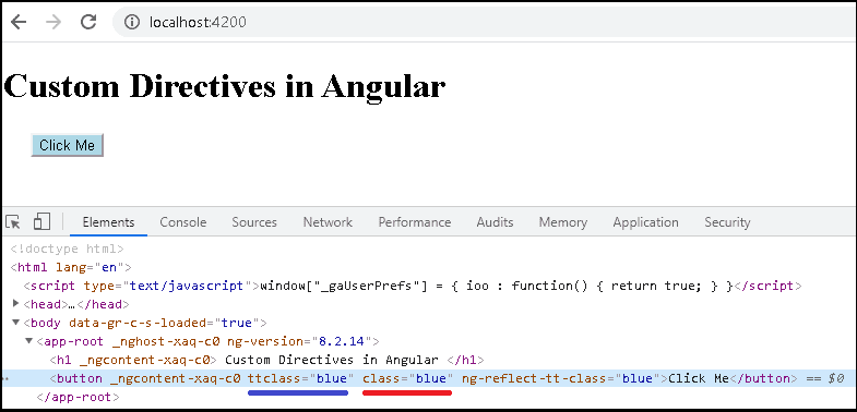
1 2 3 | <button [ttClass]="'blue'">Click Me</button> |
You can see from the image below, that class='blue' is inserted by Our Custom Directive.
The above is a simple imitation of ngClass. Have a look at the source code of ngClass
Creating Custom Structural Directive
Now, let us build a Custom Structural directive. Let us mimic the ngIf and create a custom directive, which we name it as ttIf. There is hardly any difference in creating a Attribute or structural directive.
We start of with creating a tt-if.directive.ts file and import the relevant modules.
1 2 3 | import { Directive, ViewContainerRef, TemplateRef, Input } from '@angular/core'; |
Decorate the class with @Directive with the selector as (ttIf). We name our directive as ttIfDirective.
1 2 3 4 5 6 | @Directive({ selector: '[ttIf]' }) export class ttIfDirective { |
A variable to hold our if condition.
1 2 3 | _ttif: boolean; |
Since, we are manipulating the DOM, we need ViewContainerRef and TemplateRef instances.
1 2 3 4 5 | constructor(private _viewContainer: ViewContainerRef, private templateRef: TemplateRef<any>) { } |
Our directive needs to take the if condition as the input. The Input decorator marks the property ttIf as the input property. Note that we are using setter function, because we want the add or remove the content whenever the if condition changes.
We use the same name same as the select name ttIf. This will enable us to use the property binding syntax <div *ttIf="show"> in the template.
1 2 3 4 5 6 7 | @Input() set ttIf(condition) { this._ttif = condition this._updateView(); } |
This is where all the magic happens. We use the createEmbeddedView method of the ViewContainerRef to insert the template if the condition is true. The clear removes the template from the DOM.
1 2 3 4 5 6 7 8 9 | _updateView() { if (this._ttif) { this._viewContainer.createEmbeddedView(this.templateRef); } else { this._viewContainer.clear(); } |
That it. Remember to ttIfDirective in the declaration array of the app.module.ts. The complete code is as shown below.
1 2 3 4 5 6 7 8 9 10 11 12 13 14 15 16 17 18 19 20 21 22 23 24 25 26 27 28 29 30 31 32 | import { Directive, ViewContainerRef, TemplateRef, Input } from '@angular/core'; @Directive({ selector: '[ttIf]' }) export class ttIfDirective { _ttif: boolean; constructor(private _viewContainer: ViewContainerRef, private templateRef: TemplateRef<any>) { } @Input() set ttIf(condition) { this._ttif = condition this._updateView(); } _updateView() { if (this._ttif) { this._viewContainer.createEmbeddedView(this.templateRef); } else { this._viewContainer.clear(); } } } |
Component class
1 2 3 4 5 6 7 8 9 10 11 12 13 | import { Component } from '@angular/core'; @Component({ selector: 'app-root', templateUrl: './app.component.html', styleUrls: ['./app.component.css'] }) export class AppComponent { title: string = "Custom Directives in Angular"; show=true; } |
Template
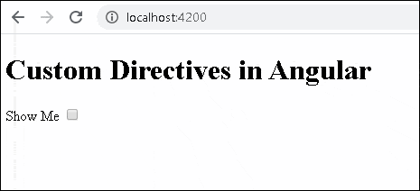
1 2 3 4 5 6 7 8 9 10 11 12 13 14 15 | <h1> {{title}} </h1> Show Me <input type="checkbox" [(ngModel)]="show"> <div *ttIf="show"> Using the ttIf directive </div> <div *ngIf="show"> Using the ngIf directive </div> |
Run the app and compare the ngIf & our custom directive ttIf side by side.
Why you need to specify *
Remove the * from our newly created ttIf directive. And you will get the error message
ERROR NullInjectorError: StaticInjectorError(AppModule)[NgIf -> TemplateRef]:
StaticInjectorError(Platform: core)[NgIf -> TemplateRef]:
NullInjectorError: No provider for TemplateRef!
We use the *notation to tell Angular that we have a structural directive and we will be manipulating the DOM. It basically tells angular to inject the TemplateRef. To inject the templateRef, the Angular needs to locate the template. The * tells the Angular to locate the template and inject its reference as templateRef
Custom Directive Examples
The following two more Custom Directive Examples. Toggle & Tooltip directives
Toggle Directive
The following directive adds or removes the CSS class toggle from the Parent element. We do that by listening to the click event on the host element or parent element.
Angular makes this easy to listen to the events from the parent or host element using the@HostListener function decorator. We use it to decorate the function (onClick method in the example). It accepts the name of the event as the argument and invokes the decorated method whenever the user raises the event.
1 2 3 4 | @HostListener('click') private onClick() { |
The complete code of the ttToggleDirective is as follows.
1 2 3 4 5 6 7 8 9 10 11 12 13 14 15 16 17 18 19 20 21 22 23 24 25 26 27 28 | import { Directive, ElementRef, Renderer2, Input, HostListener, HostBinding } from '@angular/core' @Directive({ selector: '[ttToggle]', }) export class ttToggleDirective { private elementSelected = false; constructor(private el: ElementRef) { } ngOnInit() { } @HostListener('click') private onClick() { this.elementSelected = !this.elementSelected; if (this.elementSelected) { this.el.nativeElement.classList.add('toggle') } else { this.el.nativeElement.classList.remove('toggle') } } } |
Add the following CSS Class
1 2 3 4 5 | .toggle { background-color: yellow } |
Use it as follows.
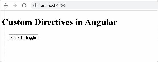
1 2 3 | <button ttToggle>Click To Toggle</button> |
Tooltip Directive
The tooltip directive shows the tip whenever the user hovers over it. The directive uses the HostListener to listen to the mouseenter and mouseleave events.
The showHint method adds a span element into the DOM and sets its top & left position just below the host element. The removeHint removes it from the DOM.
1 2 3 4 5 6 7 8 9 10 11 12 13 14 15 16 17 18 19 20 21 22 23 24 25 26 27 28 29 30 31 32 33 34 35 36 37 38 39 40 41 42 43 44 45 46 47 48 49 50 51 52 53 54 55 | import { Directive, ElementRef, Renderer2, Input, HostListener } from '@angular/core' @Directive({ selector: '[ttToolTip]', }) export class ttTooltipDirective { @Input() toolTip: string; elToolTip: any; constructor(private elementRef: ElementRef, private renderer: Renderer2) { } @HostListener('mouseenter') onMouseEnter() { if (!this.elToolTip) { this.showHint(); } } @HostListener('mouseleave') onMouseLeave() { if (this.elToolTip) { this.removeHint(); } } ngOnInit() { } removeHint() { this.renderer.removeClass(this.elToolTip, 'tooltip'); this.renderer.removeChild(document.body, this.elToolTip); this.elToolTip = null; } showHint() { this.elToolTip = this.renderer.createElement('span'); const text = this.renderer.createText(this.toolTip); this.renderer.appendChild(this.elToolTip, text); this.renderer.appendChild(document.body, this.elToolTip); this.renderer.addClass(this.elToolTip, 'tooltip'); let hostPos = this.elementRef.nativeElement.getBoundingClientRect(); let tooltipPos= this.elToolTip.getBoundingClientRect(); let top = hostPos.bottom+10 ; let left = hostPos.left; this.renderer.setStyle(this.elToolTip, 'top', `${top}px`); this.renderer.setStyle(this.elToolTip, 'left', `${left}px`); } } |
Add the following CSS Class
1 2 3 4 5 6 7 | .tooltip { display: inline-block; border-bottom: 1px dotted black; position: absolute; } |
Use it as follows.
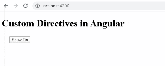
1 2 3 | <button ttToolTip toolTip="Tip of the day">Show Tip</button> |

For custom structural directive we need to include that in the declarations array of app.module.ts.
There is one missing step at the end of *Creating Custom Attribute Directive* (the author mentions it in the next section though).
Simply creating the directive won’t work, it needs to be declared in
app.module.tsin the@NgModule>declarationslike so:@NgModule({
declarations: [
AppComponent,
ttClassDirective
],
...
})
You might need to save the html file again to see the changes on your preview.
(Other subject)
I had an issue where the tooltip wouldn’t appear. After debugging, I found that I had left a link to
bootstrap.min.cssinapp.component.htmlwhich has its own.tooltipclass. Renaming our custom tooltip class fromtooltiptott-tooltipfixed the issue.