Time is Running
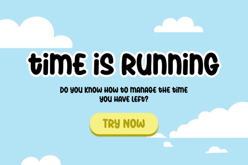
A radical time-management web app where every second countsliterally. Built to confront users with the weight of passing time through bold design and unconventional interactions.
Inspiration
I wanted to break away from sterile productivity apps. Instead, I created a visceral experience where time feels tangible: oversized counters, dramatic typography, and features that playfully force self-awareness (like a life calendar that screams "YOU HAVE 2,100 WEEKS LEFT").
What It Does
- Time Confrontation: A brutalist life countdown based on actuarial data.
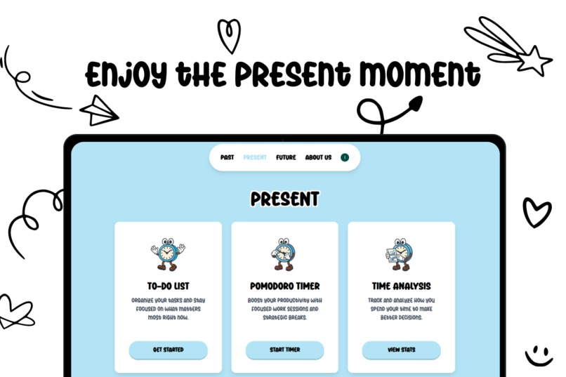
- Present Focus: To-do lists with deadlines that visually explode when overdue.
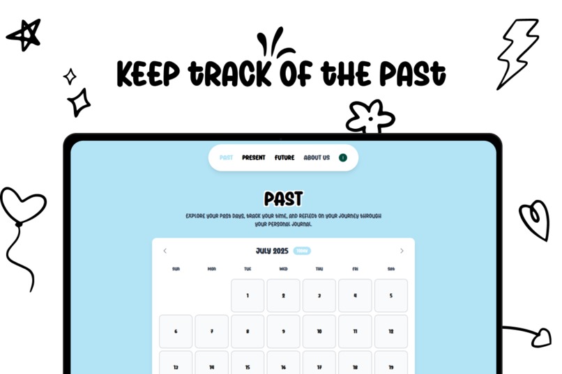
- Past Reflection: A journal with mood tracking where entries fade like old memories.
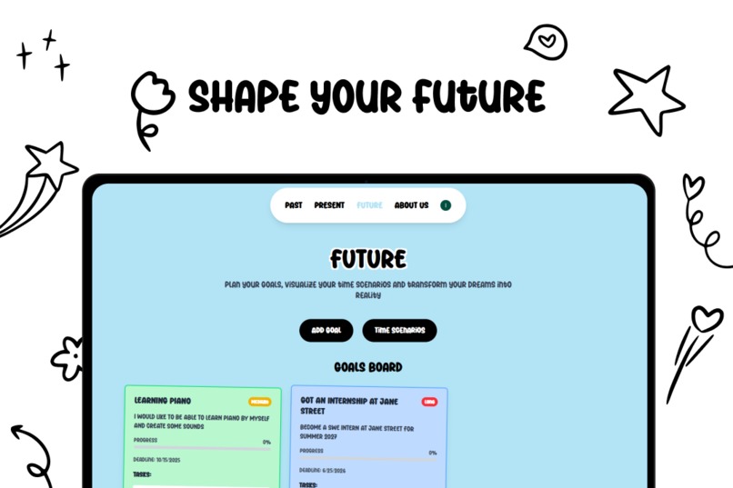
- Future Shock: Scenario calculators ("What if you waste 1h/day on TikTok for 10 years?").
- UI as a Statement: Everything is intentionally oversized clocks, buttons, progress bar to make time feel unignorable.
How I Built It
- Stack: Next.js, TypeScript, Tailwind CSS, Clerk for auth.
- Design: Figma mockups
- Key Libraries: Framer Motion for over-the-top animations, Luxon for time manipulation.
- No Compromises: Every interaction was tweaked to feel deliberate even annoying (e.g., a ticking sound that gets louder when procrastinating).
Challenges I Ran Into
- Making TypeScript cooperate with dynamic date calculations (time zones are Satan’s invention).
- Designing absurdly large UI elements that somehow remain functional.
- Avoiding user despair while showing their mortality stats (dark humor was key).
Accomplishments I'm Proud Of
- 100% Solo Dev & Design: From Figma wireframes to deploy no templates, no copied code.
- Unapologetic Originality: This app doesn’t look or behave like anything else (check the 300px-wide clocks).
- Fun Over Convention: Features like the "Procrastination Amplifier" (tracks wasted time and shames you in Comic Sans) exist purely because I wanted them to.
What I Learned
- How to weaponize UI design to evoke emotions (guilt, urgency, or laughter).
- That TypeScript generics can make you question your life choices.
- Users either love or hate bold design no middle ground.
What's Next
- Micro-Interactions: Add tactile feedback (e.g., screenshake when deadlines loom).
- Time Dilation Mode: A surrealist view where UI elements distort based on productivity.
- Social Pressure: Public commitment contracts ("Bet $10 you’ll finish this task").
- Expand Absurdity: More intentionally jarring features, like a "Time Funeral" for canceled tasks.
Built With
- clerk
- css
- nextjs
- tailwindcss
- typescript


Log in or sign up for Devpost to join the conversation.