
Premium UI .p-titleSuite for Angular





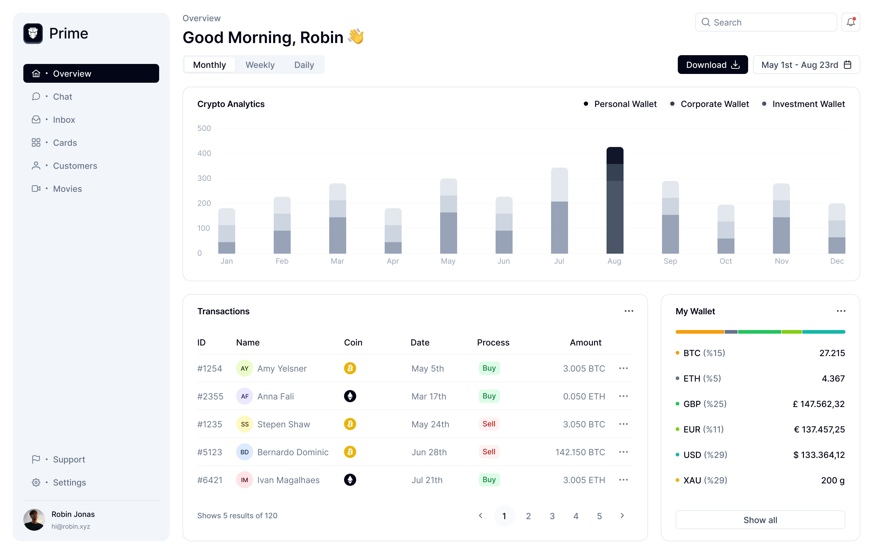

So simple to use
Import a component, pass your data, and you have a production-ready UI. No boilerplate, no setup ceremony.
npm install primengimport { SliderModule } from 'primeng/slider'
import { FormsModule } from '@angular/forms'
@Component({
template: `
<p-slider [(ngModel)]="value" />
`
})
export class VolumeControl {
value = 50
}Built in Layers
Same Dialog, four levels of control. Pick the layer that fits.
import { DialogModule } from 'primeng/dialog'

<p-dialog [(visible)]="visible">
  <ng-template #headless>
    <div class="fixed inset-0 bg-black/50"
      (click)="visible = false"></div>
    <div class="bg-white rounded-xl p-6 shadow-xl">
      <h2>Edit Profile</h2>
      <input pInputText [(ngModel)]="name" />
      <button (click)="visible = false">Close</button>
    </div>
  </ng-template>
</p-dialog>Your Design System
Powered by the multi-layered design token archictured. Customize colors, spacing, radius, and more with a single preset or override per component.
import { definePreset } from '@primeuix/themes'
import Aura from '@primeuix/themes/aura'

const MyPreset = definePreset(Aura, {
  semantic: {
    primary: { 500: '#6366f1' },
    surface: { 0: '#ffffff', 950: '#09090b' },
    colorScheme: {
      dark: {
        surface: { 0: '#09090b', 950: '#fafafa' },
      }
    },
    formField: {
      borderRadius: '0.5rem',
      paddingX: '0.75rem',
      fontSize: '14px',
      shadow: '0 1px 2px rgba(0,0,0,0.05)',
    },
  }
})Accessible by Default
WCAG compliant. Every component handles keyboard, screen readers, and focus out of the box.
Built for Developers
Modern tooling, great defaults, and no surprises.
90+ Components
From data tables to charts, dialogs to menus. Everything you need.
TypeScript
Full type safety with auto-complete. Every prop, event, and ref is typed.
Tree Shakeable
Import only what you use. Dead code elimination keeps your bundle lean.
SSR Ready
Works with any build tool. Server-side rendering, hydration, the whole deal.
Join the Community
Connect with thousands of developers building with PrimeNG.
