Inspiration
I always wondered where I would stand if I am being compared to others w.r.t my contributions on the github, whether I was giving my best to the open-source that I can and where my own projects stand as compared to other projects I have compared to. So I tried to make a utility to visualize that.
What it does
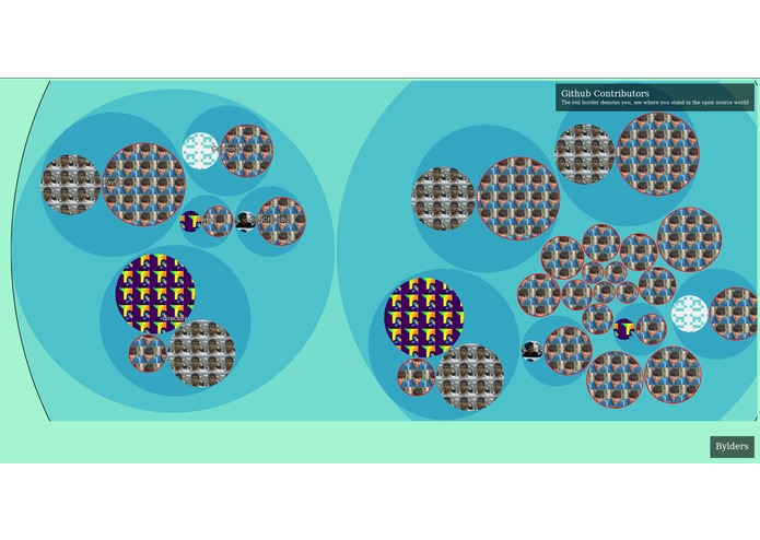
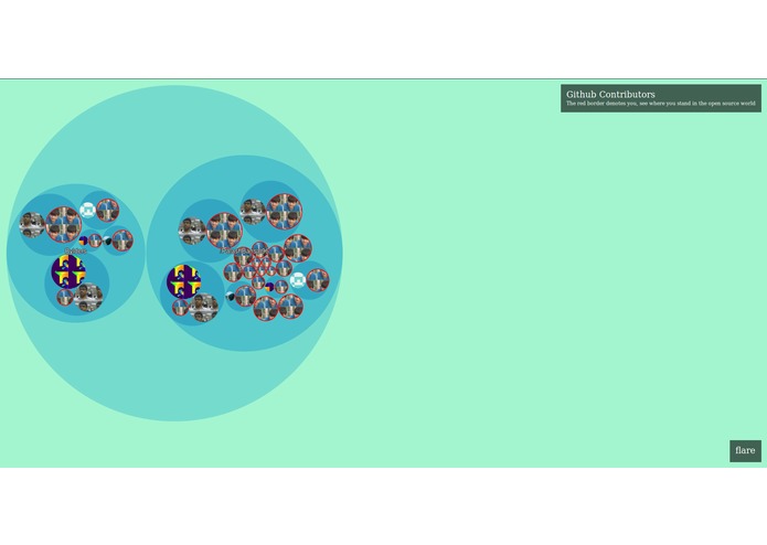
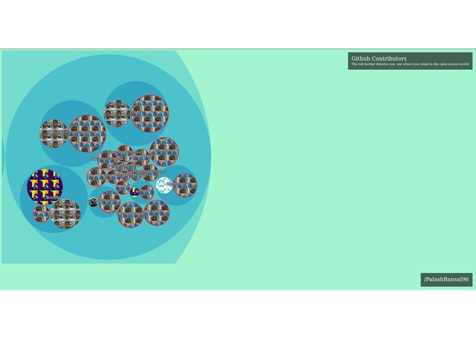
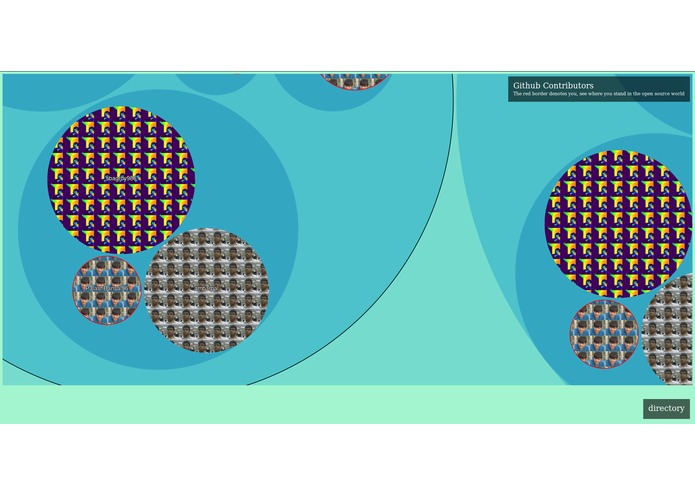
It shows all your organizations, repositories and and the people that have contributed in them in an interactive and fun fashion. It lets you see the size of your contributions and your projects w.r.t other people and projects you have contributed to. In the paid version it is also possible to generate analysis of public repos of any person on github.
How I built it
I built it using the Rocketgraph's php-sdk, using the github connector to fetch the data. In the front-end I used d3.js to make the awesome visualizations.
Challenges I ran into
It was my 1st time developing the front-end of applications, so I had some struggle there.
Accomplishments that I'm proud of
I started a bit late for the hackathon but was able to complete on time.
What I learned
css/js, d3.js, rocketgraph sdk
What's next for Github Contributors
Polishing the UI. Building a 3d one using web-gl. Adding more connectors like facebook, twitter etc and doing a similar analysis with the posts, photos, shares etc.


Log in or sign up for Devpost to join the conversation.