The Validation field in WS Form PRO provides a powerful way to display a list of validation errors when a form fails to submit. This feature enhances the user experience by clearly communicating what needs to be fixed before submission, which is especially helpful for improving accessibility.
Whether you’re building simple contact forms or complex multi-step forms, the Validation field in WS Form PRO is an essential tool for robust WordPress form validation. It helps your users quickly identify errors and correct them, improving form completion rates and overall accessibility.
Displaying validation errors in a consistent, accessible manner is recommended by WebAIM’s guidelines on form validation, particularly the practice of placing errors at the top of the form. WS Form’s Validation field makes it easy to implement this best practice in any WordPress form.

Demo
When Is the Validation Field Shown?
The Validation field appears automatically after the form has been validated, typically when the user clicks the Submit button. It gives users a clear overview of all fields that need attention.
Why Use a Validation Field?
In addition to improving accessibility and usability, the Validation field helps ensure WordPress form validation is consistent, customizable, and easy to manage, especially in large or complex forms.
Key Features of the Validation Field
- Fully customizable message and layout
- Supports full styling through the WS Form Styler
- Option to show current invalid feedback with clickable focus
- Scope validation to the entire form, a specific tab, or a section
- Add multiple Validation fields anywhere on the form as needed
Adding a Validation Field
To learn how to add, edit, clone, move, resize, offset, or delete a validation field, please click here.
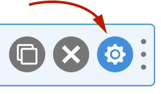
Field Settings
To edit the settings for this field type, click the settings icon on the field itself. Click the Save & Close or Save button to save your changes. If you do not want to save your changes, you can click the Cancel button or click any other form element to close the field settings sidebar.
Basic
The basic tab contains settings that the majority of WS Form users will need to control a field. The settings are as follows:
Label
This is the label shown alongside the field. As well as entering a label into this field, you can also double click the label of the field in the editor. You should enter an easy-to-understand label for your field, for example, Summary.
Hidden
If checked the field will be hidden on the form. It can be shown again using conditional logic or your own JavaScript.
Appearance
Message
This is the message that is shown above the validation errors.
Show Invalid Feedback
If enabled, the validation errors will include the current invalid feedback associated with each field, e.g. This field is required.
Behavior
Focus on Click
If enabled, each validation error can be clicked on to focus on that particular field.
Real Time Update
If checked, the validation errors will update in real time after the field is shown.
Scope
This defaults to Form which means the field will show validation errors for the entire form. If you choose Tab or Section it will only show validation errors for fields contained within tab or section the field is in. This can be useful for showing validation errors on each tab of a multi-step form, or on sections containing many fields.
Advanced
The advanced tab contains additional form attribute settings that provide further control over how a field is rendered.
Style
Use the Style settings to change the design of the validate field.
Vertical Alignment
The vertical alignment option allows you to choose how this field will be vertically aligned in relation to fields in the same row. The options are:
- Top
- Middle
- Bottom
Mask
The mask determines the HTML used to render the Validation field. The default mask is as follows:
<h2>#validate_message</h2>

#validate_list
You can change this markup to anything you wish. The following WS Form variables can be used in this field:
#validate_message– Renders the Validation field Message (As specified in the Message setting in the Basic tab).#validate_list– Renders the list of validation errors as an unordered list.
Classes
For developers WS Form allows you to add your own classes to fields.
Field Wrapper
The wrapper CSS class setting enables you to add a class (or classes) to a field wrapper. Field wrappers are sections of HTML added around a field to position them on the page. To add multiple classes, add a space between the class names.
Restrictions
Field restrictions enable you to define what can or cannot be entered into the field.
User Status
Choose from one of the options to filter which user status can see this field:
- Any
- Is Logged In
- Is Logged Out
- Has User Role or Capability
If you choose Has User Role or Capability, additional settings will appear that enable you to choose one or more roles or capabilities.
Custom Attributes
This setting is used to add custom attributes to the HTML of this field, such as data-my-attribute="1234". You can add as many custom attributes as you need.
To add a custom attributes key value pair:
- Click the Add icon to add a custom attribute row.
- Enter the key in the left column.
- Enter the value in the right column.
- Click Save to save the custom attributes.
Breakpoints
The breakpoint settings define the width of a field and also what the offset (how many columns from the left-hand side of the form or the previous field) of a field is for each breakpoint. For more information about the breakpoint settings and capabilities of WS Form, click here.