Now that we fitted the classifier and run some preliminary tests, in order to get a grasp at how our model is doing when predicting creditability we need to run some cross validation methods.
Cross validation is a model evaluation method that does not use conventional fitting measures (such as R^2 of linear regression) when trying to evaluate the model. Cross validation is focused on the predictive ability of the model. The process it follows is the following: the dataset is splitted in a training and testing set, the model is trained on the testing set and tested on the test set.
Note that running this process one time gives you a somewhat unreliable estimate of the performance of your model since this estimate usually has a non-neglectable variance.
Shared thoughts, experiments, simulations and simple ideas with Python, R and other languages
Tuesday, 15 September 2015
Predicting creditability using logistic regression in R: cross validating the classifier (part 2)
Wednesday, 2 September 2015
Predicting creditability using logistic regression in R (part 1)
As I said in the previous post, this summer I’ve been learning some of the most popular machine learning algorithms and trying to apply what I’ve learned to real world scenarios. The German Credit dataset provided by the UCI Machine Learning Repository is another great example of application.
The German Credit dataset contains 1000 samples of applicants asking for some kind of loan and the creditability (either good or bad) alongside with 20 features that are believed to be relevant in predicting creditability. Some examples are: the duration of the loan, the amount, the age of the applicant, the sex, and so on. Note that the dataset contains both categorical and quantitative features.
This is a classical example of a binary classification task, where our goal is essentially to build a model that can improve the selection process of the applicants.
Thursday, 20 August 2015
European Option Pricing with Python, Java and C++
Please make sure to read the disclaimer at the bottom of the page before continuing reading.
Plain vanilla call and put european options are one of the simplest financial derivatives existing. A european call (put) option is essentially a contract which by paying a fee gives you the right to buy (sell) a stock at a predetermined price, the strike price, at a future date. This kind of contracts was originally intended as an insurance tool for companies to fix the selling price of their goods and hedge the price risk.
Options have some interesting features, for starters, if you are the buyer of an option the payoff is potentially unlimited and the loss is limited to the option price as you can see by the payoff diagram below
of course the reverse is true for the seller (huge downside and limited upside).
Thursday, 30 July 2015
Estimating arrival times of people in a shop using R
Since the first time I was taught the Poisson and Exponential distributions I have been wondering how to apply them to model a real world scenario such as arrivals of people in a shop. Last week I was in a big shopping center and I thought that was the perfect time to gather some data so I chose a shop (randomly) and started recording on a piece of paper how many people arrived and their inter-arrival time.
I went through this process for an hour, in the middle of the afternoon (around 4 to 5pm) during a week day where the influx of customers should be approximately uniform, or so I am told. Here you can download in .txt format, the data I gathered. Note that even though the file is a text file, it is arranged as a .csv so that R can easily detect data.
What is an inter-arrival time? It is the interval of time between each arrival. Assuming that the arrivals are independent, their distribution is exponential. This assumption is further confirmed below by the blue histogram of the observations.
Summary of gathered data:
- I observed the arrival of customer for 58.73 minutes (around an hour)
- During that time 74 “shopping groups” entered the shop. “A shopping group” here is a broad label for a group of 1, 2, 3 or 4 actual customers. The red histograms describes the phenomena in greater detail.
As you can see it seems reasonable to assume that inter-arrival times are exponentially distributed
The red histogram above clearly shows that the majority of “shopping groups” is composed by either a single customer or a couple of customers. Groups of 3 or 4 people are less likely to appear according to the observed data. A good estimate of the probability of the number of people in a shopping group is the relative frequency of the observations.
The following code produces the two plots above
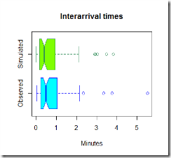
Now that we have uploaded the data, it is time to simulate some observations and compare them to the real one. Below in green is the simulated data.
The code used to simulate the data is here below
Now, the graphs above are pretty, but they are not much use, we need to compare the two sets of graphs to get an idea if our model is fine for this simple task.
It looks like our model tends to overestimate the number of arrivals in the 0-0.5 minutes section, however this is just one simulation and the average arrival time is close to what we expected using this model. It seems reasonable to use this distribution to estimate the inter-arrival times and the number of people arrived in the shop.
The R-code
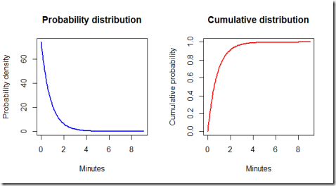
Finally, let's have a look at the ideal exponential distribution given the estimated parameters. Note that some adjustments are necessary because our model is set so that the simulated times are hours, but for practical purposes it is better to work with minutes. Furthermore, by using the exponential distribution formulas we can calculate some probabilities.
By running the code we find out that the probability of the waiting time being less than 3 minutes is 0.975 meaning that it is very likely that one customer group will show up in less than three minutes.
Conclusions.
This model is very basic and simple, both to fit and to run, therefore is very fast to implement. It can be useful to optimize the number of personnel in the store and their function, according to the expected inflow of customers and the average time needed to help the current customers. The hypothesis seem reasonable, given the time of the day considered and provided that the shop does not make some promotion or discount or any other event that could suggest a different behaviour of customers (for instance when there is a discount, it is likely that customers might tell each other to visit the store). For different times of the day, different parameters could be estimated by gathering more data and fitting different exponential distributions.
Sunday, 22 February 2015
Another Excel spreadsheet: Savings with LED lights
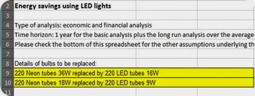
I recently uploaded a new Excel spreadsheet where I made a calculation of how much can be saved by replacing neon tubes with LED tubes.
As you might have noticed, I do like using Excel for calculations too, and I set up a page where some of my little projects and calculations with Excel are shared. Here it is: Excel page.
Tuesday, 17 February 2015
Some exercises with plots and matplotlib on currencies
EDIT: Apparently, some of the prices in the .csv files I used were missing, and this caused some problems with pandas dataframe since it replaces missing values with ‘na’. Should you encounter the same problem you could check every line with an if statement or use a method to replace the na. You can check the pandas’ documentation here.
Yesterday I was really bored and had some time which could be put to good use, therefore I decided to write a quick script to plot percentage change of currencies of some countries and compare them. The code I ended up with is a bit sloppy I guess, but that’s fine since I was primarily interested in improving my (limited, as of now) use of pandas and having fun.
First of all I gathered data from Quandl, namely the prices of the selected currencies in terms of dollars, that’s to say the value per day of every selected currency with respect to the dollar:
XYZ/USD (daily)
Gathering data from Quandl is really easy and fast using the Quandl API for Python. By the way, an API for R is available too.
I then computed the percentage change for 2 years and defined some plotting functions. Here is the main result the plotting function produces given a reference currency: it plots the percentage change for every currency (with respect to the dollar) against the percentage change of the reference currency. Some of the plotted data looks definitely weird, I wonder if I did something wrong or lost some information during the process.
Here is the code I used:
Disclaimer
This article is for educational purpose only. The author is not responsible for any consequence or loss due to inappropriate use. The article may well contain mistakes and errors. The data used might not be accurate. You should never use this article for purposes different from the educational one.
Tuesday, 10 February 2015
How to fit a copula model in R
I have been working on this topic for a great amount of time and to be honest I find R documentation not that user-friendly as the documentation for most Python modules. Anyway the fact that copulas are not the easiest model to grasp has contributed to further delays too. But mainly the lack of examples and users of these models was the biggest obstacle. Then again, I might have looked in the wrong places, if you have any good resource to suggest please feel free to leave a comment. At the bottom of this page I’ll post some links that I found very useful.
If you are new to copulas, perhaps you’d like to start with an introduction to the Gumbel copula in R here.
The package I am going to be using is the copula package, a great tool for using copulas in R. You can easily install it through R-Studio.
The dataset
For the purpose of this example I used a simple dataset of returns for stock x and y (x.txt and y.txt). You can download the dataset by clicking here. The dataset is given merely for the purpose of this example.
First of all we need to load the data and convert it into a matrix format. Optionally one can plot the data. Remember to load the copula package with library(copula)
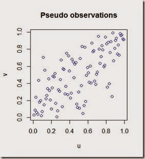
The plot of the data
Now we have our data loaded, we can clearly see that there is some kind of positive correlation.
The next step is the fitting. In order to fit the data we need to choose a copula model. The model should be chose based on the structure of data and other factors. As a first approximation, we may say that our data shows a mild positive correlation therefore a copula which can replicate such mild correlation should be fine. Be aware that you can easily mess up with copula models and this visual approach is not always the best option. Anyway I choose to use a normal copula from the package. The fitting process anyway is identical for the other types of copula.
Let’s fit the data
Note that the data must be fed through the function pobs() which converts the real observations into pseudo observations into the unit square [0,1].
Note also that we are using the “ml” method (maximum likelihood method) however other methods are available such as “itau”.
The parameter of the fitted copula, rho, in our case is equal to 0.7387409. Let’s simulate some pseudo observations
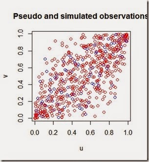
By plotting the pseudo and simulated observations we can see how the simulation with the copula matches the pseudo observations
This particular copula might not be the best since it shows a heavy tail correlation which is not that strong in our data, however it’s a start.
Optionally at the beginning we could have plot the data with the distribution for each random variable as below
And get this beautiful representation of our original dataset
Now for the useful documentation:
Copula package official documentation:
http://cran.r-project.org/web/packages/copula/copula.pdf
R blogger article on copulas
http://www.r-bloggers.com/copulas-made-easy/
An interesting question on CrossValidated
http://stats.stackexchange.com/questions/90729/generating-values-from-copula-using-copula-package-in-r
A paper on copulas and the copula package
http://www.jstatsoft.org/v21/i04/paper
That’s all for now.
Friday, 30 January 2015
How to estimate probability density function from sample data with Python
Suppose you have a sample of your data, maybe even a large sample, and you want to draw some conclusions based on its probability density function. Well, assuming the data is normally distributed, a basic thing to do is to estimate mean and standard deviation, since to fit a normal distribution those two are the only parameters you need.
However, sometimes you might not be that happy with the fitting results. That might be because your sample does not looks exactly bell shaped and you are wondering what would happened if the simulation you ran had taken this fact into account.
For instance, take stock returns, we know they are not normally distributed furthermore there is the “fat tails” problem to take into account. At least it would be interesting estimate a probability density function and then compare it to the parametric pdf you used before.
Here below is a simple example of how I estimated the pdf of a random variable using gaussian_kde from scipy
and here is the plot that we get
What we can see is that the estimated pdf is “more dense” around the mean and has some more density on the tails.
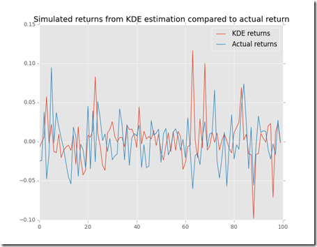
Let’s use this data to simulate a sample
For sure in this randomly generated sample there are some extreme values and they look close to the actual sample.
Hope this was interesting and useful.
Disclaimer
This article is for educational purpose only. The author is not responsible for any consequence or loss due to inappropriate use. The article may well contain mistakes and errors. The numbers used might not be accurate. You should never use this article for purposes different from the educational one.
Thursday, 29 January 2015
Portfolio VaR with Python
After some posts on correlation (How to build a correlation matrix in Python) and variance (How to build a variance-covariance matrix in Python) today I’m posting an example of application: portfolio VaR. Please before you continue reading the article, make sure to read and understand the disclaimer at the bottom of the page. Thank you.
Portfolio VaR is the natural extension of the VaR risk indicator to a portfolio of stocks. The implementation is a little bit harder than the one or the two stock version since it involves calculations with matrices. If you are interested to get a first grasp on VaR you can check my first implementation in R here.
In this script I try to estimate parametric VaR of a portfolio of stocks using historical data.
A brief outline of the process I followed:
1)First I downloaded data from Quandl (they are a great source of free data by the way), then I reshaped the data for each stock into a .csv file to make it resemble the following pattern:
ticker,average return, standard deviation,initial price, R1,R2,R3,…,Rn
where Ri stands for Rth return and initial price is the most recent price.
For my analysis I used simple returns calculation, however it should be more appropriate to use logarithmic returns if possible. Next time I’ll probably be using log returns.
2) The script contains 9 functions:
2 functions are the “builder functions” (fillDicts and runSimulation) and they are used to load the data into the program
2 functions (correlationMatrix and varCovarMatrix) are auxiliary functions since they are used in the VaR function to estimate VaR.
A plot function has been added to plot (if needed) the simulation of future returns by the runSimulation function. The model used to simulate future prices is fairly simple and can be found here.
A function (portfolioExpectedReturn) to calculate portfolio expected returns based on historical data
And finally, two functions (simple_optimise_return and optimise_risk_return) to optimise the portfolio for high returns and the risk/return ratio, respectively.
3)Some preliminary notes and some assumptions.
The model is based on parametric VaR, therefore it is assuming that returns are normally distributed like a smooth Bell curve. Furthermore, the VaR is calculated for an holding period of 1 day.
For the sake of simplicity I calculated 99% VaR for each example and ran the optimisation functions for a portfolio of 10 stocks. The optimisation functions operate as follow:
simple_optimise_return yields a portfolio of n stocks with the highest average daily return in the sample while optimise_risk_return yields the 10 stocks with higher average return to standard deviation ratio. The idea behind the second optimisation is that you may want to get the highest return possible for unit of risk that you are bearing. Note that I am assuming that the total invested amount is equally distributed among the 10 stocks (10% of the total amount is invested in each stock).
While keeping in mind that the past usually does not predict with great accuracy the future, this script let me grasp an insight of what could have (possibly) been a good portfolio of stocks in the last years.
A sidenote: since this is just for fun, some data is actually missing and some stocks have longer time series since they were on the market long before than others.
Another sidenote: a great improvement to this script could be the calculation of the advantages (in terms of less risk) of diversification and optimisation for correlation (maximum and minimum correlation for instance)
Now I run the program
And after some computations here is the result that we get:
The results look interesting to me, especially since the VaR of the last portfolio is really low if compared with the first portfolio I used to test the VaR function and the non-weighted return seems pretty good too.
Disclaimer
This article is for educational purpose only. The author is not responsible for any consequence or loss due to inappropriate use. The article may well contain mistakes and errors. The numbers used might not be accurate. You should never use this article for purposes different from the educational one.
Tuesday, 27 January 2015
How to build a variance-covariance matrix in Python
Recently I wrote a script to calculate the VaR of a portfolio of stocks given historical prices and returns and, in order to do that, I had to study the basics of a variance-covariance matrix.
First of all, what is it?
The formal definition should sound something like this: a variance-covariance matrix is a matrix whose element in the i,j position is the covariance between the ith and jth elements of a vector of random variables. Informally, we may say that a variance-covariance matrix is the matrix of the covariances and since the covariance of a random variable with itself is its variance, the main diagonal of the matrix is filled with the variances of the random variables (hence the fancy name).
What is it useful for?
When calculating VaR, say for a single stock, you need to gather the standard deviation of the returns of your stock. However, when calculating the VaR of a portfolio, things get pretty messy pretty quick, since you cannot simply add or subtract variances. In a more intuitive way, we may say that the variance-covariance matrix generalizes the notion of variance to multiple dimensions.
So how can we build it in Python?
Here is a simple template of how I built mine. I used only two stocks, but in the script I talked about earlier I used 500 stocks, you can easily imagine what a mess it can be if you miss some numbers.
Before showing the code, let’s take a quick look at relationships between variance, standard deviation and covariance:
Standard deviation is the square root of the variance
Covariance can be obtained given correlation (check how to build a correlation matrix) and standard deviations.
Now we can look at the script:
And here is the output:
Hope this was interesting.
Monday, 26 January 2015
How to build a correlation matrix in Python
Suppose you have an array of data, stocks returns for instance, and you are wondering whether there is some degree of correlation. If you are using Python then it is easy to plug in your data and do some simple calculations.
Here is a simple example of a correlation matrix using Python. This matrix shows the correlation between 10 variables (10x10 matrix): as you can see, the correlation of a variable with itself is 1 as expected.
By entering more variables into the calculation the matrix becomes more difficult to interpret although it remains quite nice to visualize. Here below is an example of a 50x50 matrix.
The code I used is really simple, you can find it here below. Basically I built a random array with 10/50 data points and then used the numpy function “corrcoef” which handles all the troubles of building a matrix in an elegant way.
Thursday, 8 January 2015
Some plots with matplotlib
I recently updated matplotlib and could finally use the style attribute from the updated module. I thought it might be a good time to plot some data and try it out.
In order to get a grasp on how some emerging markets have performed so far, I thought I could plot some data on the real GDP (GDP adjusted for inflation) and perhaps compare it to a big part of the EU’s economy (Germany).
The data I used is from Quandl a great source of data you should check it out https://www.quandl.com/
Note: dotted lines indicates that the data is prospective (in this case obtained through linear regression).
Hope this was interesting
Thursday, 4 December 2014
Animated graphs with matplotlib
Apparently it’s really simple, however a little bit of practice is needed, here below are three pieces of code where I coded and plotted the graph of (many) branch of parabolas, a random walk, and a simulated stock (a random walk again!).
Here is the half parabolas
Below is the random walk and the video:
video of the random walk: https://www.youtube.com/watch?v=3pAHwt1ioz4
and finally the stock simulation:
Hope this was interesting
Sunday, 5 October 2014
A simple approximating algorithm for Financial Mathematics
Today while I was applying some of my knowledge of Financial Mathematics, I came across a weird problem. Ok I guess that’s not that weird after all, however I did not find at first, a formula or some trick to get to my goal and therefore I decided to use a simple approximating algorithm.
Say you have some data on a fixed-rate mortgage, a really basic mortgage where both the interest rate and the annual payment are fixed. By the way, if you’d like to know more on these mortgage check the wikipedia page here.
Apparently, the expression used to determine the annual payment, given the initial conditions, should be the following:
Now, suppose that you have everything, the annual constant payment (R), the initial capital (C0), the number of years (n) and you want to find the interest rate applied (i).
At first, it may appear difficult to deal with this problem analytically, so my first idea to get around this was the following: first, define k as the ratio of the initial capital to the annual payment C0/R, then rearrange the equation in terms of k as follows
Now the problem sums up to this: find the i that satisfies the following system of equations
Eventually, here is an algorithm in python to solve the system above
And here is the final plot
Hope this was interesting. Here is Wolfram Alpha’s answer for your reference. For some reason it outputs 0.079 while I get 0.0724 which was the random rate I used to build this simple example. Perhaps some mistake occurred. If you find out please let me know.
Disclaimer
This article is for educational purpose only. The numbers are invented. The article may well contain mistakes and errors. You should never use this article for purposes different from the educational one. The author is not responsible for any consequence or loss due to inappropriate use.
Monday, 28 July 2014
Calculating VaR with R
Simulations can be useful in an unimaginably large number of scenarios. Finance in particular is a field of study where maths and statistics have made led to great advances (sometimes for the good, sometimes for the bad). Value at Risk is just another example of subject where a simulation approach could be handy.
But, what is VaR? VaR is an indicator used in risk management, it represents the maximum potential loss which can occur to a portfolio of a certain investor, say 95% of the times. Well, actually, it could be better to say that 5% of the times the loss will be larger than what VaR predicted (and it could be way larger). In this case we say that we are calculating VaR with 5% confidence.
There are at least three ways of calculating VaR:
-Parametric VaR
-Historical VaR
-Monte Carlo VaR
Let’s see each of them. For simplicity we will assume that our hypothetical investor has only one type of stock in their portfolio and that the holding period N is equal to 1.
Parametric VaR: Here is the formula
Where W0 is the value of the portfolio at time of calculation, N is the holding period, sigma is the daily volatility and Z is the inverse of the normal distribution for 1 minus alpha which is the confidence level. (If alpha is 5% then Z is approximately –1.64, note however that VaR is a positive quantity). The use of the normal distribution of course hides important assumptions which often are fundamental for the reliability of these methods.
HR are the historical returns and Percentile is the quantile function in R applied to the historical returns. Note that there is no square root of N, since the holding period is equal to 1. If holding period > 1 day you should multiply this for N as above.
Monte Carlo VaR:
With this approach you simulate a stochastic process which represent the path of the stock and then once you have calculated the logarithmic returns you just check the 5% percentile return and multiply it for the value of the portfolio at time 0.
Let’s see how to implement all this in R. The data used has been invented, and is downloadable from here
Here are some results:
The results tells us that our investor should experience losses greater than 2835.56 (or 1843.85) only 5% of the times. Usually this two values should not differ that much, however, considering how they are structured and that the data I used is completely made up and too short for historical VaR, it is still fine that we got these results. Usually the time series from which data is gathered are very long, the longer the series the more precise the result. In the last version of VaR, once simulated the behaviour of the stock you just calculate the logarithmic returns and then take out the 95% percentile.
For more information, check the wikipedia page here.
Disclaimer
This article is for educational purpose only. The numbers are invented. The author is not responsible for any consequence or loss due to inappropriate use. It can contain mistakes and errors. You should never use this article for purposes different from the educational one.
Saturday, 26 July 2014
Stochastic processes and stocks simulation
Please before continue reading, make sure to read the disclaimer at the bottom of this article.
Sometimes names of phenomena do not look like they suit the things they are attached to. In my opinion, that’s the case for stochastic processes.
Stochastic process is a fancy word to describe a collection of random variables, which should represent the path of a certain random variable followed over a period of time.
Stochastic processes are an interesting area of study and can be applied pretty everywhere a random variable is involved and need to be studied. Say for instance that you would like to model how a certain stock should behave given some initial, assumed constant parameters. A good idea in this case is to build a stochastic process.
A personal note: I do not believe these stochastic models actually performs good on stocks… At least not with these basics assumptions which I am going to list. I cannot see the reason why a stock should behave like these processes show. These processes are somehow “deterministic” in the sense that you can reasonably get to know how a stock should behave, financial markets however, have always shown to be irrational, non deterministic, and “explainable” only ex-post. In spite of all this, I still like how this kind of stochastic process works and the graph which comes out at the end looks like a stock! Furthermore I cannot hide that understanding financial markets is intriguing.
The basic assumptions are the following:
-Expected annual return and return volatility are known and constant (This is not realistic, furthermore if volatility is calculated on historical returns, there is no reason to believe it is actually capturing the future behave of the stock)
-Returns are normally distributed (Not realistic either. Returns proved themselves not to be normally distributed and to occur in larger magnitude than forecast)
The model is pretty simple, here it is:
Let’s set our scenario in R and generate the process:
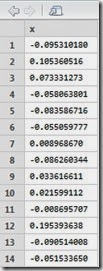
Here is the summary of our 256 generated observation:
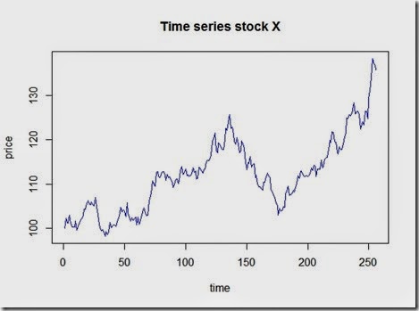
and the plot which looks realistic
Let’s compare this to a pure deterministic model where we assume a constant positive daily return of 30%/255
We can clearly see how the stochastic process uses the deterministic model as a base and then implements random shocks in.
Now, let’s have a look at the distributions
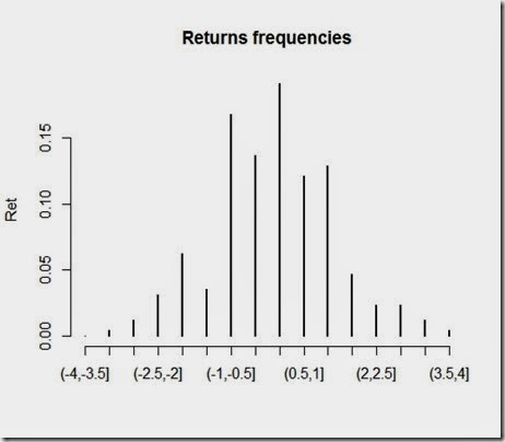
Not that much interesting, not as much as the returns, which we plotted below:
As you can see, returns are approximately normally distributed, and that’s consistent with our assumptions and the methods we used to simulate the changes in prices. It should be wise to note that drastic changes in prices are rare under these assumptions. However, the stock market proved that “extreme events” occur much more frequently than these models suggests. So, are these models to be thrown away? No, the drawings are nice and look similar to the real ones, but aside from this, I believe these models are an interesting starting point worth future development.
Disclaimer
This article is for educational purpose only. The numbers are invented. The author is not responsible for any consequence or loss due to inappropriate use. It may contain mistakes and errors. You should never use this article for purposes different from the educational one.
Wednesday, 23 July 2014
How to fit data to a normal distribution using MLE and Python
MLE, distribution fittings and model calibrating are for sure fascinating topics. Furthermore, from the outside, they might appear to be rocket science. As far I'm concerned, when I did not know what MLE was and what you actually do when trying to fit data to a distribution, all these tecniques did looked exactly like rocket science.
They are not that much complicated though. MLE is a technique that enables you to estimate the parameters of a certain random variable given only a sample by generating a distribution which makes the observed results the most likely to have occurred. Distribution fittings, as far as I know, is the process of actually calibrating the parameters to fit the distribution to a series of observed data.
Let's see an example of MLE and distribution fittings with Python. You need to have installed scipy, numpy and matplotlib in order to perform this although I believe this is not the only way possible. For some reason that I ignore, the methods in scipy.stats related to the normal distribution use loc to indicate the mean and scale to indicate the standard deviation. I maybe can grasp why use "scale" to indicate the stdv however I really do not get "loc" I do not understand why... If you know that, please leave a comment.
The result should look somewhat like this:
Hope this was useful.









![clip_image002[17] clip_image002[17]](https://blogger.googleusercontent.com/img/b/R29vZ2xl/AVvXsEgFGpczjjzD1lB0i3Ne1j_cXDohjyyrjrdX8aDVPyBk-I6H7zUVeimtYRA1kKKxa9TRGTLmmM4LPzmaesQispD55gHCzsqGS_f_QMaiUTWHkOvQ1htchV9Q7areJpuKaKWF6V0wc2qBGB8/?imgmax=800)


![clip_image002[16] clip_image002[16]](https://blogger.googleusercontent.com/img/b/R29vZ2xl/AVvXsEi7PVGVu3j_MzNDXhqtKynYBjamNchpgNT90XCXyPubNaioZbvekN4abtTEdpEAynH6Y06AgDpRURAG12ojRk-uAecYxmMSfF9Blo7Q2qfrgATbBj6azfMDbYsL3NiZDWCMGJO9WpuL9bw/?imgmax=800)


