

Hire Responsive Web Designers
Hire the Top 3% of Freelance Responsive Web Designers
Hire responsive web designers and responsive web design experts, consultants, specialists, and professionals on demand. Top companies and startups choose responsive web designers from Toptal for their skills in adaptive interfaces, cross-platform UX, fluid layouts, flexible images, and more.
Hire a Top Responsive Web Designer Now
No-Risk Trial, Pay Only If Satisfied.


Hire Freelance Responsive Web Designers

Phil Pham
Freelance Responsive Web Designer
Verified Expert in Design
United States
Toptal Member Since August 24, 2022
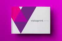
Phil is a senior product design leader with a decade of experience specializing in UI, UX, product, responsive web design, and brand identity design. He's had the privilege of designing for Fortune 500 Companies, startups, multi-billion dollar companies, and innovative organizations like Uber, FedEx, Harvard, Vistaprint, and more. Phil works well under time constraints, has exceptionally high craftsmanship, and communicates clearly to meet objectives and exceed expectations.
Show More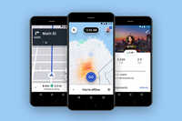


Edward Moore
Freelance Responsive Web Designer
Verified Expert in Design
United States
Toptal Member Since June 29, 2020
Ed is a 20+ year veteran UX and product design leader with a track record of award-winning projects for Google, Sony, Electronic Arts, and Sega on world-class franchises like Star Wars, Lord of The Rings, Battlefield, and Sonic. In 2014, Ed launched his own consultancy to contribute strategic gamification, research, and product design services to non-gaming companies seeking to leverage VR/AR technology to move their businesses forward.
Show More


Dobs Totev
Freelance Responsive Web Designer
Verified Expert in Design
United Kingdom
Toptal Member Since February 5, 2018
Dobs is an entrepreneur and lead UI/UX designer specializing in iOS apps and responsive web products with expertise in the eCommerce, luxury and lifestyle, hospitality, social networks, and travel industries. He has helped multi-million dollar clients increase reach, engagement, and profits. Dobs has in-depth knowledge of product lifecycles—from research, concept, and planning through design and validation to live releases and team collaboration.
Show More


Erin Michelle Stewart
Freelance Responsive Web Designer
Verified Expert in Design
United States
Toptal Member Since December 2, 2015
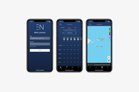
Erin has over 15 years of experience in leading product design and agile product management. She's worked with over 100 product teams, ranging from startups to Fortune 500s, to create and iterate on innovative products. Erin is passionate about solving complex B2B problems and enjoys working on AI/ML and IoT products. She's worked with companies like Intel, adidas, Astec Industries, Better.com, McGraw-Hill, and The Hartford.
Show More

Carlo Ciccarelli
Freelance Responsive Web Designer
Verified Expert in Design
Luxembourg
Toptal Member Since November 1, 2021
Carlo is a skilled and versatile product designer with a passion for creating exceptional user experiences through SaaS and web design. With 13 years of experience, Carlo brings a unique blend of creativity and practicality to every project. His attention to detail and ability to bridge the gap between design and technology have resulted in numerous successful undertakings. Whether you're a startup or an established brand, Carlo is ready to bring his unique perspective to your next project.
Show More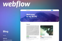

William Teig
Freelance Responsive Web Designer
Verified Expert in Design
Australia
Toptal Member Since July 7, 2022
William is a creative and self-taught digital designer specializing in Webflow design and development. He has delivered design and development work for enterprise-level clients, such as SsangYong, Kewpie, and Cellcast, as well as SME and startup clients in over 10 countries. William specializes in modern, interactive design, ensuring the client's product stands out.
Show More

Barry Iyengar
Freelance Responsive Web Designer
Verified Expert in Design
New Zealand
Toptal Member Since March 1, 2022
Barry is a strategic product designer who works as a lead product designer at Kothai Logistics. He focuses on designing, conducting research, and collaborating with other designers and project teams. With a work experience of more than six years, Barry has delivered projects in logistics, telecom, real estate, transport, and eCommerce and helped them win big in the digital space.
Show More

Michael Devries
Freelance Responsive Web Designer
Verified Expert in Design
Philippines
Toptal Member Since November 16, 2015
Michael is a strategic, design-led creative with over 20 years of experience in brand, web, product, and marketing design. He specializes in translating business strategy into compelling brand narratives, crafting visually striking, user-focused experiences that authentically reflect a brand’s vision. With a holistic approach to design, Michael ensures seamless, engaging, and high-impact solutions that drive long-term success across digital and physical platforms.
Show More


Francis Otuogbai
Freelance Responsive Web Designer
Verified Expert in Design
United Arab Emirates
Toptal Member Since May 9, 2019
Since 2013, Francis has been developing functional UX and UI designs for various disciplines. He's worked for numerous companies, including fintech and eCommerce giants across Africa. Francis draws upon his in-depth knowledge of information architecture and design thinking to create and deploy enterprise-level user interactive designs.
Show More

Igor Marques Magrini
Freelance Responsive Web Designer
Verified Expert in Design
Brazil
Toptal Member Since March 15, 2021
Igor is a designer with over 15 years of experience leading local/remote design teams, crafting digital products, conducting user research, prototyping, and designing user interfaces for web portals, mobile applications, SaaS, and infotainments for brands like Volkswagen, Spotify, TIVIT, Claro, Burger King, and other global brands with millions of users. Over the last five years, Igor has also held several workshops on design thinking—teaching thousands of new designers in Brazil.
Show More

Dapomola Ojo
Freelance Responsive Web Designer
Verified Expert in Design
Canada
Toptal Member Since June 30, 2020
Dapomola is a senior product designer with a multidisciplinary background encompassing product design, creative design, art direction, branding, and strategic leadership. With 10 years of industry expertise, he excels in UI, UX, visual, and web design, addressing challenges through well-researched and thoroughly test ted solutions. As an entrepreneur and startup founder, Dapomola leads design projects from inception to execution, collaborating seamlessly with diverse teams.
Show More


Discover More Responsive Web Designers in the Toptal Network
Start HiringA Hiring Guide
Guide to Hiring a Great Responsive Web Designer
Responsive designers are experts at creating intuitive and functional interfaces that are visually consistent across devices and screen sizes. This guide to hiring responsive designers features an overview of relevant skills, tips for creating a job description, and sample interview questions and answers that will help you identify the best candidates for your company.
Read Hiring GuideToptal in the press
... allows corporations to quickly assemble teams that have the right skills for specific projects.
Despite accelerating demand for coders, Toptal prides itself on almost Ivy League-level vetting.
Our clients


Creating an app for the game

Leading a digital transformation

Building a cross-platform app to be used worldwide


Drilling into real-time data creates an industry game changer
Testimonials
How to Hire Responsive Web Designers Through Toptal
1
Talk to One of Our Client Advisors
A Toptal client advisor will work with you to understand your goals, technical needs, and team dynamics.
2
Work With Hand-selected Talent
Within days, we’ll introduce you to the right responsive web designer for your project. Average time to match is under 24 hours.
3
The Right Fit, Guaranteed
Work with your new responsive web designer for a trial period (pay only if satisfied), ensuring they’re the right fit before starting the engagement.
EXCEPTIONAL TALENT
How We Source the Top 3% of Responsive Web Designers
Our name “Toptal” comes from Top Talent—meaning we constantly strive to find and work with the best from around the world. Our rigorous screening process identifies experts in their domains who have passion and drive.
Of the thousands of applications Toptal sees each month, typically fewer than 3% are accepted.
FAQs
The cost associated with hiring a responsive web designer depends on various factors, including preferred talent location, complexity and size of the project you’re hiring for, seniority, engagement commitment (hourly, part-time, or full-time), and more. In the US, for example, Glassdoor’s reported average total annual pay for responsive web designers is $80,582 as of January 2024. With Toptal, you can speak with an expert talent matcher who will help you understand the cost of talent with the right skills and seniority level for your needs. To get started, schedule a call with us — it’s free, and there’s no obligation to hire with Toptal.
Typically, you can hire responsive web designers with Toptal in about 48 hours. For larger teams of talent or full end-to-end project delivery, timelines may vary. Our talent matchers are highly skilled in the same fields they’re matching in—they’re not recruiters or HR reps. They’ll work with you to understand your goals, technical needs, and team dynamics, and match you with ideal candidates from our vetted global talent network.
Once you select your responsive web designer, you’ll have a no-risk trial period to ensure they’re the perfect fit. Our matching process has a 98% trial-to-hire rate, so you can rest assured that you’re getting the best fit every time.
Deciding whether to hire a freelance or full-time designer depends on various factors, including your company’s needs, project requirements, budget, and long-term goals. For certain projects, hiring a freelancer might be more cost-effective than employing a full-time designer because they typically have the necessary equipment and software available. Additionally, if your company requires specific or niche skills for short-term projects or has fluctuating workloads, hiring freelancers can be beneficial. You can bring in expertise as needed without committing to a long-term contract.
To hire the right responsive web designer, it’s important to evaluate a candidate’s experience, technical skills, and communication skills. You’ll also want to consider the fit with your particular industry, company, and project. Toptal’s rigorous screening process ensures that every member of our network has excellent experience and skills, and our team will match you with the perfect responsive web designers for your project.
At Toptal, we thoroughly screen our responsive web designers to ensure we only match you with the highest caliber of talent. Of the more than 200,000 people who apply to join the Toptal network each year, fewer than 3% make the cut.
In addition to screening for industry-leading expertise, we also assess candidates’ language and interpersonal skills to ensure that you have a smooth working relationship.
When you hire responsive web designers with Toptal, you’ll always work with world-class, custom-matched responsive web designers ready to help you achieve your goals.
You can hire responsive web designers on an hourly, part-time, or full-time basis. Toptal can also manage the project end-to-end based on your specific requirements as part of our Consulting and Services offerings. Whether you hire a responsive web designer for a full- or part-time position, you’ll have the control and flexibility to scale your team up or down as your needs evolve. Our responsive web designers can fully integrate into your existing team for a seamless working experience.
We make sure that each engagement between you and your responsive web designer begins with a trial period of up to two weeks. This means that you have time to confirm the engagement will be successful. If you’re completely satisfied with the results, we’ll bill you for the time and continue the engagement for as long as you’d like. If you’re not completely satisfied, you won’t be billed. From there, we can either part ways, or we can provide you with another responsive web designer who may be a better fit and with whom we will begin a second, no-risk trial.
Explore Related Toptal Services
Looking for an end-to-end business solution? Browse Toptal's portfolio of services.
How to Hire a Responsive Designer

Verified Expert in Design
8 Years of Experience
Zain is a senior product designer with a background in designing digital products for various domains and industries, including edtech, fintech, SaaS, blockchain, and social platforms. During his career, Zain has led several large product design teams.
Expertise
The Demand for Responsive Designers Continues to Expand
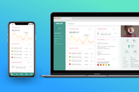
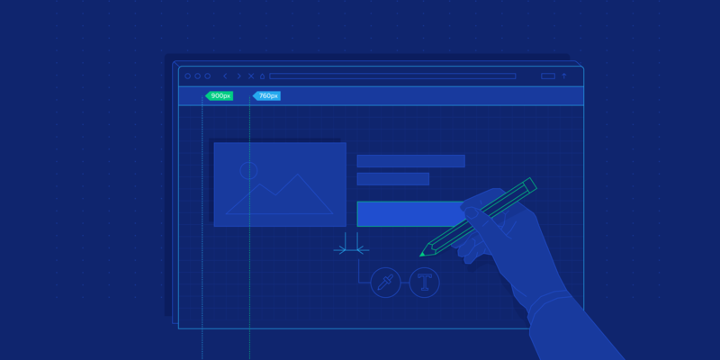
The proliferation of mobile devices has led to an increase in demand for responsive designers. Responsive web design involves creating websites and apps that adapt to diverse screen sizes and orientations. The goal of responsive designers is to provide users with seamless visual and interactive experiences as they transition between desktops or laptops, tablets, and smartphones.
To underscore the need for responsive designers, consider that there are 6.8 billion smartphone users globally and that more than 60% of all internet traffic comes from mobile devices. Furthermore, user expectations are driving demand for responsive design, with 85% of smartphone users saying a mobile website should function as well as a desktop site and 57% of internet users asserting that they wouldn’t recommend a business with a substandard mobile user interface.

With businesses facing pressure to provide cohesive, cross-device experiences, it’s essential to know how to hire responsive web designers who are experts in their field. Companies planning to hire responsive designers should look for candidates with knowledge of agnostic design, wearables, smart design, artificial intelligence, and user experience (UX). However, qualified candidates with this skill set can be hard to find. It may also be difficult to identify candidates committed to keeping up with rapidly changing design trends and coding languages.
This guide explains what a responsive designer does, how to assess candidates’ abilities, and how to define your responsive web design project’s scope and objectives. We also examine how to determine if a candidate is a good organizational fit and provide specific information to help you hire the best responsive designer for your company.
What Attributes Distinguish Quality Responsive Designers From Others?
Sourcing a skilled responsive designer is critical to ensuring that your digital product is visually seamless and highly intuitive across devices. Depending on your company and project, you may need a responsive web designer with some or all of the following attributes:
Expertise in Responsive Design Techniques: Responsive design is an output or canvas that designers build upon, so a strong candidate will have previous experience in front-end development, engineering, or UI architecture. In particular, skilled responsive designers will be familiar with the technical aspects of responsive websites, including fluid grids, flexible images, designing for the thumb zone, vector versus raster graphics, and media queries/breakpoints (a CSS technique that allows designers to define different layouts based on the size of the viewport). A strong understanding of front-end languages like HTML, CSS, and JavaScript supports responsive behavior and dynamic UI design elements. Adapting to diverse input methods ensures a seamless and intuitive user experience, so experience with designing for a mouse/trackpad versus for thumb-driven interfaces is also crucial.
Mobile-first Mindset: In the first quarter of 2023, mobile accounted for 58% of the global market share versus desktops and tablets, which reflects the value users place on mobile interactions. Experienced responsive designers will prioritize mobile users by designing for small screens first and then adapting their designs for larger devices. The limited space on smaller devices means that creatives who design for mobile face content-prioritization challenges, such as what images and text to highlight, that aren’t readily apparent when designing for desktops and laptops. Strong candidates should be able to manage, roadmap, and properly plan for mobile screens and have the ability to leverage design systems for the maintenance of mobile experiences and responsive websites. Competent responsive designers will have an evident working knowledge of designing fluid grids, which play a key role in creating content for responsive screens.

User-centered Focus: Look for a responsive designer who consistently places users’ needs at the forefront of their design process. User-centered designers make decisions based on user research and data and strive to design digital products that are easy to navigate and founded on accessibility best practices. Designers with a working knowledge of motion, haptic technology, prototyping techniques, user flows/ journeys, proper diagramming, pattern building, and design thinking will know how real-world objects behave and how to translate them digitally.
Strong Design Fundamentals: The best responsive designers should know and use the fundamental graphic design principles, including contrast, scale, balance, color, typography, and information hierarchy. They should also know how to correctly apply these principles to a digital product’s layout. Expert web designers will also have a clear understanding of gestalt design principles, such as similarity, continuation, closure, proximity, figure/ground, and symmetry and order, that help ensure that the audience perceives a design as intended.
Creativity Within Constraints: Every design project has some form of artistic, technical, or budgetary constraint. The best responsive designers know how to come up with creative, practical design solutions that are achievable within a project’s resources. They stay up to date with current design trends and are always looking for ways to improve their technique.
How can you identify the ideal Responsive Designer for you?
When hiring a responsive designer, it’s vital that you find a candidate who can provide your company with a consistent digital presence that aligns with your brand and satisfies users of all your digital platforms. Here are some critical skills to look for in responsive web design candidates:
Displays Strong Typography Skills: Typography is the practice of arranging copy in an aesthetically pleasing and readable way. Look to hire a responsive designer who can select, combine, size, and align fonts in a way that effectively conveys a design’s intended message. Additionally, the designer you hire should be familiar with typography best practices for the web, such as ensuring appropriate background contrast and font weight, minimizing the number of typefaces used, and limiting line length on mobile devices for optimal readability.
Has a Superb Sense of Color: Color is an important design element that can communicate meaning in various ways. When hiring a responsive designer, look for someone who is proficient in creating powerful color combinations that convey a specific mood and contribute to a more effective and adaptable responsive layout. Candidates should also appreciate the value of white space and use color strategically, as too much color can overwhelm a composition, especially on smaller screens.
Excels at Imagery Selection and Optimization: Images are a powerful way to showcase a product or evoke emotions. The best responsive design candidates are able to choose on-brand images that align with their designs. They also know how to optimize images for the web to support page-load speed, a key aspect of web performance. Proficiency in tools like Adobe Photoshop is essential.
Prioritizes Accessibility Best Practices: The European Accessibility Act was passed in 2022 in the EU, requiring designers to be fully compliant by 2025. Whether you’re hiring within the EU or not, any candidate you’re considering should follow accessibility best practices to ensure that people with disabilities can easily use your company’s product. Examples include not using color alone to convey important information, adding alt text to images, avoiding Flash and other plugins, focusing on keyboard navigation accessibility, and ensuring that interactive components are easily identifiable. Heuristics, such as Nielsen Norman Group’s 10 Usability Heuristics for User Interface Design are one way skilled responsive designers stay focused on producing accessible content.
Understands UX Design Principles: UX design is the practice of optimizing digital products based on users’ needs and behaviors. Seek to hire a responsive designer with experience in applying UX design principles to create apps and websites that are easy to use and navigate.
How to Write a Responsive Design Job Description for Your Project
To attract top talent, you need to know how to write a high-quality job description that addresses these aspects of responsive design:
Wireframing and Prototyping: Responsive designers must be able to generate wireframes and interactive models that illustrate a product’s layout, content prioritization, features, and task flows. Wireframing and prototyping with tools like Figma and Adobe XD are crucial to testing ideas early in the design process, long before development begins. By building prototypes, designers can uncover potential bugs, collect user and stakeholder feedback, and iteratively improve their responsive design solutions.
User-centered Design: Look to hire a responsive design candidate who places users at the heart of their design process. For your product to solve users’ problems and resonate with your target audience, you must understand their behaviors, needs, and pain points. Designers who empathize with users are more likely to create intuitive experiences that lead to higher engagement and satisfaction.
Cross-functional Collaboration and Communication: The ideal candidate will be an expert in cross-departmental collaboration. Responsive designers must solicit input from fellow responsive web designers and developers, product managers, marketers, and executive stakeholders to ensure that design choices meet user needs and drive business initiatives. Additionally, responsive designers must be effective communicators to ensure their designs look and function as intended throughout the back-end website or app development process.
User Testing and Optimization: Testing and optimization allow designers to evaluate a product’s performance and iterate based on data. By testing designs and analyzing user interaction behaviors, designers can uncover instances where the product might be causing confusion or frustration and make improvements. Testing should include an array of breakpoints to ensure the experience remains seamless throughout. Look for candidates who continually optimize their designs to meet evolving user needs and technologies.
What Are the Most Important Responsive Designer Interview Questions?
When interviewing responsive designers, ask questions that help you evaluate their design background, skill set, and alignment with your company, such as:
What does a responsive web designer do?
This basic question is a good conversation starter and reveals a candidate’s foundational knowledge of responsive design. Candidates should touch on the proliferation of mobile devices and the importance of ensuring that websites and apps look integrated and work seamlessly across a variety of screen sizes. The candidate should speak to designing layouts, optimizing navigation, arranging text and images, and ensuring intuitive user interactions on desktops and laptops, mobile devices, and tablets.
What is the difference between adaptive design and responsive web design?
Making a design responsive involves using fluid grids, flexible images, and media queries (or breakpoints) to enable a website to adjust its content layout dynamically based on screen size, from a large desktop computer to a small mobile phone. Adaptive design (or progressive enhancement) utilizes predefined layouts for specific screen sizes that the layout will be accessed on. This method allows designers to create custom website designs for specific devices, but it can be highly time-consuming, especially when devices with new screen dimensions enter the market.
What are the main advantages of responsive web design?
Responsive web design reduces bounce rates and enhances engagement by ensuring a cohesive, user-friendly website experience across devices. Additionally, responsive design simplifies content updates since changes only need to be made once, and the design automatically adapts to different screen sizes.
Share an example of a website that you’ve redesigned to be responsive. What were the main considerations and decisions you made during the process?
This question will help you better understand the candidate’s work experience. Redesigning an existing website to be responsive poses several unique challenges, such as what to do with existing content, how to address users’ mental models, and how to prioritize which features are universal and which apply only to certain devices. Ideal candidates might share an example of a mobile-first project where the deliverable was device-agnostic—in other words, design iterations, rather than content, were the first priority.
It’s important for candidates to show you how they solve problems. Artificial intelligence can easily produce responsive screens, so your candidate should be able to clearly articulate how they solve challenges that require human intervention.
How do you approach designing for various screen sizes? What steps do you take to ensure a consistent user experience across devices?
It’s vital that the candidate you hire has an established process for designing different screen sizes and thinks holistically about the user experience across devices. Many responsive designers start by creating mobile screens (mobile-first design) since mobile devices often have more design restrictions and require progressive content disclosure due to space limitations. Candidates may also discuss their approach to design strategy, use of breakpoints, and content prioritization.
How do you handle touch interactions and gestures in your responsive designs to enhance user experience on mobile devices?
Ask this question to get a better feel for a candidate’s experience with mobile-specific interactions such as touch and gestures like swiping, scrolling, pinching, and tapping. Skilled candidates should also discuss mobile-friendly touch-design principles like allowing users to perform gestures imprecisely, enabling users to manipulate UI components directly, and providing visual cues that indicate gestures are possible.
Describe a scenario in which you had to work closely with developers to implement a responsive design.
It’s important to get a sense of a candidate’s teamwork skills when collaborating with developers. The designer-developer relationship is a pivotal aspect of product development that requires clear communication and the ability to keep business needs at the forefront of design/development decisions. Strong candidates will demonstrate an ability to ensure a smooth transition from design to code.
Why Do Companies Hire Responsive Designers?
The web is teeming with touchpoints, and if companies don’t provide consistent user experiences, they risk frustrating customers and losing revenue. Responsive designers make sure that digital products and platforms are aesthetically congruent and function flawlessly on a wide range of devices.
For example, a responsive designer at an e-commerce company might ensure that product descriptions, images, and “Add to cart” buttons are displayed similarly on desktop, mobile, and tablet. They may also design responsive components for social media integrations, ensuring consistency across platforms. For a news website, a responsive designer might optimize the site’s mobile and desktop navigation and ensure that web page headers, text, images, and captions are visually consistent on different screen sizes. In both cases, consistency makes it easy for users to navigate and interact with important content regardless of device, leading to higher engagement and conversion rates.
Hiring a responsive designer in today’s competitive digital market is a strategic move that demonstrates a company’s devotion to user-centric design. When a product’s user experience is consistent and intuitive across devices, it drives customer loyalty and brand credibility—key factors in a company’s long-term success.
Featured Toptal Responsive Web Design Publications


Top Responsive Web Designers Are in High Demand.