Inspiration
Tiny Victories was inspired by a simple thought: Why do we only celebrate big achievements when our lives are built from small moments?
I realized that the things that keep me going aren’t major milestones — they’re tiny actions: cleaning my desk, waking up on time, taking a walk, finally fixing something I’ve been procrastinating. These moments are quick, fragile, and often forgotten.
Yet emotionally, they matter.
I wanted to design something that captures that blink of pride. Something small, kind, and encouraging. Tiny Victories was born from this idea — a reminder that even the smallest step ( \epsilon ) can still move us forward.
What it does
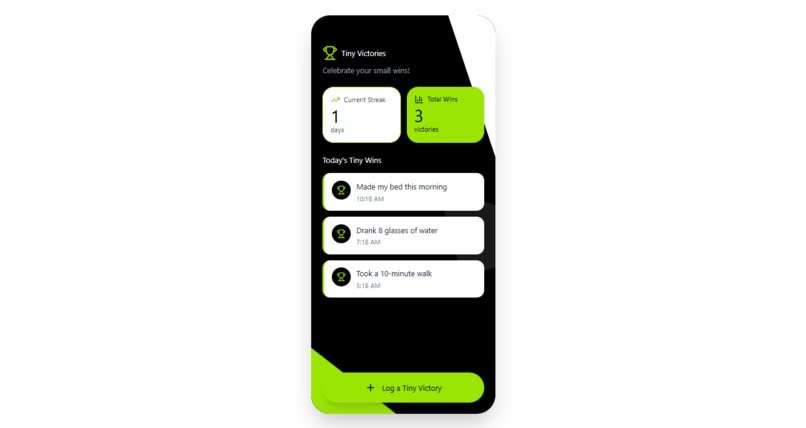
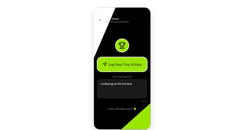
Tiny Victories is a simple, uplifting reflection tool that helps users:
- Log small accomplishments in seconds
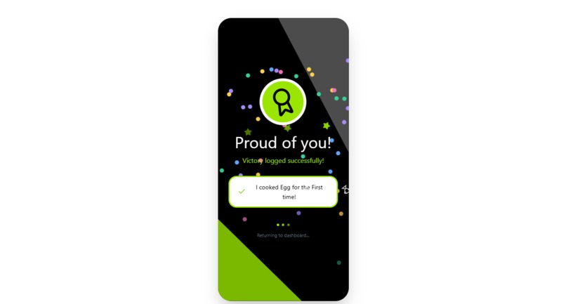
- Receive positive micro-feedback
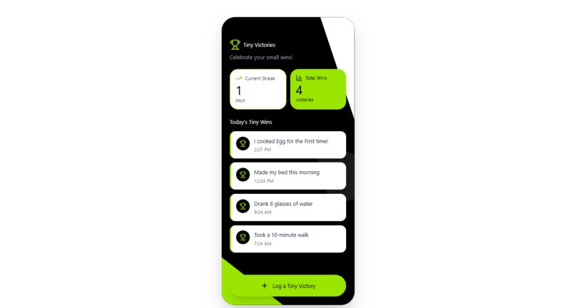
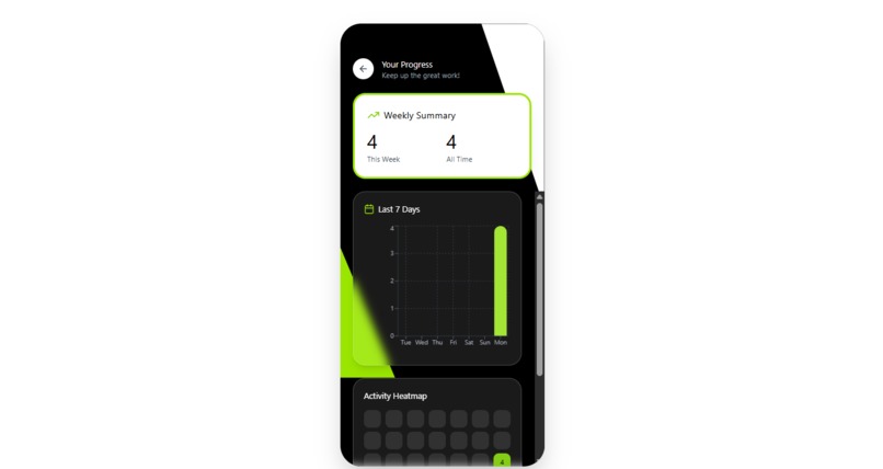
- Track streaks and total wins
- Feel motivated through visual celebration moments
It transforms everyday actions into meaningful emotional milestones.
The goal isn’t productivity — it’s wellbeing. Tiny Victories tells the user: “Your small moments matter.”
How we built it
I designed the entire interface from scratch in Figma, focusing on clarity, minimalism, and emotional resonance.
Key steps include:
- User research through casual interviews with students
- Journey mapping the emotional flow from “I did something” → “I feel proud”
- Low-fidelity sketches to simplify the logging interaction
- High-fidelity UI with a neon-green, celebratory theme
- Iterative refinement based on feedback from peers
I focused heavily on:
- Color psychology
- Microcopy tone
- Reducing friction
- Creating a consistent visual identity
- Crafting a satisfying celebration moment
Challenges we ran into
1. Balancing Simplicity vs. Functionality
Initially, I kept adding features — charts, badges, weekly goals — until I realized they ruined the emotional simplicity of the app. The biggest challenge was removing things that were “cool” but not necessary.
2. Emotional Tone
I wanted Tiny Victories to feel supportive, not cheesy. Finding the right tone for microcopy took time:
- Too enthusiastic → feels forced
- Too neutral → feels cold
- Too formal → kills the emotional spark
Striking the right balance was a challenge.
3. Accessibility Concerns
With neon green as the accent color, ensuring WCAG-friendly contrast required adjustments in font weight, spacing, and background tones.
4. Designing “Celebration” Without Overstimulation
Confetti is fun — but too much is distracting. I had to experiment with layouts and colors to keep it joyful yet calm.
Accomplishments that we're proud of
- Creating a simple but emotionally meaningful product
- Designing a clean, cohesive visual identity
- Crafting a celebration moment that actually feels rewarding
- Staying true to the theme “Moments”
- Building something that encourages self-kindness and reflection
- Receiving positive feedback from peers who said things like: “I’d actually use this to remind myself that I’m doing okay.”
What we learned
1. Emotional design matters
Design is not just about visuals — it’s about how people feel. Creating a gentle moment of pride can be just as impactful as building a complex feature.
2. Simplicity takes effort
It’s harder to remove features than to add them. But what remains becomes stronger.
3. Microcopy is part of the experience
A single supportive sentence can change how the user perceives their achievement.
What’s next for Tiny Victories
- Personalized messages based on user patterns
- Mood reflection linked to small wins
- A shareable “victory card” for social encouragement
- Optional reminders for users who want a gentle nudge
- A “Victory Garden” visualization where each logged win grows into a plant
- Light mode version for users sensitive to dark neon themes
Ultimately, I want Tiny Victories to become a daily companion — something small, positive, and emotionally supportive.
A place where users can remind themselves: “I did something today. And that’s enough.”
Built With
- figma

Log in or sign up for Devpost to join the conversation.