


Track system usage
Monitor what teams are consuming, where they’re engaging (or not), and the feedback they provide.

Optimize your system
Identify gaps, fix inconsistencies, and ensure it stays consistent and effective.

Drive adoption
Understand how your system is being used in teams and products, and pinpoint gaps to close.
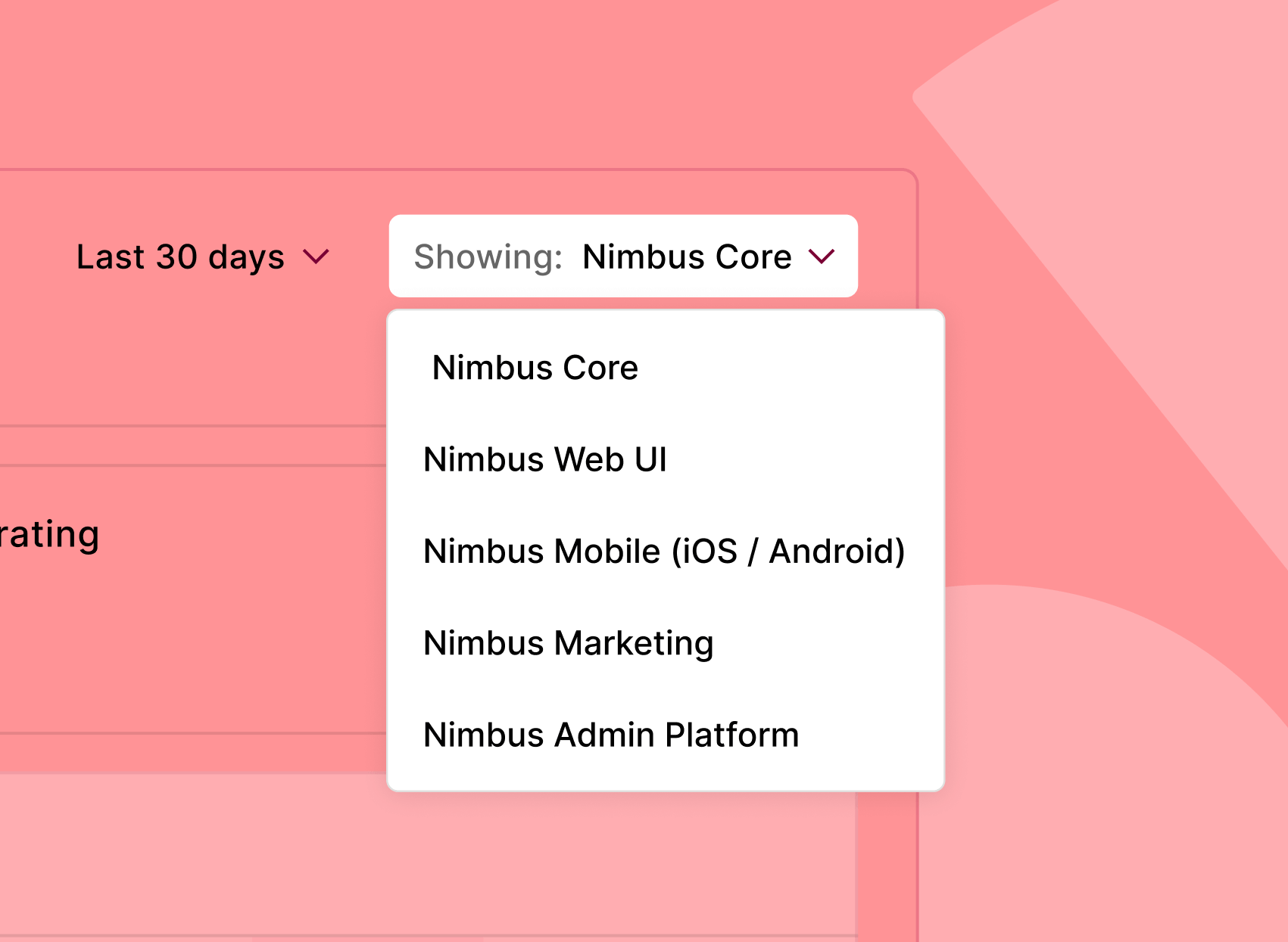
Measurement / Measure Adoption
You can’t improve what you don’t measure
See who’s using what, where, and how – and use those insights to optimize your system and drive adoption.
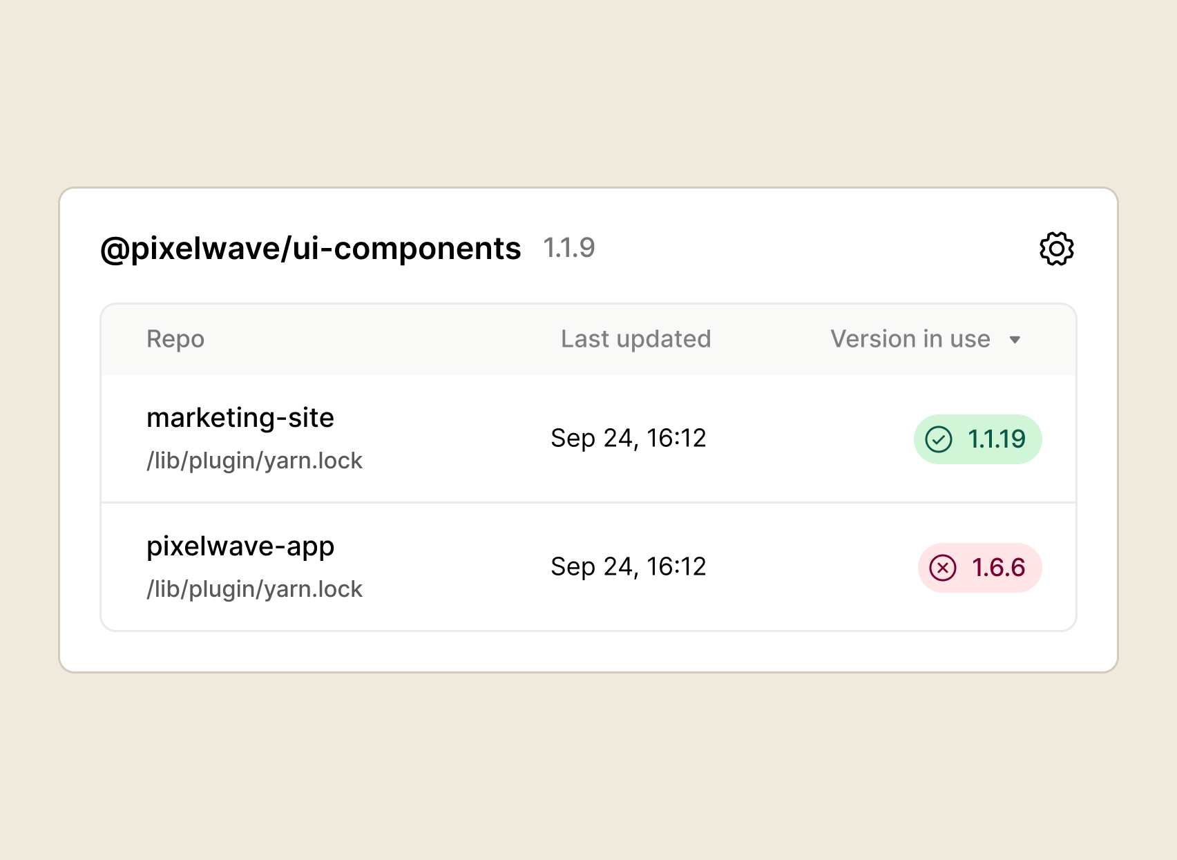
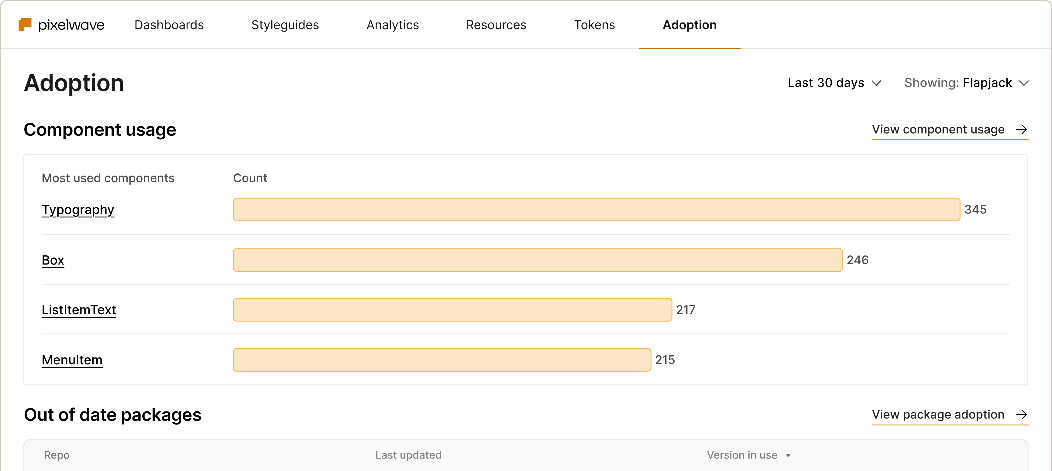
Package adoption
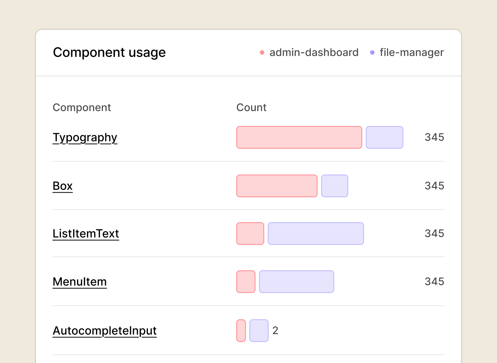
Component usage
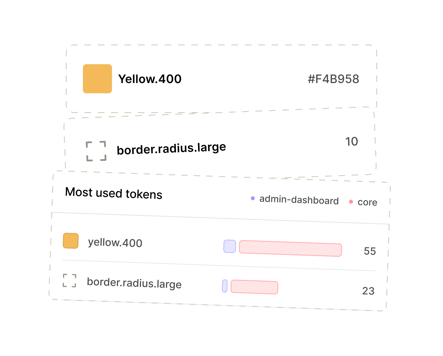
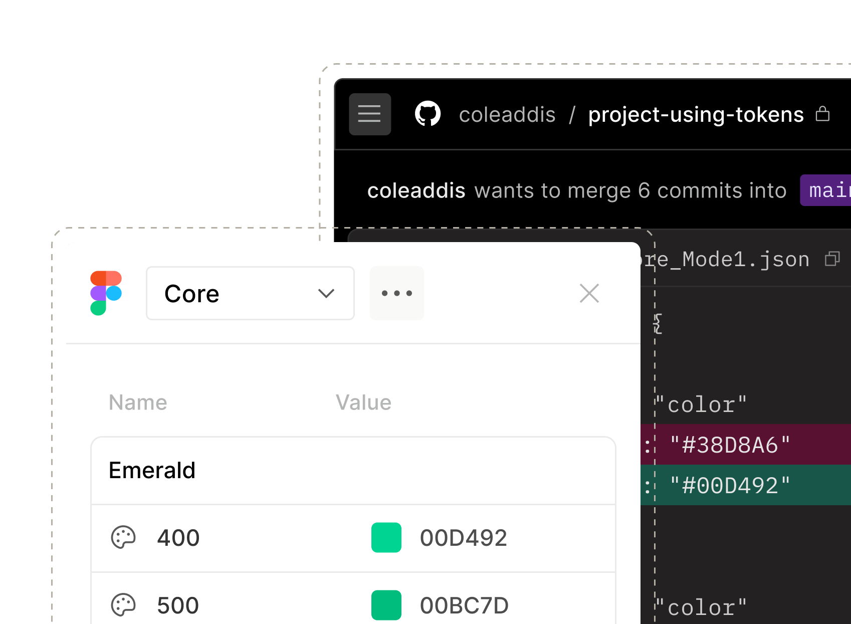
Token usage
Know which tokens are doing the heavy lifting. Track usage across your system so you can spot opportunities to standardize.

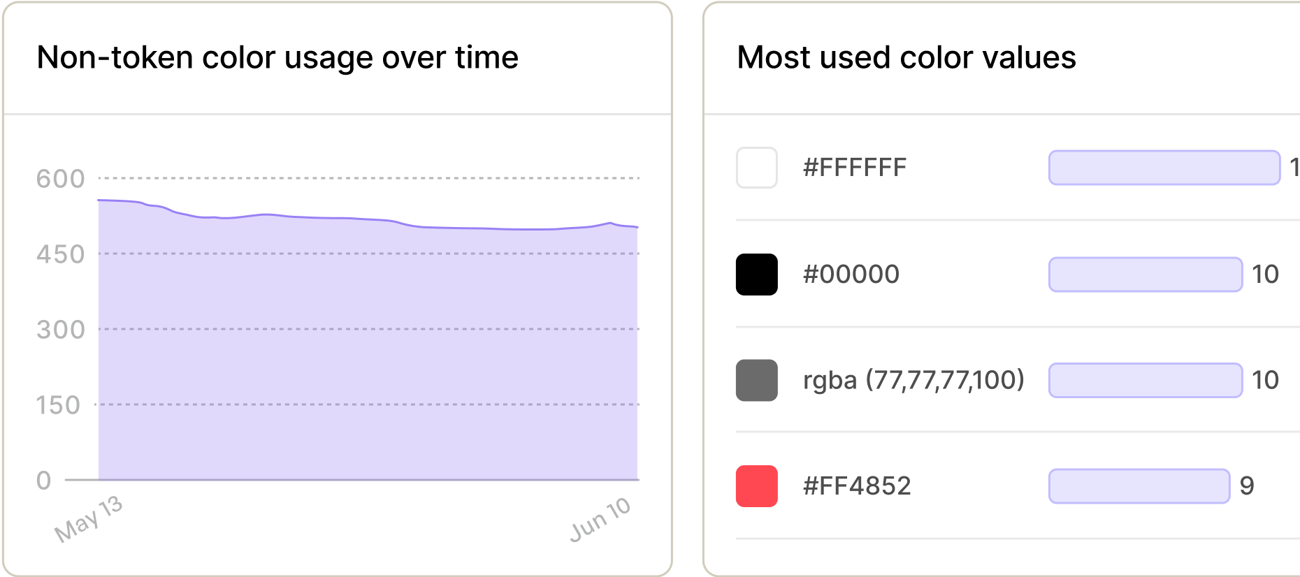
Color usage
Keep palettes on point. Catch rogue reds, off-brand oranges, botched blues and everything in-between.
Management / Track Usage
Make data-informed decisions about your docs
See how people move through your docs site, where they’re getting stuck, and what they’re actually looking for. Less guessing, more “aha.”
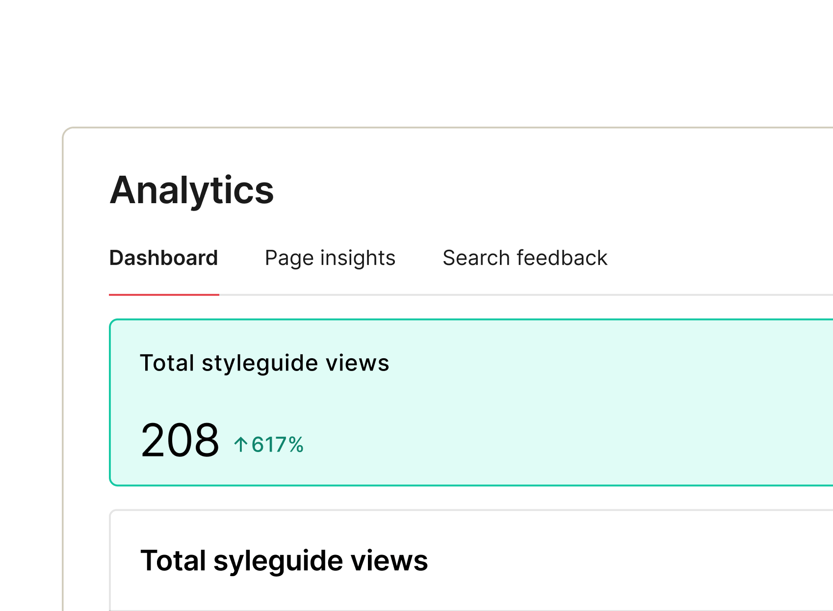
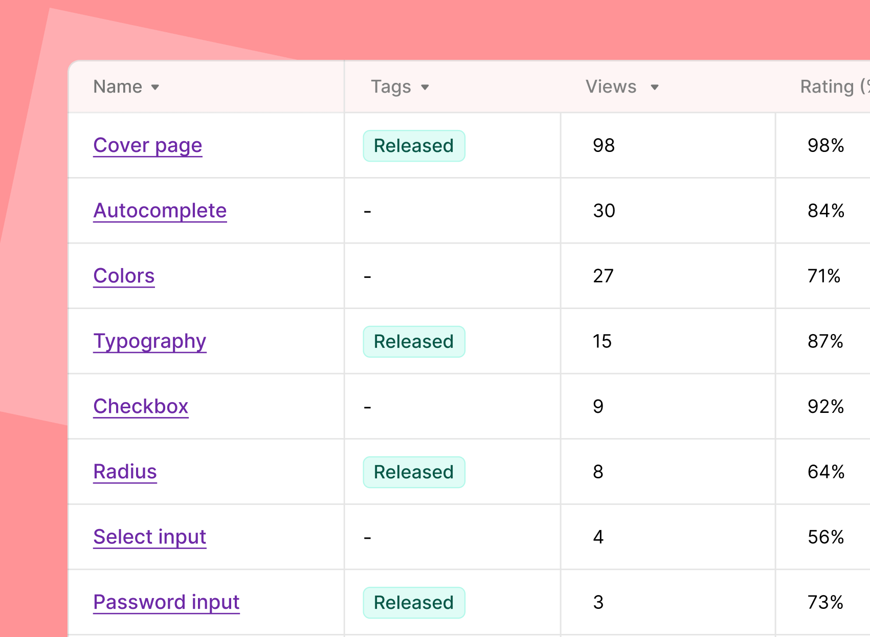
Site analytics
See how people are really using your docs: where they land, where they click, and where they drop off.
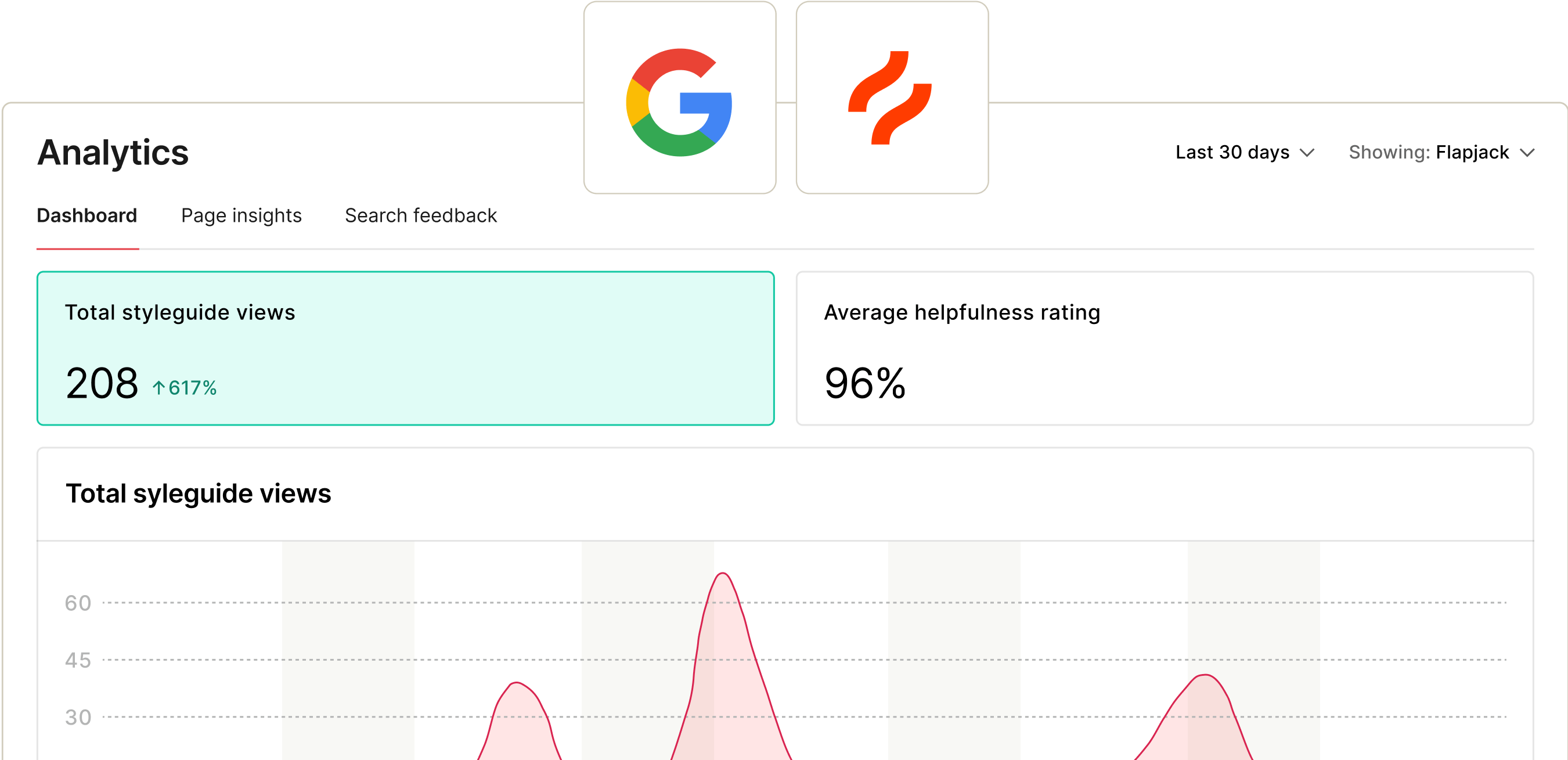
Page views
Multi-product support
Integrations


Measurement / Collect Feedback
Get qualitative feedback and insights
Data never tells the whole story. Hear directly from your users and leverage those insights to deliver maximum impact with your design system.


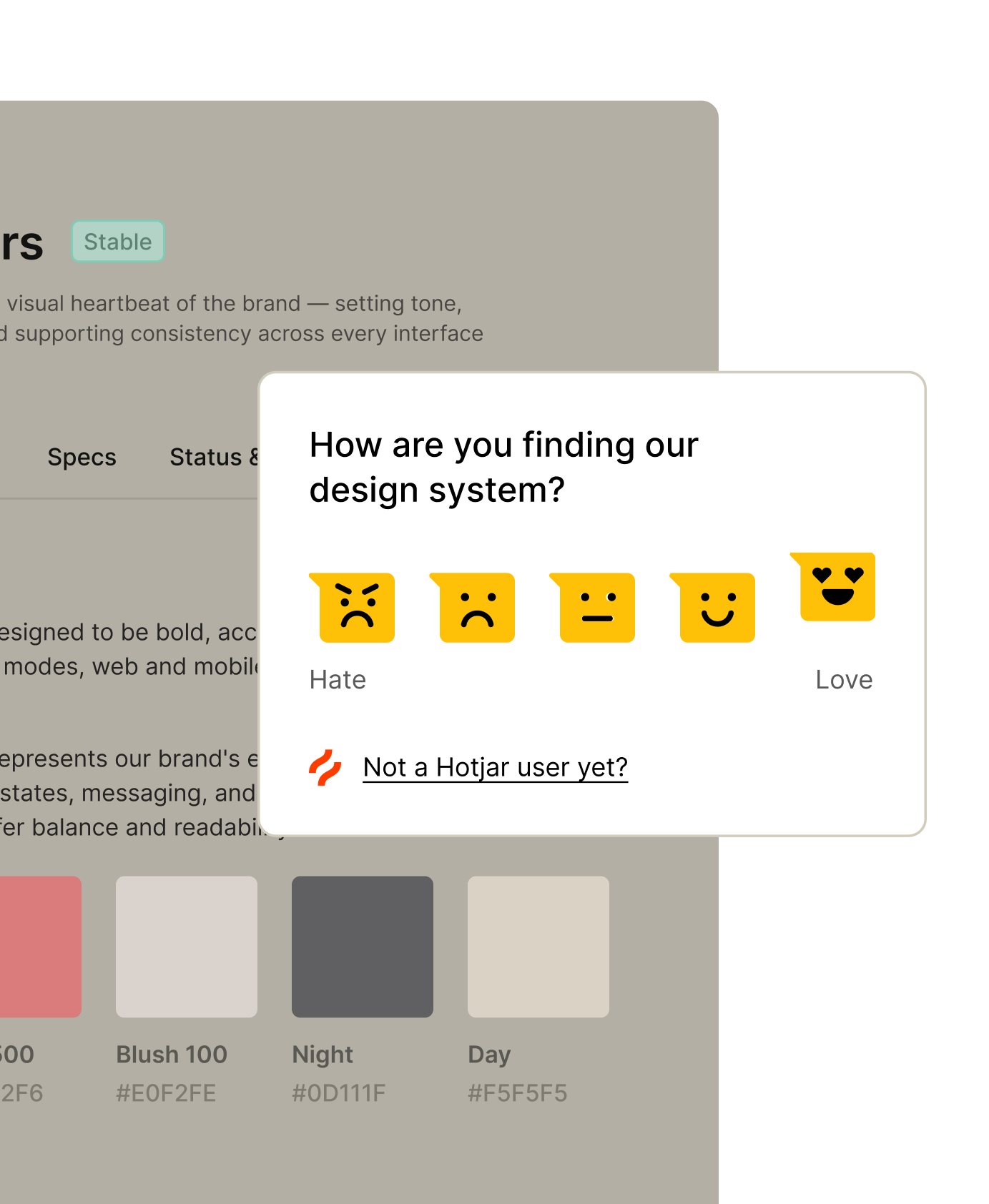
Hotjar surveys
Use Hotjar to run surveys on your site and collect feedback from viewers. No mind reading required.
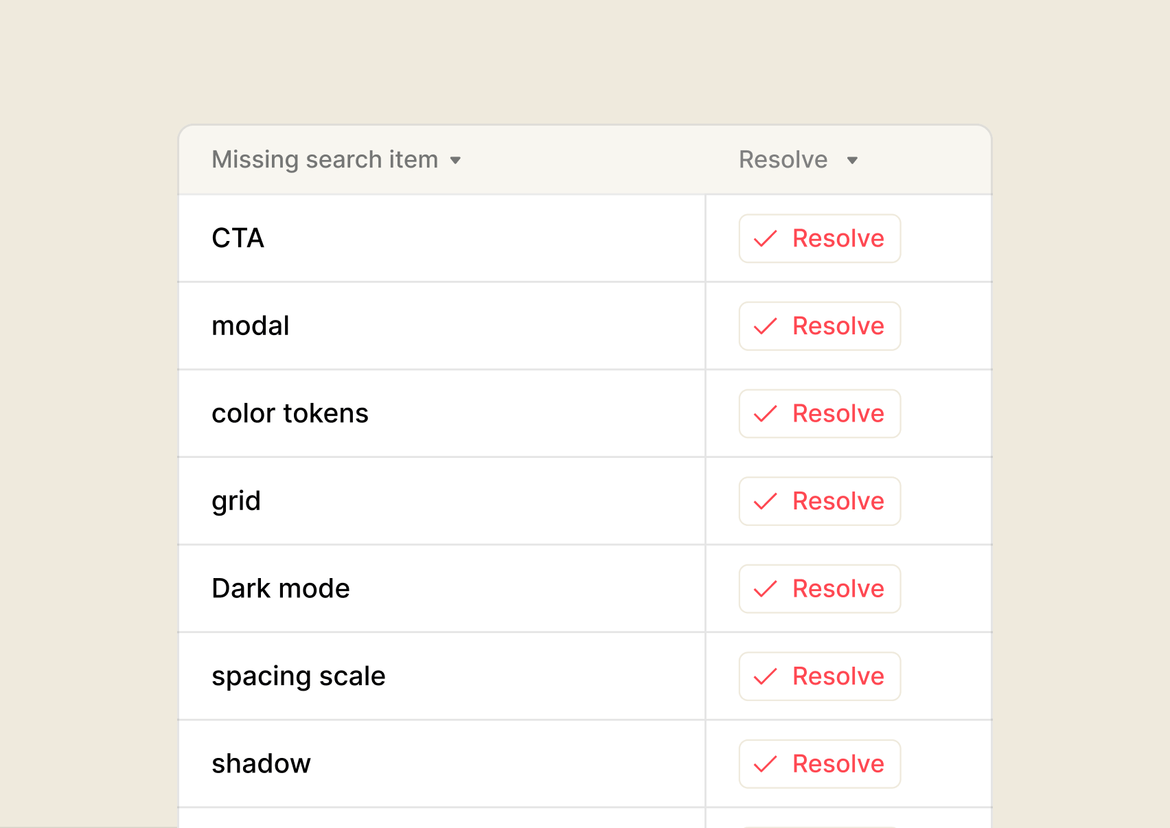
Search analytics
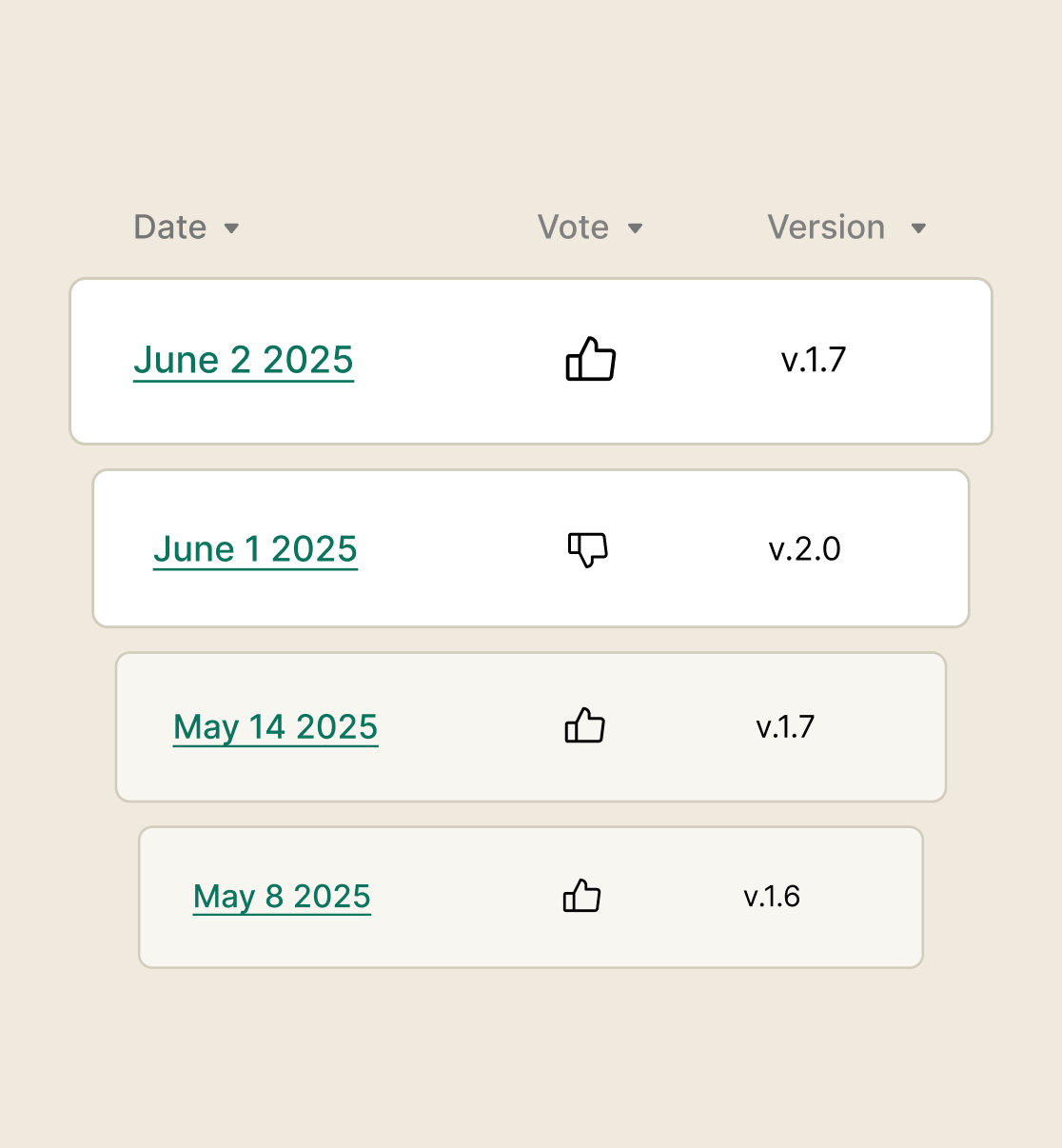
Inline feedback
Feedback footer
Embed a feedback form in the footer of your docs site to hear directly from your audience.
Your system’s working. Now make it unstoppable.
You’ve measured impact, made refinements – now it’s time to put those insights to work. From smarter governance to easy deployment, zeroheight helps your system get adopted.
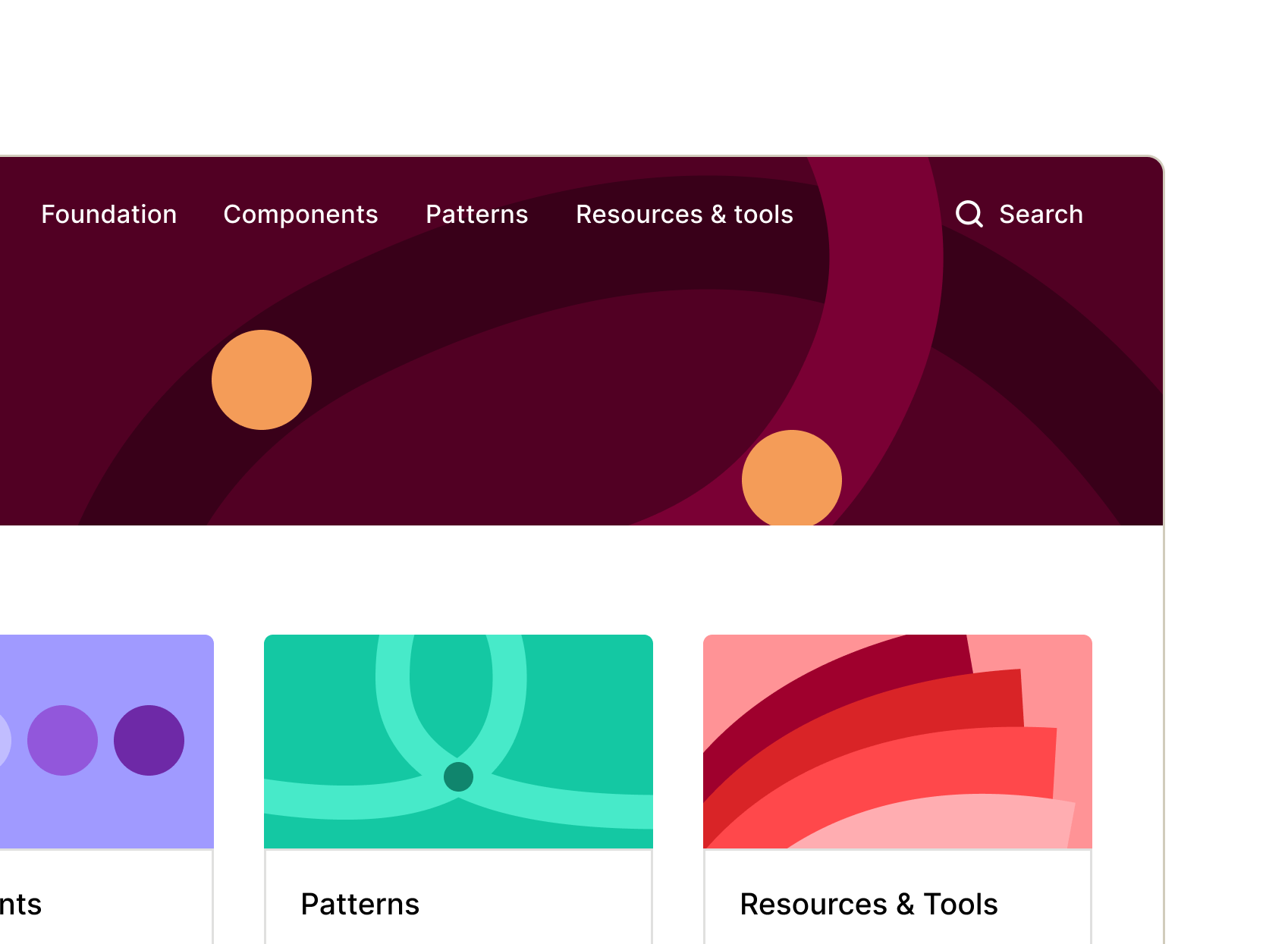
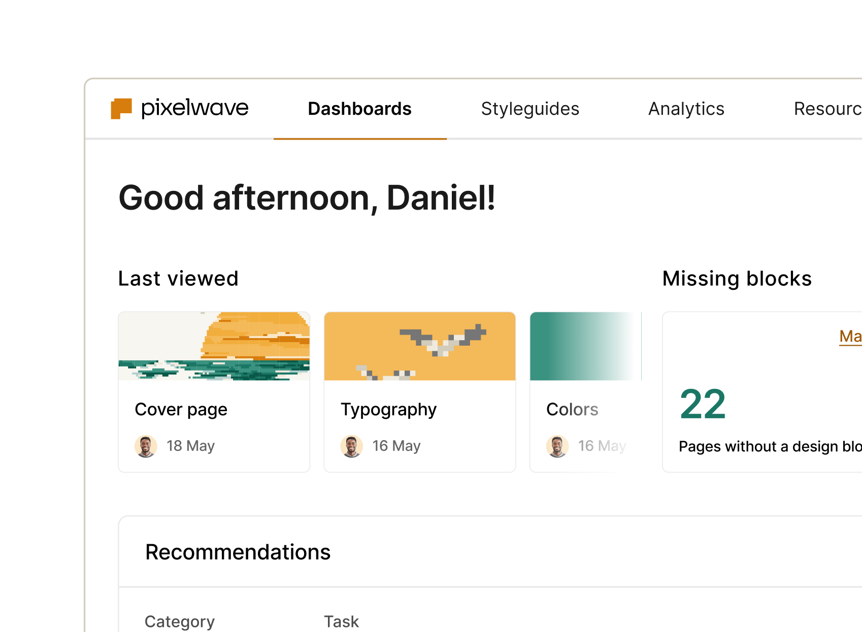
Documentation
Connect, customize, and launch your doc site into the stratosphere. zeroheight keeps your design system docs organized, up to date, and ready for your whole team to use.

Delivery
Measurement What’s in progress or adopted? What’s outdated or missing code? Get the fast answers on what’s happening and what needs attention.
Management
See the health of your whole system – think mission control for your design system. Surface insights and prioritize like never before. Manage roles, permissions, and SSO for hassle-free enterprise collaboration.