CSS-Tricks
  • Articles
  • Notes
  • Links
  • Guides
  • Almanac
  • Picks
  • Shuffle
Search

Articles Tagged
transform

22 Articles
{
,

}
Image
Direct link to the article How to Re-Create a Nifty Netflix Animation in CSS
css animation transform

How to Re-Create a Nifty Netflix Animation in CSS

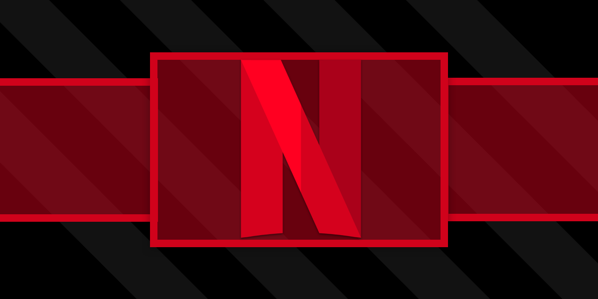
The design for Netflix’s browse page has remained pretty similar for a few years now. One mainstay component is the preview slider that allows users to scroll through content and hover on items to see a preview.

One unique characteristic …

Image
Chris Geelhoed on Apr 7, 2020
Image
Direct link to the article How They Fit Together: Transform, Translate, Rotate, Scale, and Offset
transform

How They Fit Together: Transform, Translate, Rotate, Scale, and Offset

Firefox 72 was first out of the gate with “independent transforms.” That is, instead of having to combine transforms together, like:

.el {
  transform: translate(10px, 10px) scale(0.95) rotate(10deg);
}

…we can do:

.el {
  rotate: 10deg;
  scale: 0.95;
  translate: 10px 
…
Image
Chris Coyier on Mar 30, 2020
Image
Direct link to the article Weaving a Line Through Text in CSS
CSS css animation transform

Weaving a Line Through Text in CSS

Earlier this year, I came across this demo by Florin Pop, which makes a line go either over or under the letters of a single line heading. I thought this was a cool idea, but there were a few little …

Image
Ana Tudor on Feb 26, 2020
Image
Direct link to the article Various Methods for Expanding a Box While Preserving the Border Radius
animation clip-path CSS scaling transform transition

Various Methods for Expanding a Box While Preserving the Border Radius

I’ve recently noticed an interesting change on CodePen: on hovering the pens on the homepage, there’s a rectangle with rounded corners expanding in the back.…

Image
Ana Tudor on Sep 6, 2019 Updated on Sep 9, 2019
Image
Direct link to the article Iron Man’s Arc Reactor Using CSS3 Transforms and Animations
animation transform

Iron Man’s Arc Reactor Using CSS3 Transforms and Animations

Alright Iron Man fans, fire up your code editors! We are going to make the Arc Reactor from Iron Man’s suit in CSS. We'll walk through every step so you can see exactly makes what happen.
Image
Kunal Sarkar on Apr 2, 2018 Updated on Apr 4, 2018
An animated image of a container that changes perspective when the mouse hovers over it.
Direct link to the article Animate a Container on Mouse Over Using Perspective and Transform
perspective transform

Animate a Container on Mouse Over Using Perspective and Transform

I’ve been working on a website in which large pictures are displayed to the user. Instead of creating a typical lightbox effect (a zoom-in animation with a black overlay) for these large pictures, I decided to try and make something …

Image
Mihai Ionescu on Mar 15, 2018
Image
Direct link to the article What Houdini Means for Animating Transforms
animation css variables custom properties houdini transform

What Houdini Means for Animating Transforms

I’ve been playing with CSS transforms for over five years and one thing that has always bugged me was that I couldn’t animate the components of a transform chain individually. This article is going to explain the problem, the old …

Image
Ana Tudor on Mar 7, 2018 Updated on Mar 15, 2019
Image
Direct link to the article Simplifying the Apple Watch Breathe App Animation With CSS Variables
CSS css variables custom properties transform

Simplifying the Apple Watch Breathe App Animation With CSS Variables

When I saw the original article on how to recreate this animation, my first thought was that it could all be simplified with the use of preprocessors and especialy CSS variables. So let’s dive into it and see how!…

Image
Ana Tudor on Jan 15, 2018
Image
Direct link to the article Individual CSS Transform Functions
custom properties transform

Individual CSS Transform Functions

Dan Wilson documents a classic annoyance with transforms:

button {
  transform: translateY(-150%);
}
button:hover {
  /* will (perhaps unintentionally) override the original translate */
  transform: scale(.8);
}

The native (and WET) solution is list the original transform again:

button:hover {
  
…
Image
Chris Coyier on Feb 23, 2017
  • Image Newer
  • 1
  • 2
  • 3
  • Older Image

CSS-Tricks is powered by DigitalOcean.

Keep up to date on web dev

with our hand-crafted newsletter

DigitalOcean
  • About DO
  • Cloudways
  • Legal stuff
  • Get free credit!
CSS-Tricks
  • Contact
  • Write for CSS-Tricks!
  • Advertise with us
Social
  • RSS Feeds
  • CodePen
  • Mastodon
  • Bluesky
Back to Top
Advertisement