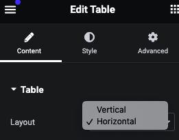
Verical and Horizontal Layout
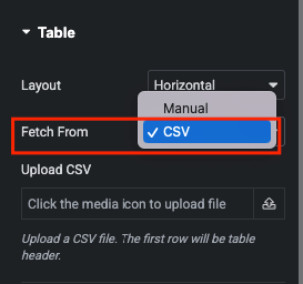
We have 2 options, One fetch from CSV file and Second one is Manual Entry Repeater based.
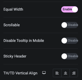
In Equal Width all Table Row Width are Same.
In a sticky header, you can make the heading column of the table remain fixed while scrolling.
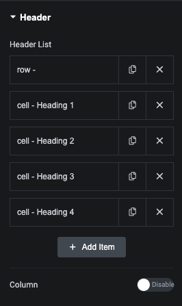
Header Tab – Manual Repeater
Using Column option, You can manage Content in Column based. Default is Inline.
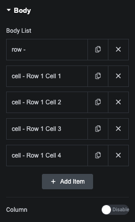
Body Tab – Manual Repeater
Header and Body have Same Options
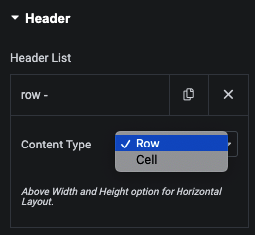
First, You need to Select Row/Column to Create Table.
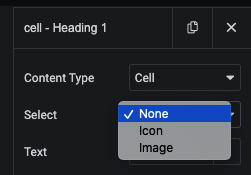
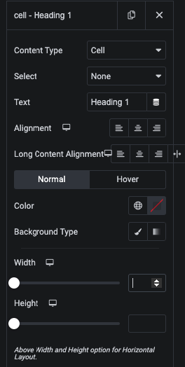
In Cell, You can select Icon or Image
In Cell, We have Text option and It’s Alignment in Repeater. So, You can manage Seprate Cell Design.
Also, We have Color, Background for Normal and Hover State.
Also, You can manage Width and Height of Cell.
We have Title and Description option in Tooltip.
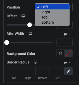
We have 4 Position options with Offset and It’s Styling.
Using this Styling options, You can create unique design.
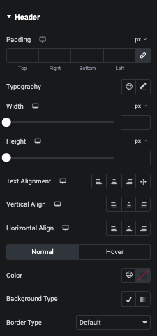
in Header, You can manage Padding, Typography, Width, Height and Alignment.
Also, You can manage Color, Background and Border for Normal and Hover State.
Header Icon/SVg – Style Tab
In this tab, You can manage Size of Icon, Margin and Color for Normal and Hover.
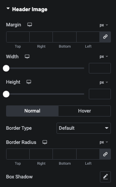
In this tab, You can manage Margin, Width and Height.
Also, You can manage Border and Shadow of Image for Normal and Hover State.
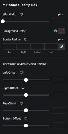
Header Tooltip Box – Style Tab
In this tab, You can manage Min. Width, Background, Border and It’s Offset.
Header Tooltip Title – Style Tab
In this tab, You can manage Alignment, Typography and Color of Tooltip Title.
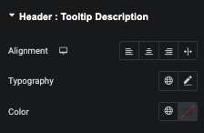
Header Tooltip Description – Style Tab
In this tab, You can manage Alignment, Typography and Color of Tooltip Description.
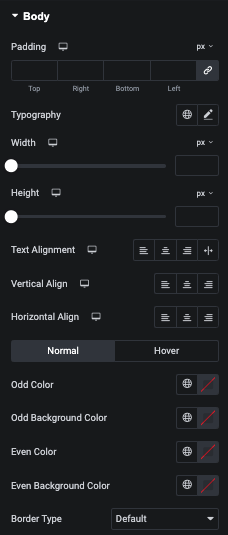
In this tab, You can manage Padding, Typography, Width, Height and Alignment.
Also, You can manage Odd and Even Styling options.
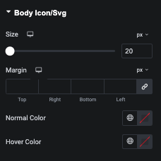
Body Icon/Svg – Style Tab
In this tab, You can manage Size of Icon, Margin and Normal and Hover State Color.
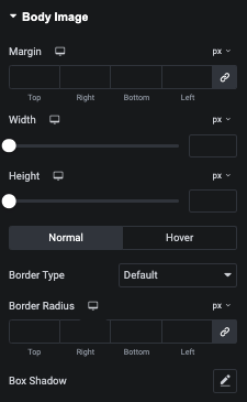
In this tab, You can manage Margin, Widt and Height of Image.
Also, You can manage Border nad Shadow for Normal and Hover State of Image.
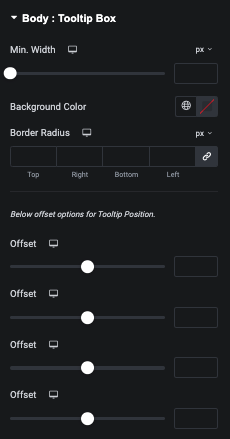
Body Tooltip Box – Style Tab
In this tab, You can manage Min. Width, Background, Border and It’s Offset.
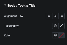
Body Tooltip Title – Style Tab
In this tab, You can manage Alignment, Typography and Color of Tooltip Title.
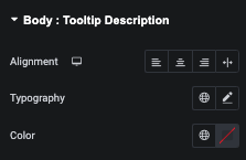
Body Tooltip Description – Style Tab
In this tab, You can manage Alignment, Typography and Color of Tooltip Description.
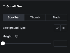
In this tab, You can manage Scrollbar, Thumb and Track styling for Large Screeen.
Mobile Table Scroll Bar – Style Tab
In this tab, You can manage Scrollbar, Thumb and Track styling for Mobile Device.