Position : Vertical/Horizontal
Content as Editor
Content as Template
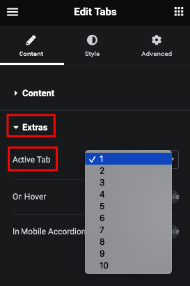
Active Tab
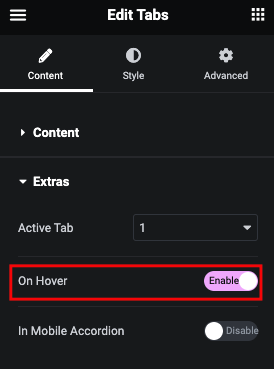
Tabs Active on Hover
In Mobile Device Tabs Convert into Accordion Layout
Manage Autoplay with Progress Bar
Style Tab
Title
In this tab, You can manage Padding, Margin and Typography.
And for Normal, Hover and Active, You can manage Color, Background, Border, Box Shadow and Text Shadow.
Title Progress
In this tab, You can manage Height and Color of Progress.
Icon
In this tab, You can manage Padding, Margin and Size.
And for Normal, Hover and Active, You can manage Color, Background, Border and Box Shadow.
Icon & Title Box
In this tab, You can manage Padding.
And for Normal and Hover, You can manage Background, Border and Box Shadow.
Content
In this tab, You can manage Padding, Margin, Color, background, Border, Box Shadow and text Shadow.
Mobile Title
And for Normal and Active, You can manage Color, Background, Border, Box Shadow and Text Shadow.
Mobile Icon
And for Normal and Active, You can manage Color, Background, Border and Box Shadow.
Mobile Content
In this tab, You can manage Padding, Margin, Typography, Color, Background, Border, Box Shadow and Text Shadow.
Box