800+ Free Webflow Components

Cloneable login forms, signup flows, member areas, and gated pages — built natively in Webflow. Free to copy, with real authentication, payments, and gated content from Memberstack.

Free until you launch
No credit card
Works in any Webflow project
Record Details Page (Data Tables)
View Component
Data Tables

Record Details Page (Data Tables)

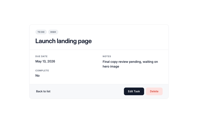
This component requires an accompanying script. Update the following attribute values on the detail wrapper to match your data table: ms-code-table — your data table name (default: "todos") ms-code-id-param — URL query parameter name for the record ID (default: id). Must match what the linking list view uses ms-code-owner-field — (optional) field that stores the owner's member ID; if set, the page only shows the record when the current member matches; otherwise the error state appears ms-code-edit-page — (optional) URL of the edit page (e.g. /edit). The script populates the Edit button's href with this URL plus ?id=... ms-code-delete-page — (optional) URL of the delete confirmation page (e.g. /delete). The script populates the Delete button's href the same way data-ms-field on each display element — set to the matching field key in your table ms-field on each display element — set to the field type: text, number, date, checkbox, html, image, or link Linking from the Card List, Table List, or Kanban The list-style components (Card List, Table List, and Kanban Board) generate per-record links using ms-code-detail-page and ms-code-id-param. To send users to this detail page when they click a card, row, or kanban card: Set ms-code-detail-page on the list/table/kanban container to the URL of this detail page (e.g. /detail) Make sure ms-code-id-param matches on both the list and the detail container (default: id) Inside each card or row, include an element with data-ms-code="detail-link" — the list scripts populate its href automatically with the record ID The card link will resolve to something like /detail?id=abc123, and this component reads that ID on load. Recommended Page Structure The detail page sits at the center of a typical CRUD flow. A clean, conventional setup looks like this: /todos — Card List or Table List view /board — Kanban Board /detail — Record Detail page (this component) /edit — Edit form /delete — Delete confirmation /new — Create form Wire each list-style page to the detail page via ms-code-detail-page="/detail". On the detail page, point Edit and Delete to their dedicated pages via ms-code-edit-page="/edit" and ms-code-delete-page="/delete". The same record ID flows through every URL as the ?id=... query parameter, so the chain works end-to-end without any custom JS. Page names are arbitrary. The slugs above (/detail, /edit, /delete, etc.) are conventions, not magic strings. Name your pages anything — /task-overview, /aufgabe-bearbeiten, /dashboard/tasks/view, etc. — and just plug those URLs into the matching ms-code-*-page attributes. The only values that actually need to line up across pages are ms-code-table (must match your data table key) and ms-code-id-param (must use the same query parameter name on every page so the record ID hands off correctly). Key Features Reads the record ID from the URL on load and fetches the record via getDataRecord Type-aware field rendering: text sets textContent, number formats with locale separators, date formats to a readable string, checkbox displays "Yes" or "No", html sets innerHTML, image sets src or background-image, link sets href Optional ownership check via ms-code-owner-field — non-owners see the error state instead of someone else's record Auto-generates Edit and Delete button URLs by combining ms-code-edit-page / ms-code-delete-page with the current record ID — no JS needed to wire navigation Three UI states: loading, populated content, and error (which doubles as "not found" and "not your record") Handles 429 rate-limit responses automatically with exponential-backoff retries Multiple detail containers supported on the same page if needed (rare, but it works) Action Buttons The default HTML includes three action buttons in the footer of the content block: Back to list — a plain <a href="/todos"> link; update the href to your list page Edit — has data-ms-code="edit-link"; the script populates the href with the edit page URL plus ?id=... Delete — has data-ms-code="delete-link"; the script populates the href the same way Remove any button you don't need by deleting it from the HTML. To skip the Edit or Delete URL population, simply omit ms-code-edit-page or ms-code-delete-page from the wrapper. Full Attribute Reference Three categories of attributes drive this component. Use this section as a complete spec when wiring up the markup. 1. Container Attributes (on the detail wrapper) data-ms-code="detail-container" — required. Marks this element as the detail wrapper. The script initializes one instance per matching element. ms-code-table — required. The Memberstack data table key to fetch from. Example: ms-code-table="todos". ms-code-id-param — optional, defaults to id. URL query parameter name that holds the record ID. Example: ms-code-id-param="recordId". ms-code-owner-field — optional. Field key that stores the owner's member ID. When set, the page only shows the record if the current member matches; non-owners see the error state. Example: ms-code-owner-field="owner". ms-code-edit-page — optional. URL of the edit page. Used to populate the Edit button's href. Example: ms-code-edit-page="/edit". ms-code-delete-page — optional. URL of the delete confirmation page. Used to populate the Delete button's href. Example: ms-code-delete-page="/delete". 2. Element Role Attributes (data-ms-code values inside the container) detail-loading — recommended. Shown while fetching the record. Add style="display:none" to the element so it doesn't flash on page load. detail-error — recommended. Shown if the fetch fails, the record can't be found, or the ownership check rejects the user. Add style="display:none". detail-content — required. Wraps everything that should appear once the record loads. The script reveals it after populating fields. Add style="display:none". edit-link — optional. An <a> button whose href the script will populate as {edit-page}?{id-param}={recordId}. Leave href="#" as a placeholder. delete-link — optional. Same behavior as edit-link, but uses ms-code-delete-page. Leave href="#" as a placeholder. 3. Field Display Attributes Use both data-ms-field (which field) and ms-field (how to render it) on each display element. ms-field defaults to text if omitted. ms-field="text" (default) — sets the element's textContent to the field value. Use on any text element: <span>, <p>, <h1>–<h6>, <div>. Example: <h1 data-ms-field="task">Loading…</h1> ms-field="number" — parses the value as a float and formats with locale separators (e.g. 1234 → "1,234"). Use on any text element. Example: <span data-ms-field="count" ms-field="number">0</span> ms-field="date" — parses the ISO date string and formats it with toLocaleDateString using DATE_OPTIONS from the script (default: "Apr 16, 2026"). Use on any text element. Example: <p data-ms-field="dueDate" ms-field="date">—</p> ms-field="checkbox" — displays the customizable BOOLEAN_TRUE / BOOLEAN_FALSE labels (default: "Yes" / "No") based on the field's truthiness. Use on any text element. Example: <span data-ms-field="is_complete" ms-field="checkbox">No</span> ms-field="html" — sets innerHTML to the field value. Use only with trusted content — does not sanitize. Use on any container: <div>, <article>, etc. Example: <div data-ms-field="bio" ms-field="html"></div> ms-field="image" — if on an <img>, sets src. On any other element, sets style.backgroundImage to url(value). Use <img> for inline images, or any <div> for background-image use cases (cards, hero banners, avatars). Example: <img data-ms-field="cover" ms-field="image" src="" alt=""> ms-field="link" — if on an <a>, sets href. On any other element, sets textContent as a fallback. Use <a> for clickable links. Example: <a data-ms-field="website" ms-field="link" href="#">Visit</a> Field display elements can live anywhere inside data-ms-code="detail-content". The script walks every [data-ms-field] descendant and populates each one based on its ms-field type. Default Values Whatever placeholder text or attribute value you put in the HTML stays visible until the script populates it. Use this as fallback content for fields that may be empty or null in the data — the script skips populating fields whose value is null or undefined. Potential Use Cases Any Memberstack-powered site that needs a per-record detail view as a navigation hub Task detail pages, project briefs, customer profiles, order summaries, content previews, member dashboards, and more Swap the table name and fields to match any data model — the script handles the rest
Pagination (Data Tables)
View Component
Data Tables

Pagination (Data Tables)

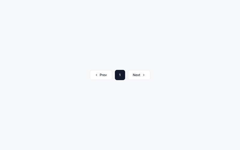
Required Elements Five attribute markers must be present for pagination to work. Place them inside your list container. data-ms-code="list-pagination" — the outer wrapper for the whole pagination bar. The script hides this entire wrapper automatically when there's only one page data-ms-code="list-prev" — the Previous link or button. The script attaches a click handler and dims it (opacity: 0.4; pointer-events: none) when the user is on page 1 data-ms-code="list-next" — the Next link or button. Same disabled treatment when the user is on the last page data-ms-code="list-page-buttons" — the inner container that holds the numbered page buttons. The script appends cloned buttons here data-ms-code="list-page-btn-template" — a single numbered button used as the template. The script clones it once per visible page, then hides the original. Always include style="display:none" on the template defensively How the Script Renders Buttons Instead of rendering one button per page (which gets unwieldy past ~20 pages), the dedicated scripts uses condensed pagination. The first page, last page, current page, and a configurable number of "sibling" pages around the current page are shown; the rest are replaced with … ellipses. 5 pages, current = 3 → shows 1 2 [3] 4 5 (no condensing — too few pages) 20 pages, current = 1 → shows [1] 2 3 4 5 … 20 20 pages, current = 10 → shows 1 … 9 [10] 11 … 20 20 pages, current = 20 → shows 1 … 16 17 18 19 [20] The number of sibling pages is controlled by PAGINATION_SIBLINGS in the script's CUSTOMIZE block (default: 1). Raise it to 2 for a roomier 1 … 8 9 [10] 11 12 … 20, or set it to 0 for a tighter 1 … [10] … 20. Classes the Script Adds Automatically is-active — added to the button matching the current page so you can style it differently (bolder, filled background, etc.) is-ellipsis — added to the … placeholders so you can style them as non-interactive (lighter color, no hover state, no border, no padding) Suggested CSS for the Ellipsis The script sets pointer-events: none and opacity: 0.5 inline by default. Add this CSS so hover effects don't flicker on the ellipsis: .list_page-btn.is-ellipsis { cursor: default; background: transparent; border-color: transparent; pointer-events: none; } .list_page-btn.is-ellipsis:hover { background: transparent; } Minimum HTML <div data-ms-code="list-pagination" class="list_pagination"> <a data-ms-code="list-prev" href="#" class="list_page-btn">Prev</a> <div data-ms-code="list-page-buttons" class="list_page-buttons"> <a data-ms-code="list-page-btn-template" href="#" class="list_page-btn" style="display:none">1</a> </div> <a data-ms-code="list-next" href="#" class="list_page-btn">Next</a> </div> Common Mistakes The template button is outside list-page-buttons — the script appends clones into the page-buttons container, so the template must be a child of it The template has no text content or visible label — make sure it has either direct text (e.g. 1) or a <div> child that holds the page number Forgetting style="display:none" on the template — without it, the unhidden template flashes briefly on page load before the script hides it Hand-coding multiple page buttons in the HTML — only one template is needed; the script clones it for each page Putting the pagination bar outside the list container — it must live inside the same container the script initializes (list-container for tables, ms-code-table="..." wrapper for the card list) Where Pagination Is Used Card List View — pagination lives inside the ms-code-table wrapper, alongside the list-container Table List View — pagination lives inside the data-ms-code="list-container" wrapper, after the <table> Kanban Board — does not use pagination because all records are loaded into columns at once Custom lists — drop the pagination block inside any container that the list script initializes; the same attributes work everywhere

Search Inputs (Data Tables)
View Component
Data Tables

Search Inputs (Data Tables)

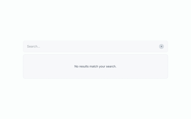
How It Works When the user types, the search dispatches an ms:search event to the target list container. The card view, table view and Kanban view list scripts listen for this event, filter their full in-memory record cache, recalculate pagination, and re-render. Where do results appear? In the existing list/table/board you already have on the page. The search input never duplicates the data it just narrows what's shown. The "no results" message and result count appear inside the search wrapper itself. Setup This component requires an accompanying script. Drop the search wrapper anywhere on the page, point it at your list, and you're done. ms-code-target — CSS selector for the list container(s) to filter (default: [data-ms-code='list-container']). Use [data-ms-code='kanban-container'] for kanban boards. Match multiple lists by separating selectors with commas ms-code-search-fields — (optional) comma-separated list of data-ms-field keys to search within (e.g. task,notes,priority). Leave empty to search every field on each record ms-code-row-selector — (optional, fallback only) explicit CSS selector for rows when a list doesn't listen for ms:search. Auto-detected for built-in components ms-code-debounce — milliseconds to wait after typing stops before filtering (default: 200) ms-code-min-chars — minimum characters required before filtering kicks in (default: 1) Pairing with the Card List View The default ms-code-target already matches the list container. Place the search wrapper anywhere on the page — typically above the list. The search will filter across all records loaded by the list (up to its MAX_RECORDS ceiling), regardless of pagination. Pairing with the Table List View Same as card list view — the default target works. If you have multiple tables on the page (e.g. "All Todos" and "My Todos"), give each one a unique selector and pair each with its own search input: <!-- Search for the "All Todos" table only --> <div data-ms-code="search" ms-code-target="#all-todos">...</div> <div id="all-todos" data-ms-code="list-container" ms-code-table="todos">...</div> <!-- Search for the "My Todos" table only --> <div data-ms-code="search" ms-code-target="#my-todos">...</div> <div id="my-todos" data-ms-code="list-container" ms-code-table="todos" ms-code-owner-field="owner">...</div> Pairing with the Kanban Board Change ms-code-target to point at the kanban container: <div data-ms-code="search" ms-code-target="[data-ms-code='kanban-container']" ms-code-search-fields="task,notes"> ... </div> Cards that don't match are hidden across all columns. Empty columns simply appear empty, the kanban's column-count badges keep showing the unfiltered totals on purpose so users understand they're filtering, not deleting. Key Features Filters across all paginated records, not just the current page — works at the data level via the ms:search event Live result count using a customizable template ({visible} of {total} results) Pagination automatically recalculates based on filtered results — page 1 of 5 might become page 1 of 2 when filtering narrows the dataset Pure client-side filtering — no extra API calls, no rate-limit impact, instant results Optional field allow-list — search only specific fields like task and notes, ignoring priority or status Debounced input prevents lag while typing on long lists "No results" state shown when nothing matches Clear button appears as soon as the input has text Press Escape to clear the search and restore all rows Multiple search inputs per page — each one targets its own list independently Custom Lists If you have a custom list component, the search input falls back to client-side DOM filtering automatically. To make a custom list participate in data-level filtering, have it listen for ms:search on its container element: container.addEventListener('ms:search', function(e) { e.preventDefault(); // tell the search input you'll handle it var query = (e.detail.query || '').toLowerCase(); var fields = e.detail.fields || []; // Filter your records and re-render here // Then optionally dispatch ms:search:result back so the count UI updates: container.dispatchEvent(new CustomEvent('ms:search:result', { detail: { visible: filtered.length, total: all.length, query: query } })); }); Potential Use Cases Any Memberstack-powered site with list, table, or board views that benefit from quick-find Task lists, customer directories, project catalogs, content libraries, hiring pipelines, order histories, inventory, and more Drop in next to any existing list component — no markup changes needed in the list itself for the built-in components

Kanban View (Data Tables)
View Component
Data Tables

Kanban View (Data Tables)

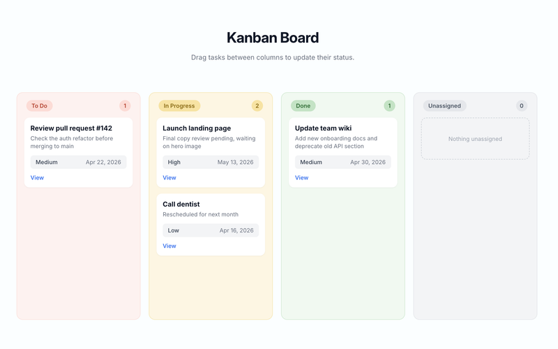
This component requires an accompanying script. Update the following attribute values in the HTML to match your data table and fields before use: ms-code-table — set on the board wrapper to your data table name (default: "todos") ms-code-status-field — set on the board wrapper to the option/text field the board groups by (default: "status") ms-code-status-value — set on each column to the exact option value records in that column should have (e.g. "To Do", "In Progress", "Done"); must match the values configured on the field in your data table. Use __unassigned to turn a column into a catch-all for records with no matching status ms-code-sort — set the field and direction for ordering cards within each column (e.g. createdAt:desc). Server-managed fields are createdAt / updatedAt; custom fields use the field key from your table ms-code-detail-page — set to the URL of the detail/edit page (e.g. /edit) ms-code-id-param — set to the URL query parameter name for the record ID (default: id) ms-code-owner-field — (optional) set on the board wrapper to filter records by the logged-in member; omit it to show every record on the board data-ms-field on each card display element — set to the matching field key in your table ms-field on each card display element — set to the field type: text, number, date, checkbox, html, image, or link draggable="true" must remain on the card template so drag-and-drop works on desktop data-ms-code="card-move-trigger" — (optional but recommended) on a button inside the card template; opens a tap-to-move menu for touch/mobile users Unassigned Column Add a column with ms-code-status-value="__unassigned" to catch any record whose status value is null, empty, or doesn't match any other column (e.g. a stale option that was renamed). When a card is moved into the unassigned column, the script sets the status field to null. When a card is moved out of it, the script sets the new status value as expected. If you don't include an unassigned column, records with no matching status are silently skipped on render. Mobile / Touch Support HTML5 drag-and-drop is unreliable on phones, so the component also ships with a tap-to-move fallback. Each card has a data-ms-code="card-move-trigger" button; tapping it opens a small popover listing all other columns as buttons. Tapping a column moves the card and updates the record — the same code path as drag-and-drop. The popover is styled with minimal inline styles out of the box; customize its look via the .ms-card-menu class on the <body>. You can hide the move button on desktop and only show it on mobile with a simple CSS rule if you'd rather keep the desktop UI drag-only: @media (min-width: 768px) { .kanban_card-move { display: none; } } Record Limits Memberstack caps take at 100 records per query, so the script paginates internally — fetching 100 at a time with skip until every record is loaded or MAX_RECORDS (default 1000) is reached. If you have a large board, raise MAX_RECORDS in the CUSTOMIZE block at the top of the script. A console.warn fires whenever the ceiling is hit so you'll know when records are being clipped. Key Features Fetches all records from the specified Memberstack data table on page load, paginating through the 100-record cap automatically Groups records into columns by matching their status-field value against each column's status-value Unassigned catch-all column for records with null, empty, or stale status values Native HTML5 drag-and-drop — no external libraries required Tap-to-move popover menu for touch devices — same logic as drag-drop, works on phones and tablets Dropping or tapping a card into a different column calls updateDataRecord to persist the new status value automatically (sets to null when moved to unassigned) Optimistic UI: the card moves instantly and reverts to its original column if the update fails Live column counts and per-column empty states update whenever a card is moved Type-aware card rendering: text sets textContent, number formats with locale separators, date formats to a readable string, checkbox displays "Yes" or "No", html sets innerHTML, image sets src, link sets href Optional owner filtering to show only the logged-in member's records Customizable drag/drop class names (is-dragging / is-drop-target) and menu label for styling and copy Four top-level UI states using the same list-* attribute roles as the Card and Table views: list-loading, list-empty, list-error (with retry), and populated board Adding or Changing Columns To add a new column, duplicate an existing data-ms-code="kanban-column" block and change the ms-code-status-value to match the new option value in your data table. To rename a column, update both the column's header text and its ms-code-status-value to match the exact option value in your field. Linking from the Card List View If you use the Card List View or Table List View alongside this board, set their ms-code-detail-page to the same edit page and the cards on both views will link to the same record detail. Potential Use Cases Any Memberstack-powered site that needs a workflow board for moving records through stages Task managers, project trackers, CRM deal pipelines, content calendars, hiring pipelines, order fulfillment, and more Swap the table name, status field, and column values to match any data model with a single option field.

Data Table State Management
View Component
Data Tables

Data Table State Management

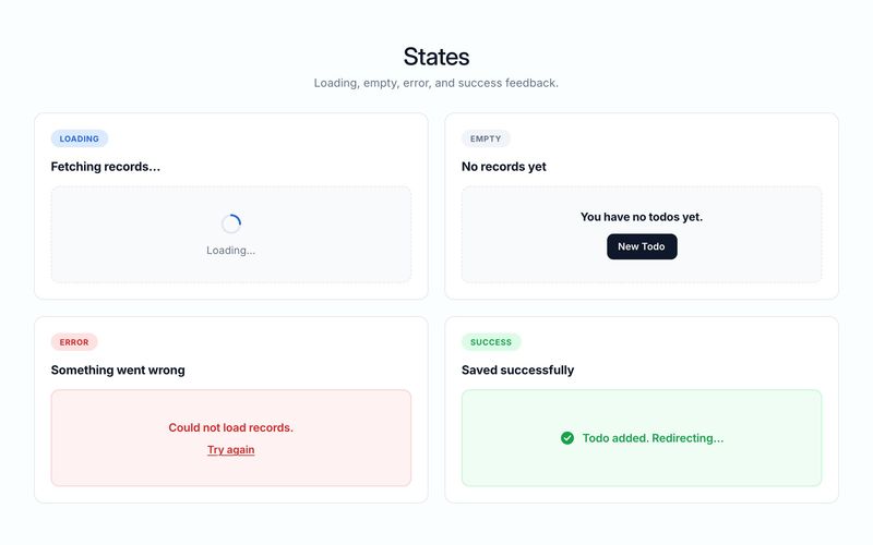
Loading State Shown while the script fetches records from the data table. Keep it brief, reassuring, and under one line. Appears in elements with data-ms-code="list-loading", data-ms-code="edit-loading", data-ms-code="detail-loading", or data-ms-code="delete-loading". Short: Loading… Medium: Loading records… Friendly: Just a moment, fetching your data… Context-aware: Loading your todos… / Loading project details… / Preparing delete confirmation… Empty State Shown when the query returns zero records. Do two things: confirm the list is genuinely empty, and invite the next action (create, import, invite, etc.). Appears in elements with data-ms-code="list-empty". Short: No records found. Medium: You have no todos yet. Add one to get started. Friendly: Nothing here yet — create your first todo and it will show up here. Owner-filtered (my records): You haven't created any todos yet. Hit "New Todo" to add one. All records: No todos have been created yet across the table. Recommended pairing: always include a visible call-to-action button inside or next to the empty state (e.g. "New Todo", "Add Record", "Invite a member"). Error State Shown when the fetch, create, update, or delete call fails. Be honest about what happened, avoid exposing technical details, and offer a way forward (retry, reload, contact). Appears in elements with data-ms-code="list-error", data-ms-code="edit-error", data-ms-code="detail-error", data-ms-code="form-error", or data-ms-code="delete-error". Short: Something went wrong. Medium: Could not load records. Please try again. Friendly: We hit a snag loading your todos. Give it another try in a moment. With retry link: Could not load records. Try again Form-level error: We couldn't save your changes. Check your connection and try again. Permissions error: You don't have access to this record. Not found: This record could not be found — it may have been deleted. Recommended pairing: include a retry trigger (data-ms-action="retry") or a link back to the list view so users are never stuck. Bonus: Success State Shown briefly after a create, update, or delete succeeds. Appears in elements with data-ms-code="form-success" or data-ms-code="delete-success". Create: Todo added. / Record created successfully. Update: Changes saved. / Todo updated. Delete: Todo deleted. Redirecting you back to the list…

Table List View (Data Tables)
View Component
Data Tables

Table List View (Data Tables)

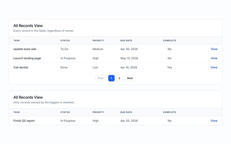
This component requires an accompanying script. The component includes two tables by default, one showing all records and one filtered to the current member but you can keep either (or both) and update the following attribute values to match your data table and fields: ms-code-table — set to your data table name on each table wrapper (default: "todos") ms-code-sort — set to the field and direction for sorting (e.g. createdAt:desc). Server-managed fields are createdAt / updatedAt; custom fields use the field key from your table ms-code-per-page — set to the number of rows to show per page ms-code-detail-page — set to the URL of the detail/edit page (e.g. /edit) ms-code-id-param — set to the URL query parameter name for the record ID (default: id) ms-code-owner-field — (optional) set on the table wrapper to filter records by the logged-in member; omit it to show all records regardless of owner data-ms-field on each <td> — set to the matching field key in your table ms-field on each <td> — set to the field type: text, number, date, checkbox, html, image, or link Key Features Supports multiple independent tables on the same page — each table is configured and paginated on its own Optional owner filtering: include ms-code-owner-field to show only the logged-in member's records, omit it to show every record in the table Renders a row for each record using a cloneable template pattern inside <tbody> Binds data-ms-field cells to record values with full type-aware rendering: text sets textContent, number formats with locale separators, date formats to a readable string, checkbox displays "Yes" or "No", html sets innerHTML, image sets src, link sets href Generates detail page links in each row with the record ID as a query parameter Client-side pagination with configurable page size, numbered page buttons, and previous/next navigation with disabled state styling Supports sorting by any field in ascending or descending order Four distinct UI states: loading, populated list, empty, and error Retry button on error state to re-attempt the fetch Using One Table vs Two The default component ships with two tables to demonstrate both modes side by side. To use only one, delete the other wrapper. To add more, duplicate a wrapper and adjust its settings — the script automatically initializes every element with data-ms-code="list-container". Potential Use Cases Any Memberstack-powered site that needs a structured record list with sortable columns and row-level actions Admin dashboards, task lists, CRM contact tables, order histories, inventory views, and more Swap the table name and fields to match any data model — the script handles the rest
Delete Data Table Records
View Component
Data Tables

Delete Data Table Records

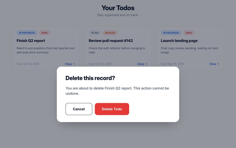
This component requires an accompanying script. Update the following attribute values in the HTML to match your data table and fields before use: ms-code-table — set to your data table name (default: "todos") ms-code-id-param — set to the URL query parameter that holds the record ID (default: id) ms-code-owner-field — set to the field that stores the member ID for ownership checks ms-code-redirect — set to the page URL to redirect after a successful delete (e.g. /todos) data-ms-field on display elements — set to the matching field key in your table ms-field on display elements — set to the field type: text, number, date, checkbox, html, image, or link Look for /* CUSTOMIZE */ comments in the script for additional options including delete mode (hard vs soft) Linking from the Card List View The Card List View component generates a link on each card using ms-code-detail-page and ms-code-id-param. To have cards link to this delete page: Set ms-code-detail-page on the Card List View wrapper to the URL of your edit page (e.g. /delete) Make sure ms-code-id-param matches on both components (default: id) The card link will resolve to something like /delete?id=abc123, and this component reads that ID on load. Key Features Reads the record ID from the URL query string and fetches the record on page load Displays the record name in the confirmation prompt so the user knows what they are deleting Verifies the current member owns the record before allowing deletion Supports two delete modes: hard delete via deleteDataRecord and soft delete via updateDataRecord with configurable field keys Handles every ms-field type when displaying record data: text sets textContent, number formats with locale separators, date formats to a readable string, checkbox displays Yes or No, html sets innerHTML, image sets src, link sets href Confirm and Cancel buttons with loading state on the confirm action Shows success message and redirects after deletion, or displays an error if it fails Cancel button navigates to a configurable URL or falls back to browser history Potential Use Cases Any Memberstack-powered site that needs a safe, user-facing delete workflow tied to a data table Task managers, project trackers, CRMs, support ticket systems, and more Swap the table name and fields to match any data model — the script handles the rest
Create Data Table Record
View Component
Data Tables

Create Data Table Record

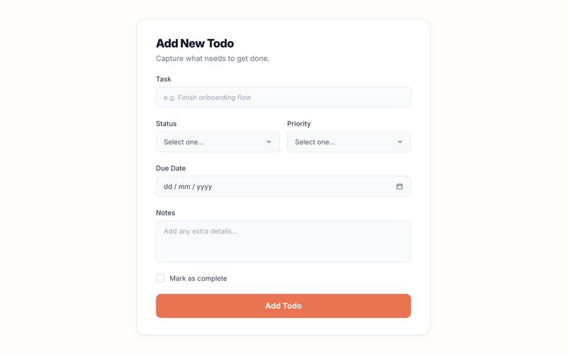
This component requires an accompanying script. Update the following attribute values in the HTML to match your data table and fields before use: ms-code-table — set to your data table name (default: "todos") ms-code-owner-field — set to the field that stores the member ID ms-code-redirect — (optional) set to the page URL to redirect after success data-ms-field on each input — set to the matching field key in your table ms-field on each input — set to the field type: text, number, date, checkbox, html, image, or link Look for /* CUSTOMIZE */ comments in the script for additional options Key Features Auto-binds form inputs to data table columns via data attributes Handles every ms-field type when collecting values: text and html pass raw strings, number parses to float, date converts to ISO, checkbox reads the checked state, image and link pass URLs Authenticates the current member and stamps owner + creation date on every record Shows loading, success, and error states with smooth fade-in transitions Prevents Webflow's native form handler from hiding the form Supports optional redirect after successful creation Potential Use Cases Any Memberstack-powered site that needs a user-facing create form tied to a data table Task managers, project trackers, CRMs, support ticket systems, inventory forms, and more Swap the table name and fields to match any data model — the script handles the rest
Edit Data Table Records
View Component
Data Tables

Edit Data Table Records

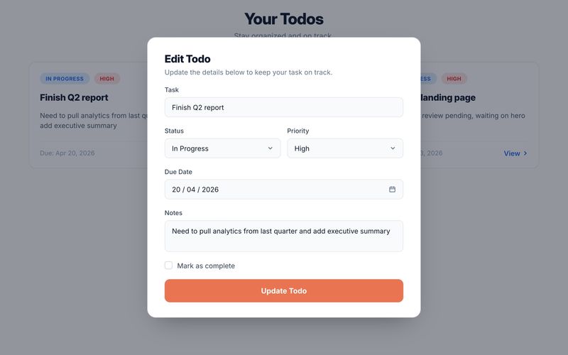
This component requires an accompanying script. Update the following attribute values in the HTML to match your data table and fields before use: ms-code-table — set to your data table name (default: "todos") ms-code-id-param — set to the URL query parameter that holds the record ID (default: id) ms-code-owner-field — set to the field that stores the member ID ms-code-redirect — (optional) set to the page URL to redirect after a successful update data-ms-field on each input — set to the matching field key in your table ms-field on each input — set to the field type: text, number, date, checkbox, html, image, or link Look for /* CUSTOMIZE */ comments in the script for additional options Linking from the Card List View The Card List View component generates a link on each card using ms-code-detail-page and ms-code-id-param. To have cards link to this edit page: Set ms-code-detail-page on the Card List View wrapper to the URL of your edit page (e.g. /edit) Make sure ms-code-id-param matches on both components (default: id) The card link will resolve to something like /edit?id=abc123, and this component reads that ID on load. Key Features Reads the record ID from the URL query string and fetches the existing record on page load Pre-populates all form fields with saved values, handling every ms-field type: text and html set the input value, number sets the value directly, date converts ISO to YYYY-MM-DD for the date picker, checkbox sets the checked state, image and link set URL values Updates the record in place via Memberstack's updateDataRecord API on submit Collects fields on submit with full type awareness: number parses to float, date converts to ISO, checkbox reads checked state, text/html/image/link pass raw strings Authenticates the current member and stamps the owner field on every save Shows loading, success, and error states with smooth fade-in transitions Gracefully handles missing or deleted records with an inline error message Supports optional redirect after successful update Potential Use Cases Any Memberstack-powered site that needs a user-facing edit form tied to a data table Task managers, project trackers, CRMs, support ticket systems, inventory updates, and more Swap the table name and fields to match any data model — the script handles the rest
View Data Table Records
View Component
Data Tables

View Data Table Records

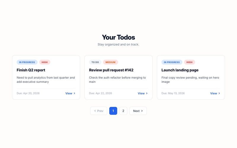
This component requires an accompanying script. Update the following attribute values in the HTML to match your data table and fields before use: ms-code-table — set to your data table name (on both the wrapper and the template; default: "todos") ms-code-sort — set to the field and direction for sorting (e.g. created_at:desc) ms-code-per-page — set to the number of cards to show per page ms-code-detail-page — set to the URL of the detail/edit page (e.g. /edit) ms-code-id-param — set to the URL query parameter name for the record ID (default: id) ms-code-owner-field — (optional) set on the template to filter records by the logged-in member data-ms-field on each display element — set to the matching field key in your table ms-field on each display element — set to the field type: text, number, date, checkbox, html, image, or link Key Features Fetches all records from the specified Memberstack data table on page load Renders a card for each record using a cloneable template pattern Binds data-ms-field elements to record values with full type-aware rendering: text sets textContent, number formats with locale separators, date formats to a readable string, checkbox displays "Yes" or "No", html sets innerHTML, image sets src, link sets href Generates detail page links with the record ID as a query parameter Client-side pagination with configurable page size Numbered page buttons, previous/next navigation with disabled state styling Supports sorting by any field in ascending or descending order Optional owner filtering to show only the logged-in member's records Four distinct UI states: loading, populated list, empty, and error Retry button on error state to re-attempt the fetch Potential Use Cases Any Memberstack-powered site that needs a browsable record list with card layout Task managers, project dashboards, CRM contact lists, product catalogs, and more Swap the table name and fields to match any data model — the script handles the rest
Pricing Tier Trio
View Component
Pricing

Pricing Tier Trio

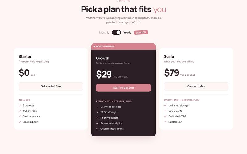
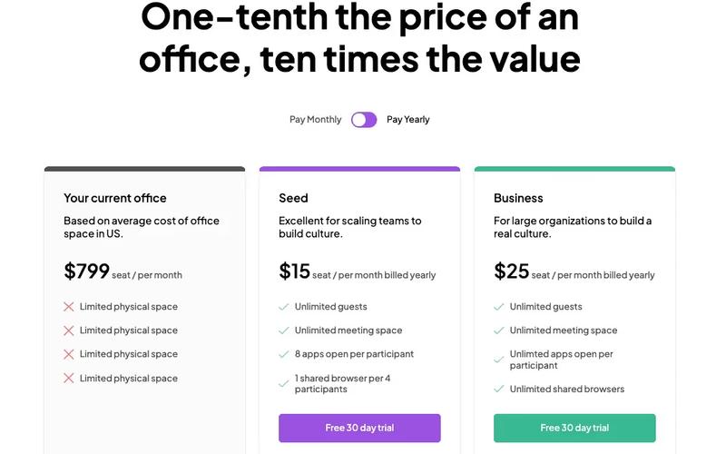
The styled pricing cards component is a 3-tier pricing section built on a warm rose palette with an ivory background. It features a monthly/annual billing toggle with a slightly rotated "SAVE 20%" badge, and an elevated dark highlighted middle card with a rose accent top bar. Feature lists build narratively across tiers using progressive language (Includes → Everything in Starter, plus → Everything in Growth, plus) rather than repeating the same features with checkmarks. Potential Use Cases SaaS and membership platforms with tiered pricing plans. Webflow template pricing pages needing a warm, editorial aesthetic. Course or community platforms with free, paid, and premium tiers. Any Memberstack-powered site needing a styled pricing section that goes beyond the default 3-column grid.

Pricing Spotlight Comparison Table
View Component
Pricing

Pricing Spotlight Comparison Table

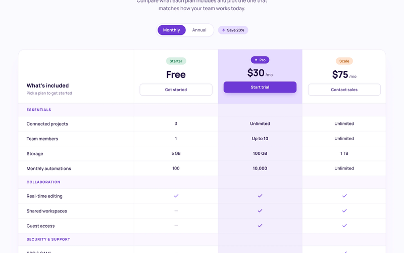
The Styled Pricing Comparison Table component is a full feature comparison matrix with three plan columns (Starter Free, Pro $24/mo, Scale $60/mo), each topped with a distinctly colored pill badge. The Pro column runs a tinted purple background through the entire column for clear visual emphasis. Features are organized into labeled groups (Essentials, Collaboration, Security & Support) with purple category labels. The table uses a mix of text values ("5 GB", "100 GB", "Unlimited") and checkmark/dash indicators, with column-specific CTA buttons at the top. Both Monthly and Annual billing states are designed as separate artboards. Potential Use Cases SaaS platforms needing a detailed feature-by-feature comparison across tiers. Membership sites where users need to understand exactly what each plan includes before upgrading. Product pages with complex feature sets spanning multiple categories. Any Webflow + Memberstack site needing a production-ready comparison table with grouped categories.

Card Wizard Onboarding Flow
View Component
Onboarding

Card Wizard Onboarding Flow

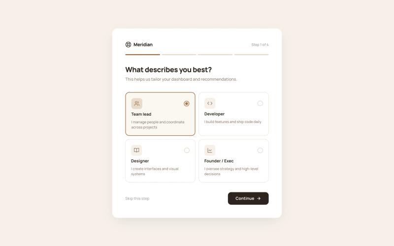
The Styled Onboarding – Card Wizard Flow component is a 4-step onboarding wizard presented as a centered card on a tinted background. A horizontal progress bar fills across all four steps, providing clear advancement feedback. Each step collects different types of input — role selection, interest tagging, referral source tracking, and a completion screen with next-action cards. All selections are designed to map directly to Memberstack custom fields via standard Webflow form elements. Key Features Step 1: Role selection via 2×2 icon card grid (Team lead, Developer, Designer, Founder/Exec), each with icon tile, title, description, and radio indicator. Step 2: Interest selection via multi-select tag chips (11 topics) with check icon on selected state and "3 selected · Choose at least 2" counter. Step 3: Referral source via icon-led radio list (Google search, Social media, Friend/colleague, Blog/article, Other) with single-select behavior. Step 4: Success completion screen with checkmark icon, congratulatory heading, two next-action cards (Go to dashboard, Browse templates), and full-width accent CTA. Horizontal 4-segment progress bar fills with accent color as steps advance. Potential Use Cases SaaS products collecting user role and interest data for personalized dashboards. Membership platforms tracking referral sources for attribution. Online communities gathering topic preferences for content recommendations. Any Webflow + Memberstack site needing a lightweight, card-based onboarding wizard.
Split Screen Onboarding
View Component
OnboardingProfile

Split Screen Onboarding

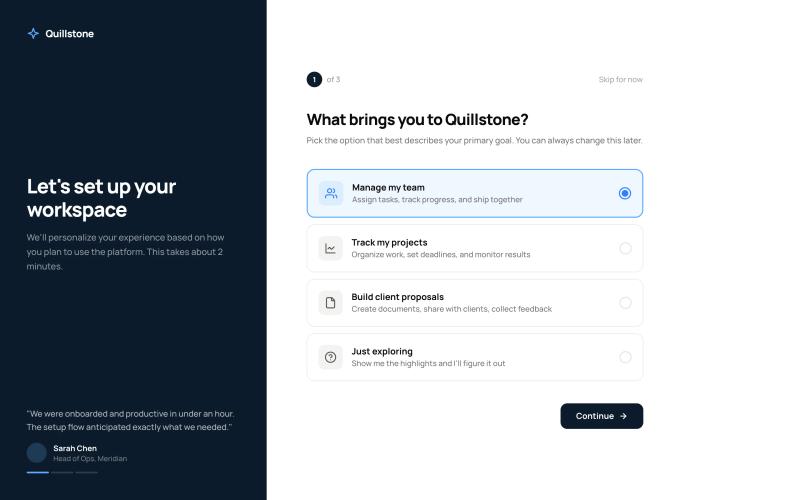
The Styled Onboarding – Split Screen Flow component is a 3-step onboarding experience using a split-screen layout. The left panel features brand messaging with rotating testimonials and progress dots that update across steps. The right panel contains the form content — goal selection, workspace setup, and profile completion. Each step is designed as a separate Webflow form that submits and redirects to the next step via URL hash, making it fully compatible with Webflow's native form handling and Memberstack custom fields. Key Features Step 1: Goal selection with four radio card options (Manage team, Track projects, Build proposals, Just exploring), each with icon tile, title, and description. Step 2: Workspace name text input, role dropdown selector, and team size pill buttons (Just me, 2–10, 11–50, 51–200, 200+). Step 3: Profile completion with circular avatar upload area, first/last name fields, company input, and short bio textarea with character counter. Left branded panel with rotating testimonials, author attribution, and step-synced progress dots. Back navigation on steps 2 and 3, "Skip for now" option on every step. Final step CTA changes from dark "Continue" to accent-colored "Launch workspace" to signal completion. Potential Use Cases Membership platforms requiring new member goal setting and personalization. SaaS products with workspace setup flows after registration. Client portals needing profile completion during onboarding. Course platforms collecting learner preferences before content delivery. Any Memberstack-powered site needing multi-step post-signup data collection.

Styled Platform Nav – Mega Menu with CTA Card
View Component
NavbarsMarketing UI

Styled Platform Nav – Mega Menu with CTA Card

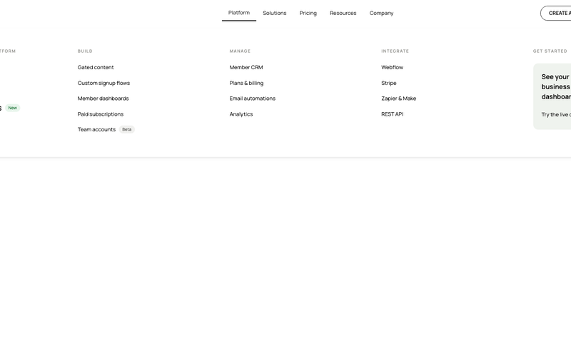
The Styled Platform Nav – Mega Menu with CTA Card component is a production-ready SaaS navigation bar with a five-column mega menu dropdown. The Platform dropdown organizes links into four categorized columns (The membership platform, Build, Manage, Integrate) plus a dark CTA card column with a live demo prompt. The navbar includes standard nav links (Solutions, Pricing, Resources, Company), member-aware auth buttons (Create account, Log in), a cart icon, and a Lottie-animated hamburger menu for mobile. Memberstack visibility attributes control auth button display based on login state. Key Features Five-column mega menu dropdown under the Platform nav item: Lead column: "The membership platform" with primary pages (About, How it works, Member portals) and a "New" badge. Build column: feature pages (Gated content, Custom signup flows, Member dashboards, Paid subscriptions, Team accounts) with a "Beta" badge. Manage column: operational pages (Member CRM, Plans & billing, Email automations, Analytics). Integrate column: integration pages (Webflow, Stripe, Zapier & Make, REST API). CTA column: dark card with headline ("See your membership business in one dashboard"), action label ("Try the live demo"), and arrow icon. Text-based logo ("stackly") on the left for brand-first hierarchy. Standard nav links (Solutions, Pricing, Resources, Company) alongside the mega dropdown. Right-side button group with Create account and Log in buttons, plus a cart icon with SVG. Memberstack data-ms-content="!members" attributes on auth buttons for conditional visibility. Lottie-animated hamburger icon with JSON-driven three-line animation for mobile. Mobile menu includes full-height nav with stacked links and dual CTA buttons. Potential Use Cases SaaS platforms with multiple product areas, integrations, and management features. Membership platforms built on Webflow + Memberstack needing organized feature navigation. Product-led companies with build, manage, and integrate sections in their information architecture. Marketplace or e-commerce membership sites needing a cart icon alongside auth controls. Any platform site that needs a mega menu with a promotional CTA card built into the dropdown.

Editorial Navbar
View Component
NavbarsMarketing UI

Editorial Navbar

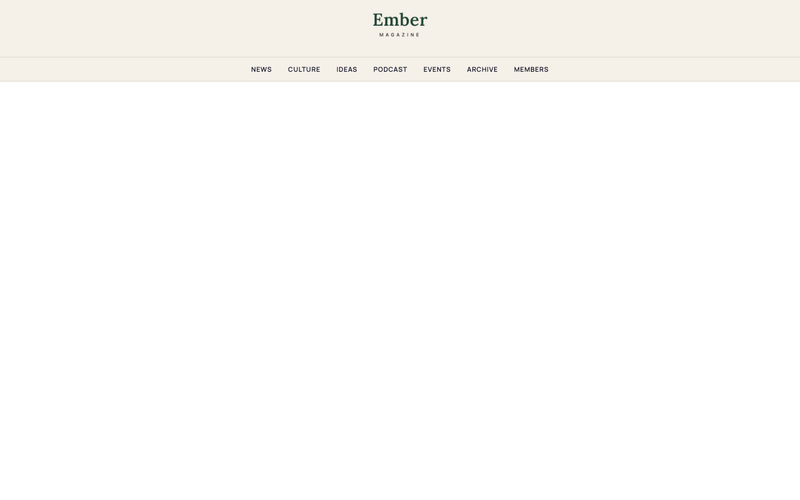
The Styled Editorial Nav Magazine Layout delivers a two-row newspaper-style navigation designed for editorial, blog, and magazine membership sites. The top row features a hamburger menu, a live date indicator with dot accent, a centered logo, a Newsletter text link, a Subscribe CTA, and a search icon. The bottom row provides a horizontal section navigation strip with category links and chevron indicators. The component uses Memberstack visibility attributes to show Subscribe and Log in CTAs only to non-members, making it ready for gated content sites out of the box. Potential Use Cases Membership-based publications and digital magazines. Blog platforms with category-based content sections. Newsletter sites with subscriber-only content areas. Editorial platforms using Memberstack for gated articles and member-only sections. Media sites needing a newspaper-style masthead navigation.

Styled Mega Nav – Product Menu
View Component
NavbarsMarketing UI

Styled Mega Nav – Product Menu

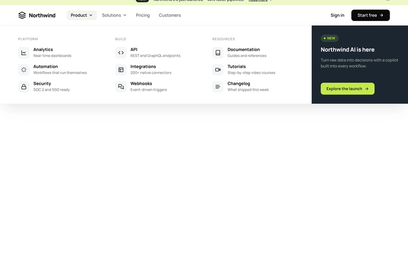
The Styled Mega Nav – Product Menu component provides a production-ready mega navigation bar with a full-width dropdown panel organized into three icon-led link columns. It pairs a dark featured promo panel (with badge and CTA) alongside categorized link groups for Platform, Build, and Resources. The navbar includes an announcement bar with a dismissible banner, a left-heavy layout with dropdown chevrons, and a compact mobile state. This component is a free resource for Webflow developers building SaaS, membership, or product sites. Key Features Three-column icon-led link grid with titles and descriptions per link row. Dark featured promo panel with "NEW" status badge and accent CTA button. Announcement bar with inline link, badge pill, and close icon. Left-heavy navbar layout with logo and nav links clustered together, CTA isolated right. Dropdown chevron indicators on trigger nav items with active pill state. Mobile-responsive hamburger menu state. Potential Use Cases SaaS platforms with multiple product areas needing organized navigation. Membership sites with documentation, tutorials, and resource sections. Product-led companies requiring a featured launch or announcement in the nav. Marketing sites that need an announcement banner above the navigation.

Subscription Plan Retention modal
View Component
ModalCancel Plan

Subscription Plan Retention modal

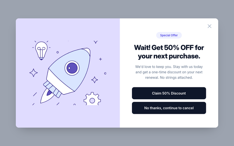
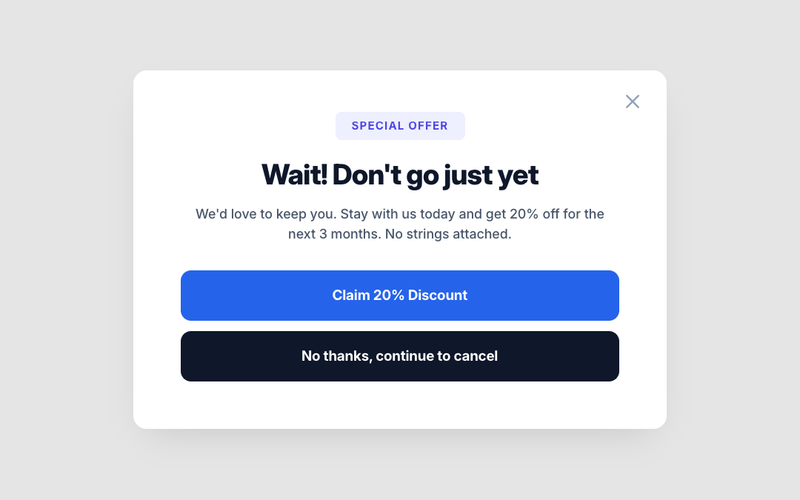
This component requires Memberscript #222. Add the following attributes to your Webflow elements before use: Trigger & Modal: - `data-ms-retain="cancel-trigger"` — on the cancel button (set to `display: none` in Webflow; the script reveals it for eligible members) - `data-ms-retain="modal"` — on the modal wrapper element Modal States (script shows one at a time): - `data-ms-retain="offer"` — the offer/discount pitch container - `data-ms-retain="loading"` — the loading/spinner container - `data-ms-retain="success"` — the confirmation container - `data-ms-retain="error"` — the error message container Buttons: - `data-ms-retain="accept"` — accept/keep plan button - `data-ms-retain="decline"` — decline/cancel anyway button - `data-ms-retain="close"` — close button (supports multiple) - `data-ms-retain="retry"` — retry button inside the error state Config Attributes (on the modal wrapper element): - `ms-retain-webhook` — your Make.com webhook URL - `ms-retain-coupon` — your Stripe coupon ID - `ms-retain-plan` — *(optional)* target a specific Memberstack plan ID - `ms-retain-field` — *(optional)* JSON key for tracking, defaults to `retention_offered` - `ms-retain-max-offers` — *(optional)* lifetime max offers, defaults to `1` - `ms-retain-cooldown` — *(optional)* days before re-offering after decline, defaults to `30` - `ms-retain-return-url` — *(optional)* return URL after Stripe portal, defaults to current page - `ms-retain-display` — *(optional)* CSS display value for the modal, defaults to `flex` Key Features - Intercepts cancel clicks and shows a retention offer before the Stripe Customer Portal - Only activates for members with an active subscription (type `SUBSCRIPTION`) - Hides the cancel button entirely for members without the target plan - Reveals the cancel button for members who do have the plan - Targets a specific plan via `ms-retain-plan` or defaults to the first active subscription - Fires a Make.com webhook to apply a Stripe coupon to the existing subscription - Tracks offer history in Memberstack member JSON to prevent repeat offers - Once accepted, the offer never shows again, cancel clicks go straight to Stripe portal - Configurable max offers and cooldown period between declined offers - Four modal states managed by the script: offer, loading, success, error - Closes on backdrop click, Escape key, or close button - Falls back to Stripe Customer Portal on decline or when ineligible Potential Use Cases - SaaS sites offering a discount to members about to cancel their monthly plan - Membership communities with a "stay and save" offer before churn - Course platforms retaining annual subscribers with a temporary price reduction - Any Stripe-powered subscription site that wants to reduce voluntary cancellations

Subscription Plan Retention modal
View Component
ModalCancel Plan

Subscription Plan Retention modal

This component requires Memberscript #222. Add the following attributes to your Webflow elements before use: Trigger & Modal: - `data-ms-retain="cancel-trigger"` — on the cancel button (set to `display: none` in Webflow; the script reveals it for eligible members) - `data-ms-retain="modal"` — on the modal wrapper element Modal States (script shows one at a time): - `data-ms-retain="offer"` — the offer/discount pitch container - `data-ms-retain="loading"` — the loading/spinner container - `data-ms-retain="success"` — the confirmation container - `data-ms-retain="error"` — the error message container Buttons: - `data-ms-retain="accept"` — accept/keep plan button - `data-ms-retain="decline"` — decline/cancel anyway button - `data-ms-retain="close"` — close button (supports multiple) - `data-ms-retain="retry"` — retry button inside the error state Config Attributes (on the modal wrapper element): - `ms-retain-webhook` — your Make.com webhook URL - `ms-retain-coupon` — your Stripe coupon ID - `ms-retain-plan` — *(optional)* target a specific Memberstack plan ID - `ms-retain-field` — *(optional)* JSON key for tracking, defaults to `retention_offered` - `ms-retain-max-offers` — *(optional)* lifetime max offers, defaults to `1` - `ms-retain-cooldown` — *(optional)* days before re-offering after decline, defaults to `30` - `ms-retain-return-url` — *(optional)* return URL after Stripe portal, defaults to current page - `ms-retain-display` — *(optional)* CSS display value for the modal, defaults to `flex` Key Features - Intercepts cancel clicks and shows a retention offer before the Stripe Customer Portal - Only activates for members with an active subscription (type `SUBSCRIPTION`) - Hides the cancel button entirely for members without the target plan - Reveals the cancel button for members who do have the plan - Targets a specific plan via `ms-retain-plan` or defaults to the first active subscription - Fires a Make.com webhook to apply a Stripe coupon to the existing subscription - Tracks offer history in Memberstack member JSON to prevent repeat offers - Once accepted, the offer never shows again, cancel clicks go straight to Stripe portal - Configurable max offers and cooldown period between declined offers - Four modal states managed by the script: offer, loading, success, error - Closes on backdrop click, Escape key, or close button - Falls back to Stripe Customer Portal on decline or when ineligible Potential Use Cases - SaaS sites offering a discount to members about to cancel their monthly plan - Membership communities with a "stay and save" offer before churn - Course platforms retaining annual subscribers with a temporary price reduction - Any Stripe-powered subscription site that wants to reduce voluntary cancellations

Confirm Password
View Component
TutorialSignup

Confirm Password

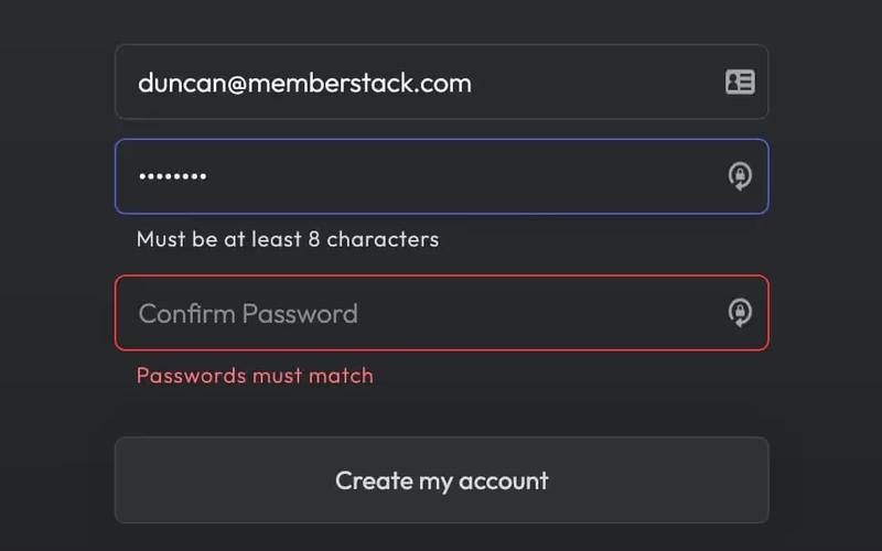
The Confirm Password component is designed to facilitate user account creation by ensuring that users enter their password correctly. It includes fields for email, password, and password confirmation, along with validation messages. Key Features Email and password input fields Real-time password validation Success and error messages upon form submission Responsive design suitable for various devices Customizable styles and classes Design Elements: Modern and clean layout Use of flexbox for alignment Color scheme featuring dark backgrounds with light text Rounded input fields and buttons Icon integration for visual appeal Potential Use Cases: User registration forms for websites and applicationsE-commerce platforms requiring account creation Membership sites needing secure user authentication Educational platforms for student sign-ups Any service that requires user account management Conclusion: The Confirm Password component is a versatile and user-friendly solution for any website or application that requires user registration, ensuring a smooth and secure onboarding process.

Unstyled Forgot Password - 1
View Component
Forgot PasswordUnstyled

Unstyled Forgot Password - 1

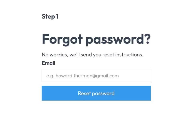
This component provides a simple and functional forgot password form, allowing users to request password reset instructions via email. Key Features User-friendly email input field Submit button with a loading message Success and error messages for form submission feedback Redirects to a password reset page upon submission Design Elements Minimalist design with no predefined styles Clean layout suitable for integration into various web designs Responsive structure adaptable to different screen sizes Potential Use Cases E-commerce websites needing user account recovery options Membership sites requiring secure password management Blogs or content platforms with user accounts SaaS applications that require user authentication Conclusion: The Unstyled Forgot Password component is a versatile and essential tool for any web application that requires user password recovery, easily customizable to fit various design aesthetics.

Unstyled Forgot Password - 2
View Component
Forgot PasswordUnstyled

Unstyled Forgot Password - 2

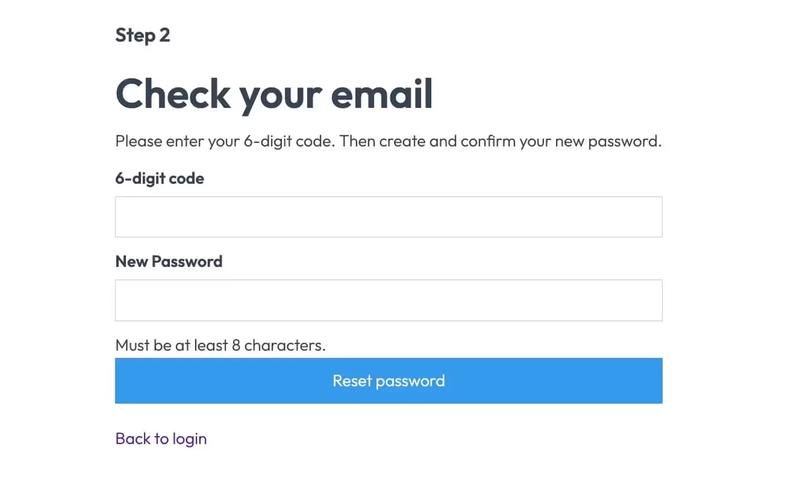
This component serves as a password reset form, allowing users to enter a 6-digit code and create a new password. It is designed to be functional without any predefined styles. Key Features Form for entering a 6-digit code and new password Success and error messages for user feedback Redirects to a success page upon completion No styling included, allowing for full customization Design Elements Minimalist layout with basic input fieldsClear headings and instructional textResponsive design suitable for various devices Potential Use Cases Web applications requiring user authenticationE-commerce sites needing secure password recovery Membership platforms with user accounts SaaS products that require user login management Conclusion: The Unstyled Forgot Password - 2 component is a versatile and functional solution for password recovery, ideal for developers looking to implement a customizable form without predefined styles.

Unstyled Forgot Password - 3
View Component
Forgot PasswordUnstyled

Unstyled Forgot Password - 3

This component provides a simple, unstyled interface for informing users that their password has been reset. Key Features Includes a link back to the login pageDesign Elements: Minimalistic design with no predefined styles Uses standard HTML elements such as forms, headings, and labels Responsive layout suitable for various devices Potential Use Cases: Web applications requiring user authenticationE-commerce platforms needing secure password recovery Membership sites with user accounts Any service that requires user login and password management Conclusion: The Unstyled Forgot Password - 3 component is a versatile and functional solution for password recovery, ideal for developers looking for a straightforward implementation without design constraints.

Instant Access Gate
View Component
Login

Instant Access Gate

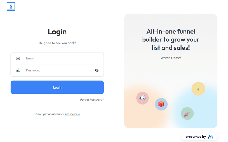
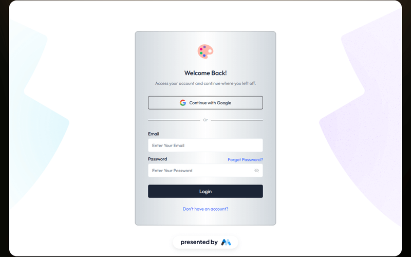
The Instant Access Gate component is designed for user authentication, featuring a login form that includes fields for email and password, as well as options for password recovery and account creation. This component is a free resource for Webflow developers to use in their projects. Key Features Login form with email and password fields.Success and error messages for form submissions.Tabs for showing and hiding password input.Responsive design with mobile-friendly elements.Includes links for password recovery and account creation. Design Elements Utilizes a clean layout with a focus on form usability.Incorporates SVG icons for visual enhancement.Employs a color scheme that emphasizes accessibility and readability.Responsive design elements that adapt to various screen sizes. Potential Use Cases Web applications requiring user authentication.Membership sites that need secure login functionality.E-commerce platforms with user accounts.Online services offering personalized user experiences.Educational platforms requiring student or teacher logins. Conclusion: The Instant Access Gate component provides essential functionalities for user authentication, making it suitable for a variety of web applications that require secure access.

Footer Link Hub
View Component
Marketing UI

Footer Link Hub

The Footer Link Hub is a Webflow component designed to provide a structured and visually appealing footer section for websites. It allows users to organize and display various links, enhancing navigation and accessibility. This component is particularly useful for showcasing important links related to platforms, apps, and services. Key Features Grid layout for organizing links in a two-by-two format, enhancing visual structure.Customizable link elements with icons for better user engagement.Responsive design that adapts to different screen sizes, ensuring usability across devices.CSS styles for improved text legibility and focus states for accessibility. Design Elements Utilizes a grid layout similar to e-commerce sites for displaying multiple links.Incorporates iconography next to text links, enhancing visual interest.Features a clean and minimalistic style, focusing on functionality and ease of navigation. Potential Use Cases Tech companies showcasing their product offerings and resources.E-commerce websites needing a footer for quick access to customer service links.Blogs or content sites that require a structured way to present categories and important links.SaaS platforms displaying various tools and integrations available to users. Conclusion: The Footer Link Hub is a practical component that enhances website navigation and organization, making it suitable for a variety of industries and website types.

Layered Plan Box
View Component
Pricing

Layered Plan Box

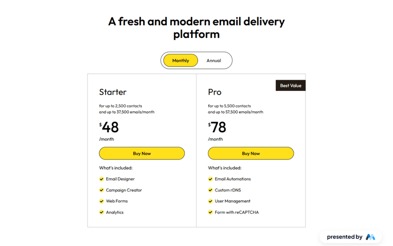
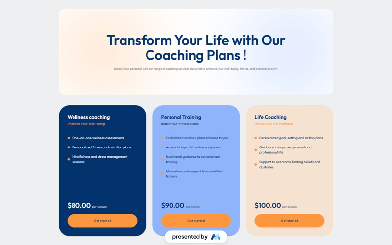
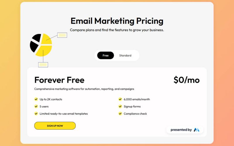
The Layered Plan Box is a Webflow component designed to showcase different pricing plans in a visually appealing format. It features tabs for monthly and annual pricing options, making it easy for users to compare features and select a plan that suits their needs. Key Features Tab navigation for monthly and annual plans, allowing users to switch between pricing options seamlessly.Dynamic content display that includes plan features and pricing details, such as 'for up to 2,500 contacts' and 'up to 37,500 emails/month'.Call-to-action button labeled 'Buy Now' for easy conversion.Includes visual elements like images and icons to enhance the presentation of each plan. Design Elements Utilizes a clean layout with clear headings and subheadings to organize information effectively.Incorporates a color scheme that emphasizes the call-to-action buttons, drawing user attention.Features responsive design elements that adjust based on screen size, ensuring accessibility on various devices. Potential Use Cases Email marketing services looking to present multiple subscription plans.SaaS companies that need to display tiered pricing options for their software.E-commerce platforms offering subscription-based services or products.Consulting firms that provide different service packages at varying price points. Conclusion: The Layered Plan Box is a practical component for businesses aiming to present pricing options clearly and attractively, facilitating user decision-making.

Reset Forgotten Password
View Component
Forgot Password

Reset Forgotten Password

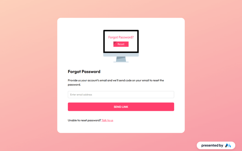
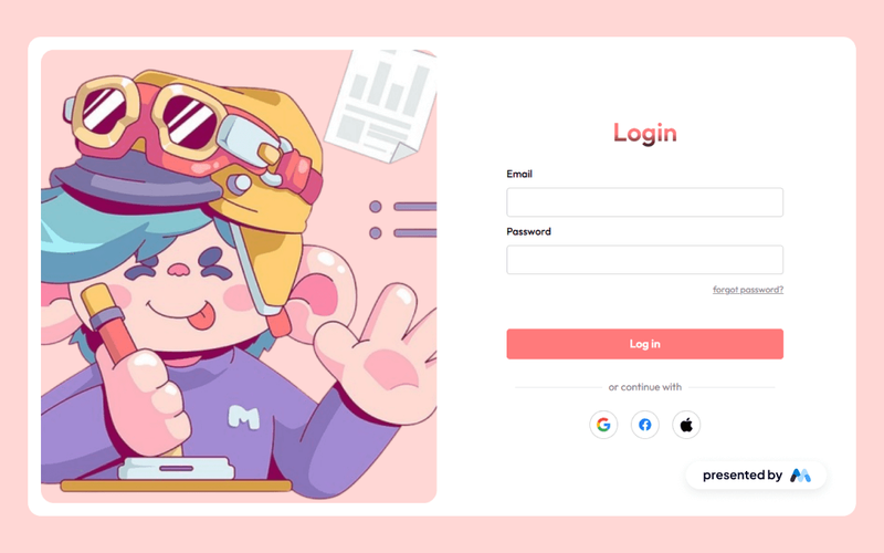
The 'Reset Forgotten Password' component is designed to facilitate users in recovering their accounts by allowing them to request a password reset link via email. It includes a user-friendly form for email input and provides feedback upon submission, such as success or error messages. Key Features Email input field for users to enter their registered email address.Submit button labeled 'SEND LINK' to initiate the password reset process.Success message displayed upon successful submission: 'Thank you! Your submission has been received!'Error message displayed if there is an issue with the submission: 'Oops! Something went wrong while submitting the form.'Responsive design that adapts to various screen sizes. Design Elements Centered layout with a clean and simple design, ensuring focus on the form.Use of flexbox for layout management, allowing for easy alignment of elements.Color scheme featuring a prominent pinkish button for the submit action, enhancing visibility.Incorporation of a header image related to password recovery, adding a visual context. Potential Use Cases Web applications requiring user authentication and password recovery features.E-commerce platforms where users may forget their passwords.Online services offering account management for users.Membership sites that need secure access for users.Educational platforms that require user login for course access. Conclusion: This component effectively addresses the common need for password recovery, providing a straightforward and functional solution for users across various online platforms.

Brilliant Upgrade UI
View Component
Upgrade

Brilliant Upgrade UI

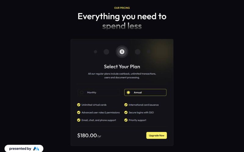
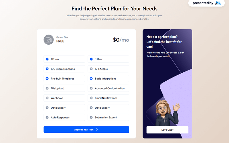
The Brilliant Upgrade UI component is designed to facilitate user interface upgrades for web applications, particularly focusing on pricing plans and features. It includes elements such as tabs for monthly and annual pricing options, a pricing table, and various user-friendly design features. Key Features Tabs for switching between monthly and annual pricing options.Dynamic content display for different pricing plans.Customizable CSS for text rendering and focus states.Responsive design elements that adapt to various screen sizes.Image placeholders for visual representation of features. Design Elements Utilizes a clean layout with a focus on typography and spacing.Incorporates a color scheme that enhances readability and user engagement.Features a tabbed interface similar to pricing tables found on SaaS websites.Includes icons and images to visually represent features and benefits. Potential Use Cases SaaS companies looking to present subscription plans.E-commerce platforms needing to showcase pricing options.Financial services websites offering various account types.Educational platforms with tiered membership levels.Any business requiring a clear and engaging pricing structure. Conclusion: The Brilliant Upgrade UI component is a practical solution for businesses needing to present pricing options clearly and effectively, making it suitable for a wide range of applications.

Lumalearn UI Kit Author
View Component
Landing Page

Lumalearn UI Kit Author

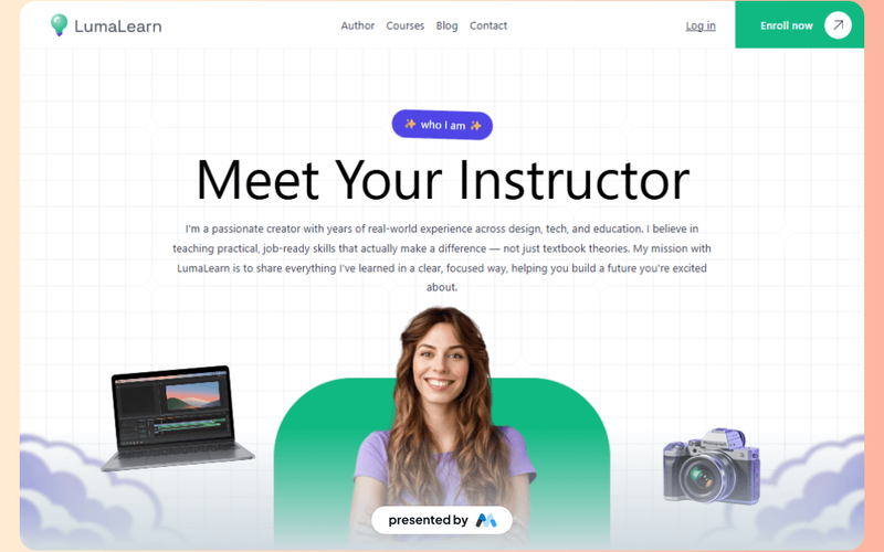
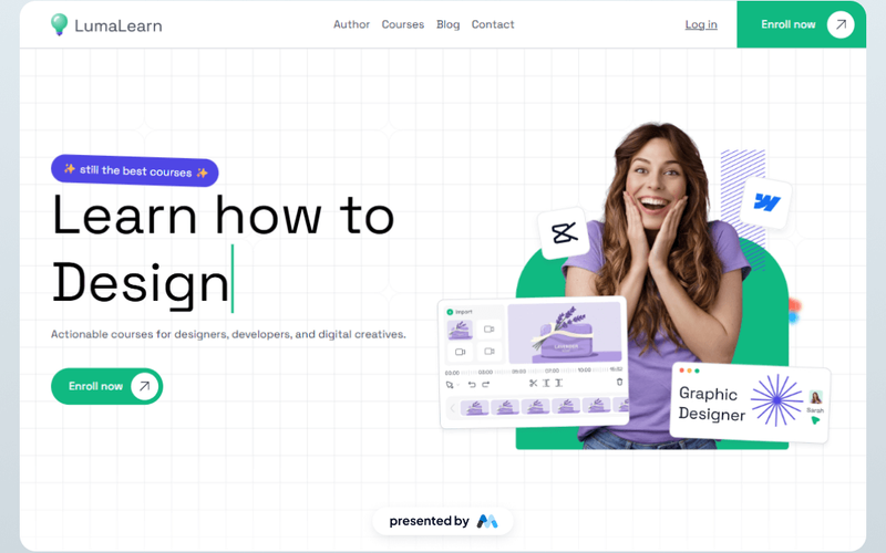
The Lumalearn UI Kit Author is a comprehensive resource designed for Webflow developers, providing a structured layout and various components to create educational websites. It includes elements such as navigation bars, buttons, and image sections, making it suitable for online learning platforms. Key Features Responsive Navbar with links to various sections like Courses, Blog, and Contact.Image components for showcasing instructors and course content.Call-to-action buttons for user engagement, such as 'Enroll now' and 'Log in'.Structured layout with sections for instructor introduction and course details. Design Elements Clean and organized layout that emphasizes educational content.Use of vibrant images and icons to enhance visual appeal.Consistent color scheme that aligns with educational branding.Typography that is clear and easy to read, suitable for an academic audience. Potential Use Cases Online learning platforms offering courses in various subjects.Educational institutions looking to create a modern website for their programs.Freelancers or agencies developing websites for educators and trainers.Non-profit organizations focused on educational outreach and resources. Conclusion: The Lumalearn UI Kit Author provides a solid foundation for creating educational websites, combining essential components with a user-friendly design that caters to both developers and educators.

Lumalearn UI Kit Course Page
View Component
Landing Page

Lumalearn UI Kit Course Page

The Lumalearn UI Kit Course Page is designed to provide a structured layout for educational content, featuring sections for course details, navigation, and multimedia elements. It serves as a template for creating course pages in Webflow, making it easy for developers to implement educational offerings. Key Features Responsive navigation bar with links to various sections such as Author, Courses, Blog, and Contact.Embedded video section showcasing course content with a You Tube link.Call-to-action buttons for enrollment and login, enhancing user engagement.Course rating display with visual indicators for popularity and feedback. Design Elements Clean layout with a focus on usability and accessibility.Use of images and icons to enhance visual communication, such as course thumbnails and navigation icons.Sections divided into blocks for easy customization and content management.Color scheme and typography that align with educational branding. Potential Use Cases Online learning platforms offering various courses.Educational institutions looking to promote their course offerings.Freelancers creating portfolio sites for educational content.Corporate training programs needing a structured course presentation. Conclusion: The Lumalearn UI Kit Course Page is a practical solution for anyone looking to create an educational website, providing essential features and a user-friendly design that can be easily customized.

Lumalearn UI Kit Home Page
View Component
Landing Page

Lumalearn UI Kit Home Page

The Lumalearn UI Kit Home Page is designed to serve as a foundational layout for educational platforms, featuring a clean and organized structure that showcases courses, navigation, and user engagement elements. It includes sections for course descriptions, navigation links, and call-to-action buttons, making it suitable for online learning environments. Key Features Responsive Navbar with links to Courses, Blog, and Contact sections.Call-to-action buttons for 'Log in' and 'Enroll now'.Image placeholders for branding and course visuals.Structured layout with sections for headings, text, and images. Design Elements A clean layout with a focus on usability and accessibility.Use of images and icons to enhance visual communication.Color scheme that supports readability and user engagement.Grid-based structure for organized content presentation. Potential Use Cases Online learning platforms offering courses and tutorials.Educational institutions looking to create a digital presence.Freelancers or agencies developing websites for educational clients.Non-profits focused on educational outreach and resources. Conclusion: The Lumalearn UI Kit Home Page provides a solid framework for building educational websites, making it a practical choice for developers and designers in the e-learning sector.

Success & Failure Board
View Component
Error / Success

Success & Failure Board

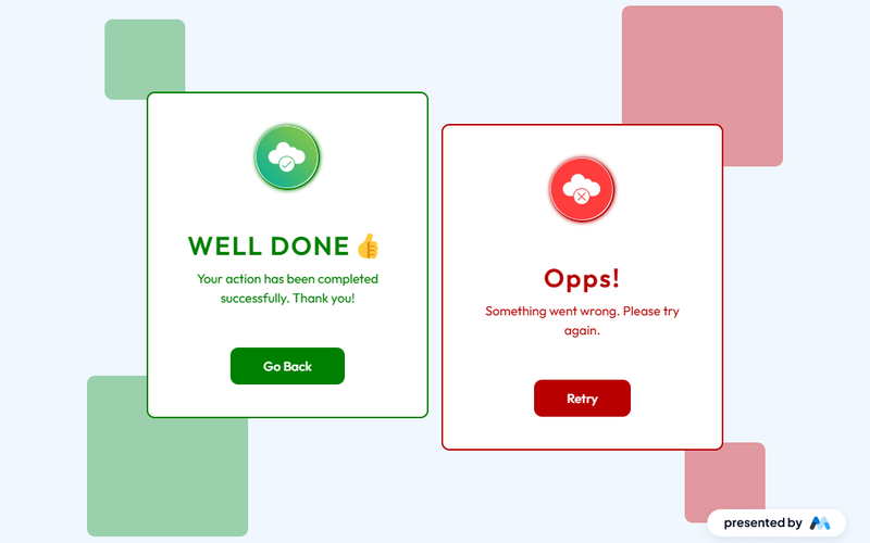
The Success & Failure Board is a Webflow component designed to visually represent outcomes of actions, showcasing success messages and failure notifications. It features a clean layout with distinct sections for positive and negative feedback, making it suitable for applications that require user interaction feedback. Key Features Two distinct sections for success and failure messages, each with its own styling.Responsive design that adjusts to various screen sizes, ensuring accessibility on mobile devices.Customizable text and images for each message, allowing users to personalize the component.Includes buttons for user actions, such as 'Go Back' and 'Retry', enhancing user engagement. Design Elements Utilizes a grid layout for organizing content, providing a structured appearance.Color-coded sections: green for success messages and red for failure notifications, aiding in quick visual recognition.Incorporates icons alongside text to enhance message clarity and visual interest.Employs a minimalistic design with ample white space, focusing user attention on the messages. Potential Use Cases E-commerce websites to inform users about order statuses.Web applications that require user input, providing feedback on form submissions.Customer support portals to communicate ticket resolutions or errors.Educational platforms to notify students of assignment submissions and results. Conclusion: The Success & Failure Board component is a practical solution for any web application needing to communicate user feedback effectively, with a clear design that enhances user experience.

Unique Email Verification
View Component
Email Verification

Unique Email Verification

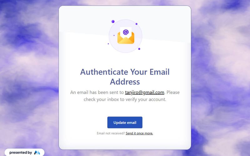
The Unique Email Verification component is designed to facilitate email verification processes for users. It features a clear message indicating that an email has been sent to the user, along with a link to update their email if needed. The component also includes a prompt for users to resend the verification email if they haven't received it. Key Features Displays a confirmation message after an email is sent for verification, e.g., 'An email has been sent to tanjiro@gmail.com.'Includes a link for users to update their email address.Provides an option to resend the verification email if not received. Design Elements Utilizes a clean layout with a centered design for better readability.Incorporates a Lottie animation for visual engagement.Features a color scheme with a light background and contrasting text for clarity. Potential Use Cases Web applications requiring user registration and email verification.E-commerce platforms needing to verify customer emails for account creation.SaaS products that require email confirmation for user onboarding. Conclusion: The Unique Email Verification component is a practical solution for managing email verification processes, enhancing user experience through clear communication and interactive elements.

Light Coding Site
View Component
Marketing UI

Light Coding Site

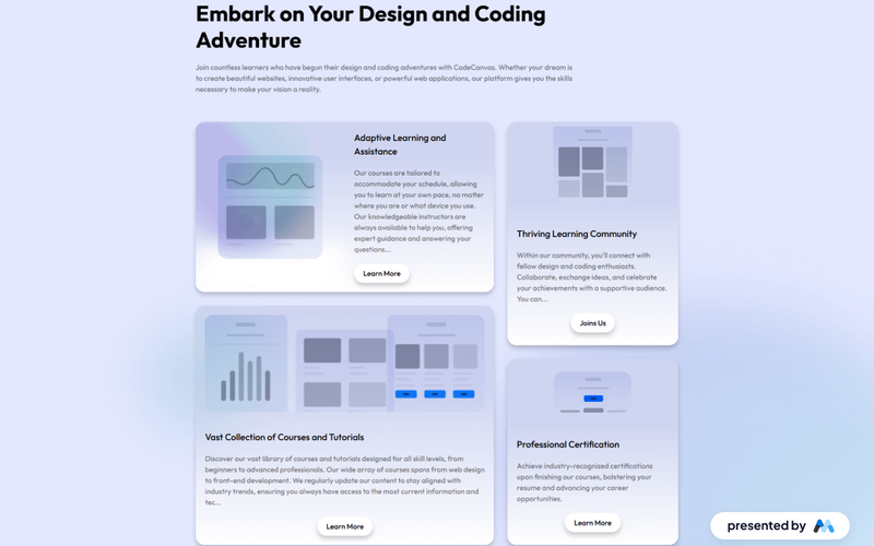
The Light Coding Site is a Webflow component designed to facilitate learning in design and coding. It features a clean layout that showcases various courses and tutorials aimed at different skill levels, making it an ideal resource for aspiring web developers and designers. Key Features Responsive design with a grid layout for displaying courses and tutorials.Custom CSS for improved text legibility and focus state styles.Adaptive learning features that allow users to learn at their own pace.Integration of images and links to enhance course descriptions and calls to action. Design Elements Grid layout for course display, allowing for a structured presentation of content.Use of modern typography and spacing to enhance readability.Color scheme that emphasizes clarity and focus, with a consistent use of margins and paddings. Potential Use Cases Educational platforms offering online courses in web design and development.Coding bootcamps looking to provide a structured learning environment.Freelancers or agencies wanting to showcase their portfolio of courses and tutorials. Conclusion: The Light Coding Site component is a practical solution for educational websites, providing a user-friendly interface that supports various learning styles and promotes engagement.

Restricted Entry UI
View Component
Gated Content

Restricted Entry UI

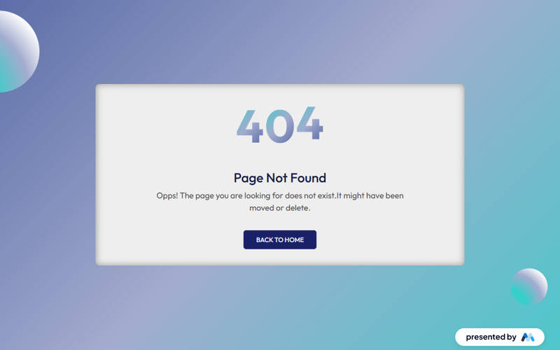
The Restricted Entry UI component is designed to provide a user-friendly interface for displaying restricted access messages, such as 'Page Not Found'. It features a visually engaging layout with customizable text and styles, making it suitable for various web applications. This component is a free resource for Webflow developers to use in their projects. Key Features Customizable error messages with options for different text sizes and styles.Responsive design that adapts to various screen sizes.Interactive elements such as a 'Back to home' link for user navigation.CSS animations for visual effects when scrolling into view. Design Elements Gradient backgrounds that enhance visual appeal, such as a linear gradient from #36cfc9 to white.Large, bold typography for error messages, utilizing classes like 'text-size-large'.Flexbox layout for centering content and ensuring proper alignment of elements. Potential Use Cases Websites that require a custom 404 error page.Applications needing a restricted access notification for users.E-commerce sites that want to inform users about unavailable products or pages.Blogs or content sites that may have moved or deleted articles. Conclusion: The Restricted Entry UI component is a practical solution for managing user navigation errors, offering both aesthetic and functional benefits for web developers.

Gated Content Section
View Component
Gated Content

Gated Content Section

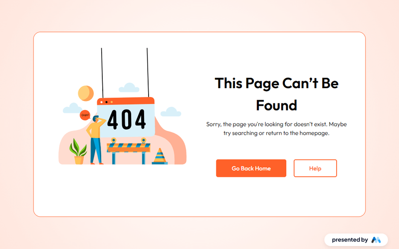
The Gated Content Section is designed to restrict access to specific content until users provide certain information, such as an email address. This component is particularly useful for lead generation and can be integrated into various types of websites. For example, it can be used to offer exclusive articles, eBooks, or webinars in exchange for user information. Key Features Includes a visually appealing layout with a grid system for content organization.Features a Lottie animation to enhance user engagement.Responsive design that adapts to different screen sizes.Customizable text and button styles for branding purposes.Supports external links for navigation, such as 'Go Back Home' and 'Help' buttons. Design Elements Utilizes a radial gradient background for a modern aesthetic.Incorporates rounded corners and shadow effects for a soft appearance.Employs a flexbox layout for easy alignment and spacing of elements.Text styles include large headings and regular-sized body text for readability. Potential Use Cases Marketing websites looking to capture leads through gated content.Educational platforms offering exclusive resources to registered users.E-commerce sites providing special offers or discounts in exchange for user information.Blogs or news sites wanting to restrict access to premium articles. Conclusion: The Gated Content Section is a practical component for any website aiming to enhance user engagement and capture leads effectively.

Marketing Plan Display
View Component
Pricing

Marketing Plan Display

The Marketing Plan Display component is designed to showcase various marketing plans and pricing options effectively. It includes tabs for easy navigation between different plans, allowing users to compare features and pricing at a glance. Key Features Tab navigation for multiple pricing plans, allowing users to switch between different options easily.Customizable pricing tables that can display various features and benefits of each plan.Responsive design elements that adapt to different screen sizes, ensuring usability across devices.Embedded styles for improved text legibility and focus states for accessibility. Design Elements Use of tabbed interface for plan comparison, similar to e-commerce sites like Shopify.Incorporation of visual elements such as images and icons to enhance understanding of features.Clear typography with headings and paragraphs that guide users through the content. Potential Use Cases SaaS companies looking to display subscription plans and features.Marketing agencies that need to present service packages to clients.E-commerce platforms that want to compare different service tiers.Educational institutions offering various course pricing options. Conclusion: The Marketing Plan Display component provides a structured and visually engaging way to present pricing options, making it suitable for various industries focused on subscription-based services.

SignIn Glow Card
View Component
Login

SignIn Glow Card

The SignIn Glow Card is a user-friendly login component designed for Webflow projects. It features a visually appealing layout that includes input fields for email and password, social media login options, and a clear call-to-action button for logging in. This component is ideal for developers looking to implement a stylish and functional login interface. Key Features Includes input fields for email and password with labels for clarity.Social media login options for Google, Facebook, and Git Hub.Responsive design that adapts to various screen sizes.Success and error messages to provide feedback to users.Customizable styles for branding consistency. Design Elements Glow effect on the card to enhance visual appeal.Use of a grid layout for organized placement of elements.Color scheme that emphasizes user interaction with contrasting colors.Typography that ensures readability and hierarchy in the text. Potential Use Cases E-commerce websites requiring user authentication.SaaS platforms needing a login interface for users.Mobile applications that require a web-based login solution.Membership sites that manage user accounts and access. Conclusion: The SignIn Glow Card is a practical and visually engaging component that can enhance the user experience on various web applications, making it a valuable addition for Webflow developers.

Simple Login Interface
View Component
Login

Simple Login Interface

The Simple Login Interface is designed to facilitate user authentication through a clean and straightforward layout. It includes fields for email and password entry, as well as options for social media login and password recovery. This component serves as a practical resource for developers looking to implement login functionality in their Webflow projects. Key Features Email and password input fields for user authentication.Social media login options, including Google integration.Password recovery link for user convenience.Responsive design that adapts to various screen sizes.Success and error messages to inform users of their submission status. Design Elements Minimalistic layout focusing on user input fields.Use of contrasting colors for buttons and links to enhance visibility.Incorporation of icons for social media login options.Clear typography for labels and messages to improve readability. Potential Use Cases Web applications requiring user authentication, such as e-commerce sites.Membership-based platforms that need secure login features.Blogs or content management systems that allow user accounts.Mobile applications that require a web-based login interface. Conclusion: The Simple Login Interface is a functional and user-friendly component that can be easily integrated into various web projects, making it a valuable asset for developers.

Simple Upgrade Interface
View Component
Upgrade

Simple Upgrade Interface

The Simple Upgrade Interface is designed to facilitate the presentation of various subscription plans, allowing users to easily compare options and make informed decisions. It includes features such as plan descriptions, pricing, and benefits, making it suitable for businesses offering tiered services. Key Features Multiple subscription plans displayed in a grid layout for easy comparison.Customizable text sections for plan descriptions and features.Responsive design that adapts to different screen sizes.Focus state styles for accessibility, enhancing keyboard navigation.Image support for visual representation of plans. Design Elements Grid layout for displaying plans, similar to e-commerce product comparisons.Use of clear typography and color coding to differentiate between plans.Incorporation of images to visually enhance the presentation of each plan.Consistent spacing and alignment to maintain a clean layout. Potential Use Cases SaaS companies looking to showcase their subscription tiers.Online service providers wanting to present different service levels.Educational platforms offering various course access plans.Membership sites that need to outline different membership benefits.E-commerce sites that provide subscription-based products. Conclusion: The Simple Upgrade Interface is a practical component for businesses that need to present subscription options clearly and effectively, enhancing user experience and decision-making.

Speedy Trial
View Component
CTA

Speedy Trial

Speedy Trial is a Webflow component designed to facilitate the presentation of a trial subscription service. It provides a structured layout for showcasing the trial process, including key milestones and a call-to-action for users to sign up. The component is particularly useful for businesses offering subscription-based services, allowing them to clearly communicate trial details and encourage conversions. Key Features Structured layout for trial information, including days and milestones.Call-to-action buttons for signing up and trying the service.Responsive design elements that adapt to various screen sizes.Embedded styles for improved text legibility and focus states. Design Elements Use of a clean and organized layout to present trial information.Incorporation of images to enhance visual appeal, such as icons and illustrations.Color scheme featuring blue tones for buttons and highlights, promoting a sense of trust and action.Flexbox and grid layouts for responsive design, ensuring content is well-aligned and accessible. Potential Use Cases SaaS companies offering trial periods for their software.Online educational platforms providing free trial access to courses.Subscription box services looking to attract new customers with trial offers.Fitness or wellness apps offering trial memberships. Conclusion: Speedy Trial is an effective component for businesses looking to promote trial subscriptions, providing a clear and engaging way to present trial details and encourage user sign-ups.

Success Path Plans
View Component
Pricing

Success Path Plans

The Success Path Plans component is designed to showcase various coaching plans aimed at personal development and wellness. It features a structured layout that highlights different coaching services, including wellness coaching, personal training, and mindfulness sessions, making it suitable for businesses in the health and fitness industry. Key Features Multiple coaching plans displayed in a grid format, allowing users to easily compare options.Clear headings and descriptions for each service, enhancing readability.Call-to-action buttons for user engagement, such as 'Get started' for each plan.Responsive design elements that adapt to different screen sizes. Design Elements Grid layout for organizing coaching plans, similar to e-commerce product listings.Use of headings (h1, h2, h3) to create a clear hierarchy of information.Color scheme that emphasizes wellness and vitality, with a focus on legibility and user experience. Potential Use Cases Health and wellness coaching websites looking to promote various services.Fitness centers aiming to provide detailed information about personal training options.Online platforms offering mindfulness and stress management programs.Corporate wellness programs that need to present coaching plans to employees. Conclusion: The Success Path Plans component effectively presents coaching services in a user-friendly format, making it a valuable resource for businesses in the wellness and fitness sectors.

Identity Login Panel
View Component
Login

Identity Login Panel

The Identity Login Panel is a customizable login interface designed for web applications. It includes features for user authentication, such as email and password fields, social media login options, and error/success messages. This component is a free resource for Webflow developers to use in their projects. Key Features User authentication form with email and password fields.Social media login options for Facebook and Google.Error and success messages displayed upon form submission.Responsive design that adapts to various screen sizes.Customizable styles for branding purposes. Design Elements Clean layout with a focus on usability.Use of icons for social media login buttons.Consistent typography and spacing for a cohesive look.Color scheme that can be easily adjusted to match branding. Potential Use Cases Web applications requiring user login functionality.E-commerce sites needing secure customer authentication.Membership platforms that require user registration and login.Corporate websites with restricted access areas.Mobile applications that require user sign-in. Conclusion: The Identity Login Panel is a practical solution for developers looking to implement user authentication features in their Webflow projects, offering flexibility and ease of customization.

Logout Confirmation Card
View Component
Logged Out

Logout Confirmation Card

The Logout Confirmation Card is designed to provide users with a clear message upon logging out of a website. It features a friendly notification that confirms the user's logout status and encourages them to log back in. This component is a free resource for Webflow developers to use in their projects. Key Features Displays a confirmation message: 'Logout Successful' and a friendly note: 'You have been successfully logged out. Thank you for visiting!'Includes a prominent 'Log In Again' button for easy navigation back to the login page.Utilizes responsive design principles to ensure usability across various devices. Design Elements The card features a gradient background with soft colors, enhancing visual appeal.Includes icons for logout and login actions, providing intuitive visual cues.Utilizes a centered layout with ample padding and margins for a clean presentation. Potential Use Cases E-commerce websites where users frequently log in and out.Social media platforms that require user authentication.Online forums or community sites where user sessions are common. Conclusion: The Logout Confirmation Card is a practical component that enhances user experience by providing clear feedback during the logout process, making it suitable for various web applications.

 Logged Out
View Component
AllLogged Out

Logged Out

The 'Logged Out' component offers a stylish card design that enhances the logout experience with a classic black and white theme. Key Features Sleek card design for logout confirmation Timeless black and white color scheme Responsive layout suitable for various devices Includes engaging text to encourage users to log back in Customizable styles and animations Design Elements Minimalist aesthetic with a focus on typography Rounded corners for a modern look Use of high-quality images to enhance visual appeal Flexible layout with grid and flexbox properties Potential Use Cases Web applications requiring user authenticationE-commerce sites wanting to improve user experience during logout Blogs or content platforms encouraging user engagement Membership sites needing a professional logout interface Corporate websites aiming for a polished user experience Conclusion: The 'Logged Out' component is a versatile and visually appealing solution for enhancing user experience during the logout process, making it suitable for a wide range of web applications.

2 Tier Neutral Pricing Table
View Component
Pricing

2 Tier Neutral Pricing Table

The 2 Tier Neutral Pricing Table is designed to present pricing options clearly and effectively, making it easy for users to compare different plans. It features a clean layout with distinct sections for each pricing tier. Key Features Two pricing tiers Clear pricing display with monthly rates Visual indicators for features included in each plan Responsive design for mobile and desktop views Includes links for further actions like signup Design Elements: Neutral color palette with a focus on readability Rounded corners for a modern look Icons used to represent features visually Flexbox layout for responsive design Potential Use Cases: SaaS companies looking to showcase subscription plansE-commerce platforms needing to display service tiers Consulting firms offering different service packages Educational platforms with tiered membership options Any business needing a clear pricing structure Conclusion: The 2 Tier Neutral Pricing Table is a versatile and visually appealing component that can enhance any website's pricing strategy, making it easier for customers to make informed decisions.

2 Tier Slack Style Pricing Table
View Component
Pricing

2 Tier Slack Style Pricing Table

This pricing table is inspired by Slack's design, providing a clean and modern layout for showcasing pricing options. Key Features Two-tier pricing structure (monthly and yearly options)Interactive tabs for easy navigation between different pricing plans Clear visual indicators for features included in each plan Responsive design suitable for various devices Design Elements: Minimalistic and modern aesthetic Soft color palette with shades of gray, green and purple Rounded corners and subtle shadows for a card-like appearance Centered headings and clear typography for readability Potential Use Cases: SaaS companies looking to present subscription plans Startups wanting to highlight pricing options for their servicesE-commerce platforms that offer tiered membership or subscription services Consulting firms needing to showcase service packages Educational platforms offering different pricing for courses or memberships Conclusion: The 2 Tier Slack Style Pricing Table is a versatile component that effectively communicates pricing options while maintaining a user-friendly interface, making it an excellent choice for various businesses.

2 Tier Upgrade Modal
View Component
Pre-built ModalsUpgrade

2 Tier Upgrade Modal

The 2 Tier Upgrade Modal is designed to prompt users to upgrade their subscription plans with a visually appealing interface. It features a two-tab layout for monthly and annual pricing options. Key Features Two pricing tiers: Monthly and Annual Interactive tabs for easy navigation Customizable modal design Includes icons for visual appeal Responsive design suitable for various devices User-friendly upgrade prompts Design Elements: Modern and clean layout Soft color palette with a transparent background Rounded corners and subtle shadows for depth Clear typography for readabilityicons integrated for enhanced visual communication Potential Use Cases: SaaS companies looking to encourage subscription upgradesE-commerce platforms offering premium memberships Online services with tiered pricing models Mobile applications needing in-app upgrade prompts Websites aiming to enhance user engagement through subscription offers Conclusion: The 2 Tier Upgrade Modal is a versatile and visually appealing component that effectively encourages users to upgrade their plans, making it a valuable addition for any subscription-based service.

2-Tab Auth Forms
View Component
SignupLogin

2-Tab Auth Forms

The 2-Tab Auth Forms component provides a user-friendly interface for authentication, allowing users to easily switch between 'Sign Up' and 'Log In' forms. It is designed for seamless integration into websites requiring user registration and login functionalities. Key Features Two-tab interface for easy switching between Sign Up and Log In forms Customizable form fields for email and password Google sign-in option for quick access Responsive design suitable for various devices Success and error messages for user feedback Design Elements: Modern and clean layout with a focus on usability Color scheme featuring shades of blue and white Rounded buttons and input fields for a friendly appearance Icons for social sign-in options Potential Use Cases: Web applications requiring user authenticationE-commerce sites needing user accounts for purchases Membership platforms for content access Online services offering personalized user experiences SaaS products that require user login and registration Conclusion: The 2-Tab Auth Forms component is a versatile solution for any website needing authentication features, combining functionality with an appealing design to enhance user experience.

3 Tab Profile Form
View Component
Profile EmailProfile Password+1

3 Tab Profile Form

The 3 Tab Profile Form is a versatile Webflow component designed for user profile management, featuring a tabbed interface for easy navigation between different sections such as general information, email, and password updates. Key Features Tabbed navigation for seamless user experience Form fields for personal information, email, and password Success and error messages for form submissions Image upload functionality for profile pictures Responsive design suitable for various devices Design Elements Modern and clean layout with rounded corners Flexbox for alignment and spacing Color scheme with dark backgrounds and contrasting text Customizable styles for form fields and buttons Potential Use Cases User profile management for social media platforms Account settings for e-commerce websites Profile editing for membership sites Personal information updates for SaaS applications User onboarding processes in web applications Conclusion: The 3 Tab Profile Form is a highly functional and visually appealing component that enhances user interaction, making it ideal for any application requiring user profile management.

3 Tier Pricing Table
View Component
Pricing

3 Tier Pricing Table

This cloneable pricing table features a classic 3-tier layout, highlighting the middle plan as the most prominent option. It comes pre-configured with Memberstack attributes and modals for easy integration. Key Features Three distinct pricing tiers Prominent middle plan for better visibility Pre-applied Memberstack attributes and modals Responsive design suitable for various devices Cloneable for easy implementation Design Elements Modern and clean layoutColorful accents with a purple themeRounded corners and shadow effects for depthFlexbox layout for responsive design Potential Use Cases SaaS companies offering subscription plans Freelancers showcasing service packagesE-commerce websites with tiered pricing options Consulting firms presenting service tiers Educational platforms with course pricing Conclusion: The 3 Tier Pricing Table is a versatile and visually appealing component that can enhance any website's pricing strategy, making it easier for users to compare options and make decisions.

3 Tier Pricing Table With Toggle
View Component
Pricing

3 Tier Pricing Table With Toggle

This component features a visually appealing pricing table with a toggle functionality, allowing users to switch between monthly and yearly pricing options seamlessly. Key Features Three-tier pricing structure Toggle switch for monthly/yearly pricing Custom Java Script for enhanced interactivity Responsive design suitable for various devices Includes a navigation bar for easy site navigation Design Elements: Modern and clean layout Color scheme featuring dark backgrounds with contrasting text Use of images for logos and icons Hover effects for interactive elements Potential Use Cases: SaaS companies looking to display subscription plansE-commerce websites offering tiered pricing for services Freelancers or agencies showcasing service packages Educational platforms with different membership levels Non-profits presenting donation tiers Conclusion: The 3 Tier Pricing Table With Toggle is a versatile and stylish component ideal for businesses aiming to present their pricing options clearly and attractively.

3 Tier SaaS Pricing Table
View Component
Pricing

3 Tier SaaS Pricing Table

This component showcases a structured pricing table featuring Premium, Pro, and Ultra plans, designed to cater to various customer needs and enhance user experience. Key Features Three distinct pricing plans Customizable features for each plan, including unlimited storage and integrations Responsive design suitable for various devices Includes call-to-action buttons for easy sign-up Design Elements: Modern, clean layout with a grid structureIcons to visually represent featuresHover effects on buttons for enhanced interactivityPotential Use Cases: SaaS companies looking to present pricing options clearly Startups needing a professional pricing display Businesses aiming to compare service tiers effectively Web designers creating landing pages for subscription services Conclusion: The 3 Tier SaaS Pricing Table is a versatile and visually appealing component that effectively communicates pricing options, making it an excellent choice for businesses in the SaaS industry.

3D Signup Form
View Component
Signup

3D Signup Form

The 3D Signup Form is an interactive and visually appealing component designed to facilitate user registration on websites. It features a modern design with a 3D effect that enhances user engagement. Key Features Responsive design suitable for various devices Includes fields for name, email, and password Option to sign up using Google Success and error messages for user feedback Customizable styles and colors Design Elements 3D visual effectsGradient background imageRounded corners and shadow effectsClear and modern typographyInteractive buttons with hover effects Potential Use Cases Startups looking to create an engaging signup experienceE-commerce websites needing user registration SaaS platforms requiring user account creation Event registration pages for conferences or webinars Educational platforms for student enrollment Conclusion: The 3D Signup Form is a versatile and visually striking component that can significantly enhance user experience and engagement on various types of websites.

4 Tier Lifetime Plan Table
View Component
Pricing

4 Tier Lifetime Plan Table

A comprehensive pricing table featuring an email form and four distinct plan options, designed to facilitate user engagement and conversions. Key Features Four different pricing plansIntegrated email subscription formResponsive design for various devicesClear call-to-action buttonsDesign Elements: Colorful backgroundsRounded corners for cardsGrid layout for plan cardsHover effects on buttons and linksPotential Use Cases: SaaS companies offering subscription servicesE-commerce platforms promoting membership plans Online educational platforms with tiered access Fitness or wellness programs with different membership levels Non-profits seeking donations with tiered benefits Conclusion: The 4 Tier Lifetime Plan Table is a versatile and visually appealing component that effectively communicates pricing options while encouraging user interaction, making it suitable for various industries.

4 Tier Pricing Table
View Component
Pricing

4 Tier Pricing Table

A versatile 4-tier pricing table designed for use with Memberstack attributes, ideal for showcasing different pricing plans clearly and effectively. Key Features Four distinct pricing tiers Responsive design for various screen sizes Integration with Memberstack for user management Customizable pricing options Includes call-to-action buttons for user engagement Design Elements Clean and modern layout Colorful accents with a blue background Use of icons for visual appeal Clear typography for easy readability Hover effects on buttons for interactivity Potential Use Cases SaaS companies offering tiered subscription plansE-commerce platforms with different pricing levels Service providers like gyms or clubs with membership options Educational platforms with varied course pricing Freelancers or agencies showcasing service packages Conclusion: The 4 Tier Pricing Table is a highly adaptable component that effectively communicates pricing options, making it an excellent choice for a wide range of businesses.

AI Power Boost CTA
View Component
CTA

AI Power Boost CTA

The AI Power Boost CTA is a Webflow component designed to enhance user engagement through a visually striking call-to-action section. It features a bold heading and a compelling message aimed at encouraging users to take action, such as 'Get Started'. This component is suitable for websites focused on technology, innovation, or AI-related services. Key Features Prominent heading with customizable text, e.g., 'Set fire to the AI industry now'.Call-to-action button styled for visibility and interaction, labeled 'Get Started'.Responsive design that adapts to various screen sizes, ensuring accessibility on mobile devices.Incorporates images that can be easily swapped out for branding purposes. Design Elements Bold typography for headings, enhancing readability and impact.A contrasting color scheme that draws attention to the CTA button.Use of images that complement the text, creating a cohesive visual narrative.Flexbox layout for aligning elements centrally, ensuring a balanced appearance. Potential Use Cases Tech startups looking to promote AI solutions.Educational platforms offering courses on artificial intelligence.Consulting firms specializing in digital transformation.Marketing agencies focusing on innovative technology services. Conclusion: The AI Power Boost CTA component is a powerful tool for driving user engagement, making it an excellent choice for businesses aiming to promote their AI-related offerings.

AI Product Pricing Table
View Component
Pricing

AI Product Pricing Table

The AI Product Pricing Table is a visually appealing and functional component designed to display pricing options for AI products. It features a clean layout with interactive tabs for easy navigation between different pricing plans. Key Features Responsive design suitable for various devices Interactive tabs for switching between pricing plans Clear display of features included in each plan Pricing options for monthly and annual subscriptions Visual indicators for discounts on annual plans Design Elements: Modern and clean aesthetic Color scheme featuring shades of purple and grey Use of icons for visual appeal Well-structured layout with ample spacing Potential Use Cases: SaaS companies offering AI-based services Startups launching AI productsE-commerce platforms selling AI tools Consulting firms providing AI solutions Educational platforms offering AI courses Conclusion: The AI Product Pricing Table is a versatile component that enhances user experience by clearly presenting pricing options, making it an excellent choice for businesses in the AI sector.

Access Denied Page
View Component
PaywallGated Content

Access Denied Page

The Access Denied Page is designed to inform users that they do not have permission to view certain content, encouraging them to upgrade their plan or log in to access restricted areas. Key Features Responsive design suitable for various devices Clear messaging for users about access restrictions Call-to-action buttons for upgrading or logging in Customizable layout and styles Design Elements Clean and modern layout with a white background Use of contrasting colors for text and buttons Incorporation of icons for visual appeal Flexible grid layout for content organization Potential Use Cases Membership websites requiring tiered accessE-commerce platforms with exclusive content Educational sites with course restrictions Corporate intranets for employee access control Conclusion: The Access Denied Page is a versatile component that enhances user experience by clearly communicating access limitations while providing pathways for users to gain access, making it ideal for various online platforms.

Account Creation #7
View Component
Signup

Account Creation #7

This component is designed for user account creation, featuring a clean and modern layout that facilitates easy sign-up through email or social media accounts. Key Features Responsive design suitable for various devices Supports social media sign-up options (Google, Facebook, Linked In)Includes form validation for required fields Customizable success and error messages User-friendly interface with clear instructions Design Elements: Minimalistic style with a focus on usability Color scheme featuring dark backgrounds with white text Use of icons for social media buttons Flexible layout with sections for form fields and social login options Potential Use Cases: Web applications requiring user registrationE-commerce platforms needing customer accounts Social networks or community sites SaaS products offering subscription-based services Event registration sites Conclusion: The Account Creation #7 component is a versatile and visually appealing solution for any website looking to streamline user registration and enhance user experience.

...

Showing 1–60 of 826 components

No website yet? Check out our free & paid pre-built template websites!

View templates