Log inSign up
jhey ʕ•ᴥ•ʔ
47.4K posts
Image
user avatar
jhey ʕ•ᴥ•ʔ
@jh3yy
designing interfaces. engineering experiences. many can build it. few can explain it. @shopify brand design studio 💎 playbook waitlist → craftofui.dev
Null Island
jhey.dev
Born August 19
Joined March 2014
137
Following
146.3K
Followers

New to X?

Sign up now to get your own personalized timeline!

Create account

By signing up, you agree to the Terms of Service and Privacy Policy, including Cookie Use.

Terms of Service|Privacy Policy|Cookie Policy|Accessibility|Ads info|© 2026 X Corp.
Don't miss what's happening
People on X are the first to know.
Log inSign up
  • Pinned
    user avatar
    jhey ʕ•ᴥ•ʔ
    @jh3yy
    Aug 18, 2020
    "The Impossible Checkbox 🐻" Now with sound! 🔊 ⚒️ @reactjs && @greensock 💻 codepen.io/jh3y/pen/LYNZw… via @CodePen
    Image
    00:00
  • user avatar
    jhey ʕ•ᴥ•ʔ
    @jh3yy
    Oct 24, 2024
    pro tip: near the end of an interview, tell your interviewers that you want the role
    1.7M
  • user avatar
    jhey ʕ•ᴥ•ʔ
    @jh3yy
    Feb 7, 2025
    an "ugly" CSS only version with :has() + anchor positioning ┬┴┬┴┤•ᴥ•ʔ├┬┴┬┴
    Image
    user avatar
    jhey ʕ•ᴥ•ʔ
    00:00
    user avatar
    jhey ʕ•ᴥ•ʔ
    Image
    00:11
    user avatar
    Jibraan
    @KadriJibraan
    Feb 5, 2025
    make software silly again
    673K
  • user avatar
    jhey ʕ•ᴥ•ʔ
    @jh3yy
    Aug 21, 2023
    It's all about perspective...
    Image
    00:00
    597K
  • user avatar
    jhey ʕ•ᴥ•ʔ
    @jh3yy
    Dec 12, 2023
    CSS Tip! 🤙 You can use mask-composite and some JavaScript to create this pointer proximity following glow border ✨ .glow { mask-composite: intersect; mask-clip: padding-box, border-box; mask: linear-gradient(#0000, #0000), conic-gradient(#0000 0deg, #​fff, #0000
    Image
    00:00
    Image
    00:10
    user avatar
    DoubleGlitch 🇺🇦
    @double__glitch
    Dec 11, 2023
    Hey, do you like fancy glowing cards? Let's get this tweet to 250 likes, and I'll create a tutorial for it. This is 100% @figma. Xitter is really butchering the quality, check how smooth it is live: figma.com/proto/Aw5VqbnF…
    1.2M
  • user avatar
    jhey ʕ•ᴥ•ʔ
    @jh3yy
    Jan 15, 2024
    What if the scrollbar went around the corner? 👀 CSS could do that ✨
    Image
    00:00
    Image
    00:05
    user avatar
    Morten Just
    @mortenjust
    Jun 12, 2023
    A scroll indicator that wraps around a rounded corner by @RoberaGeleta
    847K
  • user avatar
    jhey ʕ•ᴥ•ʔ
    @jh3yy
    Aug 25, 2023
    Future CSS Tip! 🔮 You can create sweet scroll-driven micro-interactions using CSS scroll-driven animations 😎 .avatar { animation: scale-down; animation-timeline: scroll(); animation-range: var(--header-range); } @ keyframes scale-down { to { scale: 0.3; } }
    Image
    00:00
    685K
  • user avatar
    jhey ʕ•ᴥ•ʔ
    @jh3yy
    Dec 8, 2022
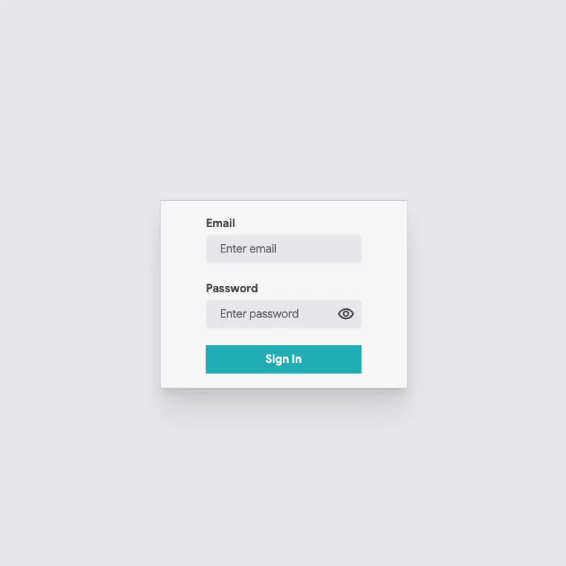
    Bringing the bear back to form controls with CSS :has() and CSS anchoring 👀 ʕ´•ᴥ•`ʔ :root:has([type=password]:focus) .paw { top: anchor(--password, top); } Only JavaScript is to toggle the password reveal whose button is anchored to the input 😉 @CodePen link below! 👇
    Image
    00:00
  • user avatar
    jhey ʕ•ᴥ•ʔ
    @jh3yy
    Aug 13, 2022
    JavaScript && CSS Tip! ✨ Use IntersectionObserver(IO) with a low threshold and custom properties to power list animations 🔥 el.style.setProperty('--shown', entry.isIntersecting ? 1 : 0) li { scale: calc(0.25 + (var(--shown, 1) * 0.75));} Demo link below! 👇
    Image
    00:00
    Image
    00:18
    user avatar
    Roaa 🦄💙
    @roaakdm
    Aug 13, 2022
    #Flutter animation tip🪄 Bring any boring scroll view in your UI to life (ListView, GridView, ..etc) by wrapping its children with an animated widget and let the itemBuilder do its magic 🪄🧪 (it will run your animation when each item scrolls into view 🤫) Code 👇🏼
  • user avatar
    jhey ʕ•ᴥ•ʔ
    @jh3yy
    Mar 8, 2024
    the little details™ Use trigonometric functions in CSS to create a smooth staggered transition delay 🎬 .character { transition-delay: calc(sin((var(--index) / 12) * 45deg) * 0.475s); }
    Image
    00:00
    Image
    00:03
    user avatar
    Julien Sagot
    @Barbapapapps
    Feb 22, 2024
    Still can't believe this effect can be achieved by a single line of code. Mind blowing.
    540K
  • user avatar
    jhey ʕ•ᴥ•ʔ
    @jh3yy
    Apr 28, 2023
    This? Completed it ✨ HTML, CSS, and JavaScript can take you to fun places 🚀 You might spot some added extras in this version! ┬┴┬┴┤•ᴥ•ʔ├┬┴┬┴ @CodePen link below 👇
    Image
    00:00
    Image
    00:29
    user avatar
    Joie Chung
    @hellojoie
    Apr 28, 2023
    still laughing at this
    1.2M
  • user avatar
    jhey ʕ•ᴥ•ʔ
    @jh3yy
    Nov 24, 2023
    Developer Math: Buying a $5,000 Macbook Pro to open a couple of browser windows and a text editor
    559K
  • user avatar
    jhey ʕ•ᴥ•ʔ
    @jh3yy
    Aug 7, 2023
    CSS Tip! 🤙 Use custom properties to work out the nested radius of elements for you 😎 .parent { --nested-radius: calc(var(--radius) - var(--padding)); } .nested { border-radius: var(--nested-radius); } Couldn't resist making an interactive visual! @CodePen link below 👇
    Image
    00:00
    Image
    user avatar
    Aleks
    Figma
    @aleksliving
    Aug 5, 2023
    quick tip for nested radii → your corners will look a lot better if you set the outer radius to the sum of the inner radius + padding
    795K
  • user avatar
    jhey ʕ•ᴥ•ʔ
    @jh3yy
    Feb 5, 2025
    <table> highlighting with CSS :has() 💡 td:has(~ td:hover), /* previous sibling cells */ table:has(td:nth-of-type(3):hover) /* column cells */ tr:not(:first-of-type):has(~ tr:hover) td:nth-of-type(3) { background: var(--highlighted); }
    Image
    00:00
    487K
Advertisement
Advertisement