![[personal profile]](https://www.dreamwidth.org/img/silk/identity/user.png)
Reload page in style: light

Moon Series
Click here for the seven splash pages
Seven splash pages for a Tabula Rasa journal. The moon sits on the page; hover a destination to change its phase. Each listing has the CSS, the entry HTML, and a live preview. Please credit gelateria if used!
Moon Series
Moon Series is seven Tabula Rasa splash pages for Dreamwidth, each with a moon on the page. Paste the CSS into Use embedded CSS, paste the matching entry into a future-dated sticky (HTML mode, Disable auto-formatting on). Style: Tabula Rasa, Plain, one column. Leave Custom stylesheet URL blank.
The moon is the through-line: a disc on the sheet, phases on the destinations, craters, a terminator, earthshine, an occultation, a night log. Hover a destination and the face waxes or wanes. The color stays.
Named for lunar things: Selene, Lunaria, Terminator, Mare, Syzygy, Libration, and Orrery. Same install for all of them. Done by request from pen_umbral. Open the CSS, copy it. Open the entry HTML, paste that into the sticky. Preview on the hub before you go live, and replace YOUR-JOURNAL in the nav links.
All 7 are below, each with a screenshot and links to the live preview, CSS, and entry HTML.
Please credit gelateria if you use one, and contact me if anything is broken.
Brutalism
Brutalism is the first Architecture Themes subset: five Tabula Rasa layouts for Dreamwidth, built around one as-found 2:3 portrait rather than print-shop or bakery paper. Style: Tabula Rasa unstyled, one column. Copy CSS from the stylesheet links below into Custom CSS.
The design cues come from construction rather than print: a shared 2:3 portrait, five different relationships to it. Broadsheet, framed plate, narrow column, cover then page, edge band. The through-line is structure over decoration, type that holds up in long entries, and spacing that keeps comments and metadata from crowding the text.
These five began as six layout variants made for rp_help. They kindly agreed to let five of them be published here. (Go check them out for RP help!)
All 5 Brutalism plates are below. Each has a screenshot and links to the stylesheet and preview hub.
Open a stylesheet, copy the CSS into Custom CSS, and preview twelve Dreamwidth views on the hub. Replace PASTE-YOUR-PHOTO-URL with a 2:3 portrait from Manage File Storage, then pin two entries. Please credit gelateria if you use one, and as always contact me if anything is broken or doesn't work.


Tabula Rasa CSS - start here
This series is for people who have never written a Dreamwidth journal stylesheet. You do not need to know the Customize screens yet. The rest of this post walks through them.
A journal stylesheet is the CSS that sits on top of Tabula Rasa and paints the page: colours, type, spacing, entry cards, sidebars, comments. These posts give you a beginner baseline, not a finished theme.
Start with Tabula Rasa, the Plain preset, and 1 column. Keep the layout stylesheet on. Then pick the post that matches the journal you actually want.
A stylesheet sits on a blank slate
A named theme already has opinions. Plain Tabula Rasa is mostly structure: boxes, columns, and defaults. Your CSS is then the look you see.
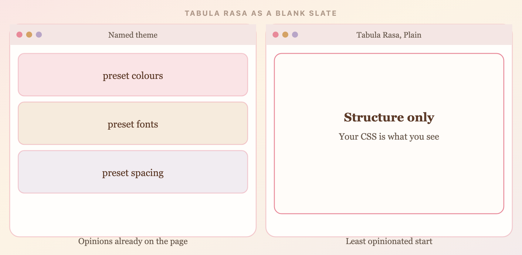
Left: a theme that already decided. Right: the blank slate these posts start from.
How to read this series
Set Dreamwidth up here. Then open the post for your layout. Check the live journal against real entries before you restyle anything.
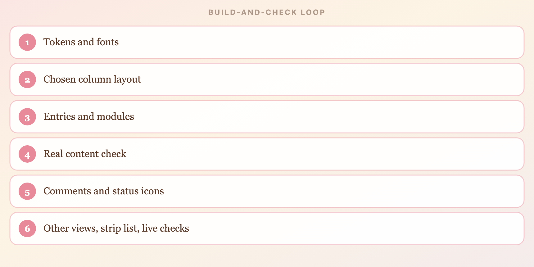
Tokens, then the column layout, then the reading page, then the rest of the journal.
Tabula Rasa CSS - one column | Tabula Rasa CSS - two columns | Tabula Rasa CSS - three columns | Tabula Rasa CSS - the rest of the journal
Tabula Rasa CSS - one column
A beginner baseline for a one-column Tabula Rasa journal. If the theme and CSS slots are not set yet, read Tabula Rasa CSS - start here first. The click-path lives there, not here.
This post paints the reading column: tokens, page shell, header, entries, and room for the control strip. Sidebars wait for the next post.
Install reminder
Tabula Rasa, Plain, 1 column. Layout stylesheet on. Comment indent set to responsive. Journal CSS in Use embedded CSS. Fonts, if you want them, in Custom stylesheet URL.
The hub has the Customize click-path. If that is not done yet, stop here and finish it first. Tabula Rasa CSS - start here also has the strip lists and the recovery steps.
Tabula Rasa CSS - two columns
The sidebar path, at the same level of detail as one column. Read Tabula Rasa CSS - start here if the theme is not set, and Tabula Rasa CSS - one column if you still want the reading-column walkthrough.
Switch the layout first. Then style #secondary. The sidebar uses the same font tokens. It does not need a second remote font request.
Install reminder
In Customize Your Style, set the layout to two columns left or two columns right. Place modules in sidebar one. Keep the default stylesheet on. Tabula Rasa already knows how to float the columns.
If there is no sidebar on the page, the layout setting has not changed yet. CSS cannot invent #secondary.
Tabula Rasa CSS - three columns
Two sidebars, as a complete path. This is the advanced column switch, not a requirement. If you only wanted one sidebar, you can stay on Part 2.
Choose three-columns-left, three-columns-right, or three-columns-sides. #secondary is sidebar one. #tertiary is sidebar two. Let Tabula Rasa place them.
Install reminder
Change the layout setting first. Put modules in sidebar one and sidebar two. Keep typography in the same font tokens so the third column does not add a second font host.
If a column is missing, the layout setting does not match the page you think you are on.
Tabula Rasa CSS - the rest of the journal
Comments, other views, forms, and the small icons. Add this block after the layout CSS from Part 1, 2, or 3. It is grouped coverage, not a second theme.
Some selectors only exist on certain views. If a selector is missing from an audit, the view may not have been open. That is not proof the selector is invalid.
Install reminder
Keep comment indent on responsive. Paste this block after your layout CSS, or merge it into one saved stylesheet. Do not paste it on its own unless the page shell is already styled.
The hub still has the strip lists. The same silent-strip recovery steps apply.
Splash patterns - advanced
This post is for when Standard Issue or Lock Set is not enough. New readers start at Splash patterns - start here, then Splash patterns - flow. Come here for Safety Lock, Cover Plate, and Front Panel.
Splash patterns - flow covers the two starter shells plus wrapper unlocking. If the theme and sticky are not set yet, that click-path is in the hub, not here.
Quick start
Overlay live checks
Why not the old sticky fallback?
Current Safari, Chrome, Firefox, and Edge all support :has(). The older no-:has() sticky fallback hides every Recent entry, then tries to reopen whatever looks sticky. It cannot see the splash root, so it can hide the wrong entry, stay locked after you unstick the splash, and misfire if you have more than one sticky. If a very old browser is a hard requirement, that is a compatibility test, not a first splash. These posts do not give it as a sixth copy-paste shell.
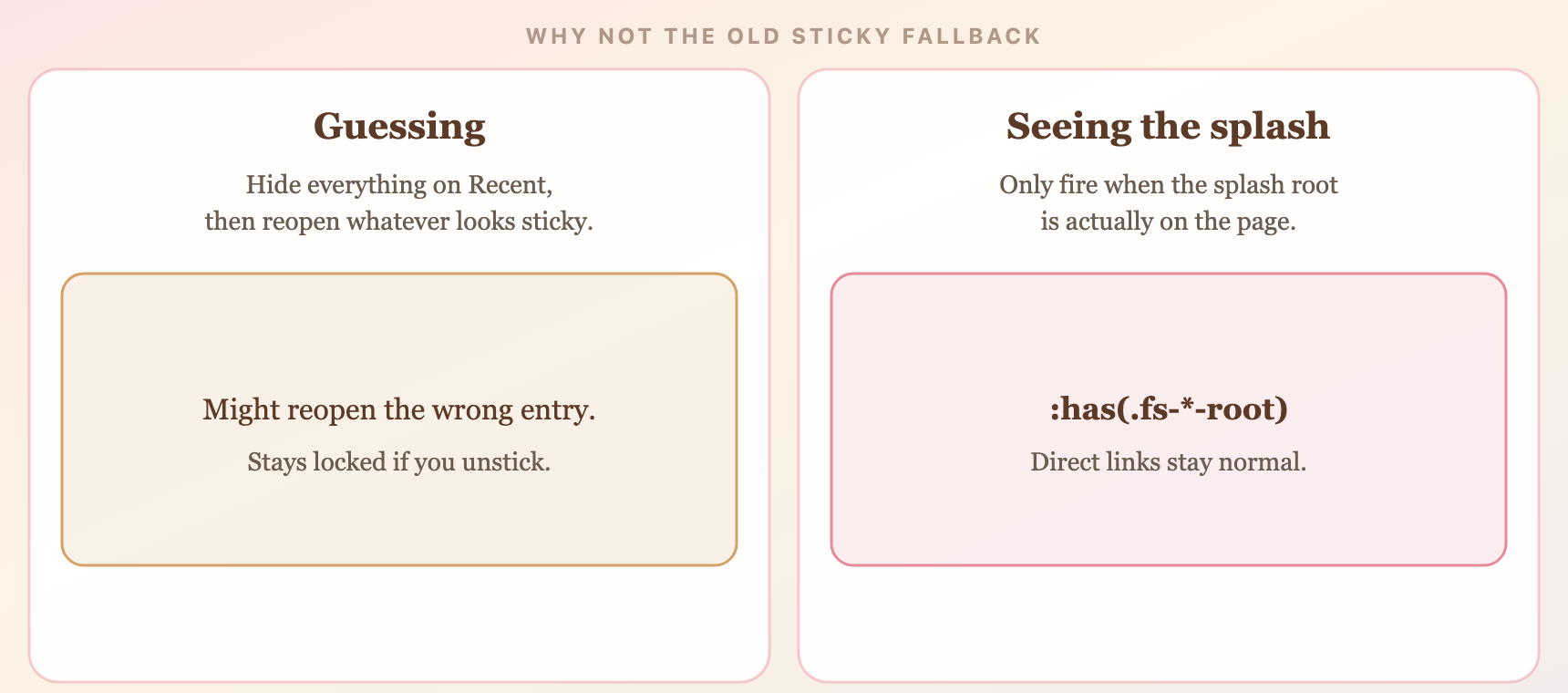
The five public patterns can see the splash. The old fallback cannot.
Patterns in this post
| Pattern | Class prefix | Best for |
|---|---|---|
| Safety Lock | .fs-hyb-* |
Locked front page with the least fragile selector structure |
| Cover Plate | .fs-fix-* |
Fixed full-screen overlay when wrapper unlock is not enough |
| Front Panel | .fs-ent-* |
Self-contained overlay with minimal wrapper dependency |
Splash patterns - flow
Two starter shells for a first splash on Dreamwidth. If you have not set the theme and sticky yet, read Splash patterns - start here first. The click-path lives there, not here.
This post covers Standard Issue and Lock Set. Splash patterns - advanced in this series covers Safety Lock, Cover Plate, and Front Panel.
Install reminder
Theme > Use embedded CSS > HTML fragment > sticky URL. The hub has the Customize click-path. If that is not done yet, stop here and finish it first.
Quick start
Patterns in this post
| Pattern | Class prefix | Best for |
|---|---|---|
| Standard Issue | .fs-gel-* |
Landing page with the journal still underneath |
| Lock Set | .fs-net-* |
Front page that hides other entries |
The HTML and CSS for each pattern are a matched pair. Do not mix Standard Issue HTML with Lock Set CSS, or change a class prefix in one file without updating the other.
Splash patterns - start here
This series is for people who have never built a splash page on Dreamwidth. You do not need to know the Customize screens yet. The rest of this post walks through them.
A splash page is a designed landing screen on your journal's front page - a character intro, a musebox menu, a game portal, a comm welcome screen - instead of the usual scrolling list of entries.
These posts give you five structural shells. They are not finished designs. Once the shell is sitting on your journal, you change the copy, colours, and links inside.
A splash is a landing screen
A normal Recent page stacks entries. A splash replaces that first impression with one designed screen.
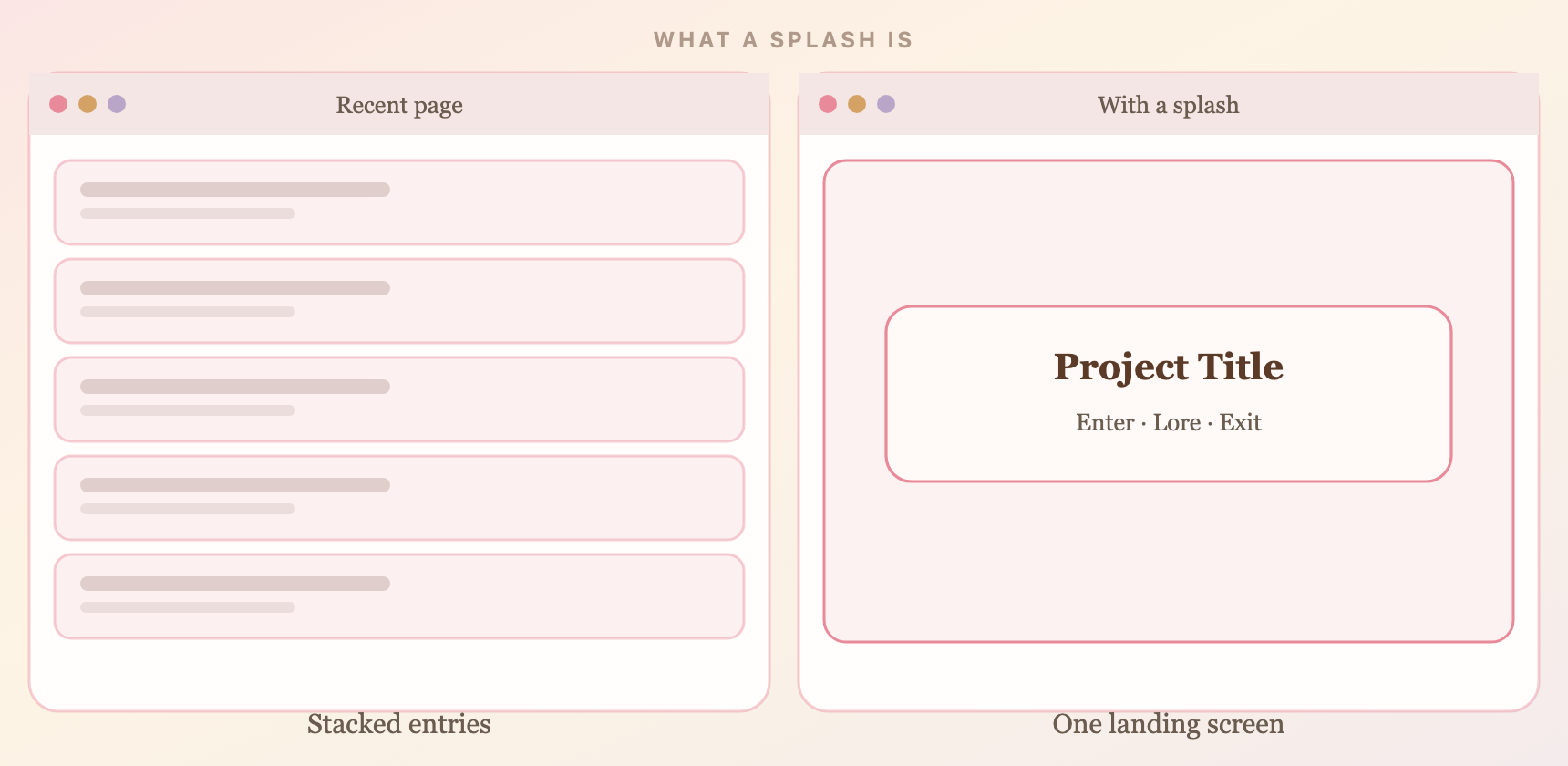
Left: an ordinary journal front. Right: the same front with a splash.
How to read this series
Set Dreamwidth up here, then paste a shell from Part 1 or Part 2. Check the live journal before you restyle anything.
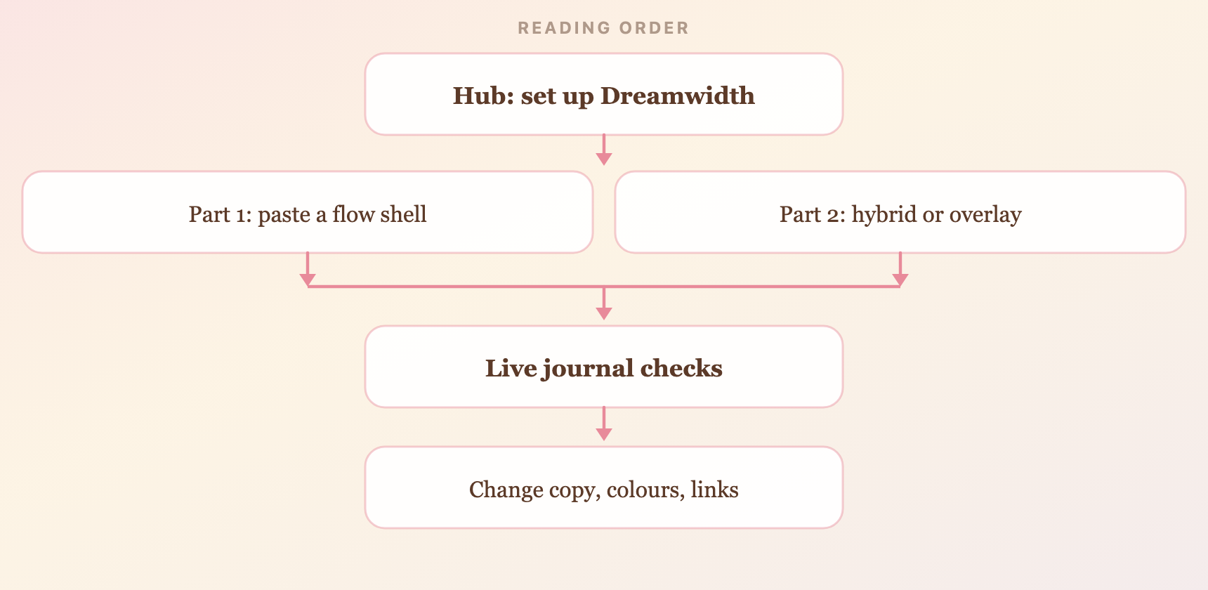
Hub first, then a shell, then live checks, then the design inside.

Pearl Series
Click here for the twenty-eight splash pages
Twenty-eight splash pages for a Tabula Rasa journal: nacre, mother-of-pearl, pale color and a pearl on the page. Each listing has the CSS, the entry HTML, and a live preview. Please credit gelateria if used!
Pearl Series
Pearl Series is twenty-eight Tabula Rasa splash pages for Dreamwidth. Each one turns Recent into a full-viewport front: paste the CSS into Use embedded CSS, paste the matching entry into a future-dated sticky (HTML mode, Disable auto-formatting on). Style: Tabula Rasa, Plain, one column. Leave Custom stylesheet URL blank.
Nacre is just another word for mother-of-pearl. That is the through-line of the series: pale color, a little iridescence, and a pearl in most of the layouts.
Named for objects: Orient, Chamber, Atelier, Macro, Rosé, through Milk. Same install for all of them. Open the CSS, copy it. Open the entry HTML, paste that into the sticky. Preview on the hub before you go live, and replace YOUR-JOURNAL in the nav links.
All 28 are below, each with a screenshot and links to the live preview, CSS, and entry HTML.
Please credit gelateria if you use one, and contact me if anything is broken.

![[community profile]](https://www.dreamwidth.org/img/silk/identity/community.png)

