
A fixed-width sidebar can sit beside fluid page content on a wide screen and move below it on a narrow screen. CSS Grid handles both layouts without floats, negative margins, or hiding the sidebar on phones.
The original example used floats to reserve a 320-pixel sidebar and hid it below a 768-pixel breakpoint. The updated pattern keeps supplementary content available at every width and makes the breakpoint a layout choice you can adjust to your content.
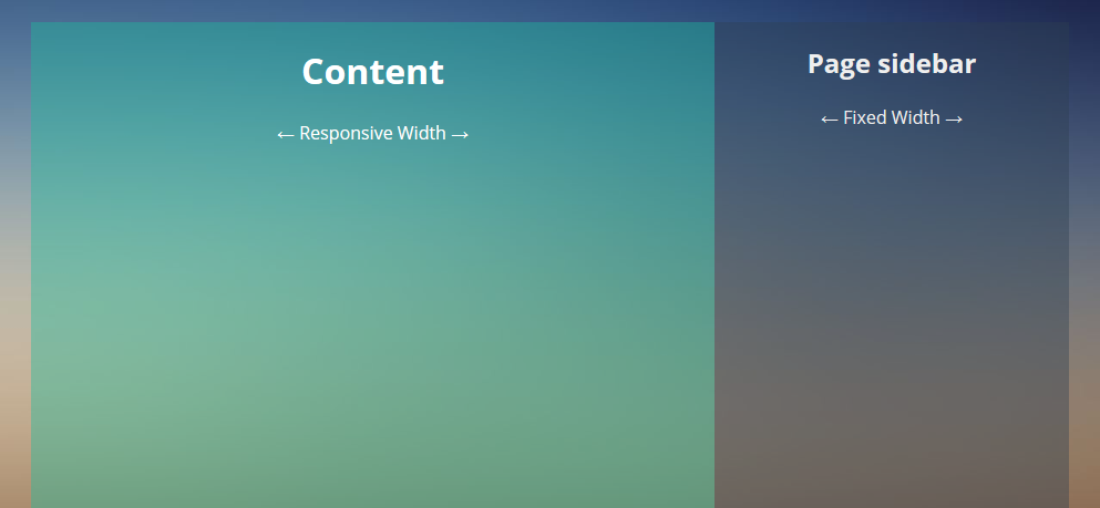
Mark up the main content and sidebar
Keep the main content first in the document so it remains first when the columns stack. Use an <aside> for content that is related to, but separate from, the main content. See MDN's guidance on the <aside> element. If your page template already has a <main>, do not add a second one.
<div class="page-layout">
  <main class="page-layout__main">
    <h1>Page content</h1>
    <p>Your primary content goes here.</p>
  </main>

  <aside class="page-layout__sidebar" aria-labelledby="sidebar-heading">
    <h2 id="sidebar-heading">Related information</h2>
    <p>Add supplementary links or other useful content here.</p>
  </aside>
</div>
Set a fixed sidebar width with CSS Grid
Grid keeps the main column flexible and the sidebar at a predictable width. minmax(0, 1fr) and min-inline-size: 0 let the main column shrink instead of allowing its contents to widen the whole page.
*,
*::before,
*::after {
  box-sizing: border-box;
}

.page-layout {
  display: grid;
  grid-template-columns: minmax(0, 1fr) 20rem;
  gap: 1.5rem;
  width: calc(100% - 2rem);
  max-width: 72.5rem;
  margin-inline: auto;
}

.page-layout__main,
.page-layout__sidebar {
  min-inline-size: 0;
}

@media (max-width: 52rem) {
  .page-layout {
    grid-template-columns: minmax(0, 1fr);
  }
}
The 20rem track is fixed while the layout has two columns; adjust it to suit your sidebar. At 52rem and below, the sidebar moves after the main content in the document order. That value is a starting point, not a universal tablet breakpoint: resize your actual page and change it where the columns become cramped. MDN's CSS Grid guide explains the grid tracks used here.
Keep the layout usable on small screens
Do not hide important sidebar content just to make a narrow layout fit. If a sidebar contains only optional promotion or decoration, decide separately whether it belongs on small screens; CSS layout alone should not remove information a reader needs. Use the same approach when placing an ad: make sure the page's primary content still fits and remains in a logical reading order.
Check the page with its real text and images at a narrow viewport, including the equivalent of 320 CSS pixels, and with text enlarged. Look for page-level horizontal scrolling, clipped content, and a sidebar that appears before the main content. The WCAG Reflow guidance explains when content should reflow and the limited cases where two-dimensional scrolling is appropriate.
For more responsive layout approaches, see our guide to practical responsive web design patterns. MDN also documents CSS media queries for adapting layouts to viewport or device features.


http://jnet.sytes.net/apps/Round_Images/
for live test the frame is at the bottom instead of top right how do i move the iframe? (the iframe is the right hand menu im trying to implement any ideas?
Hi Jay, We are not using any iframe to implement the layout suggested above. Are you sure you are referring to the tutorial in correct way?
Hi Kanishk!
I can’t seem to be able to put the sidebar to the left, any tips?
Hello Victor, I have updated the post to include a demo for fixed width sidebar on left. You can find the demo on codepen here: http://codepen.io/kanishkkunal/pen/ZBmrGx
Thanks a lot!
When there is more content text in sidebar than in the ‘contents’ div and the sidebar height is increased, the footer doesn’t move down and the layout looks broken. How can we fix it?
The ideal layout would be where the heights of both columns stay the same.
Thanks Aqeel for reporting this issue. I forgot to include clearfix for page class. Kindly add the following CSS snippet to fix this. I have updated the CodePen demos too.
.page:after {

  content: "";

  display: table;

  clear: both;

}
The footer should now stay on it’s own row even if the sidebar content is longer.
Correction: There is no div with a class of “content”
It is , so the CSS should read:
.content-inner {
margin-right: 320px;
clear: both;
overflow: auto;
background: #1abc9c;
background: rgba(26,188,156, 0.4);
min-height: 600px;
}
… or did I miss anything?
There was an error in the code shown in the post. The class ‘content-inner’ should actually be ‘content’. Kindly see the CodePen demo which contains the correct code and a working demo.
I have corrected the class name in the post too. Thanks for pointing out the mistake Francis.
great code. Is there a way to collapse this with a Hamburger to be able to get full view of page and vice-a-versa. Example idea is, have a few data pages and content is crowded with sidebar out, would be nice if user can collapse sidebar to view whole page content, then when done viewing can re-open sidebar.
What you are looking for is called a slide-out off-canvas sidebar. Check out these great examples of sidebar transitions https://tympanus.net/Development/SidebarTransitions/ and corresponding article here: https://tympanus.net/codrops/2013/08/28/transitions-for-off-canvas-navigations/
Why sidebar is display: none ?
@media only screen and (max-width: 768px) {
.sidebar {
width: 100%; min-height: 100px;
}
.content {
clear: both; margin-right: 0;
}
}
Your query is already answer in article. Let me repeat it below:
“For the mobile screens, I am going to hide the sidebar altogether and just stick with the main page content. This is an ideal way to display content on small screen devices and generally you should not be placing any important content in the sidebar.”
Nonetheless, if you are showing the sidebar on mobile, you are more than welcome to do so as per your choice.
Just a side note:
We can now make such sidebar using flexbox instead of float as browser support for flexbox is now more prevalent.