Elementor Image Carousel Widget: Free Slider with Lightbox and Coverflow
The Image Carousel widget in Master Addons turns a WordPress gallery into a swipeable slider. You pick the images, choose how many show on desktop, tablet and phone, and add autoplay, an infinite loop, a lightbox and a 3D coverflow layout if you want one. Every slide can be styled in its normal, hover and active state, and the arrows, dots and progress bar follow your brand. It works for portfolios, product shots, hotel and property tours, and client logos.


Coverflow and Carousel Layouts
Choose a Carousel or Coverflow layout in Carousel Settings. Slides per Column sets how many slides show at once, from 1 to 6, with separate values for desktop, tablet and mobile, so the carousel is responsive without extra CSS. Slides to Scroll sets how far each step moves. Loop makes the carousel infinite, and Autoplay, Center Slide, Grab Cursor and Drag Free Mode change how it moves. Turn on Observer when the carousel sits inside a tab or an accordion.
- Responsive: a different slide count on desktop, tablet and mobile.
- Movement: Autoplay Speed, Animation Speed, Pause on Hover and an infinite Loop.
- Height: Auto Height follows the tallest visible slide, or set a Custom Height for the carousel.
Style Slides in Normal, Hover and Active States
The Carousel Items section styles the box around each image in three states. Set a background, border, shadow and padding for Normal, Hover and Active, plus the Item Gap between slides and the Opacity. Use the Active state to make the centre slide stand out from its neighbours.
- Hover: a shadow lift or a color change when the pointer is over a slide.
- Active: a different border or background on the current slide.
- Frame: Border Radius, Box Shadow and Padding on every item.

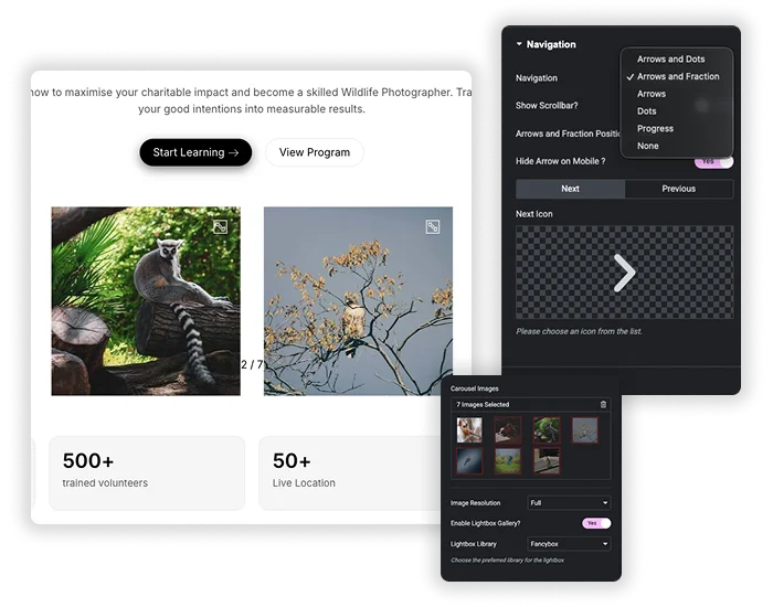
Image Carousel With Lightbox, Arrows, Dots and Progress Bar
Navigation can be Arrows, Dots, Arrows and Dots, Arrows and Fraction, or a Progress bar, and you can add a draggable scrollbar to any of them. Arrows take custom icons and sit Inside or Outside the carousel. The lightbox is on by default and opens each image full size with Fancybox or the Elementor lightbox. The image title and its media library caption appear in the lightbox, and you can style both, along with the preview icon and the overlay.
- Arrows: color, size, background and Horizontal Offset, with an option to hide them on mobile.
- Counters: a fraction such as 1 / 8, or a progress bar at the top or bottom.
- Lightbox: Fancybox or Elementor, with a custom preview icon and overlay.
Coverflow Image Carousel Without Elementor Pro
In Elementor, the coverflow effect belongs to the Media Carousel widget, which is part of Elementor Pro. The Master Addons Image Carousel has it as a Layout option. Set Layout to Coverflow and the centre slide faces forward while its neighbours turn away. The Coverflow Effect popover has four sliders: Rotate, Stretch, Modifier and Depth. The carousel below is live, so drag it or use the dots.









For flip, arc and orbit styles, see our guide to the Elementor 3D carousel.
Elementor Image Carousel vs Master Addons Image Carousel
Elementor’s own Image Carousel is enough for a basic slider with captions on the slides. Pick the Master Addons one when you need a coverflow layout, a progress bar or a fraction counter, Fancybox, or separate styling for the active slide.
| Elementor Image Carousel | Master Addons Image Carousel | |
|---|---|---|
| Price | Free | Free |
| Slides per view per device | Yes | Yes |
| Layouts | Slide or fade | Carousel or 3D coverflow |
| Captions | On the slide: title, caption or description | In the lightbox: image title and caption |
| Navigation | Arrows and dots | Arrows, dots, dynamic bullets, fraction, progress bar and scrollbar |
| Lightbox | Elementor lightbox | Fancybox or Elementor, with a custom preview icon and overlay |
| Slide styling | Basic | Normal, hover and active states |
| Links | One custom URL for all slides | No link field, images open in the lightbox |
What the Image Carousel Widget Can and Cannot Do
A quick list of what is in the widget and what is not.
| Feature | Image Carousel |
|---|---|
| Lightbox (Fancybox or Elementor) | Yes |
| Coverflow layout | Yes |
| Slides per device, 1 to 6 | Yes |
| Arrows, dots, fraction, progress bar and scrollbar | Yes |
| Autoplay and infinite loop | Yes |
| Normal, hover and active slide styling | Yes |
| Caption in the lightbox (image title and caption) | Yes |
| Caption on the slide | No |
| Link per image | No |
| Multiple rows | No |
| Video slides | No |
| Thumbnail navigation | No, see Gallery Slider (Pro) |
Image Carousel Examples
These three carousels are live widgets. Click any image to open the lightbox. More layouts are in the demo viewer under them.
Hotel tour, three across
Three slides on desktop, two on tablet and one on mobile, with arrows over the images.



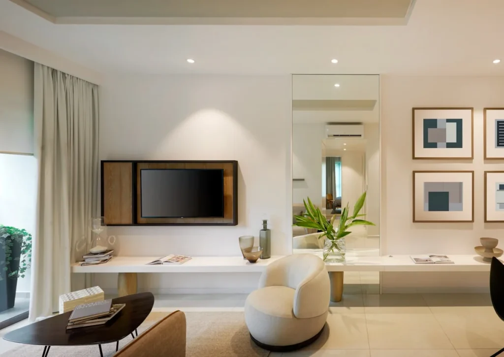




Menu strip with a progress bar
Autoplay with Drag Free Mode on and a Progress bar in place of dots.


















How to add an image carousel in Elementor
For a longer walkthrough with screenshots, read how to create an image carousel in Elementor.
- Install the free Master Addons plugin and edit your page with Elementor.
- Search the widget panel for Image Carousel and drag it into a container.
- Click the gallery field, pick your images and set the Image Resolution.
- Set how many slides show per device, then turn on Autoplay, Loop and the lightbox if you want them.
- Choose Carousel or Coverflow, style the slides and arrows, and publish.
Related carousels: Logo Slider, Team Slider, Gallery Slider (Pro) and the Blog widget’s carousel mode. For hover animations on a single image, see Image Hover Effects.
For a filterable grid of images, see Filterable Image Gallery.
Frequently Asked Questions For Image Carousel
What's the main advantage over Elementor's basic Image Carousel?
Elementor’s Image Carousel handles a simple slider well: captions, a lightbox, autoplay, and slides per device. Master Addons adds a 3D coverflow layout, fraction, progress bar and scrollbar navigation, a choice of Fancybox or the Elementor lightbox with a custom preview icon, styling for normal, hover and active slides, and an Observer option for carousels inside tabs or accordions.
How do I keep all carousel images the same height?
Upload images with the same aspect ratio, because the widget shows each image at its own shape. If you cannot crop them first, give the widget a CSS class and set a fixed height with object-fit: cover on the slide images. Custom Height sets the height of the carousel itself and does not crop the images.
Can I use this for a logo slider with grayscale to color on hover?
Yes. Upload your logo images. In the Carousel Items tab, set the normal state Opacity or use a CSS filter to make them grayscale. Then, in the Hover state, set the opacity back to 1 and remove the filter. Or use the Logo Slider widget, which is built for client logos.
Can the carousel scroll continuously?
It moves one step at a time, with or without autoplay. For a strip that glides without stopping, build a marquee. Our Elementor marquee guide shows three ways to do it.
What is the difference between a carousel and a slider?
A slider shows one slide at a time, usually full width. A carousel shows several at once on a track. This widget does both: set Slides per Column to 1 and it works as a slider. There is more in carousel vs slider.
Can each image have its own link?
No. Images open in the lightbox and the widget has no link field. Elementor’s own Image Carousel has a Custom URL option, but it applies to every slide. For a link per item, use the Logo Slider.
Trending Elementor Widgets & Extensions
Build sophisticated websites in less time.
Glassmorphism
Container Extras

Patterns
![Master Addons Post/Page Duplicator extension for Elementor: MA Duplicator row link in the WordPress Pages list creating a Landing Page - [Duplicated #128] draft](https://d1asvmc6qcowgk.cloudfront.net/wp-content/uploads/2026/09/15102930/post-page-duplicator-768x403.webp)
Post/Page Duplicator