
Responsive Menu features
Every setting lives in one live editor with a phone preview. The free plugin builds your mobile menu. Pro adds a desktop and mega menu, a header bar and a WooCommerce cart.
-
FREE
Live visual editor
Change any setting and watch a phone, tablet or desktop preview update straight away. You never edit CSS.
Read the guide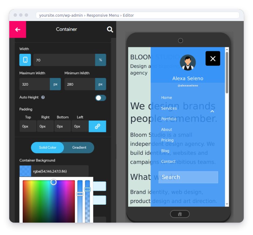
Design
Make the menu look like the rest of your site.
- FREE
Ready-made themes
Start from a finished design, then change anything. Save your own design as a theme to reuse it.
Read the guide about Ready-made themes - FREE
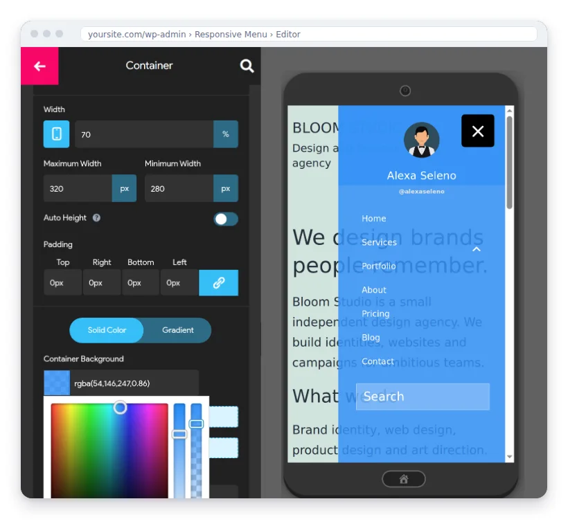
Colours with opacity
Every colour setting has an opacity slider, so the menu can sit over your page and let it show through.
Read the guide about Colours with opacity - PRO
26 button animations
Animated menu buttons, from Spin and Elastic to Vortex, most with a reverse version.
Read the guide about 26 button animations - PRO
Icons on menu items
Give each menu item its own Font Awesome icon so visitors scan the menu faster.
Read the guide about Icons on menu items
Layout & content
Where the menu appears and what goes in it.
- FREE
Slide-in mobile menu
Open the menu from the left, right, top or bottom, sliding over the page or pushing it aside.
Read the guide about Slide-in mobile menu - PRO
Desktop & mega menu
Use the same plugin for desktop navigation, with multi-column mega menu panels and dropdown effects.
Read the guide about Desktop & mega menu - PRO
Header bar
A bar above the page with your logo, menu, search and any HTML. Pin it to the top as visitors scroll.
Read the guide about Header bar - PRO
WooCommerce mini cart
Show a cart icon with an item count, plus cart and checkout links, right in your menu.
- FREE
Search, logo and title
Put a search box, your logo, a title and your own HTML inside the menu, in the order you choose.
Read the guide about Search, logo and title - FREE
Call, email and social icons
Add tap-to-call, email and social links inside the menu panel.
Behaviour
How the menu opens, closes and reacts to the page.
- FREE
Mobile and tablet breakpoints
Choose the screen width where the menu takes over. Pro can show a different menu on tablets.
Read the guide about Mobile and tablet breakpoints - PRO
Scroll lock and page overlay
Stop the page scrolling behind an open menu, and darken it so the menu stands out.
Read the guide about Scroll lock and page overlay - PRO
Touch gestures
Let visitors swipe the menu open and closed on touch screens.
Read the guide about Touch gestures - PRO
Smooth scrolling links
Menu links to sections of a page glide there instead of jumping, at the speed you set.
Read the guide about Smooth scrolling links
Control & compatibility
Who sees what, and where it works.
- FREE
Menus by user and role
Show items only to logged-in members, only to guests, or only to the user roles you pick.
Read the guide about Menus by user and role - PRO
Show on specific pages
Include or exclude the menu page by page, for example to hide it on a landing page.
Read the guide about Show on specific pages - PRO
WPML and Polylang
The menu switches with the visitor's language, and button text can be translated.
Read the guide about WPML and Polylang - FREE
Copy your menu to other sites
Export your settings and import them on staging, production or a client's site.
- FREE
Works with any theme
Use any WordPress menu. Tell it which theme menu to hide, and visitors only see the new one.
Read the guide about Works with any theme - FREE
Elementor integration
Use Responsive Menu inside Elementor layouts.
Read the guide about Elementor integration - FREE
Keyboard and screen readers
The menu opens, closes and moves focus correctly with a keyboard and assistive tech.
“The option to export it from my staging site and import it into production was great too.”
★★★★★ Arno Kools on WordPress.org, Sep 2025 · 4.5 out of 5 from 573 reviews
