CTA widget

Last Update: June 15, 2025

Add the widget

Image

To access and use a widget:

  1. In Elementor Editor, click +.
    All available widgets are displayed.

  2. Click or drag the widget to the canvas. For more information, see Add elements to a page.

What is the CTA widget?

A Call to Action (CTA) is a prompt that encourages the audience to take a specific action. It is commonly used in websites to guide people toward a desired action, such as making a reservation, signing up for a newsletter or making a purchase. 

The CTA widget helps you quickly construct an attractive call to action for your visitors to take.

See all the options available with the CTA widget.  

Common use case

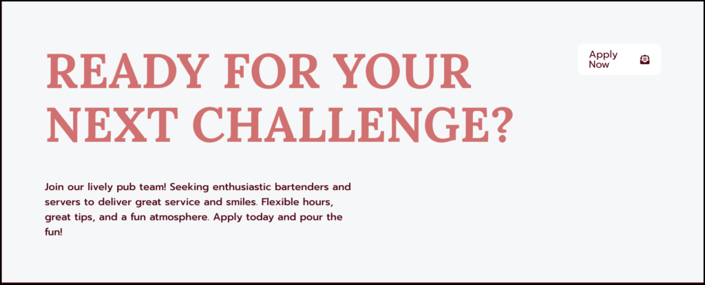
Alex is creating an About us page to for their website. Since they are trying to recruit new employees, they decide to add a CTA to the page asking people to email them resumes.

Image

Additional use cases

  • A restaurant puts a CTA on their Menu page encouraging people to make reservations.
  • A clothing store adds a CTA to their Home page asking visitors to sign up for sales notifications.
  • The clock tower committee is raising funds to repair the local landmark. They put a CTA on their front page asking for donations.

Adding a CTA widget: Step-by-step

In the example below, we’ll create a CTA encouraging potential employees to email applications to pub management. 

Add a CTA widget

To add a CTA widget:

  1. Drag the CTA widget to the canvas.
    Image
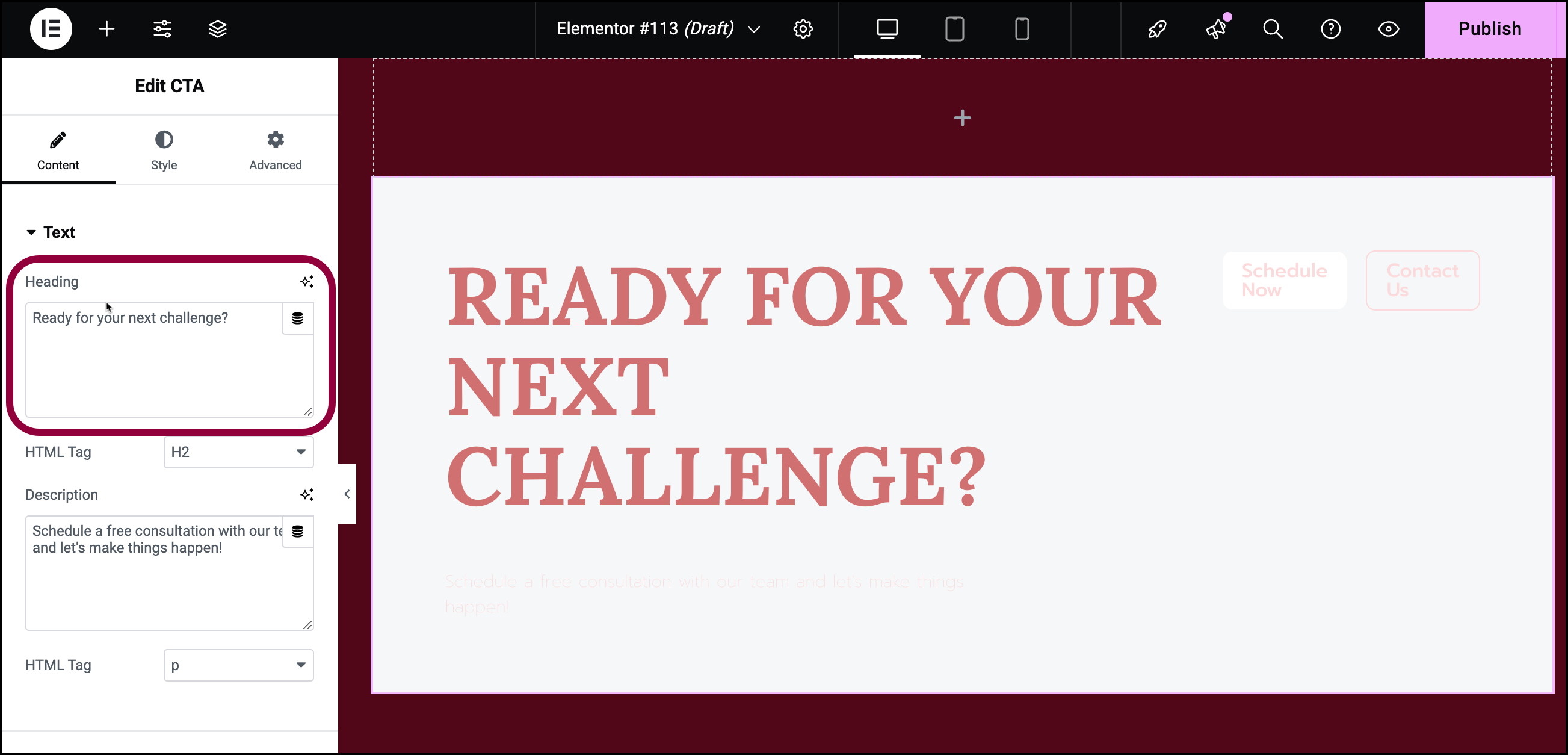
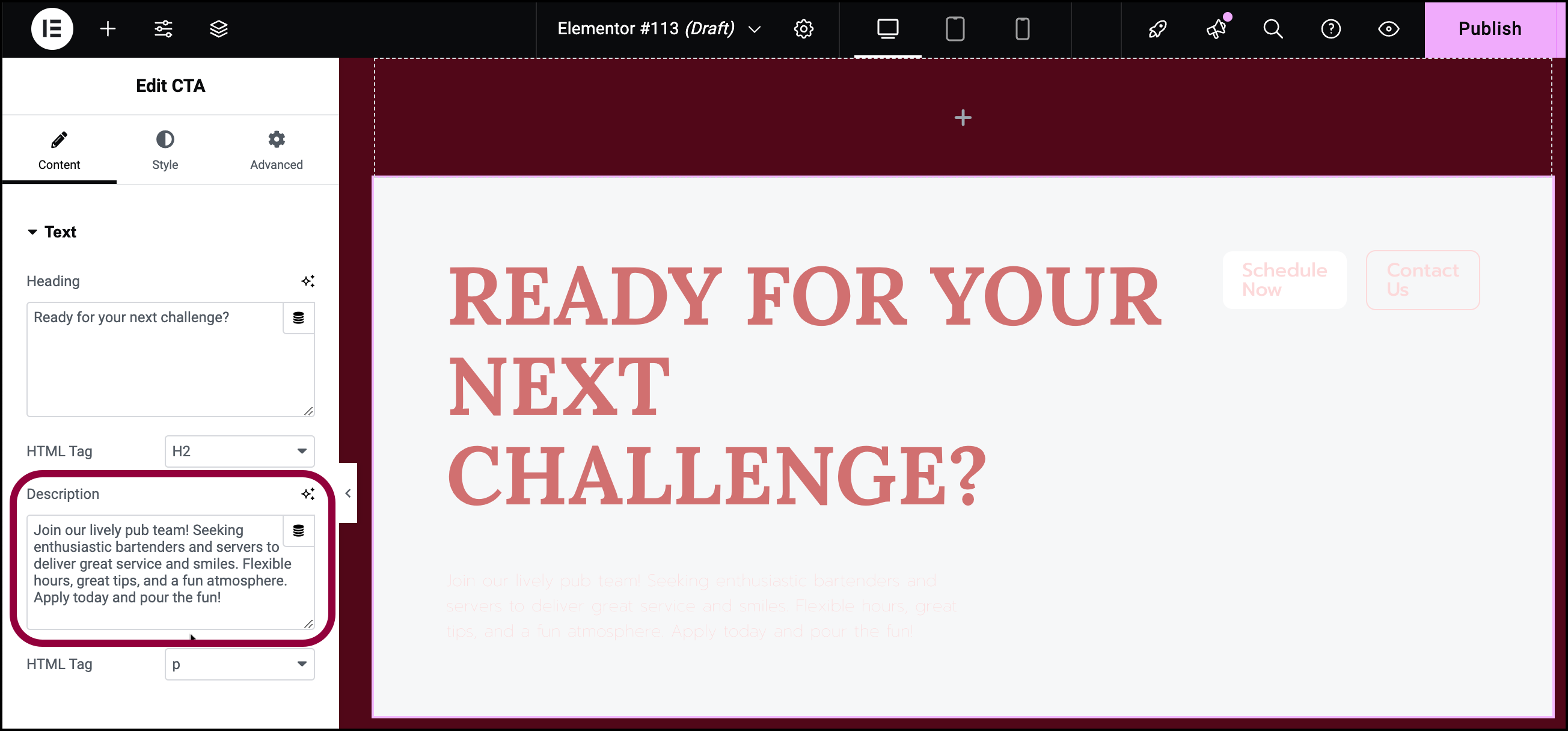
  2. In the panel, in the Heading text box, enter Ready for your next challenge?
    Image
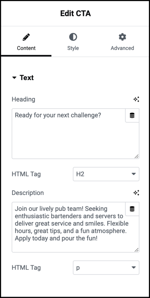
  3. In the Description text box, enter, Join our lively pub team! Seeking enthusiastic bartenders and servers to deliver great service and smiles. Flexible hours, great tips, and a fun atmosphere. Apply today and pour the fun!
    Image
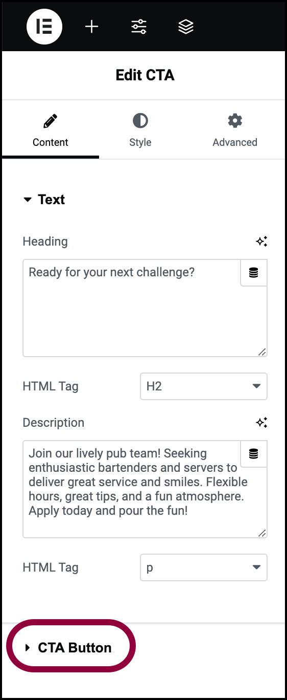
  4. Open the CTA button section.
    Image
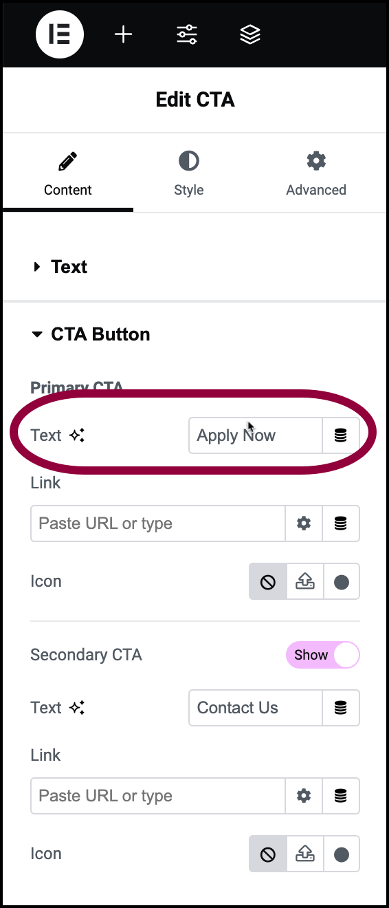
  5. In the Text box, enter, Apply Now.
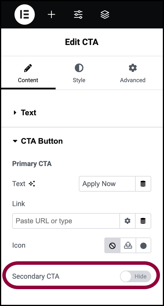
    You can add two CTA buttons to the widget, but in this case we’ll only need one.
    Image
  6. Toggle Secondary CTA to Hide.
    Image
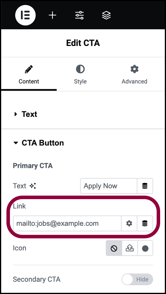
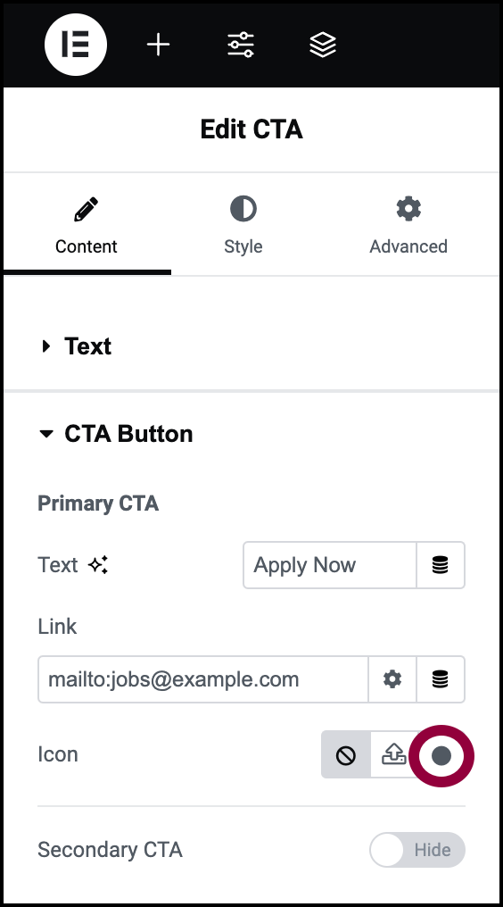
  7. In the Link field enter mailto:jobs@example.com
    This will open a new mail sent to this address. 
    Let’s add an icon to help the button stand out. 
    Image
  8. In the Icon field, click the icon symbol.
    This opens the icon library.
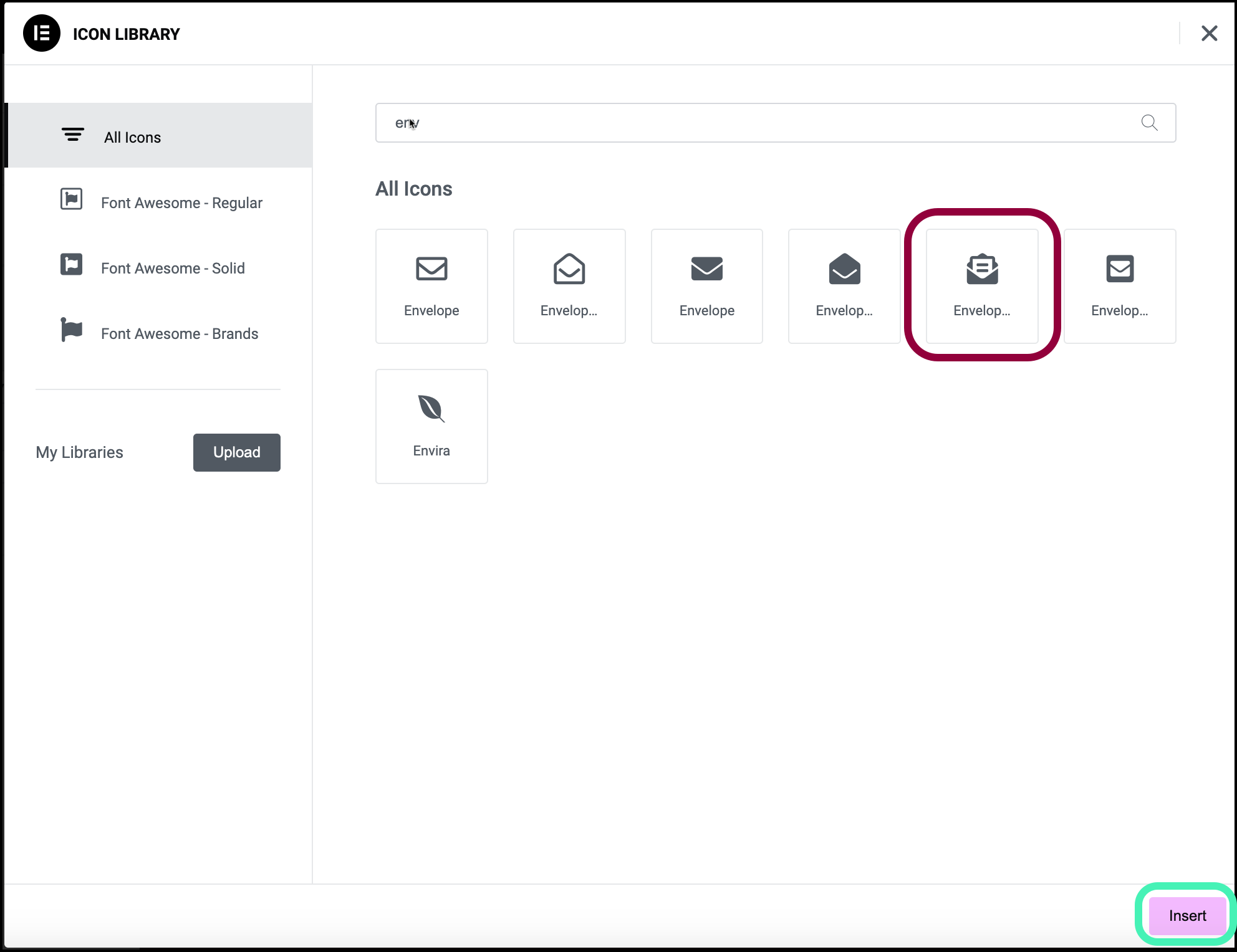
    Locate the mail icon.
    Image
  9. Select the mail icon and click Insert.
    The mail icon is now added to the button letting visitors know what to expect when they click the button.
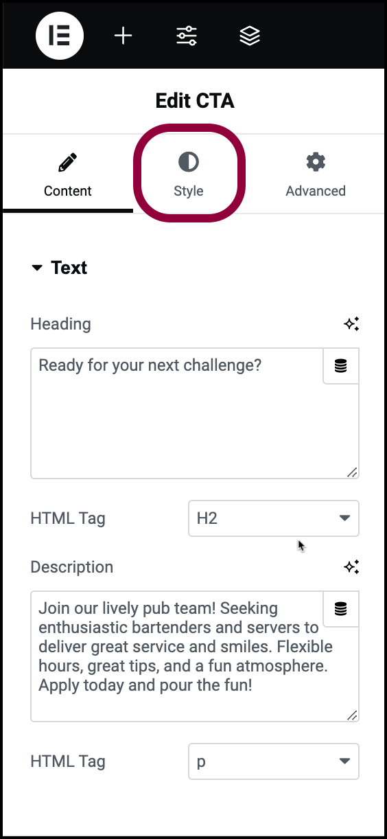
    Now let’s tweak the look of the widget. 
    Image
  10. Click the Style tab.
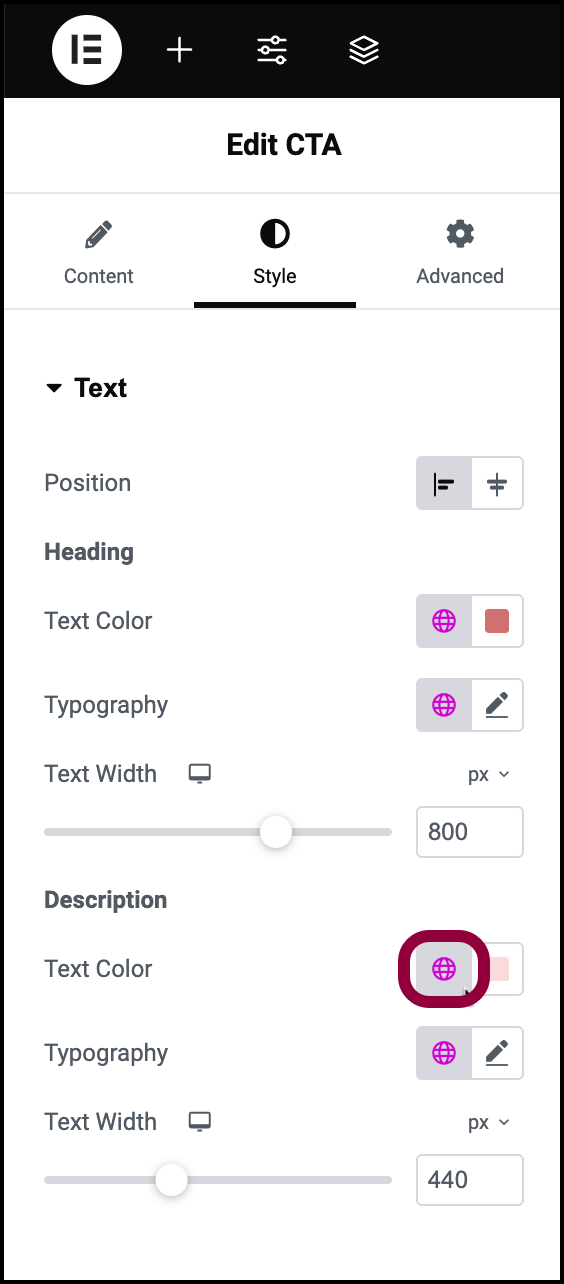
    The description is difficult to read, so let’s change the color.
    Image
  11. In the Description section, click the global icon next to Text Color.
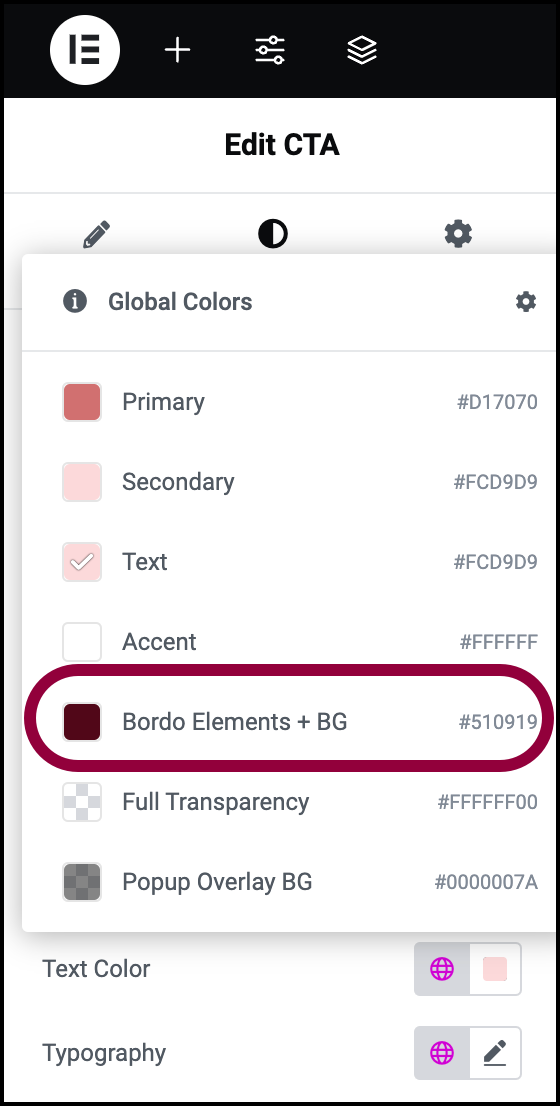
    Image
  12. Select the Bordo elements color.
    The text is more visible, but let’s add some weight to make the text stand out more.
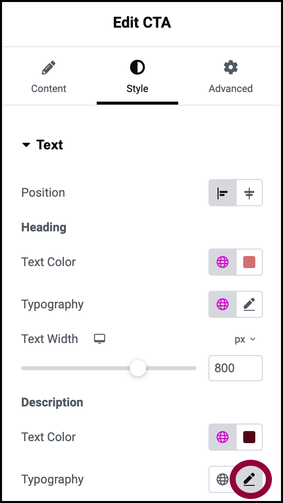
    Image
  13. Click the pencil icon next to Typography.
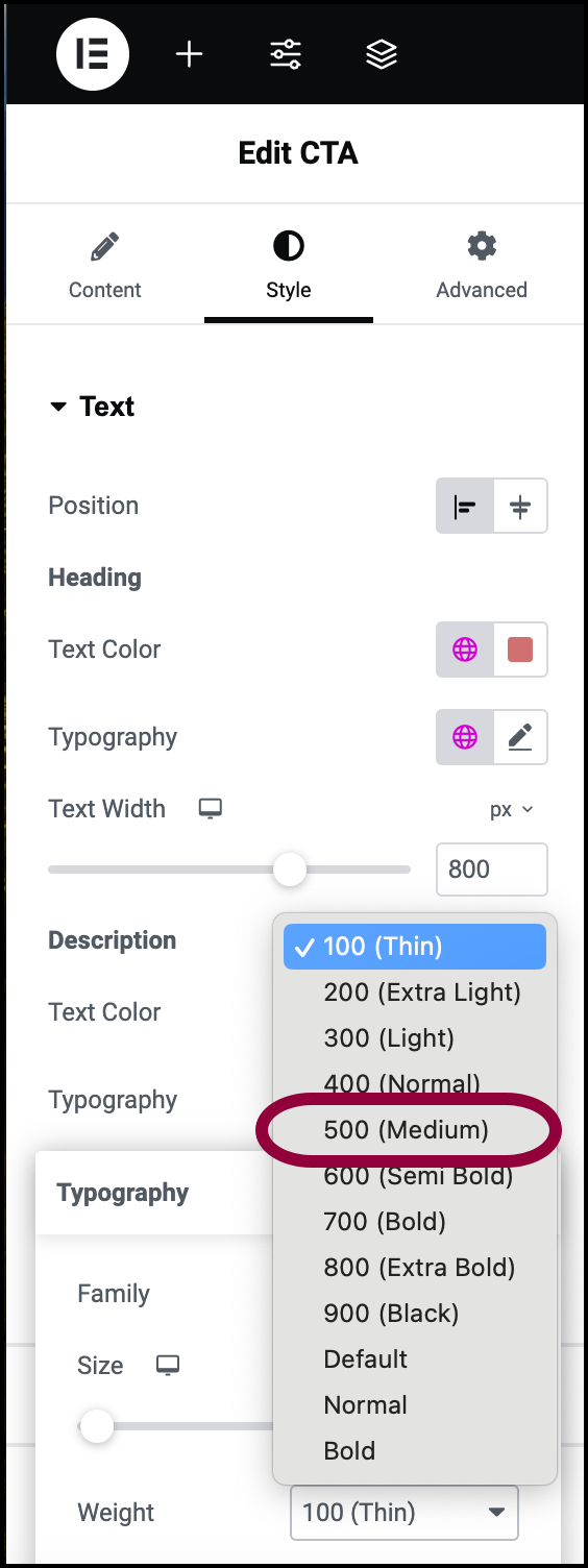
    Image
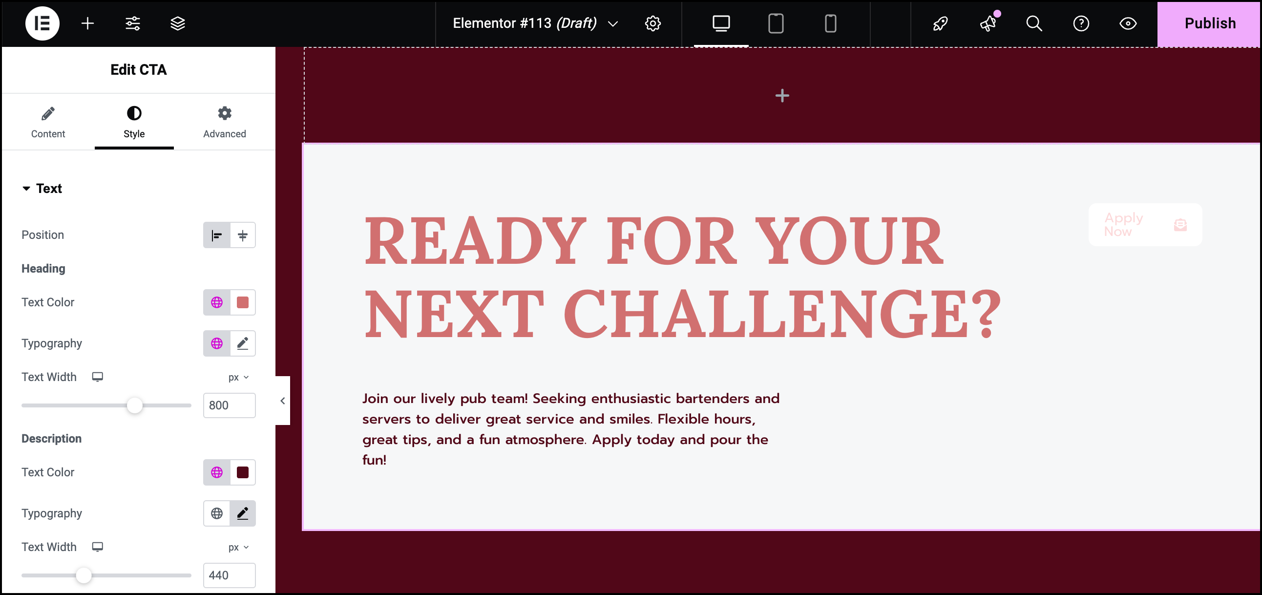
  14. Use the Weight dropdown menu to select 500.
    Image
    The CTA is now ready.

Settings for the CTA widget

You can customize your widgets using content, style, and other advanced parameters, offering you great flexibility in tailoring them to your needs. Click the tabs below to see all the settings available for this widget.

Content tab

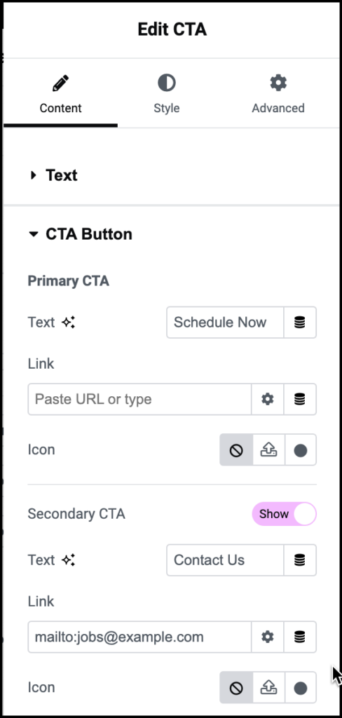
Here is where you’ll enter the Heading, Description and CTA button details

Image

Enter the Heading text into the text box. Heading should be kept short – up to ten words at most.

The HTML tag shows search engines and accessibility tools the importance of the text. We recommend sticking with the default value, but you can use the dropdown menu to change the HTML tag.

Enter the Description text into the text box.

The HTML tag shows search engines and accessibility tools the importance of the text. We recommend sticking with the default value, but you can use the dropdown menu to change the HTML tag.

Image

Text: Enter the text you want to appear on the CTA button.

Link: Enter the URL you want visitors to go to when they click the CTA button.

Icon: Click Image to have no icon on the button,  Image to upload an .svg file as an icon, or the icon symbol to select an icon from the icon library.


The HTML tag shows search engines and accessibility tools the importance of the text. We recommend sticking with the default value, but you can use the dropdown menu to change the HTML tag.

Toggle to Hide if you only want one CTA button. The Secondary CTA button acts just as the first one.

Style tab

Determine the look and feel of menu items and controls.

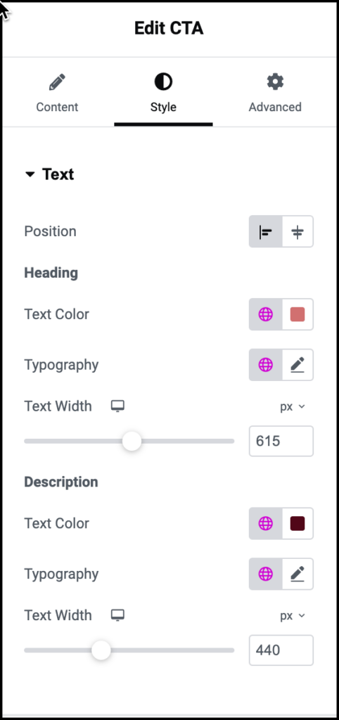
Image

Position the text either at:

  • The start of the widget Image
  • The center of the widget Image

Determine look and feel of the Heading text:

Determine look and feel of the Description text:

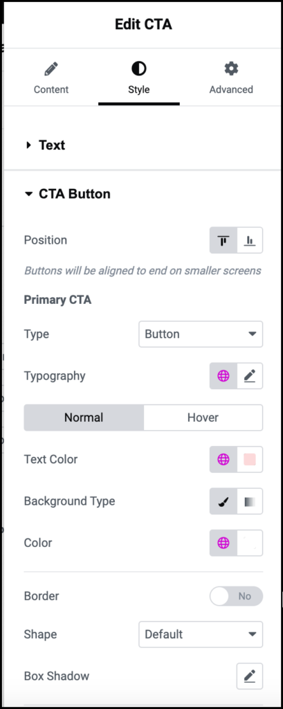
Image

The buttons can be placed:

  • At the start of CTA widget Image.
  • At the end of the CTA widget Image.

The CTA widget can include two buttons/links. The same options are available for both.

The CTA can be displayed as either a button or a simple text link. Use the dropdown to switch between them.

The options below can change depending on where the cursor is:

  • Normal: How the CTA button/link appears by default.
  • Hover: How the CTA button/link appears when visitors mouse over it.

Dynamic options for the CTA:

  • Text Color: Change the color of the CTA text. For details, see Choose a color or Use global fonts and colors.
  • Background type: (button only) Switch between a classic background or a gradient background. For details, see Create a Background.
  • Color (button only): Change the background color of the CTA. You must choose a global color.

Use the dropdown menu to add a border to the toggle. Learn more about border types.

  • Shape: Use the dropdown to determine the roundness of the CTA button.  Choose between:
    • Default
    • Sharp: Rectangular button.
    • Round: Buttons appear with smooth corners.
    • Rounded: Buttons appear with evenly curved edges.

Click the pencil icon Image to add shadow to the toggle. Learn more about shadows.
Image

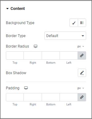
Determine how look and feel of the CTA widget as a whole.

Add a background to the widget content. Learn more about backgrounds.

Add a border around the widget. Learn more about border types.

Round the corners of the borders around the CTA widget if you added a border.  

To adjust the radius with the counter control, use the four counters to adjust each individual corner. Learn more about measurement methods. 

To adjust the radius, use the four counters to adjust each individual corner. Learn more about these measurement methods. 

Click the pencil icon Image to add a shadow to the menu tab’s content. Learn more about shadows.

Add space around the CTA widget content. Learn how to create space with padding and margins.

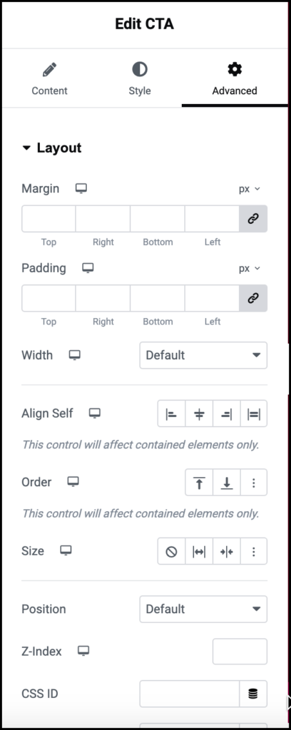
Advanced tab

Control the placement of your widget, insert links, add custom code and more.

Image

Learn more about the Advanced tab settings.

Have more questions?

Can’t find the answers you’re looking for? We’re more than happy to assist.

Contact support

Related Articles

On this page

Share this article